
Design
Your Blue Color Palette Is Probably Not Complete: Here’s How We’d Fix It (Using Real Reader Homes)
Over the course of my tenure at EHD (I’ve been around since 2018 off and on), I’ve seen into a ton of reader homes. It’s always so much fun for me to see how other people live; it speaks to my inner home voyeur. But you start picking up on things when you do it enough, and something I noticed over and over again in many submitted homes was that the color palette was falling short. I found this to be true particularly in the ones where help was being sought out for color or just a general sense of “make this better!” The majority of these rooms were built around blue and neutrals, which makes sense for fans of Emily’s style, of course.
So today, I’m revisiting some images that fit the bill for the above. They’ve been sitting in my email for a variety of reasons, such as not being selected for the original post they were submitted for, and it’s time they saw the light of day and get some of our EHD-approved feedback. I’ll break down my thoughts on their color strategies, establish some blue color palette rules, and then study some of Emily’s rooms and build expert palettes pulled from those.
Let’s go!
Let’s Look At Some Reader Homes
The below image was featured in a post I did in recent months about finisher pieces; meaning, rooms that readers felt were unfinished or just not quite there yet. In this home, at first glance (and per the reader request), the issue was the curtains. But as I looked at it a bit deeper, I realized the *true* answer to what the owner was seeking was the color palette, and yes, the curtains could solve that by introducing another layer of color.
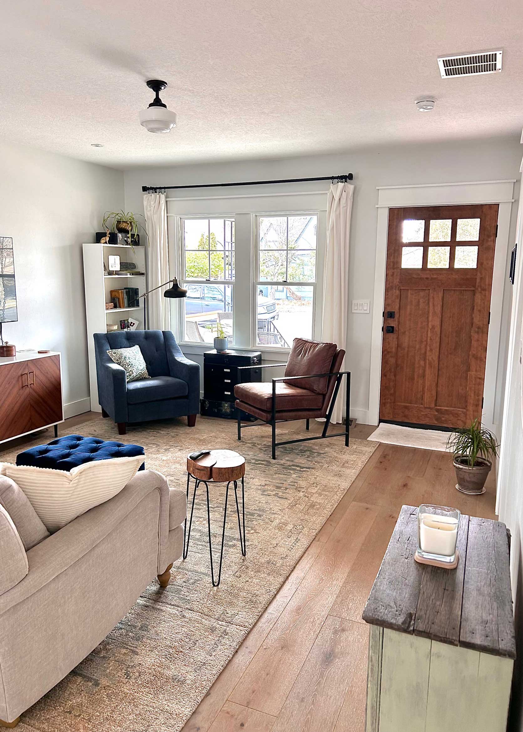
In general, I find that most rooms readers were labeling as having a blue color were really just neutral rooms with a pop or two of blue. The base was essentially a mix of cream, or gray, or white, there were some wood tones typically in the same tonal family sprinkled around, and then a blue thing here and there. I totally understand why, though. Adding color into our homes in any substantial way can feel very risky. What if you tire of it? What if it feels too loud or bold or suffocating? Certainly, a neutral foundation makes the most sense to build from, right? Well…yes, in theory, but look, if you are a person who likes to have some color in your rooms, there *is* a way to do it without it feeling like you’re living on the set of Austin Powers. I’ll go through some rules in just a bit, but let’s keep exploring some homes first.
In the finishing piece post, I recommended some curtains that I know the reader actually ended up buying. Here’s how else I’d round it out, adding in some green via the curtain fabric, a throw pillow, and then a touch of soft steely blue for some variety with a throw (to be put on the brown leather chair):

Pierce & Ward Floral Lattice Curtain | Fringed Linen Blanket | Classic Cotton Velvet Pillow Cover

Next up was this home (above), that was submitted during my Fix It Friday call for assistance with color palettes. This room is beautiful. The architecture offers a lot; the fireplace is stately, and it has great bones. I can see from the blue pillows and the turquoise planter that the person who lives here is okay dipping their toe in color, but feels safest in a warm neutral territory. This is, of course, totally fine! But we’re here to talk about A+ color palettes (and again, that’s what they were asking for from me originally), so let’s break it down. While there is some variety thanks to the hit of black from the frames and mantel, the cream walls, rug, and cognac leather sofa could use some friends.
As you’ll see in my rules, it’s not just about adding in more blue, though in this case, I would. Taking some more chances with the pillows, an interesting throw, and something punchy (maybe a slate velvet chair) in the corner where those plants are now would be the first layer. Then, I’d bring in two additional accent colors. It could be via curtains, art, a few decorative accessories, or even something as subtle as a trim on a pillow. It doesn’t take much, but it’s all about intention. Maybe even something like this:

Accent Chair | Vase | Striped Pillow | Dark Blue Pillow | Lumbar Pillow

Here’s another. Similar home vibes in that they have traditional architecture, pretty windows, a fireplace, and mid-tone wood floors. Everything is neutral except the rug, which is very rarely enough to say anything. In my personal and professional experience, the lack of a locked-in color palette is where most rooms stay in novice limbo. Here, I’d pull from that rug, and even that one small colorful piece of art on the bookshelf, to create something a bit more robust. This room gets amazing light, so it can take on almost anything!
I’d consider a fun slipcover on the sofa and chairs to liven up the gray, bring in some warmth with burgundy to play off the pink, warm earthy tones like rust and orange in accessories, an amazing piece of eye-catchy art above the mantel, and simple window coverings in a warm neutral.

Stocksund IKEA Sofa Linen Slipcover | Art | Patterned Pillow | Lumbar
I didn’t include a window covering in the products above, but a flax or oatmeal curtain or shade would be really great to add a little contrast against the buttery walls.

Now here is a space that leaned into the blue, which I love. But there are two things I believe it could use to get it to the next level: varied blue and wood tones. The floors, table and sideboard are in the same range of brown, so in theory, either swapping either the sideboard or table to something lighter (as the chairs are already satisfying that dark tonal range) would make things more interesting. Not everyone is in the business of swapping out furniture, of course, so there are some other fixes: The brown on the seats can be easily reupholstered with a lighter neutral fabric, or even something that brings in more color and pattern. Even a subtle stripe or a solid hue (perhaps a rust or olive green) would work wonders. From there, I’d swap (or refinish) the frame on the art to widen the spectrum in here, and add in window coverings that complement the new seat upholstery.

Curtains | Upholstery Velvet | Low Footed Bowl

Finally, this bathroom. Soft and serene, yes, but perhaps just too stripped down in terms of color. An all-white bathroom can be beautiful, but when you go monotone, you must add textural differences. The homeowner here, as I remember, was tired of the blue walls and wanted to repaint, but I think the blue is lovely and just needs some more friends to play with. A rug, a trash can perhaps in more of a natural material like rattan, neutral towels with an interesting border or trim, and new art would reinvigorate this room so that no annoying painting has to be done. Even the medicine cabinet, if in the budget, could be swapped to something wood in order to break up all the white finishes. I’d even go as far as to say to do MORE of that blue, on the ceiling, to really hug the space. But that’s just me.

Rug | Medicine Cabinet | Waste Basket
Okay, time for some rules, because it wouldn’t be an EHD post without them.
Good Blue Color Palette Rules
- Mix in multiple blues! I’m starting with the most crucial of rules for a blue color palette if you want it to feel robust and interesting. Using just the same medium or dark shade of blue in a few places of your room is stopping you from accomplishing that look you’re likely after. The key is to have at least two, if not three, shades of varied blue tones throughout your space.
- Avoid the “pops” of color strategy: Sorry if you’ve heard me say this already in the past, but I’m really just not a fan of a “pop” of color in a neutral room. A “pop” of red in a well-balanced room? Sure! A pair of blue throw pillows in a white and gray room? Nope. Have intention, people! Have your blue or blues be a main character in the design. This means on your walls, on your furniture, in your art, on your rug. Blue should be on at least two major surfaces.
- Vary your wood tones and brown tones. Just like with your shades of blue, you have GOT to bring in some variety to anything brown in your room, such as your wood furnishings, floors, and leather. Ideally, you’ll have a good mix of light, medium, and dark tones, but at least two of those should do the trick.
- Introduce supplemental colors. This is where most color palettes that fall short fail; they simply do not have enough else going on to be interesting. You need two to three additional colors to round things out, especially if you’re working with white walls. They don’t have to be huge moments, but they should come in as an accent on a rug, pillow, curtain, or even something as subtle as a single piece of decor.
- Make sure there is enough contrast and warmth. And while I’m at it, limit your gray, too. Blue color palettes that have too much gray or other cool tones without the contrast and warmth of something on the opposite side of the color wheel end up feeling cold and a bit dated.
- Add neutral pattern and texture. Pattern doesn’t have to be loud and dramatic. Your room will not end up feeling like a bag of Skittles exploded in it; I promise. To avoid your room feeling flat, bringing in moments of subtle pattern and texture in neutral colors will make it sing.
Now that we have that established, I want to put together some blue color palettes pulled directly from some of the rooms in Emily’s farmhouse. She’s no stranger to blue, in fact, it’s her signature color as we all probably know. But there’s a reason the rooms feel full, intentional, layered, and that’s due in large part to fully rounded out color palettes.
EHD-Approved Blue Color Palettes (Pulled Straight From Emily’s House)

The family room in the farmhouse is an ode to blue. About 90% of the room is a similar shade of deep blue with greenish undertones, but to satisfy Rule #1, Emily brought in a brighter punch via the sharper aqua pillow. Two blue shades > one blue shade. From there, she added tons of contrast, which is needed in a monotone space like this, with earthy ochres, browns, and rust. Black detailing in the throw and sconces grounds everything nicely.

In contrast, the breakfast nook is light and bright, but still follows the blue rules above. Two to three shades of blue are satisfied: here, we have a deep navy on the throw, the seat upholstery, the leather tops of the stools, and the cafe curtain, then a brighter cerulean on the bottoms of the stools, and a dustier blue on the throw cushion. From there, rust-hued throw pillows bring in an accent, a dark wood side table adds to the mid-tone wood floor, table, and window framing, and black accessories and lighting, yet again grounds things.

Emily’s primary bedroom is a perfect example of being super intentional about a color. She wanted blue, so she went all in. A dusty blue on the walls and bedding, a deeper blue on the curtains (and on the fireplace wall on the opposite side of the room). She continued the warm earth tone accents from the dining nook (and other areas of the house) in the throw pillow, art, and even the leather straps of the bench, and the mauve throw softens things nicely.
I also want to point out her use of neutral patterns, which can be such a help in making a room feel robust without being overly loud. The rug is neutral, but the low and high piles, as well as the dashes and lines make it interesting, but doesn’t overpower anything. Same goes for the Rebecca Atwood bed fabric. It’s like how they say people who speak quietly hold more power than those who yell, because it invites you to move in closer, listen more intently, and connect more.

And finally, the sunroom dining space. At first look, you might think “this isn’t a blue room” but ah! It is! You can love the color blue and not have to make it everything in a space. It can be equally balanced with another start color (like the green here). If you want a specific shade of blue to stand alone in your home, pick another color as its sidekick and use it in equal amounts, but be sure to bring in at least one or two other colors and tones to make it interesting. Here, the subtle mauve napkins on the table (which, no, are not always there but look nice here) are that supporting color component, as are the beautiful wood tones of the furnishings.
SO! There are my thoughts on how to make a blue color palette truly sing. I know it can be daunting; trust me, I even struggle in my own home, and I’m a certified color lover. When is it too much? How do you balance it all? But I promise, if you identify with any of the reader homes at the beginning of this post, and you work through the rules for your spaces, you’ll see a huge difference in how you feel about them. They’ll feel more polished, robust, and intentional, all three things that come together to create beautiful rooms.
Good luck, send photos if you make any changes, and see you next time.
Opening Image Credit: Design by Emily Henderson | Photo by Kaitlin Green | From: Introducing The Next Room…Robyn’s Welcoming Patterned Dining Room Reveal


Very well written post, thank you
Thanks for reading!
This was such a fun article. I found myself trying to guess what Arlen was going to recommend and then see if I was on the same page. I love posts like this – they get my creative juices flowing and give me a way to look at my spaces with a fresh eye. I also like that many of the suggestions involved only small tweaks, which make them more approachable to a wider audience. Thank you!
Honestly, small tweaks are usually what take a room from “pretty okay” to “oh, this is good!”
This is so useful to try to train ones eye for the big picture. Very readable. More from this viewpoint please.
Thanks for that!
I do love Arlyn’s posts.
I also miss having the comments on the homepage (how many there are) and the link at the top to go down to the comments. On some blog posts I’m curious what people are going to say and will glance back at prior comments sections if they are robust. Bring back those features so people can interact more!
Thanks Beth! (I also loved seeing the comment count on the homepage, fwiw!).
I love how you explain things,makes me want to put this knowledge to use right away and/ or hope to remember moving forward
Bookmark the post and come back to it whenever the time is right!
Arlyn, your context and narrative really highlight what makes the examples from Emily’s beautiful rooms work. It’s always a pleasure to gaze at these spaces, but the “words” on the how and the why bring it home.
Hi Pamela!! And so glad my words helped squeeze more out of Emily’s beautiful rooms.
followup question re: mixing wood tones. Should the light/med/dark wood tones mixed still be in the same warm or cool color family? I’ve lived in countless rentals with the same “cool ashy blonde” wood, and could not get eye to bring in any sort of warmer wood tones for fear of clashing, so I have no true wood at all, only cool blue colors and painted wood (with a hint of yellow). Is this reasonable or am I being overly critical? (I also used to get annoyed at how my cool white tv stand seemed to clash against the warm white rental walls so I may just need to cool it). Arlyn, I loved your series on how to work with 2000s era cherry wood rental kitchen cabinets – could we get a 2.0 version of color Palletes to work with 2010’s greige (fake) wood kitchen cabinents (especially since many 2010s era kitchens are open to the living room)?? Pretty please!! Your eye for color is unmatched!
In theory, yes, I’d say the warmth (or coolness) of the wood tones should align but that’s not always something in our control, right? Especially as renters, when we have no say in our built-in cabinetry, floors, wall colors, etc. If your floors are “cool ashy blonde”, I think as long as you have large rugs to separate furniture from flooring, it should be okay. So cool it, Frankie! 🙂
Having some before and after PhotoShop pictures here would be great to reinforce your rules!
I totally agree and I LOVED the rough mockups on instagram stories today – they actually sold me on the recommendations 1000x better than the descriptions here, tbh. Even very rough, collage-y, quick mockups are extremely helpful for these room recommendation posts.
LOVE these posts!! I had to go back and read the “Fix -it -Friday -Color palette” again!!
Thank you Maggie!
I find taking photos and studying the photos from the major room user viewpoints helps me realize what a room needs. I think we process photos differently from environments.
What a great post! My entry is a space I’ve struggled with–it opens directly into my living room, and is an underused space in a small house. Blue is a feature color, mostly due the artwork on the walls. I decluttered and added some green, and now I feel like it’s finally coming together!
But also how cute is that dog?!?
aww thanks! that’s Lulu, my fourth pit mix from the same rescue. I’m in the Deep South, and unfortunately there are so many stray dogs that need adopting down here. she loves to pose for photos! also, why didn’t I notice the open dresser drawer? lolz.
FWIW I, a complete stranger on the internet, ALSO think this looks really pulled together lol. No seriously I feel like this is the right balance of neutral to color and enough colors that play at the same level of intensity. and a dark green plant is a great way to counteract blue imho. I’m still working toward balance in my living room which has a much more hushed palette of off white + blue patterned rug but it helped a lot once I noticed how much I loved how my plants looked. It doesn’t get the best light to grow a lot of things but I am still leaning into natural green as a balance. Thanks for sharing and please give a treat to that very good boi who adds so much to this pic!
thank you! the other side of the room isn’t in this photo, as it’s still a major work in progress! I have a giant found painting of Joe Louis to match the Josephine Baker painting you see most of here, and right now, I have 2 beaten up 1940s leather chairs flanking it. I adore the chairs but I’m a little tired of them (purchased in a yard sale 30+ years ago) so I tossed IKEA sheepskins on them for a low-commitment change. one of my main issues is that my house is very small–5 rooms including the kitchen–and has many doorways, so I tend to buy furniture for one spot and then find it difficult to relocate. I’ve given up a lot of stuff recently, but there are some things like these chairs I will never re-home. until recently, this space had a darker mid-century credenza where the dresser is now, plus heavy curtains over the front door and sidelights. I had a couch on the side of the room you don’t see, but previous dog loved to stand on the couch to greet me and any visitors face-to-face, which was a bit too much. now I have two… Read more »
Thank you so much!! Excellent teaching, Arlyn:) I can now decorate with more confidence in my decisions for sure:)
I’m so glad to hear it was helpful. <3
What is the wall color in the first photo in this article. The room with the white IKEA curtains?
Hi, that’s my home! I’m out on an adventure, so I’ll check the paint can when I return home and let you know!
Thank you!!!!
Here’s a peek of my blue room 🙂
Sumptuous! Royal enough for a cat too I see
I never comment on blog posts, but I had to this time! In this age of so much fluffy online drivel, this was beautifully and succinctly written and the example photos were so well-chosen. I appreciate that your recommendations can be done at any price point, and you even had recommendations for folks who might not want to paint everything (good for renters). Kudos!!
Dithering drapes gal here… I DID order & hang those drapes… yeah, the but you expected here is reality, they weren’t a ‘hell yes’ for me. I’ve been out adventuring, it is summer after-all, bookended by my career job, so the drape dilemma continues. Stay tuned. The green chairs and the green pillow Arlyn linked in this post grabbed my eye, so who can tell where this will end up?! So delighted to have Arlyn process post like this, so helpful and inspiring!