Let’s Make It Better – 3 Real Life Reader-Submitted Rooms Get Our Honest Decor Styling Advice
The other week, for fun, Marlee put up an Instastory asking the followers what they needed advice on in their homes. It was meant to just be an Instagram thing, but then we decided that it was silly not to share our suggestions on the blog, too! So that’s what we’re doing today. Here are 3 rooms, 3 different design problems, and 3 (or more) potential solutions. Let’s jump right in!
The Accent Wall…
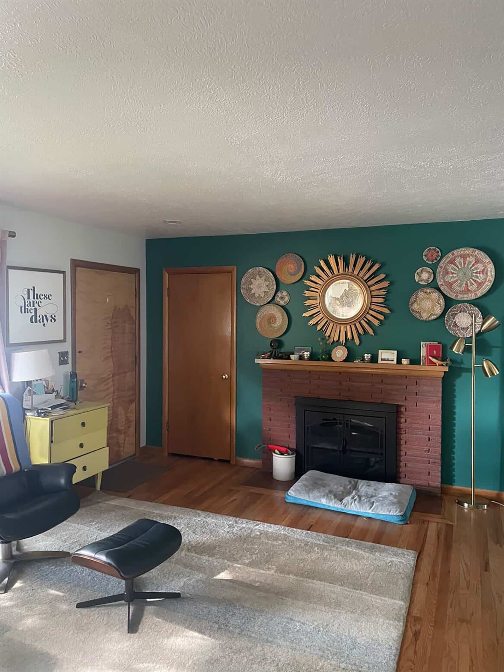
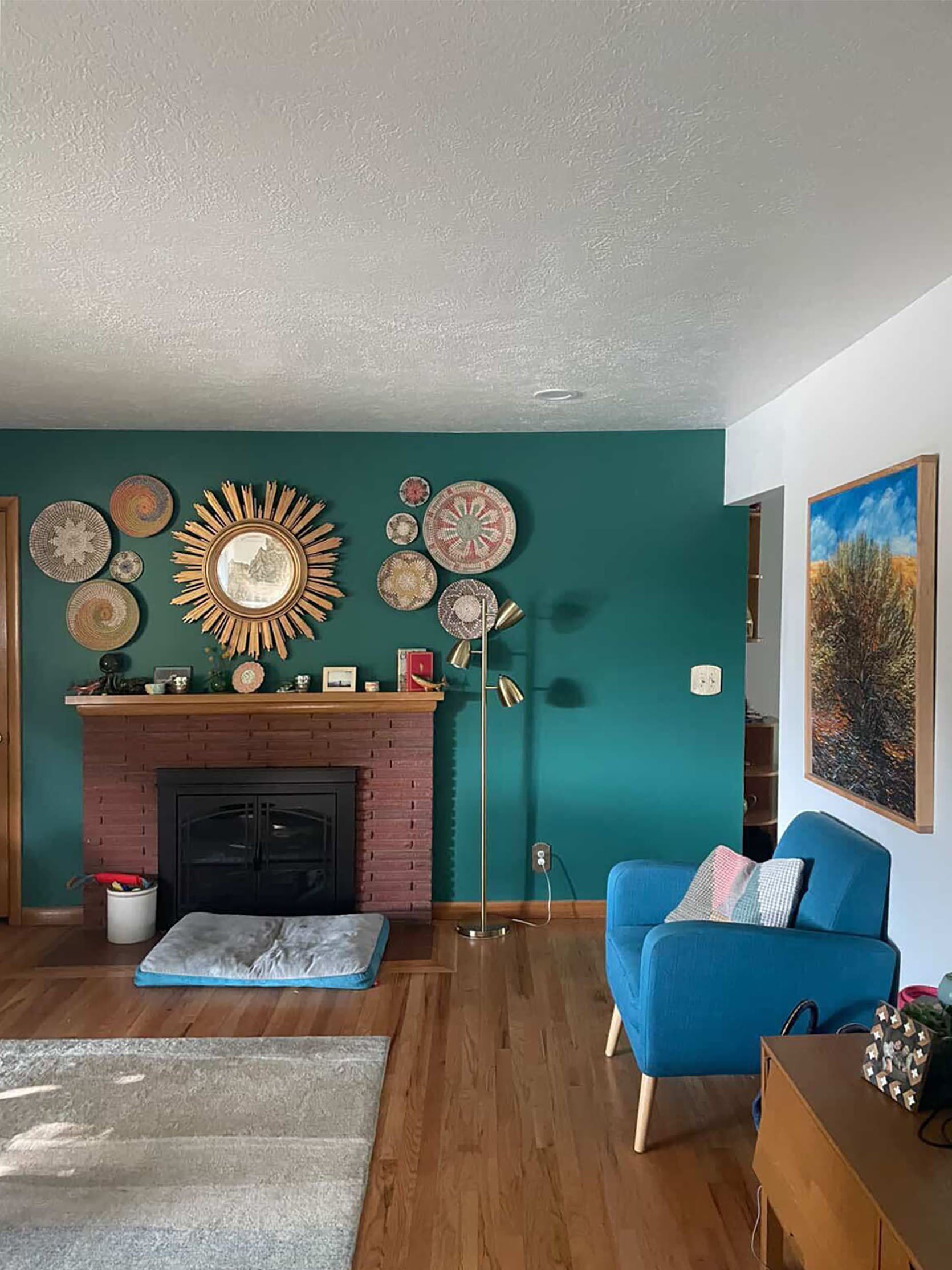
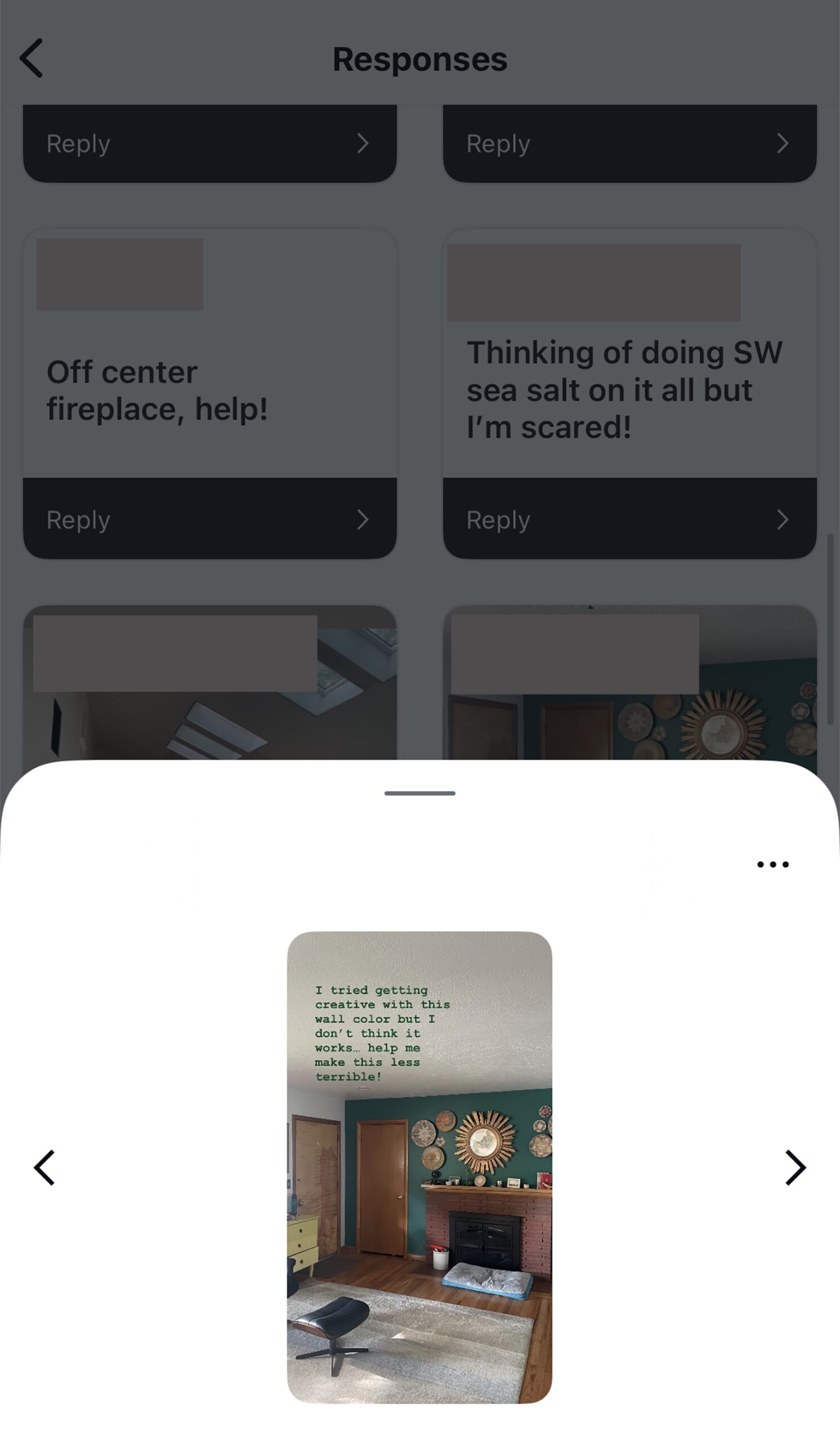
First off, it’s definitely not terrible, but we have some suggestions to give her ideas to get the look we think she wants. Also, as a general design “rule”, accent walls are hard. They were a massive trend in the early 2000s, but since then, designers advise against them unless it’s drawing attention to an architectural feature, such as a nook. Arlyn wrote a great post about it here. They are advised against because they can feel jarring and stop your eye abruptly. I think that’s what she’s feeling with her’s.
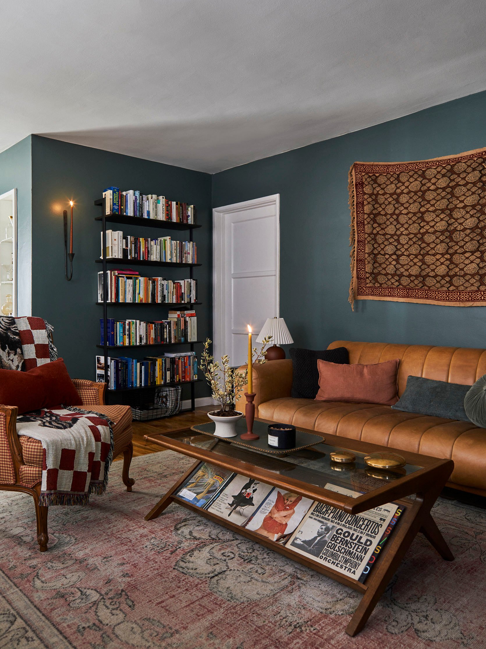
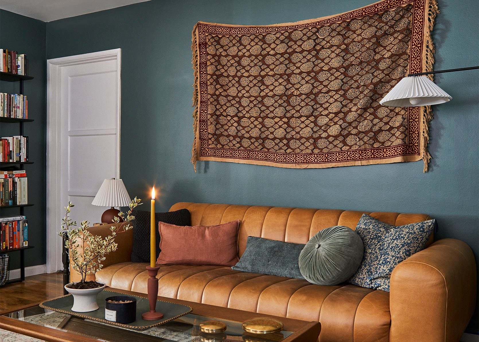
We’re not sure if this room is a part of an open concept plan; if it isn’t, we suggest really committing fully and painting all of the walls like Ryann did in her last home. It feels intentional in a great way and keeps the eye moving around the whole space. Then, if it’s in the budget, a deep-toned, colorful rug would really help to visually balance the space. Also, going up a size will also make the space feel better scale-wise. Much like Ryann’s home, we recommend leaning into richer-toned furniture and decor. In conclusion, we think that the overarching issue she feels is that the space doesn’t feel balanced. So, by painting all the walls and leaning into those richer tones throughout will definitely fix that.
And for fun, here are some rug options with a reminder of what the space looks like:)

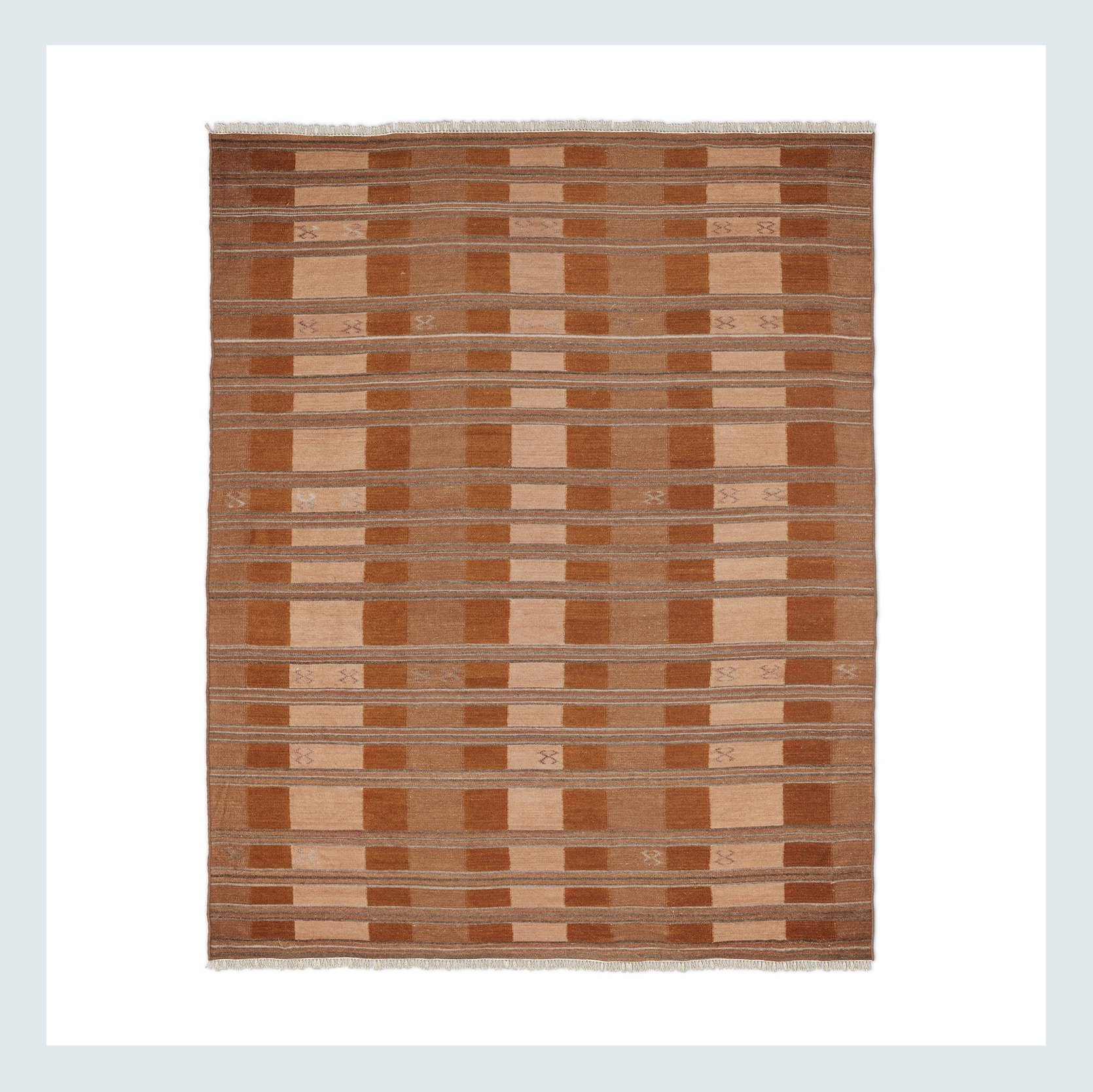
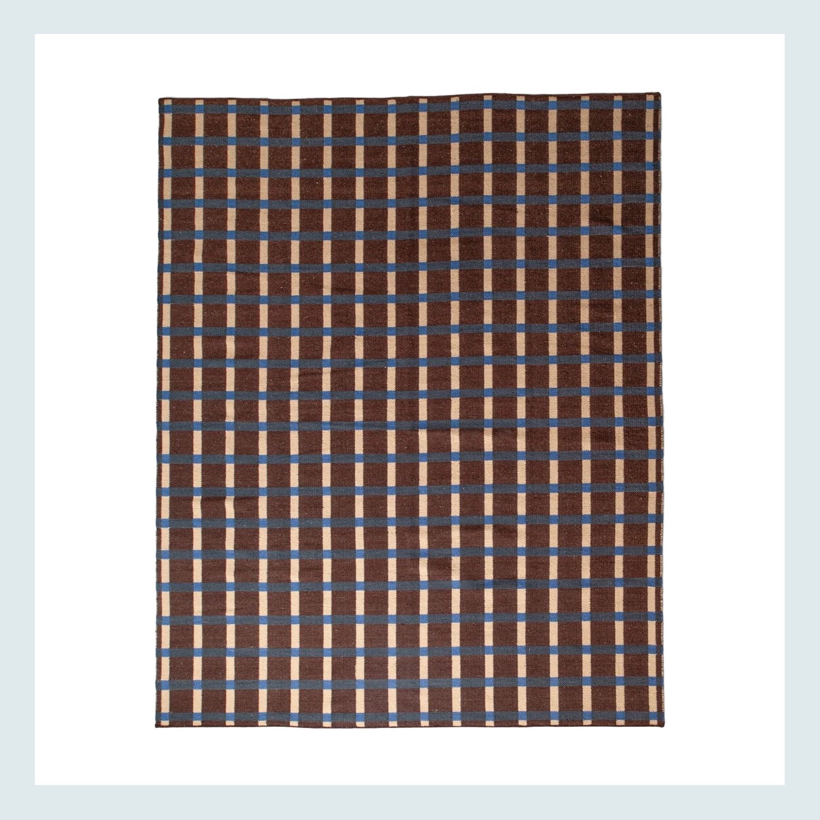
Aymer Copper Rug | Plaid Wool Reversible Rug
From what we gather from the baskets on the wall, loving pattern isn’t an issue. Both of these rugs are rich and warm with a pattern that won’t overwhelm the room. The copper rug is a little more neutral and has a similar vibe to the baskets, while the brown and blue one is a little more unexpected and modern.
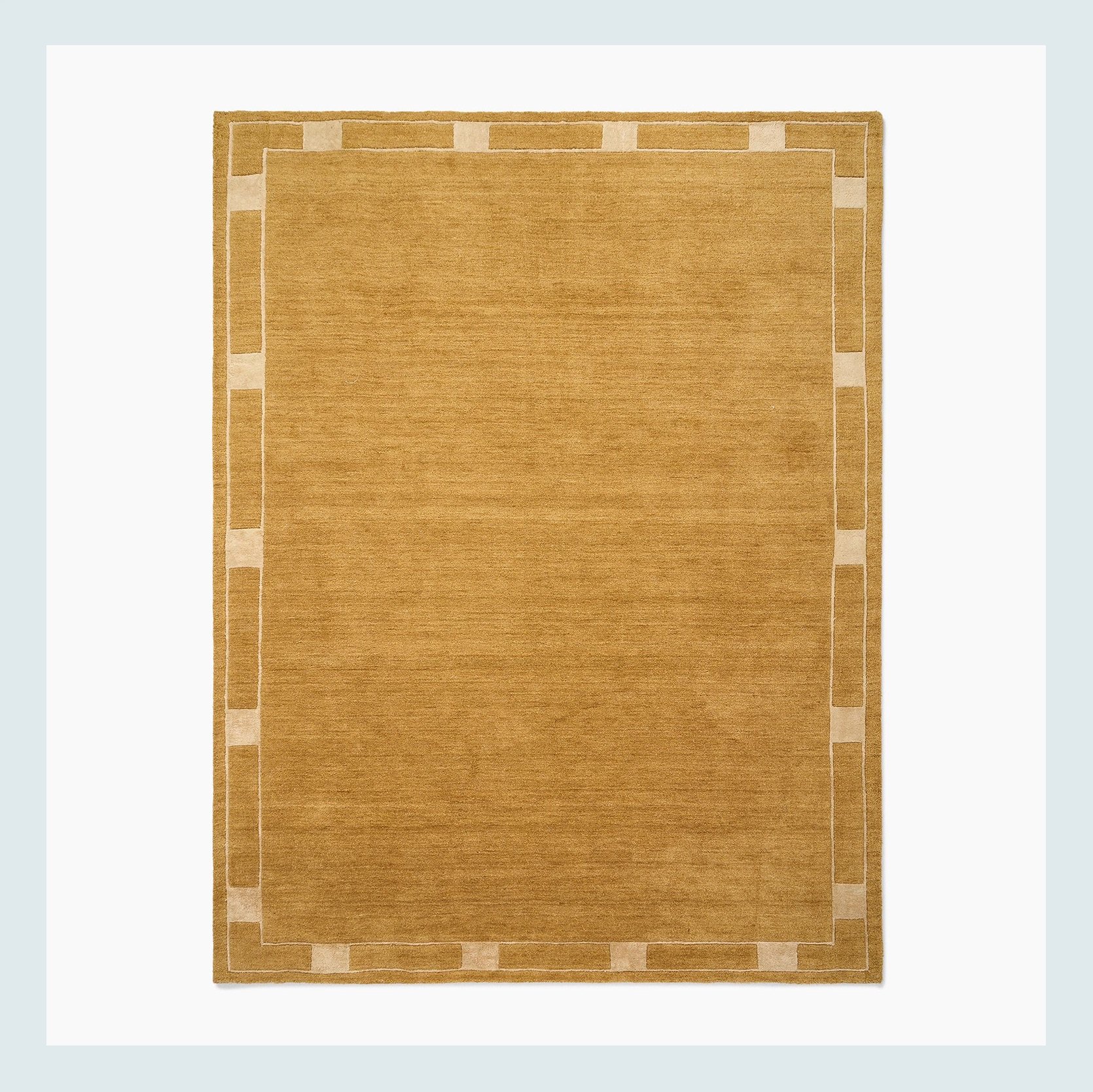
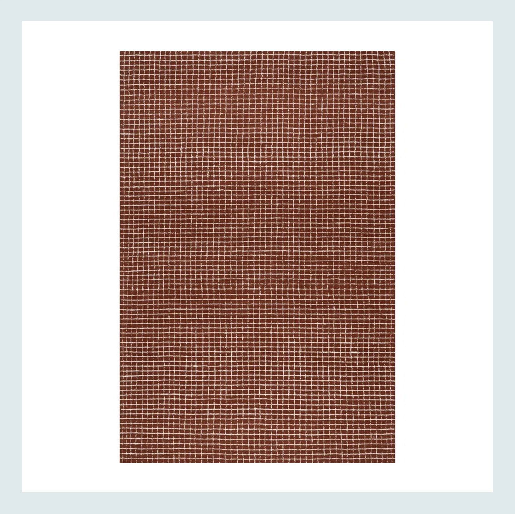
Pierce & Ward Deco Border Handwoven Wool Rug | Katasha Checked Wool Area Rug
Then, if they wanted to choose a rug with a less intense pattern, I think this golden colored rug would be very fun and complement the bright color of the wall. Or they could tone it down but still add richness with the checked one that would also talk to the brick on the fireplace.
Hope this helped!
A Bathroom That Needs More Color
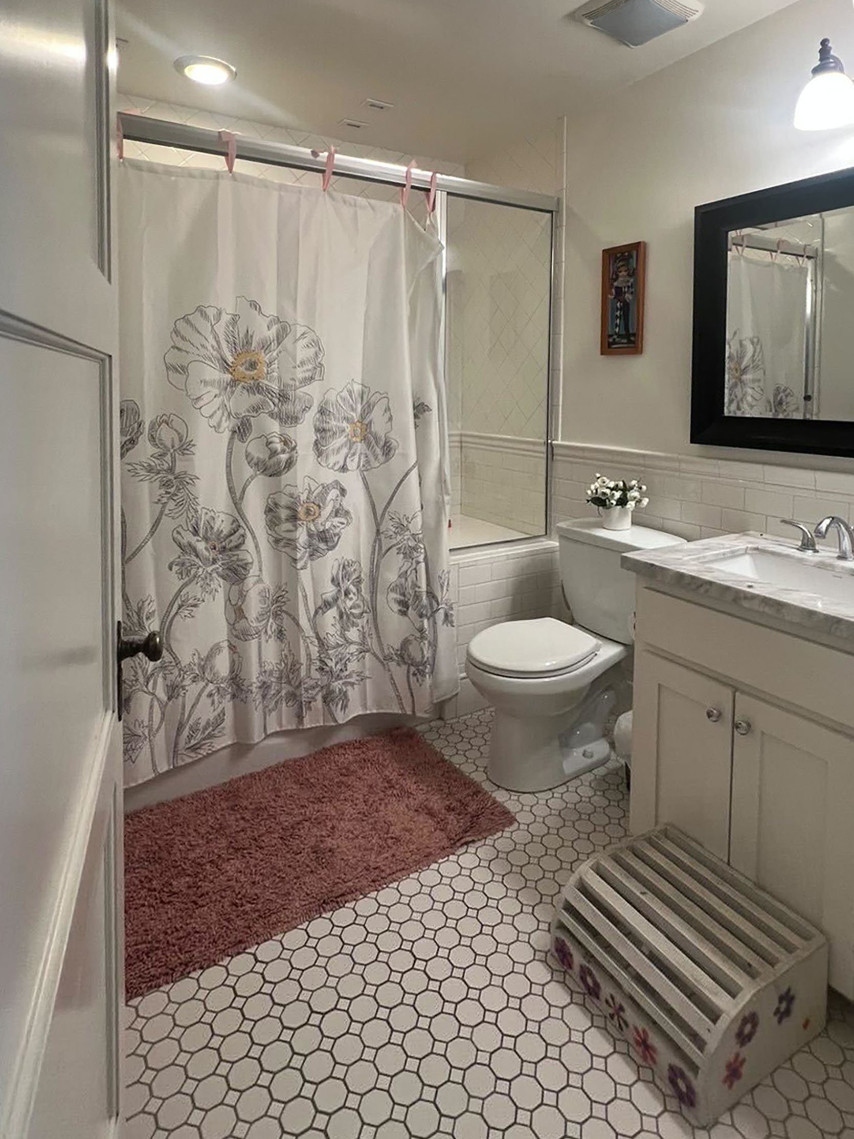
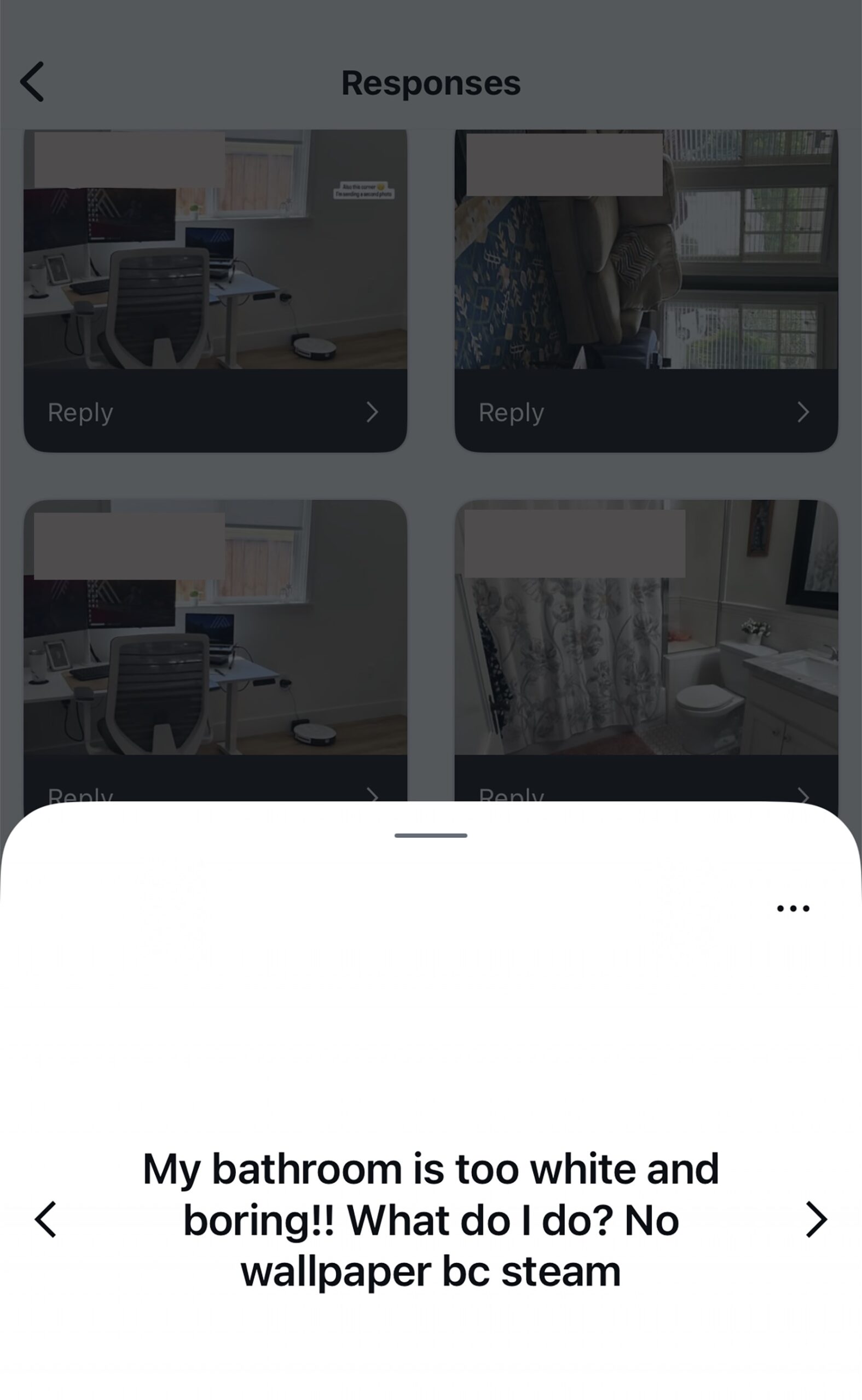
This follower really wants to add more color because she thinks there’s too much white. Well, fear not because we’ve got you. The good news is that this is a beautiful bathroom, so this is going to be a breeze.
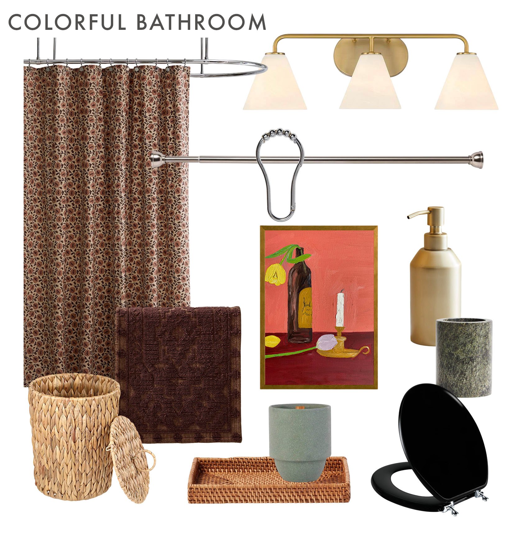
We decided to really only recommend decor changes. Could they paint the walls? Sure. But we don’t think it’s necessary to inject a healthy dose of color to cure her from her “boring bathroom” blues. Naturally, there are two mood boards (we can’t help ourselves), and we based the style and some colors on what was already there – florals, pink tones, and a modern traditional look.
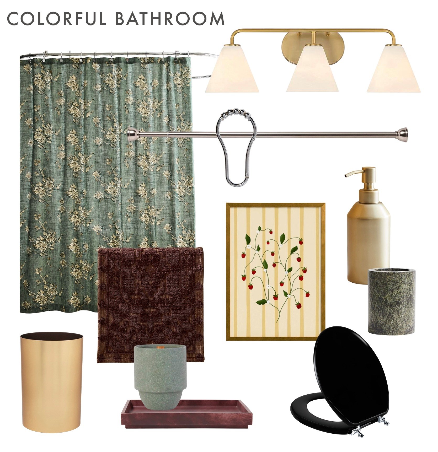
Deco Blossom Shower Curtain | Blair Warm Brass 3-Light Bath Light | Half Moon Dual Mount Shower Rod | V Hook Shower Curtain Rings | Sahar Bath Mat | Raspberry Vine Print | Caspian Soap Pump | Marble Toothbrush Mug | Metalla Trash Can | Candle | Luxe Faux Marble Bath Tray | Black Round Toilet Seat
This first one is definitely more green-forward, but we love that shower curtain so much that we couldn’t not include it. Speaking of the shower curtain, they should get a rod, hang it towards the ceiling, and make sure the curtain is long enough to almost touch the floor. This will make the whole room feel taller. Now, as you can see, we mixed metals. This is totally allowed, but make sure each metal looks balanced. We did, however, feel that the rod should match the shower doorframe. Then, while it’s not necessary, we liked the idea of switching out the current vanity light for a brass one to warm up the space. Just an option. Remember when I said the metal tones should be balanced? That’s why the soap pump and the waste bin are also brass. A little brass high, medium, and low. And if you’ve been paying attention, then you know our deep love for burgundy. It’s rich, is a warm neutral that is anything but boring, and it’s a perfect match for green. So that bath mat and tray (that would work on top of the toilet’s tank) are perfect additions and will really add in the color this follower is looking for. But their current bath mat could also be great. Now, for the toilet seat, I am very pro black seat cover. I have one myself, and I think it really makes the room look so much better. It feels vintage-like but not old, and since this is a modern traditional bathroom, it’s kinda perfect, right?? I also love the added green textures of the toothbrush holder and candle. And finally, the piece of art. There’s nothing wrong with the beautiful piece they have, but it does look a little small and/or hung a little too high. So if they are looking for a new piece of art, I love this idea of this print because it’s got all of the tones of the established color palette, but a little more saturated/bright to add a little pop to the whole space.
Deco Blossom Shower Curtain | Blair Warm Brass 3-Light Bath Light | Half Moon Dual Mount Shower Rod | V Hook Shower Curtain Rings | Sahar Bath Mat | Velas, Vinho e Flores Fine Art Print | Caspian Soap Pump | Marble Toothbrush Mug | Wicker Waste Basket | Candle | Rattan Tray | Black Round Toilet Seat
This mood board leaned much harder into the warm tones, so you can see the same color palette but with a different color emphasized. We also swapped out the waste bin and tray to be in a natural woven material, since bathrooms inherently have a lot of hard surfaces like tile and stone. Oh, and that wonderful print is again, a brighter version of the rest of the colors to add freshness. The only thing that I didn’t mention that could also be switched out is the mirror, if they wanted. It’s totally great, but a slimmer frame might feel more balanced in the space. I think a black frame would still be a perfect color, but silver or brass would also look awesome. Happy decorating!!
Adding Character To The Builder Grade Kitchen
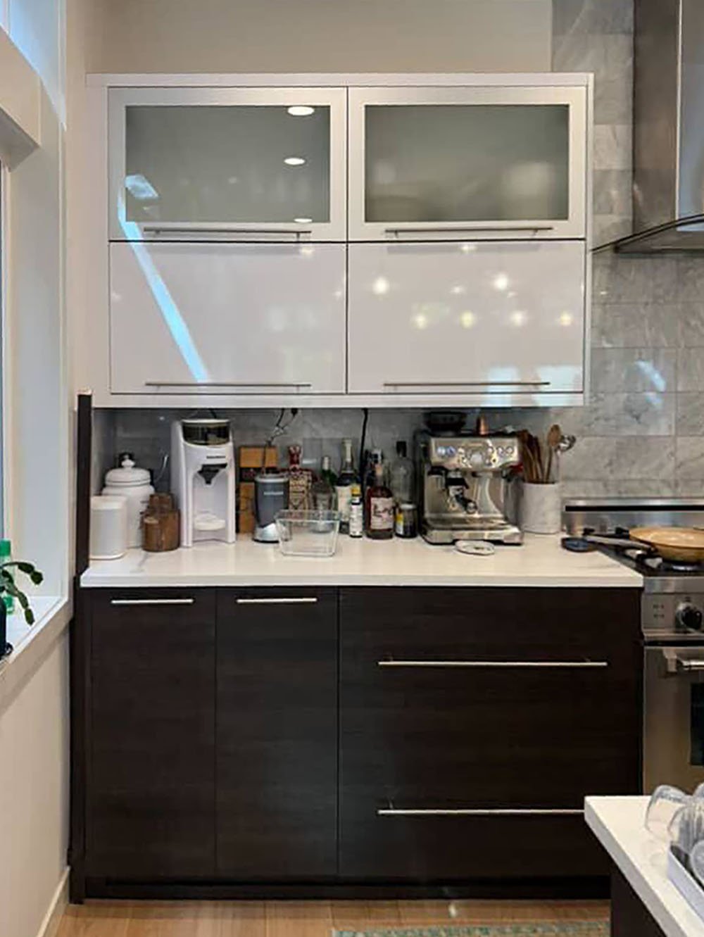
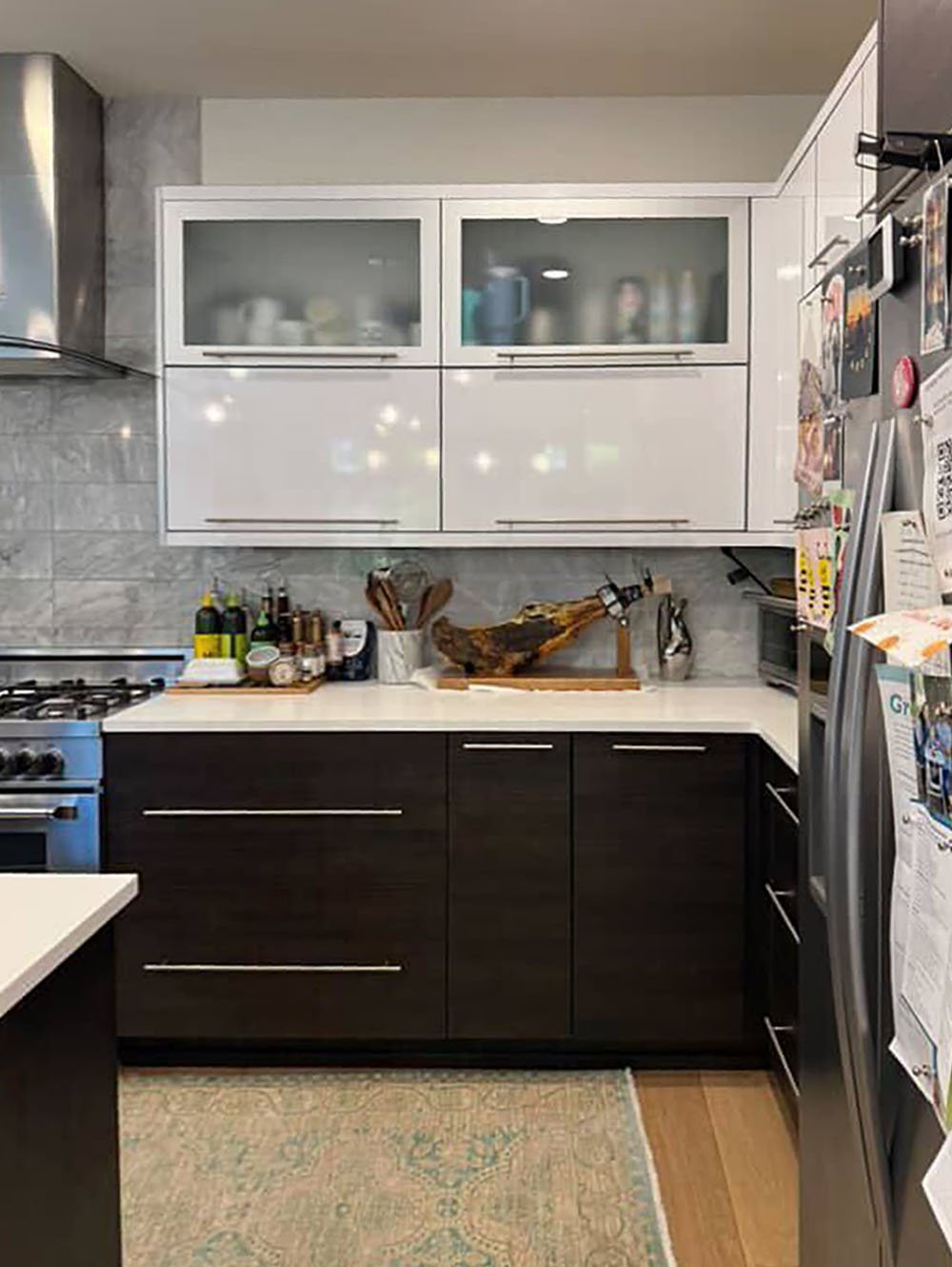
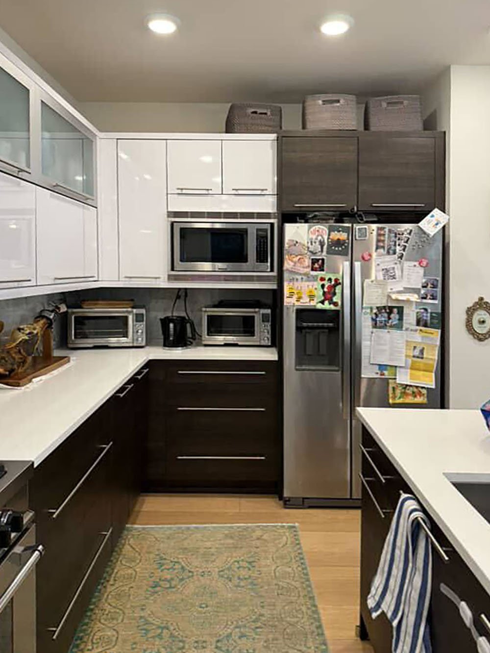
Now, this follower has a great kitchen, but given that it’s builder-grade, they really want to add more character to it. Clearly, it’s very modern, so we’re hesitant to recommend going “too vintage”. That doesn’t feel quite right for a design like this because it may feel like too much of an overall contrast. Like they are fighting each other instead of working in harmony. We only say that because when most people hear “character,” they mostly only think “add all vintage”. Keep reading:)
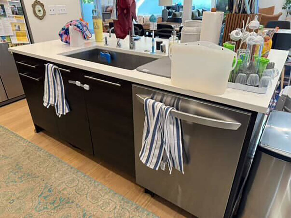
So what we are about to recommend is a little vintage, but mostly things that add color and texture. It’s really about adding personality, right? With that said, the biggest change they could make is the handles. The brushed silver they currently have isn’t helping the space to feel warm. But to be fair, the cabinet colors are also not warm, so adding on bright gold pulls that would highly contrast (and may visually overwhelm) isn’t the answer either. So what could work??

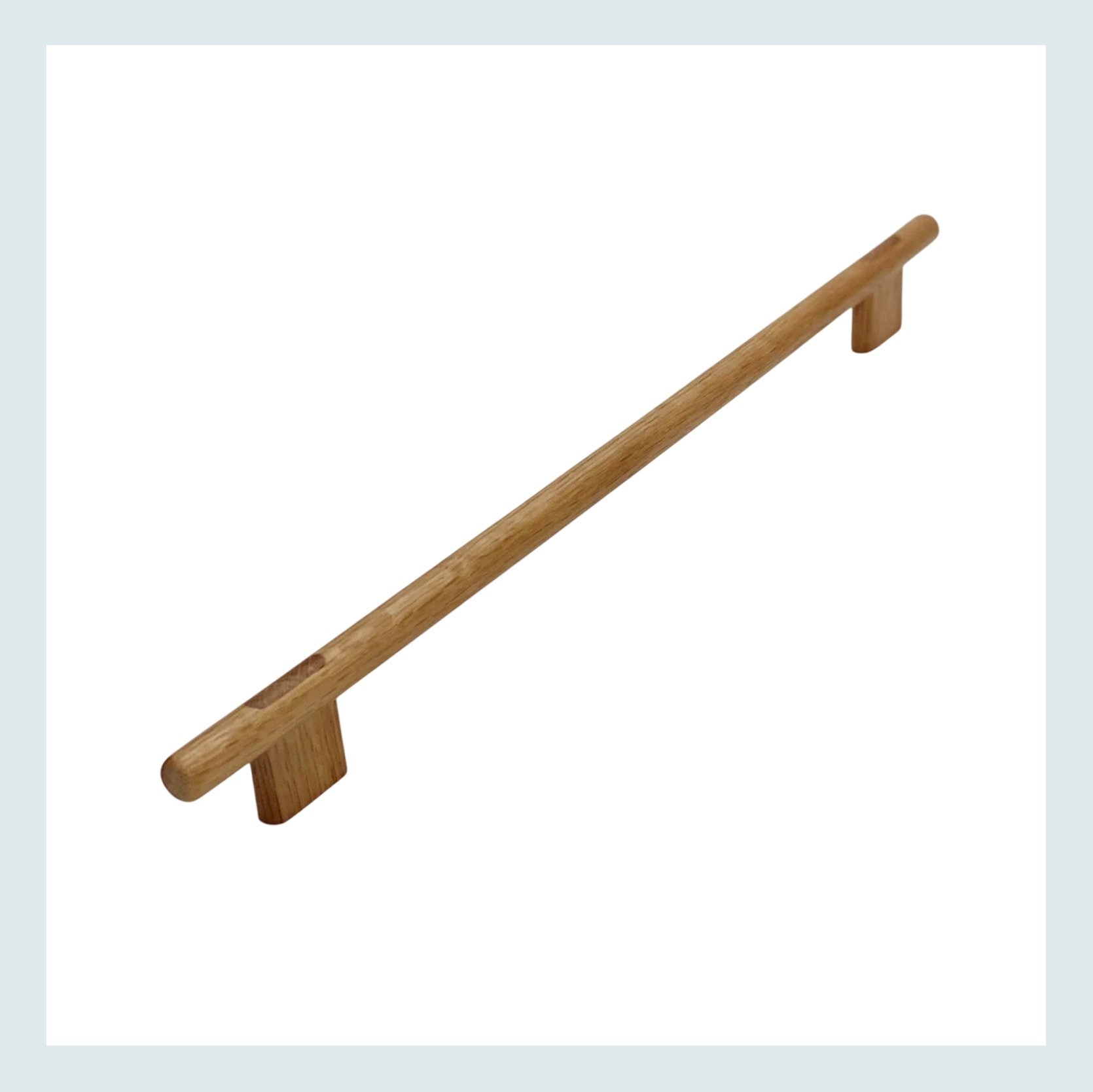
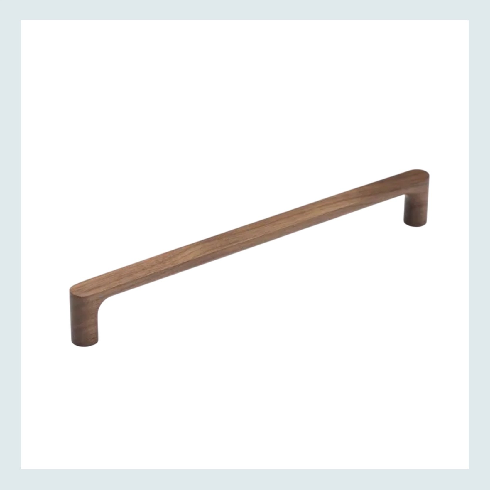
Lacquered Oak Wood “Join” Cabinet Handle | Oval Bar Wood Handle Cabinet Pull
We first thought a mid-toned wood handle pulls. They could warm the cabinets up a little and be a more unexpected choice. The other issue is that we couldn’t find any wood pulls over 12″, and some of those drawers look much longer than that. It’s an option, but we think we have a better idea.
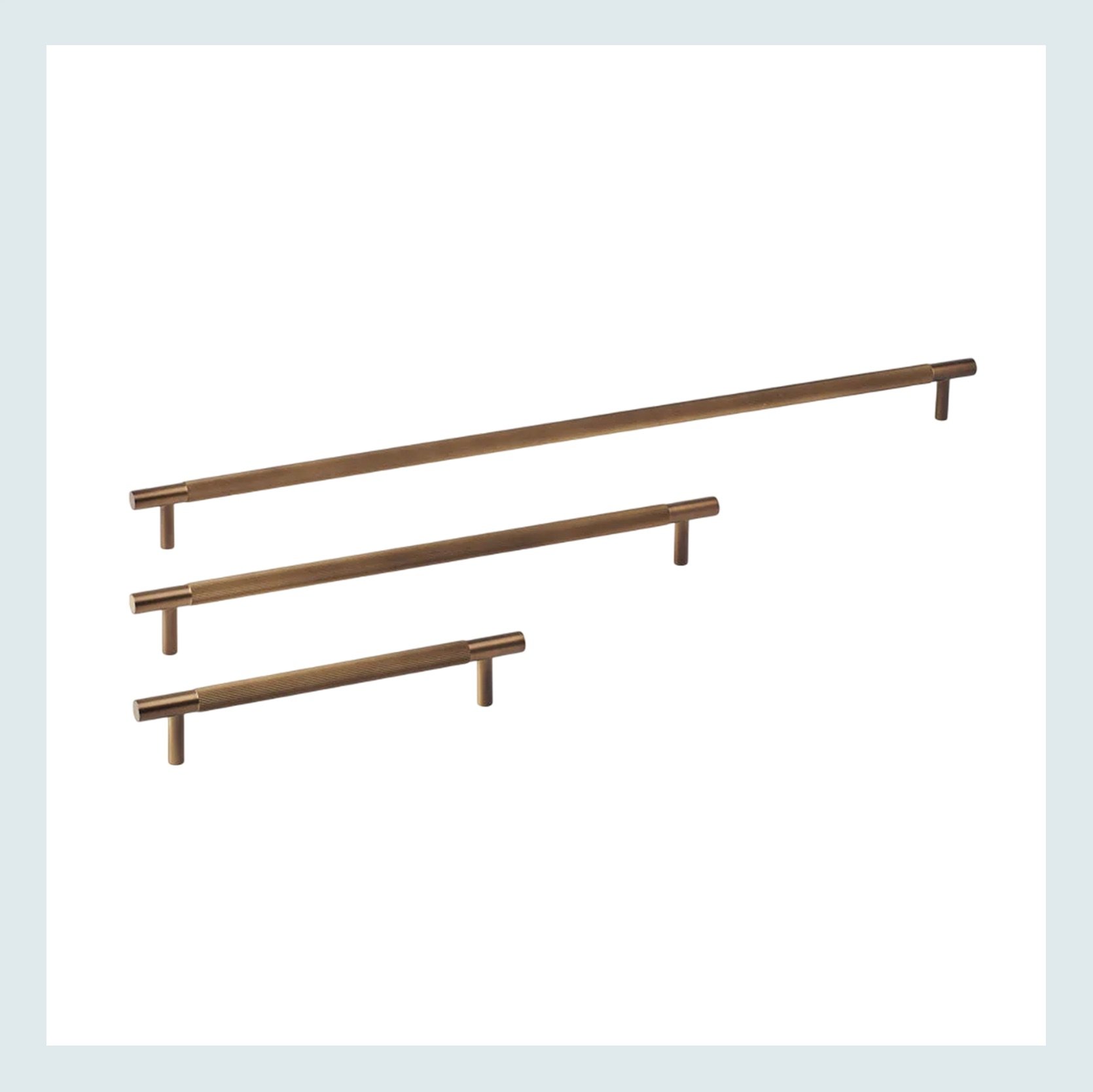
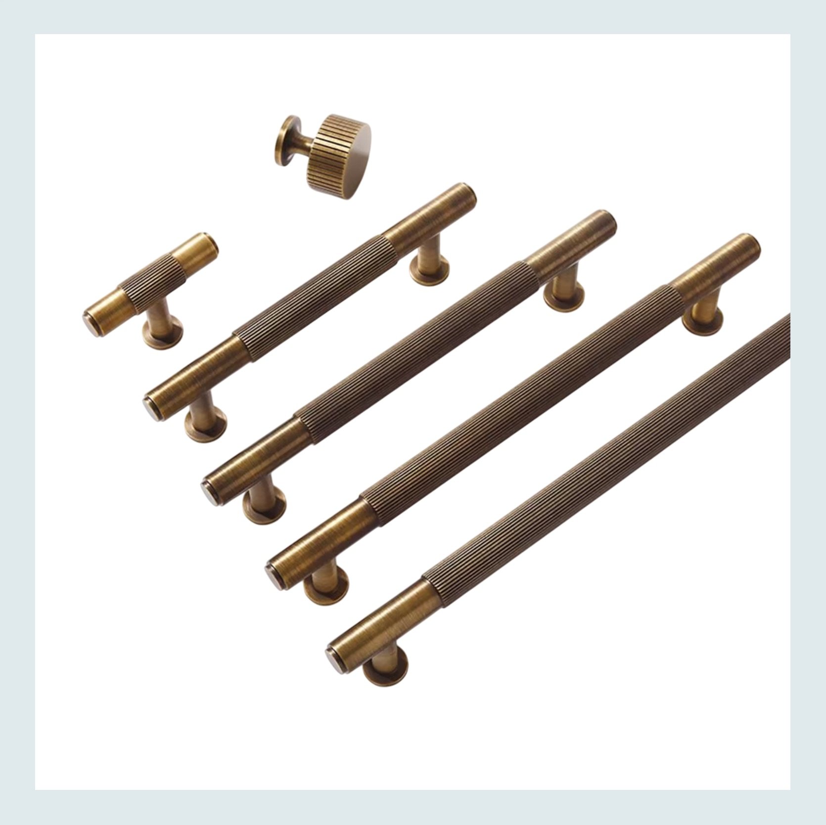
Linear Pull Bronze | Antique Brass Cabinet Pulls
Bronze. It’s not as bright as gold brass, and it seems like it’s easier to find extra-long options. We think this could be the most elevated option for what they have. Warm but not too warm, you know? 🙂 Plus, we LOVE a knurled detail like the ones above have.
Onto decor!
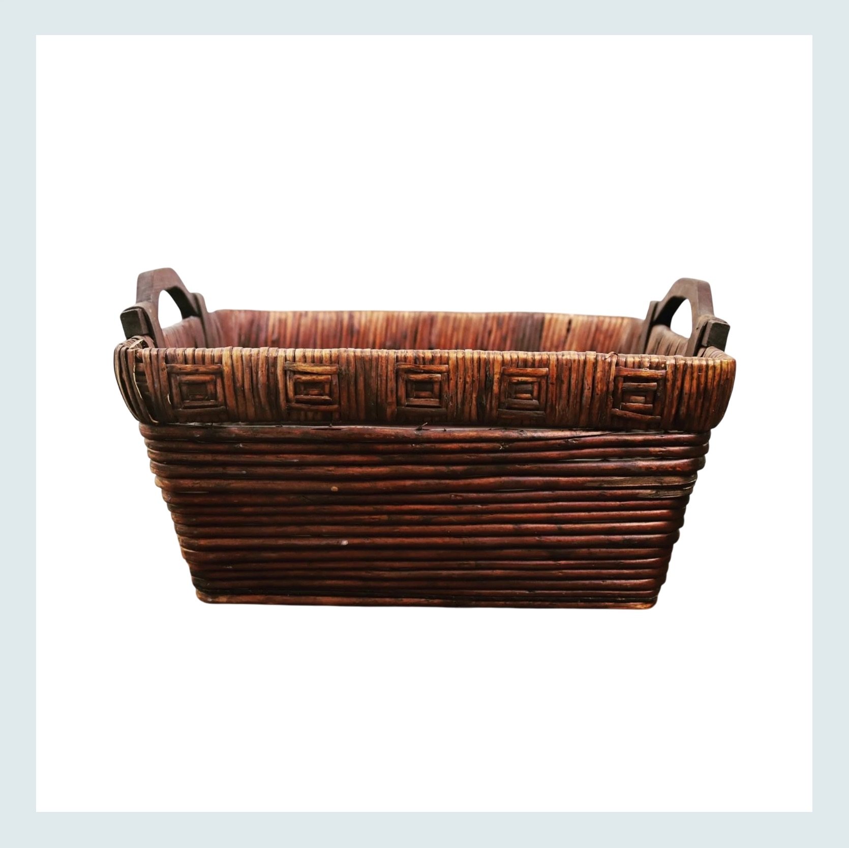
We want to start with the space above the cabinets. Currently, all they have are a few gray-brown baskets that look too similar to the gray undertone of the brown cabinets. A rich, warm vintage basket like this (with others) would look great up there. It’s texture, it’s warmth, and it’s anything but builder-grade.
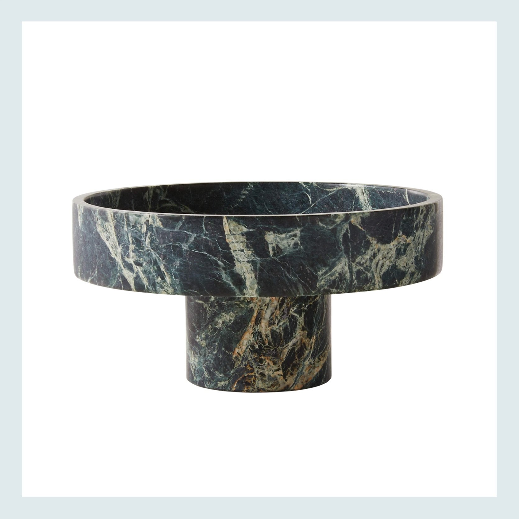
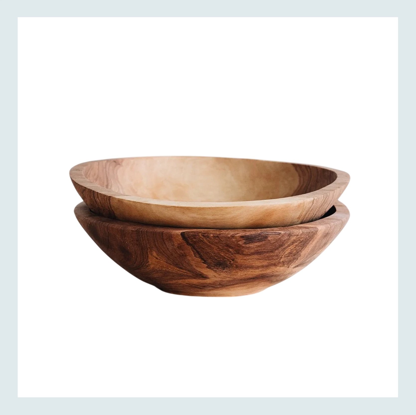
Orcino Green Marble Fruit Bowl | Hand Carved Wild Olive Wood Bowl
But as we said at the start of this space, decorating with all vintage isn’t necessarily the move in a super modern kitchen. So adding in pieces like this beautiful green marble footed bowl (that also adds a great rich color) would look awesome displayed above the cabinets. The same goes for these hand carved bowls. They aren’t vintage, but they have so much texture and movement. The biggest thing when decorating an area like above cabinets is to make sure not all of your pieces are the same height, and that they are big enough to make a visual impact when you’re looking at them from the ground. Create levels and don’t forget scale!
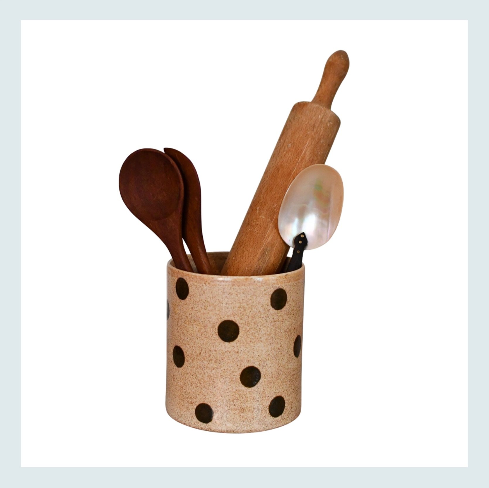
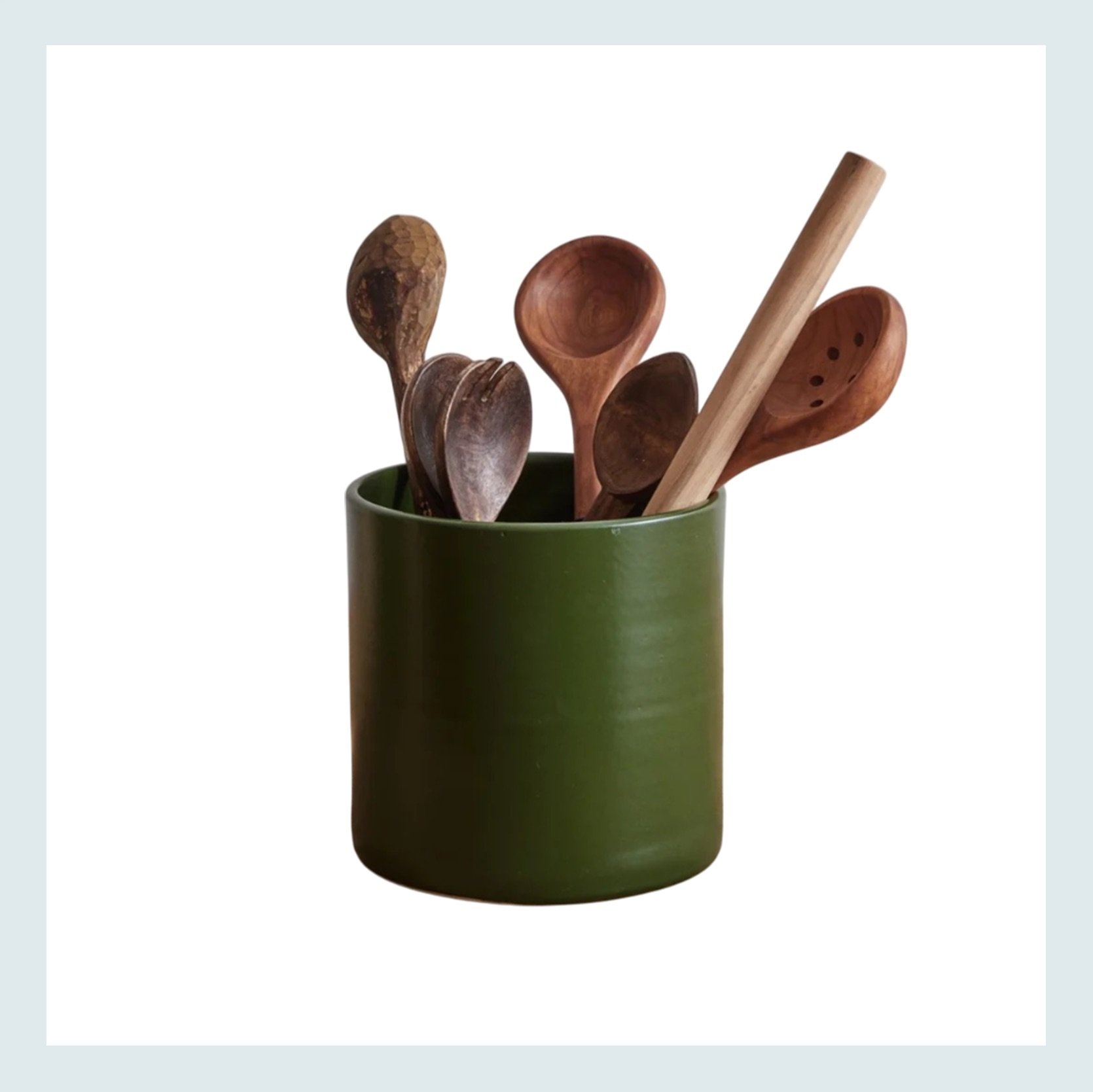
Handmade Studio Pottery Polka Dot Utensil Holder | XL Utensil Holder
We also think this kitchen could use more color and/or pattern. We love a well-placed polka dot, and that utensil holder is the perfect amount. But you know a splash of color is just as impactful, and you bet that Nickey Kehoe sells the most beautiful green utensil holder in town:)
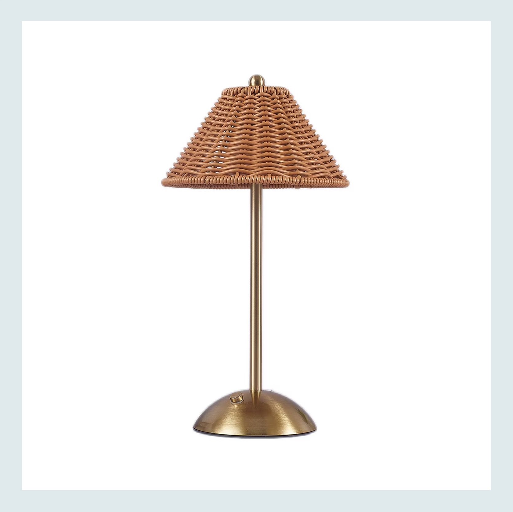
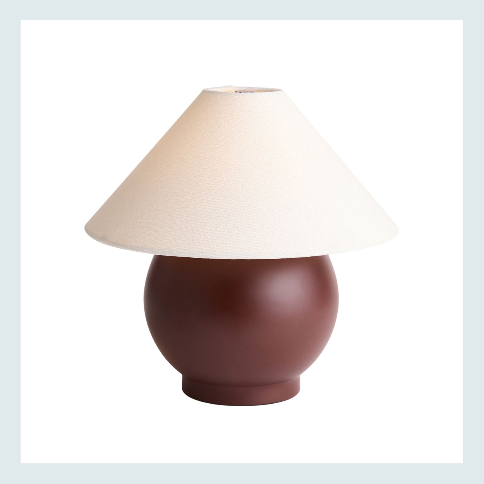
Rechargeable Dimmable Rattan Touch Table Lamp | Ryland LED Table Lamp
This one may be tricky because it’s clear this kitchen gets a lot of action with at least one baby living under their roof. But if they can clear a little corner, we LOVE a kitchen lamp. It adds so much personality, ambiance, and guaranteed character. Both of these are rechargeable, so no need to take up any outlet space.
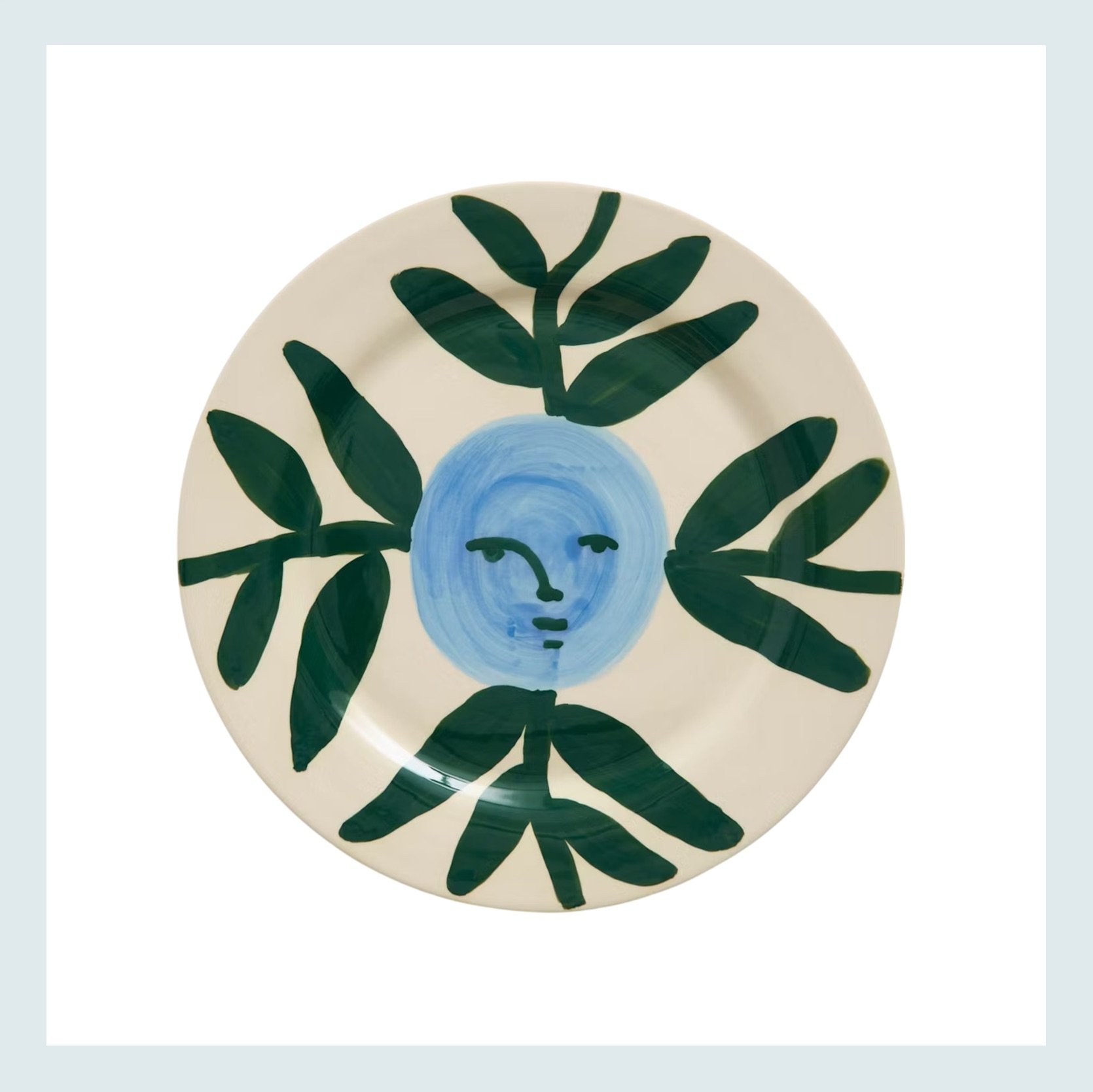
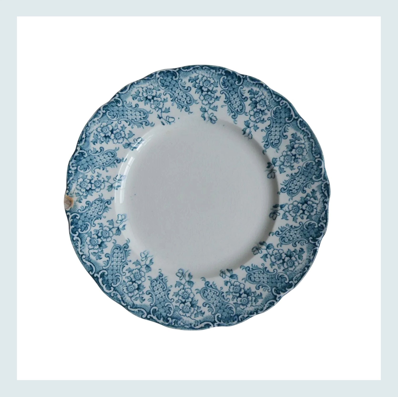
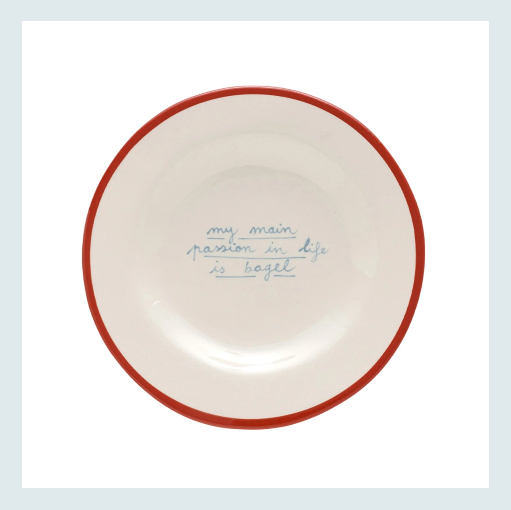
Moon Face Vine Dinner Plate | Antique Upper Hanley Semi Porcelain Dinner Plate | My Main Passion in Life is Bagel Plate
Ok, at first, the idea was to maybe hang a mix of modern handmade and vintage plates on the tile backsplash, but obviously, they would be difficult/potentially require holes to secure, and there’s the whole cooking grease mess issue. However, we still think that maybe the wall with the window or the wall next to the fridge could be options. Even if it’s just a single vertical line of plates or more of a gallery like this. The great thing about plates is that they are great to thrift, too! But again, for this kitchen, make sure it’s at least a mix of more contemporary and antique.
To the people who submitted, THANK YOU! And when we do this again, those who weren’t chosen will absolutely be looked at again, and we will also, of course, make sure you ask our blog-only readers too<3
Love you, mean it.
Opening Image Credits: Design by Ryann Trombetti | Styled by Emily Bowser | Photo by Sara Ligorria-Tramp | From: Ryann’s Living and Dining Room Reveal


Jess, I love these ideas so much. And, thank you for promising to not neglect the blog only readers. I’d love to submit but never know how to do it since I’m not on social media. I’ve always thought a good post would be about people who have cool accessories but have no idea how to utilize them. That, combined with an awkward layout, are my issues.
Same. I don’t use social media but have been a blog reader since the beginning!
aw same!
Just as an exercise, I decided to tweak this kitchen in an entirely different way than the suggestions here. Instead of leaning into more natural textures, I’m adding a kelly-type green and chrome. So, instead of softening the current high-contrast slickness, this would add more of a graphic punch. The toaster, dish rack and kettle are from Alessi, and the rest from Ikea. I think this is a different way of working with the bones and finishes of the space, and it could even work with the proposed wooden or bronze handles.
I love this!
Thanks! When I saw the kitchen and the word “vintage,” my mind immediately went to the 80s and a vaguely MTV aesthetic. But make it sophisticated.
I love this angle. My sense was that the move toward vintage is fighting with the modern vibe. I love your idea of making it more playful and visually interesting!
Literally said “perfection!” Out loud when I saw your take on the space Maya! Love the green. I could see layering in a bit of black and white also (inspired by the basket you show) to bring a bit of modern meets 1920’s vibe.
Love it too!
How fun would it be if the team facilitated a ‘readers suggestions’ once per month or something, and kicked it off with their own suggestions like Jess has done!
I think a problem with the first room is that the wide fireplace, with the short and wide arrangements of items on the wall above it, is making the ceiling look even lower than it is.
I think if the person took away all the items except the mirror, it would visually narrow the fireplace area and make it look more vertically elongated. A few tall candlesticks would also add another vertical element.
However the baskets/dishes are beautiful. I think they would work very well hung in a vertical cluster to the right of the fireplace. They are shallow depth, so they wouldn’t interfere with the entrance to the room, but they would fill that empty space nicely and again be a vertical element to visually raise the height of the ceiling.
A tall narrow piece of fabric art, hung on the door to the left of the fireplace would make a positive difference too.
I had a similar thought, but that the baskets were too clustered – they need to be spread out.
Hi, it’s me, the owner of the room. These are great suggestions! I’m going to try it. Thank you!
I love this series! Seeing relatable homes from fellow design-enthusiasts sparks a lot of creativity and inspiration for me. Love all the ideas!
These all seem like great options. The last one is definitely the hardest, but the suggestions would really change the look and feel of the kitchen. Is it possible to follow up with the homes featured in this series to see what they actually did (and why)? I, for one, would love to see what readers ultimately did.
NAILED IT! Omg this one is so fun. I shared it with three different people I know all with very very different vibes. Thank you for making my brain sing with excitement.
Does anyone have any experience or recommendations with the black wood toilet seat covers?
Been meaning to get one (love the look) but have seen too many poor reviews and kind of questionable brand offerings online….
To be clear we already have a nice newish Koehler toilet so we didn’t want to get a new
seat if it wasn’t actual (not molded) wood and was not prone to breaking/splitting.
thanks!
The accent wall post is missing.
Throwback Trend Thursday: Accent Walls Might Be “Cool” Again (& Here’s How to Do It Right)
stylebyemilyhenderson.com/how-to-make-accent-walls-work
Paint is going to be tricky in this room with the competing reddish browns. The brick is muddy, and the wood more golden red. I’m wondering if it would help to paint the door and trim in the same color (muddier green) as the wall. I’ve recently had my own paint battle and have decidedly lost for now.
Great post, I love all the thoughtful ideas! I definitely see a hole in the shower curtain market though. We simply can’t hang them high and have them barely skin the floor with standard measurements. Would love a roundup of options for longer shower curtains and liners.
I have to chime here, since I recently faced this issue. Any curtains can become a shower curtain. You may prefer to stay away from velvet or 100% cotton, but the world is more or less your oyster in this regard. You may also want to connect the two panels to make them one. There are lots of options at different price points and different heights.
Longer liners can easily be found online, in different lengths, widths and number of holes at the top.
In my bathroom, I went with 84″ as my length, got a pair of panels with tabs for hanging, and then chose an 84″ wide liner with the same number of holes as the number of tabs on my curtains, to make hanging easy.
This is my favorite type of post! Very renter/budget friendly! 🙂
wow this is so great! I wouldn’t have known what to do with these rooms, and your explanation is so helpful, I feel like I just went to interior design class for 5 min and was taught lifelong wisdom! Thanks so much.
Also – I am not on instagram, so I am very happy you posted it here.
Heads up – one link is missing here: “Arlyn wrote a great post about it here.” – no link there.
Thanks so much for teaching us!
Love from Germany
The last modern kitchen looks like it has two toaster ovens? Maybe one is an air fryer, in which case switching to one appliance that has both functions could save them a ton of counter space.
Article was fun to read, as was the reasoning for proposed change. CC
This is so fun!!! I love to see real life rooms with issues and your ideas to solve them!!! love it!!!
I also had the all white bathroom problem as a renter, and I used a flat weave outdoor rug over as much of the floor as I could in a rectangle that made sense (toilet space excepted) and that made all the difference for me. I have a linen shower curtain with a liner. I clean the tile under the rug with a mop, and vaccuum and lightly mop the outdoor rug. It’s fine.
Thanks Emily! I’m the owner of the first home. I love the West Elm rug you linked above but a new rug isn’t in the budget right now. You can’t see it in the pic but the one we have is from there and does have streaks of a similar gold hue, and our couch is a coral color.
I will take your recommendation and color drench the room. I was worried it would make the room too dark.. but time to take the risk because the accent wall never quite sat right with me.
Thank you for your help!!
J’aimerai bien ces idées de décoration.