Design 101
Are Your Favorite Hues Starting To Feel Too Safe? Here’s How Arlyn Built A “Fresh” Color Palette For Her Home Office
I will begin this post by saying that I’ve never had my own workspace. Since I started working remotely from home in 2016 for Apartment Therapy, I either had a desk set up in the living room or just bounced between my dining table, sofa, and bed. I’ve never had to put much thought into what kind of room would keep me focused when I was feeling frazzled, or spark inspiration when my creativity tank was at zero. So when we moved to North Carolina and I finally got my own home office, I ignored it. This, of course, means it became the junk room of our upstairs: ironing board and iron left out for easy access; storage containers (both full and empty) stacked in corners waiting to make their way into the garage; a hodgepodge of furniture.
People coming to visit, and I needed to quickly stash away the tool bag and a lingering load of unfolded laundry? Into my office they would both go. You know the drill. We all have these types of spaces. But lately, I have been really struggling with my attention span and also feeling fairly uninspired. Maybe it’s the natural ebbs and flows of a creative’s mind, but it made me stop, look around my office, and put some thought into giving this area the attention it deserved. (Though, tbh, this probably happened because I was procrastinating doing some other project, so wallpaper options magically popped up on my screen for perusal as a distraction…)
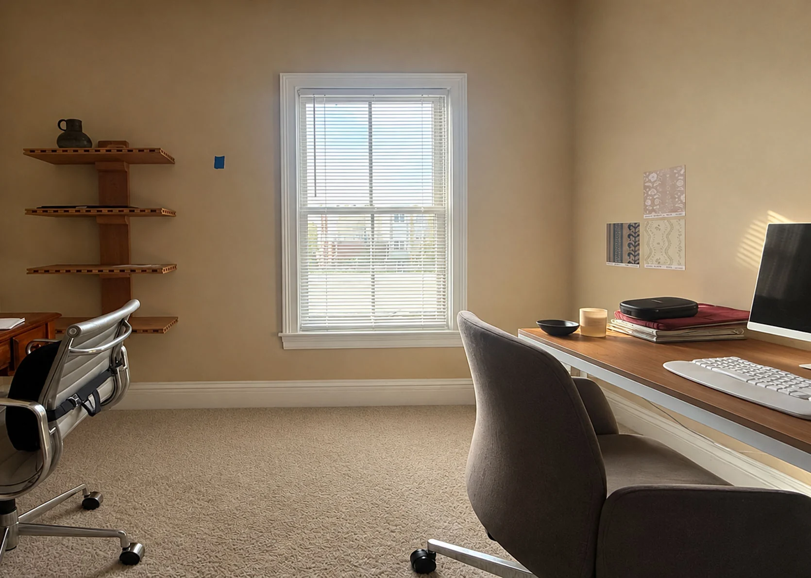
Here she is, in all her junkroom glory. But I need to be honest with you…to take these photos, I took out a giant art box (it holds a mirror I haven’t decided on a placement for) that has been leaning against that window wall for months; I folded the ironing board and put it in the hallway just outside; I cropped out storage containers with my daughter’s too-small clothing castoffs. I’m an honest, vulnerable writer, but we all have our limits on how far we’re willing to keep things real.
The room itself is a rather plain box. It’s quite petite, designed likely for the scale of a home office or baby nursery. The window you see there doesn’t let in a ton of light because of an overhang.
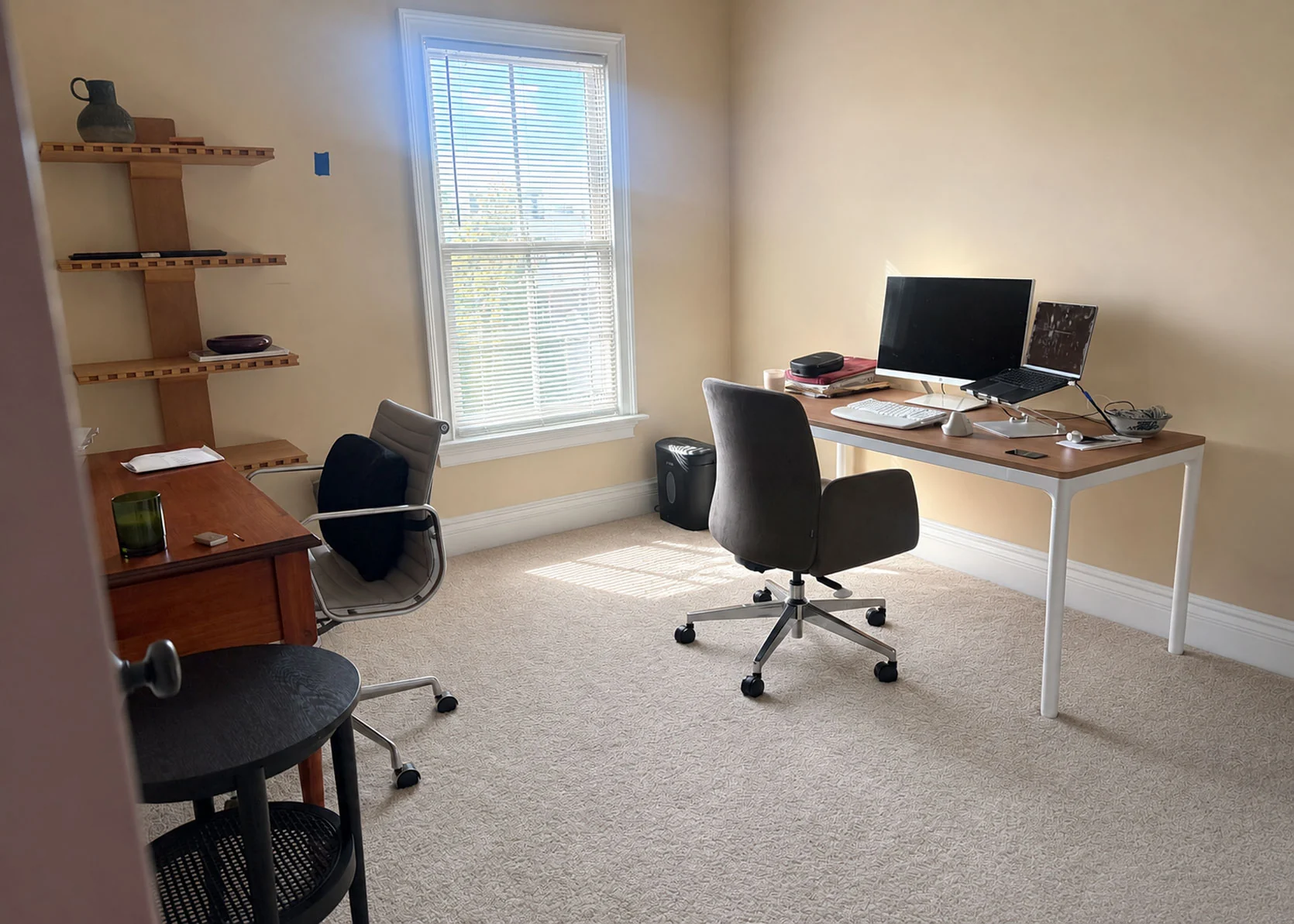
I had to up the exposure in Photoshop here because it’s rarely ever this bright in here. But it’s just two blank walls, one wall with an offset window, and then a partial wall across from it with a double-doored closet. That’s it. When we first moved in, and we had very little furniture, I promptly bought the red-toned wooden desk from Craigslist. It was cute, but the way the side drawers came down on both sides of the center drawer meant I was constantly hitting my knees in the corners when crossing my legs, or hearing a loud WHACK sound from my desk chair arm when I turned even a little bit. Don’t get me started on the overstimulation of getting that same desk arm stuck on the drawer knob when I moved around. On top of that, with my work setup that includes a large external monitor, a laptop stand, a keyboard and mouse, I had almost no room to even write in a notebook. It was shallow and not very wide, so I knew it was just a temporary solution.
It was around that time of daily annoyance from lack of surface area that I started seeing a physical therapist for pain in my neck and shoulder. He quickly recommended a standing desk if I was able to swing it, to give me the option of standing more, but also because I could lower the desk to exactly the height I needed for the best ergonomics, given how petite I am in stature. So I got to work acquiring this version from Branch, and I love it. I wanted something simple, not super bulky, but without the standard T-shaped legs you tend to see on this type of furniture. It has three presets, which I’ve configured to the height I need for working sitting down, the height I need for standing, and then a resting height where I can push my chair in under the tabletop.
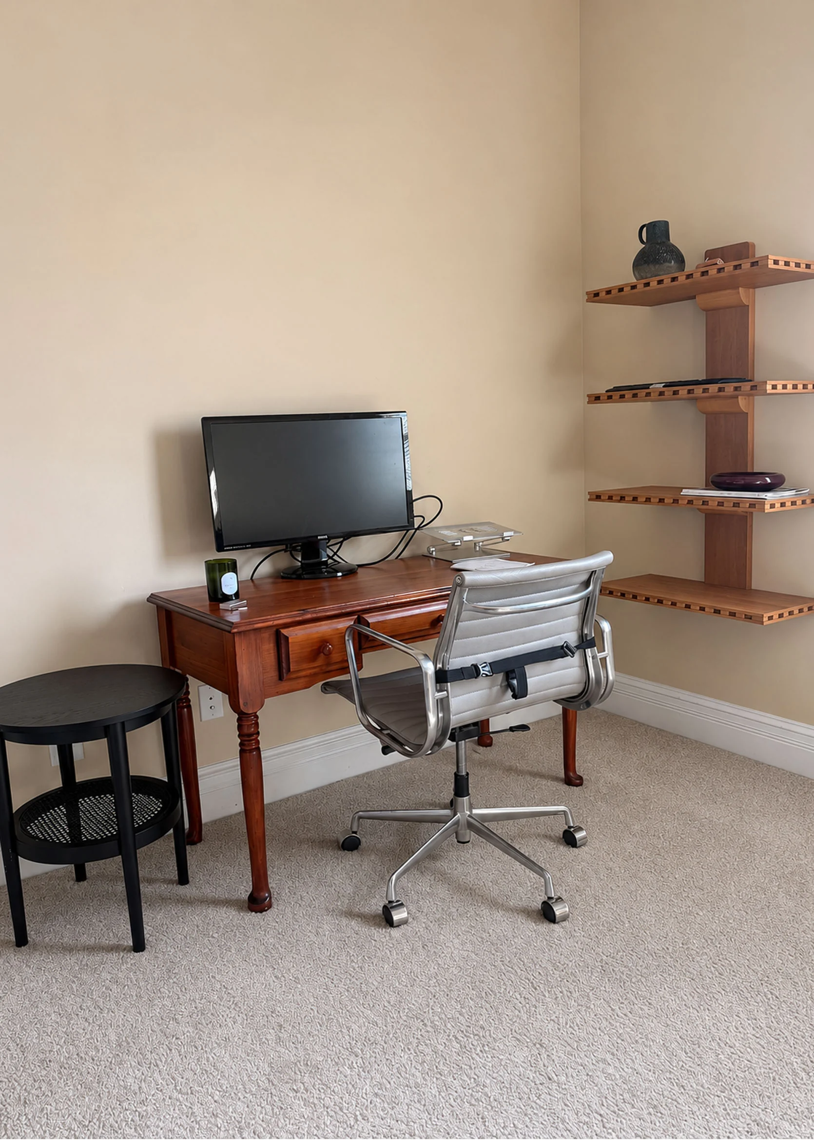
I’ve so far left the other desk and chair in the office for the occasional guest (like Jess!) or when my husband works from home, though he also doesn’t have enough space for all his monitors, so he tends to stick to the dining room. The black side table is another holdover from like three homes ago; I just threw it in here to get it out of my living room after I brought in the gateleg table next to the sofa.
The only thing in the below photos that has any intention behind it is those shelves from the Pierce & Ward collection for West Elm. I splurged on them this summer because I couldn’t get them out of my mind. I plan on using it as a decorative trophy shelf of sorts for some of my work, like my book, magazines I’ve worked on, etc., with pretty things mixed in.
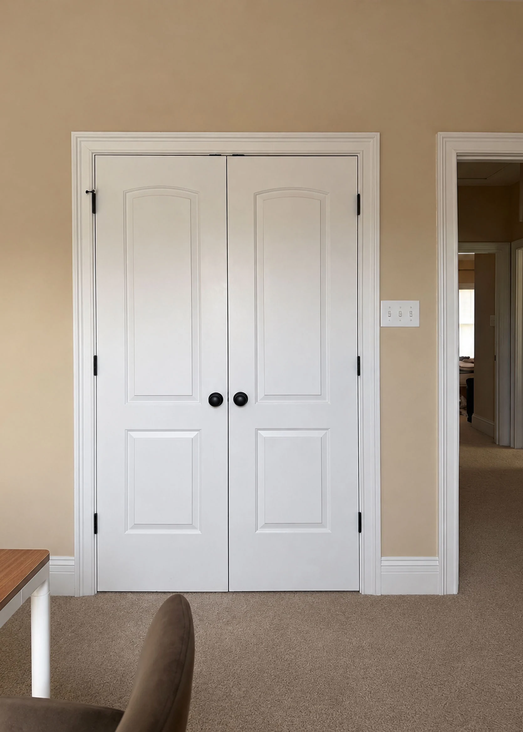
But here is where my true dilemma comes in. Once I started tinkering around, I found myself a bit stuck on a color palette. I am definitely a “do as I say, not as I do” decorator. I’ve written every story imaginable about having a jumping-off point for your design decisions, or building a palette before starting to help be your guiding light. I didn’t do any of that in my home office. I just started pulling things I thought were pretty and hoped they worked together. With the plethora of design inspiration there is out there on our social and Internet feeds, I’m much more inclined to select items in a much more chaotic way. I don’t want a space that feels perfectly pulled together. I want rooms to feel like they came together by accident, full of things I loved. Of course, being able to pull off something like that is a skill set alone that I may or may not possess.
For the sake of moving this story forward, let me tell you where I started in here: The wallpaper. I ordered MANY samples from many different companies. Florals, stripes, checks, abstracts, a variety of colors and patterns. I settled on this pretty print from Chasing Paper. And then…I changed my mind. I wanted something more dramatic in color and just a bit funkier. That’s where I landed on this groovy olive and ice blue stripe from Wallshoppe. I loved it and knew it would give me the combination of moodiness, punch, and playfulness I was hoping for. Except for one thing: I couldn’t get out of my head about what to do with rounding out the colors.
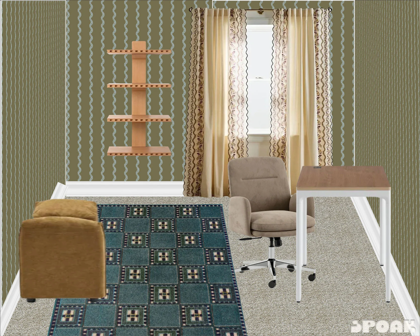
Wallpaper | Wall Shelf | Curtains | Adjustable Sitting-To-Standing Desk | Desk Chair | Rug | Storage Bench
This was my first pass moodboard. It’s fine, but not where I hoped to fully land. I was finding it very difficult to break from the blue and green of the paper. I tried a peacock blue rug to try and make things more interesting, but it all felt flat to me. I still love those curtains from Anthropologie, but the wavy border was too on point with the wavy wallpaper. The only place I liked where I went with it is the golden hue of the velvet on the bench (it looks weird in this photo, but it’s actually a great looking bench with storage for a great price! Check it out, for sure). Except that I have a mustard velvet bed and a mustard velvet sofa, so again, it was just pulling a page out of my same playbook. It was safe, that’s for sure.
I pulled in some other options, but everything ended up being some version of blue or green or neutral, and while that’s a fantastic combination of colors, I wanted something a bit fresher. I’ve used that duo many times over in my designs, and I was hoping for something more original for me, but my brain alone wouldn’t take me there. I felt stuck.
My next step was what I’d recommend to anyone do if they were lacking ideas: Hunt down inspiration. Dilute your brain with beautiful things, and then pluck out what makes your eyes bug out of your head in delight, and break down what you can borrow from it for your own home. What else could I do with olive green, hints of light blue, and warm wood tones? Oh, something I should also mention: I’m not interested in painting. Peel-and-stick wallpaper is so easy to put up and take down without much effort on the back end when you’re already stressed during a move. As much as I think a complementary hue along the millwork would be beautiful, I’m keeping it all white. Same goes for the carpet. This is a rental, so it stays, and it’s fine.
Color Palettes That Use Green & Light Blue
Below, you’ll find five color palettes that felt well-rounded and robust to me. While they don’t all directly apply to my specific shade of olive or blue I’m using in the wallpaper, I was able to expand my mind a bit for what else to pair with these colors. Here’s the first one:
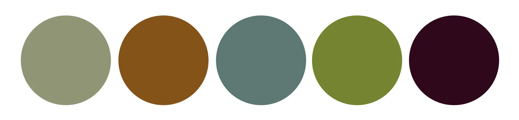
The green here in the first slide is a warm sage, and the blue only comes in through the painting, but it was the amber, bright grassy florals and rich burgundy grapes that piqued my interest. It was a good reminder that sometimes all you need is a flash of some other hue to add that effervescence I’m looking for. I obviously have no plans to have a bowl of purple grapes just sitting on display in my office, but I like the idea of threading these shades through in small moments.
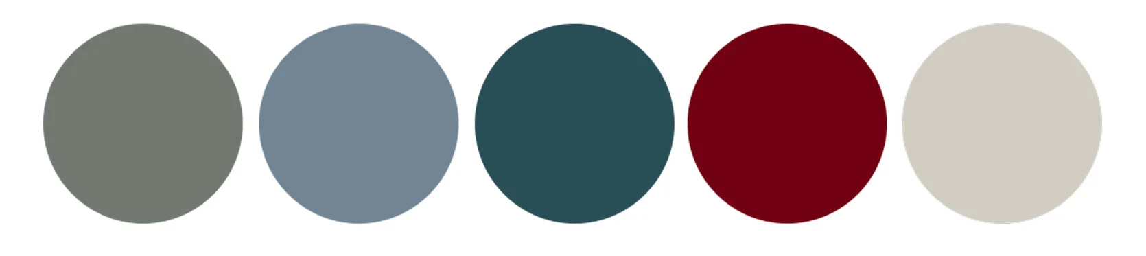
When I first bookmarked the above image, my eye read the millwork color as mint, but now that I’m looking at it again, it’s very clearly aqua blue. Whoops. But I’m leaving it, because if that mint were olive, it would all still work, just be a bit less “sweet.” Seeing the denim or chambray upholstered armchair made me crave an upholstered piece on the blank wall opposite my desk in a hazy or icy blue, as well. The pop of red from the stem’s berries got me craving a berry-like jewel tone.
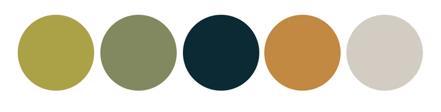
This chartreuse is very different from the aqua we just saw; it intrigues me. What I take away from this one is the bravery to opt for colors that are stronger and less milky. As much as I think cooler-toned greens are lovely, I do think they’re oversaturated from a trend perspective, and I love this move away from the stern to juicier, saucier pigments. Pickle brine green might not be what immediately comes to mind when you have a room to paint, but…maybe it should be?!?
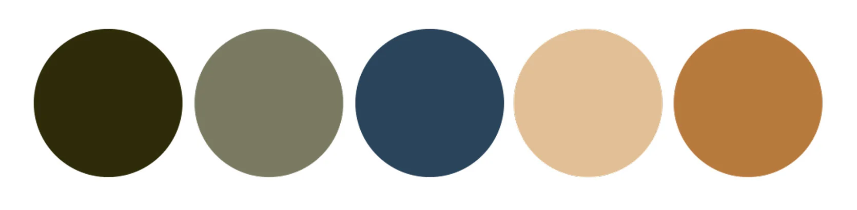
A few things in the above image caught my eye: How layered and rich this room looks, the mix of patterns between the wallpaper, draperies, pillows, the top and skirting around the desk/table, and the tiger-print chair. It’s a beautiful layering of blues and greens, but with an unexpected orange moment via the sconces and the pin board. They almost look like they’re glowing in the sun. We see that same warmth in the swirl of the tissue box cover on the tabletop, and the amber of the candle vessel. If you click through the images, you can see all the details of the room and how different all the colors look depending on the sunlight. I thought those lampshades were dark hunter-esque green, but turns out they are minty velvet!

And then finally, I got here. I couldn’t look away from the mauve and the aubergine and the olive and the flax. It got me so excited to try something new. It made me realize that I’ve never decorated a room with any shade of purple, but it felt immediately right to me. Then I remembered these curtains I had pinned a while back that had a light blue ric-rac ribbon running down tiny aubergine florals, and it came flooding into my soul. Olive, sky blue, mauve, and aubergine. Yes! Rounded out with neutral wood tones and some natural rattan in something like a lampshade of a sconce, and a flax linen-wrapped moodboard, and I came back to life!
I played around with some products and could feel the excitement percolating in my chest. It’s not perfect, and there are some things to figure out (like if it’s feasible to have a rolling office chair sitting atop a rug that’s on top of carpet), but here are the vibes I settled on:
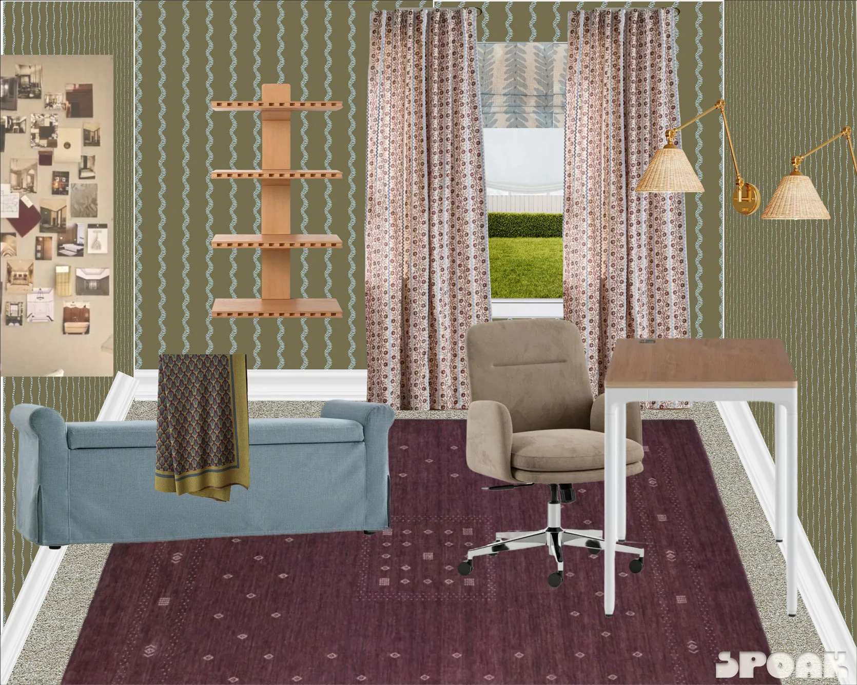
Wallpaper | Wall Shelf | Curtains | Roman Shade | Adjustable Sitting-To-Standing Desk | Desk Chair | Rug | Upholstered Bench | Sconces | Throw Blanket
It’s bold, eclectic, a touch heavy-handed, and very much me. I do tend to struggle with how much contrast I can peacefully live amongst design-wise, but I realized in this journey that I want my office to be a place that feels alive. That laughs out loud. That tickles my brain when it’s slumping. My bedroom can be a calm, stripped-back room, but where I work needs to excite me. And the above definitely checks that box.
As much as this post was about me challenging myself to break through my color boredom in a room I felt stuck on, it’s also a call to you, readers, to go on your own color journeys if you feel the itch, and try something new. It just might be the thing to shake you back to yourself; and hey, you might surprise yourself with where you land!
Until next time, friends…(and stay tuned for where I firmly land with this room design!).

Oh wow! I am SO here for this transformation. Brava! Not everyone could pull something like this together and make it sing. Thank you for the reminders and encouragement to push on expanding our own comfort zones.
I love where you landed Arlyn! Cohesive but still unique and unexpected. Quick note on chairs with rolling wheels – you will absolutely want to put down one of those plastic office mats. If you get a clear, matte one hopefully you won’t even track it visually but it will prevent the wear on the carpet and/or rug. Maybe with the rug you will be able to get away with not using it, but since this is a rental I am sure you don’t want the excess wear on the carpet.