Design
Cafe Curtains Update – In The Mind Of A Designer Trying To Make A Decision
Over a year ago I threatened to put up cafe curtains in the kitchen. We have a lot of glass windows and in “the great long dark” (i.e. November to March) it just looks like black reflection and doesn’t feel very cozy. But then other priorities got in the way, spring came and I forgot again until this November. So January seemed like the perfect time to tackle it and this time I’d DIY it to save some dough (felt simple enough).

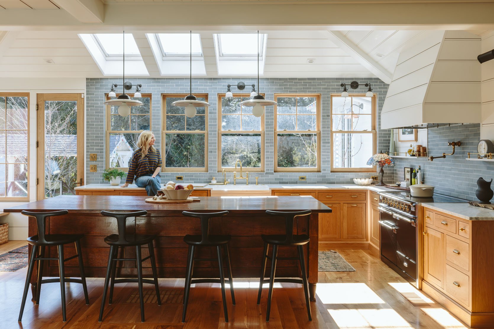
This is how our kitchen looks on days when it’s clean, without a lot of styling, so you can get a sense of how it feels. It’s always bright and sunny and during the day you don’t really think about cafe curtains until about 4:30 and then you want them badly. Also, ignore our dirty windows – we didn’t hire someone this winter, but will in the spring – they are FILTHY.
As a reminder, this is the rest of the living room (with some slight changes).


The Block Print

This is how it went down – I chose this block print linen, in a bright white with a green and gray pattern on it. I really liked how it looked and spent hours and hours making the panels. I have a tutorial coming soon (they are no-sew). They look pretty great in this shot.

But here’s the deal, when I started putting them up that night, they looked so bright and high contrast and just BUSY. Now this could be because the kitchen was also messy post-dinner, but I did NOT like the vibe (and Brian and the kids agreed). Just too much.

Nothing is wrong with these and again in the bright sun I think they are so happy! But it’s like all I could see after the sun went down, against the darkness outside. Sure, if it were a softer cream that might have helped, but during the day the bright white works so well with the bright kitchen.


So 7 panels in, I had an epiphany and decided to move the Boro fabric (the vintage indigo plaid) from the other windows in the living room and hang them here instead.

I LOVED THEM. Now the issue with these is that there is no way to get 10 panels that match so I had to make sure that the tones worked well together and that they were balanced. Additionally, the panels that we had weren’t exactly the right size so I turned them horizontally and they were a bit short (while others are a bit long TBH), but I think I can still make them work.

Pulled back I like them so much more in person (and in the photos, TBH but I’m not sure that opinion will reign supreme). In context to the whole room, shared with the living room, it looks so good. It pulls you over there, but it’s not busy (just blends in with the blue during the day and the “black” of the windows at night).

And when they are closed you see the pretty patchwork quilting of the Boro fabric, which I know is not everyone’s cup of tea (one commenter told me to stop “trying to make my ripped rags work” which honestly made me LOL that someone would DM me such a thing – hurt people hurt people!).

We used the Rejuvenation unlacquered brass tension rods so that we didn’t have to drill into the tile, and then they sell these pinch clip rings that were tricky to figure out, but once we did were so easy and I love how simple they look. Now don’t look too closely or you’ll see that some of the rods are at different heights and that’s because some of the Boro was just shorter than others, but it’s really hard to detect. Since I generally live in the “interesting is better than perfect” philosophy I don’t care. I’m into this. And before you say that you aren’t sure about this I’d love to style out the kitchen and shoot it with the context of the living room (soon!)

We did take one shot with more context and me in it 🙂 I actually love the solid neutral curtains in the living room being simpler now, and it’s inspired me to finally paint the fireplace. The blue cafe curtains just draw you over to the kitchen in such a “me” way and create so much coziness. And you’ll have to trust me that the white was actually busier than the darker blue, which seems nuts! Stay tuned for more photos in the spring of our updated living room (with some surprise products in it :))
*Photos by Kaitlin Green


I’m a fan of café curtains but in this instance I kinda think they aren’t really fulfilling your desired function. I totally get wanting to close out the darkness on long winter nights but if the door and window to the left remain uncovered, as well as the top half of these windows, then is this not just a partial solution?
Personally, I think I’d choose full blinds on these windows (and on the door and other windows in this room) that lift completely above the windows during the day so you still have all that gorgeous sunshine streaming into your kitchen and uninterrupted views of the garden.
In my own home I’d do exactly that, as I want 100% privacy haha, but I remember last year Emily saying she doesn’t have the same need, she just wanted a cozier vibe. 🙂
Oh so exciting!!! I actually totally agree that the white curtains seemed more busy and I absolutely love your boro fabrics 🙂 they are certainly less busy and seem very harmonious! Since there are so very many windows, they would even still maybe feel a little bit too busy for me. If it was my kitchen I’d be tempted to try an even lighter blue that is closer in tone to the tile or even switch to roman shades or those see through accordion ones that are wedged within the window frame and can be pulled up or down or made completely flat and nearly dissappear, since it seems like you really only want them at night and not furing the day, I’d try to find a solution thats less visible during the day. But more power to you! The favrics are gorgeous and I am happy you are happy!! And I would love to see it all styled out and for you to pull the fireplace colour from the fabric sounds like a great move! 🙂
I totally agree with you. Id be more tempted to do either curtains that match the same color as the tile to disappear during the day and night or switch to mostly disappearing accordion shades.
I had the same reaction about the business of the overall look. There are a lot of horizontal lines in that kitchen with the tile and shiplap. The lines in the Boro fabric add more. I agree that simple blinds or a Roman shade might be a better choice.
Agree- suggested that she try bottom-up, solid but unobtrusive, shades for a less busy look!
I disagree – I think the kitchen is so clean and the windows so clean and modern that the cafe curtains warm up the space. Bottom-ups/shades would feel more “designed” and less cozy. It’s so helpful that you pointed out how different the white curtains read day vs night, and I think you nailed the compromise.
I adore your rags! Looks perfect to me.
it’s very much you! love it. something I say to my kids so much they now repeat it: different people like different things.
best application of boro in your house so far, imo!
This is so perfect and now that I’ve seen this I don’t think I could like anything else!
The blue tons together look lovely!
I agree! I love the lighter and darker blues together! There is depth and variety while still being soothing.
Love the Boro fabric with its texture, dark pattern(s) and interplay. A suggestion would be to make the Boro into a modified structured Roman shade extending from the midpoint. One of your articles was on Roman DIY. The block print, while attractive, had too much “flounce” against your kitchen.
So happy for you enjoying this fabric you love in your kitchen, which is the heart of your home.
Huh. It’s so strange how the light curtains look so jarring in the kitchen while the Boro fabric ones seem calming. I would never have guessed the Boro fabric would work as cafe curtains but they looks great!
The ripped rags comment will go down in infamy with the Sponge Bob comment.
This blue works so well with the tile and I love that the extension rods can be taken down if you don’t want them at certain times of the year (or certain photo shoots or if you want to easily switch out the fabric) vs a more permanent roman shade.
This still feels really busy to me and a bit heavy for how light everything else is. I could see a much simpler application here, like a tone on tone slubby linen fabric with some texture but not a lot else. Of course, a photo is very different from being in a space. Also 1000% disagree with whoever commented that the fabric is rags. I do love it, just not in this application.
I completely agree with this comment. I strongly prefer the windows to be just naked, but if you absolutely need to bring in a textile for coziness, then a solid linen would be my choice. But, it’s not my house, so as long as Emily loves it, that’s all that matters!
This is my favorite use of this fabric. Would love to see the nighttime shots of it.
Yes nighttime shots!!!
The block fabric is stunning but I agree they look too much. It’s weird how beautiful things can sometimes just not be right. The blue is more tonal and less starkly contrasting.
I would love to see them in ‘the long dark’. I’ve only ever seen photos of your house bathed in sunlight and I’m super curious about how it all plays out on a wintry evening or even a rainy day, maybe with the fire crackling etc.
The blue ones look nice, but I still find them visually busy in a room that already has a lot of texture. If it were me I would go with a plain linen (either crisp white or indigo blue) with no additional pattern.
Also, I think the room would benefit from he removal of the sconces- they seem to add to the busy feeling.
I absolutely love it! It warms up the kitchen so much and I have always loved your Boro fabric collection so to see it out every day such a treat. So are you gonna make new café curtains for the window these came from or are you gonna leave those blank?
Hmmm- a bit distracting for my taste- would this not have been a great use of bottom up blinds- something that was virtually invisible when not in use?
This looks so good. Please do not put blinds on these gorgeous windows! Cannot wait to see more.
I love both versions. It’s so cozy. You can change them seasonally if you want.
wonky, vintage, blue
standing quietly -exhale
soulful perfection
OMG love this. The site’s commenting rules should be haiku-only…
: ) Thanks Juanita!
As it turns out, this wasn’t even my first ‘blog comment poetry’ entry -I once wrote Emily a poem about the dinner party that was sure to result if she purchased a particular vintage light fixture in a round-up post about flea market finds..?
I definitely like this final solution! The fabric has so much personality to it. Is it the very most tasteful and elegant option? No, but that gets quite boring IMO. Now it looks like the home of someone with taste AND quirk!
I think it’s great that you’re doing what you like. That’s what makes your content so good and not like everyone else’s.
When I saw your option 1/2 photos on IG first, my gut reaction was that surprisingly I preferred the dark curtains. I didn’t realize it was due to the busyness of the white/black block print, but it’s definitely that. I do wonder what plain cream curtains with a false plain print would look like, but I’m also on board with making the boro work and being done with it! FWIW I don’t love boro fabric personally but it does work here if you love it.
I have all sorts of thoughts! First, sorry about that rags comment – it was unkind. BUT thanks for letting there be respectful differences of opinion here. For a while it felt silencing to have any difference of opinion marked “hate.”
-I do think the Boro is better here – funny how the dark blue blends in more – and I’m glad you love it. I would be curious what tonal linen would look like as I wonder if I’d like that better (but you do you).
-I really miss the seascapes. Those white pictures on the side of the hood just don’t hold weight, and with all the other geometry in this area the blue ?houses picture also feels blocky. I would love to see something with more circular movement.
-I love how this all plays out with the Tiffany lamp!
And most of all I’m glad you love it.
I love this process! I’d really like to see photos of not bright afternoon light, especially since that was such a factor in your decision making.
Agree the block print were too busy. i like the boro fabric! And its your kitchen so you have to love and with a tension rod you can always change them up so easily or take them down.
I like ’em! Dark blue is such a nice anchor to a space.
Wow, I definitely love the curtains but it does seem like a tough decision to make. Honestly, lighting is everything so I’d probably make the decision based on how much light that room gets and how often it’s extremely hot and sunny vs cloudy and dark. It would be very different functionally in the pacific northwest vs in texas.
Also, I love the brass in the kitchen. But it seems like it would wear unevenly over time.
“I love how cafe curtains add such a cozy and charming touch to any space! Your post really highlights their beauty and versatility.”
I personally love the less refined look of the Boro fabric and the saturation of color. My question is – what is outside that always has Emily staring out yonder in all of the pics? ; )
Love that Sir/Madam Stoneware Aviary Pitcher No 1 in Matte Black.
I love that Cloud Serving Basket by Maison Balzac on the island. Is that really bamboo???
They are perfect. Don’t let the haters get you down hahaha
I like the boro alot and agree it’s better than the white with the print. I wonder what would happen if you dyed those white curtains a pretty denim blue to match the tiles? Then you’d have very little contrast but still some block print coming through. Just a thought, and might be nice for summer when you want it to feel lighter. But if you are thrilled with the boro, then no other suggestions needed!
The blue looks great! Way better than the white block print. Can’t wait for the tutorial. I need to make some cafe curtains for our bathrooms but have been putting it off.
I think this is great. Things always look busier in photos than in real life, because we don’t “see” everything at once. I’m sure the boro just reads as cozy in person. (Also feeling a little smug about the block print. Nearly EVERYONE voted for the whiter fabric, which really surprised me, because I was sure that would feel too contrast-y).
I like the look of the Boro fabric but would worry about sun damage. You could always line them but that would block the light that filters through during the day.
I love the Boro fabric! I think it looks perfect in your kitchen. They ares so good with the vintage island and the perfect contrast with the “cleanness” of the rest of the space. Beautiful!
I totally agree that the be beautiful block print was jarring and I love the boro — I think they’re perfect and it’s so helpful to see the contrast and am grateful for the visual and the analysis of why things do and don’t work! Just love them
I had two short windows side by side at my former home, and I just put tiers at the top and left the rest open. It worked well for me.
These are great!!!!
Cute striped top. Looks like the Shrunken Henley in Capital Stripe by The Great?
The Boro does look better than the white, but still quite busy for my own tastes. I’d love to see a medium dark neutral colour, even photoshopped maybe?
Also, what are you going to do on the windows where the Boro used to be?
I will take the white ones off your hands lol they would work perfect in my house
Not a fan (too dark) but you love them and that’s the most important thing!
Oh you’ve definitely pulled this off – I wasn’t a huge fan of the boro in the first place and I thought the windows looked perfect without curtains. Then the block print didn’t work for me, too twee and whimsical for the space, so I didn’t have high hopes for this project at all. The result however is wonderful, I love it. I’m now thinking of changing out my block print kitchen/diner curtains!