The kids bathroom in the mountain house is the biggest risk we’re taking in the whole house, but we are EXTREMELY excited about it. A month or so ago, you guys chose the materials (it was between that insanely gorgeous green quartzite we were secretly crossing all of our appendages would win and the blue zellige tile that I know would have been beautiful, too). It was pretty close(ish)…58% to 42%. A kids bathroom is a great place to have a little more fun, be playful with your colors and materials because, well…kids are fun and playful. Of course, kids grow up eventually, but nothing about this bathroom’s design feels “kid” necessarily, so I think it will definitely age well.
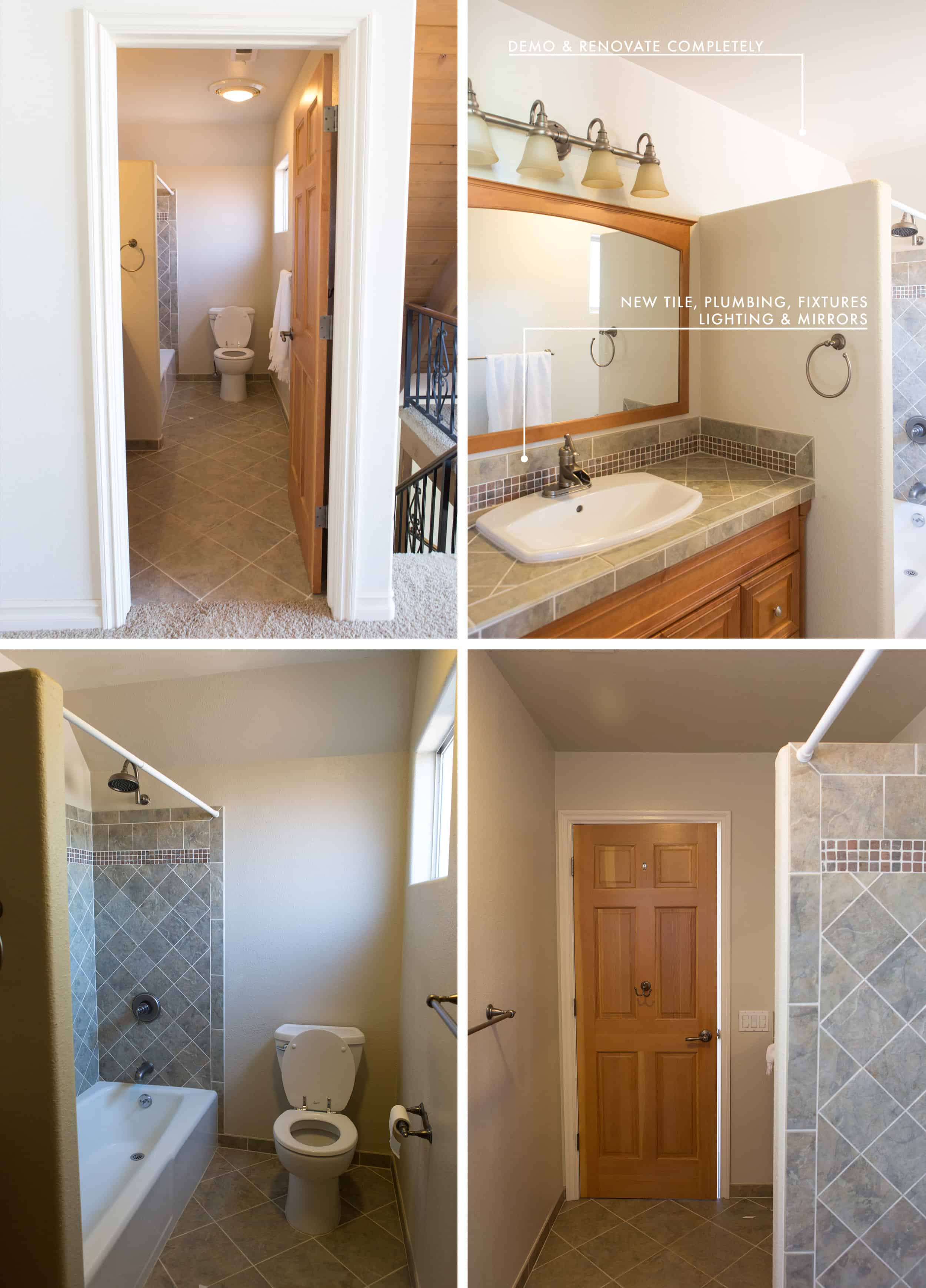
So now it’s time to show you how we actually designed it with those materials that won. As a recap, this bath looked like this before it was demo’d:
It’s upstairs across the hall from the bunk room (not attached to it because we wanted the kids’ room to be attached to the attic and we couldn’t do both).
Originally, when you opened the door, you were faced with the toilet, with the bath and vanity on the left side, but we rearranged it so that, instead, you saw the tub first, which meant that the tub surround was our real “moment.”
You chose the materials that we would use (see this post for the one that was rejected!). We were SO glad that this version won, but Brian is still VERY skeptical about that green quartzite.
Vanity Backsplash Tile | Emerald Quartzite | Window Frame | Countertop Marble | Floor Tile
And here is how we laid it all out.
EEK. I’m SO excited about this bathroom. The emerald stone (which we’re going to hone or leather) is the big moment here, with the quieter white tile supporting it (in a parquet pattern) and the modern brass fixtures from Kohler—who I partnered with for the mountain house (and Portland house) bathrooms—being a big star.
Because of my partnership, I was lucky enough to preview their Finish to Order program, which lets me personalize the faucet I want in the finish I want, which is then made to order. Customization, folks. Head to your local Kohler Signature Store or Kohler Experience Center to find out more about the program.
Mirror | Sconce | Composed Faucet & Cross Handles | Caxton Undermount Sink | Composed Towel Holder | Cabinet Pulls | Cabinet Knobs | Composed Robe Hook | Composed Towel Bar | Poplin Vanity | Marble Countertop | Corbelle Toilet | Composed Toilet Paper Holder
We chose the Poplin vanity because it’s simple and classic, and those shaker doors add some warmth to all those hard surfaces. The biggest challenge of this house has been balancing these really modern fixtures (me) with the rustic/cabin feel (Brian) and this felt like it was a good fit for that marriage of styles (and my marriage). This vanity also provides a ton of storage and can include electrical outlets inside for razors, hair dryers, etc…tons of great personalization options offered here. It comes in a variety of finishes but we ordered these way before we designed the bathroom so we chose the linen white to be safe and it’s probably what I would have chosen again (although I do love the teak finish). We went with a toe-kick versus legs in this bathroom because it was up against the side wall and I liked that slightly more built-in effect. Also, because it’s the kids’ bath and they will likely be messy with their water, we didn’t want water to get trapped underneath the vanity.
The faucet we picked is from the new Composed line and it’s SO BEAUTIFUL. It wasn’t available in the states until recently but I saw it at the Kohler Experience Center in LA in the international center (for designers designing abroad with different codes and therefore different fixtures) and fell IN LOVE with it in the vibrant polished brass. It couldn’t be more streamlined and simple, and in that modern polished brass, it looks really high end and hotel-like. This is the only faucet that Brian thinks is too modern for him, but he was fine with it in here since I loved it so much. The cross handles feel more classic and kinda calms down the sleekness of the faucet.
We are using the Caxton undermount sink in a rectangle shape versus round or oval to help it feel more modern (although I like all three options), and topping it with a white honed Thassos that works beautifully with the tile backsplash and the emerald quartzite.
The Corbelle toilet is one of Kohler’s newest toilets and features their cleanest flush yet. It’s great for a few reasons. It’s affordable while still having some pretty cool features like ContinuousClean technology (this fights germs, stains and other yucky stuff) and CleanCoat technology which together actually and visually keeps the toilet cleaner longer. Every time you flush, ContinuousClean dispenses a small, consistent dosage of your toilet bowl cleaner tablet of choice that’s housed in the tank away from kids and pets. Because it’s special and optimized, each tablet can last more than a year (instead of dropping one into your tank and running through them within weeks). Yay for less toilet scrubbing.
To bring in wood and warmth we have wood cabinet pulls and knobs and this insanely beautiful and yet totally simple sconce from Allied Maker that I’ve wanted forever. If you are interested in the micro-bubble sconce trend and want some more affordable options, see this post. These are made beautifully in the US and we chose the walnut and blackened brass finish options.
For the mirror, we went with a rounded rectangle, although we haven’t purchased it yet so this could change. But we are going to hinge it and build into the vanity wall to create shelving behind it like a medicine cabinet. Yes, we could just buy an actual medicine cabinet but we are hoping to have something that looks more like a pretty mirror on tile and less like a built-in medicine cabinet, but we’ll see.
Now to the bathtub/shower side of the room.
The entire surround, tub front and top will be in the honed or leathered emerald stone. This is what scares Brian, and I get it and it kinda scares me, too, but unlike the Portland house, I can take more risks here because it’s ours and we aren’t trying to sell it. I want to create some more risky, editorial moments in this house and this is one of them. Also, my team and I saw this stone in person and it’s SO BEAUTIFUL, whereas Brian hasn’t yet. He’s only seen the polished sample and having it in a matte finish makes a huge difference.
Purist Showerhead | Composed Transfer Valve Trim With Cross Handle | Composed Volume Control Valve Trim With Cross Handle | Composed Thermostatic Valve Trim With Lever Handle | Shift Handshower | Composed Bath Spout | Underscore Drop-in Bathtub | Emerald Quartzite
The shower suite has mostly the same Composed line of the vanity with the exception of the Purist showerhead as they don’t have a shower head as of now, but the two look great together as you can see (a huge plus of pulling from the same manufacturer across the board…you want those finishes to match, folks). Mixing isn’t always a good idea, but these two lines work so well together. I love that simple spout and the squared off cross handles. For this bathroom, we have a thermostatic temperature control and a diverter, but we kept it simple. And we finally get a handshower for the kids, which I’m sure will prove to be messy when controlled by them, but I’m thinking it will make washing hair a bit easier. Plus, it’s JUST so pretty.
A classic of Kohler‘s, the Underscore drop-in bathtub comes in a variety of sizes and can even be tricked out in different ways. Kohler’s four hydrotherapy options harness water’s natural ability to enhance well-being and give you the benefits of a spa treatment in the comfort of your own home – so you feel centered and energized…who could say no to being balanced and peppy?!? Not this bubble-tub lovin’ lady.
*We are currently designing the niche for storage, but we have encountered some hiccups due to the plumbing in the walls. Stay tuned for that.
We went through a few iterations of this design, so I thought I’d walk you through the process:
At first, we had the marble just on the tub but it felt random and weird. Then we put it on the tub and floor but still, it wasn’t right. Lastly, we added it as the surround and put white on the floor which was the winning combo for us. We also played around with the mirror shape and size and ultimately landed on a rounded rectangle.
*A quick note: In a perfect world, we wouldn’t have that 3-inch framing jut-out on the left, but it was one of those things that wasn’t caught and they already framed for it. There is a huge original water pipe behind it and diverting it so that we could push that wall back would cost $3k so we aren’t. But if you have the opportunity to reduce the amount of awkward lines in a room, please do. Also stay tuned for shower door design, still TBD.
Overhead, it looks like this (note: we might replace the interior doors if we can squeeze it into the rapidly diminishing budget).
We all LOVE how it is turning out. Yes, the stone is a risk. Yes, the modern fixtures are a risk in a cabin. But we think we have a combination of styles, materials and finishes that creates this amalgamation of Refined-Scandinavian-Contemporary-Minimal-Rustic-Cozy California-Mountain-Cabin that we are going for. YES, I realize how ridiculous and insane that is, but it’s a challenge we are accepting and working on every day.
Here is the bathroom all together:
Mirror | Sconce | Composed Faucet & Cross Handles | Caxton Undermount Sink | Composed Towel Holder | Cabinet Pulls | Cabinet Knobs | Composed Robe Hook | Composed Towel Bar | Poplin Vanity | Marble Countertop | Vanity Backsplash Tile | Corbelle Toilet | Composed Toilet Paper Holder | Floor Tile | Emerald Quartzite | Window Frame | Purist Showerhead | Composed Transfer Valve Trim With Cross Handle | Composed Volume Control Valve Trim With Cross Handle | Composed Thermostatic Valve Trim With Lever Handle | Shift Handshower | Composed Bath Spout | Underscore Drop-in Bathtub
And just so you can really feel like you’re in the space, we created a rendered video for your viewing pleasure.
So what do you think?? Are you scared of the leathered quartzite and modern fixtures? Or excited? Or both?
Let us know all your thoughts, feelings or concerns in the comments (and praise or support is always welcome :)).
*This post is in partnership with Kohler but all words, designs and selections are our own. Thanks for supporting the brands we love that support the blog.
**A huge thanks to my design team for their hard work on the renderings of these.
Love love love the green quartz ! This bathroom is going to be stunning. I have one question though – how would you terminate the two finishes (white tile and green quartz) if it wasnt for that 3″ jut out?
Basically the stone, (unlike tile) terminates itself. Polish it or in this case continue the matte finish. Done deal.
yes but isnt that so abrupt? I work in hospitality design and we would be crucified for that detail. Very first world problem I know. 🙂
One would just finish the edge of the stone. Unlike tile it is a solid material, the color goes all through it.
I think it’s striking, certainly, but it really doesn’t feel timeless (or like something that belongs in a mountain cabin that’s rustic or cozy, although maybe one that’s refined/contemporary/minimal). I get it that you are a designer and looking for something editorial, but one of the reasons why bathrooms are often so boring is because renovating them is expensive and people want one they won’t tire of before, say, 15 years go by (I say this as a person with a bathroom with a tile job and bathtub from the 50s!).
I like the green stone, but will I still like it in 2 years? Will you? I kind of doubt it. Same for the sconces and faucets, though those are easier/cheaper to change out. Again, I appreciate that you have slightly different goals from a typical homeowner.
I couldn’t disagree more. It’s hard to be tired of good design, quality materials and timeless pieces. Those kohler fixtures are simpler than traditional fixtures from kohler or other brands. Yet tgey posess timeless quality duecto their simplicity. As such they will age better without putting off a specific vibe. In such an interior you can add traditional accessories and rug, and it will automatically become more traditional. You can also put wood accessories or mat and it will be a mountain cabin vibe. I hate hate hate traditional kitchens and baths from the 1990s and 2000s.. they are so dated. So are most baths from 1950s. Lived with those for a while. One was pink and brown, the other green. But not this kind of green. I’d never equate beautiful stone and awful tile in a completely different style and quality.
I couldn’t agree more! I love everything Emily does in general but I am not feeling this bathroom at all. Sorry ?
Me too Liz M I love her work but this bath doesn’t speak to me.
Agreed. From the second I first saw this design, all I could think was how quickly it would look dated. To be honest, it already looks dated to me. It has a very 80’s-there-should-be-a-giant-corner-jacuzzi-tub-in-there-vibe going on. And it’s not even a little rustic, or Scandinavian, or mountainy.
YES to all of this. Exactly what I was thinking.
Question! Shower curtain or glass panel on the shower/tub?
I was wondering the same!
My guess is nothing until the kids are bigger and then glass
First, I absolutely adore this bathroom!!! Re. the 3” jut out – I actually think it looks great! To me, it looks intentional and makes for a nice transition. Re. leathered quartzite – I think I would do the honed, as I feel like it will be more timeless.
I agree about the jut out! I like it and think it actually makes the stone look more substantial and luxurious. I wonder if repeating the jut-out on the right side would make it look even more intentional, and provide a possible solution for building in storage on that side if plumbing is currently getting in the way?
I agree with the choice of honed over leather. It seems more timeless. I also feel that beautiful stone will always be beautiful.
Agree! Honed will be awesome. Leathered, meh, not so much.
Sooooo scared of the green quartz! One, green just isn’t in my palette and two, I’d be scared that it’s going to feel dated in a few years (or the second it goes up?) I don’t know but I’ll be watching (reading!) to find out. It’s so fun going on this journey with you. If you ever VRBO the house out, I’d be there in a heartbeat with my besties! 🙂
I am anxious about the shower door design. Since you said “door” and not “curtain” does that mean we will always will get to see the lovely green tiling? I like the blank space wall for towel knobs. Can’t wait to see how you deck out the bathroom with soft goods and accessories to make it more playful. Great chance to add some forest friends- dragonflies, frogs etc
It’s certainly an eye-catching moment, and I really want to just love love love it. Like every element is awesome, but I do echo some of the concerns about it not being timeless… I really feel like that green marble might be the pink and black tiles of the 50’s. (I say that having a lot of love for pink and black tiles of the 50’s.)
I think where i’m stuck at is while this is certainly a striking look, it feels nothing like a kids bathroom. I realize that kids aren’t kids forever, and they’re currently probably more stylish that I will ever be as an adult buuuuut this just feels so ADULT. Maybe the styling will help me visualize? Regardless, I love seeing the risks you’re taking, and I look forward to seeing what you do with it!
I agree with this. This doesnt say fun or young to me at all. It says “I am a designer” (shrug)
100% agree. I feel like a kid bathroom would be more playful. This is editorial, but feels more Hollywood Hills or Palm Springs than mountain house
Yes! Definitely Hollywood/Palm Springs with the marble and gold fixtures. Pretty but not rustic/Scandi
You wouldn’t buy and install a Disney themed toilet just because a kid was going to poop in it? Or would you? Sorry, your opinion and all, but saying the bathroom isn’t kid enough because kids happen to use it is just silly. It’s a bathroom.
Oh come on. There’s a million miles between a dumb Disney-themed bath and this slick Hollywood glam bath. I’m not feeling the bath either, and it’s not so much because of the kids, but because it doesn’t seem to suit the house. Even if there’s a “theme,” which it’s better not to be tied to, this bath is nowhere in the ballpark of Scandi, cabin, whatever. But hey, I’m waiting to be proved wrong.
Very very tasteful design and selection of materials. It must be very exciting for children.
The bath is one of the initial excitement experienced with your children. It is very important for mother and father in terms of to see the confidence and skills related to children care. When you use the appropriate products and materials you will realize how much fun that your child bathe.
Based on my experience in my children’s towel selection, I can say that the Turkish towel is one of the the right choices for responsive mums and the generations growing healthy. It is a product that absorbent, lightweight, long term use, comfortable,easy drying, hand waved, vegetable dyed so that eco-friendly. Peshtemal kids towel has got an antibacterial texture due to being completely natural, fine and napless.
I wanna share with you an online site with both quality products and affordable prices;
https://turkishtowelstore.com/
If you want to have a look
The green quartzite feels so 80s to me. I think my relative had a bathroom like that. I know it won’t look bad bc you designed it, but I’m watching through my fingers on this one!
Same. My concern about it not being “timeless” is that it already reminds me of bad trends from the past, not so much that it’ll look modern now and dated in two years. That said, I believe that the stone is beautiful in person, and that EHD’s design will hold up, so I can’t wait to see it come together.
That was my exact thought! I love everything but the green…it looks like something my grandma had in her bathroom years ago
Beautiful! We are redoing our master bath and read in several places you shouldn’t place lighting above the mirror [which is what we previously had] because it creates shadows on the face. Instead you should have your sconces on either side of your mirror. We also have a very large window facing the vanity [so, behind you when you are standing at the sink]. Thoughts? Thanks!
Absolutely beautiful. I think the green stone brings a little bit of ‘rustic’ and lots of warmth — highlighting a beautiful natural material. curious to see what your ideas are for the shower door!
EXCITED!!!!
I can’t wait to see photos of this finished bathroom! While the green wasn’t what I voted for, I know this is going to be stunning.
I re-read some of this a few times because I do not understand why the green is scary- it’s a beautiful neutral and I wish so badly that I could have access to it for my own life. It’s gorgeous.
I also don’t understand the appeal of double vanities but I guess other people love them!
This is hard for me to say because I for one love the green quartzite. I think people are reacting to the way you have applied it here rather than the actual material. Doing it up the walls in solid panels with bathtub application reminds me of the bad resin plastic shower inserts of the 80’s. Where its one big cheap solid piece of plastic. Now its done in apartments in all white but from the 80’s it was a faux marble sometimes and usually an odd color like pink or green.
If you do the quartzite Id save some money and just do the tile. Having solid walls with no grout lines is not only an un-necessary expense I feel it looks a bit more dated. If this was a master shower with no tub I might feel differently about it. Or I would reorient the quartzite to the floor or counter and not the walls of the shower.
Just my 2 cents. Sorry for the negative feed back. I really do love the whole palette and everything you selected here. I just think the exact same materials could be better applied to be a fresher take on the concept.
I feel exactly the same. It already looks dated, to me.
I disagree – solid walls with no grout lines do not look dated. Function-wise, it is much better — easier to clean without the grout.
I love the green. I find that to this day, 25 years later, I still love the slate and granite I chose for our remodel. I hate the ceramic tiles. Something about stone. Granted I chose black and gray but I think if you love the color green you will love this stone.
Oddly, the only thing I don’t like about this bathroom, which is gorgeous IMHO, is the black frames on the mirrors. I’d prefer a light wood, actually. With stone that dramatic, I’d like everything else in the room to provide minimal contrast, so it’s peaceful, textured, subtle, calm, etc.
Agreed!
Yes the minimal black edged mirrors are out of place for me, though the shape is great. The green stone is gorgeous! Stone is timeless. Always, unlike tile. Though these tile chosen are stunning and I don’t think will ever be anything but timeless. I love all the materials, though they don’t speak cozy mountain cabin they certainly go along with Emily’s recent aesthetic.
Yes! I couldn’t put my finger on what felt ‘off’ here for me, but you nailed it. The green can go ‘Mountain fixer-upper’ easily but the black framing and gold modern elements take that away from it. Thanks for hitting the nail on the head for me 🙂
(Though in a different house, I’d adore those black frames!)
Glass doors and kids in a bath do not mix with me. I would consider a curtain and when they are older install glass doors.
Stone is gorgeous. Any other options for mirrors?
Hmmm. Not sure about the green. And the brass. Beautiful room but doesn’t read Scandinavian let alone rustic. Definitely more contemporary. I do like the new improved layout and tile picks.
LOVE the quartzite. How exciting and beautiful and different!
I had originally voted for the blue tile option, but I am definitely excited to see how the green turns out! And I love the shape of the mirrors. The only thing that’s throwing me off is the combination of the brass fixtures against the green stone. Did you ever consider black or silver hardware?
I’m excited to see this. I would love to see a pair of vintage teak mirrors or some sort of interesting shaped vintage wood mirror in there for a little more fun and warmth.
Love this but I keep thinking..isnt black plumbing fixtures more mountain house or even the brushed oil rubbed bronze in a modern design. The brass just keeps throwing me off of it all feeling “mountain house”
I think I could love the green shower if it were paired with warmer mirrors and lights. Those little in-your-face bulbs are going to be a tough sell, as in dated within a few years. Those mirrors are beautiful, but bring no mountain retreat warmth to this space. Can’t wait to see how you and your team will make it all spectacular in the end and make me eat my words though?
I love all of the pieces that you chose! It’s such great inspiration for our bathrooms that we’re currently starting to remodel!
Paige
http://thehappyflammily.com
I cant get over how realistic the renderings are!! The future is here guys!
This bathroom needs some wood! Love the green, but I feel it needs some warm wood accents to somehow ground it to make if from feeling too…80’s? Is there room for a skinny bench along the wall? Some ancient wood step stool for the kids to reach the sink? Without wood it feels a little stark and sterile.
Yes, I agree to wood! I love the inspiration picture you shared on Instagram Emily with the minimalistic modern custom wood vanity. It modernized the green marble and helped it feel special. I feel like green quartzite isn’t the issue here so much as the vanity. The white vanity looks a little like a missed opportunity. Excited to see how you make it work though! It’s fun to see you taking a big risk 🙂
Beautiful! Can’t wait to see it finished 🙂 What program do you use for the still renderings?
I like your decision to carry the green quartz up to the ceiling! I think that rendering looks best.
I believe you that the quartz will be beautiful, but it does read very modern – I’m not getting any rustic cabin feel. I’m wondering if it might be the brass faucets and shower trim. Have you tried this in polished chrome or nickel? I think that green and gold isn’t sitting well with me.
My other suggestion would be to find another way to bring in wood/natural elements – potentially wood mirrors? Or a less modern light fixture?
I think it’s going to be a beautiful space. It feels very hotel/refined to me, not ‘kid bathroom’ at all. Maybe the art or rug you choose will bring in a bit more of a youthful vibe? One thing I would have liked to see in this house overall is less brass fixtures…I was hoping you might opt for black or something else that’s different from your other homes. But again, it’s clearly going to be beautiful. Maybe not timeless with the green, but I can see it’s a risk you’re ready for. Looking forward to seeing it come together!
It is beautiful. Reminds me, though, of a high-end hotel bathroom. Maybe it is the gold faucets, etc with the quartzite that takes it to that level.
Thinking about the bathtub. the reason one is put in a children’s bath is to give small kids a place to bathe. If you use glass doors it is difficult to turn on the water, adjust it and actually wash the kids as the door is in the way. So shower curtain makes more sense as a practical matter. And if the shower will be used the majority of the time then no tub needed at all.
This is the only room I’m scared for. Hoping you’ll prove me wrong.
Love, love, love the Cle tile though!
I think the green is going to be timeless- weird and funky in a beautiful and expensive-looking kind of way. It won’t be a ‘little kids bathroom’ for long. I think it will be dated but in a good way. I think down the road it will be the one thing in the bathroom not to change during an update. I could see pairing it with a wooden cabinet and even dark tile floor but the green makes a statement. I really wish the gold wasnt polished but looked more like the rendering shown, but thats just me. I agree about how the glass door feels cold for a kids bath as opposed to a soft curtain.
Can’t wait to see it finished.
I’m pretty scared of the green quartzite. Now green is my favorite color, particularly yellow-based greens, but I get a sort of camo vibe in the renderings, especially with the yellow of the brass fixtures! I feel like once it’s in it could go either very 80’s or modern woodsy. I’ll just have to wait and see… and styling can really push the feel, of course!
I don’t care at all that there’s no “kiddie” stuff happening. Kids don’t need that, houses don’t need that. At least not in the permanent and expensive fixed finishes! Put in a cute tree branch stool for them to reach the sink and a piece of art with Beatrix Potter squirrels or something, and that’s all you need for them. And it will cost practically nothing and be easy to swap out in a few years/for resale.
I want to love this, and I think maybe for a boutique hotel in New York it could work???♀️ It’s just so dated 80’s. It’s not a look for a bathroom that’s in a cabin. I just think there are a million other options that could have had an amazing FUN feel for a kid’s bathroom.
I feel like a total jerk for leaving a negative comment, but I wonder if you and your team are striving so much for stuff that’s new and different that you are losing sight of livability and cohesiveness.
I absolutely love your style, (so much!) and I’m excited about the kitchen and the gorgeous black bookshelves in the family room. Those things were pushing the envelope a little, but in a way that made sense for a mountain house.
I want to love this, and I think maybe for a boutique hotel in a city it could work???♀️ It’s just so dated 80’s. It doesn’t say bathroom in a cabin. It also doesn’t seem to be designed for kids. I just think there are a million other options that could have had an amazing FUN feel for a kid’s bathroom.
I absolutely love your style, (so much!) and I’m excited about the kitchen and the gorgeous black bookshelves in the family room. Those things were pushing the envelope a little, but in a way that made sense for a mountain house.
In any case I’m sure you’ll make it beautiful, I just would have loved to see something more fun and fresh instead of Dynasty-esque.
I totally agree it needs some wood to warm it up/cabin it up. Sad you couldn’t do a real vanity so wood mirrors are an excellent suggestion (or wood accessories).
Love the green! I just wish there were a beautiful stained wood vanity to make it more rustic.
I’m so excited! If theres one thing I hate about bathrooms it’s dirty grout lines so this is basically a dream tub surround. My neighbor has green stone countertops and although it sounds horrible on paper in person it is drop dead gorgeous. You are creating something no one else will have and I can’t wait!
What color grout will you use on the floor? Are you worried about using white/light grout in a kids bathroom? Also, are those zellige tiles slippery when wet?
Are you doing the countertops in quartzite too? I thought I saw that and it looked great? I think the bath will be stunning! And I actually like the little 3″ bump out for the shower.
My initial reaction awhile back was to think, “Well, it’s not my bathroom.” But the green quartzite is soooo growing on me. I think it will be beautiful. It sounds like the materials are pretty well firmed up on this one, so my one comment for (hopefully) constructive feedback is that the amount of tile going up the wall will cause one heck of a reverberant and loud space. A backsplash that does not go all the way to the ceiling may soften things up, be less cacophonous, and perhaps help the main focal point, the quartzite, truly shine. Can’t wait to see the photos of the finished space!
Wow! I love the risk you’re taking with the green quartz and am so excited to see it when it’s finished. I feel like the honed would probably be my pick over the leathered but I do believe it will be gorgeous and incredibly striking either way.
Hi Em & Team,
Your teams Sketchup skills are ON POINT! Can you share if you use any additional plugins to get the good fixtures, lighting and layering?
Hi Breanne! We use the plugin SU Podium from the Sketchup Extension Warehouse for a ‘relatively quick’ rendering, and then add a line layer of the scene over on Photoshop to define the edges of the scene a bit more. Podium also has lighting capabilities which we sometimes also use depending on the image we’re trying to render.
Hope that helps! 🙂
I think it’s brilliant (in more than one way) that you’re engaging your readership with requests for their opinions. My decision regarding the green stone would hinge on how long I plan to keep this property. Clearly, YOU love the more unconventional selection. It is beautiful. I firmly believe designing a home should be a reflection of who you are, the locale where the property resides, and the emotions it stirs as you walk through each room. From a ROI standpoint, these factors should be tempered with the length of time you plan to keep the house. If you project selling within the next 5 years, perhaps consider a “safer” choice. If you’re in this for the longer haul, compose this house to feed your creative soul! When we built our Texas home 25 years ago, we were a bit rebellious…shunning the cookie cutter convention of brick turrets (no offense to anyone…it just wasn’t us), tired layouts, and expected finishes. We used Shakertown cedar shingle siding, vintage old Chicago brick, a tall stucco fireplace in the kitchen, as well as a touch of shiplap (gasp) on the kitchen ceiling. The layout wraps around a simple, rectangular pool on three sides (shunning the popular 90’s trend of boulder type waterfalls). Touches of copper on the exterior rounded things out. I still LOVE our home. It’s a reflection of who we are. So…filter this feedback and move ahead with whatever makes sense to you. It’s going to be beautiful regardless! All the thought, fretting, second guessing, and driving yourself nuts will pay off when you admire the finished product!
Love all of it except for the herringbone tile next to the green quartzite – it feels too structured next to the organic quality of the stone. That Cle tile is GORGEOUS – I just worry it is competing and it feels a little formal for a kids’ bath. That quartzite is stunning. It feels so mountain appropriate to me
Yes I agree. I really want to give the green quartzite a proper chance, I voted for it because the material is beautiful and you have such a cool vision for it, but when I look at the renderings there’s something about the scale/contrast of the shiny herringbone and the quartzite that just doesn’t work for me. I don’t know if it’s the scale or the texture but something is throwing it off.
I do think the green can be amazing! I’m just interested to know how it might look with a simpler tile, I think.
This looks incredible. I would spend an alarming amount of time in my bathroom if it looked like this. Don’t change a thing!
It’s looking great! The green certainly isn’t for everyone but like you said, it’ll be editorial and something fun for you! What about putting the shower niche under the window in the tub? Chrislovesjulia.com did a whole post on deciding about their under-the-window shower- niche and all the options looked great! That way it would balance out the wall with all the fixtures and shampoo bottles (although I’m sure even those will be beautiful) won’t be on the wall facing the entrance and you’ll be able to see the stone as the star!
I love the green quartzite but worry about the combo of the quartzite and all the brass fixtures being to glam. Maybe matte black fixtures would be more Scandi ?
I love it all. Especially the bump out of the shower pluming wall. It looks special and interesting to me ?♀️
Verrrry scared about the green but so excited to see how it turns out! I know we’re always scared about things being timeless, but sometimes choosing something that might be dated is still worth the risk.
To be kindly honest, I feel like this was a huge missed opportunity to do a fresh, fun, whimsical cabin bathroom for the kids. Especially since the guest room has its own en-suite bath. This seems much more appropriate there. I’m very surprised that this isn’t more kid-friendly. It’s very dramatic and grown up, I was just shocked when I saw it. I also very much agree with others that the solid tile looks like those old, marbled plastic shower inserts of yesteryear. I have one in my 1980s house and hate it.
Are you concerned at all that the bathroom will end up looking a bit too much like a Kohler showroom display? It doesn’t really have soul/warmth and the design seems to be a bit sponsorship driven rather than “rustic Scandinavian cabin” inspired. We can all appreciate wonderful fixtures, but slapping them on a generic vanity doesn’t require much creativity. It comes across as a bit like buying a matching bedroom suite or living room suite from a big box furniture store – anyone can do that.
While I always love the EHD looks and blog I’m finding myself a little uninspired lately due to the growing amount of comped/sponsored materials, both for Emily and the other blog contributors (Orlando’s parents donated redwood for example). I would prefer seeing spaces utilizing their wonderful design style, but with materials that are actually within their budget. If someone would donate some top-end designer fixtures to me I could probably also come up with some more amazingly designed spaces.
I’m so glad the green quartzite won! The gold fixtures are so pretty with the green. The only issue I have with the leathered finish is that I’ve heard it’s easier to have spotting issues.
However, I’ve been told that dropping cleaning tablets in the toilet tank can cause deterioration of the plastic parts inside. Is that not an issue with this particular toilet? Because, hell yeah, less toilet scrubbing is something I’m always on board with.
It’s going to be a little jewel-box! I voted for the green quartzite and am excited to see all these materials together. I don’t think it’s 80’s: the abundance of white textured tiles, classic white vanity and comtemporary black light fixtures make it very now. It’s not particularly Scandinavian or rustic either, but I think it will look stunning. I don’t think timeless is the #1 goal here either but I am hopeful that it will still be appealing in 5-10 years time.
Full discloser, I did not read the entirety of the post because work. It seems like this could be really dark with only 2 bubble sconces overhead. No idea how much light they put off to start, but maybe even adding another with them on the wall, spaced between the mirrors. Still – could be dark..??
The quartzite shower surround is gorgeous. Though, I’m not feeling the mountain house vibe. This bathroom would have worked really well in the Portland house!
I think it could use more wood tones such as white oak or walnut. The walnut knobs and pulls are barely noticeable. Rather than brass fixtures, maybe matte black or chrome fixtures? I love that the brass complements the gold veins in the quartzite, but it’s a bit too luxe for a mountain house. Brass fixtures could offer a more mountain house feel if they were not polished and had a primitive/simple look to them.
What I would love to see is more WOOD!
Thanks, Emily and team for welcoming our feedback! <3
I recently went to a new restaurant (open <1 year) with small hex zellige tile on the floors and was shocked at how awful it held up. It looked like someone had taken a hammer to it – lots of crushed, cracked, missing pieces where the unfinished body of tile was exposed. I’m sure a vacation home will experience less wear and tear than a restaurant but I probably wouldn’t feel comfortable putting that material on floors.
I don’t want to be negative but I don’t understand how this is a kids bathroom? It looks like a bathroom at a boutique hotel in a city, not a kids bathroom in a mountain house. It is beautiful, but it doesn’t fit the function to me. I know kids grow but this isn’t even playful to me.
What will be in front of the bath? A shower curtain? Glass doors? That will also impact how the green tile looks.
My comment was lost but I totally agree with this. For me, this is a missed opportunity to something fun and kid-friendly. This looks way too high-end and fussy for the purpose. Whimsical, warm/cabin-y tile would have been so much better for this space.
Oops, I did find my comment, so I take that back. I think a free standing tub would be so much sweeter in here, and make it look much more open. As a kid, I’d be super intimidated inside that tub.
I agree if you the quartzite makes your heart sing you should do it. And I personally LOVE the Cle title. But I agree with one comment questioning the parquet pattern as so much structure against the stone. The close up shot of Cle parquet is beautiful but stepping back, I don’t love it next to the stone.
But even though you have great renderings, sometimes the feeling doesn’t fully translate anyway, I’m here to support your journey. Have fun. xo
I love the Cle title and the close-up parquet is very sweet. But standing back, I don’t love parquet with your stone and personally would opt for a quieter installation of the Cle back splash.
But the rendering, while excellent, might not fully translate. And anyway, I’m here to support your journey so have fun and love it.
xo
I love it! I have white quartzite countertops in my kitchen and adore them!
I do think, though, that there is universal confusion about the differences between quartz and quarzITE! It seems like most people don’t even realize there is a difference.
Thoughts on that? the difference is so huge and important- at least it was in our kitchen renovation!
Hi Emily! Thanks for sharing this process. I love the Cle tile! I even have the same in my bathroom. The green is beautiful, but I think having it concentrated on one side of the room is a bit much for me. If you put this room on a scale the right side of the room with the shower would out weigh the white left side of the room. Are there going to be any green elements elsewhere in the bathroom? Also, this room doesn’t seem to tie into the rest of the house. Where else are you using green?
I LOVE the solid stone and the black rectangle mirrors. Those definitely warm up the space and give it that modern cabin vibe.
I know your styling will complete it perfectly!
First, I really love your work and blog and come here to see what’s new every day. Since you asked though 🙂 I had to comment to say ‘no’ on this green tile. I spend a lot of time at my mother in laws 90s style mcmansion with tons of dark marble and I think this will feel super dated from the outset. Maybe a blue grey or a heavy veined white one instead? Also agree with other posters that this does not have a kids bath feel. If it’s used for other guests too then will make more sense but it just seems really heavy. Too expensive a risk to take IMO but of course it’s your house, blog, business, life so do what works for you! 🙂
LOVE LOVE LOVE the green stone! I’m having a hard time with the parquet tile on the wall though. It seems really busy and makes me think of volleyballs haha. It might just be the rendering though…I’m sure it’s much better in person.
Also, I feel like this bathroom is not rustic or cabin-y at all..again might just be the rendering vs. real life thing? But it’s still a bathroom I would be VERY excited to walk into, and again, that emerald stone is SOOOO GOOD!!
Hello there…the layout/use of space and overall feel are great. I’m going to chime in and agree with 2 other comments that have already been mentioned…
(1) Perhaps the brass fixtures are making the green scream “80’s!” and replacing with black finishes would be a little more subtle and really let the green stone shine (as well as coordinate with the mirrors). Then add in funky/quirky brass light fixtures? That way the brass is more of an accent and doesn’t compete with the lovely green stone. You’ve got 3 finishes going on…brass, black, wood…and that may be too many.
(2) Not totally sure you need all that wall tile. Again, competes with the green and could be gilding the lily.
Honestly I detest this. But I do want to see where you take it!
One of the reasons I so dislike this design is that all three walls in the tub are covered. It feels dark and forboding. Maybe leave the window wall white?!? Also, do you have to wrap that 3” jut out in green stone? A white edge there might help it disappear.
Having grown up in a home where there wasn’t a huge distinction between the adult and “kid” styles (we still had plenty of say in what was in our rooms, don’t worry), I think this is awesome! I love that your kids get to experience design in a more holistic way throughout the house. Use the styling to make it quirkier, if that’s what they want. Most kids I know only care if their toys are in the bathtub 🙂
First off; this bathroom is beautiful! I love everything about it – especially the green tub/shower. However, the only things that say Mountain Cabin to me (either rustic OR modern) are the sconces and mirrors. All the other finishes while beautiful and functional are not site specific. If it were me (and I know it’s not), I would make the kid’s bathroom more kitschy a la a camp bunk house or 1950’s Adirondack cabin.
I don’t hate the green, but the green from top to bottom makes the bathroom look smaller to me. I’ll be curious to see what it looks like in real life.
Gorgeous!!!!
My god, this is my DREAM bathroom!!! It looks AMAZING!! I can’t wait to see it when it’s finished!!
The quartzite SLAYS me………and the bathroom focus as well…….DEAD
I love everything in this bathroom … except the green. But that is just me. I love the back splash, the vanity, the mirrors, all so pretty. As far as a glass door – won’t it be difficult to bathe a small child? I’ve had glass shower doors and hated them – too difficult to clean (although if you have a cleaning service it might not be so bad). You might want to re-think that option while your children are small. I’d do a shower curtain and then you can always add glass doors later.
I am excited to see how this turns out in real life because these renderings are really not doing it for me at all. Feels very hotel at the moment and not at all mountain house. Maybe the styling will make all the difference!
I like the design alright, but not for a kids’ bath or a mountain house. The design choices just don’t seem to fit either of those designations…
I second this–while it’s a nice design, it looks more like a 5-star spa retreat than a mountain cabin. I also don’t see how this is possibly a “kids”-friendly bathroom. Then again, it’s your family’s choice, and if you’re excited about it, that’s all that matters…
Ohmygosh this is BEYOND BEAUTIFUL! This is one of my favorite stone combinations I’ve ever seen and it’s making my heart sing <3
Oh no, not loving it….,.it’s a bit of a shock because I love pretty much everything you guys do. To me the contrast is jarring, the colour a bit slimy, and overall does not feel fun or clean. Respect the need for you to take risks and appreciate that its ‘design’ appeal is probably lost on me. Lots of other beautiful elements in the room that I love. Always great to see your work and journey through the processes and decisions that take you there x
Oh no, not loving it….,.it’s a bit of a shock because I love pretty much everything you guys do. To me the contrast is jarring, the colour a bit slimy, and overall does not feel fun or clean. Respect the need for you to take risks and appreciate that its design appeal is probably lost on me. Lots of other beautiful elements in the room that I love. Always great to see your work and journey through the processes and decisions that take you there x
Just here to say I love the green stone and am so excited to see it executed. I have no doubt it will be so beautiful!
Also echoing what some others said.. I’d love to see wood framed mirrors possibly in a more fun shape
I voted for this because it was risky and different and it is! It’s cool and chic and glam – would love to see more wood and some textiles to add that warm, cozy vibe you want in a kids’ bath. From a practical standpoint, I’d consider lighting in the tub area so you can see when bathing the kids at night. And the sharp edges around the tub and on the floor tile worry me with little ones…
Love it! I honestly don’t think you (and hopefully Brian) will be disappointed with this combination. The risk will be totally worth it!
The quartzite is so pretty; I think it will look great in the space. I wish the room were a little more playful and a little less staid, but it will be lovely because you’re doing it. I don’t think the parquet looks right, it’s not reading as “Scandinavian-Contemporary-Minimal-Rustic-Cozy California-Mountain-Cabin”, seems a more classic pattern, even though it is that beautiful weathered cle tile. It’s a beautiful room, but it looks a little more like a New York apartment to me. Excited to see how it turns out!
I really love about this bathroom except for the green stone. I am of course not a designer but it feels dated to me and I think I would be afraid of my kids hitting their heads on those stone sharp edges.
When the Portland bathroom renderings were presented I thought it was pretty- then I saw the actual pictures and it was a “wow” moment! I think the same may be the case- while the renderings are fantastic, I’m sure the finished product will blow our minds!
I’m curious how much it cost to move the plumbing for the toilet? I’ve thought about rearranging our bathroom to sink, toilet, shower from its current toilet, sink, shower configuration. But, if it’s going to cost an arm and a leg, then it’s probably not worth it. Thanks!
As I read everyone’s comments I think, “I agree”
“It’s so beautiful. Why is it considered scary?”
I agree.
“I don’t think it screams kid bath”
I agree.
“The green is natural and belongs in a mountain house”
I agree
“You may get sick of it”
I agree.
Ha, I’m sure it will be lovely. I appreciate the risk.
Do not love the green. Doesn’t feel calming in a bathroom. Feels like an awkward green and not a classic green. May be great for a vintage feel rather than contemporary and relaxes
Green is my absolute favorite color as yet I always have a hard time finding ways to incorporate it into my home. I LOVE this and would never tire of it. Beautiful!!
I was just thinking of this bathroom the other day and hoping the green quartzite won!! I’m sooo incredibly excited to see how this comes out.
I want to like this, I really really do but it’s giving me flash backs of a bathroom I saw once while looking for a wedding venue. We were in Paso Robles at a horse ranch that had a house on the property. While touring it they brought us through the bathroom that we could get ready in and it was COVERED in purple stone. Huge slabs of it on the walls, in the shower, up against the tub. It nearly blinded my husband and I. Even funnier was that I guess the home was once owned by Alex Tribeck and he had designed it himself. Long story long…while this feels editorial now it will feel dated soon. Even the finishes feel like they have a time stamp on them.
I have to agree with the others who said they were not a fan of the green and/or the brass. The combination just doesn’t look right and is totally not rustic Scandinavian cabin. Looking at the mockups of this doesn’t excite me at all – something looks very out of place that i can’t put my finger on – but it looks sleek and harsh and not the comfy warmth of a Scandinavian cabin. And agree with the others – a door on a tub is a nightmare for bathing kids.
Leathered stone is literally everything. Can’t wait to see the finished product ?
Sorry, but I think this is dreadful. Looks like it could be the Incredible Hulk’s bathroom–and not in a fun way! Too dark, heavy, serious, formal. Not unique, warm, or woodsy. I suggest trying again.
It needs more warmth. The marble countertop does nothing and the poplin looks builder grade boring with some fancy “boutique hotel” style hardware slapped on. I think a live edge wood countertop might help here. And different lighting fixtures. If I had to choose between 3k on getting rid of the bump out and however many thousands on the stone – I’d choose getting rid of the bump out! I dunno. I live in a town with a chalet vibe and I have spent time in this home’s location as well. It just feels very jarring as a bathroom intended for use with children, especially when I think about that super rustic ceiling in the living room. The weirdest part of this is, I actually like the poplin… I’d choose it for my own home, but here with everything else it just feels wrong. The small knobs being the only wood doesn’t do it for me.
So pretty
Beautifully unique and I also think it is a fairly timeless look overall..with the fixtures you have chosen. I bet you will end up loving the finished product!
The green quartz reminds me of the terrible avocado green sinks, tubs and toilets that used to be the style once upon a time. Don’t do it!!!! In no time flat, that’s going to SCREAM dated and out of style, and ‘fixing’ it (aka gutting the bathroom), is going to be problematic. Nevermind the environment we are destroying to mine these natural resources that will end up in a landfill once someone tires of the green. ???
I kinda love it?? I trust your designing skills and taste so I think it will look great and if for some odd reason it doesn’t there’s always a shower curtain. Can’t wait to see it!
I love it!!!
Adore. I’m excited to see a really soft, subtle color. It feels both luxurious and relaxed at the same time. I love this!
I think this looks beautiful but not aligned with mountain cabin or the Scandinavia style you set out for. For the whole cabin that is.
I feel like your copying Joseph Dirand’s style but just copying and not influencing it with your own style, which is what pushing design boundaries is all about.
Just my opinion, but I’d like to see you push things to a hybrid of your style while influenced by the style du jour or various style influences (like Joseph dirand).
I’m trying really hard to like the green quartzite but I’m not there yet. It’s jarring to me for some reason. I think it could be pretty as a small counter top but there is something overwhelming and incongruent to me about it there. I’ll be very curious to see what it turns out like. It could blow my mind.
I am so excited for the green quartzite. The natural pattern in the stone will be amazing to see! I love the sconces, but I think more wood accent would warm up all the white- like the walnut rounded rectangle mirrors from Rejuvenation
I wonder if the green is reading a bit dated because it’s a tub surround instead of a shower. It instantly reminded me of those green bathtubs from the 70’s and now I can stop picturing that bathroom in The Shining.
But I trust your eye and a vacation home is the perfect place to take a big swing. It will always feel fresh when you visit since you won’t be living with it full time.
My parents just had their granite replaced & they chose the green quartz or quartzite. It is stunning!!!! They don’t regret it one bit
I don’t HATE it!!??? ??? I love a honed stone but that green does scare me a little. I’m crossing my fingers that it’s FAB!
Seriously NOT scared and so excited to see this! I’ve been rooting for it from the moment it came up and still so so excited! DONT change any of it!
I really want to like it but there are too many disparate elements going on in a very small space and it just feels uncoordinated and jarring. I could love the green quartzite if everything else in the room had been planned to showcase it. I love both tiles, but the two different patterns, both so geometric, only add to the chaos here. Even inside the tub, the overkill of shiny, harsh, brass (gold) fixtures on the quartzite looks manic to me. (No comment on the zzzzzz… of the vanity, same as every basic HGTV bathroom, just white instead of gray.)
I agree with comments suggesting more wood, although I suppose because of sponsored items that’s not an option.
Terrifyingly wonderful would be the best term, I guess! My own personal taste leans towards neutrals and more timeless finishes. BUT- I do appreciate great design, and this is stunning. I love color and bold choices in other people’s homes more than I could in my own. Can we talk about the lighting…
Is it bad that I’m underwhelmed by the sconces? I envisioned something more substantial.
Nice Design, wrong place in my opinion! Ok for a short stay in a boutique hotel…not timeless
I’m a quiet long time reader, but I felt the need to comment on this one. I think I voted for the green one in the hope that the bathroom felt more “soft” looking in comparison with the dark tiles it was competing with (even though they are gorgeous, they felt more grown-up to me). With all that said, seeing your excitment and that you can not change the winner, what about trying to put the green on the back wall and bathtub and leaving the rest continue with the white tile? I think it could disguise the framing jut-out too. I’m also missing some wood in the space (like the pic used as an example of the quartzite, I think that made it look more “cabin” looking). I hope this helps!
I agree about the green on the back wall and bathtub. I think this would look great!
Hi Emily,
Maybe you can mix the greens with white, grey and black shades and test it out first, although I love the current design, it seems like it’s an acquired taste (my mum had some doubts about liking it ? ).
It appears you’ve created #bathgate2018 🙂 Can’t wait to see how it all turns out…. Did you consider at any stage only having the quartz running up and over the bathtub and up the main wall and then continuing the white tile on the wall with the shower head as well as opposite wall? Some people are commenting it feels boxed in with the quartz on three walls I thought this may feel more open.
The green is lovely and the minimisation of grout lines is great too. I think you will regret the white vanity unit. The teak would have added some much needed warmth to the sea of white in two thirds of the room.
I ain’t scared! It’s beau-ti-ful! Doing things differently is what makes you so good at what you do. ❤️
I love the green quartz!!! The only thing I feel a bit off is the brass fixtures. Green and gold feels a bit shiny. I’d be tempted to try the same shapes with black fixtures? It will let the green quartz take center stage.
I love the green. It feels very modern… What I’m hesitant about is the vanity… It looks kind of dated and old school, but not in a good way… A sleeker, more modern version (Scandinavian/light wooden) with simple drawers would be so much nicer and would correspond better with the green stone. But that’s just a thought…
It’s wonderful! I love it. ?
I love how controversial this design is! I have to admit, I’m not a fan. In my opinion:
– It is not cohesive with the rest of the house.
– It has 0% rustic mountain cabin feel.
– It feels ridiculously sophisticated for a kids’ bath. Not that I was hoping to see something childlike, but maybe just a little more whimsical and playful.
– I do like the green quartzite, just not in this context. I think I would prefer it as a counter top, either in a master bathroom or on a kitchen island.
– The green stone on the walls does feel dated to me, and especially when combined with the shiny brass fixtures, makes me think of a bathroom in a chic new LA boutique hotel where Liberace would have stayed in 1982.
BUT it is your house and your design and I appreciate your willingness to take risks and present something new and bold, and most of all, your willingness to gracefully accept all feedback, good and bad. Since it seems like the green quartzite is set in stone (har har), I offer the following suggestions:
– Go with a teak vanity if it’s not too late. This bathroom needs some warmth, and I think that would give it just the right dose of “cabin.”
– Nix the polished brass. Matte brass or black fixtures would feel less Liberace and more Scandinavian cabin.
– Swap out the light fixtures for something more substantial.
I agree with this in its entirety.
It’s okay, but I’m not super excited for it. As others have said, it’s not whimsical, as you’d want for a kids’ bathroom. Also, I am not a huge fan of the Cle tile. And there does need to be some wood in there fore it to feel more cabin-y. But I do love the green quartzite, I think I just wish it were used on the wall behind the mirrors and the toilet, almost as an accent wall. I think it would better balance out the space there.
I love that green quartzite – I can’t wait to see it for realsies!
I love you Emily, but I think this green bathtub and shower surround are a big mistake. You do you though, love what you love I say! But I don’t know if other people would want this in a bathroom in their home. If you never plan to sell though, I guess it doesn’t matter.
Terrifying – looks like a 70’s bathroom needing an update. But what do I know! Also, how grown up are the other bathrooms if this is a kids version?!
I think it looks beautiful but doesn’t have a mountain/lake cabin feel to it. You do a great job with your designs and I am looking forward to seeing how your cabin turns out when you are done!
I’m a huge fan and have been for years but I gotta say that bath does not look cosy and inviting to me. The green marble seems cold and hard and the whole enclosed bath area seems kinda claustrophobic. The contrast with the tile seems too busy. I agree with other commenters that it needs some wood and I especially like the idea from another reader who suggested vintage wooden mirror frames. I agree with others that it’s screaming high end hotel rather than cosy, family mountain cabin.
Saying all this, only ‘cos you asked, I’m sure you’ll totally pull it off and make it look amazing.
I don’t love it so far, but I know you’ll make the finished look stunning! Don’t see the “kid” vibe here either, but as you say kids grow up!
I think it is going to be beautiful! We are in this business to take risks, after all! You may not get the opportunity for this lovely combination again. So why not do it in your own home!
And after it’s complete, I bet you won’t even know the 3” jut-out!
I love the green. I think it will be great and shows some interesting use of color. I also love Kohler. 14 years ago we installed a Kohler fixture on our kitchen sink. It recently broke and when I contacted the company, they replaced it for free. What a great company. Not only did they make an excellent product, they stood behind their warranty.
Negative Nancy here, but the only thing in this bathroom that screams rustic mountain cabin, are the light fixtures. I do love the faucets, tub, vanity. But agree the green quartz screams bad 80’s renovation.
You can’t really compare this version to the inspiration picture on Instagram. There, the green is darker and more matte, the teak and black accents add warmth and modern simplicity, and the interplay of the two primary materials is interesting. Here, the green feels guilded, shiny, and concentrated to one corner with no natural integration into the space and the other finishes are typical white and bright, lacking the originality and restraint of the other room. To extent is it possible to rethink the design?
OH MY SWEET LORD. THIS WHOLE BATHROOM JUST SCREEEAAAAAMMMMSSSSSS AMAZING. And yes, I did want that in all caps to reiterate just how amazing this is. The green quartzite. The patterned walls. Just fantastic. Amazing job.
If the quartzite is blue toned, I’m on board. But it seems more yellow toned, which is very 70s avocado green/baby food peas to me. One is beautiful, one is not. At least to me.
Do you love yellow toned greens enough that you won’t want to change this in 2-3 years?
Love it. Don’t change a thing!
One question: What’s going on at space between the the head of the tub and the back quartzite slab? Looks like there’s an intentional gap? If so, I think a built in wooden slatted “shelf” (that’s parallel with the tub) would be a nice addition. Could be a place to put candles or bath products on? And the wood could add some warmth to the space. Just a thought…
I think changing the mirror frames to wood could be a nice improvement to this design. Right now, it feels very, very cold to me… sort of the opposite of the feeling I’d be looking for in a kid’s mountain chalet bedroom.
I agree on the coldness! Much to sharp and chilled. Can you walk us through the Rustic/Scandi presence here? I’m not seeing it at all.
Also not a fan of the green quartz for the same reason others mentioned (the 80’s/Gordon Gecko vibe), but I am also not a fan of Sarah Sherman Samuel’s work in Mandy Moore’s house, which most people seem to love and feels similar to what you’re doing here, so maybe it’s just a taste thing.
I do LOVE the white, parquet wall tile lie SO, SO much.
Oh…my. This green surround is reading very, very 1970s-1980s jacuzzi tub to me.
Especially with the brass, which is pulling out all the yellow tones and thus the whole thing reads as Avocado and Harvest Gold on that side of the room.
I think it could work only in the context of pure editorial “statement” – but I don’t see it working at all in a mountain house, I think it will stand out as an awkward pastiche that was generated just for content, but isn’t ultimately livable, or “of a piece” with the rest of the house.
Love, love, love your work – I don’t mean this to sound so terrible! It’s just that that half of the room feels so shoehorned and not right.
I can’t wait to see the finished product!
Micro Bubbles over the mirrors look like joysticks. Or eyeballs. Awkward.
At first I didn’t love this. I thought it was the green marble. Something felt dated to me. But, on second thought, I realized it wasn’t the marble, it was the finishes its been paired with. Everything is so sharp and severe and pairing the 80’s looking green marble with trendy brass fixtures in trendy ultra shape contemporary shapes with ultra trendy black frame mirrors and sconce lights is just an overdose of trendiness guaranteed to look dated in under 5 years.
I’d recommend Switching the brass fixtures to chrome in a slightly softer silhouette and switch out the mirrors for brass mirrors to bring in warmth to that area.
I feel like that might help add a few timeless elements to help prevent any possible issues of it looking dated quickly. That, and it will help soften it and feel a tad more inviting.
But, you are the super famous designer here, so maybe I don’t know what Im talking about.
I am neither scared nor excited. Those feelings are way too strong for a stranger to have about a rich person’s fancy bathroom in a vacation home.
There is nothing childlike, nothing Scandinavian, nothing mountain cabin in this bathroom. The hard stone bath surround looks like it would be easy to get hurt on.
I vote to cancel this design altogether and start from scratch.
Preach! There is no way anyone could possible disagree with this.
Blonde wood! Somewhere! Please! It will warm that green up and the whole room will feel less cold. Give it a little Scandi touch somewhere.
I was thinking the same thing Amanda! I think that would make it feel simpler, warm, and streamlined.
I hate the green I that room. It’s too small a space and no window to let natural light brighten it up. I would tire of it quickly.
Excited! I think it’s going to look great.
First, I didn’t vote for the emerald quartzite so I’m not going to feel too bad if it turns out to be a diaster. Personally it feels like way, WAY too much of the stone is showing here. My initial gut reaction was yuck! Too much of a good thing perhaps. I vote only the shower surround stone and a white tub area.
Not to be a Debbie Downer, but it’s bad. Like that’s something someone will find 10 years from now and go “what were they thinking?!” Like carpet in a bathroom. Or when maroon was a thing. I mean, I’m thinking that now. It’s not mountain, it’s just taking a design risk for the sake of risk and it’s bad.
I’m inexperienced in renovations but how is it possible to move the septic pipes? I understand that the toilet is being moved very far but I thought to move the septic pipes was nearly impossible in an already built house.
When there is a pipe or joist or something permanent in the way of what we want to do, we just say “house says no.” Our contractor says it now too. But since the house is about 130 years old so we respect that. Love the cross handles and leather finish sounds great!
First, I hope my name doesn’t get removed from the “Win a Trip to the Mountain House” contest. Second, I appreciate your design and ability so much. And third, I don’t like to hurt anyone’s feelings. However, this is awful. I mean, is there an adjacent ‘Hunt Room’ with maroon walls and fox and hound pics hung? This screams early 90s and I would expect a Hunter green Ford Explorer with tan interior in the driveway. Too much? Sorry.
It’s also too busy with the texture and pattern of the tiles juxtaposed next to the grain of the marble. My eyes are scrambling. And oval mirrors? Boo.
I think there is a better iteration of this bathroom lurking in your design team. STOP THE PRESSES.
(*Will love green bathroom if wins contest. #fwp)
I adore the green! Reminds me of classic Hungarian baths in Budapest (in a good way!) Very spa like and classic but daring at the same time.