
Bedrooms
Creating a Big Impact Without Making Any Permanent Changes
***Written by Orlando Soria | Photography by Zeke Ruelas
Designing my parents’ house has provided a ton of opportunities and challenges. The main opportunity is to design a space for people I love. The main challenge is incorporating a lifetime of furnishings, decor, art and objects into a home that is a completely different style than the one I grew up in. I was raised in a little craftsman bungalow in Yosemite National Park, a historic structure built in 1929, which we weren’t really allowed to do anything to because it is a historic building and also was a rental (all homes within the park are rentals as they are for park employees only and you have to move when you retire). The home my parents bought after they left Yosemite in 2012, which I call Casa Soria, was built in 1977 and is a combination of ’70s modern, suburban tract home, and 2011 flip.
[Quick Side Note: As I’m writing this, a huge fire is burning in Yosemite. As far as I know, Yosemite Village, the area where I grew up is still okay but Yosemite West, another residential community, is in danger of burning down. Hoping it gets under control soon.]
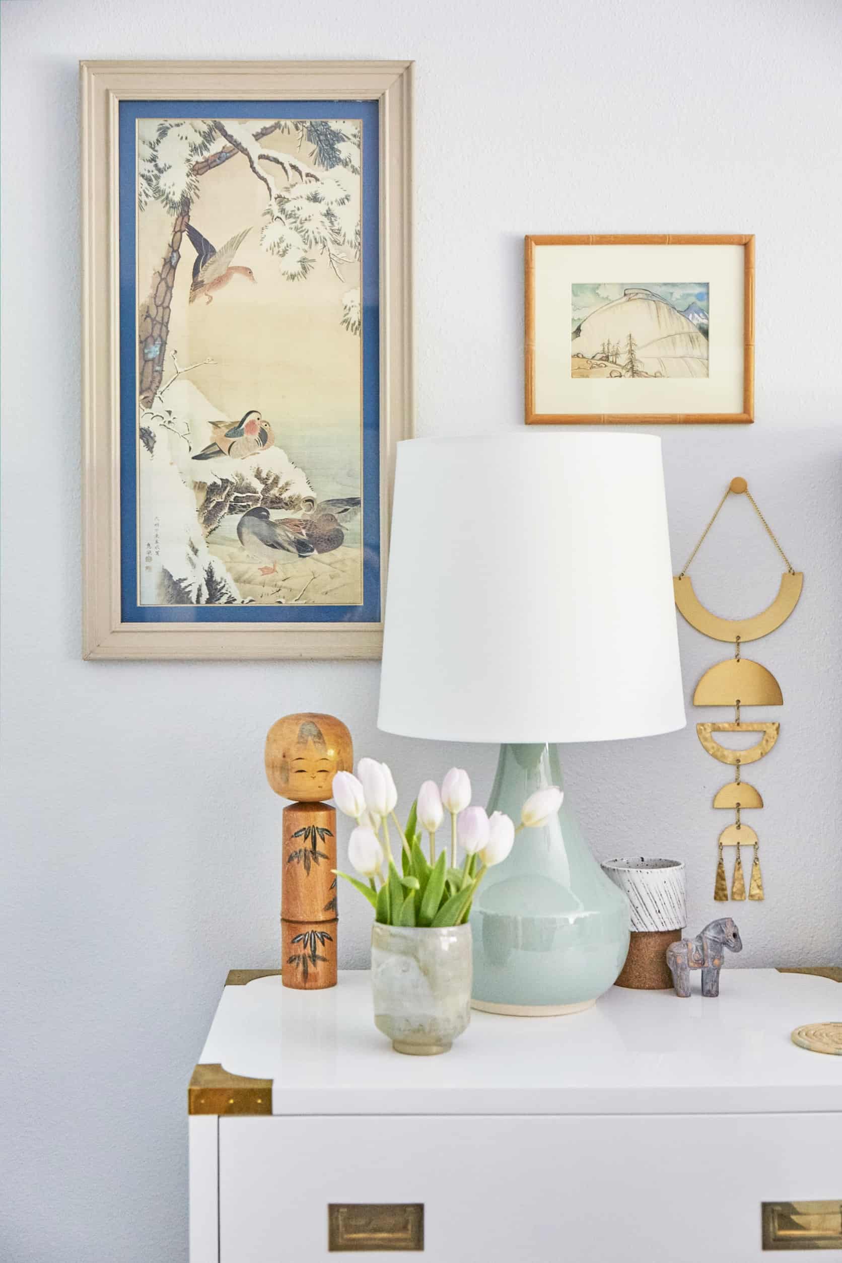
One of the prettiest rooms at Casa Soria is the guest bedroom. There are three guest bedrooms, but one rises to the top as the favorite for guests. We call it The Japanese Room because it’s filled with all my mom’s art and objects inspired by her childhood in Japan (she spent her childhood there, studied and taught there as an adult, and passed her love of Japanese art and design down to my siblings and me). The room is bright and inviting but before I got to work on it, there was little more than a mattress and some bookcases in there. My goal was to make it a bit more formal and tailored while keeping with the cozy California casual vibe that suits my parents.

When my parents moved into the house, every wall was painted a nauseating color of beige. My parents quickly remedied that by selecting a very beautiful gray and painting the whole home’s interior (it’s Alaskan Husky by Benjamin Moore and it’s a great go to for light grays that provide contrast with white trim while still being bright and airy). Other than the tasteful paint color, the guest bedroom was kind of a blank slate. orMOMdo and orlanDAD pretty much gave me carte blanche to do whatever I wanted in here, with the exception that they didn’t want to paint or do anything permanent to the walls since they’d just painted. This provided the first challenge: how to add bold color and design without painting the walls?
I came up with three simple solutions for adding bold design into a space without doing anything requiring any sort of commitment: 1) Adding in textiles in pretty patterns and luscious hues of blue 2) Adding removable wallpaper to my parents’ hideous/cheap sliding closet doors and 3) Swapping out their ugly light fixture for a more beautiful one.

I came up with a few different solutions for adding color. Firstly, I added in a BEAUTIFUL rug that I’m obsessed with from Annie Selke. The floors are covered in a light carpet that I actually like a lot (the whole house was carpeted when they moved in but they installed wood floors as that color isn’t durable for use in living rooms, entryways, or anywhere high-traffic). People always ask me what my rules are for layering rugs. Anyone who’s read my book (which you can buy here, at this link!) knows I don’t really believe in design rules. The general rule of thumb with rug layering is that you should try and make sure the rug you’re putting over another rug (or on carpet as I did here) is a distinct texture and color from what is below. However, gonna be honest and say the beautiful Annie Selke rug isn’t THAT different in texture than the carpet below it (it’s flat woven and the floor below is kinda berber-ish). They’re different textures for sure, but not so distinct that they probably meet that “distinctly different textures” rule. But it still works for some reason.
I’m a big fan of rugs under beds. It freaks a lot of people out because they’re like “BUT HALF THE RUG IS COVERED BY THE BED!” but it helps anchor the bed in the space and, in this case, is a great way to incorporate some pretty color that will make your eyeballs pop directly out of your head. Since the room was already carpeted, we didn’t need the rug for coziness, just for some pattern and color.

My mother’s art collection has a lot of blue in it, probably because I get my love for blue from her. In decorating Casa Soria, I’ve struggled not to make EVERYTHING blue (which is why we went blush pink in the other guest bedroom, which we’ll be featuring here soon). My dad loves red, so I’ve been trying to figure out a way to incorporate that somewhere, even though I definitely do not share a love for that color. Seems like a good design challenge, though…

The upholstered bed from Wayfair was one of my favorite finds in the room and was a relatively approachable price, coming in under $800 (which isn’t cheap but isn’t crazy for a big, beautiful upholstered bed like this). Word to the wise: this bed doesn’t come assembled so you have to spend some time putting it together. orMOMdo and orlanDAD did it in a few hours but it’s not something to be taken lightly; it requires some patience. I wanted to hire a TaskRabbit but that’s basically against everything my parents stand for so they demanded we do it ourselves (I immediately ran out of the room and ignored them while they yelled at each other during construction). I guess Wayfair offers assembly, which I might spring for if you don’t feel like risking divorce to put a bed together.


I know Emily does a lot of stuff with Target, so please don’t think this is #SponCon (I paid for these lamps) but every time I go in there I’m like “WHAT IS GOING ON WHY IS THERE SO MUCH GOOD STUFF IN HERE?” They have so many cute lamps right now. I loved these celadon table lamps so much that I took inspiration from their shade to add in as an accent color (also featured on the very cute wallpaper from Chasing Paper).

I’ve been working a lot with Hedge House on various projects and was so stoked to have them make a custom bench for guests to put their luggage on and sit while they tie their shoes (or buckle their Birkenstocks). There’s a cute story behind the flag-bearing wooden pole to the right of the bench. My mom hiked Mount Fuji as a child, where she got her original Fuji pole. Later on, she took me and my sister to Japan (on two separate occasions) and we each got our own Fuji pole. Sadly, her original Fuji pole got lost on our trip (we left it on the Shinkansen—the high-speed bullet train—in a shuffle to get from town to town). But, we got her a new Fuji pole on our trip (pictured here). Basically, it’s a walking stick that you get wood-stamped at various outposts along your journey to the top of Mount Fuji, which is a staggering 12,000 feet in elevation (it’s so high, they sell little cans of oxygen, the legitimacy of which we never determined). I have one of these poles and so does my sister. We made orMOMdo buy us every stupid flag they were selling along the way. It’s the object I value most in my life and would be the most devastated to lose. It encapsulates so much for me. A wonderful memory. My mom’s desire to show us as much of the world as she could afford to. A love for the world passed down. It’s just a stick but I’d die if I lost it.

My mom’s collection of Kokeshi dolls has long fascinated me. I’ve always found them so cute and endearing. Each one has its own character and story. They also have the added benefit of making amazing decor accessories because they come in various shapes and sizes.


The preppy chandelier from Serena & Lily replaced an extremely lame boob light that previously occupied the center of the ceiling. There are actually boob lights all over the house we are slowly replacing. I love adding a chandelier above a bed (since overhead clearance is less of an issue there). It helps bring light close to human level and provides a sculptural focal point.
You’ll notice I didn’t try to do a Japanese theme room here. While the objects and art are predominantly Japanese, I didn’t want to try and make it seem like I was trying to make a film set for a movie set in Japan. This is a very eclectic space whose main goal it is to celebrate all the pretty things in it. So while the indigo blue color I brought in is definitely a reference to shibori fabric (something I grew up with which I LOVE is having a moment right now), mostly I just wanted the space to be cohesive and elegant. We are living in sensitive times where having objects in your home from around the world can be misconstrued as cultural appropriation. So I even felt a little self-conscious about sharing this space. It’s a tricky thing to talk about. But the way I was raised, and the way I still feel today, is that being excited and interested in cultures around the world is a good thing. Honoring the beauty and ingenuity of diverse cultures helps create understanding and connects us. So while I think a certain amount of research and sensitivity about a certain culture is required before you go and showcase their art, seeking it out in a genuine, responsible way is a good way to be a conscientious world citizen, to see outside your own small bubble.
So yeah, that’s my small disclaimer about why my parents have all this Japanese stuff everywhere (and other objects from around the world in the rest of their house which you’ll see in upcoming posts). Carry on!
I love the way this room turned out and I always love staying in it when I visit my parents. The collection of vintage and contemporary pieces in here, along with the huge collection of Japanese art and objects, makes it a cozy, eclectic room. Adding color in textiles, swapping out the lighting, and covering the doors in removable wallpaper were the three biggest ways to customize the space and add bold color. See?!? You can have it all! Fun, bold design AND NO COMMITMENT! Party on, commitmentphobes!
[drawattention ID=”160827″]
1. Indigo Stripe Sham (similar) | 2. Indigo Stripe Coverlet (similar) | 3. Chandelier | 4. Wallpaper | 5. Vintage Kokeshi Doll with Bow (similar) | 6. Seafood Green Teacup (similar) | 7. Vintage Small Kokeshi Doll Set (similar) | 8. 3 Drawer Dresser Nightstand | 9. Upholstered Bed | 10. Rug | 11. Blue Dot Shams | 12. Shibori Extra Long Lumbar Pillow (similar) | 13. Tansu Chest (similar) | 14. Linen Duvet Set | 15. Tall White Drum Shade (similar) | 16. Celadon Table Lamp | 17. Brass Wall Hanging | 18. Bamboo Wood Frame (similar) | 19. Vintage Japanese Print (similar) | 20. Small Vintage Japanese Landscape (similar) | 21. Japanese Ceramic Cup (similar) | 22. Vintage Japanese Wood Doll (similar) | 23. Vintage Kokeshi Doll Set (similar) | 24. Bench (similar)


STUNNING!!Great job combing the best of two worlds. Just wondering, r any of these rooms that ur doing for ur parents sponsored, just wondering cause Emily usually tells. But once again so pretty and cant wait 2 see the rest!
Hi! Yes, this room was partially sponsored in that I got a lot of the items in exchange for coverage on my social media. I am doing this throughout their home. So a lot of the stuff is purchased (either by me or my parents) and a lot is sent by brands. It’s all stuff I’d source anyway so I’m happy I can hook my parents up as a thank you for everything they’ve done for me in my life.
Absolutely beautiful and full of useful home decorating tips…I was extremely thankful for how you layered the bed with pillows and throws and anchoring the room with that beautiful rug
Bravo Orlando. An absolutely beautiful, stylish, personal bedroom. It’s also a lot more achievable than most designed rooms. I can use it as inspiration for my own guest room, which has a similar color scheme, and art and textiles that I have collected in my travels. Blue and white have been used together by so many different people and cultures around the world that they are a perfect color base to start from. I sometimes struggle with how to make all the little collected pieces look curated. This manages to look both elegant and eclectic. I look forward to seeing how you incorporate red into another room.
Orlando is always terrific and I enjoyed this post very much. This room is gorgeous and I learned about Mt. Fuji sticks today too! I also had a giggle at his mom and dad refusing the Taskrabbit–sounds like something I’d do, lol. I’m sorry to hear about the fire in Yosemite, too.
I love all the Japanese art and decorative pieces – they clearly mean something to your family and add a really interesting layered look. Love.
Love! Gorgeous!
Every single detail is beautiful.
That is the sweetest room! So endearing and cozy. Maybe my own travels to Japan and love of the country are influencing my feelings, but I am utterly charmed by the guest room. Thanks for sharing!
Gorgeous room and the art is absolutely unreal. Really well done!
I have my own Kokeshi dolls that I got as a child. It so great to see them in someone a fresh modern setting.
So pretty and fresh! Love the incorporation of pieces from their travels. It makes it so much more personal.
I love this so much! It always warms my heart to see an interior filled with meaningful things collected over time. I’ll take a space like this over a trendy, sterile room any day. Well done, Orlando — this is what design should be!
What a fresh, yet warm, lovely room. 🙂 Quick question about laying rugs down in carpeted rooms — how do you get them to lay down flat? Mine always wrinkle up the moment anyone steps on them. I’m afraid to damage my carpets with double sided tape, but I don’t know how else to avoid the problem! Any tips or ideas would be SO appreciated!!
Me too! Help!
This rug actually lies pretty flat on its own. However, one thing to note is that you need a lot of people to lay a rug like this down. It took orMOMdo, orlanDAD, and me to get this one in place. Two people held the bed while one person put the rug in place. If you’re having trouble keeping your rug from laying flat sometimes those rubbery rug pads help, but honestly it’s a struggle everyone deals with and one of the reasons I hate dealing with rugs so much.
maybe you could do a post about rug sizes and placement in bedrooms?
If you look at a post from Emily called bedroom style rules, it goes into that. I found it so helpful!
Hi Mariah, check out this post. It may help you:
Gorgeous room! I’m looking for this style bed that also has storage drawers. Anyone know where I can find one?
Love this post!! Could we get more like this please please please? Emily is such a talented interior designer, but all of the house renovations are totally outside my budget. When it’s only renovation posts or shopping posts, I get a little bored. This stuff is right up my alley. Real people’s stuff on a budget, with an emphasis on using what you have. Thanks so much, Orlando!
Agree!
Ditto!
Love the room, but that one creepy mask still has me LOLing. That was the best instastory of. all. time.
Haha! Agreed! I laughed/cringed when I saw it.
This is really beautiful, Orlando! I also love that you were able to put so many things that are important to your family and display them. They are treasures and seem to carry so many memories. I absolutely love how this room came together!
Bravo! We all have stuff/keepsakes/whatever that is precious to us (or husband … sports memorabilia, I’m looking at you) and it’s wonderful to see an attainable approach by a professional designer! #reallife
Ditto!
The room is really lovely and peaceful. I could stay there happily.
I could have done without the treatise on “cultural appropriation” as an almost apology that her mother apparently had the audacity to collect and own Japanese artifacts. All anyone needed to know, was that her mother spent her childhood in Japan and studied and taught there as an adult. If the Japanese had an issue with westerners owning such things, they wouldn’t sell them in the first place.
My grandparents had some Japanese objects by way of my uncle being stationed there in the 1960s, combined with my grandmother’s love of Japanese art. Ah, the good ole days, when you didn’t have to provide a documentary on your decor.
As a person of Asian descent, I actually appreciated his commentary. So while it seemed like an unnecessary apology to you, it made me feel like Orlando respected cultural aspects without making it feel “exotic” or exploitative. And while you recall the “good ole days,” do remember the “good ole days” were not always so good for people of color…
Orlando, I actually thought the blurb on how you were concerned about cultural appropriation showed how thoughtful and sensitive you are! I’m Asian-American (but not Japanese), and I didn’t think this was cultural appropriation at all, but did appreciate how you carefully did consider this. Thank you!!
I agree! It made me really respect Orlando that he was aware of this and included it in the post! Beautiful room too ?
I laughed about the putting together of this bed… we recently got the same one and it was relatively simple to assemble– I actually did most of it myself while my fiance was at the gym. The instructions are fairly straightforward and is definitely quicker than installing a dishwasher (I’ve done this twice and it is my personal nightmare scenario– no doubt I’ll do it again though. I have too much pride.
My dad was a Navy officer, so I have many items he brought home from Westpac cruises. I’ve deployed some of them in a manner similar to what you’ve done here, but this gives me more ideas! Thanks so much…
So, is that a fitted sheet on the box spring?
I also MUST know more about that!
This is actually a dust ruffle orMOMdo tie dyed. Before there was a bed in there there was just a frame with a boxspring on it and she used this to cover it. This bed frame is meant to be used with a thinner boxspring than the one we have so it poked out a bit which bothered me. This is a bit hard to keep perfectly in place so I think a fitted sheet would probably work better.
It does take talent to include that many Japanese things and not having a themed room, kudos to you, Orlando!
My older sister spent a year in Japan in college and brought back several kokeshis that I glommed onto. Love them! And I love how you’ve used them here. As you said, there’s a Japanese flavor to this room without it feeling like a slavish imitation.
Is that one print with the lanterns a Bertha Lum? Or the other woman artist whose name is escaping me at the moment? I’d love an original of one of those, but they’re out of my price range now.
Glad you got rid of the “boob light”* on the ceiling.
* credit to Tommy Smythe
P.S. Shibori was the first thing I thought when I saw that rug. Gorgeous.
Lovely! I was hoping to see a photo of the wallpapered closet doors. The one picture I see with closet doors doesn’t really show off the paper.
Yes! I know I just noticed I failed at getting a good shot of the doors all together. Basically, I still don’t LOVE them so it was hard to get a pretty shot. And I was shooting this room with Zeke, who really doesn’t wanna bother taking shots that aren’t pretty. So the Chasing Paper definitely makes these doors look better but they still aren’t that pretty. Kind of a lipstick on a pig situation I guess. Hopefully I can find a door company to change these all out at some point.
Adorable! I can “feel” how special her treasures are! Great job.
I LOVE the whole room! Great job, Orlando!
I love all of the blues. And I super LOVE that Kota rug. I ordered a 2×3 of it to test for our living room. As much as I love it, I ended up cancelling the order for the big version because I knew my kids would destroy it and it’s too scratchy to imagine my 3month old spending much time on it.
The personal decor touches really help make a room not seem too staged or stuffy. ?
I can’t imagine designing any other way than using beloved art or items that bring back memories and the pleasure of the hunt, while defining who the owners are. When I walk into one of our guest rooms, I will sit on the bed and am flooded with happy memories in a room guests always pick as the one they like to stay in. Your parents new room is stylish, modern and above all personal. Love it.
You talk about the ugly closets (and show the before) but no after photo with the wallpaper. Maybe you could sneak that in when you show another bedroom? Otherwise stunning room and love the post.
Waiting breathlessly.
Hi Patricia! You can see a good sliver of the closet doors in the 6th photo down from the top!
I’m really inspired by the idea of using wallpaper on things other than walls.. Right now I’m eyeing the side panels of my armoire. And that’s just from where I happen to be sitting at the moment. Fun!
Love the room and always love the color blue. The Japanese objects add interest to the room. My son studied and lived in Japan and gets.back there regularly. I feel that liking things that are attractive no matter where they come from is a form of appreciation and flattery. Just my own opinion.
Orlando, you did a fabulous job on the room. I just don’t get the cultural appropriation disclaimer. Seriously, I do not get it, so if someone is genuinely upset with the design in this room, please respond nicely to me. I am lost! I think we are all tiptoeing and it is causing more harm than good. Sorry, but I claim Native American by osmosis. Ohhhh…big no-no in the world of PC, but my mother was orphaned and therefore accepted by the Natives (who are family to us and all call themselves Indian and laugh when we try to be PC and declare, “Only white people walking on eggshells call us that!”) and was thus raised on an Indian Reservation in NE Washington State. Her best friends were native. The man she almost married was native. We grew up spending weeks on the Rez every summer. I studied and traveled all over western Europe during college…is it somehow insensitive for me to hang my artwork that I purchased 25 years ago? What about art given to me by my son’s birthdad who is from Taiwan? Or from his birthmother who gave us stuff from Ecuador (she is 50%) or Ireland… Read more »
I think there’s a difference between appreciating a culture and just doing a silly themed room without genuine interest in that culture… To me, the objects Orlando’s family has collected over time are so lovely and his family has a meaningful connection to that country, so displaying them is great. I don’t know who would be offended by this, but it was thoughtful of him to mention it. For when it veers into cultural appropriation… it’s like if someone was thinking, “I’ll do an Asian theme in the guest room!” And then they proceed to indiscriminately grab “Asian objects” like a Japanese fan and Chinese artwork or generic Asian calligraphy posters etc. It comes off as a little uninformed about the vastness of the various Asian cultures by just lumping them all together, even if they didn’t intend any insult. Orlando’s room is clearly not that. The examples you give of the objects in your own home just sound like things you have and like because of the many people you have in your life. I don’t think most people are mad when a Caucasian person has cool souvenirs from their travels. Someone correct me if I’m wrong, but my… Read more »
Thank you, Ashley. Your examples help…somewhat. I get what you are saying in your last few sentences, but again…when big box stores do that, it is fake, it is cheap, and probably all many average people can afford who have a crush on, say, Japan, but will take “Asain” b/c they don’t know better, will never go there, can afford it. I just don’t see how it is so incredibly bad. Yes, my boys are from Ethiopia. Sometimes they specify and sometimes they say they are from Africa. But thank you. I will try to think about what you wrote more…and really try to be more sensitive.
I totally hear this. Basically I was just worried it would look totally weird that we had all this very culturally specific stuff in one room of the house. Was just trying to prevent anyone from feeling like it was all there for some superficial or based on an exoticized idea of Japanese culture. It’s an uncomfortable conversation but I wanted to acknowledge it.
Christina, you are not the only one to not get this whole “cultural appropriation” thing.
In Europe is a non issue – I personally think that your beautiful diverse family (not that it would have been different if you were travel aficionados with milky white skin) has all the rights to show off its treasures without fear 🙂
Simply gorgeous space Orlando!
Thank you for letting us in on your family life and memories ❤️
Sending good thoughts to Yosemite!
Long time follower, first time commenting….LOVED this post! We’ve been living in Europe for the last few years and collecting decor souvenirs from all our travels. I’ve been stressing out about how I can still use these treasures in my future home when we return to the states, but this post was inspiring and totally what I need! Now if you could just give me any advice about where to make a Black Forest cuckoo clock fit into my decor, that would be great ?
You did a beautiful job. Love everything you did and I know your parents must love it too. I can’t wait to get a Kokeshi doll, so adorable.
Love it!! The art is beautiful. I just painted my guest room blush pink and now I’m stuck, so I’m eager to see the next guest room. Blue is also my default.
Long time reader, first time poster. Orlando, I enjoy your posts so much. Love your style, how you explain the process and the varied sources. I love how your personality is so much a part of your writing and in this case, the love and appreciation or your parents.
First kudos, love the room and the story about the Fuji poles! Your mom did good. I scanned back through because you didn’t show a picture of the wallpapered doors. I’d love to see them too.
Longtime reader, first time poster. My heart skipped a beat when I spotted the walking stick, and I knew instantly that it was from Mt. Fuji. Orlando, I totally, totally get your love for that stick. One of my best friends and I climbed Fuji-san during my post-college year spent teaching English in Japan. By the end of the journey, those sticks had become part of us (could have had something to do with the fact that we did the entire journey from the bottom on foot…no tour bus for us!). When I was ready to leave Japan, airport security wanted to confiscate it, citing the fact that it could be used as a weapon. I paid $200 from my dwindling bank account to check it (it was oversized and I had already checked multiple bags), and thank goodness I did. To this day, my Fuji stick remains a tangible symbol of adventure, friendship, and freedom. Sorry to get all wordy about a damn stick. This post has inspired me to put my mine in a much more prominent place than the corner of our home office, and to sort through the boxes of artwork I collected during my amazing… Read more »
Yes! It’s a lovely memento of a very lovely memory. Glad you have one too!
Beautiful!!! We NEED a shot of the wallpapered closet doors!
EEEEEEK what a great way to start my Monday! Thanks for mentioning Homies and our extra long lumbar shibori pillow 🙂
Big fan of Homies!
I love this room, Orlando! I will have to show it to my daughter, who also spent time studying and traveling in Japan and came home with SOOOO many souvenirs — very nice items from the many kind and generous Japanese people who she met and stayed with. She has traveled a lot and it is one of her favorite places because of the people.
Orlando, I follow you on Instagram and I always enjoy your talent and your sense of humor, but this is one of my favorite posts of all time. I very much appreciate how you approached this room, and it came out beautifully. P.S. I’d like to see the closet doors too!
What a beautiful room- and what a master class on humor balanced with cultural awareness (with a huge dose of design tips). I love you for this Orlando (and you Emily for sharing!)
Attractive, but way too visually busy for my taste.
The bedding is just THE BEST thing! Way to go!
I lived in Japan full time for 14 years/still do on a part time basis. My husband is a Japanese national–my kids have dual nationality. My living room is blue & white, I have Kokeshi dolls, and I also have my walking stick from Mt. Fuji. Short of reading Amy Kato’s interior book, Blue and White, I’ve never seen an American combine the two cultures so beautifully. This is fantastic!!! LOVE IT!!!
And your cultural note was a pleasant surprise. Very classy.
very good
beautiful and excellent