
Kitchen
A Kitchen Makeover That Focused On Small Changes For A BIG Impact (Julie And Velinda Did It Again!)
How has it been over a year since we “EHD-alumns, turned-sister-team” reported back?! Today, Julie and I, along with Grace (our other EHD-found-friend who supported this project while juggling many others) are happy to say it’s been for good reason. We have a couple of large projects that will be INCREDIBLY fun to share when they are installed this/next year. We also aim to revisit some more E Design reveals (of which, we’ve nearly reached 300!) soon. (Shameless self-endorsement: you don’t have to be in Los Angeles to work with our team! Join us through E-Design!!!!)

For today’s reveal, we’re rewinding time… Back to the days of wiping down apples and oreo packages before bringing them into our homes, back to when wood prices were sky high and sofas were taking 9+ months to deliver instead of the “currently-impressive” four months… yes, I’m sorry, we’re going back to 2020… to the Days of Quarantine… the “DQ”. During the DQ, VHD (Velinda Hellen Design) was a months-old team and were lucky enough to have a still-to-this-day-favorite client reach out with this proposal: “Is Ojai too far??? I promise it’s a nice break from LA!”. Alongside this client, during a crazy time, we found a new appreciation that “small improvements” really do matter! Changes don’t always need to be big, to be high-impact. Great news for most of us “human-projects-in-works”! I can speak for myself, despite all the therapy, there’s still clearly some sorta “mold or asbestos-like” infestation up in these “studs”. It’s probably safest to just keep some wonky drywall in place and look the other way, am I right?! (Legal Disclaimer: this is not home advice. If you fear spores below surfaces, call remediation asap. If you’re personally a little “wonky,” join the rest of us!).
Back in the DQ, Julie, who was the lead designer on this project, was new to the VHD team and we hadn’t-yet ventured outside of our own city for “Full Service” projects. Although, thanks to remote projects as a part of the EHD team, we already had tools for that type of experience. Our client’s promise of being merely a fun road trip away, nearby orchards, and a tour of a newly-attained Airstream had us nature-needing designers trekking. When we arrived, the space looked like this:

Upon meeting our client, we discovered that during a time of absolute unease, she was, well… an ease and a delight! Frankly, we had forgotten anything in the world could possibly be so. She and her husband are smart, have great taste, communicated well, already had a contractor that they trusted, and the capacity to serve as their own project manager. This is something we never really encourage, but in a household of multiple lawyers, we didn’t doubt that every “T” would be crossed. We felt lucky to get to help (and eventually camp with???) this client.


Appreciating simplicity, they wanted a clean look with a natural coziness that didn’t pull the eye from the surrounding views of nature. I’m SURE their THREE boys UNDER the age of 10 never distracted from this Zenful setting. But juuuust in case they ever did introduce chaos (doubtful) we all agreed some hidden storage and a better “running through and out of the house flow” might prove beneficial.
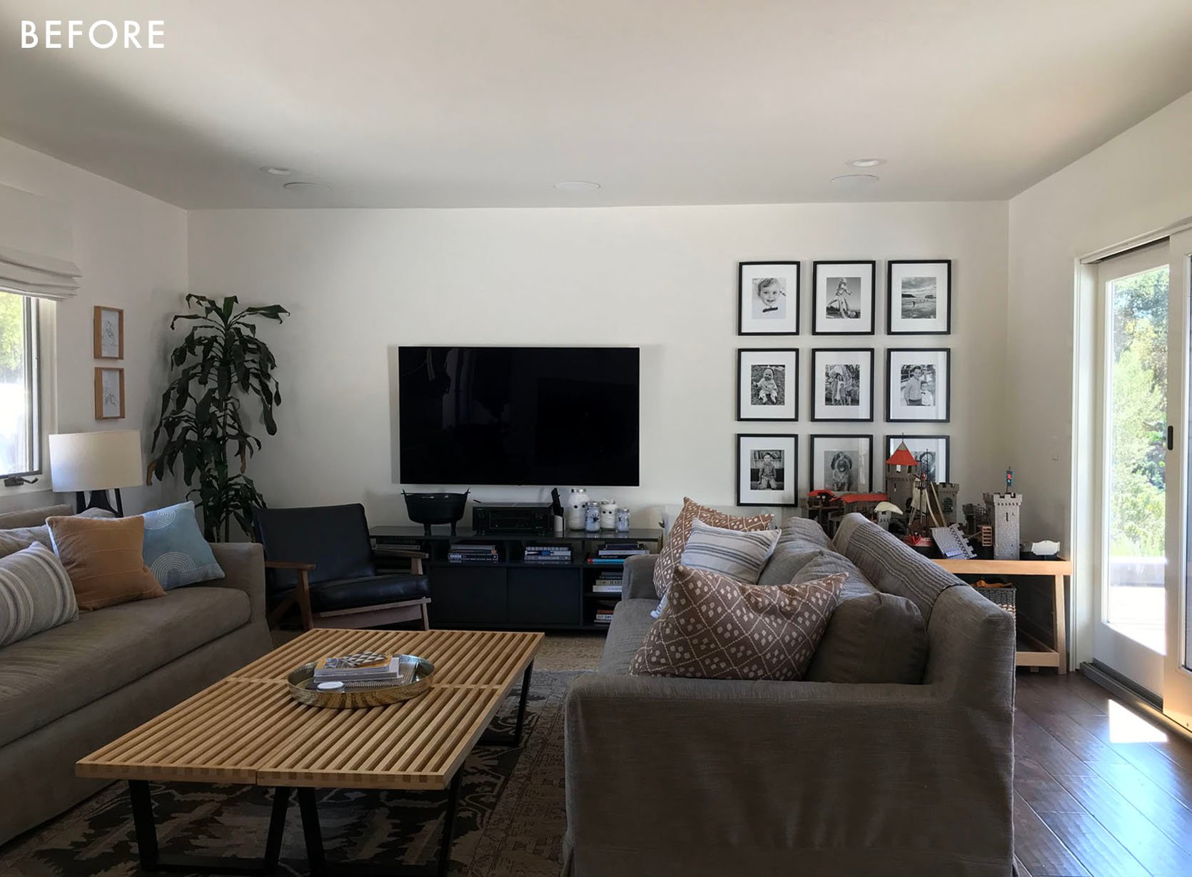

While the location and home were a dream, the allocations of some pretty unimportant walls were not. The dated, pass-through wall, half-heartedly divided the kitchen from the rest of the space unnecessarily. Meanwhile, the entry seemed to be missing part of a wall that would transform the function and visual impact of the home’s first impression.

By client-request, we originally explored additional footprints. For fun, here’s a quick look at a variation; the “what could have been”.


We love the puzzle-solving nature of the design process and appreciated a client who wanted to see varying project scopes in order to fully compare, but in the end, this was the simplified design we landed on! Notice that the “befores” shown above and the “afters” to follow are the results of changing only TWO, ITTY-BITTY PARTIAL WALLS. The major footprint, plumbing, and windows were left alone.
The aim was to solve the following dilemmas:
- A dated kitchen & dark, divided space
- The lack of an entry/landing space for the kid’s school bags/dog supplies & an awkward opening into the living room
- Missing kitchen functionality (for their needs), a want for updated appliances and ease for multiple cooks
- An overall lack of storage and visual “anchors”
So, onto the solve:

The first thing to note is that the layout of the major plumbing and appliances remained the same. To do this we simply combined the stovetop and oven into an induction range (which is environmentally friendly!). At first, we encouraged moving the sink from the diagonal, but it was important to our client to keep it there for easy surveillance of backyard activities, which I assume means watching her boys garden and meditate. 😉

We put a huge emphasis on seamlessness within this design in an attempt to keep the eye flowing throughout the zones of the home. Where it was previously unnecessarily divided, a few tricks helped hide functionality within visual unity! An obvious help was panel-ready appliances, which we love for their ability to contribute to a clean, unobstructed look. When it came to cost, this was a priority more so than shifting appliance locations. So, leaning toward accepting existing plumbing provided extra funds for added panels and panel-ready machines.


Appliance Pulls | Brass Handles
And while we’re hiding appliances, let’s talk about the coffee and small appliance “garages”! The desire to hide frequently used, usually countertop-located machines is common, but not all of us have the extra space to lose to added widths required for retractable doors (which has become a popular “appliance garage” solution). Since this was a smaller space and we needed to utilize every inch, the solution became soft-opening cabinet doors that operate on a mechanism to go “up” and get out of the way.

A few additional space-and-clutter-saving solutions we opted for: pull-out drawers to flank the range to eliminate “stuff” on the countertops (spices, oils, cooking utensils, and cutting boards). A small shelf above the range for an easy-to-reach surface space when cooking. Lastly, keep a “ledge” behind the corner sink to display some greenery & bring that Ojai nature feeling indoors.

By losing that unnecessary wall and keeping the sink in the corner, we were able to create a large, seamless island with a wonderfully “unbroken” countertop surface for cooking day prep, homework, crafts, and beyond! (By “unbroken” I mean there isn’t a sink or stovetop). We used the island’s depth to hide even more cabinets for storage on the stool side which is operated by subtle, finger-pull hardware. The design of the doors was meant to be softly disguised as a millwork face.

While on the other side of the island is where we have some necessities that are hidden away from view when you first enter the home. A built-in microwave with a large drawer below, in the middle two large drawers for pots and pans, and last but very necessary the pull-out drawer for trash & recycling, topped off by the staple of everyone’s home, the “junk” drawer.

The other note-worthy cabinets in the space are the full-height, countertop cabinets. We really hate letting vertical space go to waste in a smaller kitchen, but we didn’t want to overpower the eye with heavy/solid floor-to-ceiling cabinets since they were so close to the corner windows. We found a solution that our client could store infrequently-used items up top, while masking plates, bowls, and your favorite mug behind the glass fronts which creates a sense of depth and “airiness”. The MVP for this game: reeded glass. It comes with a lot of the expected perks of a glass cabinet (“visual room” and lightness) but it hides more. If you like to keep your cabinets styled and ready to feature in the next issue of (insert your favorite home magazine here), you may not need this option. If you have three boys, two dogs, and an active cooking life, meet your new best friend!

Dining Table | Pendant (similar) | Chairs (Simiar) | Rug
The dining room was simple, both in style and solution. The idea was to increase the “feel” of the size of the kitchen by confusing the eye as to where it stopped and the dining room began. So, we tied the tone/style of the custom buffet build into the kitchen cabinetry. Aiming again to reduce visual bulk, open shelving was utilized within the overall goal to keep most storage “hidden”. And as an extra, nod to the kitchen, the same wood detail on the sides of the kitchen island was used as the back of the open shelving. This also contributed to added depth and texture in this open dining space helping to define and “anchor” the area a bit more from its before version.

Both of these spaces lived within the eye line of the home’s main door, meaning they contributed to all “first impressions,” but not perhaps not as immediately as the entry itself. Our clients had lived in their house for years prior to renovating, which meant they knew what they needed more and less of within their space… and what they never used. The latter proved to be the under-utilized access between the front door and the living room. We decided to redesign this “zone” for something a bit more craved – a spot to “land,” put on shoes, and hang jackets. So, we turned that “dead zone” into storage, adding a drawer for shoes and hooks to the space above to hide unsightly leashes and doggie bags in baskets.

Then, on the other side of the new wall, we gained shelving in the living room, providing the perfect place to display book collections and family photos. The client loved the new spot for a cozy reading chair by the fire. Bonuses on all sides!

Table Lamp | Built In Color | Coffee Table | Leather Pouf (similar) | Rug
Since we’re in the living room, let’s look at the major impact the custom build had on the space. That’s really the only major change in the room…. Well, it’d be unfair not to emphasize what a MAJOR impact a good vintage rug can have. We actually added one to every room we touched on this project.
We customized a full-height, wall-to-wall storage unit, built around the size of their television and customized it to store large speakers and electronics. The design allowed for unobstructed sound and ventilation as well. We also balanced open shelving for displaying cherished collections and art with hidden storage for lots and lots of legos! Above it all, awning-style cabinets function well for accessing more seasonal items.

Small, careful changes made a big impact for our clients who proved, in the end, to be as delighted as they were delightful. And though we have yet to see them in person without masks, we’ve decided we’re invited along for their next Airstream camping adventure! Should they find themselves asking us for small-design solutions for said camper, SO BE IT! Bring on project #2. Until then, we’ll leave you all with one last, post-COVID thought: you still need to add at least a week or two to listed lead times, but your apples no longer taste like Clorox. Cheers to improvements!


ROLL CREDITS:
Design By: Velinda Hellen Design
Lead Designer: Julie Rose
Contractor: McLeod Construction, Inc.
Photos: Sara Ligorria-Tramp
Styling: Emily Edith Bowser


Wow!!! This is so much lighter and more stylish. Wonderful improvements! The way you explained everything was so easy to understand too. More of your 200 makeovers please!
thank you, sarah!
Thank you, Sarah! We hope to share more of those soon 🙂
WOW! BRAVA! So glad you shared this lovely space.
The living room’s colour and texture combinations here are so lovely. The warm tones in the rug pair perfectly with the moody blues of the built ins. One of my favourite rooms I have seen on the blog. Kudos to Vellinda Helen Design for knocking this out during the days of quarantine, no less. Definitely going to take inspiration from this!
thanks, Allison! Sheba from Blue Parakeet Rugs has such a great vintage collection.
They’re a top ‘go-to’… SO good.
I agree. One of my favorite spaces ever. And feel the same about the kitchen, although I’d have done flat front cabinets (wholly personal choice, no notes). So thoughtful! This made me immediately want to hire you if I decide to remodel my 1953 Bay Area rancher, even though I’m pretty sure you won’t want to travel all the way up here;)
Thank you so much! It’s a full-team effort with thanks to Julie Rose leading the design and Emily Edith Bowser for styling! So glad it inspires and appreciate the kind words!
Beautiful! Can you share the paint color of the cabinets?
Cabinet paint color please (!!!)
This kitchen is so beautiful! I love every single thing about it. Could you share where the cabinets were sourced from? I am curious if panels for appliances have to be custom made or if some cabinet makers do this as a standard feature.
thank you! The cabinetry is custom by someone our client’s GC had worked with prior.
A lot of brilliant thoughtful solutions here. Well done
thanks, susan!
Ahh, this was so much fun to see! I liked making guessing about what you’ll do and then seeing if I’m correct 🙂
You two are sooo good!
Everything you’ve done is fabulously livable and comfortable, inviting and stylish.
I still remember Julie’s bedroom MOTO & Velinda’s basement rental kitchen makeover – both on my all-time favourite list!
LOVE LOVE LOVE IT!
thank you so much Rusty!
THANK you, Rusty, for rooting for us from the start!
I don’t have time to write detailed comments right now- but- LOVELY! And I expected nothing less from you!
Wow this is beautiful! That made such a huge difference. I also appreciate that you added a wall/bookcases to one spot – sometimes taking walls down is not the only answer! Really nice work. Thanks for sharing with us!
thanks and agreed, we love creating storage solutions for our client’s!
Curious why the original dining table was traded for a new one. Love the old/original one!
We all love vintage pieces as well but sometimes needs shift in a space and our client needed one that could sit more family & friends.
Everything looks great! These are not small changes though – floors were changed, walls removed/added, appliance locations changed. I would consider this a full-scale renovation.
Agree. Custom cabinets are not small changes. plus the counters, tile, appliances.
Semantics, but, sure. Some would consider this “large”. However, what I believe Velinda means is that nothing large had to be done in order for the facelift. Everything was essentially cosmetic. As she said, no plumbing had to move. That takes even more $$$.
Agree – plumbing changes and exterior impact – doors, windows, sky lights – all fall in the ‘large’ category that I think they were alluding to here. While the flooring changed color, in the scheme of things that’s almost maintenance, not enhancement, for wood floors of a certain age. But I realize everyone has a personal idea of what large, medium or small is. Given MANY kitchens served up on blogs and social media are well into six digits, I think we can forgive the idea that a redo under $60k (for hypothetical purposes) may not be considered large to a professional in an urban area.
I suspect the title here has more to do with SEO and bringing people to read the article than the best descriptor of the content.
Yes I thought it was going to be hardware changes and adding a backsplash by the title but this was definitely $10s of thousands of $$$ worth of renovations. So stunning and breathtaking but the title was click-bait for sure. It almost discredits how much work the designers and contractors put into it; their talent and hours of work should not be diminished!
Gorgeous and livable. Love all the little moments and that it feels true to the house. (At least from the befores, seems like 50-60s ranch.)
Sarah, so glad you approve of the ‘house-suited’ changes! Thank you!
There is a lovely casual sophistication to this. Way to go Velinda and team! I hope to see more!
thank you!
Thanks for expressing such simple thoughts in a strong and effective way. i found very useful information on this website . more information visit
Aaah this is so beautiful! Every kitchen you guys do makes me want to redo my kitchen (but to be fair there are 1980’s tiles for the countertop so the kitchen sort of does that on it’s own, too). Anyway I love it!
Love this & always love seeing everything VHD does! Cabinet paint color please?!?
Another stunning one by the VHD team!!! It is so cozy and sophisticated and it looks like you put every dollar and square foot to work with smart choices. No one designs a built in quite like Velinda!!
thanks so much Erin, it was such a fun one to design with our client’s needs in mind!
Thank you so much for the nice feedback, Erin! Julie and I (along with the team) appreciate it!!!
THIS IS SOOOOO GOOOOOD!!! Such an elegant design, so beautifully simple but with unexpected elements like the wood paneling. I wanna move in!
thanks Orlando!
Beautiful! The built-in in the living room really adds soul to the place. I have a question about rugs in the kitchen – my floors get so gross (messy cooking, dogs, farm life, kids, husband, etc) that I feel like it’s easier for me to clean the hardwoods than vacuum/spot clean a rug, especially one that isn’t really big that the vacuum likes to suck the edges up on. But I LOVE what rugs add to the space. Do most of you wonderful awesome designers/other Emily followers have rugs in high-traffic rooms like the kitchen?
I resisted a rug in the kitchen for a long time for that exact reason. But I got a washable runner from Tumble and I’m really happy with it! I wash it every few weeks and it’s super easy. I got a style with a lot of variation so that dirt and spills aren’t so noticeable between washes.
We have had a smaller vintage Turkish rug in our kitchen for over a year and it has totally withstood the wear, tear and mess (we have a dog, kids, mud, etc.). I was skeptical it would work, but you can totally do it!
To answer your question about the vacuum sucking up the edges of a rug — ChrisLovesJulia recommended these “Home Techpro Rug Pad Grippers” (you can find on Amazon) a while back, and they make a difference!
I have a long runner in my mudroom that got constantly bunched up by foot traffic and pup traffic. The grippers (more like a 2-sided textured sticker) hold it flat to the floor without damaging the rug or leaving any sticky residue on the hardwood.
Beautiful work, once again – kudos!
Bravo! I certainly understand the desire to keep the sink with a sightline to the backyard, but I am curious what the alternative VHD team recommendation was?
I did love this point in the article – design needs to be both beautiful and functional – the client knew that looking out over the backyard while washing dishes was a ‘moment that mattered’ in her life (to quote Ingrid Fetell Lee) and so she kept the window in the corner, even if there may have been a more aesthetically appealing alternative. I suspect that the designers suggestion would have been to put the sink in the island bench? (Actually scrolling up you can see that option in the black and white sketches) Everyone’s needs are different but I LOVE my ‘unbroken’ island bench – it’s the heart of my home and a handy space for eating, cooking, crafting…everything!
Lily, you guessed it… we had suggested that sink placement as an option. But we have joined you in our love for the ‘unbroken’ island!
The island was such a surprise! Love it. I love the paint color choice for the cabinets. Any details on it?
Thanks!
lovely, what a great job you did! Can you please share paint colors for the walls and that fabulous wall unit in the living room? Also, paint color for the kitchen cabinets would be fab to know!
Gorg! Love it. Can you tell me the brand of the sink faucet? Thank you!
Ok- so this is beautiful. My question is with the removal of the canned lights I don’t see 2 sconces and one 2 light chandelier as enough lighting.
Ok- I saw the video posted and now see they’re still there but we’re edited out. Please don’t edit out canned lighting. It’s so helpful and mostly seamless anyway.
Amazing!! You need your own blog–where can I sign up?
Absolutely perfect! Beautiful and clever!
Love the solutions to this space. Is it possible to do a feature on doing built in cabinets??? Thanks
Gorgeous rugs! Love the warm lightness of the kitchen dining and how you grounded and closed in the living room! So good!
That is the appliance garage solution I’ve been searching for since the space I need it to go in abuts a wall that has an outlet and doors that slide in wouldn’t work there. Thank you for solving this years-long problem!
Beautiful! Can you tell me what the countertops are?
Another supremely beautiful design from Velinda!!
And Julie! Big VHD fan here.
Really beautiful and why I still read this blog. Love it all. You women are very clever and good at what you do.
This question might be too late because I get the impression the team moves on quickly from reading comments after the first wave but the layout of the floorboards are really different and multi directional in the very last photo with Julie and Velinda. I would really welcome some more insight into that and what’s involved, maybe even a whole post. It looks really interesting.
If you look closely at the before pics, that same directionality seems to exist — the floors diagonally dead end into the half wall that was removed. My guess is that the owners patched in new flooring where needed in the kitchen, but otherwise just refinished the wood to that lighter stain and decided to live with the quirk.
Wow. Insanely beautiful transformation, especially considering the minimal structural changes.
Gorgeous job. I love what you did to hide the tv
Holy hell. Just stunning!!
Watit what this is sooo beautiful!!! Too long between drinks, hope to see more of Velinda and Julie!
Can you share the cabinet color? It is so beautiful!! We need to redo ours and I could see that color working so well.
Always happy to see Velinda and Julie back on the blog, and this was another beautiful design. I bet the family absolutely loves it, and I am having major rug envy. Well done VHD!
thanks Heather!
Another great job! Debating buying that cream vase on the coffee table:
I love this so much, I am reaching out for my remodel! Looking forward to connecting on my challenging project – you’ve incorporated so many amazing solutions, the reeded glass, the cabinets that open upwards a shelf behind the kitchen sink, the wood siding and then in the dining room, the built-in cabinets in the living room, I love everything about this post and project. I adore those tiles too, they are warm and bring light and look so cozy, warm yet clean and simple! I am feeling inspired to speak with your team.
Please keep posting on the blog I really appreciate the before and after shots for the clients it really showcases the improvements you did for them.
I appreciate that it was easy to understand and follow what you did. I love the vintage rugs
Hi there – Love the kitchen and built in cabinet colors – possible to share pls. Seems out of character for EHD not to have these in the post.
They are listed under kitchen and living room
I’m curious about how they watch TV in the living room, with the sofas not facing the TV. Do they turn the sofas? Turn their heads? I’ve thought about this arrangement in my own living room, but I haven’t done it for this reason.
We’ve had that layout for years because it’s literally the only way we could fit everything into one room. It’s really not a big deal. We usually sprawl out on opposite couches when it’s just the two of us (so we are lying facing the tv) but when we do family movie nights and have more people, we just turn our heads. It’s not awkward or uncomfortable.
What a great job!! This is such a slam dunk!
Love it!!
nice