
Make Overs
Our new design library and a sneak peek into our studio
When we first moved in to the studio three years ago, it felt so big and spacious. It is 1, 200 square feet, and with three people, that felt ample. This room was used 1/2 for desks, the other for storage/props and shoots. Since then we have doubled in bodies and rent the back unit to house anything unsightly because the front space became a total insane ugly mess. It was absolutely not designed. In fact it was uninspiring and embarrassing. So when Wood, Naturally reached out to us about sponsoring a project, we used it as our excuse to finally tackle our studio and install some much-needed shelving. The biggest challenge we had was dealing with storing samples for design clients – tile, fabric, catalogues, etc. The props were gone, but we needed to have a decent inventory to save us and our client sourcing time.
So, we cleared everything out and it looked like this:

We use to shoot a ton in the studio (remember these 1 credenza 3 ways shoots, and this 1 bed 4 ways?) but we now try to only create content at clients’ homes – which have way more environment and are generally just prettier. So while it seems like doubling the people would double the need for space, we are just repurposing it and figuring out the best way to use it properly for our needs.
The cement floor is really cold, especially in the winter. It’s cool and industrial but that’s not really us, and we wanted it to be prettier. We thought about painting it bright white (which would still be cold, but so pretty) but we knew that it would get destroyed within days. So we decided on carpet. We saw these FLOR tiles laid out in this post and thought how fun and warm that would be to try our own variation on it. And we weren’t wrong. We had them installed over a weekend.

With the light pink and the yellow door it seemed like such a fun place… to drop off your baby for the day while you are at work. Don’t worry – those things changed and the space became much more mature and office-y.
Meanwhile we met and worked with Chaffee from Fourth Period Woodshop to design and custom build our design library. Our needs were mostly closed storage since bins and baskets of things just aren’t that pretty to display and have out. And then we wanted drawers so that we could dedicate a drawer to each client/project(materials mostly, not files). With those requests in mind, he came back with two versions:


We much preferred the open back, and liked having the cupboards recessed. He added some pretty beveling and joints to give it some more dimension. For materials inspiration, we went to Wood, Naturally, a great resource for creative ways to use softwood lumber in and around the home, or a workspace like ours. We chose Douglas Fir – a common, classic, and affordable soft wood species. Chaffee showed us the more ‘clear’ options (no knots) and we loved how the color and natural grain looked. The grain is super simple and minimal and it worked perfectly for the look we were going for.
Six weeks later they arrived and were installed:

We were in love with them, and couldn’t wait to style them out:

WE LOVE this studio now. It’s such a happier/better place to be and one that we are proud of, not embarrassed about. It is a bit playful, but not crazy and the best part? It’s WILDLY more functional. All our desks are on the other side of the room and this side serves as the design library and meeting/conference area (this is not a full reveal, just the furniture post) so stay tuned for the whole reveal coming up early next year! Look at us just working away, filing, pinning and me just reading my novel, while everyone does their thing.

My team wanted to kill me for not telling them it was picture day, but I think they all look really good. Obviously being in the picture was optional – not everyone was there that day so stay tuned for a proper team picture post. Let’s get into that beautiful shelving unit:

It’s just so simple and pretty and full of function (and now full of fabric books, boxes of tile samples, hardware samples, sample paint pots, etc). Ginny had been begging me for a proper design library forever, I just needed some extra motivation to pull the trigger on the piece of furniture.

We used some super simple pulls that we painted rose gold after playing around with a few other colors. White looked annoying, black looked contemporary, and we could have done something leather but we didn’t have time and weren’t sure how those would hold up with the amount of use they would get. These are super streamlined and definitely go away (in a good way), which we like.

Chaffee designed it so that the shelves are modular, but in a super chic and modern way. He mitered the slats where they are inserted which gave it a really great architectural detail that we love. I don’t think that we’ll need to move them, but I love how it looks regardless. It definitely elevates this piece, and is such an easy detail if you are building your own bookcases to consider so that you can have all the shelves adjustable without having to do the traditional peg and hole method.

When you need a lot of closed storage it’s so easy for it look like a big generic cabinet, so those little details help to give the piece some variation and character. Inside it is temporarily styled out with beautiful ‘things that we need, ‘ which will quickly be filled with ‘stuff that we can’t throw away’ as we start to live and work with the piece to fill it up and organize it.

For now it’s great to have the closed space for the less than beautiful things that we don’t want to look at everyday and can cause visual chaos and clutter. And now that we have a larger design staff, we actually have someone dedicated to keeping things categorized and organized in the office and these cabinets. THANK GOD.
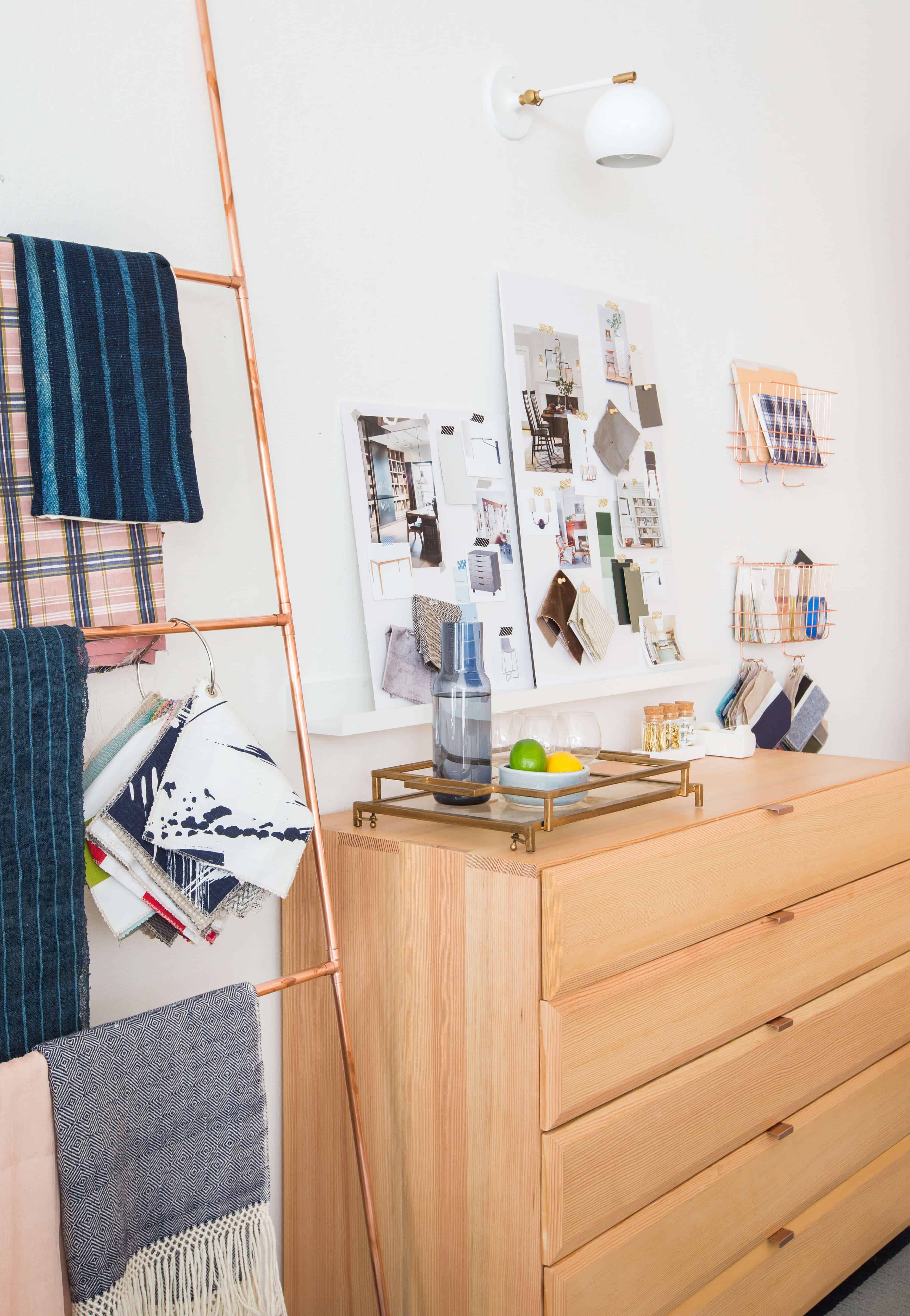
On to the dressers. These were designed to house mood boards and materials, per client.

We needed them to be relatively shallow so that they a.) weren’t too heavy and b.) we could put flat materials into them without it becoming this deep abyss of garbage on top of beautiful mood boards. To help with wear and tear on the bottom of the drawers we cut some thick felt to fit the size of the drawers which also helps to keep everything in place when we open and close them and quickly pull things in and out for client meetings.

That drawer was for my new house and it makes me feel VERY important as a client and as a human being.
It’s making it super easy for us to keep our clients lives organized and separated from the blog editorials and shoots. I love the joinery detailing and the beveling gives it a lot of dimension and makes such a simple piece look so high end.
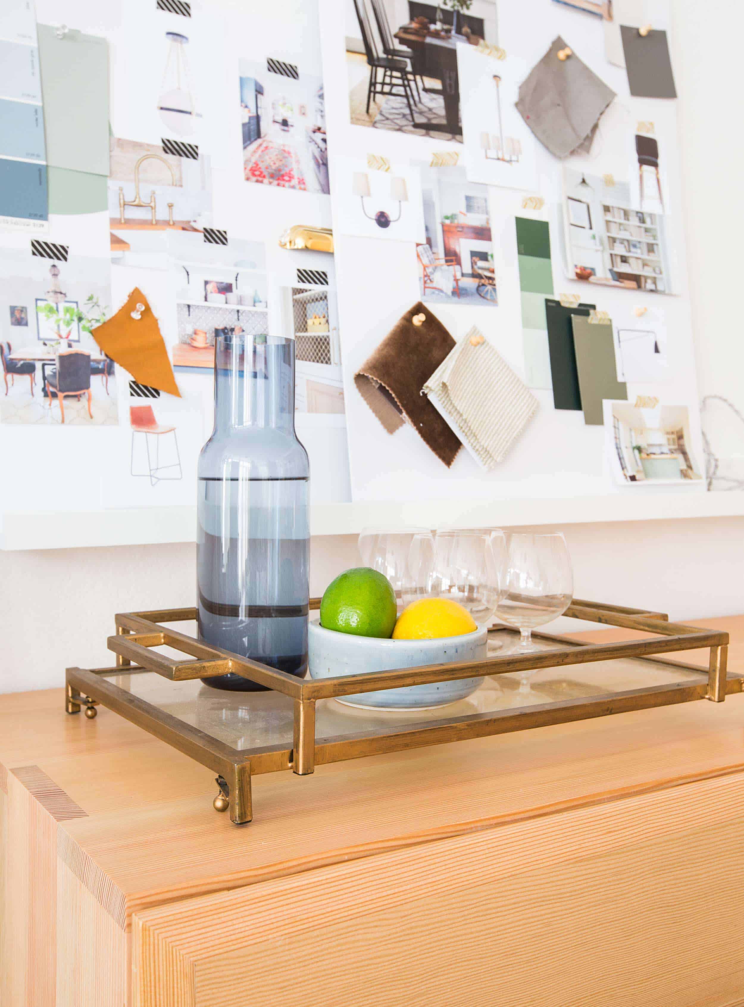

We installed these simple art ledges above them so that we could display some of the mood boards of current projects we are working on, and to free up the top of the pieces to use for laying those mood boards out and brainstorming.

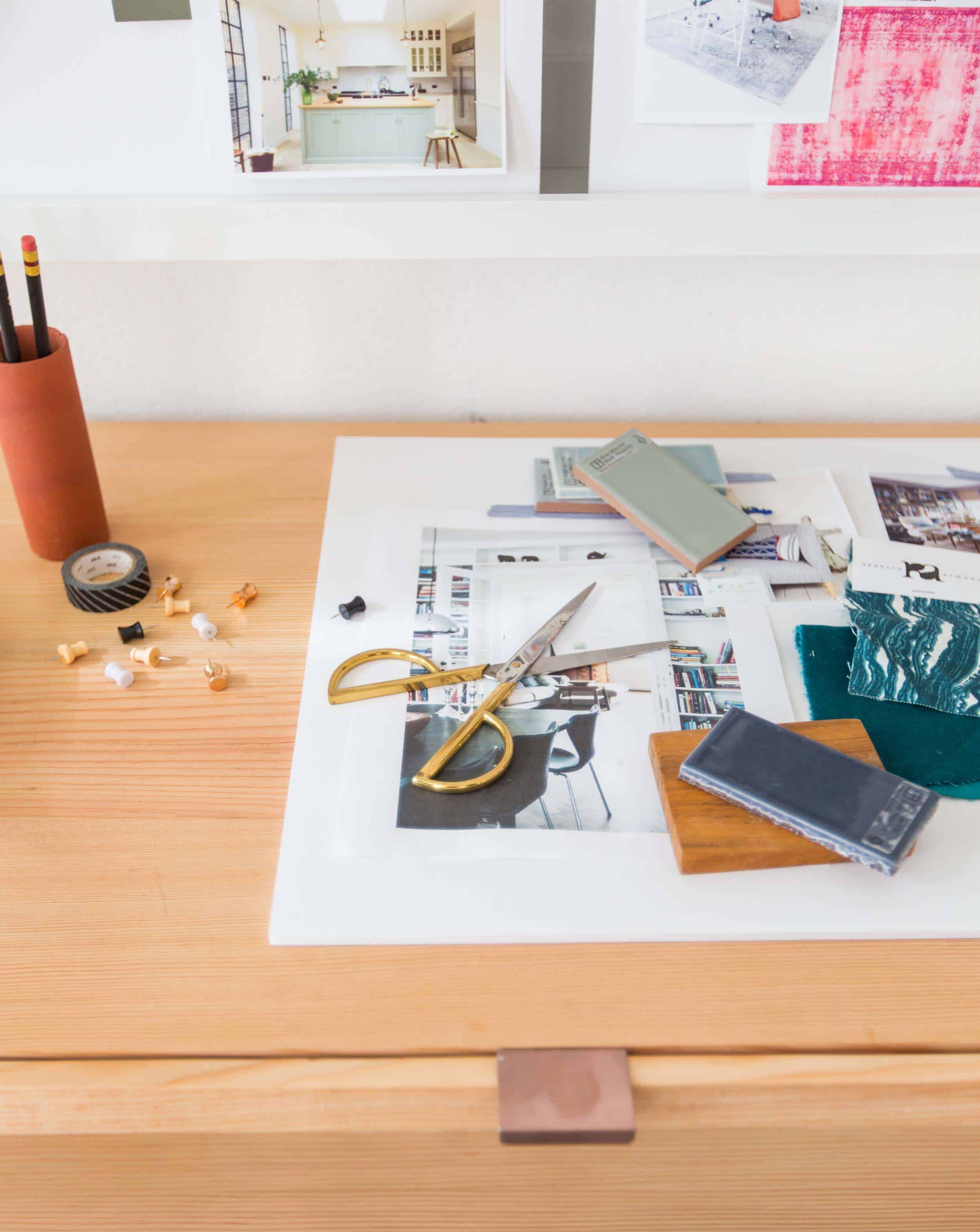
Mood boards – real or propped for shoots, are endlessly satisfying to look at, no? We can work on them on the big tables or on top of the dresser which really helps when we are pulling together design plans for clients.
We had that copper ladder custom made by our welder for $250 and it’s perfect to break up the space between the dressers, create a soft/sculptural piece for your eye, and to hang pretty fabrics and samples on. We installed our old sconces from the other side of the office above the dressers to round off the space and add more lighting in the winter when people are in the office past sundown.

I know that you guys are dying to know about the chairs and table. So there you go, and more on those later in the full office reveal post. But, I will say that finally investing in studio furniture has made us all feel way more proud to be at work and I honestly think we get more done sitting in and at higher end furniture. This table here is more of a conference table, and a place to layout materials – our actual desks are on the other side of the room.

We replaced the lighting with these great pendants and propped out the shelves with all our design books and catalogs – it’s a library of inspiration.

A huge thanks to Wood, Naturally for sponsoring our custom office furniture. We love the clean and modern look of Douglas Fir, and on top of that, it’s affordable and durable. The unit is perfect for housing all our materials and keeping my staff feeling proud of where they work every day.
For a look at how we styled our shelves so that they’re both functional AND pretty to look at, watch this little video:
https://www.youtube.com/watch?v=W3d-o8Selc4&feature=youtu.be
**Thanks to Chaffee at 4th Period Woodshop for designing and building those amazing pieces and being so lovely to work with. Now that I’ve found ‘my furniture dude’ I will be customizing so much more when budget allows. And the large units are modular so if and when we move we can take them with us – which is always nice to know.
And last but not least, here are some quick source references (in case you missed them above): Flor tiles in Frost, Navy, and Flannel Blue, desks/tables, pendants, sconces, cabinets/dressers, copper accessories, white magazine holders, white wire baskets, office supplies.
***Photography by Tessa Neustadt


Absolutely gorgeous! As always, love the styling. I just redid my home office and it’s so true–I feel so much more productive and legit in a pretty and functional space. Can’t wait to see the rest of the office!
so glad you used flor tiles! i’ve been wanting to get those in my basement (i have a dog who occasionally has accidents so could easily clean or replace them!) lovely office space, so professional but still fun/stylish.
What a beautiful work environment, so organized and stylist at the same time!
Outstanding transformation Em and team! It must be so uplifting to come to work and face a space that has gone from fairly uninspiring (though a decent blank slate) to “grown up” and professional. I am sure you are proud of all the changes your work has done for others but this is something you all get to pat yourselves on the back over on a daily basis. Well done.
So beautiful and clean, Emily. I love it. I do wish you were more transparent about cost though, with this post and lots of others. Many of us read, living vicariously through each post, dreaming of a day when we can achieve a similar look. Explaining prices in detail (retail versus what you pay as a designer) keeps you honest and gives us a sense of reality. I would love to see this happen more not just in your posts, but also Brady’s, Ginny’s — your whole team. Many thanks.
Hey Esme, I totally get it and I, too, love knowing the cost of custom work. The shelving unit cost around $7k and the dressers came in at $5k (so $2500 each). Ain’t cheap, but custom, beautiful, perfect work never is. We didn’t put it in the post because frankly it is sticker shock, but since you asked I’m happy to disclose it. Nothing is ever a secret but sometimes the negativity that comes with disclosing expensive purchases inhibits us from just throwing it out there. The wood is affordable, but the labor from a small wood studio does add up (because, again, custom beautiful work is expensive and worth it).
Love your space! Will you be sharing the flor tile colors in the next post?
just kidding, just noticed you linked them at the bottom 🙂 beautiful office, hope you all get to spend some quality time away from it over the holidays!
I have never seen FLOR tiles look so beautiful–almost like a large-scale buffalo check (but way more timeless!).
There are not prices as Emily didn’t have any.. again. seems like so many posts are about you getting free stuff.. do you ever give away..( besides your nanny? ) or facilitate furnishing non profits ? might be a lovely thing to do as you appear to have plenty.
Yes, such a great idea! I love that Kate from Centsational Girl uses her brand connections to furnish transitional housing for victims of domestic violence. Seeing bloggers getting loads of free merch gets old, but occasionally using the free stuff to do good would be so refreshing!
I think it’s nice she’s so up front about the sponsored posts. That’s how this blog makes any money (and she runs a business, not a personal blog), so it’s a necessary evil.
She did donate a lot of her time to the family shelter last year:
The shelter project was wonderful.
I didn’t see that, thanks. It would be hard to miss that Emily has a lot, watching even her new kitchen. ( I love that pendant light, but $1000 would sure feed a lot of folks. I love design, and have worked for years in non profits. They are usually depressing decor. I fell in love w/ Emily long ago when she recycled a lot. I’d be in design myself, but , as maybe apparent, I have moral issues spending so much on things. One in 8 americans don’t know where their next meal is coming from. ( source abc news) It is my problem, I know, but I worry about it , the planet,( all that new wood?) and wish we would all be care-ful . I raised my sons with the question ” do you need this , or want this?’ Both are important, as are the resources we use in a depleting world. If I didn’t think Emily cared I wouldn’t read at all..( and I am so happy to hear you are thinking about nonprofits!) I am now following my son Will’s lead. He makes a lot of money, and when he buys a large ticket… Read more »
Just to offer a counterpoint, there’s likely a lot of work behind the scenes to make these posts happen and anytime Emily puts her name on something, she’s taking a risk. We see the end product but don’t consider all that goes into these pictures or the strings attached to these “free” products. I think commenting on how much you perceive Emily has is unnecessary and a bit mean spirited.
I totally appreciate this conversation, truly. Good design is expensive and those units cost around $12k for all three. We paid for them, full price as we do from any small local, artisan/maker. Now when it comes to bigger brands, yes, we are gifted many items to help offset the cost of producing the shoot/post – meanwhile they get great shots of their product in beautiful environments shot by talented photographers. We also do a lot of pro-bono work, like the shelter and families like my nanny, Sylvia. We have many more in the works for 2017 that I’m very excited about and we know that a huge responsibility (and privelege) of mine is making sure that we are using our influence for the good of our community and the individuals who are in it and are in need. Talking about money is never comfortable – both what we spend, what we get for free or what we charge for posts. But you can rest assured that we buy with good intent and we are only gifted things that we truly love. And while we can’t please everyone we are thinking about all budgets, all styles, all demographics while trying… Read more »
I love your blog. Because of you I learn about design, at no cost to me. I see products I might like, which saves me time. You make your living doing this. I make my living doing something else. I appreciate what you do and how you do it. Years of following your work and other designers has made my home a prettier & more functional place for my family without the cost of hiring a designer. Thank you.
Ok. I’ve always loved plaid, so that floor is SO GOOD.
Also, that table might be the nicest one I’ve ever seen. It’s beautiful!
And of course, the new storage is lovely. Good for you. But I agree, for the regular folks, it’s
probably pricey (?).
Functional is the new Fun!
Loving that new bookcase/storage area SO much! The simple details are really what make it so nice so that it doesn’t just feel like another generic piece of furniture. Well done!
Loving this post so much, and so fun to get a look inside your design process as well as how the studio is coming along. Obsessed with that design library and your new FLOR tiles.
I want to work in a studio as chic as this. I am already depressed as I look around my cubical and it looks nothing like the inspiring space you have created for your studio. Can’t wait to see the other half.
Very nice!
It looks like the concrete floor was uneven at the several seams. Was there any prep work before laying down the carpet tiles? How are the tiles kept in place? Is it necessary to have someone install it or can it be DIY?
We had a carpet guy instal them that had worked with FLOR tiles before. The floor was a bit uneven in some places but there wasn’t any prep work that had to be done to the floor which is why we chose the tiles and they work great for the space. They are all held together with sticky dots in the corners rather than adhered to the floor, so it is definitely something you could easily DIY. xx
🙂 Thanks for that info.
Woah. Your studio is twice the size of my house! (Condo)
Those flor tiles, that custom bookshelf, those pendants, those chairs – I want it all! I love how seamlessly and organically you do your sponsored content. Keep it up.
So lovely! Well done EHD and happy holidays.
gorgeous! what will happen to the home office now that you are moving houses?!
Emily,
The studio looks great! I’m a huge fan of you and your work. I have to say that something I’ve noticed on your blog/instagram/instastory is that your favorite adjective is “pretty”. While I get that you like “pretty” things, maybe you could try a little harder to mix up your descriptions? It gets a little old to hear almost everything described the same way. I’m not trying to be sassy, it’s just something I’ve noticed as of late.
Hiya
Thanks so much for your comment. I found it beautiful and stunning, if not totally breathtaking and cute. As someone who loves handsome pieces and sumptuous shapes, I found your comment to be lovely, really gorgeous and PRETTY much the truth. I’ll do my best to vary the adjectives for you and will be sure to add this to the list of very long things that I need to improve on. xx
Love this! Just a friendly (Christmas wish) reminder, there was a lot of interest in an “how Los can you go” therapy office (or any office with fresh and sitting space)
“How low can you go”
I know!!! we have more in 2017 happening, I promise. the holidays always derail design content. xx
Really beautiful, playful, and professional looking. I love the way the tonal Flor squares read as a plaid rather than a checkerboard. Every element is gorgeous, especially the copper ladder and the scale of the storage pieces. Your eye to detail really paid off.
Thank you xx
Such a great space to work in!
I’ve found that ever since you redesigned your web site the pictures take FOREVER to load. So long in fact that I can read the entire post and the pictures have still not loaded. This is irregardless of what computer/tablet I’m on. Something you might want to look into. The description of the studio improvements certainly sounded lovely tho.
LOVE these shelves!! They look incredible and I love all the simple details! I’ve been reading your blog for a few years now, and was wondering if you ever thought or planned to do a post on you and your response favorite design books? I LOVE reading design books, especially yours – “Styled” and “Domino” and would love to know your favs!
Emily,
Great post. Where’s the gold tray from?? Looks lovely there. I’d love to know!
The tray is from a few years back from Target. It’s good!
Hey Emily!
Gorgeous! Where did you get your mood boards? I picked one up at target today in natural cork/wood and was thinking about spraying white and then I saw your white ones on here! Please let me know, thank you!
As a cabinet makers daughter, I have to say that those pieces are gorgeous!! The detailing is beautiful! And the grain…all the heart eyes. I really appreciate all the detail you put in each post and how you handle feedback. You are for sure a better woman than I. Thanks for always putting out such good inspiration for me!
Agree with Bri– great design and very gracious responses to feedback always. Em and team are consistently professional and generally awesome.
I love how it looks! So cozy and welcoming! I love the floor!
How a/ the big floor basket ? Where is it from? Thanks!
This is the third post of yours that I don’t see any pictures loaded….i’ve refreshed several times and I’m viewing on a regular internet browser on a computer (not a phone/tablet). Has anyone complained of this??
This looks so lovely !!! Emily you are so talented and so good at what you do. Ive been in the design industry for over a decade and find so much inspiration from your blog and your work. For all the negative comments about how much you spend, I think that’s in really bad taste. Its no one else’s business how much you decide to spend on your office – a space that we spend more time in than our own homes. Ive learned over the years that its pretty impossible to please everyone all the time and I hope that you take the negative comments with a pinch of salt. You truly are doing a wonderful job as a designer, a parent and a community member. A very merry Christmas to you, your beautiful family and your talented team ! Hope 2017 brings even more joy and goodness to your life xxx