
My Master Bathroom: The Process + Shop The Look
It’s shocking how long we can live with a disgusting bathroom. It’s like dating someone who is TERRIBLE for you and everyone knows it, but he’s not the kinda guy who will just let you dump him easily, so you keep putting it off and putting it off in hopes that it somehow will get easier and besides, maybe it’s not all that bad. You learn to ignore the horribleness and focus on things like how he lets you control the remote on Tuesday nights. Then when it’s over, when you’ve found a nice, lovely man, you just think, HOW DID I DO THAT FOR SO LONG? Followed up with, HE WAS THE WORST PERSON IN THE WORLD. I did for over a year and a half – the bathroom, not the man. And the main motivation for finally pulling that plug was the fact that I’m a designer and I should have a prettier bathroom. On a day to day basis I was annoyed, but it wasn’t until people came over that I was really embarrassed about the way that my bathroom looked. It’s like putting a mirror to your face and seeing all of those terrible laugh lines, crows feet and flaws up close.
Renovating your bathroom isn’t as easy as switching out a lampshade. It’s very expensive, takes a ton of planning, needs decisions that if made wrong are very costly, and disrupts your home in every way. There is a reason why people don’t buy fixer uppers, they need actual fixing up. The rest of the house was so easy; replace the flooring, skim/repaint the walls, paint some cabinets. GREAT! But the bathrooms needed to be gutted, and that sounded like an annoying task and a boring amount of planning.

The main problems were obvious – everything was filthy, disgusting and dated – besides the shower head. I LOVE that shower head. The layout of this was fine – small, but fine. And unless I eliminated my closet (HA, we all know that wasn’t going to happen) there was no real way to make the bathroom bigger.
The goals were simple – to make it feel new, fresh, happy and modern, but with some quirk and interest that keep it from being too predictable ‘mid-century’ and certainly far from generic. Oh and whatever we did, I had to make sure that it was going to feel as big as possible.
First things first – we needed that show stopping tile.
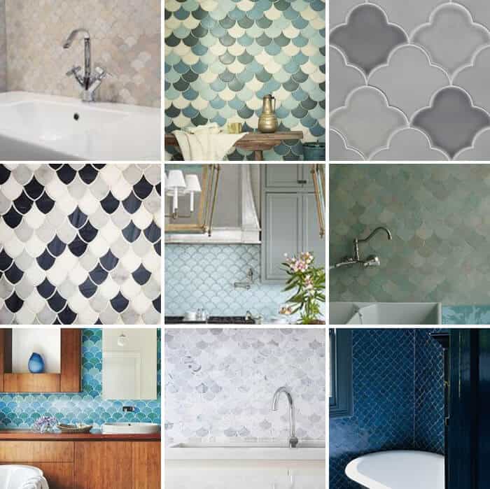
There are 1 million tile options out there. I felt pretty overwhelmed at where to start but I knew that it was going to be the most important thing. I toyed with cement tiles, but ultimately I didn’t think the small room could handle a pattern – it needed to feel as big and clean as possible. A heavy pattern could be totally fine on the floor, but not on the walls. I find that the cement tiles are hard to mix with other tiles – it’s almost like they are so handmade and matte looking that you have to mix it with a solid version of that same tile – which is certainly a good option, or a big stone slab – something super simple. I started looking around at the options, when I found Fireclay and fell in love with their fresh patterns in very simple finishes.

I leaned towards using a their scallop pattern (they call it the ogee drop) as it’s is happy, airy, tonal and classic. You can also mix the tiles up so you have multiple colors. While browsing through the internet I had found a lot of other scallop patterns on the market and they looked either very cheap or they were insanely expensive, so Fireclay’s were the perfect option. They look handmade but have a more classic and clean feel than the other scalloped cement tiles I had seen.
Once we had that locked down we had to figure out square footage, color and design. Basically how much tile, where it was going, what color it was going to be and what was going to go on the floor.
Fireclay, sent out a handful of color samples after we had told them we wanted to stick within the white, grey, and pale blue color palate. They have so many beautiful colors we had a hard time deciding but we played around with some different combinations and we came up with these.

We loved the way that the colors played off of each other and thought that the mix of colors would be a nice combo for the walls. Fireclay’s design team was so easy to work with and offer a great service where they will render up your bathroom (once you provide dimensions) with their tile and the patterns and color you have selected.

Once we saw the colors up in the renderings, we quickly realized that it would be a little chaotic with multiple colors as well as a striped pattern. There was no way I wanted to take my relaxing post pregnancy baths in a fun house, so we decided that less colors and a more organic pattern would be better, and we ended up with this.

This was getting closer to what I wanted for the bathroom, but it wasn’t perfect. So I had Brady throw together these renderings of the bathroom in its entirety so that we could play with the pattern and height the tile would go on the walls as well as give a clear plan to contractor of what we wanted.

After we saw the clean and solid color (even if it was white) in the renderings we realized that simple was best in this case, as we wanted the pattern to shine rather than the variation of colors. Ultimately we decided on the Ogee Drop in the ‘crater lake‘ color. It was the perfect pale blue that had enough color to create an impact but it wasn’t so saturated that it would still allow the light to bounce around the room. Click through here, to shop the look over on Fireclay’s website. We also decided to have the tile go all the way up to the ceiling on the shower wall and then on all the other walls go to 45″ to help with both cost and so that the room was not too tile heavy. Lastly, you may have noticed the glass panel on the shower that is in the renderings. Originally we had thought that we were going to put that glass panel up to prevent water from spilling out while taking a shower, but as the design process went on, we realized that a shower curtain would be best as it would soften all the hard sleek edges and surfaces, but could also be pushed aside when I wanted to get some R&R in that tub.


Now, lets get real and breakdown choosing the major things (including some hard lessons learned):

1. Let’s talk bathtub. The tiling of the bathroom was already $3k in labor + the cost of materials. If we had bought a drop-in tub it would have been more expensive as they would have had to build out the frame, and tile it. Plus drop in tubs are way more expensive and this bathroom was already costing around $20k so adding another 1 – 2k seemed crazy (the tub was gifted, but that doesn’t mean I’m going to choose a $3-5k tub unless it’s necessary). So I chose a cast iron tub because it had a finished apron and I like the way cast iron looks and feels more than acrylic. We would have to build out the left side but that was only a couple hundred dollars, as the two ends of the tub are unfinished, but when the tub arrived I realized it was pretty darn short. I ordered this one because I loved the cast iron and the width. We couldn’t make the tub longer due to code, but it could be wider and this was one of the widest ones out there for the scale – 60″ x 32″. The problem is that it’s shallow, which I thought would be fine, and by the time we got it shipped, unwrapped and in the bathroom it was a bit too late. We needed it to be installed or it would hold everything up (the tub had to be in before anything else could be done around it, including the tile). I wasn’t there that day, but it took 5 guys to lug it up our stairs (as it is SOLID CAST IRON) and they installed it and finished the rough plumbing before I got home.
My reaction was two-fold – ooh, what a pretty tub and then woah, that lady is shallow – perfect for a kids bathroom, but not a soaking tub. In retrospect I wish that I had ordered this one. It would have been more expensive (around $2500 with the additional labor to frame it and tile it) but I think it would have given us the look that I wanted – a deep master bathing tub. But I didn’t care enough, it is a pretty tub, and while I wish it were 4″ taller, it wasn’t worth the extra money for me to rip it out, order a new one, and go weeks with a bathroom that was mid-renovation. Meanwhile its actually a GREAT tub for kids and I’m debating getting it for our other bathroom. It’s shallow and wide so they have room to play, but it’s not too deep so it’s easy to get in there and wash them, play with them and yes, even bathe with them. The ledge is even wide enough to rest shampoos, toys, etc on.
2. We had a few issues with tile and grout. When they first installed the tile everything went as planned.

After they grouted it looked like this:

You can see in the pictures that where the tile met the tub there was a large line of excessive grout where there should be small tiles.The large grout was a problem for many reasons – it looked bad, the pattern stopped abruptly when it should look continuous, and that grout was going to get chipped, dirty and messed up pretty fast being on the line where the tub met the tile. The problem happened because they started the tile pattern on the floor line (I think) when they should have started it on that bathtub line as it was the most prominent and visible. In a perfect world the bottom of the scallop would start right there so that way it really showed off that pretty tile. I told my contractor and they took care of it the next day – scraping out the grout and putting tiny pieces of tile in there that made the pattern continue.
3. Next we had a problem with the floor grout color.

They told me that they have to use different grout for the walls and for the floors (due to usage, foot traffic or something) so when they put the floor tile grout in it was pretty beige and a lot darker than the white grout on the walls. They said it was still drying but after a couple days it was clear that it wasn’t, and was just beige. So they scraped it out and redid it with the brightest white they could find. To me it still looks beige on the edges, which is kinda a bummer, but what am I going to do? Rip out all the floor tile and re-install it? I don’t have that kind of time or general attitude in life. It’s good enough – I wish it were better, but it’s one of those situations where you don’t really know who’s fault it is and everybody just does their best to rectify it the best they can. It looks good, and sometimes good is good enough.
Yes, we made some mistakes. But, we also made some good design decisions, learned a lot in the process and as I use this bathroom I can’t control my excitement at the way that it looks and makes me feel. Now, let’s just hope that the rest of the bathroom remodels go off without a hitch.

1. Blue Scallop Tile | 2. Kohler Purist Faucet | 3. Vanity Top | 4. Drawer Pulls | 5. Kohler Vanity | 6. Wall Mirror | 7. Brass Wall Sconce | 8. Kohler Purist Shower Unit | 9. Vintage Persian Rug | 10. Toilet | 11. White Floor Tile | 12. Bathtub | 13. Shower Curtain | 14. Brass Robe Hooks | 15. Pink Abstract | 16. Gold Vanity Mirror
Here is a sneak peek of the finished product, come back tomorrow for the full reveal as well as a picture of me in the bathtub soaking it all in (just kidding).
*After Photos by Jessica Isaac. All other photos by me.
To see the Master Bathroom from the very start click here and to see how it progressed click through here.
I just found Fire clay last night!
And yes they should of started at the tub. My husband is an installer/owner of a tile business here in the Nashville area. With layouts he finds the focal point. Not trying to put down any other installer but filling in the missing pieces with grout like that is not ok. Glad you had it fixed. I’m mid-renovation and I can’t tell you how good it is to hear that stuff goes wrong no matter who you are. Thank you for sharing that and showing how to have a chill reaction to it:)
Beautiful – and you can always say the bath is intentionally shallow to lessen water usage in a drought prone area 🙂
haha I love that response… good idea!
Do you know what I love about this post? You admit to not loving how everything turned out and you detailed the process of not being 100% happy with an outcome. It is refreshing and reassuring to the rest of us navigating projects. There is always something that doesn’t turn out exactly as planned. I appreciate your honesty. However, I know that the reveal tomorrow is going to be jaw-dropping and beautiful!
Agreed! I just finished a backsplash in my kitchen that did not turn out as I envisioned it. It’s not terrible, but I was kinda bummed with the end result. Lesson learned!
Also agreed! That’s one of my favorite things about Emily’s blog, how honest she is about the process and the disappointments. It gives me a lot of confidence as a novice designer and homeowner and I really appreciate that.
That tile is to die for. The bathroom is cozy and cool and spa-like all at the same time. Beautiful!
Love! I love seeing how you plan to style it out! You are so good at giving your rooms such depth – which is hard to do in a bathroom! Can’t wait for the full reveal! I also agree with the other comments regarding appreciating the recap of the process. So helpful to hear what you asked to be changed and what you accepted. Thanks!!
I love it so much. I’m not sure I’ll be able to check back for the full reveal because of the deep ache of jealousy I know will plague me. I’ve got 2 of those bad-boyfriend-bathrooms, one with a 40+ year old avocado green tub. Someday, someday!
That bathroom turned out gorgeous!
Love the tile design you ended up going with. Perfect color for the bathroom.
Josh | The Kentucky Gent
Your bathroom is turning out fabulously!! I love the tile that you have chosen, the color is so soft but adds such a dramatic and vibrant flair to the room. Also just wanted to let you know that there is a product sold at Home Depot that you can buy that changes the color of your grout. You paint it on with a little brush- I picked the brightest white they had and it took by greige grout to nice and bright white:)
Nice job being so chill about the mis-steps. That is truly the key to a happy life! Also, the hardware is amazing. Saw that mirror at Target the other day and allllllmost bought it, might need to go back for it!
I can’t help but think there’s something really wrong about a professional designer spending that much money on a renovation and not getting exactly what they wanted (and paid for).
My husband and I did our own bathroom gut renovation (to the studs, releveling floor joists, reworking plumbing, etc.) and while it took us 6 months, it only cost us $3500 and every single last detail is precisely how I wanted it to be.
I’d be sick to my stomach had we hired the job out for a TON of money and it wasn’t perfect.
But, in order not to be a total Debbie Downer, I do think your bathroom looks beautiful!
I agree with your first line. But I think the real reason is because Emily is too engaged in her works she has no time to properly and personally monitor her own reno. 🙂
Emily,
I LOVE it and I can’t wait to see the full reveal tomorrow! I’ve been waiting for you to reveal this!!
We are planning on the same Kohler gold fixtures in our guest bathroom which will be black/white/wood/gold. Would it be taboo to use the same gold fixtures in our master bathroom with grey/white/gold and a different tile? Are you supposed to use different fixtures in each bathroom?
That tile is so gorgeous! You did an amazing job!
Paige
That tile is gorgeous. I so prefer bathrooms with 2, maybe 3 at most, coordinating tiles, and only one needs to be the showstopper. I’ve seen so many bathrooms these days with way too many different types of tile in them competing for attention. Even if they are coordinated well, they still look too busy to me. I can’t wait to see the entire bathroom.
Awesome job! and I love everything about it, great taste. The tiles are superb!!!
LOVE IT!! The tiles are superb! You sure did a great job overall.
Hey Emily! LOVE the Fireclay tiles, they look absolutely fabulous 🙂 Just thought I would pass along some Sketchup advice I have learned in the trade from one design professional to another. Sketchup has the fantastic capability to make renderings look hand drawn, but there are also a variety of ways to spruce up drawings by changing the default settings. To make renderings look cleaner, our firm uses a few techniques: – Use the Drawing Template called “Architectural Design – Feet and Inches” (Window > Preferences > Template) – Use the Style called “Shaded with Textures” (Window > Styles) and change the edge color to a gray tone under the “Edit” tab (click on the little black box next to the “Color” heading) – In the Shadow Settings (Window > Shadows) check “Use sun for shading” and Turn up the “Dark” setting to somewhere between 60-70 These changes help make the drawings look brighter and a little more refined. That being said, “loose” and more “hand drawn” styles help the drawing look more conceptual and less set in stone. I’d say there is merit to both 🙂 Either way, I am very excited to see the final photos and congrats… Read more »
Thanks for the SketchUp tips!
Other than a few unnecessary “that”s and “had”s it was a very informative post. I think the bathroom turned out lovely.
It looks like you! Cheerful and a little retro/chic in a whimsical way. I really like it but your contractors should not be grouting along the bathtub or the floor or the sink or the ceiling or anywhere along the perimeter. It needs an expansion gap just like hardwood flooring so they should have used caulk instead of grout so that it moves and isn’t rigid like grout. You could get tile cracking without the caulk there. I hate being a downer but I’ve been through all this, unfortunately.
Exactly right. These tilers don’t sound that good. You can definitely use the same grout for walls and floors if you go high quality unsanded… done it many times. On the other hand, it’s impossible to get out grout completely, so if you replace it with lighter grout you’ll be left with a line of dark along the edge.
I can’t tell for sure, but looking at that image of the vanity, it looks like the tiler aligned with the vanity. If you look straight on at the vanity upon entering the bathroom, that decision would make sense. Unfortunately, carrying that same line around to the tub didn’t quite work.
The end result is beautiful however, and I don’t think the small bits above the tub really matter.
What a stunningly beautiful bathroom! Thanks for sharing.
I can’t tell you enough how much I love your work! I am ALWAYS so excited when I see you have posted something. I look forward to reading your blog, and seeing your beautiful design work. Thanks for sharing this beautiful room with us!
Oh I hear you on the bathtub regret! I bought the same one for my master bath reno last Spring and man I wish I had bought a deeper one. I replaced a wonderful old cast iron tub with the Bellwether. I was at a point of “let’s just get it done”, wanted cast iron but was trying to avoid the cost and drama of the drop in tub (looking for slabs etc.) Silly me. I kept mine for all the reasons you did – live and learn. Next time I will remember how important the depth is when it comes to soaking away the end of a long day.
LOVE your tile … beautiful color!