
My House
Mountain House Monday: The Last-Minute Changes I Want to Make But Won’t (or Maybe I Will)
To make a fashion analogy, when we shoot my house, it’s typically dressed more to host an Oscar viewing party, but when being shot and featured in a professional interior design magazine, read by professional interior designers and brands (and seen for the FIRST time), it feels like it’s being photographed on the red carpet then presenting Best Picture of ALL TIME. The once-thrown-together outfit for friends now becomes a real “look” that I get to amp up. It’s not bad stress, it’s kinda the best stress ever. I really want it to represent my style and show what myself and the EHD team can do.
So with nine days until the shoot, there are some things that I’m like, “ooh, would it make more sense/be more impactful if it were [insert musings here].” Most of these were decisions that were made quickly near the end of the renovation and some were even placeholders that we never switched out. None of them truly drive me nuts or I would have changed them, and thank god I have SO few regrets with this house. But here are the things that I’m considering at the 11th hour…
First up, the closet door hardware.

Near the end of the renovation, we chose these knobs because they match the rest of our interior doorknobs, which I LOVE, but once they were installed, my team and I had the same reaction: They should be long and linear not round and small. I suppose it’s because of the vertical nature of the wood that just wants a long handle, versus a knob. Plus, those closet doors (from Ross Allen) are SO pretty, so I don’t want to miss an opportunity to show them off.

But they are so nice!!
A month ago, I told Julie that we should replace them, then two weeks ago (when I was super tired and feeling overwhelmed), I changed my mind with a “no, it’s good enough. It’s fine!”
Then last week, as we were doing another walkthrough, predicting the shots and angles we were going to shoot, we realized once again that if the closets were to be shot (and they will for the blog regardless) then it’s just such an easy fix. Sure, we are going to have to patch some holes, but the wood is busy enough and wood filler will blend in. We have these in two of the bedrooms.
So we are switching them out for these.
A far bigger dilemma is the dining chairs and light.
As a reminder, we originally were going to have the table oriented in the middle of the room, so we had two junction boxes installed with those beautiful matching pendants (custom from The Urban Electric Co.).

Then we realized that my dreams of having a massive banquette could come true, so we oriented the table this way to see if it would work, but at that point, the second pendant closest to the kitchen was no longer necessary.


We took the second light down and capped it. Here’s where we are now with just the one fixture over a pretty massive (top secret) table (House Beautiful, like all magazines, wants us to keep a few spaces secret so that when its shot professionally its the first time you’ll see it!):

While it’s still gorgeous, it feels small for the space now, and as Julie said, it looks like it’s missing its friend. This type of light usually is hung in multiples in order to have the impact that it should have.
The kitchen has a linear piece so I feel like a linear chandelier could also work here to fill the overhead space. Here are some we’re considering, although many are over our budget and have a crazy lead time (but fun to show you what i’m thinking):

1. Balance Chandelier | 2. Astro Mobile Light No. 2 | 3. 3 Arc Island | 4. Lodge Chandelier Three | 5. Black Sputnick Light | 6. Chiltern Double | 7. Sculptural Pendant | 8. Lucca Chandelier Iron | 9. Industrial Chandelier
Will I change it out? I don’t THINK so. I actually just found a few more on Lulu and Georgia and a couple vintage ones from MidCenturyLA that are affordable (and available in LA). But as I write this (at the mountain house, sitting at the banquette) I look up and see the fixture and it’s truly so pretty (the underside of the disk is brass, by the way) that it seems just silly to replace it just because something might be a better scale.
Additionally, the banquette is built and the cushions are being made as we speak but I kinda forgot about the three chairs that will be in front. I have some vintage wood chairs that are cute and it wasn’t until like two weeks ago that I thought maybe we should actually consider what the right chair would be. I love a mixed chair situation but is this the right house for that? When I brought it up to Brian, he said “oh, I thought those were placeholders.” HA.
So now I’m on the hunt for chairs that are “right” stylistically, but also good for kids, work with the new bench fabric design and frankly can get to us in time. Here are some I’m strongly considering (one of which we landed on):

1. George Armchair | 2. Sammie Stacking Chairs (Set of 4) | 3. Tilt Side Chair | 4. Bok Chair | 5. Tanner Dining Chair | 6. Nestor Chair
The table is so pretty that I don’t want them to be too visually heavy and block it, but at the same time, they need to be fairly wide to fill the space properly. I don’t want them to be stylistically “loud,” rather minimal (but not cold). They also need to be comfortable. It’s hard, guys.
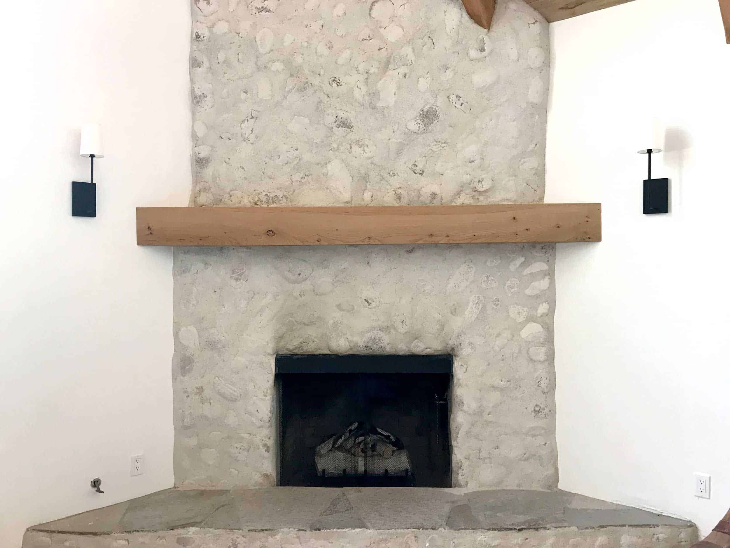
Okay, let’s move onto the schmear on the fireplace…

I’m around 80% in love with the schmear, and to get me to 100, I’d love one more layer of plaster. Just a tiny bit more schmear. Maybe it’s that I know what was under there, but I just want the bubble rocks to be smoothed out just a bit more. Julie, Emily B. and Brian do not agree and with nine days left to go, I think I’m losing this battle. I also don’t care THAT much but I’d love for you guys to weigh in.
Should we all chant together “ONE MORE SCHMEAR, ONE MORE SCHMEAR?” Or no?
Onto some (more) lighting choices:
Let’s start in the living room:
These sconces are so good for the price ($118 from Shades of Light) and we chose them later in the renovation to pass inspections, but we all really like them.

Lately, I’ve had this thought that they could be more special, but I also know that not everything has to be a “moment.” As of now, I’m leaving them because the living room will have enough visual interest and perhaps these don’t need to scream STYLE at you. The black squared off lines are kinda perfect and the fabric shade provides the light that we want (more ambient, not directional). One thing we could do is switch out the shades for black ones…should we?
Next up are the master bedroom sconces:

There are two awesome sconces above the nightstands, so we chose these as a placeholder for the other two in the room. I’m so sorry to say we don’t remember where we got them, but these are similar and so affordable.
But we always had the intention of putting in an articulating statement reading light, we just had decision exhaustion so to pass inspections we put in these.
These are the sconces we are considering (the lantern style ones were to go by the patio door, not in this corner):

1. Perry Sconce | 2. Houe | 3. Peel | 4. Leighton Adjustable Sconce | 5. Scoop | 6. Tully Sconce | 7. Hillgate Pocket | 8. Bayberry Wall Sconce | 9. Arlo Light
I think this is important to really make that fireplace wall the moment it deserves. I’m not sure if that is the chair that will live there, but I think something with a black arm coming out will be the best choice.
This stuff is the good stress. It’s not renovation. Not permanent tile choices. I can honestly say that I love this house so much regardless, even if I didn’t change a thing, but as a designer and stylist its fun to care about the details and talk about the creative process.
Head to stories today where I’ll show you more and YOU GUYS COME BACK NEXT MONDAY FOR A BATHROOM REVEAL!!!!! We finally found out what rooms the magazine will likely not run, so we can start revealing those. YAYAYAYAYAYAYY!!!


I think your fireplace is perfect as is – no more schmear!
It’s all beautiful – can’t wait to see the finished banquette. I have one in my kitchen and i LOVE it every day!!!
I agreee… no more schmear!
No more
No more schmear! No more schmear!
It really looks great as is. Just enough rocky character peeking through.
Can the dining room have a bench or is that too redundant/missed opportunity for a good chair?
The only change I’d make is closet doorknobs. Everything else would stay! Can’t wait for reveals!
I feel you on the light in the dining room, could be better more to scale, but don’t want to clutter that view out the windows either and the banquet may be busy enough you don’t want more visual space taken (tough one for sure). Sconces seem great in living room, MAYBE diff. shades but not essential by any stretch. Good call on closet door handles. Leave the schmear be, it looks lovely and another coat is just playing w/ fire at this point. Reg. bedroom light – I’m not a fan of the cord hanging down wall sconce unless next to a bed, but the wired ones chosen seem like an insane price for one wall light. I like #8 for wired, 1 and 6 for not wired options. So excited to see the reveal!!!!!! You all have done an amazing job.
No more schmear, the fireplace is fine! I would look at doing something different with the hearth, but maybe it’s the angle of those photos that makes it look unfinished to me. Is it flagstone or something? I like the reading light options a lot and completely see your point on the closet door hardware as well.
To be honest, I don’t love the schmear and I don’t think adding more is going to help your cause. If you like seeing the stones underneath then leave the fireplace as it is. Otherwise there will be too much schmear and not enough stone. If it is the stones that are bothering you (which if I remember correctly I think you disliked them from the beginning) then maybe plaster over them completely? And have a skilled plaster person come in and do a texture and color you like that is still within your rustic but refined concept.
I agree they should just plaster over it completely so it’s smooth. As it is now the rocks look like blackheads or pimples in the “skin” of the plaster lol.
I completely agree. I suspect that you’re never going to love the wall as it is or with another layer. Leave it until you can do something entirely new.
Yep agree I don’t think the wall ever turned out how you wanted, plaster finish over it all is what I’d do at this point
This fireplace needs its own TV show.
You never liked it. You still don’t like it. We already know you’re going to change it. So just do it.
Just weighing in to say I love the schmear as is!
you got this emily. can’t wait to see the finished pics!
(enough with the schmear already ;).
xo
No more schmear! The fireplace looks lovely!!
Dining room light is lovely – leave it. Switch out shades only by fireplace – white blends into wall in photos. Leave fireplace as is….I think it’s perfect. I could go either way on the closet doors – the knobs you have are so nice but it does want a longer look. Definitely switch out the lights by the fireplace – they are cute but small for that space. I love 9 but not for that price! 1 or 4 are just as nice! So excited to see it!
☝️ what they said!
#9 is our Arlo Light ands it only $805! The price is listed incorrectly here. Thanks for the love!
So fun! I’d say no schmear. It feels more rustic as is. I also like the sconces but would make the shades black. The others are gorgeous but again, maybe too urban? I know she’s a movie star now, but let’s not forget her roots. Yes to the door handle change, although the round ones are pretty awesome so glad they are everywhere else. Thanks for sharing. Looking forward to the HB article.
Yes to new closet handles
Yes to a more linear pendant.
Industry West chairs are the best
NO, no, no more schmear
No to black shades on the sconces
Yes to new lighting in the bedroom
I completely agree with Anna – except I would add the black shades on the living room sconces.
Looking good Emily!
*slow clap* Anna! Anna! (She nailed it all)
I think Anna said everything I wanted to say! The DR pendant is lovely, but it doesn’t feel like it’s elevating the design at all. There’s so much visual space above the table; I think it’s asking for a “moment.”
That fireplace has already come a looooong way! You add more, you take a risk. LEAVE IT. Yes to new dining chairs. The Industry West look beautiful. NO to black lampshades. Had one, looked good, VERY LITTLE LIGHT! You’ve got to have some function with that form! Leave the living room sconces. All the others choices look good, a few could maybe look better, but they still look damn good! And once everything is styled, they’ll look even better. Can’t wait for the reveals! The kitchen is STUNNING!
What Anna said
ha. ANNA FIW. 🙂
I second the vote for loving the schmear as is!
1. No more schmear…I think it looks great!
2. Good choice to switch doorknobs to something longer
3. I think the chandelier over dining room should change. She is right it looks like it is missing a friend! I like all of those other options
4. I also think the scones on either side of fireplace seem too small….they don’t need to be elaborate but something bigger??
Also, the sconces at that height are interfering with the mantle. Maybe something longer or move the sconces higher? There’s a lot of tension here.
All great tweaks, and that’s the perfect schmear! I do wonder if you could add a tiny bit to the vertical edges, perhaps creating a straight line with painters tape? It bothers me just the slightest that those lines are not precise and little shadows are created where the shmear returns “back” to the drywall. Maybe I’m crazy, but for photos it might be worth considering 🙂 Also wondering if you have plans for the hearth or if it’s staying as is? Might look more “finished” with a darker (slate? black?) piece of stone installed on top. Can’t wait for reveals!
Agree! I don’t think more plaster is needed all over, but I’d love to see the edges a bit more even.
What??! The uneven edges are gorgeous… best part of the fireplace!
YES! The crooked edge would drive me batty(er)!
It’s beautiful! I don’t think you need to add more schmear. To me it looks great. I also think the white shades look good on the sconces next to the fire place. Excited to see more reveals. Good choice on the closet door pulls.
No more schmear. It will end up looking like a wall of concrete with no rocks at all. Best of luck with the shoot!
Hi, also the Arlo light is $805, I got a nice surprise when I pressed the link.
To me re: schmear I think the issue is the bottom half below the mantel looks better like it was given more attention, (and schmear) and got filled in more (which I like) where as the top half over the mantel, it looks like there is more valley and dips around the bubble stone, so it makes the bubble stone stand out more.
Hence my vote is a second finishing for the schmear.
Hard to commit to dining chairs till we see more top secret:) and at the same time those Mater chairs are pretty special if you want store bought.
Thanks for sharing
I have to say, enough with the schmear!! Once it’s styled out, I think you’ll fall in love…looking at the blank area, it’s definitely missing something, but the something is stuff, not schmear.
OMG I’m getting super excited to see the big reveal on the mountain house.
I think you should replace the dining room light! That one is so pretty, but tips like the best scale light for a room/table is one of those tips everyone can use, even those of us who aren’t able to afford the fanciest fixtures. Teach usssss! But please leave the fireplace.
Agree with this 100%! Switch out that light, enough with the schmear 🙂
I’m sad you’re not keeping the Paul McCobb chairs in the dining area! They are a nice mid century addition to the more rustic wood around the banquet. Although I guess the middle one looks like Nakashima for Knoll. But I know where you can get more McCobb if you ever want it!
And I am sorry but I think we are going to start the opposite chant.. no more schmear is needed! I think the fireplace looks perfect. I would be afraid with even one more coat that you would lose the rock all together and just have a schmeary concrete looking surface.
Oh my gosh I can’t wait to see the full after pictures of this house! It’s so amazing! For what it’s worth, I’m really pulling for one of the assymetrical light fixtures for over the dining table. I’m just dying to see #2 or #7!! Also an arm lamp over the chair in the bedroom. Also some black chairs in the dining room. The ones you have there now are so good but the wood gets lost to me. Love the #2 lulu and georgia ones! Personally I think the fireplace is fine and I like the shaded pendants. But I feel STRONGLY about the dining light hahaha! It just feels too small since there’s a lot of clear glass and it’s such a special banquette situation, I think something wider would give even more “wow”. Whatever you do, it will look stunning though!
No more schemes, yes to black shades on the fireplace sconces, and also I really want to see what the chairs in your LA dining room would look like here-I think those sculptural arms would be so pretty at the mountain house!
I think it’s the gray in the schmear…make it more cream like a vintage stucco kind of look. I think you need a wider light for the dining table. And the sconces are too traditional…black shades would look rad!
Because it is a Mountain House, I believe some of your choices are spot on and others may need a new choice:
Handles on closets doors: keep- great choice.
Smear on fireplace great: no more smear- any more and it looks like you wanted to drywall it.
Fireplace scones could have been a little bigger: same scones but maybe a size or two bigger- the fireplace swallows them up-(scale looks off in picture)
Dinning Room chandelier: perfect- Great choice.
Scones in bedroom above nightstands: same ones maybe slightly bigger or the #5-scoop.
Good luck and congratulations on the House Beautiful article!!?
I’m loving the ‘scones’ typo here. Who would not be on board with bigger scones! And what fireplace would they not improve?
Go for blueberry, Emily!
Love all of this! I definitely think all of the questions you have, except for the fireplace, should be done. The doors are beautiful, but the knobs bring attention to themselves because they do not fit the style of the door. For the light over the table, the light is beautiful, but looks best as a pair over a table, an island or even down a hallway. Go bigger and more open on this one. For the chairs, you have lots of wood everywhere! Go with something metal or painted versus being a natural wood. The sconces by the fireplace are pretty, but they just don’t go with the schmear. You have very modern versus more rustic. Usually you can marry the two, but I don’t think this is a happy marriage. Your other options would work better. Rejuvenation has a pearl sconce that would be perfect! You could do a combination of black and brass if available. Either way, I’m excited to see this design. Your style is always a homerun in the end!
These are all great points!! Thank you so much Xx
I’m going to play the devil’s advocate. I’d like to see another layer of schmear!
I vote for a linear chandelier over dining table.
Agree on the closet door handles.
Disclaimer: I am not a designer.
Here’s my feedback: dining chair #2 because they are beautiful objects, light but with some visual oomph. The light fixture is nice; I would keep it if it was me. I think it looks better than any of the linear fixtures, and the space doesn’t appear to be linear, but round. Sconces at fireplace I would leave alone because even though the shades kinda blend into the wall during the day, the black structure is still nice to look at. But then again, for a shoot… maybe black looks best. But for RL, I would go with the white ones to get more light at night. The schmear, I am indifferent about. I think it’s fine. And the bedroom sconce, I would pick the PB #6 or #8. They are both simple, elegant, sculptural, and make the corner look like a cozy reading spot. How exciting, to be in House Beautiful!
No more schmear!
About the dining room light— remember when you wrote a post about your lights being too big? I think this one is PERFECT! Seriously, it’s incredible. DO NOT TOUCH.
Oooh yes I remember. ha, thank you 🙂
Love this discussion! I always find it fascinating how designing the same residential space for different purposes (living at home, photography, vacation space, etc.) creates a unique set of challenges. Another layer of schmear isn’t going to change the geometry of those rocks, it will just make everything feel more flat, so I say leave it OR add a layer that gives the whole thing more texture or variation in color. Do the black shades (the white blows out in photographs). I see what you’re saying about the light…it’s beautiful ad I’d love it in my home but it also feels like a missed opportunity. Both Workstead lights feel more unexpected and are a play on linear fixtures that doesn’t feel like something I’ve seen in magazines over and over again. Love the Barnaby Lane chairs because they use texture to create interest without competing with the other sculptural elements like the table and potentially the light. Also love the #4 Industry West chairs but if your table top is so special and you’re trying to draw attention to it, it seems like a curved back at approximately the same height might compete. Love the #1 Katy Skelton fixture for… Read more »
Team no-mo’-schmear. But have you considered sealing it. Not like a wet look or shiny type. More like a matte finish that would darken it up a bit and possibly highlight the stone a bit more? Agree on the doors. Also, think another light fixture would be best! Love following along!!!
I hate to be the devil’s advocate, but I love the idea of one more layer of schmear.
No more schmear! Looks great at the moment. I really love these mountain house Monday posts – so fun to see how house coming to life!
I think another layer of Shmear in a lighter color, closer to white, would add depth and interest. As it stands, (at least in photos) the color feels flat and washed out, perhaps even unfinished. Such a pretty focal point, I think it deserves the attention to get it just right.
If you put more schmear you’ll lose that lovely black fire patina just above the firebox! I love that part. Also chair #6 is my favorite, but as a person with a big butt and thunder thighs those little front leg nubbins sticking up into the seat look like pure torture!
please remove my last name from that last comment…
I think the fireplace is great how it is and once you style the mantel/hearth you probably won’t even notice it anymore! l LOVE the lighting you have in the house. As for reading light love the first Kate Skeleton or the Pottery arm light – very different from each other but cost often is a factor (at least for me). Longer handles would be gorgeous on those stunning doors!!!!
Change the handles, leave the dining room light, it looks great. I’m sorry to say that I hate the fireplace though. It looks half assed to me, not one thing nor the other. The lamps look too small next to it too.
Is it me or is the mantel not level. Maybe it is just the angle of the picture?!
I thought that too.
Emily, I LOVE the light above the table. I wouldn’t change it, but if you do, then can you send it to me? 🙂 I would go with only 2 chairs at the table, 3 seems crowded. Chair option #1 seems to fit your style best, and the padded leather seat looks comfy. The fireplace looks good as is, but you will be the one looking at it every day, so I would add another schmear if you really want to! I think it would be a softer look and blend well with your modern style with another schmear. I actually really like the sconces on either side of the fireplace. It would depend on how you dress the rest of the room whether you need that impact from black shades, but I would keep as is. Maybe buy the black shades to try out once the room is done? In the master bedroom, I agree that you’ll want more of a reading light sconce. I like #4 and #6 best for the price and style. Closet doors, I agree change them out. They need to be long linear black hardware like your kitchen cabinets. I think you do amazing… Read more »
The fireplace looks great as is! Also, will we get the reveal of the rooms that will be in the magazine after the magazine runs them? Thx!
Before I read your words, I was thinking to myself “I wish there were a little less schmear.” Based on that, I am 100% against any more schmearing. It’s schmifficent and schmeffective as is (sufficient and effective).
I say no to the addition of more shmear on the fireplace. It looks fabulous the way it is. Why do more, more, more?
No More Schmear but YES to changing out the sconces next to the fireplace. They blend in too much, just look basic in not the best way
I wish the shmear was a white color, right now it looks too cement-y.
Yes this too!
No more schmear on the fireplace but I do think you need some sort of “cap” for the hearth!
Step away from the schmear.
And I can tell this is going to be a ridiculous reveal. Can’t wait! P.S. I’m so happy you love your new vacation home so much!
Ha! thank you so much 🙂
I want to preface this by saying that I’m a total EH fangirl through and through, and so I say this from a place of love:
Emily, step away from the fireplace.
I love the fireplace as it is.
no more schmear. It’ll start looking like there is no rock in there.
The fireplace sconces look a little small to me.
I can’t wait to see how you pull off the built in seating and dining room table. We’re planning a similar treatment and I love your style.
On the closet doors: is there a longer oblong black plate that could be swapped in…what’s the word? Escutcheon??