Hi, folks! Velinda here again.
You guys were so welcoming of me and supportive of my first blog post (remember the master bedroom closet design?) a couple weeks ago (thank you!). Today, I’m back with an I Design, You Decide for the master bedroom fireplace and…I may just be risking all those good graces and possibly enduring some name-calling, which could be deserved (keep reading). Option 2—my favorite—is a bit different and I’m pretty sure you’ll either love it or hate it. If you love it, can you help me and Emily convince Brian it’s a risk worth taking? Or maybe it’s a terrible prospect, I have my own doubts. So luckily, you get to decide. I love I Design, You Decide projects because, ultimately, we can just blame you. Cool? Here we go…
Remember, this wasn’t originally a master bedroom, but an upstairs living area that looked like this:
And here’s the current plan for the space:
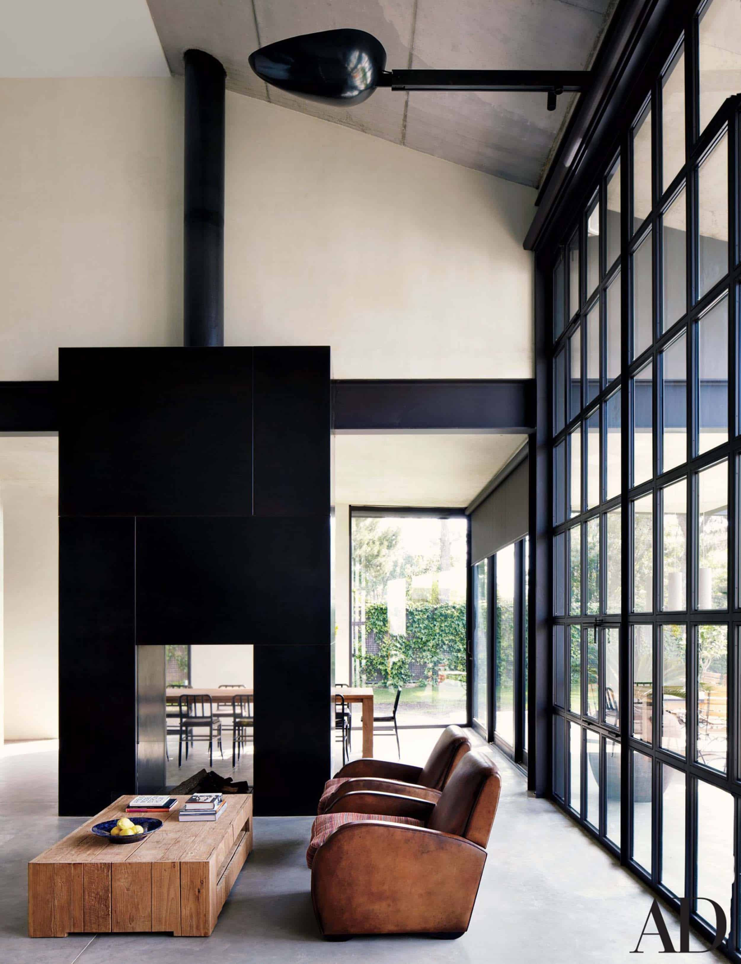
The fireplace we are using is the Montigo R324STIO. It’s a see-through fireplace, so there’s both an interior and exterior side. Here’s the inside as of now:
Now, don’t tell Emily I told you this, but fireplaces have become the Achilles heel of the EHD design team. Between the Mountain Fixer and Portland Project, we easily have 365 concept drawings to donate, should any of you be making a daily calendar for a fireplace fanatic friend (what a gift!). One thing we’ve learned after so many “try this/try that”s is that we prefer them simple.
For this room, given that we plan to have a cozy chair in the adjacent corner, we deemed a bench unnecessary which really keeps things sleek. Plus, we didn’t want to crowd the floorspace around the bed. So for the first option, we found inspiration from these clean, not-overly-fussy fireplaces:


Now, most of those shown above (except for one) have that shelf we mentioned we were skipping, so here’s what this concept looks like in our master:
Not award-winningly original, but certainly pretty. Our only concern here is that the slanted line (due to the slope of the ceiling) might feel odd. I think it’s fine, though. You? Drawing the eye all the way up to that gorgeous wood cladding/sky view seemed like a good thing. Plus, vertical lines add drama, especially at that height, which helps keep it from being too bland.
Brian loves the light color. He’s a fan of having this fireplace “disappear” and feels it doesn’t need “a moment.” He makes valid points. It’s definitely the less risky option and in a handmade, stacked tile would be lovely. But you’ll notice white isn’t one of your choices. Stay tuned for why…the third act gets truly heated (get it?)!
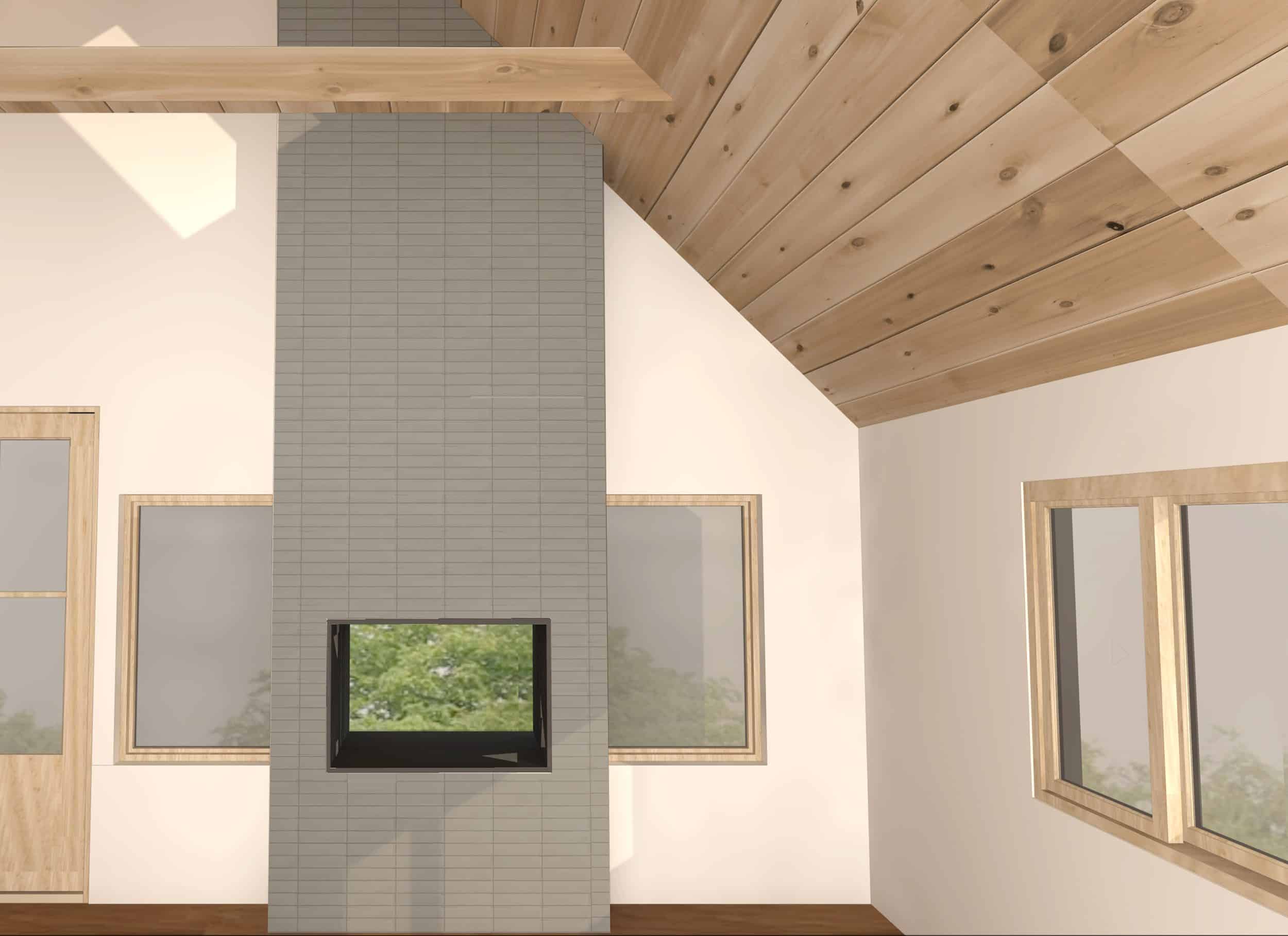
Okay, moving on to the more “daring” Option 2, which I conjured immediately after completing the closet design. Feeding off of the same, slightly more Nordic-industrial feel, it isn’t like any fireplace I’d seen Emily jump up and down over before (a real fireplace-fanatic, that one). But my thought was that this is a Scandi-modern-cozy-refined-something-something mountain house! Where else can we play with something so stylized and different? BRIAN!? Let us plaaaayyy!
Can I just tell you how terrifying it is to be six months out of design school and pushing Emily, the seasoned designer, to take approaches she could end up HATING…or ending a marriage over (Team Paint/Reclad the Ceiling – over here). 86% chance my name appears on Emily and Brian’s future divorce papers with 79% chance I’m jobless after this project. This fireplace is worth the risk.
But here’s the idea:


And here’s what this idea could look like in our space:
Steering away somewhat from the iron seen in many of the inspiration images, this concept would be a bit less cold thanks to a softer, charcoal brick/tile. But the top, flue and firebox opening would be steel to echo the framing of the closet windows. See, it just fits! Or you hate it! I’m sure you’ll let me know. We should probably practice our “I vs You” statements so this doesn’t get ugly (I’m married to a therapist-in-training, so getting pretty good!)
So, we had your two options! Ready for the big twist?
I hope the appropriate Superzoom sound effects are playing in your head right now.
That. Gasline…sh#@$!
Because we didn’t recess the firebox completely, the gas supply was exposed instead of hidden inside walls. We didn’t recess it originally because we thought a flush mount might feel too modern for the space, plus we didn’t want the box jutting further onto the limited space of the deck on the opposite side. And thanks to the timing of a vital inspection, we had to make the decision of where to place the firebox before ever having a design. Now, to hide the line, additional framing would be required in an already narrow space, which means really crowding the windows and feeling cramped.
Our immediate solution was to give in to the idea of a flush fireplace – so the gas-line would be hidden in the wall. But redoing the work would have cost thousands in labor and would mean occupying our crew with a redo when there are SO MANY other projects still to be done.
Then these inspirations came along:


What if we just embraced the close proximity of the fireplace to the windows by widening the design to go all the way to them? Then, by carrying the same design inside and out, the design could behave like the single unit it is. The added depth of this now larger unit could help balance things out. Here are our concerns (and why we lost white as an option):
- These inspiration images have floor-to-ceiling windows. Our windows wouldn’t reveal as much of the design on the other side. Will it still feel balanced?
- We aren’t using window trim inside, so no problem butting up to the window’s line. But outside, it would mean no trim or partial trim or something we have yet to figure out…it could be awkward in context to the rest of the house. (Since the exterior is all one color, would that detail just disappear?)
- If we went with white inside, it would mean white outside, which would be a pretty jarring contrast to the exterior’s monochromatic, dark paint.
So, we lost white as an option. We’d still keep a lighter hue, just something that might work a bit better both inside and out. For now, we have made the renderings a bit more of a greenish-gray, but the specific tile is TBD.
Emily, happy enough with this solution and the idea that she wouldn’t have to bleed more money to reinstall proclaimed at one point “I guess we kill the second option and just do this.”
Nooooooo…Grace, Julie and I (all Option 2 enthusiasts) started grieving the loss. And the death of an I Design, You Decide. We burst into tears, called our moms/pastors/therapists.
But WAIT…what’s wrong with the gas line showing in Option 2? It already has an exposed flue. It’s already a bit industrial. And it’d just be a small, black tube that would mostly disappear into dark tile anyway. Screw the extra framing, let’s leave it. (This is where I expect to lose your good graces… too ugly?) Ultimately, Emily was down and Brian agreed to leave it up to you guys, so Option 2 LIVES (and now looks like this):
And now it’s up to you…SO VOTE! I honestly can’t wait to see if you’re excited to see something different or if you think Option 2 is ugly-trash-nonsense. Do you prefer to play it safe? Recall, this is only my second post, so I’m going to ask you to remember those ‘”I vs You” statements. Let’s practice:
Not Nice: You are ruining the whole project by leaving that gas line exposed and your use of charcoal tile looks like a black eye…which is what you deserve for your nerve-grading use of metal. The only flue you should be in charge of is the stomach flu, because your design makes me sick.
Nice: I feel eye-violated when I encounter exposed plumbing and it would be helpful to me to see this kind of exposure being punished by law/job loss. I am experiencing a let down because I believe I would have done a better job while drunk and blindfolded.
***Emily here. I’m voting for #2 with conviction, mostly because of one statement that Velinda made – “When are you going to get a chance to design and shoot this style of fireplace again? The floor to ceiling tile is fairly standard and certainly safe. But this is your chance’. That sounded like a double dare and with her and the design team working out the details I’M ALL FOR IT.
Thanks, friends! Now vote.
*** UPDATE
There’s been an audience MUTINY and as a result, option two will VERY LIKELY be all metal. It was metal in the original design, but was thought to be too scary. But thanks to you guys’ push to be bold, Option 2 now looks something like this (I’m thrilled, Emily is excited. Let’s all ‘pray’ for Brian 😉 A vote for 2, is a vote for steel! :
[SBEH_POLLS poll_id=”168298″][SBEH_GIVEAWAY_ENTRY id=”168298″]
Wait. Why did I not know indoor/outdoor fireplaces existed??? Awesome. I loved the 2nd option on first look…before reading the post. I love how the black ties in with the closet framing, and I thought option 2 seemed too modern. I love the all-steel examples in the inspiration photos, but I understand how that might not work in this project. Not gonna lie, the gas pipe is jarring in the renderings, but I feel like it will disappear in real life. I think this team is very talented and doing great work.
I love this indoor/outdoor fireplace too! So much fun.
Quick question: is the flue in Option 2 purely ornamental since it’s a gas fireplace insert, or does it actually vent out? While I do think the flue is cool-looking (some of those inspo pics were phenomenal!), if it wasn’t necessary for function, I can’t help but think above the fireplace would be a great place to put an amazing piece of art. (Above the black box in option two or hanging on the tile in option 1)
Also, just want add that I really enjoy Velinda’s writing! Fun and informative!
Btw…..Emily did the two sided fireplace in the Portland project too ?
I also enjoy Velinda’s writing style.
Option 2! But what’s wrong with an all iron front?! To me that reads so cabin(y). PLUS it’s black (duh!), the shape reads smoother and sculptural and the overall feel is simple, yet refined. Tile is good, but seems disjointed here (maybe it’s just the rendering). I feel like if you’re going to go for it, go all the way, right?
Agree!
exactly! go all-in on the industrial look. the grey tile looks like a bulky compromise that’s trying to distract from the flu and gas line. just do it!
I agree with you Elizabeth. The industrial look all the way. The gray tile in the picture looks bulky and colder than the relaxed feel of the homes design. If you still are set on doing it like option two is there a lighter looking boho tile option? I vote expose the pipes. They’ll make your hubby all “hot and bothered”. BTW, two great blog posts. Love how you keep it real. I am volunteering to come and sit for weekends at a time to judge your options. I’ll need to see it in different lighting different seasons. Probably will need my own room to retreat to for pondering.
I agree. I voted for Option 1 only because I also thought the gray tile looked ‘off’ in Option 2.
However, I’m not sure if the industrial look of an iron fireplace would go with the decor plan for the rest of the room.
Was wood or a wood-look tile (to the ceiling) considered?
Good luck. I’m sure the final result will be beautiful.
Same here! Option 1 only because I don’t understand/like the gray tile look.
I agree. The matte iron also seems warmer and softer to me than the tile.
So warm and cozy!
Exactly
I completely agree. The materiality of the inspiration images are what make them so beautiful.
Agree SO strongly!! I’m obsessed with the black iron inspo photos and I feel like that’s exactly the rustic cabin/but not too rustic vibe they’re going for.
Totally agree with this. I guess it’s back to that “why does the fireplace need a Moment” but honestly…why doesn’t an indoor/outdoor fireplace in a stunning plush master bedroom not deserve some extra attention???
I agree -intensely! Option #2 buuuut with the same iron material as the original inspiration images in this post!!! (When I saw the tile in the renderings I had a moment of “ohh….” -using it here feels almost like a half-hearted commitment to doing something daring design-wise..? tile would certainly be fine, but the matte iron with the exposed flue would look and feel absolutely a-maaaaahzing : )
Yes! Same iron material as the inspo photos!!!
My thoughts exactly!
Yes!! Totally agree!
Yes! Option 2 with an all iron front is a winner. The charcoal brick/tile looks so busy when what it wants is a clean, bold statement.
Yes
I agree, the metal actually looks warmer and cozier and more scandi to me. Although I think the box should be a bit shorter. I don’t like how it lines up with the door height.
Yes, so true. #2 without the tile has wood-burning stove vibes and is VERY scandi and warm when paired with wood, cozy styling etc. I think it pairs better with the stone fireplace in the living room.
#1 is intense and feels like a different decade/house to me. I guess that is the very hard thing about trying to mesh scandi-cabin-minimal-mid century etc!
Okay yes, you’ve convinced me. Come on, clad iron!
AGREE. Team #2 but with iron, not tile all the way.
totally agree! #2 but with iron!
Completely agree. Option 2 but with an all-iron front. Lose the tile.
I agree I liked option 2 because it didn’t go all the way to the top. I feel the beam cutting across and the angled ceiling line plus the tile is a lot hence why I picked option 2. But I think it needs to be all steel/industrial it would simplify the whole pipe, gas pipe and then a different material situation – good luck – you can’t go wrong with a fireplace in the master. They are tricky little buggers though
Another vote for all iron—loved the inspo but felt that the rendering was a bit disappointing. overall I am loving the indoor/outdoor fireplaces!! I do not see them much around me (presumably because of heat loss in a Michigan winter?) and I am all about it.
100% Agree!
Agree!
OMG such good point! Studio McGee has iron/metal fireplaces in their “modern mountain” and “promontory” projects. They look amazing, industrial but so warm and cozy
I’m on team all black metal!
I voted option 2 as well and will admit the only thing that kept me from not was the tile look. The warm iron is the way to go!!
Agree! All iron is the way to go for this. The tile looks so busy and the iron would be such a more cabiny feel, and the clean lines of it would read much more modern than the tile.
10000000% AGREE. If you go option 2, you HAVE to lose the tile. Make it all black like your inspiration photo: https://www.archilovers.com/projects/219299/gallery?2037945
Thanks for your push, Lindsay! I think Option 2 just became all steel and I’m SO excited.
Definitely agree with this – I feel like the gas pipe will blend much better as well if it were all iron.
Agree!!!
I voted for option 1… but would be on board for option 2 if you did an all iron front! I think that switching materials sort of visually truncates the height of the room and doesn’t allow the tall sloped ceilings to be as impactful as they could/should be.
Another vote for option 2 with an iron front – dreamy! But is there a reason why option 2 can’t have the width to cover the gas line à la Option 1?
Yes!!!! Go all the way!
Like everyone else, #2 but without the tiles! All black…
Agree. Option 2. But with iron – it’s so perfect for the space. Also then the gas line makes sense exposed gas line. Do. The. Iron!!!
Same! All iron, all iron, all iron! I voted #1 because it just looked right, but I would’ve voted #2 if it was the all iron front.
Yes to this! I didn’t vote yet because I like the idea of the more industrial second option, but the all iron front would be so much more interesting. I really dislike the tile on it and it just looks like a weird bulky mistake in this rendering. The gas line thing makes me twitchy and I agree with other commenters that the proportions are off… *I feel* this design would benefit from some tweaking. 😉
I like Option 2 but only if it’s the iron fireplaces like in the inspiration photos. Those were beautiful, charming, and seemed to fit the Scandi-rustic-etc design. Also, the brick choice in the current option 2 is jarring and seemingly going up to a random height. I really like the lower iron fireplace stoves. So without these as choices, I voted for Option 1. If it was an iron fireplace or bricked/tiled only the lower portion of the room to draw the eye up to the tall ceilings (like in inspiration photos 1, 2, or 4), I would’ve picked Option 2.
ABSOLUTELY option 2 but with the iron front! I voted for 1 just because 2 seemed awkward with the broken-up tile look. Make option two iron and raise the top of the fireplace front so that it isn’t so matchy-matchy with the door frame height, and I’m 100% on board. I would even love to see the top of the fireplace front sloped at the same degree as the ceiling to echo that instead of match the door and window frames with SO MANY horizontal lines.
Agreed! I would go for an all-iron front too, to make it look more like a stove! but I would also make it shorter, as in lower than the top of the windows, because it looks a bit bulky to me (and the tile doesn’t help…). The gas pipe can easily be hidden with a basket for instance, and photoshopped out of the photos for publications!
I agree with this. I voted for option one only because I don’t like the mix of tile with the exposed flue…but exposed flue with an all iron box would be great!
Could not agree more!!! The second option tile just isn’t working for me. Give us a third option!
I rarely comment but had to so I could whole heartedly agree! I voted option 1 only because I am not a fan of the tile in the context of option 2 but would be obsessed if it was one material like the inspiration pics.
We’re convinced! The material has changed. Thanks for chiming in.
I also agree! I LOVE the look of the iron front, and wasn’t obsessed with the tile in either option.
Cari, clearly you’ve led the audience into anarchy with your metal suggestion. I’m so glad you did! Have you seen the updated Option 2? Thoughts?
Apparently I have haha! So excited about the metal option, nothing scary about it! It looks right at home (right, Brian?!)!
PS Loved your post Velinda!
Agree with all iron! I DO NOT think the tile version has anywhere near the industrial charm of the iron.
I actually don’t have an opinion on the fireplace, but I really enjoy Velinda’s writing 😀 take the HEAT lol
I want her to write at least one post a week, I’m really enjoying her voice
Thank you, Samantha!
Saaaaame. Those “I vs you” statements killed me.
I really enjoyed her voice except the joking about divorce part. Can we please treat speaking of marriage with a little more hope and respect?
Hahaha. Thank you, KWu.
Neither. I really think you need to pony up and reset the fireplace in the wall.
Also yes, I would hide the line! I like the shape bettie inset than spanning windows. If I walked into this as a buyer I would think it was done wrong, and that more things might also have been done wrong I can’t see!
That door as you walk in to the bathroom should swing the other way, right?
The door is just a filler for the render.
I voted for option 1 and it was an easy choice. I found that Option 2 reminded me of a juice box with a giant black straw sticking out of it. Perhaps in real life it wouldn’t look like a juice box, but who wants to risk THAT?
Seriously thought, I felt like the choices in option 1 enhanced the view from the windows and that the choices in option 2 competed against the view from the windows, so that made it easy for me.
This was a fun ID/YD!
Agreed! This one was super fun. 🙂
First off, thank you for your entertaining writing. I very much enjoy your new “voice” in this project!
I voted for 1 because I can’t seem to wrap my head around the visual noise of 2, but I also really like flu situation. Would it be totally crazy (or unsafe) to clad that fireplace in the same wood you used on the back wall of the closet? I think the repetition of materials might be really interesting (or weird/boring- not a designer here).
I do really love this series though and can’t wait to see how it all turns out!
I totally agree with Brian – option 1 – this doesn’t need to be a moment. Keep it quiet and simple. I kinda hate Option 2. The straw thing is ridiculous and somehow makes the black steel of the closet less cool…
To the ceiling!! The second option looks so stunted to me (especially because the top of the fireplace is so close to being in line with the top of the door and windows). Maybe if it was much shorter? But as it is, something just doesn’t look quite right. Team “To the ceiling!”
I like option 2 but agree that it should be shorter rather than in line with the doorway
Yeah. Did you try in line with the top of the windows (or just slightly above them) instead? I also agree about the exposed steel if you go this route. I think the flue sticking out works better if it looks like a big huge, custom freestanding fireplace, vs. a built-in that doesn’t go all the way up.
Agree with everyone, though, was a fun post. Thank you, Velinda! You guys are spoiling us letting us weigh in on these things. (Although, I personally always vote for whatever Brian is leaning towards because I love Emily even more than I love her work 😉
For me, Option 2 would work if the fireplace sat lower on the wall. But it would then lose the indoor/outdoor charm and would be a pain to redo so that’s definitely out. Then I read the comment above about Option 1 and seeing past the fireplace to the view and I’m completely sold on Option 1. Before I kept trying to find a way to make Option 2 work but in the end, Option 1 is the stronger choice for a calm, peaceful escape that a master bedroom should be.
I’m interested in what you think of Option 2 now that it’s shorter? Helpful? Thanks!
I actually don’t feel that strongly either way, but I would bring the end of the tiled part in line with the windows if you went with the exposed flue. And screw the exposed gasline! It is easy enough to place something in front of it (think plant, wood basket, fireplace accessories) to hide it. Either way it will look pretty!
Just one question before I vote, ( I don’t have a gas fireplace) Are there any safety concerns, especially with kids around, or dogs/cats in the future?, with the gas line hanging out like that? Other than that one issue I really like option 2.
I vote for no fireplace. It looks squished between the two windows.
Might be a good idea.
Whichever option you chose, I would prefer to see drywall between the fireplace facade and the windows (on both sides). Option 1 doesn’t appear to have that, and thus the fireplace looks like an after-thought.
This bedroom, overall, seems very modern to me (glass over the closet wall). For that reason, I would go with a more cabin-like option, but the exposed flute just ain’t doin’ it for me – it looks wonky and Charlie and Chocolate Factory (from Charlie’s home in the beginning, before his amazing adventure at the candy factory).
Or, maybe adding a mantle of some sort to Option 1, but you may not have space? Hmm……
Yes, this. I keep voting for option 1 because I HATE the exposed gas line which looks so much like a mistake but option 1 needs breathing room between the fireplace and the windows too.
I agree- the flue is too much and cheapens the look in this space
I voted for Option 2 because, as you say, when will you have another opportunity to do something like this? However, personally I loved the white version for the quiet simplicity. Btw, Velinda’s writing is very enjoyable. Great job everyone!
Thanks, Nancy! I appreciate the encouragement.
I like the exposed flue but the proportions feel off to me? I want the framing to stop closer to the top of the fire place and more flue. I think if there is more flue it will help accentuate the height of the room better instead of chopping it in half visually?
I think I agree with this. Along with thinking maybe the lighter tile (?) of the first option would be better. The charcoal, while more interesting, is mostly just reading dirty to me. I also don’t really understand why the gas line is exposed in #2. I’m cool w/ the exposed flue (again, with more of it), but the gas line just looks out of place/like a mistake. Why can’t the framing on option #2 be taken to the windows too, like in some of the inspiration pics? Would that just not look right b/c it’d be too squat looking? I think right now I have to vote for Option #1. Don’t you see yourselves getting creative with angles to NOT let that gas line show in pictures? If so, I feel like that’s your answer.
oh no -when I voted I apparently didn’t look closely and just assumed Option #2 also included the gas line hidden by window-to-window framing! hhmmm…?
I am also in the “Option #2 BUT with more exposed flue please!” camp (aaaand using the matte iron from the inspiration images rather than tile).
I like 2 as welll, but the proportions feel off to me too!
Go with the actual size of the unit, clad in black steel with the black flume (no tile!! tired of tile!!) makes the fireplace secondary to the view but keeps it editorial and scandy rustic.
Yes to this!
Hey Sydney,
What do you think of the new proportions of Option 2?
So much better! I think it will look so great! I hope it wins 🙂
How do you secure these when there isn’t a fire burning. If it’s accessible from outside could a person or animal crawl through? Just asking.
Please align the window heads with the door head!
I agree. Why a squatty window when you have tall walls? It is visually relaxing when they line up. Fireplace to the ceiling though I don’t love the tile. Something is off there, but better than option 2.
I completely agree with this. With both options, something seemed “off”, and I couldn’t put my finger on what it was. Now, I realize that it was the window/door headers. I think the whole fireplace situation will be much more visually pleasing if the windows are taller.
For the record I voted for option 1, but I’d love to see a visual representation of the the other comments for option 2 (shorter and iron-clad)…I think could really get behind option two if those changes were made.
Second this!
Because of how low the ceiling goes on the side wall, it goes below the line of the door frame. They made it so all windows line up.
I don’t know what it is but the windows feel out of scale w/ option 2. Option 1 here.
I like both, but voted for Option 2. I LOVE Velinda’s voice! Great job!
I love the second option, but not in this context. It seems more appropriate in front of a wall of windows or a staircase where you would not want to block the view. For this space it seems better to let the view out of the windows and the fire itself take center stage.
I voted for option 2! However, I more importantly vote for more posts from Velinda 🙂
So I love the style of Option 2; the exposed metal flue speaks really well to the closet and definitely brings in that rustic-scandi-mountain vibe. But I really don’t like seeing the gas line–I think no matter how much it blends in, it will always look like an accident (which it was). My question is: can you not combine the 2 options? Leave the flue exposed but widen the surround to meet the windows? If you were to do this, it might look better to bring the top of the fireplace down to meet the top of the window line, which admittedly might be too low. But if the proportions work out it could be a nice middle ground between the unique/daring design and something more clean and modern.
YESSSSSS! Perfectly said Maddie : )
?
Or do what the rest of us do in the real world and put a plant in front of the gas line.
I voted option 2, but don’t really like its scale as shown. If you look at your inspiration images, most of the fireplaces with exposed flue are shorter/squatter (possibly because it’s more of a common look with an all-in-one wood burning stove?). There’s obviously nothing keeping you from custom building something taller, but on this particular wall, right in line with the windows and door, I think the height looks strange. However, you’re already locked into the distance of your fireplace from the floor, so that may also contribute to ultimately needing the whole design to be taller.
Good luck!
I agree with this completely, and voted #2 with this caveat as well
Agree! When I saw the inspo images, I thought, of course Emily likes it— it looks like a wood burning stove and we have tons of those here in Oregon. But the proportions in the rendering feel really awkward to me. I sort of agreed with someone’s juice box comment above 😉 Also without seeing actual materials for the tile, the rendering is making it read more cinderblock-ish, and therefore I get a prisony vibe from it instead of rustic cabin. I love the concept of #2 but I think there need to be tweaks made to scale and material in order for it to work. In concert with those above— why not iron?? I don’t think it reads purely modern. Like I said, it could easily scream wood burning stove which is 100% an old school cabin feel. Voting for #2 because I don’t want to see it vanquished, but also I think it needs tweaking!
Option 1 all the way!! I don’t hate the more industrial look, but I feel like it looks best when there’s a large open room, or you have the entire fireplace in the room. An awesome concept, but in this case, it reminds me of one of those box vapes. I half expect a button on the side that pours strawberry vanilla smoke into the room! Option 1 is classy and looks like it was meant to be there!! Great ideas & I love your writing style Velinda!! Can’t wait to see more posts from you!!
I was all for option 2 in the inspiration photos, but I don’t like it in the rendering, clad in tile or brick or whatever at all. The gorgeousness of it is the wood stove-vibe, which requires iron.
I have to choose option 1
My guess is the tile rendering is going to sway votes to #1, like it did yours. I voted for #2 with the assumption that the real tile will be prettier than the rendering. Because that digital tile is out to murder our eye-balls. But the cozy mountain vibe must win! Please!
If its between the 2 above then Option one is the only option. If you get more votes for option 2 I think you should consider doing the tile darker almost black to match the gas line and or making it wider to hide the gas line. Exposed gas line just looks like a mistake.
But I always prefer the tile and fireplace going straight up. I don’t like the flue look. Option one is so much cleaner and more modern.
I hate to say it, but I prefer the original white option the best. I know it’s logistically not an option, but making it blend in did make it seem a more appropriate scale for the windows. Given the options, I lean more towards Option 2 simply because it seems more cabin-like. What about cladding it in a stone painted black so that the flue and stone are more cohesive and less visually heavy? I do think Brian was on to something with having this one “blend in” so that the windows don’t seem like an afterthought.
I love the inspiration images for Option 2! But… it seems like something is missing in the rendering for Option 2. The inspiration images all have something (intentionally) “off” in the proportions- either the firebox isn’t centered (vertically and/or horizontally), or the flue is much taller than the chase. In Option 2, the firebox is exactly centered and the flue looks about as tall as the chase. What if you moved the proportions around to make it more interestng/fully stunning?
PS- Love the “I vs you” statements. 🙂
I actually love the style of the fireplace in #2, but I hate how it makes the wall a series of blocky rectangles with the windows and doors. #1 for this room, specifically!
Also, I am on the Velinda bandwagon. I FEEL like her writing is delightful.
I like option 2 better but cannot vote for an exposed wire, pipe, or anything else unless it is very intentional. I’m picky that way. I love the inspiration pics of option 2. I don’t love either option in the renderings, but I imagine they will look different in person. Thanks for the context and explanations. Good luck.
Have you tried lowering the height of the tiled area on Option 2? I feel like the height is dwarfing the windows a bit. What if the cladded part was lowered below the line of the windows? It seems like a lot of fireplaces with exposed flues work with a squatter profile.
I voted #2 b/c wouldn’t it be fairly easy to just put a big basket or an angled chair to cover that gas line anyway? Seems like not a big deal, even if it looks bad, you just cover it with decor!!!
Ha, nothing like a good ‘hide it’! Thanks, Molly.
Option 2. Option 1 makes the fireplace look to big and the windows really small and seems to block the windows and light. With option 2, you can stick a plant or an end table or bench or lots of things and hide the gas line so it won’t be an issue.
We’ve totally thought the same thing… doesn’t seem you’d notice this once the room is styled! Thanks.
I fee like option 2 is out of proportion. Needs less tile and more flue and more iron.
While option 2 is so pretty, all I can think about is DUST SHELF. Especially in a home that isn’t continually occupied. It’ll accumulate so much dust.
I like the inspiration photos for #2. I own a beautiful fireplace that has the pipe exposed. But the rendoring for the room makes me feel something is off. (How was that statement?) It is just off….maybe the height of the stone? Something is wrong. I’m all for industrial, but the gas line is also wrong. That isn’t industrial, that is an “oops, we messed up.” It looks unfinished. It doesn’t go with or compliment the pipe. Totally stick with option 1. I don’t even love the stacked stone, but the angle at the top is architectural and it fits the house, style, room.
Having the gas line exposed doesn’t seem safe, especially with kids around. I love the white tile option and having it disappear into the wall. Could the windows be slightly smaller instead, it really feels squished in there.
I voted option one for a couples reasons. I couldn’t get a sense of what that tube in option two would look like IRL. I think, at least for me, it would become the “thing to hide” and why design a space with that mindset already. Along with tubegate, the height of the tile in option two seems a little off to me. I actually like the steel flume BETTER though and am wondering if a couple little adjustments to option two could make it the perfect choice.
I love the creativity of Option 2, but on this one, I’m leaning simple and warm. I like my bedroom to be quieter visually, but that’s a personal preference.
Usually with the I Design, You Decide voting I like both options, and just have to decide which I like best. Unfortunately, this time, I seriously dislike option 1. At best, it appears generic. And it seems too big for the space, like it was crammed in between the windows. Also, with it being a solid block all the way to the ceiling, it feels overbearing. Sorry 🙁
I don’t disagree… I think some of this could be helped with juuuuusttt the right tile, but having to stray from white, it definitely got a lot heavier.
Love Velinda’s voice in these posts! And love the work, but I think there some tweaking to be done. To start, I vote for metal cladding instead of tile. There’s already metal, glass, wood, and drywall on the fireplace wall, working with one of those is going to look so much better than adding in a new material. Also, the height of Option 2 isn’t working for me- I get that it matches the door height and has the same dimensions above and below the firebox, but I think it’s making the wall look stumpy and fighting with the height of the windows. Truly loving your work on the mountain house, just mentioning these ideas in case you’re still working on the final vision.
I’m commenting on the shower door situation in the master bath – Is there a reason to not use a sliding glass door on the shower to keep it from crashing into the door to the bedroom? This seems like an ideal use. Example here:
https://www.homedepot.com/p/ANZZI-MADAM-Series-60-in-by-76-in-Frameless-Sliding-Shower-Door-in-Chrome-with-Handle-SD-AZ13-02CH/301371713?cm_mmc=Shopping%7cTHD%7cG%7c0%7cG-VF-PLA-D29B-SpaWorld%7c&gclid=EAIaIQobChMIr4PjjNO13QIVA5yzCh1S-gMgEAQYASABEgIs-_D_BwE&gclsrc=aw.ds&dclid=CL7Ym5LTtd0CFcpBDAodLPYILA
I second the comments to level the top of the fireplace with the windows and door AND to use the black metal front like the inspo images 🙂 These are my favorite posts!
Loving this voice!!
Also, what an awesome name.
High fives all around, Velinda!
Thanks so much, Grace!
LOVE the exposed flue, but that exposed gas line would drive me crazy! I agree with the other comments that going full iron would be dead sexy 🙂
I voted for the second design, mostly because of the I/You statements. And because they’re both great! I don’t understand why there couldn’t be white tile on the inside in option one – true, people could see the other side a bit through the windows, but it seems like it would be well worth it to make the fireplace blend on each side, instead of picking a compromise color that wasn’t really right for either the dark exterior or light interior. Also, even though I voted for it, I think there has got to be a good way to camoflauge the gas line in option 2. Put a fake one on the other side to balance it out! Put a bench over it on that side that is just balanced by the chair on the other. Or a plant in front of it! I think you have a ton of creativity and will figure something out that is much more amazing that a random pipe on one side. Agreed with the commenters that say it would blend better if the material was the same as the flu for the whole fireplace. Anyway, <3 you forever!
I mostly voted for Option 2 so Velinda could keep her job 😉 Someone already suggested this, but lining the top of the cladding with the windows instead of the top of the door is a cleaner looking option. Also, I know you said that you didn’t want a bench but are little bump outs on either side of the fireplace (maybe only 12 inches high) to cover the exposed portion an option? That may add another horizontal surface to style as well. I really don’t like the fireplace flush with the window trim, you really need the windows to be floor to ceiling for that dose of drama to be effective.
I agree with this comment.
100% agree
I wanted to like option 2 better, but I don’t know how you make it feel balanced, with the fireplace box. at the height it is. In the inspiration pics I only like the ones where the fireplace and surround is 40% of less of the total height and the chimney pile is at least 60%. But you can’t drop the height of the fireplace surround much before it looks out of balance with the amount of surround below the fireplace box.
I just don’t like Option #1, even if I think it would be hard to embrace the gas line of Option #2. I guess I’m an outlier, but tall and slanted ceilings., can start to feel kind of scary. And a fireplace all the way to the top would be frightening in the night, that chimney looming above me..
OK.
Just me;).
And me!
🙂
I love the exposed flue so much and especially for this house, but I’m not loving the tile rendering and it feels maybe too high? Most of the inspiration photos had the bulk much lower so that the flue is longer. Is that an option? Either way I’m sure you’ll choose the most beautiful tile and it will look spectacular! Thanks for taking risks, Velinda!
With either option, I would prefer either wood storage below (yes, bugs – use as decor and treat) or a seating ledge. It would break up the expanse of brick. The exposed gas line does not bother me at all; in fact, I sort of like it as, again, it breaks up what is otherwise a vast bulwark of brick.
Celeste, wood storage would bring so much warmth… I don’t think there will be built in storage here for that, but I hope there is in the styling. SO cozy.
I voted for Option 1 because of the sleeker appearance. However, I’m wondering about the size of the windows on either side of the fireplace. Why did you not go with longer/taller windows to take advantage of the views and bring in more light? The current windows add nothing to the drama of the room.
Any chance you could, for now, leave the gas line exposed, then later add in a bench or shelf under the window and connected to the fireplace to hid it? Rather than hiding it with the framing of the fireplace?
I vote #2 because I want to make you all happy.
And I think it will look fabulous. The problem is the rendering just doesn’t do it justice. There’s a limit to how well people can visualize, and when you put this concept into a rendering it just doesn’t sing like the inspo photos do. But when they see the rendering, they think that’s exactly how it will look and it doesn’t look as balanced as the plainer version.
I’m also intrigued by the suggestion of using matte black steel finish. I like it!
Don’t worry about the gas line, one strategically placed basket will take care of that.
Theres definitely a point where the renderings hurt more than help the design. Its a great planning tool, but so much gets lost in translation.
Hahaha. Thanks for keeping our happiness a priority. 😉 I agree, renderings are cool and somewhat helpful… but they don’t do justice to what it’ll actually be, either way.
I dislike option #1–it is big, bulky, boring, and I don’t like the way the windows mesh into it. Option #2 (while quite square (in general I like softer lines)) does match the “modern scandinavian” theme of the house, and the black iron matches with the iron used in framing the closet. I think it goes better with everything, and it makes the windows look nicer, standing as their own distinct entities. Really nervous to see that #1 is winning right now–I’m not a fan of it :/
I’m a pretty strong Option 1 — it is sleek and soothing. Use pretty tile and you will never get tired of it. In my humblest opinion, Option 2 looks like a garbage incinerator/crematorium furnace and approximately the last thing I’d ever want to go to sleep looking at, not to put too fine a point on it. You are all working very hard and I’m afraid you might not be seeing the forest for the trees here.
I voted Option 2 but I think it still needs adjusting. The height isn’t quite working in relation to the adjacent windows and nearby door. It looks like the top of the fireplace is aligned with the top of the door frame, maybe 80″ from finished floor? Generally, I’m an aligner but in this case it has a sort of crenellation effect and looks busy. I think the key to solving this puzzle is to lose the tile/brick and go with all metal, as shown in all of the inspiration photos. Allowing the fireplace to be all one material gives it more of a freestanding/sculptural feeling that stands on it’s own. With the tile facade it doesn’t feel celebrated. I know every room doesn’t need it’s moment but if you give it one then don’t start the orchestra 5 seconds into it’s speech.
At first i was skeptical about option 2 because I was worried that the black flu would cut off the room and make it feel shorter, but then I realized that the room has enough upward eye catching abilities that it wont be a problem and it certainly doesn’t outweigh the benefit of having a super cool industrial detail. Additionally I think that it would be a very cool/good thing if the gas line was EVEN MORE prominent, provided we go with an industrial look. It would accentuate the industrial thing and be an awesome detail.
Wholeheartedly voted and commented on #2, but I do have to chime back in that I think #2 does look a little funny to me. I would do some mock-ups with different heights for the “mantel” of the fireplace….I don’t like that it’s as big as the door. Try one with it going to the height of the windows, and another with it shorter than the windows (the line of the door, window, mantle descending would correspond to the ceiling height also descending….might be interesting). Also, as others have said, try it in the iron–I don’t mind the metal and I think it will age and patina and add the rustic look that Brian likes. And too, the stacked tile looks too dated and era specific to me.
I think Option One with white brick looked best. I don’t understand why you couldn’t use white brick inside and a less expensive, paintable brick on the exterior deck side — you never see both surfaces at the same time, correct? Also, Option Two would pose cleaning problems — the flue and flat surface would need to be dusted.
I agree that Option One with white brick would look best…plus would keep the room to breathe between each window on either side…so actually, my favorite and strong strong vote would be for the Prequel to Option One.
It’s hard to imagine that the white tile will really be a problem from the outside. And enlarging the entire fireplace footprint to hide that gas line seems like an out of proportion response. Can the gas line just show a little; can it be be copper? brass? something pretty? The white is so much more soothing than even a light gray seems like it would be.
I don’t like Option 2 at all (though I feel like I should based on the many above responses and Velinda’s design credentials)- \it looks 1970’s heavy at best and crematorium/menacing basement heater from Home Alone at worst. It seems like something that might be exciting initially, and then be a big eye sore a couple years down the line.
I’m also enjoying Velinda’s writing. Thank you EHD team for all of it.
Velinda, you are darling. That’s all.
I was open to option 2 until the gas pipe. Exposed gas pipe and young kids would be a recipe for disaster at our house ??♀️. #everythingisatoy
Hm! I’m going to have to think on this one and read all the comments before voting this time. My first gut feeling is Option 1 because Option 2 feels heavy. dark, and unbalanced in the room. It works great in the inspiration pictures but not in the rendering for this home. However… I realize the room isn’t finished, and furniture + styling could certainly balance it out.
Thing the second… I don’t totally get why it can’t be white inside and a different color outside? Because you want to use the same material 360 degrees around it to emphasize that it is one piece? Honestly I like the white tile to the ceiling option best and agree with Brian that it doesn’t have to be a moment. You have that eye popping closet already and the type of fireplace makes it special without extra design pops, IMO. The green-gray tile is pretty decent too though. Ok, off to read what others are thinking and saying.
OK, I ended up voting option 2 but only IF you take to heart the excellent comments made here about lowering the mantel height to window height (adding log space underneath if needed to fix proportions) and cladding it in iron rather than tile. Please don’t do that charcoal stacked tile shown in the rendering. Otherwise…. still liking the ceiling height white tile best.
Hi Julie, so what do you think of the new option 2?
Yes, I really like it! I didn’t expect you to take the mantel height down even to below the window tops and I think it looks great in the side view of the room, where you can see its size/height in relation to a bed. It is a big chunk of matte dark but no longer feels looming, just cozy and unique. It now channels those Scandinavian inspiration photos. Nice work crew. Hey, it may not be a forever classic style but most design decisions aren’t and that’s not what this house is about! It IS…. rad 😉
I really love Velinda and wanted to vote #2 just to please and encourage her but I really didn’t like it with the grey tile – if it is was all metal like the inspiration pics, I would have chosen it immediately but the tile really bothered me
I gotta come clean. I look at the overall design of the room and I do not get the closet. The cupboard doors inside the small dimension of the closet seem unnecessary and will block access to clothes. I get it for larger dressing room style closets, but this is not one of those. Also, not sure about the extra glass panel above the wall. Just sayin’.
The version with the exposed flue looks beautifully grounded and balanced. I prefer that version by a lot! The gas line doesn’t matter to me; it’s not like you’re pretending it’s a wood-burning stove.
I also appreciate the way Velinda demonstrates the ways that I/you statements can be used to make anyone feel wretched 🙂
I was #teamchalet over here, so option 2 has got to be it! The wide framing of the first option is just too overbearing for this room – you actually get to see/appreciate the ceiling and windows with the second option, and the added bonus is it’s more “special.” Come on, option two!
Sorry, I just think option two is a place for dust to collect.
Did I miss something?? Is this going to double sided!?!?
I’m dying in love!! ❤️❤️
Are you going to be sharing details on the firebox y’all chose? Considering a double sided for my living room, it shares the wall with my outdoor screened in patio.
I voted for option one. I feel like option two is a little less romantic and too masculine for a bedroom. I love the style I just don’t feel like it works In a master bedroom the way it does in a main living space.
Not crazy about either option, really. I like the “disappearing” of the lighter chimney, but it looks VERY mid-century modern to me, and not at all cabin-y. I *could* like the darker version — definitely more cabin-y — but, as others have commented, it just looks “off” in it’s current design. And I agree: the gas line will disappear when the room is furnished, so I wouldn’t worry about hiding it/not hiding it.
So hard………..I ended up voting for #2 after reading EVERY comment! And feeling the whole time that I don’t like the exposed flue somehow, at least from the final rendering and then I clicked #2. Also thinking why not use that beautiful bluish ‘Cle tile that didn’t win in the green bathroom. Though I actually love the matte metal. Also wondering why not have that whole wall a darker color so that the fireplace doesn’t jar so much. Plus could add a cozier vibe.
I don’t understand why the inside/outside finish has to be the same.
The pipe is unfortunate but also doesn’t seem to be such a big deal to style to hide. Safety issue is another matter.
So final thought, please use the matte metal and actually on the adjacent walls I would love to see the same or similar color as the exterior. I think part of why I don’t like the flue is that it just looks stupid to me jutting up there. I hate saying that but I couldn’t think of a better way to say it. But if it became a “texture” against a darker wall I it would make better sense to me and I wouldn’t mind it.
I like Option 2 a lot but I’d put a plant in front of the gas line to hide it. Or a stool. Or a basket of knitting or something. Or see if the installers can shorten the line so it fits flush against the side of the fireplace instead of bowing out like it does. Anything to hide it.
I’ve very confused why you can’t do the metal flue while still extending the fireplace to the edges of the window and covering the gas line. What am I missing???
It won’t let me vote for some reason.
The windows don’t work with option 1. For that reason I pick #2. (It also calls back to the closet trim. But like many others that have commented lose the brick/tile and go with the steel cladding. Something feels off about the height of it as well. I almost want the fireplace box to be shorter with a taller flue. I’m not positive though since that would mean 3 different heights of the elements on that wall.
So weird, I didn’t have the option to vote, I just see the results. Anyone else have this issue?
Option ONE all the way! It’s so much more pleasing to the eye, the exposed flue seems too noisy to me (maybe it’s the color of the tile?)
This one was super hard for me. I agree with the all iron option for #2, I’ve loved those for years and they are so sleek and lovely. My BIG suggestions though is why you can’t you replace those windows to the side of the fireplace with floor to the same height as the door/chimney box? That would really make it look much more coherent (IMO). There is a reason why those inspiration images are so charming.
Have you thought about cladding the fireplace with large (really large) chunks of stone? I can’t figure out to link to what I’m thinking of, but if you google “large slabs granite fireplace Maine,” you’ll find what I’m talking about. The slabs are FLAT, and its super rustic but also reads modern and new. Going to try to email you a photo. Good luck. Not sure how I feel about the exposed gas line. I think its going to be weird. Option #1 feels too midcentury to me.
I prefer no fireplace! With the indoor/outdoor unusual style of fireplace you’ve chosen, which is an anomaly to begin with, then to cram this into a small area, it achieves the opposite of your basic design goal of simplicity.
I cannot understand the advantage of a see-through fireplace in this situation-if it were interior to interior, certainly, but not interior-exterior. What about all the rain you will get-won’t it flood into the bedroom carrying ash with it, or at minimum put out the fire. The eye will be pulled and stuck on this feature pondering the point whilst the rest of the beautiful room may be ignored.
I like option two if it were in the black metal as the inspiration pictures and another look is taken at the proportion. It seems off. It is almost the height of the door and in my opinion looks a little awkward. In the inspiration pictures many have a longer flue and a shorter firebox. An amazing idea though!!!
I like all the way to the ceiling but NOT all the way to the windows. It looks smashed and accidental to me. Whatever you guys do will look FABULOUS, and I think an exposed gas line wouldn’t be a problem in real life and could be covered up. 🙂
Is anyone else having trouble voting??? I just see results, no “vote” button.
Anyway, option one just looks like any contractor-grade fire place at any new open house–and I see a lot of those. It’s so BLAH. I cannot underscore this BLAH enough–how to italicize?? Except in white (which doesn’t fit you vision for the space), like in the first example with the two black circles, it has a very different, kind of Scandinavian feel. As is, it screams “suburban contractor”: BLAH. MEH.
P.S. Not really loving the stacked/grid lined tile look, seems too trendy for this space. Don’t always hate it, just doesn’t say mountain house to me.
I voted for option 1. Liked the concept of 2 however the scale and proportions just don’t work for me here. The end result doesn’t seem worth risking a marriage over. Save it for a better battle. ? My husband, of 32 years (and 10 beautiful homes) recently told me he’s never felt comfortable in our homes. ? I know, asinine yet soul crushing! In an effort to save Emily that same argument years from now, I just want to state (the obvious) that one doesn’t “live” in a photo shoot. And what husbands think really does matter.❤️
Option 2 looks too dark to me… Dark as in morbid. It has a crematorium feel that I can’t shake.
It won’t let me vote…tried on two devices. Trickery! 😉
I’m thinking a lovely basket (with wood or throws, etc.) can be placed to block the view of the gas line, so I vote for #2!
I hate option 2. I think there was too much justification and explanation I the post intending to create artificial support and votes for it. The view is the moment here, not the fireplace. And doesn’t the closet already have its moment? Let the view be the star and let the fireplace fade. Option 1.
Wholeheartedly agree, Jen!
I find it pointless (& unprofessional) to call it “I Design, YOU Decide” when it is so obviously stated which one the design team is leaning toward….& guilting readers into. Commit to the process & stay neutral until after the vote.
Option 2, but I agree with many other commenters that the proportions are off. The surround needs to be much shorter!
Option 2, because option one makes me want to fall asleep. Or maybe that’s good because it’s in a bedroom? But no tile, just iron like the inspo images.
Oh man. I voted for option 1 but what I really want is a bench (which would cover the exposed gas line), white tile, and the windows getting to be windows because this idea works with floor to ceiling windows but not with the ones you have. Can you do white on the inside and a different color on the outside? And while I liked option 2, the height killed it for me. Most of the pictures you showed were shorter/pipe starts earlier which I think looks better. So I was a reluctant vote for option 1. And find it insanely weird that I’m weighing in here. Not normal for me but really caring about this one for some reason.
I’m not voting for either one. Sorry. No can do! Option One looks like an after thought with the fireplace crowded right up against the windows. Option Two is weird to my eyes. The top edges of the door and the windows and the fireplace are making my eyes confused. Also, though I like the edginess of the very industrial looking Option Two, I believe down to my 62 year old designer bones, it’s going to look super dated in a decade or so… It’s very clear to me that you can’t raise the windows to be level with the door height due to the roofline issues, (something that could be visually addressed with a creative window treatment) however, I’m of the mind that the time to correct the gas line problem is now before more layers of construction get added. All in all, if your’e going to live with the exposed gas line, then I would go for the very first Option One with the facade ascending to the ceiling. However I would not use white tile. I would select something darker and more in keeping with the blacks/charcoals in the master bath. My two cents are worth what you paid for them!
PS: I am loving your process and the content and the writing. Y’all are doing wonderful things for my imagination!
Thanks for your thoughts, Lisa
Love option 2 – no one will notice an exposed flue – they will be looking up at the cool pipe/fireplace combo and the black ties that side of the room over to the iron on closet. You are truly talented, Velinda, and should feel very confident in your suggestions to Emily!
I’m torn! I love Option #2 but that gas line… Why not expand to the windows AND exposed flue? Best of both worlds??
Prefer the exposed flute! – but if you’re going to go bold and beautiful why not with iron paneling similar to the inspirational AD image? Seems more timeless than the basic proposed darker brick, offers a higher contrast with the light wood, and leaves adding texture to textiles instead of relying on the brick material.
I voted for #2. Sorry Brian. 😉 The safe option is boring, and I definitely don’t like it butting up to the windows. Floor to ceiling windows, yes, but not here. The black steel is the perfect compliment to the closet design. Balance and harmony from one side of the room to the other. A marriage made in heaven! The exposed line is not that big of a deal. If it is troublesome, a good old fashioned hide works. Think basket full of beautiful logs in winter and an awesome potted plant in summer.
I totally agree the other design would work so much better with floor to ceiling windows… and a “good old fashioned hide”… ha.:) Thanks for your thoughts!
Yes for option 2 WITHOUT tile! Bring back the iron and the black!
I agree…. and iron is back! Option 2 can now be all iron. Thanks for helping push this… love it.
Go Big or Go Home. Industrial Look all the way!!! Tile needs to be bigger sized..
Hello, fellow industrial lover! Thanks for the push to go big.
I voted option 2 because I love the exposed flue but I’d reconsider that tile. I think something more refined would provide much better balance. It looks heavy and bulky and competes with the elegant flue, beam and ceiling. Personally, I’d opt for something more streamlined and easy on the eyes, even if were drywall with a beautiful hearth to compliment it.
I really like option 2 but does the gas line have to be black and flexie like a propane tank hose? Maybe copper pipe, and angular. It would look intentional and meld well with the industrial look. The only negative for option two is cleaning the top of the fireplace and disting the pipe.
I feel like the fireplace extending halfway up cuts the room in two vertically and just looks awkward. In all of the inspo pics that I liked, the fireplace box is much lower and wider to give it the right scale. In the rest of the inspo pics where it extends up ~7-8 feet, I just wish they’d extended it all the way to the ceiling.
I keep thinking of Chris loves Julia’s cabin where they have they have a similarly narrow fireplace with stone that extends only halfway up and they are demolishing it to add stone all the way up.
It’s always BOTH, isn’t it? Option 1: It’s beautiful, it will look great from the outside. Option 2: what isn’t working is the height of the monolith, it just feels awkward. All the other references seem balanced with the weight at the bottom, this one is too tall. Can it stop at the horizontal stile in the door? Can you change materials in the facade to make it less of a refrigerator? Like 20″ up in steel and then it’s brick to the 60″ top? I’m not in the rendering but I feel like if you keep pushing Option 2 is the “photo op” you’re looking for. I love how the pipe would balance the metal in the closet glass frames.
I see that you say you are going to use tile, but a lot of your pictures have concrete blocks, and just in case you are thinking of going that route, after living in a house that was constructed of concrete bricks, I would like to offer the kind input that it can never be warm and cozy.
Ugh. This is such an tough choice and frankly to me both options emphasize the fact that something went wrong, design-wise. (Sorry if that sounds harsh!) is there any way that the gas line could be replumbed with some elbows to go backboard into the wall?
I want to add a note to my vote for Option One.
Leave the gas line exposed and slim down the tile box so that there is more room around the windows. The width of option 2 + the color and design of option 1.
I think that the exposed flue looks kitchy and not streamlined at all in that small of a space.
I’m not sure I understand why Option 1 can’t be white. Can’t the fireplace be a different color on the exterior side? The gray looks like cinderblock to me, but maybe the real tile would feel better than the rendering. Option 1 going right to the windows looks a little weird to me (could a plant or other item just hide it?), but I like the clean lines to the ceiling. I think I would like Option 2 better if it were all iron, but something about the proportions feels off, so I’ll vote 1!
I love this look into inspiration and design process, and love Velinda’s voice. So much amazing talent on your team!
I am not entirely sold on the current proportions of option 2 and very strongly prefer the iron clad front over tile (the one tile clad inspiration pic shown for this option from ArchDaily is easily my least favorite of the bunch), but I voted for option 2 anyway because it’s more interesting and cabiny feeling to me than option 1. I also like that it ties in with the dark framing on the closet.
Option 2 ftw, but I agree with the others saying go all in and do the matte steal instead of tile.
OK, so I voted for Option 1 before reading the comments (oops!)….the Option 2 rendering just looks off and I can’t get on board with it as is. However, I’m into the #2 inspo pics and agree with several of the comments that all matte black iron and a shorter and wider box (that may be able to hide the gas line?) could be a really great statement. Also – well done post Velinda, love your writing style!
why not an exposed flue and also going to the width of the widows? I like the flue showing but not the pipe…so I vote for option 3 😉
I like #2. However, the height of the fireplace feels off. Its creating an A,B,A,B rhythm with the door and window height. What if the height of #2 was aligned with the tops of the windows/back wall? A few other alignment comments: the top of the closet wall should align with the top of the plaster wall so all of the doors and walls align. The cabinetry can do its own thing because its not an architectural element. I adjusted the rendering quickly in Photoshop, I’d be happy to email it to you. Can’t post it here apparently.
Gosh I really like the first option proposed in the off white/white color… I don’t think everything has to be a design risk. The second “First Option” crowds the windows and feels way too big for that wall. And honestly not crazy about the exposed flute. It definitely feels like an after thought/mistake. Hard call.
I am curious why you chose to locate the fireplace that high up on the wall. I think if it was lower, it could be stand alone the way you are proposing it but with it up that high, it kind of demands a ledge or a small bench on the door side so you keep the balance (assuming a chair in the other corner).
Does the flue have to be on the inside of the house? Can it be on the outside? Or is there a flue for both inside and outside… I don’t know how these dual fire places work.
Also, I think if the edges of the fire place are going to butt up against the windows (which I do like a lot), I think the windows should be much taller to match the height of the door and the door should be all glass. Almost as if it were a wall of glass like one of the inspiration photos. But if the window dimensions are set to the size they are in the rendering, I would not have the edges of the fire place be so close. It’s strange to me.
Great entry. Long but great. Will there be an upcoming post entitled “Which pair of jean shorts will I buy next?”
Ugh I voted for #1, then read the comments.
I vote for #2 ONLY IF there’s more exposed flu & all iron. Yes, yes , yes… that is what needs to happen.
I would have voted for #2 if it were black instead of grey – I’m not a fan of cool grey with warm wood. Maybe make it black wood like kitchen island? And shorter? Either way will be beautiful!
Ooh, at this point it’s pretty much neck-and-neck!
Here’s my two cents: some of the inspo images with the stovepipe look really great. However, this master BR fireplace doesn’t jut out into the bedroom that much, which makes the flue look too close to the wall. I don’t think the exposed cord is horrid since you’ll probably put a small piece of furniture there to cover it or at least distract from it. However, I don’t like the dark color in this room. The inspo images I like best have darker walls against the dark flue. In this room I feel there is too much contrast between the flue and the wall behind it. Therefore, I vote “to the ceiling.” And re your question about the line of the ceiling–that doesn’t make it bad, that makes it good! It gives it character! I much prefer the to the ceiling option.
I am afraid I don’t like any of the options, but it isn’t the fireplaces’ faults. It’s the windows. This room when it was a living room had a gorgeous view of greenery outside and looked quite peaceful. Now the windows are so short (why are they lower than the door?) and few and small and squished that I don’t even really notice that there’s a pleasant view outside. Especially when you’re doing something more avant garde with the fireplace and that is therefore pulling a lot of focus, the outside becomes almost nonexistent.
Therefore, if the windows aren’t changing, I’d vote for the first (most boring, least moment) fireplace option. But even going with that isn’t really living up to this room’s full potential.
You know the white brick inspiration picture where the rest of the wall is windows? That kind if window set-up would balance out a large or interesting fireplace nicely and better highlight the gorgeous greenery outside.
I’m usually siding with the more daring option, but option one just looks pretty and calm and in a greenish gray tile would be perfect. Even a darker color would look good in my opinion. I generally prefer the industrial vibe and think the black exposed gas line would totally work if you were going for the industrial and slightly rustic look, but option one just fits in with the clean/Scandinavian design and exactly what the master needs. Feels kind of weird to be on the less daring side of things but that’s my vote on this one!
Great post, Velinda. I voted for Option 1 because I like things simple and streamlined. It seems calmer for a master bedroom. That pipe sticking out on the left side would drive me crazy, haha. And it could possibly be a hazard in a house with small children. Team Brian!
Perhaps a combo of #1 and #2? I like #2, but I just can’t get past the exposed gas line.
I voted for option 2 because I prefer it BY FAR, but the exposed gas line is a little weird. I’m hoping it just disappears. I think Option 1 is too modern and a bit blah. I don’t think the fireplace needs a “moment” but I think Option 2 just works so much better with the style of the house.
I think option 2 is unique, fits the mountain theme and ties in the closet framing. Could you widen it to cover the gas pipe just like you did for option 1?
I don’t like the height of the surround in option two. My eyes see “door-window-fireplace-window,” whereas in option one my eyes just see all those pretty lines. If you love option two, could you look at different heights?
Even with the exposed gas line I’m loving option 2. Very happy that the voting is so close.
Option 1 is just so boring in both its incarnations. The first pic immediately turned me off, because I HATE white painted brick. Even worse? White tile outside a bathroom (and maybe a kitchen). It just looks so bathroom-y to me. Kind of icky.
The variation in tones of the charcoal tile is not so much to make it busy, but instead has an appealing texture. I wouldn’t mind the to-the-ceiling treatment of option 1 in a living room or family room, but it just seems so overwhelming in a bedroom. I’m surprisingly in love with the naked flue, because I’m not much of an industrial design fan. Here it looks great.
I love that you are pushing creative limits and trying something new. I also LOVE that charcoal brick/tile on Option 2. And the gas line does not bother me. You could always have a potted plant or something small there to hide it anyway. All that being said, I love the look of going all the way up to the ceiling, especially in contrast to where the horizontal line of the closet will be. So, I am voting for Option 1 but perhaps in the charcoal tile of Option 2.
ALLLL THE WAY UP!! It chops the room up too much if it short and choppy!!!!
I know it’s the master, but I would be concerned about having an exposed gas line jutting out like that. Is it a safety issue? I would worry about something hitting it, or kids messing with it, or some other paranoid rationale for not doing it. I like the look of option 2 better – but could you do a stepped surround on it, so there’s maybe like a small bench seat under the window?
Love this post! I feel like this is the first I Design, You Decide where we have two very different feeling options and I feel really passionate about which one I prefer! So exciting! I would be really excited to see Option 2 win, since it seems to vibe so well with the closet design. I think it might also be worth considering making the tiled portion shorter (more similar to the inspiration photos)? Besides, I think the windows are way too small to go forward with Option 1. Can’t wait to see which option will win out!
I like the idea of the exposed flue but something seems proportionally off to me. In most of the inspiration photos, there is wood paneling or something behind the flue to warm it up a bit (didn’t want that to be a pun but it’s unavoidable!) If you are going to do tile partway up perhaps you also need some paneling the rest of the way up? Or ditch the tile and go for the full iron detail, but perhaps with some type of shelf or mantel over it (very basic/non-ornate) to give you some styling options in a fire-safe way?
If you would go with the metal, like in the inspiration photos, then #2 and leave the gas line exposed. Otherwise, i would like to politely suggest that you go with option 1, but add a bench/window seats to conceal the gas line which would allow you to leave space around the windows.
With the beautiful exposed beams and and vaulted ceiling this room just begs for a fireplace! I just can’t get over the proximity to the windows. I’d love to see a smaller fireplace in that space – then you wouldn’t have to worry about the exposed gas line either. Also, the inside/outside is interesting but I’m not sure it’s right for this space, you already have the windows after all. Would love to see this fireplace: https://www.europeanhome.com/product/modore-100h/ or maybe a modern wood stove designed into this space. Excited to see how it all shakes out!
Option 2 … BUT all iron and shorter. Height and the tile are not working for me.
I love the idea of the exposed flue, but this tile in the rendering looks meh to me — voted for Opt 2 anyway bc i think in person / with real materials it could be beautiful! Especially if the building out the custom closet area is getting postponed until later — you want something special in the master after all this work that you can enjoy!
I have to say I’m not crazy about either option. I would like #2 if the pipe top was longer and the brick/tile part shorter. I chose #1 for overall aesthetic but don’t love that it goes right up to the windows
I don’t love either! But leaning more towards #2, and I’d probably be in the camp of the people that said skip the tile for #2 and do iron….that black hose would blend in more…and i’d probably buy a little stool or basket and stick it in front of the hose and call it a day!
I…hate both of these and am not voting. The second one would be amazing if it wasn’t watered down – go full scandi-industrial or go home, and soften it with rugs and textiles, etc. The all metal fireplaces look amazing, and the brick/tile look makes it look like it’s embarrassed to be itself – like wearing a giant t-shirt over your swimsuit at the beach. And if you went all black, the gas line wouldn’t stick out like a sore thumb.
I’m afraid I don’t find option 2 attractive at all.
I definitely prefer option 1, but with white tile. I don’t see why you can’t have white tile inside & have the outside be of the material that you clad the other fireplace or chimney with. You don’t have to have the same material inside & out. It looks nice on your inspiration photo because the windows are floor to ceiling, but that’s not the case with the master bedroom.
I also love how the tile going to the ceiling really enhances the diagonal lines of the ceiling. Option 2 is just too boxy & static.
Good luck!
The black iron inspo photos literally took my breath away!! I voted for #2 in spite of the gas line poking out – but I agree with the other commenters that the black iron would be more cohesive looking than the tile… maybe it would even make the gas line stick out less? #1 would still be beautiful but I love the drama of the iron!
I agree with pretty much every commenter: #2 with the metal, and perhaps a height adjustment. A custom, modern, 2-sided version of your basic stove – how cool would that be? And the gas line wouldn’t matter at all.
I feel like there might be a little over thinking going into this fireplace. Don’t worry about the ceiling. Both options are incrediable and either will be beautiful!!!
Perhaps I’m missing something – is there a reason you cannot combine the exposed flue that you and Emily love while also masking the protruding gas line? Would that just be a matter of adding a little more framing? I agree that the exposed flue is cool, but I can’t get past the gas line sticking out.
I’ll also put in a vote for using iron after all. Good luck!
I’m on team metal fireplace. You could also give it a patina to warm it up a bit, like here:
http://vonfitzdesign.com/pasadena-residence#/id/i10519589
Option 2 but in iron!
I do not hate option two, I just love option one. The clean aesthetic ties in so well with the “modern cabin” vibe, and the full height draws your eye all the way up the amazing lines of the ceiling. CAVEAT: IF option two were completely iron/black I would vote for that. I think the more visually complex design of option two calls for a one-tone, one-material palette, and who doesn’t love a good matte black focal piece?!
I know that Option #1 is technically the safe option … but I really don’t like it. I don’t think bringing the tile all the way to the windows works. The inspiration pictures have walls of glass or really large windows & it looks amazing, but the windows in the actual room are small & the expanded fireplace feels like it’s being crammed into a spot it doesn’t belong (kind of like a woman squeezing into too small jeans & then not being able to move around).
On a happier note, I really enjoy Velinda’s writing and 100% agree that this is really the one opportunity to design a fireplace like Option #2. I do agree with some of the other options that the proportions feel a little off in the rendering for #2, but I would love to see such a cabin-y option. Floor to ceiling tile can go anywhere – not to say it isn’t gorgeous (that white tile rendering made me drool) – whereas a design like #2 is so uniquely fit to this kind of space, so I hope it gets the votes 🙂
Don’t know if I hit send on my comment, so here goes again:
I find option 2 to be too boxy & stunted.
I love option 1, but with white tile, especially if Brian doesn’t think it’s too modern.
I also think that I’d like option 1, but with it all in plaster or drywall. Could you try that as an option?
There’s no reason why the inside & outside of the fireplace needs to be the same. It’s the same in the inspiration photo because the windows go floor to ceiling, but that’s not the case with the master bedroom.
I think the outside of the fireplace should match the outside of the other fireplace.
Option 1 really draws attention to the beautiful beams, ceiling, & diagonal lines. In that way it echoes the closet, too.
Good luck!
I don’t think the exposed flue or iron front is some kind of designery ‘moment’- I spend a lot of time in mountain cabins that have never been touched by a designer, and they all have exposed flues! To me it actually reads much more traditional, in a good way!
Interesting insight. I love that it’s both modern and traditional, especially now that it’s all metal. Thanks, Caitlin.
So I love both, my only comment would be I think the risky second option needs to be juuuust slightly taller. I’m not diggin’ how it lines up with the top of the door. That said, I could really go either way, but I love that you’re pushing riskier options!!
Funny, we had actually decided to go slightly taller AFTER rendering all of these out, so similar instinct… but what do you think now that the riskier option is not likely all metal clad? We thought shorter so it’d be less heavy. Thoughts?
I agree with many comments here, that option 2 should nix the tile and go with a matte metal finish. I think that is what will make it truly different while still fitting with the cabin feel.
I chose #1 because I like the simplicity of it, but if #2 was all iron clad vs. those harsh and splotchy tiles, well, I could get on board with that real quick.
For me, simply put, Option 2 (regardless of how beautiful I think it is) is not the fireplace I would want in my bedroom. My vote is for the quiet simplicity of Option 1.
I love the re-do of option 2 and now it’s perfect!!! <3
I’m confused why the inside can’t still be white, even with the window-to-window version. Is there a law that the tile has to be the same color on the inside and the outside of the fireplace? (There’s a restaurant here that has a fireplace built into basically a fence, and the two faces are differently styled.)
Of the two, I voted option 1. If you’re gonna do an exposed steel flue, you got to do the dark dark steel look basically everywhere else. The grey stone portion in the #2 mocks is a cop-out, and an awkward height besides.
I like these both, was hard to choose this timeI think I would use the tile from the floor to ceiling version with the exposed flue. I like how the iron ties in with the closet
Please paint the gas line the color of the wall and it will almost disappear. Also can it be on the other side and not on the side where you enter the room?
OMG!! I live in the mountains in Colorado. We are designing our mountain modern home from the ground up. I was just looking over our plans this past weekend on our fireplace. We have very high ceilings and although I am thinking of our living room your whole bedroom concept came to me(option 2) but I couldn’t quite get a good visual. The floor to ceiling tile is way too much. For the space it occupies. The metal and pipe is perfect for the look and feel of being in the mountains! Cant wait to see what the final results are!
Great job, Velinda. And I love option 2, but with all iron.
This is a great post! Your sale price-point will tell you if the fireplace should be reset even though you know the buyer will just put a cute basket in front of that flue. I love the look of the exposed dark stove pipe and think it would pair perfectly with a light concrete body rather than stone but the lightness of the first option rally gives the bedroom the simplicity that I crave in my resting space. Both are such lovely designs and I am sure either will be wonderful in the space but the closet feels really special in the simple and lighter option #1, and maybe you could use the fireplace as leverage for your “paint that g.d. ceiling already” debate with Brian.
LOVE the revised version of Option 2! The new height is perfection and the steel mirroring the closet window frames brings the whole room together. OPTION 2 ALL THE WAY!!
Option 2 is the warmer !! option. I agree with the iron clad suggestions, Go for it.
I voted for Option 2 because I love the idea of tying in the black from the windows and a little bit of a foil to all the light elements. I could be totally wrong, but it feels like the tiled portion should extend a little higher. In the rendering, it’s level with the door. I was thinking it should maybe extend between the door and the beam to keep the eye traveling up. The gorgeous ceiling will most likely do that anyway, of course.
Could you raise the back metal surround up to the window tops? Looks a little short
This post kept getting better and better! First, I ❤️ Velinda. Seriously, she reminds me of young Emily. Then there was the emotional rollercoaster of the design. The smaller footprint white tile was ok and the black brick w/ stovepipe was slightly better but not breathtaking. Then I hated the tile all the way to the windows and feared for the second choice. Thank God you didn’t scrap the whole design just for a tiny little gas line! Then – out of nowhere – you upped the ante in a big way with a steel option. My heart skipped a beat and I’m in LOVE! This is what a mountain house is all about and you are killing it!
Ps: Velinda I was also 6 months out of design school when circumstances in my firm changed and all the sudden I was front-and-center. It’s scary but the BEST thing that ever happened to me! Keep treading water, that’s what we’re all doing no matter our experience level.
Option 2 is lovely… for another room! Option 1 is going to feel so much more peaceful for a bedroom. This is what you will be staring at falling asleep every night – I agree with Brian on not making that the moment.
I only vote for the exposed flue IF it is metal clad. My favorite examples were pictures 1 and 5. I loved Option #1 too. So, it will be beautiful either way. But NO, to black tiles. Just no.
As an artist with fairly good design skills, I think option 1 is so much more simpler and relaxing. Option 2 might have its’ place somewhere but maybe not in a master bedroom.
I would block off the windows before I would make them flush like that. I also think the exposed gas line is a huge ‘no – no’ if you have anxiety like me. Either option 1 with a bench to cover the gas line (could be fun!) OR remove the windows do option 2. because you are staring at the fireplace while in bed I think it is super important to make that feel GOOD and restful (not cramped). ALSO, when you are outside how do those windows feel looking in? is it nicer to have a calm wall instead of windows? trying to be nice helpful/constructive here. Excited to see what you choose.
I like the materials of 1 better so I voted for that. BUT Id love to see the top even with the windows, corners cut on a 45, and the flue coming out the top. ;-). I don’t knoww how to make that make sense without pictures. I do love both options and think cant go wrong! Something about 1 seemed more warm and bedroom to me.
Good save, guys. I was gonna vote 1 until I saw the shortened all-black version. (I still really like the narrower white tile version too. Alas.)
I don’t understand this: “If we went with white inside, it would mean white outside, which would be a pretty jarring contrast to the exterior’s monochromatic, dark paint.” Why couldn’t you paint the brick on the exterior? Do I just not understand how chimneys work? I know I’ve seen painted brick chimneys. I’m no designer, but this should be an easy solution.
I don’t understand this either. Please explain! It seems like there should be a different solution.
Love the EHDT! Great work Velinda! Option 2 all the way! Y’all will rock the styling around it fo sho!
I was definitely not planning on voting for option 2 until you changed it to make it all metal. LOVE THAT!
I like both options but voted for Option 1 only because the exposed gas line is no bueno for me. Maybe there’s a better way to hide it in Option 2? If so, I would really be torn on the two designs…which is obviously not helpful to y’all but here we are 😉
P.S. Velinda, you’re doing a great job!! Brava!
In addition to looking so cool, option 2 with steel also makes sense of the exposed gas line.
I vote for the 2nd with black. The tile with the black on top looked like a lid on a box. The black is so beautiful, and the gas pipw will disappear on the black at every angle but straight on. It feels like a cool twist on a cabin stove pipe.
JC………I leave for 1/2 day to get all my dysport re-shot and there’s pure anarchy here at EHD. Geeeez.
K, loved #2 but I admit all metal IS my jam! The industrial is plain SEXY. Emily, you’re gonna want to make more babies in front of that sweet fireplace ?
I-I-I, Velinda, also appreciate reminders of my 15 years of therapy and appropriate responses in a brawl. Not that this appears to be a brawl. It seems unanimously all metal.
Off to ice my face, hurts like helllllll?
I STRONGLY disliked option 2 when it was tile, but changing it to metal made it amazing. Great work on this one! I honestly love both options, but #2 has my vote.
I voted for option 2 because I like the black metal look, and I hate how option 1 goes all the way to the edge of the windows and the ceiling. But I really can’t stand the idea of an exposed flue; I think it’s an eyesore. Would you consider doing some kind of brick bench under the windows that tied into the fireplace somehow, as a way to hide the flue?
At least hide the flue with a plant or something.
ALL STEEL YESS!
I wish the top of the iron option in #2 was a window height. So I’m on the fence.
I am so glad option 2 was changed to all metal! I wasn’t that excited by either until I saw that footnote.
I wasn’t wild about the dark charcoal tile mainly because it would be so hard to dust up there. The new option 2 is terrific and I really think it will look great.
Wow! Already over 280 comments by 5pm p.s.t! I voted for #2. However, I strongly recommend that the “top” of the fireplace be even with the windows. Lying in bed looking at the different elevations (door/windows/fireplace/wall) would constantly bug me. Otherwise, you did good on both choices Velinda!
Absolutely all metal for option 2. I alsam will sure tou’d Done all the windows to the floor in this room.
So I voted for the first option (I can’t resist a poll and every vote counts) – but I really like the first mock up in the post best – narrow and white. I also visually miss having the shelf/low mantle – even if just across the front of the fireplace. I can also imagine that a shelf or built out low mantel could help hide the gas line.
I also wanted to thank you for asking for “I design, you decide”. I have really enjoyed the process.
So I was all anti-number 2, but I do like the all steel, and it makes more sense. Although the little ear of a gas line does bother me a little, I like it better than the two giant ears that is the fireplace running all the way to the windows. So little ear it is!
YESSSSSSS METALLLLLLL!!!!! (But like, nobody is going to burn their fingies on it, right?) assuming safety, I vote METALLLLLLL!!! ??????
I love the black fireplace!! I also liked the inspiration images where the fireplace butts against the windows. I think it would not be noticed on the outside trim, according to how you explained the exterior.
How do you think it would look if….not sure how to explain, but if the windows made like an upside down U shape so it filled in the white space between the current window configuration (over the fireplace)??
I hope Brian changes his mind. Tell him he really won’t see it much as he will be sleeping most of the time while in the room. hahaha
Why does the steel option get shorter than the original tile/flue option? It seems like the box needs to extend at least above the height of the windows!
They are both beautiful but I think #1 is asthetically more pleasing, although less daring. I suppose my main decision criteria is that I have 3 children under 6 and although I am a fan of designing for what we want, not what we have, that exposed gas line looks like a handle. And it’s gonna get pulled. And ruin the vacation. I’d rather curl up in the cozy chair and look at option #1 than have to spend my vacation chasing toddlers enraptured with “the handle.”
Go bold and unique here, this is the perfect time to do something cool ? #exposedflue!
I was going to SAY that it has to be black metal! Me likey Oprion 2. Who cares about the gas line?? ❤️
Option #2 with the iron material is clearly a winner! I feel like option #1, while it’s proven beautiful, does not really work here because of the higher ceiling than the ones in the inspo pictures. It does not seem seamless, but more bulky. PETITION FOR BRIAN TO AGREE ON THE EXPOSED IRON FLUE!
Side note: I do love and appreciate your team’s Podium rendering. They feel so light and real without being too… real? I don’t know the exact words to describe but you guys make me consider trying Podium to render! I think it works efficiently for concept presentation. (I might be fed up with V-ray at this point :P). Hope you don’t mind my rambles!
Thank god the all black is an option. No offense, option 1 is boring.
Love the stark black fireplace with the exposed flute! I think a natural wood floating bench jetting off to the right side of it would look amazing and balance the heaviness. Also if it was taller than the windows like the original design, I think it would look even more streamlined. Glad you’re pushing the boundaries with this design! I love following along!
Last time I vote for option 1 but now that you changed it I vote for option 2
Wow, that was a lot of twists! I was all for Option #1 UNTIL the metal switch with #2 at the very end. The simple, modern, strangely warm(?) metal just looks so Scandi-minimal-rustic-cool!! Also, the smaller size allows the fireplace to have its “moment” without overwhelming the room. I really do like it better (even though I still like #1). The final bit that makes #2 the winner for me, the extra gas pipe sticking out on the side blends in SO much better with the metal than it did the grey tile (that tile did make my eyes squint with pain). Lastly, it piques my curiosity about how Emily will decorate the rest of the master with fireplace #2 — what colors? many soft textures? pattern???
I voted 2, but only want my vote to count if it is indeed black metal 😉 don’t like the grey tiles at all.
I can’t vote yet. Are the two options the same price? Sometimes when I am unsure, I let budget become a factor.
Another option for the exposed gas line is it to hide it from view with a matching black steel bench with an open front for wood storage – maybe a 3″ flat face frame would hide it – it’s also right by the door so easy to refill, and cute with a thinnish worn leather cushion. Pretty sure you could find a welder to knock one out pretty cheap if not available already.
We did a quartersawn white oak cladding on our current ceiling, and went with white stucco for the fireplace – I know that white may still be an issue with the inside/outside reveal, but with the exposed gas line, does that change? If so, they make an off-white high temp spray paint that goes right over metal.
I’m glad you went back to the metal. What about storage boxes under each window? It could add a window seat, storage and hide the exposed gas line? Storing wood there doesn’t make sense because it’s a gas fireplace, but maybe make sliding doors on the storage boxes that add natural texture and hint at the idea of stored wood.
Yes! This was my exact thought, too.
OMG, the black metal fireplace is soooooo beautiful!
I like the metal fireplace better but not the lower height with the windows. Looks weird to me. I vote for metal but taller (window height or higher) and still with flue. Option 1,041.
I’m going against the tide of comments. I find the light tile much softer in appearance. Light tile in the room would add coziness. I know industrial is all the rage but Id rather not cozy up in an industrial loft. I feel like the dark fireplace is a bit too bold for the space and the paler one would make for a more cohesive space. Plus for some reason the space between the dark fireplace and the window bothers me as it is not the same distance from the window frame to the door. Tiny detail but Im weird like that. I would definitely goes at light as you can on the tile but still matching the outdoors. If you do go with the iron I would make it a bit smaller so it doesn’t take over the wall.
I voted for Option #1 but definitely preferred the lighter color in the first rendering. Option #2 just seemed too industrial for a bedroom.
If you have no free space, you able combine some furniture. I had a similar situation, there was no free place for the bed. Then I decided to save the space and bought myself a large recliner. I slept on it, studied and read. Cool thing, I’ve been using that chair for 5 years already. Good list where good models from Amazon are collected — http://thebestreclinersreviews.com/
[Updated] option two: NAILED the Scandinavian summer cabin look!!!! Really! This may be worth sacrificing a marriage for.
Tricky… Option 1 is rendered at a different time of day (looks like sunset-ish) and doesn’t look as bright outside as Option 2 has been made to look so option 2 is feeling lighter… I can’t decide!
So glad you switched option 2 for all metal, its the winner for me, didn’t like the tile on it at all before!
Neither :\
That all-steel looks heavy and overwhelming and very out of place. At the same time it’s heavy, it looks so small. There’s no grace to it. Just cheap- looking to me. Design one looks like a mistake. I suppose I would do a recessed with a bench to cover. Or, really, you could do the option you showed up top (that is not an “option” to us) and place a small bench to the side.
I think we need more options. Please don’t do it.
Updated option 2 is the best by far. I was having trouble with the height and material of it at first, so this was a great improvement. I agree with other commenters that going wider to the ceiling takes away from the windows/view. I think it is fun that you listened to comments and updated the option.
I was going to comment that I wanted option 2 in all metal. Glad to hear everyone else felt the same! Please do #2!!
Personally, I like option 3. Oops! There is no option 3. Oh well. I like the original picture at the top of this post which is a combination of the two. It adds more character to the wall. The lower side of the fireplace stair steps down to the window and replicates the stair step of the door to window on the left. It is the same height of the door and creates a shelf for a plant that can cascade down the side to soften the look of the metal or to put an unusual piece of sculpture or such. The tall side of the fireplace draws the eye up to the high vaulted ceiling and the wooden beam, and the lower side of the fireplace is in keeping with the lower edge of the ceiling. I would still keep the metal pipe in black going up the edge of the tall part for the industrial vibe, but cover the rest in a gray metal in a mat finish rather than black. The black pipe ties in with the metal frame around the closet . Keeping the rest of it gray, tones things down and compliments with the woodwork in the ceiling and on the floor.
Option 1 but without the tile – just wall board painted white with a metal frame around the firebox would I think, look nice and clean.
I was on option 1 team while reading throughout this entire post, until the VERY end when you showed option 2b. I hated the look of 2a mostly because it seemed too tall for the space. But I LOVE the look of the shorter bolder Option 2.
Yaaassss!!! So glad you went with steel vs tile for option 2! It’s perfect with the closet!
I voted for option number two yesterday, but last night (I don’t know why I was even thinking about it) I suddenly realized that for two to work, it HAD to be the metal – otherwise the look would fall flat. I am so happy that all the other readers thought so too, because the metal does look so good!
Woo hoo! thanks for updating the options! I think the revised 2 is a great choice and would work well with the closet and fixtures, balancing out the modern with some rugged while using the same materials. Go Team#2!!
Look at Jotul stoves from Norway. They can convince anyone to do visible flue. Hot like Mexico!
I LOVE BOTH !! But guys, I don’t want to be a DD — but, those window head heights need to be pulled up to align with the doorway to the balcony !! Maybe taller, slimmer windows; but right now, the Architecture / Window Heights are very distracting. Even more so in Option #2… 🙁
Holy wow that WAS a roller coaster of emotion. I was literally thinking “Option 1is ok, but kinda boring, but I cannot in good conscience vote for option 2 with the tile, bc the first inspo pic in metal is just too damn good” and then scrolled down to see the like-minded folks in the audience had already taken care of that for me! So excited for number 2!! You are all such amazing designers and it is so fun to be this invested in someone else’s home reno for a change.
Am I crazy that I just want to see the black steel keep going all the way up?… like the first fireplace but second materials.
I like the revised Option 2. I’m wonder if you could somehow hide the gas line in this option. Perhaps build out the sides to run adjacent to the windows. Just a thought. I actually like both options but the new option 2 is edgier and exciting.
I would combined both options. I would’ve voted for the original option 2 but the darker tile looks off. My choice would be the tile from option one with the metal flue.
Option 2! But I like iron. More enduring and cabin-y. (Pipe is not a big deal)
hah, i came to this post late and I’m glad the mutiny already expressed exactly what I was going to comment. I loooove the metal version; I’m glad y’all are going bolder with this look!
Steel!!! Yes! And it looks so much less cramped in there.
Velinda, I love you voice! I hope you keep writing posts.
Brian can’t kill all our OG Scandinavian dreams (though he will admirably try). So yeah, full metal option 2.
I’m so glad you changed option 2 to all metal, I think it now echoes the closet perfectly and gets my vote all day long! ❤️
Well, when I saw earlier in the post that fireplace #2 was not going to be all black metal I thought it would be an easy choice for #1. Then I got to the bottom of the post and saw that #2 was fixed. Now it’s a tougher (but better) choice.
I’m not sure I really dig either option…. Widening it to connect it to the windows definitely looks better. But really I just think the fireplace is too high up on the wall. I always think that looks strange. Fireplaces should be lower.
I think the windows are wrong on the sides of fireplace. There r too many differing horizontal lines like the door and firebox. Just look out the door or another window for the view. It looks too tight and messy with either type of fireplace front and those side windows.
I may have missed this, so my apologies if so, but why can’t option 2 be widened to conceal the gas line like option 1? And if that can happen, I would align the top of the fireplace with the top of the windows on either side. Then, if you could add transom windows above all of it, that would look really cool.
Oh god yes the steel solves all problems
Option 2!