
Design 101
So You Just Wallpapered… Here Are The 7 Tips You Need To Choose Art That Will Work With (And Not Against) It
If your first response to this post’s title was, “ummm I just spent a pretty penny on this patterned wallpaper and you are telling me I also need to pick out and hang art on top of it??” that is 1000% reasonable. Also no one is saying you have to do anything. BUT if you want to jazz up those walls just a little more and give a tiny bit more dimension, you’re going to need to pick out some art. I promise though that these tips are going to make it sooo much easier.
So, I’ve been keeping a secret from you. I’ve been designing a project for the past month that we haven’t said a peep about but is getting revealed in two weeks (I KNOW). It’s very close to my heart but also a little out of my design comfort zone in the best way. I’m one of those annoying people that love surprises (well good ones) to the point that if I’m given the option to know information early I refuse. So I’m still going to keep this mostly mysterious;)
OK FINE. One sneak peek at the end of the post. But that’s it.
So because of this “secret project”, I have first-hand, very recent experience in picking art for a wallpapered room. So while I have my own thoughts, I also consulted with Julie because when you got a pro/friend at your fingertips you use them.

As I now intimately know, there’s a pretty wonderful and overwhelming joyous feeling when your wallpaper goes up. As someone who has never been a mother, I equate it to seeing your baby for the first time. The same, no?? 🙂 It’s so perfect, you love it so much, and you want to do everything in your power for it to have a few holes in it as possible. See the analogy totally works… no holes (pun intended). So when it comes to choosing art, you gotta make sure it’s right, doesn’t compete but also doesn’t get lost in the pattern of the wallpaper. It’s a lot to think about. But through my experience and research, here’s what you need to know to dress up your baby to perfection…
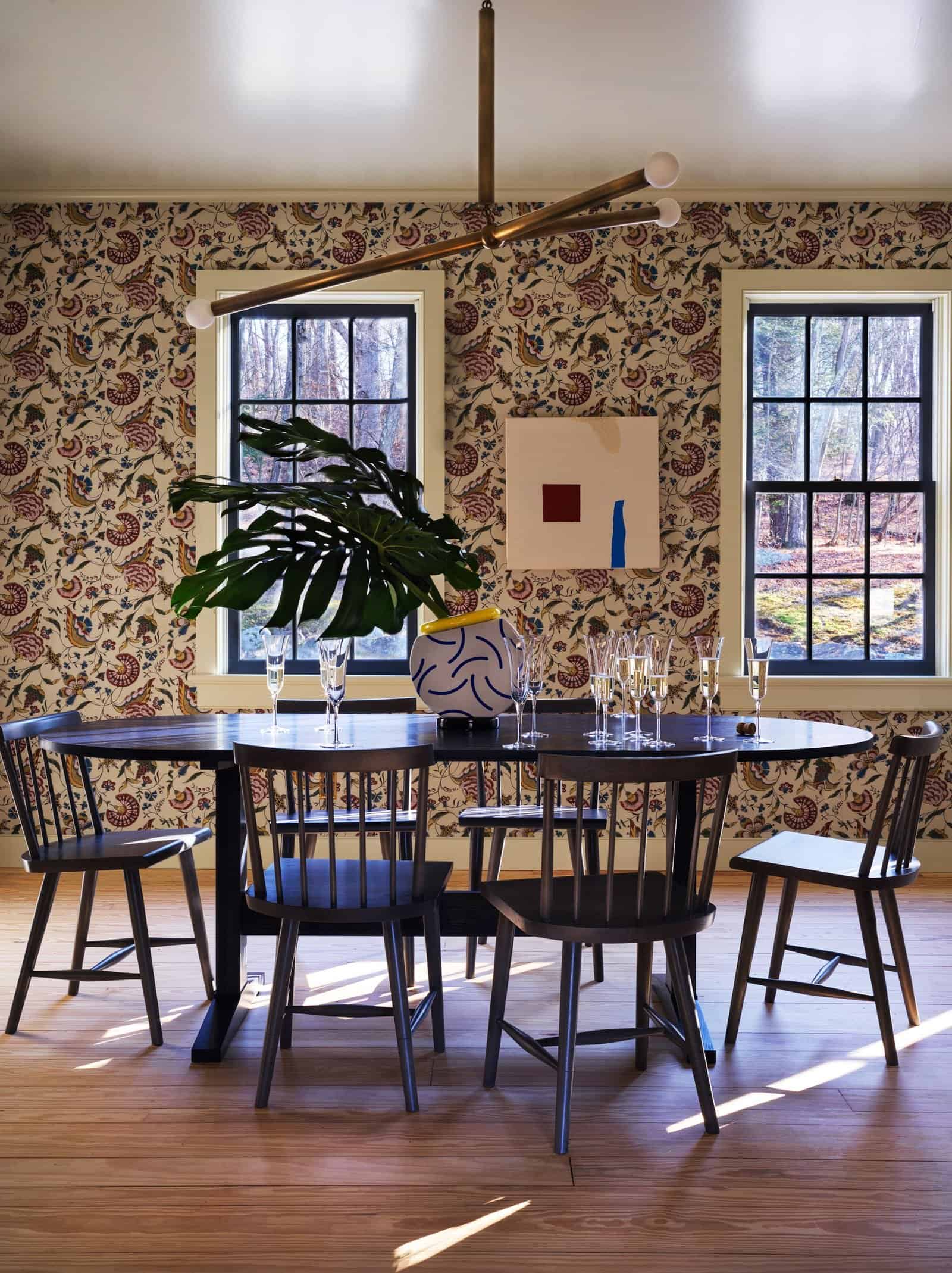
You Don’t Need A Lot Of It
This one may be obvious but a good reminder. I know how easy it is to accidentally overdecorate and that’s what we want to avoid. Of course, if you are a maximalist that wants all the things everywhere then by all means. It can obviously look awesome. But if that’s not what you are looking for then this is for you. Plus the wallpaper itself is art! Don’t put baby in an overdecorated corner, ok?

Ah, the beautiful Portland Project dining room. This wallpaper is from none other than Rebecca Atwood. It’s neutral, extremely fun, and playful. Basically, it adds a ton of movement to the room while still being soft on the eyeballs. But by throwing in those two MaryAnn Puls pieces, they give the room a focal point and a little more personality.

Notice how those are the only two pieces. You’ll actually notice the minimal use of art in a lot of the photos below. It’s all about choosing your moments and not overdoing it because you really don’t need to. It’s a harmony, not a fight.
Mats And Floats Are IMPORTANT (AKA Negative Space)


A no-fail tip when picking art is to make sure you have “negative space” around the piece or that the piece has some blank space around the edges. This could easily be a mat but we also love a float mount (when the art sits on top of the matting). Why? Well, it’s the most effective way to visually “separate” the art from the wallpaper and gives your eye a little break. Example A and B are above in Caitlin’s bathroom. On her vanity wall, she hung a wonderful little neutral piece with matting to gently make it stand apart from the wallpaper pattern. Then for the one above her bathtub (by Elissa Barber), it’s slightly more pronounced with the darker tan color. Imagine if the tan filled the whole frame. It would have gotten lost in the wallpaper.


First off, this art is incredible. Emily always has the best art. I’m not even a cat person and would gladly hang this piece in my home. But you might notice that it’s not matted or float mounted. The piece itself has a lot of negative space which really makes it pop off that beautiful saturated blue Farrow & Ball wallpaper.

Leave it to the Jungalow team to create the most happy and vibrant spaces! I know we are here to talk about art and wallpaper but can we take a moment to appreciate this tonal pink desk and chair?! Ok back to the task at hand. The art is in the same “pattern scale world” as the wallpaper. So those mats are super important to help give them the visual attention they deserve!
Contrast The Pattern Scale

You don’t always have to have negative space around your art. Another way is to have the scale of the art’s subject (or scale as I also call it) be fairly larger or smaller than the print of your wallpaper. See how Julia Marcum hung those wonderful horse paintings in her daughter’s room? The art itself isn’t very busy and the horses are a much larger scale than the wallpaper pattern. That and the dark colors really make them pop off the way in a really nice way! Then notice how the mask art has a lot of negative space:) The flag banner’s pattern scale is a little on the smaller side but again the dark color contrasts really nicely with the light wallpaper. All in all so cute!!


This wallpaper (from one of our favorite homes that is also in the book!) used this suuuuper small scale patterned wallpaper and paired it with two pieces of larger scale, graphic pieces. I love the contrast of styles (traditional and modern) and how they are visually powerful but work so harmoniously at the same time. Sorry, I can’t find the wallpaper source:/ If you know, drop it in the comments:)
Contrast The “Pattern Busyness”

Pattern scale contrast is a big one to consider but another option is the general “busyness” contrast. Wallpaper tends to be busy in the best way. So an easy way to balance that out and have your art also shine is to choose “calm” or “minimalist” style art. Take the room above (one of my old EHD favorites as a big toile fan). This toile (like all toile) is busy. So by choosing art the is super minimal and in the same black and white color scheme, your eyes happily bounce around and your mind hopefully laughs at those great prints:) Basically, the wallpaper is still the star but the art gives you a little visual break.

The “busyness scale” (and actual large size) of this awesome piece in front of that very pretty small scale wallpaper is what makes it work so well. The art is simple with large blocks of color (yet has beautiful movement). Minimal art doesn’t mean visually boring. Great job, Marynn!
Ugh, I love this totally modern, very minimal art on top of this super traditional and busy wallpaper SO MUCH in Eva Chen’s home. You can feel the tension! Also, those colors in the art piece are simply the same but more saturated versions of the colors in the wallpaper. This brings me to my next tip…
Cohesive Color Palette But Duh

I am sure you are TIRED of this broken cohesive color palette record but it’s going to help you narrow down your art selections. By all means, break the color rules here and there! But keeping to a decided color palette will always work (you just gotta mix the tones and textures to keep to interesting:)) But let’s talk about it when it comes to choosing art for wallpapered walls…
The magic that is Kirsten Dunst’s home is just, well it’s wonderful and if you haven’t seen it go right after you read this post! But here, in her little boy’s room, is olive green heaven. The wallpaper is so fun and that cowboy (?) art is perfect over it. What is great about this piece is that the olive and brown colors are in the center and then you have this beautiful sky blue and gold toward the edges to make it really stand off the wall. It matches while having a good amount of color contrast.


This post might as well be called “The Wallpapered Rooms That Jess Fangirls Over And Also It’s About Art” because WOW does this room lift up my whole spirit. No surprise that it’s designed by the super talented Brittany Jepsen and Meta Coleman. With the art here, she decided to zoom in on the colors from the wallpaper and went bold so they could contrast yet complement. Notice how that dark green and white abstract jumps off the wall but helps to highlight the greens and whites in the paper. I think it’s super smart since the red and yellows are so powerful. It’s a balancer:) Now for that incredible leaning piece. I love how it has a more pronounced red, and white! This mixing of scales is the freaking best. Oh and take a little peek at those two stacked matted pieces. She’s doing it all and I love it.

Has there ever been a more color-coordinated piece of art for a room?? It’s a least top three. This piece works so wonderfully because it plays up the softness of the wallpaper mural, has enough varying tones of pink to not be too matchy-matchy, but also enough cool tones (hi greens and blues!) to contrast and make it visually diverse. Also, this is one of my all-time favorite shots. Those two wallpapers together? Forget about it!

Color balance at its finest! With the wallpaper being on the lighter side and the furniture/decor darker, the large dark-toned pieces of art seamlessly marry the whole space together! Try to imagine this room sans art on the walls…doesn’t really work huh? But then again, I expect nothing less from the ever-talented, Kirsten Blazek.
Frame Color (And Style)


Finally, we are talking about frames! For me, this is probably only second to having negative space around your art piece. The right frame really assists in bringing your art “off the wallpaper”. Unless you want a very tonal look, contrast, contrast, contrast. I love this vintage gold frame above for two reasons. One it’s a little thicker and ornate which both stands out and works with this light neutral but movement heavy wallpaper. It also picks up on the brass fixtures;)

While I love everything in this room down to the orange dinosaur, this simple modern styled frame on top of a wonderfully busy patterned wallpaper is perfect. Unlike Emily’s bathroom wallpaper, which was boldly patterned but neutral in color, giving way for an ornate frame, this wallpaper is boldly patterned AND boldly colorful, which means it would likely eat up or compete with an ornate frame. Basically, this simple black frame nicely contrasts the busy wallpaper and balances with the other dark colors in the room.

A middle ground! Carmeon is the wallpaper/painted patterned wall queen so clearly she had to be included. The black wallpaper she chose for her hallway is awesome and busy and the frame is bold and detailed. It works so beautifully because the gold frame makes those gold cheetahs stand out. Plus with such a dark wallpaper color you want to make sure the frame pops off. The gold color and detailing make that happen. White could have worked but let’s be honest, it had to be gold.
When In Doubt Use A Mirror

Y’all mirrors are THE EASIEST way to give some dimension to your wall and break up the pattern a little. Plus you can see the wallpaper reflected in it AND it will bounce around any light. It’s a win, win, win. There will definitely be a mirror (or two) in the room I’m working on. But let me take you through your options.
You can go classic and simple like in the bedroom above. A round mirror is also an easy way to shake up the shapes you might have in your space. If you got a lot of rectangles, get a circle in there:)

But you can also have fun with it and do something like Justina did in her old bathroom. She already had a ton of pattern with her wallpaper and tile, so to let those be the star (but still keep it Jungalow), she added in those very cool differently shaped mirrors. So creative, unexpected, and totally balanced.


Another thing to think about is texture in mirrors. It kinda does the same thing as art (in terms of adding another layer of dimension) but in a quieter way. I mean look at that beautiful wooden mirror Shea McGee put in her daughter’s room. The frame is special, stylistically works perfect with the wallpaper, and that wood has a ton of movement and super sweet beading. Ok, well if we want to talk about “mirror movement” then actually I should escort your eyes to the right photo where Megan Hopp installed this incredibly cool rattan wall mirror. And because it’s a natural material it really adds a unique texture over the wallpaper. I also love that you can see the pink roman shades in the reflection:)
Well, that about does it! I hope you are now even just a little more confident in your art/wallpaper combo-ing. If all else fails, less is more, contrast is your friend, and/or get a mirror:)
Ok now for the sneak peek!

Sorry, I don’t want to show you the color yet because I love suspense and my stupid phone was not getting the glory of its actual color. But I promise it’s going to be really special. Also after re-reading my “baby analogy intro”, I promise it’s NOT a baby’s room (or my room:))!
Love you, mean it.
Opening Image Credits: Design by Studio McGee


This was such a fun post full of gorgeous photos, all tied together by one of my favourite writers. 🙂 Thanks Jess! Can’t wait to see your secret project!
Thank you so much!
Enjoyed a content post again, lots of ideas. I like Holiday lists but glad to read something else.
Brittany Jepsen’s beautiful room was actually designed by Meta Coleman 🙂
Thanks for the juicy design post!
How I missed this collab I’ll never know! Thank you for catching that<3
Great post – lots of inspiring design images. It is so fun to be able to explore different design styles within the overall topic of “wallpaper plus art” – I loved almost every one!
So happy you enjoyed it!
So glad I tuned in this morning! Beautifully written post with unique curation of photos. I would have known this was Jess’s work without reading the byline. Thanks Jess! Looking forward to seeing your secret project.
That’s so sweet of you and thank you! I’m SO excited to show you all!
So many great photos! I love a bold, big-scale wallpaper pattern! I think in part because then you really don’t need much else on the walls–I’d love to use grouping of modern silhouettes for the eye to rest, and that’s it.
That would look great:)
Great post Jess! It is sad when you get excited to see a design post on a design blog instead of a link dump. Hope to see more design posts soon!
I promise we are working on them:)
This is so important!–Probably before you were born, I had a bold patterned wallpaper in my dining room and *never* hung art up. We’re so fortunate that there are so many resources for both ideas and products these days! Thanks for sharing the beautiful rooms, I have a soft spot for Reath Designs Boho look.
You are so welcome and me too. I love everything they do<3
Refreshing to finally read a meaty design/decor post after what felt like a zillion gift guides. Well written, and I learned a ton. Thanks so much
So happy you enjoyed it
Can we also have a post about choosing fabric (window treatments bedding pillows etc) to go with wall paper? I’m guessing there is a similar formula, but there were several rooms in this post where I didn’t understand the thinking behind their curtain choices. Wallpaper seems like a fun treatment to try but then I know I would get stuck figuring out how to pair it with soft goods in the room. Maybe you already did a post on this topic? Thanks!
I second this! We are about to put wallpaper in a room where we also need window treatments, and I’m not sure where to start.
O that’s a great idea! I’ll definitely bring it to the team.
Yes! I have a large pattern wallpaper in the master bedroom and I need a bedspread. Do I have to go with a solid or can I use another pattern?
You can go either way! Just make sure the scales are different:) You could also do a solid duvet and patterned sheets if you wanted a little bit of both!
Maybe this is a dumb question, but do you just hang things as you normally would on wallpaper? Or is there some kind of adhesive you could use instead that wouldn’t damage it?
We are about to have our dining room wallpapered, it’s not going to be cheap, and my spouse is very reticent to poke holes in it, even though we have some decent wall space that I think could use a mirror or art.
Also, I wanted to echo some other commenters in saying that I enjoyed this post a lot and found it helpful. Please keep it up and refrain from doing more gift guides.
Not dumb at all! I actually meant to talk about it in the post! When I chatted to Julie about it, she was afraid that something like a command strip (especially if left on a wall for a long time) could damage the paper even more than a nail. Plus when you are hanging something like a mirror you are going to need something that can hold a good amount of weight. Julie recommends those art hooks since they are pretty sturdy and the nails are usually pretty small. Just check the weight strength. But I think it’s just a necessary evil and small holes aren’t too noticeable if you decide to switch it up later.
What exactly do you mean by art hooks? I did a websearch and that basically pulls up everything. Is there a specific product you mean that has an unfortunately generic name?
These hooks are amazing for art even if it’s heavy. The thin nails don’t shred your walls.
I read somewhere that you can cut a tiny v shape in to the paper and fold it under (or back maybe?) so that you don’t end up poking the nail through the paper in case you later want to remove the artwork. Then you just unfold the v and paste it back down for a seamless look.
o smart!
I’ve seen people cut a small V in the paper and then nail into the wall itself. That way, if you move things around later on, the paper can be glued back down without holes.
Wow, I could have spent hours with this post, studying every last detail, if I didn’t have to work! Stunning rooms, all of them. There are so many I was inspired by, but the one by Maryann Udvarhelyi really stopped me in my tracks.
This makes me so happy!
Great post – thanks, Jess! Really interesting and helpful design analysis and breakdown, and a lot of inspiring photos – especially love the ones designed by Brittany Jepsen, Kirsten Blazek, and Julia Marchum.
And already looking forward to your new project from the image you shared 🙂
Thank you!!
What a fun post! Lively and interesting. A total palette cleanser in the middle of holiday prep. Does anyone know who makes that whimsical citrus paper in the room by Reath Design?
I think it’s Jennifer Shorto? Saw in in AG earlier:
That’s great. Thanks!
ahhhhhhhhh, this post is exactly what i needed! love these eye candy posts. all of the examples shown are gorgeous obvi, BUT, i am so obsessed with the reath design one, the 1000x better one, and the brittany jepson and meta coleman one. sigh! droooool….
omg and the jungalow desk and chair, HOW could i forget that! oh, and the one by jane hallworth and colin king! oh lord. they are all too good.
ALSO, i can’t wait to see your secret project!
Great post Jess! The ‘how to’ tips are of course appreciated but I especially wanted to thank you for all the included links to so many inspiring designers -thank you!
I have to admit, I’ve been skipping a lot of posts lately. I’m tired of link ups, holiday gift guides, holiday decorating guides, farm non-update updates.
This post is visually interesting and contains good tips to consider. The posts that caught my eye recently are this one and Ryann’s MOTO.
Thanx for this useful info .
What a great article! Fun and informative and the photos were so inspiring!!
This post makes me want to wallpaper EVERYTHING!
Loved this, but what I’d tho king of hanging on my fresh new wallpaper may or may not fit this rule book. But I’m kind of vibing on it. But I don’t want needless holes in the wall. HELP! Can I send a photo? Where to?
Here are photos. I’d like to place these decoupage parrot plates in a 2 x 2 grid above our bed. The headboard wall is the only wall with the wallpaper.