
Make Overs
Afraid Of Designing A Boring Home?? This Designer Will Steer You Clear By Showing You Her Tricks
If there is one thing we love when it comes to designing a space, it’s getting to play around with unexpected style pairings. Wait. Is there actually anything more fun? (she suddenly asks herself and thinks probably not). I mean sure you don’t have to bring in a modern brutalist ceramic in your soft floral cottage home. BUT wouldn’t it look cool and super unique to you??? Well, Sarah Zachary (one of our new favorite designers, and the one responsible for this stunning colorful home) also thinks that mixing styles is the way to make your home more interesting and personal to you. So if you’ve been clutching your “one style only” rule book, Sarah is here to, once again, show you that it’s time to throw it out because a “one style home” usually equals a “one-note design”.
I also want to give an extra special thank you before we start to Sarah because despite her giving birth on THE SAME DAY we featured her last project (so only about a month ago), she graciously took time to answer my burning questions about this home and her approach to the design. I know, women are incredible 🙂


Shelf Brackets | Pendants (vintage)
Note: Moving forward Jess’ will be in bold, and Sarah will be un-bolded!
JB: Could you give me a little background on this project? Was any part of it a gut job? What were the client’s design aesthetic requests?
SZ: My client got in touch with me when she was about 6 months pregnant wanting to work on a few smaller items like choosing wallpaper for the den and fabric for the dining room chairs. Over the last few years, we have moved on to redesign most of their living spaces throughout the house including a kitchen redo and bathroom renovation. The bathroom was a gut job, but we worked with a lot of what was already there for the other spaces. The clients wanted their home to feel like a cozy cottage. I wanted the space to feel cozy, classic, but still modern.
Jess here to expand on that last part a little. From my conversations with designers, it’s important to remember that you hire a designer for their style and experience. They, of course, should cater to your wants and needs but trusting the designer you chose and their vision is the exciting part of working with one. Essentially, have an idea of what you want, but trust the professional you hired. You will be so happy you did.

Bar Stools (similar)
JB: Was it purposeful to choose the more classic English style for the permanent elements to make resale easier? Or was the purpose of blending English farmhouse and mid-century modern a way to combine the different personal styles of the clients.
SZ: We weren’t thinking of the resale value when designing the home. We actually removed a lot of elements that would be considered upgrades because they had a generic builder grade feel. We wanted to incorporate more character and lean towards the architectural style of the home which is English Chateau/Cottage.
JB: Speaking of different personal styles, what is the approach you take when working with coupled clients who might have varying styles?
SZ: These clients were both pretty much on the same page in terms of style. I think they have eclectic tastes and were open to a wider range of styles. When I am working with clients with different aesthetics, I try to lean more towards what the architecture demands in terms of style and try to find their common ground. I usually work with one client that is more involved in design decisions and their partner willingly provides final approval.


Chairs (vintage) | Chair Fabric | Dining Table (vintage) | Pendant | Cabinet | Table Lamp | Rug (similar)
JB: What are your “rules” or “theories” on mixing styles in the same home? Or is it more “this is awesome, let’s try it?”
SZ: I always want the rooms in a home to feel like they connect and flow based on the very least color or material. I think if you find a wallpaper or piece of furniture that you really love that doesn’t necessarily go with the aesthetic of your other spaces, figure out a way to tie the spaces together. We used some bold wallpapers in the bedrooms and bathrooms but kept the living spaces a little more clean and contemporary. The unifying element is a nod to the English cottage aesthetic.

JB: The art is awesome. Did they already own a lot of it or was that sourced to give the space a more varied and eclectic vibe?
SZ: The clients owned most of the art before. They love photography and have a few pieces that are really meaningful to them. They also collected a few other paintings and prints during the design process. I didn’t select one piece of art for them, which I love because every piece is meaningful and that is how it should be.
We are BIG proponents of investing in art if you can. Not only is beautiful art the easiest way to make your home feel more high end, but it’s also the easiest kind of decor to move with you from home to home (and even room to room). It’s a good long term investment. I mean Emily spent $300 or $400 on her famous vintage submarine drawing over 10 years ago when she had no money living in NYC, but it’s still her most cherished decor piece. Hindsight is 20/20, but I’d say worth it.


JB: That shelving unit is SO beautiful. Was it custom? I love the beadboard accent in the shelving. Was that added in to bring the traditional feel to it or a call to the ceiling or both?
SZ: This is the piece I am most proud of. My dad, John Zachary, made this custom walnut cabinet. He works as a production designer, but when he is on hiatus I get the luxury of having him build pieces for my client projects. I wanted to incorporate the beadboard backing for a country feel and to add texture and visual layers.
I think we all collectively, at the same time, wished we all had a John Zachary in our lives. Sorry dad, you are also very talented and I am very grateful for you (I love how I’m pretending my dad reads what I write. Ha!)


Wallpaper | Pendant | Cabinet (custom) | Blue Bud Vase
JB: Once again your use of wallpaper was flawless!! Do you have any tips for people who are wanting to put wallpaper on all five walls (the ceiling being the fifth)? Pattern size, colors, etc.
SZ: Thank you 🙂 Consider the size of the pattern and size of the room when installing wallpaper on the ceiling. In my opinion, use smaller patterns for smaller spaces and larger patterns for larger spaces.
We agree! A large scale bold pattern on every wall and ceiling would potentially only work in a small room where you don’t spend a lot of time like a powder room.

Mirror | Tile | Baskets | Soap Duo
Take note that while this bathroom is very “English Cottage” Sarah brought in that awesome photo to help tie in the mix of modern that’s in the common areas. It’s unexpected and very cool.

JB: Where did you find that awesome tub!? Was it painted custom?
SZ: I discovered a great resource for vintage style plumbing fixtures called Vintage Tub and Bath. They have a few colors to choose from, but you can select a custom color if you want. We were under a time crunch, so we chose a standard color but it worked perfectly in the space.
Is there a single person that hasn’t at one point dreamed of a clawfoot bathtub?? I just don’t think so. Talk about design goals.
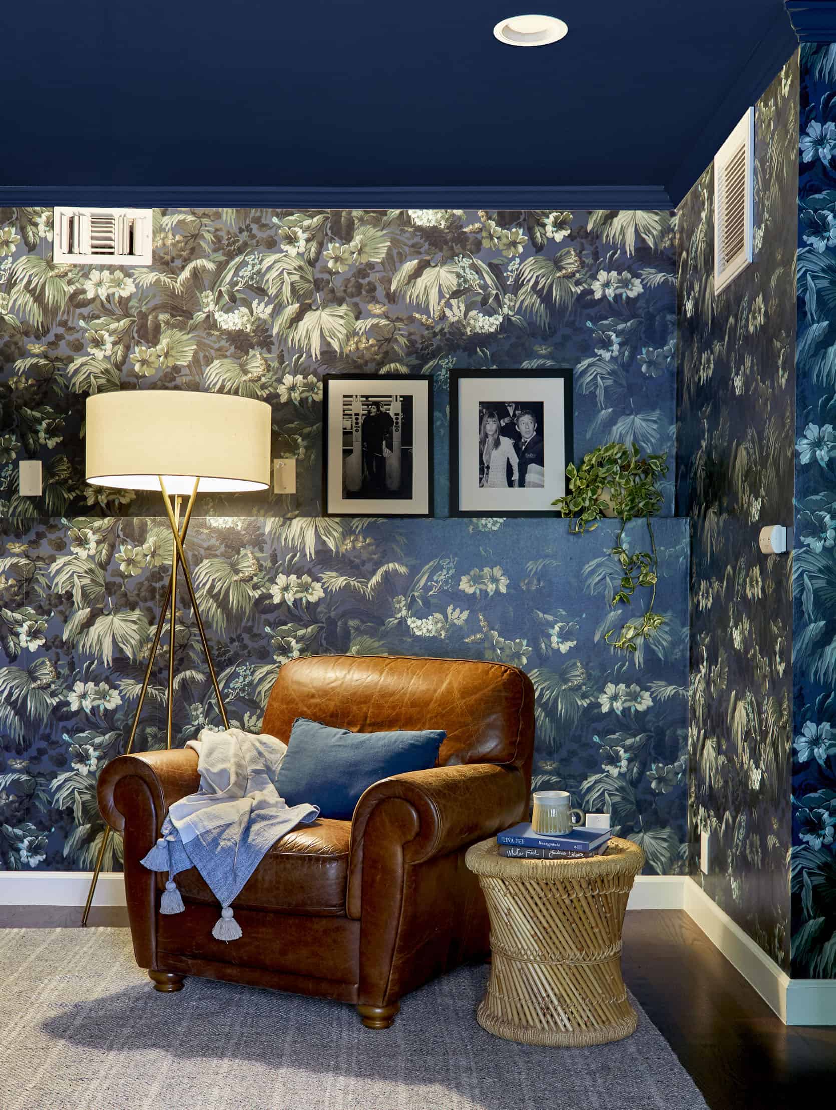
Wallpaper | Floor Lamp | Side Table (similar)
FYI I had the most questions for this room because it’s so bold and fun. Wouldn’t you want to know more after seeing this photo??
JB: I LOVE how bold the blue room is! But it’s also stylistically the most different from the rest of the house. What was the discussion with the client when talking about this room?
SZ: This was the first room we did on this project and definitely wanted the space to have its own separate feel. I had shown the clients several wallpapers and they fell in love with this pattern. This paper is made by House of Hackney so there is still a common thread of English traditional style.
JB: What is that room used for? How did that impact the design choices?
SZ: This is the TV room/den where they watch movies and play video games. We wanted the space to feel moody and cozy so we wallpapered the entire room and painted the ceiling and trim dark blue.
JB: Also is it an enclosed room so you felt more freedom to verve a bit from the rest of the home’s style.
SZ: Exactly! This is the only room on the bottom floor and from upstairs you can only see a peek of the wallpaper.
JB: Was the leather chair a way to bring the traditional style into the room?
SZ: Yes! The rest of the furniture in this space is a little more modern so the leather chair adds a touch of vintage and warmth.
Well, I wanted to leave you with a bang and that room is just that. If you were thinking that mixing styles is a design faux pas, hopefully Sarah has made you feel confident and liberated to do whatever you like. Mix and match as you see fit, people. Just make sure to keep consistency in the materials, colors and themes. Ok, so there are some “rules”.
Please go follow and support Sarah because she is an awesome up and coming designer. I want to thank her again for taking the time this week so we could spread some design joy.
Love you, mean it.
Credits: Design by Sarah Zachary | Styling by Emily Bowser | Photos by Sara Ligorria-Tramp


I am so appreciative of seeing a maximalist style that doesn’t feel cluttered. This was so beautiful! Were the bench built ins in the dining space pre-existing or added? Wondering if Sarah has notes on that. I love how the base of the table and the chandelier there keep the space open. I will probably keep returning to this post over and over – there’s so much to see! I love the mix of modern and traditional. Also, Sarah, your father is very talented, as well.
What a cool home! If your dad is every in Michigan and dying to make some new furniture, please send him my way. that cabinet is gorgeous. also, wondering about the built-in dining bench as well. Please spill all the details about it.
Seriously. Can you imagine if someone in your family was that talented? so awesome.
This house was amazing, it felt modern and welcoming but also so unique and personal. The wallpaper! the built in bench fabric and pillows!, the custom walnut shelving! – I am really inspired by the choices, and the overall vibe of the home.
the wallpaper in this bedroom!!! WOW. so glad i didn’t preview this post as you were working on it, THIS HAS BEEN SUCH A TREAT to take in this morning!!!
So pretty! I really appreciate her treatment of colour and pattern.
A note about the font: the italicized paragraphs are really difficult for me to read (and are not an accepted accessible format in general). I loved the pictures but I skipped reading most of her responses because it was too much of a strain
It’s also inconsistent from some other posts on this site, where the interviewer is in italics and the interviewee is not. Maybe just use initials like some magazines do? i.e. JB before Jess’s thoughts and SZ before Sarah’s.
Interviewer in bold, interviewee in regular?
Got it! It’s been edited so that Jess’ text is in bold and Sarah’s text is unbolded. Hopefully that’s easier to read! And we’ll keep it consistent moving forward. Thanks for the note xx
love it!! <3
Thank you!!
Beautiful
Wot the?!?
This is so clise to my dream style (just needs a smidgen or eight of eclectic).
Seriously gorgeous and inspiring combination of classic and contemporary.
Yaaaasssss!!! ?
Ah, dodgy, numb fingers = typos. ?
I LOVE the bathroom! I’m noticing the tile grout is white…how do people keep their tile grout white?! We recently bought our house and redid all the bathrooms with white grout and it’s already stained after six months. Even with a deep scrub I can’t get it off. Does anyone have any suggestions?
if you haven’t tried a scouring powder like Bon Ami and a brush head drill attachment- prepare for your life to change.
As a designer I love using tile on bathroom counters, especially penny tile. I always have the installer use the epoxy grout that doesn’t stain. Maybe too late for yours but something to think about for future. Installers often don’t like to use it because it is more difficult to work with and may cost a little more, but so worth it. I use it anyway, floors, walls etc. I must say I also try not to use white grout but sometimes obviously that is the one that may be the most appropriate. Good luck!
Will you please share the brand? I used one about 5 years ago (Bostick) that has failed and is cracked and needs redone : ( I would love to know what you recommend.
Love this! I am so curious what elements were removed that were considered more “resale” friendly but not in line with the design.
In the midst of this crazy world, seeing beautiful spaces like these make me go “aaah” for a few minutes. Thank you.
It seems a rather tame “maximalist.” The first photos seemed very cliche and not especially colorful. That later rooms made up for it! I love all the wallpapers (particularly the House of Hackney one), and the red tub is very va-va-voom!
Love this house! It feels eclectic, personal, and pulled together.
The dining room is gorgeous! The wallpaper and the vibe of that last room I’m at a loss for words and painting the ceiling that beautiful blue was ingenious!
Funny, I just purchased a replacement faucet & handles for our vintage bathroom sink from Vintage Tub and Bath. They’re very nice, but something that I hadn’t thought through clearly enough was the return fine print. The faucet didn’t end up fitting our weird, vintage sink and we need to return it. The cost of shipping back + the restock fee is about 1/3 of the cost of the items! Something to consider when purchasing online.
DANGIT. I love this. Makes me want to change everything at home!
Beautiful house! Do you happen top know the beautiful green color on her kitchen cabinets? I have been searching for a similar green for awhile. thanks!
oh yeah! i’d like to know that too!
can you PLEASE share source for the bathroom wallpaper? the small scale one with the wood vanity? I need it in my english tudor!!
Yes Please!! I’m also keen for it! Her instagram notes it is from Walnut wallpaper but i cannot find it.
I found it! Boråstapeter Josefina wallpaper
What is the color on the kitchen cabinets??
Ahhhhh – I love EVERY BIT of this home. It’s perfect! So much personality, so inspiring, all the colours and wallpapers and textures together – it just looks like such a warm, happy home. A new fave. Well done Sarah and Emily!