
All Things Renovation
12 Tips To Make A Spec Home, Special…With Max Humphrey
We would love for you to officially meet Max Humphrey! You might already be familiar with his work from Apartment Therapy’s Small/Cool Event that both he and EHD got to be a part of earlier this year. And in case you missed it, check out his fun-loving “Inner Child” space here. He has been one of Emily’s favorite designers for some time now after instantly falling for his effortless PNW eclectic style. Anyway, this is how he describes that style…“My style is a lived-in, layered look and I think every room should show signs of life. I believe style is about knowing who you are, what you want to say, and not giving a damn.” Emily and I completely agree and is a reminder to “Style, Play, Every Day” because why not, it’s fun, who cares!
Today, however, I am excited to give you the grand tour of the home below that he transformed from a spec house to a very special home. In case you are not familiar with the term “spec home” this is typically referred to as a new build house that is constructed with the intention to sell to a speculative buyer (get it?). This project however was slightly different, the homeowners actually purchased the house before they broke ground in November of 2017 which allowed them to customize it during the 2 years of construction to their own personal style.

The project is located in a suburb just west of Boston which is a, “really old New England town with lots of historic homes” he said. Luckily enough, Max was already familiar with the area and style of homes having previously attended college in Boston. Since he takes on clients all over the US working on a project from the other side of the country wasn’t really new to him. But this time he had a strict schedule from the builder with due dates for all the specifications of the home. So to adjust they worked backwards from that list as they were designing. When I asked him how they communicated the design plan Max said, “The clients wanted their house to be different than the others in the neighborhood – even if they all had basically the same floor plan. They have two young kids so there were the normal client requests about nothing being too precious. I definitely didn’t have to fight for any ideas – my clients Greta & Bill were super fun to work with and both were totally on the same page and there was a ton of communication between all of us. We basically designed the whole house together over a year-long group text. I’d text ideas and they’d both weigh in with yes/no/maybe. A lot of clients need to see the ‘big picture’ before they make a single decision but I don’t really design that way, like with fancy mood boards and stuff. They trusted that each decision we’d make would work in the grand scheme.”
What I was really curious to know was what the design limitations were working on a spec home so here is what Max had to say, “The contractor said we could do anything we wanted cosmetically as long as we didn’t try and change the original floor plan. So no moving walls. I did add and widen a few doorways but that’s it in terms of the layout. Beyond that, we had a set of specs from the builder with things like what kind of windows and moulding they had planned and then allowances for all the spec materials (tile, flooring, plumbing fixtures, etc) so we were able to choose all that stuff as long as we kept within the basic budget parameters. If we went over by choosing some super expensive marble countertops or something that would be something the clients would have to pay for on top of their initial agreement with the builder. Everything else was up for grabs and I was able to design all of the kitchen cabinetry and built-ins everywhere and bathrooms and stuff. I added wall moulding details where there was only sheetrock in some spaces and was able to select the exterior siding finishes.“
Honestly, sometimes the hardest part of a new build is figuring out the floor plan so if the flow of the home works then this sounds like a designer dream to come and add in all the fun stuff aka the materials, light fixtures and furniture.
So how did Max help them customize the home you ask? Well, come on in and take a look for yourself!
Non-Traditional Cabinetry

Let’s begin in the heart of the home, the kitchen. This is probably one of the easiest yet expensive rooms in your home to customize to your heart’s desires.
So in terms of customization, let’s just talk about the non-traditional uppers in this space for a minute. I am a big fan of the countertop cabinet or cupboard, as one of my favorite kitchen companies deVol refers to them. That moment combined with the more modern open shelving really helps to touch on both the old and contemporary styles Max mixes together throughout the home.
Unexpected Cabinet Color

Before you ask in the comments below the color of the cabinets was custom and so unfortunately we don’t have a name to share with you but we do have some others paint colors so stay tuned. In my opinion, it is the perfect gray-blue that doesn’t feel like it belongs in a nursery. I’m currently holding my paint deck to the screen to try and match it, yes I am that designer.
Special Details

It’s the little details in this space like using a more elongated textured subway tile, two statement pendants over the island, adding a pot filler for the stove area, and having a beautiful yet very functional farmhouse sink that gives the kitchen that upgraded feeling without going over budget.
My favorite addition in the space is that additional storage over the doorway which not only makes it feel custom but that way the fridge doesn’t look like it is ‘floating’ off on its own. Plus now there is an en-TRANCE to the formal dining room where we are headed to next.
Adding Modern (Wide) Wainscoting

I’ve already mentioned my love affair for a well-designed chair in this post here so you better believe that when I laid my eyes on this photo of the dining room my jaw literally dropped. Now, this is a dining chair that is both beautiful and looks so comfortable (but no longer available!). Dear Greta and Bill, I am more than happy to come over in the future for a long dinner party, just saying. Is it about time that we pull together a comfortable dining chair round up?
Those chairs combined with the blue boxy wainscoting that Max added is color combo perfection. He opted for a wider moulding than the standard size which helped to add that traditional architectural interest to the walls that we all crave in a house while keeping it current. As Max would say, “Otherwise they’d just be big drywall box rooms and drywall has no soul.” Agreed.
Quiet Playful Patterns


There are three other great additions in this space that really put the room over the top and tie it all together. First is the custom roman shades (which is a staple you will see throughout the home) the tiny dot pattern is so playful juxtaposed to the other wonderful wallpaper addition. Adding wallpaper to a space, especially when paired with some custom millwork, will really make a room feel complete. The pattern he chose for the space is subtle but effective and adds that warmth to the walls to balance out the large black dining table. Lastly, consider adding in sconces to every room you can instead or in addition to can lighting. Even though can lights are functionally great a sconce will add a touch of your personality. If the only thing that is holding you back is the height placement then we have you covered in this post here. 😉
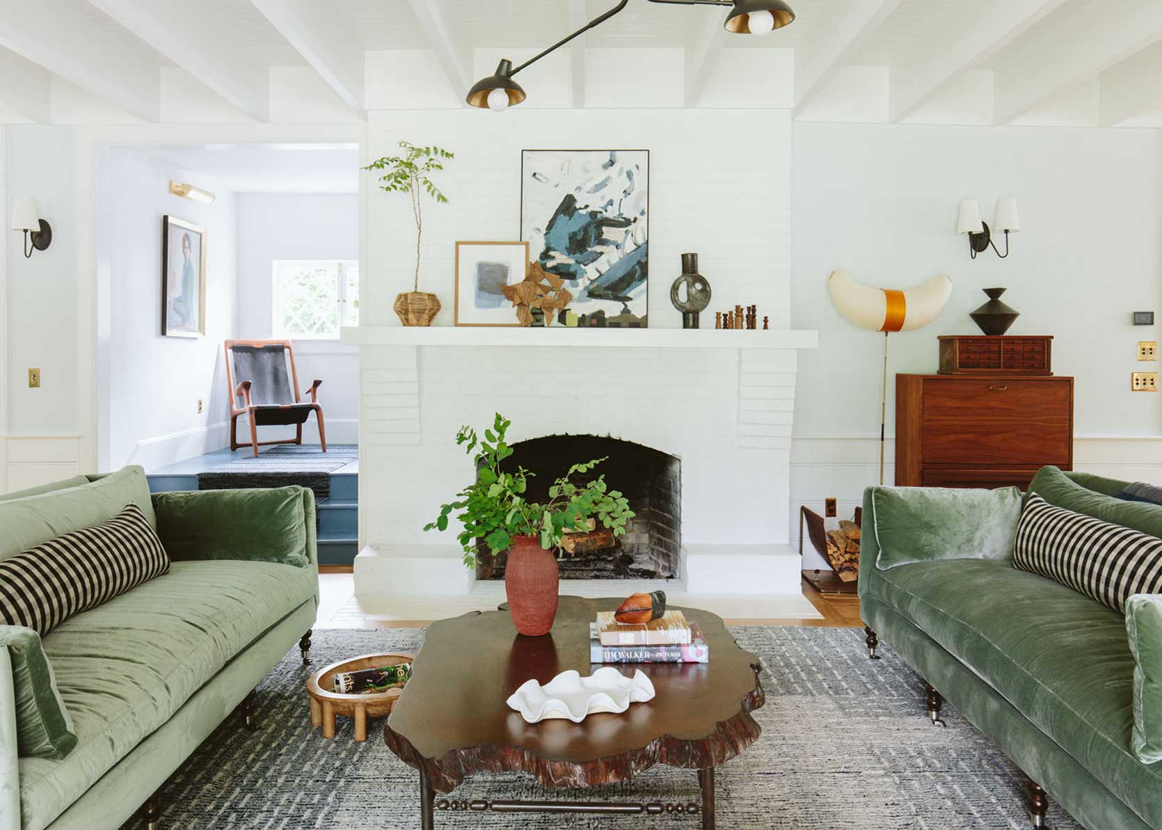
Bold Accent Moulding

Try for a second to imagine this room without the gray box moulding and those custom built-in benches flanking the white brick fireplace. Not only would the fireplace really stand out (and not in a good way) but something would just feel like it was missing. Max, being the smart designer he is, created two areas for all their reading, lounging, and staring out the window desires. I am also very into the scale of the box moulding which is modern and helps draw your eye all the way up to those high ceilings without being busy. Plus the fact that they are slightly contrasting in color helps your eye not have to compete between the texture of the brick on the fireplace and the millwork.
Special Nooks

Again, it’s those little details like the contrasting hardware paired with the buffalo check cushion and custom roman shades that will make a home feel unique to the client and stand out from the rest of the block.
Contrast Furnishings Style to Architecture

This double-height entry is such a stunner with the same style wainscoting as the dining room but now is a clean and fresh white. To me, this is the most traditional space of the home with the wood & white staircase and the transom window over the doorway so I was excited to see that Max choose to furnish the space with an entry table and two stools rather than a more traditional entry storage bench. He said, “Some clients who renovate old homes get stuck on making things look period specific but for me its about the mix. I like using vintage furniture in new homes and modern furniture in historic homes.” Which will make a lot of sense once we get to the main bathroom.
But we have one very special space left before we go upstairs for the grand finale. I spy a peek of green from the far right doorway which I think we should all go check out next.
Go Moody

Max wanted the study off of the entry to feel cozy, I think I can safely say mission accomplished. He really went for it by painting not only the custom built-in bookshelves but also the baseboards, crown moulding and walls all the same beautiful green color.
Custom Forward Thinking

It was such a smart choice to design the custom built-ins to the dimension of the sofa. The additional storage is probably great for the homeowners but this is a design trick that I’ll be putting in my back pocket for a future project. Instead of spending the additional money on a built-in day bed or bench, you can buy a sofa that you could take with you if you need to move or swap out if you want to change up the style of the space. SMART.

Last but not least, the main bathroom of the home which is huge and has a seriously unexpected ‘wow factor’. This comes in as a close second for one of the more traditional leaning spaces of the house with the plaid custom romans and white beadboard paneling which Max mentioned it seemed appropriate to New England. But since it’s a brand new house he didn’t want it to look too “olden timey” so there are a few details though that help to keep it feeling modern.
Mix Up The Permanent Detail’s Style

The mix of the beadboard and modern thin shaker-style cabinet door fronts mixed with the crystal knobs. Had he opted for a standard size shaker cabinet it would’ve been too close in width to the beadboard and maybe even make the bathroom feel a tad “farmhouse”. Also, the subtle cutout for the builder grade mirrors make them now feel intentional and custom to the space.
Add A Disco Ball (jk…but maybe not?)

There is a DISCO BALL over the freestanding tub, I repeat there is a disco ball in this house! You know I had to ask the backstory of this surprising design choice and I loved Max’s response, “We couldn’t get the contractor to install a chandelier over the tub due to some pesky building code nonsense so the disco ball was the next best thing. When the light through the window hits it it’s an instant bathroom dance party.”
And there is definitely room for a dance party so why not?!

A huge thank you to Max Humphrey for letting us show you this beautifully designed spec house and how to mix styles flawlessly. To the lucky homeowners, Greta & Bill, we hope you are enjoying all the personal touches he added that make this house feel like your own special home.
Have any of you implemented these tricks or any others into your own home to make it feel more than just a white box with a roof? I’d love to read all about what you’ve done in the comments below or better yet share some photos with us over on the EHD Insider Community. Talk to you all soon. xx
**Design by Max Humphrey
*Photos by Christopher Dibble


This is such a beautiful space! I’m thinking about painting our home office a moody color like in this office, but if I paint the whole room including moulding, should paint the moulding in the same sheen as the walls? Would love your advice!! Thank you!!
I also would like to know the answer to this question. When you look at the bookshelf, it appears the immediate right wall is the same color and sheen as bookshelves, but the left side wall looks different.
The kitchen cabinets looks like BM Stonington Grey.
I am also curious! We painted our walls and trim the same color white. We did eggshell on the wall and BM advance on the trim which is what the paint store recommended for people with pets or kids…but we don’t have crown molding and that shouldn’t really get dirty so curious what you are supposed to do with that sheen-wise?
When painting our kitchen cabinets we used BM advance but were a little stumped when it came to the sheen to use for the island. Google had no answers haha. The island has cabinets on one side so we decided to use advance on all 4 sides ( mostly because we were lazy and didn’t want to make another paint run). But the next time I found myself at a paint store they said it’s more common to match the island finish to the wall sheen.
I think you did the right thing with the island paint, Jill. Our cabinets were custom painted and the island is the same sheen as the rest of the cabinets. I can’t imagine the abuse and wear it would show if it were the same sheen as our walls.
Amanda, so happy you enjoyed Max’s beautiful design!
As far as paint goes there are two things to consider apart from the paint color itself.
1. Is the type of paint – Water-Based (good for walls, ceilings, doors). Acrylic (which is great for exteriors since it will expand and contract with the weather). Oil-Based (great for trim and cabinets since it’s more durable).
2. Is the paint sheen – the higher the shine the easier it will be to clean and so it can come down to personal preference on this and how precious you are about keeping your walls pristine.
Hope that helps! xx
I live all this – but the grid wall molding I’m seeing everywhere is driving me nuts because it’s a dust trap. At least panel molding on the lower wall is reachable and curved!
Er *love*!
haha maybe they have a really long extendable duster!
I would actually really love to know the answer to this. Wall moldings are so trendy right now and look beautiful, but how does it actually work in practicality if you don’t have full-time help cleaning it?? I think a general “know before you go” there post (or series) would be good for these kinds of things (molding, Emily’s wooden cabinets at the mountain house (we had similar ones growing up that my parents refinished every 5 years or so…)…even the canopy over the kids bed seems like such a dust trap. Would be good to know what maintenance you’re signing up for before making certain design decisions. Thanks!
Any designer who adds a disco ball above the bathtub is a designer after my own heart. When my kids were growing up we had dance parties a lot, the disco ball being the thing they loved the most. Now I think I need a beautiful free-standing bath tub with a disco ball. Wonderful!
Right?! Had to save the best moment for last, so cool!
I LOVE the disco ball!I LOVE all the built-ins! Great space 🙂
Max did such an amazing job, I loved checking out the rest of his work as well!
I don’t share the love for the dining room color combo (the dark table particularly feels out of sync to me) but the rest is eye candy.
Uhm… YES to the comfy dining chair post!
It’s in the works, stay tuned!
I’d love to know about the chairs he used in that dining room; the table and cabinet were sourced, but not those (vintage cane?) chairs. TIA!
These people really need to put up some art. While pretty everything looks so impersonal.
I couldn’t quite work out what was missing for me and THAT’S it! Art!!!
Well spotted.
I believe that the photos were shot awhile ago so I am sure by now they do but yes, art always adds a more personal touch to the space!
I find artless walls soothing, spacious, calming…
Max did a great job with the interiors, but can ANYONE please explain what is happening with that roofline on the exterior? Whyyyyyyyy
hahaha yes I was thinking the same thing! the outside has McMansion vibes for sure.
Just to prove once and for all the style is individual and idiosyncratic, this design triggers me for reasons I cannot remotely locate. It makes me deeply depressed and I have to look away.
Next time someone asks me my style I’m just going to reply, “Max Humphrey.”
Love that!
This house is such a great example of creating charm in a spec house.
EXACTLY!
My jaw dropped when I saw those dining chairs!!! I just want to touch them!!
Same! So sad that they are no longer available 🙁
Would love to understand the cost of the ENTIRE project. We’re considering tearing down the almost 70 year old raised ranch that DOES NOT FUNCTION for our family and starting over. Incidentally, we’re also in a historic (tho not actually historical) old greater Boston town, so the costs would be helpful to understand.
I believe that the costs of this project were dependent on the developer since they were building all the homes on the same street with different floor plan options. So your renovation cost would vary depending on what you and your contractor decide on. Some contractors charge time+materials and others give an overall estimated bid for the project. Hope that helps!
The kitchen is beautiful, BUT……where are the outlets???? Where do you plug in a toaster, coffee pot, stand mixer….anything??
Were they photoshopped out? I don’t see a single outlet in any of the photos.
I will have to ask, since these photos weren’t taken by EHD we don’t have a say in the way others photoshop their work so there is a slight possibility of that. There also might be some in the full length cabinetry similar to how we did ones in Emily’s cabinets for small appliances. 🙂
Definitely photoshopped out – I spotted a disappearing outlet 🙂 The photo directly under the Unexpected Cabinet Color heading shows an outlet just peeking out from behind the utensil canister next to the stove, then in other photos that show that spot, the canister has been moved and there’s no outlet.
GOOD EYE!
MAX!!! What an amazing job!! Loved each moment! Thanks, EHD, for the great share!
So glad you enjoyed it, his work is wonderful!
What is the kitchen tile used? I’ve been looking for one just like it…
Beautiful space!
Hey Qiana, some of the resources are linked just below the photos but here you go!
Thank you!
Yes, suppose all taste is different. This screams McMansion and price per square foot ‘value’. Hopefully the home owners love it immensely.
This is terribly uncool, but I would love home tours/ideas for actual cookie cutter tract homes in newer developments, where every house is the SAME. Unfortunately this type of house will be my only option for the foreseeable future and there must be other readers out there like me? I would love to live in an established neighborhood where houses have individuality, but suggestions for those spaces don’t always work (or seem totally out-of-place) in this stucco suburbia. Again–it isn’t cool content and people may sneer, but it is reality for a lot of people and I’d appreciate some help/tips on making it better in a site-appropriate way. Thanks!
Your question made me think of this fantastic Design Sponge post from last year. It’s a classic 90s suburban home made more modern and unique, mostly with paint!
Did I miss something? I could not spot a transom OVER the front door – just a window in the front door. Given that a front door sets the tone for the entire entry and home, I would have spent the $$ to upgrade that awkward door.
What’s the beautiful green in the office/den? Link is broken.