
Makeovers
Griffith Park Client Library and Powder Room Intro
It’s Ginny here with our final intro at the Griffith Park house we’ve been designing. To recap, these are all the rooms we’ve been working on and have introduced you to so far – Sunroom, Living Room, Dining Room, Master Bedroom and Dining Nook.
Todays post encompasses two rooms that didn’t need too much help so we combined them into one post. First up – the library:

This is a beautiful wooden clad space that is perfect for hunkering down and watching English crime dramas when June gloom hits LA (or that’s what I’d personally do… has anyone watched The Fall yet? I’m behind, I know!)
They already had their eye on a sofa and chairs from Lawson Fenning but wanted help with fabric selection and general guidance on what else to do in here.

This client has really great taste so we loved what they had already selected. We picked out a pretty silver-grey velvet for the sofa and a solid, and slightly darker grey for the chairs. Let’s just talk about the two pieces individually. The sofa is Lawson’s curved back sofa. I love this piece because it’s a great one for floating in the middle of the room – for obvious reasons that are not-so hidden it the name. The chairs are beautifully crafted and are perfect for floating in the middle of a room as well. I love a good club chair and the contrasting leather piping helps make this traditional chair feel more modern. Believe me when I say that this is not sponsored by Lawson Fenning (nor did we even get an extra discount). They are one of EHD’s fave stores in LA. They have an amazing selection of vintage and in-house designed furniture pieces, like these two, as well as an array of local/hand made accessories. You can customize their furniture with their selection of fabric and wood bases. If nothing else, check it out for inspiration if you are in LA. 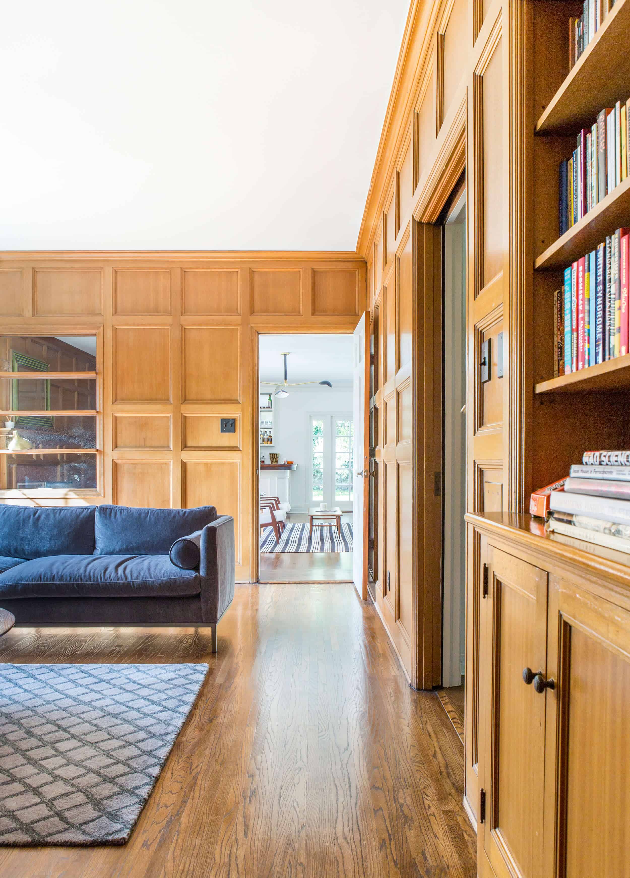
We considered adding a larger area rug here but, size-wise, we agreed that the floating rug would actually work better (Emily still thinks in a perfect world it would be larger and ran the length of the room, but she thinks it works as is as well) . This room is a transition room between the entryway and the sunroom (which you can see in the background), so we didn’t love the idea of blocking the walkways. We gave the recommendation on adding the mirrors to behind the shelves in the wall panelling, which helps to bounce light in here.

There was talk of changing out the media cabinet to something less Danish Mid-Century style and we did suggest some black lacquered vintage pieces. We didn’t love the idea of bringing in another tone of wood because of the floor and walls, and a color other than white didn’t feel quite right. Not fully convinced by the idea of a black pieces of furniture, our client – in his inquisitive ways – actually used black contact paper and applied it to the Mid-Century cabinet doors. I bet you couldn’t tell until I told you, right? After he’d done that we stopped hunting for pieces because he is satisfied. Again, in my professional opinion, this piece could be more interesting, however it’s simplicity and solidity is a great backdrop for the chairs and allows for the wall panelling to be the star of the show.
No doubt we’ll style out and shoot this space, because why the heck not.
Now the powder room.

This again wasn’t a primary project for us to tackle, but as we delved more into the design of other areas the clients wanted us to weigh in on this room. It already had a pretty chair rail detail, so it was clear to us that we needed to wallpaper. We found this beautiful fan-like metallic that comes in silver and gold. We ultimately decided on the silver (or onyx, as it’s called) which picked up and highlighted the chrome bathroom fixtures.

This room has no natural daylight and is directly off a corridor which also with no natural light. No second hand light makes it quite hard to shoot. We just had to show you this wallpaper because it’s beautiful. I also really appreciate the fixtures in this room with the deco style towel bar and octagonal shaped sink. I personally am a sucker for anything that feels slightly traditional so these plumbing fixtures are a delight to look at.

There is part of me that wants to paint the bottom half of the wall black to match the wallpaper to give it that extra dramatic look. But this room is a low priority now that we have the wallpaper in and have other rooms to finish up. We have since added a couple of pieces of art in here and would love to replace the wood Demi-lune with something more deco-inspired, so stay tuned for the afters!
Thanks to everyone who has followed & commented on the intros to this house. We really love how everything has turned out and although we’re almost done, we still have a few bits to find before shooting. We are currently pitching this out to magazines and online publications, so fingers crossed.
Again – see the sunroom, living room, dining room, master bedroom and dining nook.
P.S. A few readers commented during the dining nook post that my (Ginny’s) writing style/my overall thoughts to working with this particular client came across negative. I’m so sorry! Some people may or may not know that I am English and even though we do speak the same language, my written and spoken words can often be misconstrued. I would NEVER, ever intentionally say anything to upset or disrespect any of our clients (and they weren’t offended, either). Working with a designer is a very personal experience and we do become friends. We are hired to challenge our clients and push them into doing things they wouldn’t normally do or haven’t thought of for themselves and sometimes they don’t agree and that’s all good. So, if I suggest for them to paint a room or switch out a light fixture or make the drapes longer, that’s my professional opinion and since we blog about each project (and they agree to transparent blogging beforehand) they know that we are going to be honest and tell you just that. It is ultimately down to the them to decide to heed our advice or not, and we support them no matter what and help them create the rooms of THEIR dreams, not ours. More often than not, it’s our clients who get the biggest giggles out of reading our posts – because we are friendly. There’s a lot of picture perfect things on social media theses days and we’d rather be honest and open about our process because it’s real life, whether it’s the good, the bad or the ugly.


I’m really looking forward to seeing all of the afters of the house! I love the art deco vein that is running through the spaces.
I am surprised that the rug in the library isn’t larger. I realize you covered that Emily wishes it fit the room better above, and I would heartily second that opinion. The floating rug is sort of jarring as it’s not in keeping with the EHD mantra of at least having the front legs of all the furniture on it. Still it’s a beautiful rug, in a beautiful space, with beautiful furniture. I have no doubt that the fully styled after will be even more drool-worthy. Keep up the fantastic work Ginny!
I would third that opinion, actually! It did strike me as odd that the rug didn’t fit. Maybe you could do a post sometime about when its okay to break some of the “rules”? (I use that word very loosely.)
I agree about the rug. It looks accidental. Although I love the design direction!
You know, I totally felt where they were coming from on the rug, actually. If the clients end up using the room as a pass-through, sometimes it’s nice to keep the floor clear to make it easier to clean, minimize tripping hazards, avoid wear on one side of the rug (requiring it to be rotated or whatever), etc. I have a room between my kitchen and the bedrooms that I use like this — both a room in its own right and also as a hallway, kind of — and I agonized for months about layout before I finally realized I could float the furniture and the rug and then have a clear “hallway” at the same time! Tl;dr, one vote in favor of rug as is, and I bet it will be gorgeous when it’s all styled out!
I agree that the rug should stay out of the walking path! Absolutely!
However I would have chosen a much bigger rug and oriented it the other direction, so that the sofa was on it, but there was still a walking path beside it.
This house may be my favorite house and I’ve never even seen it! I can not wait to see all the reveals! Will there also be video tours or a Facebook Live tour of the house? It would just be so great to have a full understanding of how and why things were chosen once we can see it all together.
Beautiful selections so far but you couldn’t make that gorgeous library ugly if you tried. Love. It.
I agree. That library is the perfect space. I die…
There are photos in the post of what looks like a blue sofa in this library room. Was that one option you considered and ultimately decided against?
I think it’s the same sofa, but it’s showing different in photos due to the lighting.
I think that is the same couch, it just looks different at different angles and different light. It’s velvet, and velvet definitely does that.
It totally looks blue in one and gray in the other. I like the blue one best. 🙂
All the wood work in this home is stunning! I love it!
Paige
The curved back sofa is a stunner! At first glance I thought you converted the open shelving near the window to barrister shelves instead of mirror-backing them. Still not too late ; )
STUNNING rooms–But that rug is waaay too small. Maybe orientate a larger size the opposite direction as to not block the walkway? ?
YES agree!!
Love this house and Ginny’s posts!
I am loving the art deco/traditional style harmony that this house has going on! Can’t wait to see these rooms with some awesome art that will take it to the next level. As a designer I totally understand the need to push a client in a direction they might not have thought of, sometimes they go for it and sometimes they don’t and I appreciate the honesty of your feelings when they don’t! Thanks for sharing!
I really appreciate your writing Ginny and your PS because you guys are great with your transparency that it is a process! Although if you ever turn into a fairy godmother with a magic wand and could remodel and decorate my house in a twirl, please let me know!
The Fall is great! Very creepy though, especially the first few episodes.
Try “Happy Valley” if you haven’t already. Great show!
Ginny, yes to painting the bottom wall~ black.
******sexy/glam/retro…… I want this look!!! .
Lovely p.s., Ginny! And I think you’ve always been lovely. If you were less transparent, people would complain about that too.
I cannot wait to see all the finished rooms! I found it sad to read all the rude, negative (in my opinion) comments. I am not a professional decorator/designer but several friends who like our house have asked for my input over the years. We agreed ahead of time that I would help choose, offer ideas, push their boundaries but that the final decisions were theirs because our friendship is most important. I appreciate the honesty of EHD and all the crew.
the light in picture three? I assume vintage, but if not….?
I LOVE that floor lamp with the winding/climbing globes. Ginny, can you tell me where it’s from?
And I hope a magazine or online publisher bites soon on photographing this place! Cannot WAIT to see it all styled out!
Wow, the curved lines of the furniture in the library are a great match for the structure of the library. Where is that beautiful coffee table from?
Is that a wooden valance that I see over the windows? Do you intend to use it for window coverings?
Is that a wooden valance over the windows? Do you intend to use it for window coverings? BTW love this home…..
I think I’d like to see a larger rug in the space, too. What size is in there now? I’m thinking one size up and turned lengthwise. That way it stays out of the traffic area. There’s a lot of wood in that room and I think a larger rug would be a better fit.
Please, please, please have someone check your posts before they go live. There are many missing words, misspelled words and mistakes that are really distracting. I love this website but the seeming haste with which this post was written is disappointing.
These posts are great for illustrating that there are a million decisions that go into realizing a vision, but very few are of the “make it or break it” variety. That makes me far less stressed about the whole process! The posts also show that the room really comes together in the end, after the big pieces are in. I am dying to see what you will do with all the woodwork in this room. Are you going to style it somehow? Drapery? Plants? Art hanging from the ceiling? So much suspense!
Great post and beautiful home. I had to laugh though bc my husband is British and he often comes off as a bit of a Negative Nellie (Nelson?) if you don’t understand his personality and sense of humor (very dry, very British). I never thought of Ginny as being negative – just giving a full explanation of the design process, which as I designer I totally appreciate 🙂
I looooove the rounded back of the chairs and the sofa in the library! A great contrast to all the squares, rectangles and hard edges in the room. That sofa is quite drool-worthy.
Hey Ginny, I was one of those people who misunderstood and thought you didn’t like your client. I’m sorry for jumping to conclusions and judging you! Thanks for the clarifying PS, that means a lot! 🙂