
Makeovers
A Bold and Traditional Master Bedroom Introduction
Hey all, Ginny again with another intro from the Griffith Park house we’ve been working on. So far we’ve covered the sunroom, living room and dining room but today we’re looking at the master bedroom. After scouring the client’s pinterest boards, we pulled together an inspiration and initial product moodboard (scroll down) to get conversations started about the look and feel of the room. These typically evolve over time but are a great jumping off point and help the clients to figure out what they do and don’t want to see in there. Sometimes it can be hard to actually understand what you like and what styles you’re drawn to and these boards can really help with that.
Wallpaper | Lamps | Nightstands | Bed | Chandelier | Bench (similar) | Dresser (similar) | Drapery | Side chairs (we’re custom making but you can find similar here) | Bedding – Duvet, Sham, Quilt | Artwork (vintage) | Rug


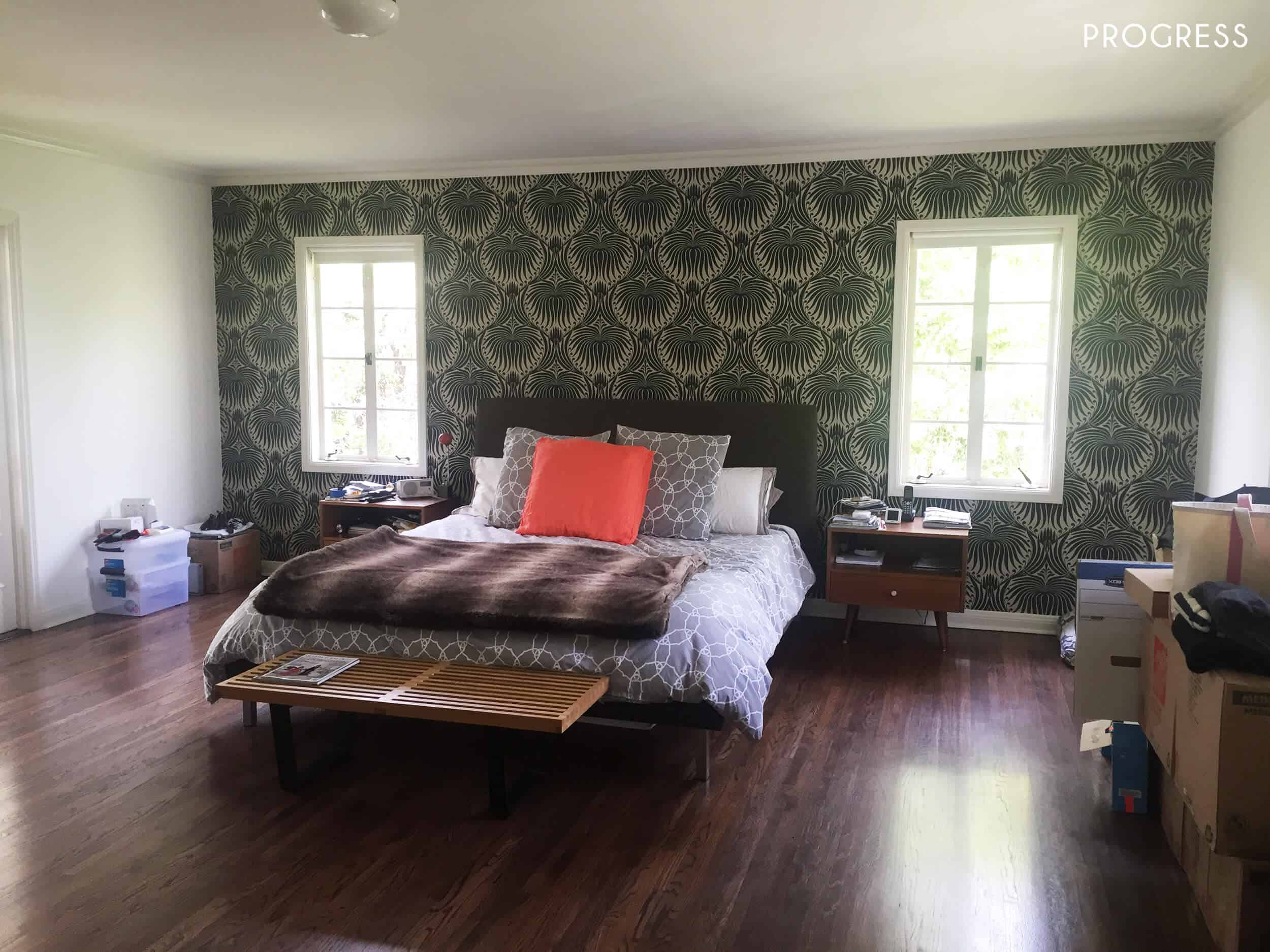
The space itself is fairly large with lots of natural light giving it a lot of potential. All the pretty paned windows and detailed doors are original to the house and the floor had not long since been laid, so all of those were staying. However, they weren’t precious or tied to the furniture they’d brought from their old house so we were free to replace and add new pieces in here.

Directly off the bedroom is a sunroom (above left) which they use as a home office. The glass doors leading into it allow for more light to filter through, meaning all three walls have some form of window. The other door leads to the master bathroom and closet (which they eventually want to remodel. Fingers crossed that happens soon because we want in on it! *client shakes his head whilst reading this).

Wall Mural | Bed | Nightstand | Lamps | Chandelier | Dresser | Side chairs (similar) | Trunk (similar) | Rug | Blue Striped Pillow | Mixed Stripe Pillow | Inky Pillow
This was the initial product board we pulled together for them. We loved the idea of the master bed feeling sophisticated yet eclectic but having an overall moodier edge to it. The color and materials palette was quite simply blacks, whites, blues, woods and metallics. Since the room is so large in footprint we were initially drawn to doing a black metal 4 poster bed but in the end the ceiling height didn’t really allow for it. The blank walls were crying out for some color or pattern so we proposed a neutral mural wallpaper in tones of gray, white & black. That would have been a great backdrop for introducing wood nightstands and brass detailing. There’s enough space in the room for a sitting area which is where we could bring in some color and compliment those with throw pillows/blankets on the bed. Since the floors are a mid-toned wood, we liked the idea of a solid light color rug so that it would pop more and not compete with the wall mural. For the window treatments we suggested doing a roman shade on both the windows behind the bed and then drapery on the side windows.
These were sent off to the clients in a presentation and they gave some helpful feedback notes. “Simple yet inviting” was what they requested and really loved the overall color and materials palette. The wall mural wasn’t a hit but they were open to doing something other than all white walls – music to our ears as always. They were really on the fence about whether to do a small loveseat or two chairs in there (I’ll tell you about “chairgate 2017” another time) but ultimately agreed to have some form of seating area.

Wallpaper 01 | Wallpaper 02 | Nightstand (similar) | Bed | Sconces | Dresser (similar) | Bench | Blue Striped Pillow | Mixed Stripe Pillow | Inky Pillow | Rug
After we’d nixed the idea of a 4 poster bed the search was on to find the perfect cal king and wallpaper to go with it. Even before we pinned down the bed we snagged the two burlwood dressers from Chairish. They have less traditional detailing that we’d imagined for the dressers in here but their simplicity and tone of wood is really beautiful and feels very much in line with our client’s style. We pulled together some more options that had different beds and wallpaper on to show them the direction they could go. At this point they were open to suggestion and didn’t really know what they wanted. The room is large so we felt that a footboard would work particularly well so that was key to our search.
The bed above has a more relaxed feel with it being slip covered. I love the dark blue in here and it sits well with the burlwood. As I often do I looked to Farrow & Ball first for the wallpaper. Since the clients had requested a more neutral pattern I was liking both of these a lot – they are both tonal but have a lot of movement in them because of their organic shaped pattern. They’d actually purchased these sconces before we started working with them but weren’t tied to using them. In cases like this we do try to use as much of what the clients already have, but if we ultimately don’t think it works then we’re fairly transparent about it (in a nice way). The cute seat bench is from Cisco Home and they can make it in any fabric. My thinking behind this guy is that he could’ve gone up against the side wall (between the windows). The nightstands need to be large in here to compliment the size of the room/bed. I liked the idea of doing something that has some form of curvature or that felt organic which is why I opted for these side tables. With the bed having a skirt all the way down to the floor a nightstand with legs would help to keep it from feeling heavy.
Wallpaper 01 | Wallpaper 02 | Nightstand (similar) | Bed | Sconces | Dresser (similar) | Bench | Blue Striped Pillow | Mixed Stripe Pillow | Inky Pillow | Rug
Sticking with a blue bed I did an option with tufting to give it a more detailed traditional feel. This particular one felt too boxy though (especially with the new dressers) but the tufting adds a nice detail to the room without competing with the wallpapers.

Wallpaper 01 | Nightstand | Bed | Sconces | Dresser (similar) | Bench | Blue Striped Pillow | Inky Pillow | Rug (similar)
As you can see I was favoring the swirl Tourbillon wallpaper over the other (I need to put this into a room because I love it so much). I like this bed because it’s raised off the floor more so than the other two which makes it feel lighter. I went to see the bench in person at Cisco and they had a leather version which I liked a lot but it started to get quite heavy with the two dressers and the new nightstand I added in.

Wallpaper | Nightstand | Bed | Sconces | Dresser (similar) | Blue Striped Pillow | Inky Pillow | Rug | Bedding
The clients really only wanted to do the wallpaper behind the bed (for cost purposes and busy-ness factor) and typically we prefer to do the whole room as opposed to a feature wall but they ended up winning that battle. With that being the case for the next few options I went with a bolder style wallpaper to give us a wow moment on that wall. The clients were actually quite into it (I’d already proposed this for the dining room – so I was pushing hard for it in this room) but they did worry that it would ultimately feel too busy for them. We did show them a ton of other options in person and they went with a really fun bold print which you’ll see further down. In this option above, I like how the light color tufted bed pops off the back wall and compliments the color in the wallpaper. I switched up the nightstands in this option for ones with a curved front and brass hardware.

Wallpaper | Nightstand | Bed | Sconces | Dresser (similar) | Blue Striped Pillow | Inky Pillow | Rug | Bedding
For this options I changed out the bed for a dark charcoal fabric to go even more moody in style. It definitely speaks to our inspiration but would really need livening up with blue chairs and bedding for EHD’s tastes.

Wallpaper | Nightstand | Bed | Sconces | Dresser (similar) | Blue Striped Pillow | Inky Pillow | Rug | Bedding
The clients had mentioned in passing that if we didn’t do blue chairs (or bed) that they’d be open to a large blue rug, so this option shows exactly that. I was really feeling this bed (which we ended up going with but in a different color) because it’s a solid balance of boxy softened out with curves and tufting. I also like that it’s on turned legs which helps to make it feel light and off the ground and keeps it feeling traditional.
Now when I said we showed options of bold wallpaper they probably picked THE boldest one we had (aside from the Tourbillon). As much as we do love all walls wallpapered this might have been overkill. So instead we used a complimentary color that matches the cream tone in the wallpaper to paint the rest of the room. That way the walls didn’t feel too stark against the dark pattern.

After presenting and discussing the bed options with the client they went with the Chesterfield from Restoration Hardware in slate blue vintage velvet. It has a softness to it that sits well against the wallpaper and the color is subtle but stands out. You can see the window treatments from Decorview here too. We did a light oatmeal linen for both the shades and drapery with black hardware. I cannot express how much I love custom window treatments. They are definitely not cheap and are a total luxury but they are worth every single penny as they make a room feel more polished and pulled together.

The initial plan was to do a bench between the two windows and we found a really cool vintage 70’s rattan one from Goodeye Gallery. Without divulging the secrets of Chairgate 2017 just yet (I think that will have it’s own post) the bench actually looked better in front of the footboard. So we’re going to do two chairs and a side table here instead.

This is where we are currently at with the design plan. We have the nightstands in there now which are the larger version that Emily has in her master bedroom. They’re leather and have really nice curves to the front (from Made Goods). The bottom shelf is also lined in a linen fabric too which makes them feel extra special. The bench’s seat pad is currently being reupholstered in very cool black and white pattern fabric from Schumacher. There was some concern about adding another pattern in this room because the wallpaper is so bold but the bench fabric pattern is small so that it doesn’t compete with the lotus motif. These chairs are very similar to the ones we’re actually making for them – rounded barrel chair with a swivel wood base.

Here’s a little sneak peek into how this room is coming along. It’s really hard not to show you all the recent progress photos we’ve taken, but it would just give too much away. So for now this is as much as you’re getting. Don’t worry we have the full reveal coming up as soon as it is all styled out and finished.
We still have a few more small intros in this house before the final reveals, but let us know if you have any questions so far!


I cannot WAIT to see all the reveals from this house! Loving it so hard!
Freedom APK is what comes to mind when it comes to surfing and playing premium game without shelling out a dime for it.
Many users have complained that there are no free lunches in life but this app makes us believe otherwise. Want to know more about the Freedom app? Check out this website
I love that round, 3 legged side table! Is it a one off piece (since there isn’t a link to the exact table)?
It’s a vintage piece sadly for the rest of us. xx
This bedroom is my favorite. Ever. That’s all.
Very pretty room but I would have done the carpet color on the bed and the bed color on the carpet. As it stands now there is no differentiation between the bed and the wallpaper. I understand the wallpaper is being used as the focal point but a lighter color bed would “pop” and relate to the other 3 walls wall setting off the wallpaper, in my opinion. YMMV.
Just FYI That “inky pillow” is the Hand-Dyed Indigo Topo Pillow from TRNK.
O perfect! Thank you!
Can you tell me what the creamy paint color is? I’m looking to paint my bedroom a very neutral color after a misstep with a color I thought I liked in the swatch but ended up hating when it was the whole room.
Is it possible to link to the blue swivel chairs or something similar? If they have a small imprint, they may be what I’ve been looking for. Thank you.
I LOVE the bed and love the wallpaper! I wish they had chosen to paper the whole room, though. Just one wall seems 1990s to me and kind of stark against the light non-papered walls. However, I’m sure you’ll make it look fabulous as is!
My parents had an entire bedroom set in that Burl wood and now I’m horrified that we gave it to my Aunt in the late 90’s. The armoire pattern and headboard always looked like monsters to me, but ti was gorgeous and incredibly well made.
Ginny, I love your initial product board. It is spot on for me (if I was your client), especially that mural. Nevertheless, it looks like you and the client are happy with the changes made and progress to date…and that is what matters. Thank you for sharing and I look forward to the reveal. Cheers, Ardith
I agree… me too preferred the previous boards
looking forward to the final reveal
ohhh, i love the burl pieces! i love all the burl you’re doing in this house! love the wallpaper, the bed, all of it. woowooo.
Have any of you burl lovera seen the show Filthy Riches? It’s amazing! It made me appreciate burl wood even more. I love that it’s regular people like you and me that go on adventures to gather the things that make life beautiful! Check it it sometime if you get a chance. Sounds like a commercial – but just wanted to share something that made me appreciate the whole process even more. :).
I love that wallpaper!
Paige
I like the bedroom only one color
well! love this style…the color look great… I love the bad room a lot..
The print on the wall paper looks like upside down lotus
Is this the way it was intended… looks topsy turvy to me !!!
and why was the four poster bed swapped out
Jenny at Little Green Notebook has her lotus wallpaper the same way up so it must be right – or at least all the coolest people are hanging it upside down!
And it says in the text the ceiling height ruled out the four-poster bed.
As for me I feel like I wish the bed were wider so the bedside tables could be properly under the windows. But I do realise that’s being a bit fussy! The house is going to be amazing.
As per the Farrow & Ball website it looks like this is the orientation the wallpaper is intended to be hung
I am so giddy and excited about this! Everything is beautiful, unique and jaw-dropping. These spaces will serve as #interiorinspo for years and years to come. I CANNOT WAIT for the full reveal!!
Love the final rug! Where is it from?
Thank you for the information
cara membuat rebusan daun salam untuk asam urat
This room is stunning – love watching your design evolution!
Google Pixel is a terrific phone, front and back cameras are both very good which is very decent set and view it in the company of the world it is this value for money you’d love a look by the time use. Google Pixel 2 is another smartphone coming this year in Oct. If you want to know more about, then visit our page.