
Make Overs
How Megan Hopp Stretched Her Design Budget To TRANSFORM Her Three-Story Townhouse (You HAVE To See The Before & Afters)
I last left you with my tale of how I ended up buying this house in Alexandria VA, and what my plans were to turn this space around in a big way without a super big budget. Working on this new (old) house I had a lot of goals…
- To fully finish the common spaces, kitchen, and bedrooms (bathrooms I would leave for another day).
- To turn these rooms around as quickly as possible! With a newborn baby and all the changes happening in life, now was not the time to dilly-dally.
- To use as much of the house “as is” without compromising my overall satisfaction with the design.
- To work with as many of my favorite vendors as possible on collaborations so as to represent the pieces and materials I love and use often in work. And to keep it real, help out with the overall budget.
- To round out furnishing and decorating the space with as many second-hand or outlet pieces as possible – if you’ve ever read or seen a drop about me, you know I am a second-hand, previously owned, thrifting gal about town. Not only was this element of working on my home ESSENTIAL to actually finishing the scope in budget, but it’s also just fundamentally who I am. I adore fancy furniture, but at this time in my life purchasing a fifteen thousand dollar sofa is not in the cards.
With that-welcome to my home! I live in this three-bedroom, three-story brick townhouse with my husband and 18-month-old son. Join me as I take you through the house and design journey that unfolded as I built each room balancing style, budget, and practicality every step of the way!
The Entry/Stairwell
Scope: Wallpaper, Retile Floor, New Lighting, Furniture & Decor

Wallpaper | Door Paint Color | Woven Pendant | Mirror | Marble Hex Tile


This space started off so dark, and nondescript with a black floor and door, and a teeny tiny light fixture. The goal here was clear, go big and go BRIGHT. Blue and white stripes are my go-to pattern/color combination and I knew I wanted one of the more dramatic prints used to be in the entry and stairwell as the first impression. I fell in LOVE with a print by Wallshoppe called Roman Holiday Grid (in grasscloth), and boy oh boy does it make a statement in the best way. The particular shade of blue strikes just the right tone, and the pattern proves super classic, with a tiny twist of vertical and horizontal lines, making it feel fresh and interesting. If you’ve ever encountered grasscloth, you know it completely elevates a room, changing the physical feel of the environment dramatically. After making my wallpaper selection, I knew I wanted to update my existing front door to a shiny blue, so I turned to Clare Paint (who makes paint shopping the absolute easiest), and selected the color Frozen. A big design mistake I see people make is matching colors too literally. I didn’t want an identical match in shade between the door and wallpaper, but rather to strike a complement of hues in the same universe to create a monochromatic harmony.
For the floor, I opted for a low price point classic Carrara 2” hex tile that I picked up myself at the local Floor and Decor for $13/sq ft. (now $15-inflation!). It’s not the tile of my dreams by any means, but the white marble added a much-needed light reflective surface, and the texture of the natural stone packs a punch design-wise higher than its actual cost. I used a dark gray grout to contrast the white in the tile and make it pop that much more, darker grout is also a more practical selection for a high-traffic area like an entry space. I am a big believer in big lighting, and so my personal rule is if you’re over 6’2”, you may need to duck. I don’t have high ceilings in this space, but opted for a rattan cone pendant that was just about as tall as I could manage to fit. What is an entry space without a superstar mirror right? I was lucky to partner with Shades of Light who have a great selection of mirrors, and for the entry I went with an ultra sculptural white textured option that holds its own as a real centerpiece. I rounded out the space with a slim simple console I’ve had for years prior from CB2.


Kitchen
Scope: Wallpaper, Moving Lighting/New Fixtures, Painting Cabinets, New Hardware, Custom Range Hood, Furniture & Decor

Taking a sharp left into the kitchen, this was a space where I really felt a challenge ahead of me. I myself am not super into modern kitchen design. My dream kitchen was probably built circa 1930, has original cabinets, tile countertops, a vintage stove, and quirky built-ins galore. I also like a kitchen that feels light, clean, and neutral, like the window is always open with a summer breeze blowing through…BUT I don’t want a boring white-on-white design. The kitchen was my greatest challenge budget-wise because I was going to be doing what I call “heavy decorating” (this is a term I would actually use to describe the nature of the work throughout the entire house), but I really wanted to make this space feel different. The kitchen had some modern updates (granite countertops, gray backsplash, and a stainless steel/glass hood) that felt really disjointed to me with the older features like the original cabinetry. I knew for better or worse we were keeping the counters and backsplash, so the task ahead was to adjust everything around them to make the entire space feel less…gray.

Cabinet Paint Color | Knobs | Tea Kettle | Sparkling Water Maker
The biggest splurge in here was a professional paint job on cabinets, which ran us about $5,000. Luxor Improvements (my go-to contractor in the DC area) did a wonderful job removing all the doors and hardware, sanding everything down (there were so many layers of paint on these cabinets they said each front took at least 20 min), and spraying the cabinets both off and on-site in Benjamin Moore’s French Canvas. I opted to keep the original brass hinges, but swapped in low price point knobs at less than $3 a piece. While there are certainly $30 knobs out there that I dream to have – blowing my budget on knobs was not the move in this time or place.

Onto the wallpaper, originally I would have told you I was committed to some sort of large-scale vintage floral in this space However, given my above sentiment on color pairings, with the counter and backsplash the right shades were crucial in this selection. When I saw Thibaut’s classic gingham print Saybrook Check, I immediately knew it was the perfect solution. The overlapping neutrals were the perfect color combination to tie in and warm up those gray counters, making them feel less stark, less modern, and more like a causal stone counter that’s just doing its thing. I also definitely had the ah-ha moment of “of course I should do a classic gingham…obviously”.

Another money-saving “hack” I came up with was to remove the glass arc from the existing hood, and build a custom decorative wood covering around it, so as to match and integrate with the cabinetry. This way I was able to keep the existing functionality of the hood as is, as opposed to starting from scratch, a huge win. Luxor was able to take some of my rough sketches and inspiration images and build something off the cuff on-site in a single day (I was so delighted, I kept saying your tagline should be “a hood in a day”).
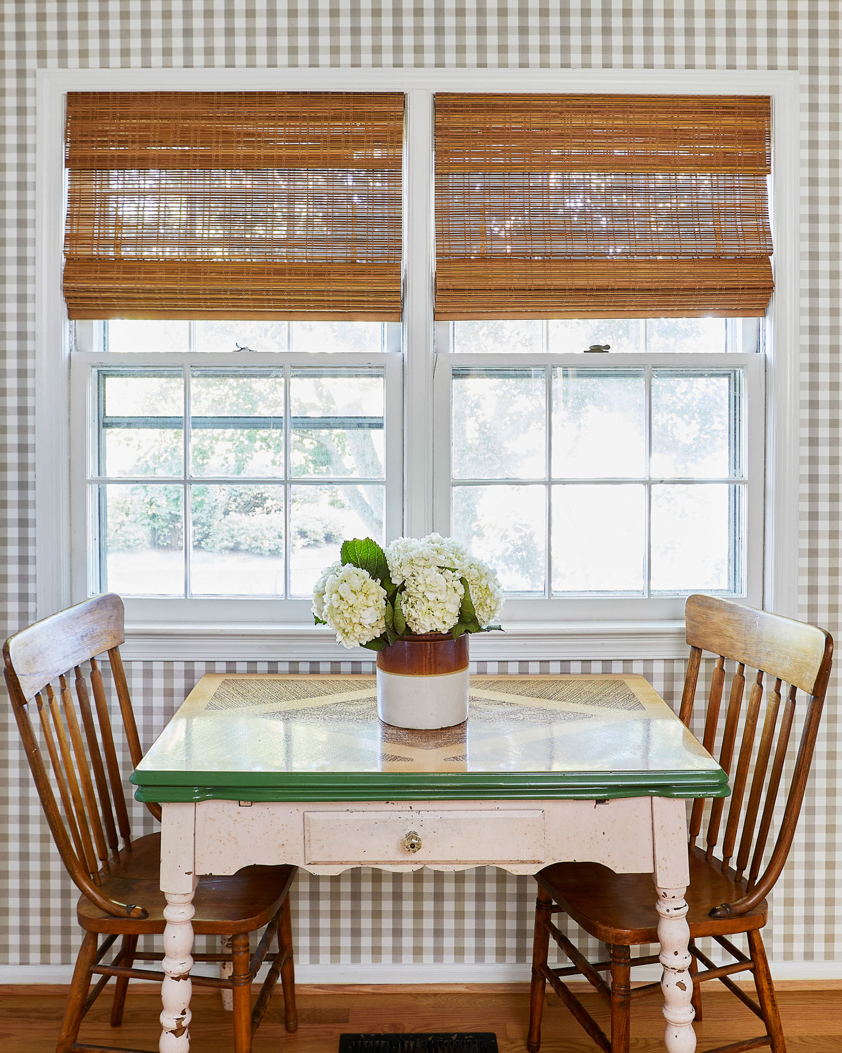

I finalized the space by moving some lighting around and swapping in some classic schoolhouse-style fixtures, as well as replacing the window treatments with my all-star favorite bamboo roman shades that I have used for years. The furniture is all second-hand – the table is a vintage enamel top gem I scored on FB marketplace for $40 and the chairs from Goodwill for $10.
Living & Dining Room
Scope: Wallpaper Walls & Ceiling, Eliminate Recessed Lighting, Add Flush Mount Lighting, Replace Chandelier, Furniture & Decor

Wall Wallpaper | Ceiling Wallpaper | Drapes | Sofa (Thrifted RH) | Coffee Table | Green Bowl | Side Tables | Brass Table Lamps (Similar) | Flush Mounts
Whether you know me or not, it takes nothing more than a quick glance at my work to gauge my passion and dedication to wallpaper. It’s the core of my design work and personal style, and it’s where I begin in crafting a space every single time. The living room is the center of the home, and therefore the center of a design, and as such this entire process began in selecting what wall treatments I would do in this room. I knew I wanted to paper both the walls and the ceilings, I knew I wanted blue and white on the walls, I had a hunch I wanted a block print of some sort…and so the search for the perfect print began. I ended up being lucky enough to partner with one of my tried and true favorite vendors, Thibuat, and they were generous enough to send me one million samples. While I like to review everything in the world, I am also the fastest decision-maker ever, so when I saw their Julian print it was “DING DING DING, selected and pressing on.” For the ceiling, I wanted to get something super textured up there to add an architectural quality and bring a real warmth to the room. I landed on a chunky woven grasscloth that ended up being one of the most special elements of the house.

Bench | Natural Rug | Top Rug (Vintage)


Planter | Chair (Thrifted Crate and Barrel) | Throw Blanket | Green Side Table (Thrifted and Painted ) | Decorative Box | Bar Cabinet

Chandelier | Dining Table (Vintage) | Captain Chairs (Old RH) | Side Dining Chairs | Mirror | Curio Cabinet (Vintage)
I always say that Alexandria reminds me of a mix of Charleston and Beacon Hill in Boston…which is a little like, “duh it’s geographically right in between”. Much like its place on the map, my goal with this design was to layer a mix of styles that struck that middle ground. I wanted the home to feel playful and color-forward without being a southern pastel Disneyland, as well as revolutionary chic, all while not ending up an uptight antique shop. As the furnishing theme continues, nearly every piece of furniture in the space was purchased second-hand, or from an outlet or thrift shop. The sofa is Restoration Hardware that I found on FB marketplace for one thousand bucks, the coffee table and bar cabinet I got at my local Crate & Barrel outlet at a super steep discount. The dining table is from Chairish and the Curio Cabinet I found at a Salvation Army for $250 (a nightmare to move but worth it). One thing I really splurged on in this design was lighting. There are light fixtures I have used in client spaces time and time again and kept in my heart for YEARS. This go around I finally got to implement some of these fixtures into my own space, the two brass Visual Comfort and Co Clark flush mounts being top of my list.

The last element to come together in this space were the window treatments (and when I say last I mean I hung them myself at 11 pm the night before we shot the room…and dropped a curtain rod on my eye sending me glasses to Mars). Real talk here…custom window treatments can cost you more than a car, they are just that expensive no matter how you slice it. I know this, I live this, and I just kept hemming and hawing over how to get substantial draperies into this room without spending ten thousand dollars, truly without spending one thousand dollars. Pepper Home to the rescue! These curtains were made to order so I could get the perfect length and style without having to alter some off the shelf panels myself. With their pinch pleat detailing, velvet border tape, and 100’ width per panel they transformed my living room in the most dramatic fashion!
Primary Bedroom
Scope: Wallpaper, Built-in Removal, Replace Light Fixture, Furniture & Decor

Wallpaper | Bed | Quilt (Flax) | Fringe Pillows | Lumbar (No Longer Available) | Curtains

Desk | Chair | Chunky Knit Rug
The bedrooms required a lot less work than the common spaces and consisted mostly of wallcoverings, new lighting, furniture, and decor. In the primary bedroom, I ripped out an old built-in that spanned one side of the room. While built-ins can be such a luxury, this one wasn’t particularly practical or attractive. I could have spruced it up but it ultimately felt like a mistake to put any money into something that just wasn’t working from the start. Instead, I opted to eliminate it entirely creating a nook for the BIGGEST dresser I could fit. Casegoods are one category of furniture where cost and quality are directly correlated, but I obviously wasn’t going to shell out thousands for a new piece, so I took to the second-hand market. After a bit of a search, I came across a Restoration Hardware eleven-drawer piece on the second-hand site KAIYO, and was able to procure the dresser for a true fraction of the original retail price.

Mirror | Dresser (Thrifted) | Rug
Having come from NYC, you live a life where you never have enough drawers, and every time you open the ones you have, they are stuffed to the brim and the experience is miserable. This dresser is what suburban dreams are made of. I tend to lean towards lighter softer colors in a bedroom out of personal preference, but I didn’t want the room to feel sterile or even worse boring. I built the room around another Thibaut textured wallpaper in a sage green herringbone. The pattern and color are subtle enough to create a somewhat neutral base for the space but interesting enough to make a statement. If you are going to use textured paper anywhere in your home, prioritize the bedrooms. My favorite quality about a textured wallcovering is how it dampens the sound, creating an instant cozy factor.


Chair (Vintage) | Nightstand | Table Lamp
Another special find in this space was the silk striped armchair in the corner. I didn’t quite know what I was looking for with this piece but recognized the chair on FB marketplace as being from the home of another designer in the area whom I follow on Instagram. I immediately loved it and shot her a note to see if I could call dibs! The bed I wanted to keep bright, light, and neutral, and worked with Serena & Lily to dress it in all my favorite go-to linens and pillows. I’m not someone who subscribes to the “I’ll sleep when I’m dead” mentality. No time to waste, I’d prefer to do so now.
Nursery
Scope: Wallpaper Walls And Ceiling, Replace Light Fixture, Furniture & Decor

Wallpaper | Mirror | Dresser (Unavailable) | Rug (One of a Kind Kellogg) | Glider | Footstool (Vintage) | Roman Shades
The nursery was the first space I designed in this house, and to be honest, I really designed it well before we found the house, or even getting pregnant. After having worked on countless nurseries for clients, I slowly was building the nursery I would want in the back of my head over the years. Boy or girl, I knew I wanted neutral stripes and blue florals, and so that’s what I did. Serena and Lily worked with me on this space, and I was able to bring it to life with some of my favorite pieces from their line. Stripes are my number one pattern in the universe, and while I love color, I also like the flexibility a neutral pattern can offer while still adding fun visual interest. I also knew I wanted to run the stripes across the ceiling to create a circus tent atmosphere, which is always the physical place I really want to be.


The wallpaper, crib, bedding, mirror, and baskets are all from Serena & Lily. The dresser I have had since my solo lady days back in my first Brooklyn apartment and was really thrilled to be able to repurpose it here. The rug was an excellent second-hand find (from say it with me, FB marketplace), a one of kind embroidered Kellogg rug.

Daybed (Vintage) | Quilt | Square Pillow | Lumbar Pillow | White Bin | Shelf (unavailable)
The daybed frame I scored for $75 bucks with the seller claiming it was a vintage piece from a Parisian flea market – who knows but we’ll go with that story. My nature as a designer is to go all in on a colorway in a space, but in this room, the choice to lean more neutral was also very budget motivated. For starters, this child will age and the look of the space will need to grow and adapt with him, and financially speaking I will not be changing this wallpaper in 5 years.
There is also a potential we may do some room swapping/reconfiguring in the future and if the current nursery ever becomes the primary bedroom I wanted a base that would work in either scenario.

The one piece of furniture in my house that I TRULY splurged on is the glider. I bought it new and it arrived one week before I gave birth – I plan to sit in it every day until I die.
Guest Room
Scope: Wallpaper, Carpet, Furniture & Decor

Wallpaper | Headboard | Bone Inlay Nightstand | Table Lamp | Lampshade (Vintage Laura Ashley) | Pedestal Side Table


Console | Mirror (Similar) | Shades | Rug (Vintage from Old New House Rugs) | Bench
I’ve obviously never had a guest room before and was really excited to create a cozy little space for family and friends to feel comfortable and welcome when they visit. In addition to my excitement about this space, it was also my last priority in terms of budget. As such, much of this room consists of repurposed pieces from previous homes and spaces. The only new piece of furniture in this room is the vintage cane seat side chair which I got at a Goodwill for $2.99, everything else I had previously. I love using furniture you’ve had one way forever in a new environment where it suddenly feels like it has a new lease on life, such a rush! The wallpaper was of course a new addition, also from Thibaut. I have a bit of an obsession with using red and blue in combination with one another, but I always feel a hesitancy in taking it too far with an end result that reads “patriotic lunatic”. This felt like a safe space to lean in on the red and blue while layering an eclectic combination of patterns and textures on top.
Den/Office
Scope: Wallpaper, Carpet, Paint Fireplace & Wall Paneling White, Replace Light Fixture, Replace Sliding Door With French Doors, Furniture & Decor

Wallpaper | Sofa | Loveseat | Side Chairs (Vintage) | Ottoman | Media Console | Pendant | Roman Shades | Drapes
Lastly, we come to our final destination on the tour, the hybrid den and office space, arguably the most transformed room in the house. Much of the house has very traditional finishes, crown moldings, etc. The lower level however was architecturally much simpler, and much more cookie-cutter as a starting point. My husband is a mid-century modern design lover and given that I didn’t really inject much of that anywhere else in the home, this felt like the moment to lean in. I wanted to do a fresh take on a classic mid-century wood-paneled basement, all while taking the original space from dark and heavy to light and airy.


Brown Velvet Pillow | Tiger Lumbar Pillow | Wall-to-Wall Carpet
The wallcovering in this space is the absolute star of the show, a geometric wood veneer covering from Thibaut that brought this room alive in the most electric way. This wallcovering was actually one of the first samples I ever ordered from Thibaut years ago, I kept it in a drawer just waiting for the right space to use it in-not knowing it would be my own! We ripped out the old carpet and covered the entire downstairs in a soft textured ivory wall-to-wall selection. It’s so nice to have at least one space in the house kids can roll around on and get cozy.


Desk | Bookcases | Chair | White Bins
Other updates included a fresh coat of white paint on the wall paneling and fireplace, updating the overhead lighting, replacing the old sliding door with a modern french door set, and new window treatments and furniture (the large ottoman from Shades of Light being my favorite piece to throw your toddler body on with zero risk). The room works out great as a workspace during the day that shifts into a place to relax on nights and weekends. While this is technically the least colorful room in the home, I’d hardly characterize it as neutral!
Until Next Time
In hindsight, the timing of buying a house weeks after having a baby, and jumping into a full transformation soon after didn’t make for the most relaxing year – like anything worthwhile, the journey to get there is hard and taxing. I can say being on the other side of this project is really a sigh of relief to come home every day, and not think about what I need to do next in the space, but rather enjoy it. The moral of the story and what I hope to leave everyone with is to cut yourself a break when it comes to interior design. You aren’t crazy for wanting a picture-perfect space, everyone does, but nothing is as easy as it may seem or as one might say. I transform spaces for a living every day of my life, and even with the skill sets I have under my belt, the access to discounted product, and knowledge of how to stretch a budget as far as humanly possible…it’s a challenge. A challenge I enjoy more than anything and think about incessantly, but I never want to leave you with an unrealistic picture of what it takes. My best advice is to take your time (within reason of course – love a fast decision put into action!) and don’t let the pressure of the price tags defeat you altogether. Little by little the projects, progress, and great finds add up, and with each new improvement you’ll be on your way to that perfectly made space for you.


*Design by Megan Hopp
**Photos by Kelsey Ann Rose


Emily, you should hire her to help with the farmhouse!
Her style would fit in so perfectly at the house in Portland!
I always enjoy everyone’s differing opinions. I don’t think this style would be what Emily would want for her house or personally think it would look right for her and am loving all of her reveals with her style starting to be infused more and more.
I was just thinking this! Megan does some of the most sophisticated, light-hearted color/texture/pattern-mixing I’ve ever seen–at least of a type that would work with Emily’s blue, green, lightly pretty, natural woods style. What if Megan and Emily collaborated on the farmhouse living room? Just for fun? That space is tricky, and I would love to see what Emily+Megan could do with it….
I meant lightly “preppy”
WOW. This was a RIDE from start to finish, and I loved it! Makes me realize just how much vision a designer brings to a project; I look at the before pics and can’t fathom how you could see beyond what was there. Congratulations!
Ok, compared to the AD home tour yesterday, finally wallpaper I can get behind! This home is such a great example of how traditional style can still be fun and sophisticated. The kitchen is a standout. And love all the thrifted/secondhand furniture, very jealous of what seems like a fantastic DC area market! Thank you for sharing this with us!!
The kitchen and living room look great — the wallpaper enhances both spaces without being over the top. Speaking of over the top, that blue wallpaper in the hallway is a huge No for me. I think I’d have a migraine from having to walk through that wallpaper every day. Yikes.
I agree! That wallpaper seems out of place to me with the rest of the house.
Wow – wow – wow! This is one of my favorite transformations you’ve ever shared. So much inspiration … I couldn’t stop staring at each and every picture and taking in all the details!
This is INCREDIBLE. It’s preppy, it’s fresh, it looks classic and ridiculously cozy. WELL DONE MEGAN! It looks like you’re a hardworking genius with a clear vision and amazing taste.
This is absolutely gorgeous – BUT – big BUT here – in the real world with real pricing you cannot do this with 25,000! Kind of a misleading heading.
I would love to see the comparisons. So it cost you $25 000.00 which in the world of design is really impressive. I would love to know what this transformation would have cost a regular person without sponsors. Not to judge just to know. I think what she did was really lovely.
Yep. The $25k doesn’t include the free wallpaper or nursery stuff from Serena & Lily. Still, a beautiful job and love the Facebook shopping.
Yes. Love this space but totally agree. You could spend $25k alone on designer wallpaper for a whole house!
At least another 25k. Thibaut is right there before deGournay, and I might missed it, but I don’t know if the installation is covered or joint partnership with another contractor or not. Ceiling installation is a beast.
I wish we can know how much this would cost for normal people. Title is misleading and makes me cautious to click the next article.
Totally agree. The wallpaper + install price tag alone would’ve been $25k, easily.
This is what I came here to say. Love it, but felt lied to through the whole post — no chance in hell someone could spend $25k on that — and by sharing it with that expectation (even with the note about sponsors) is just deceitful.
And I love this blog! So I hate having these feelings about it.
Agree! There’s a $400 blanket. Just left a terrible taste.
The title isn’t “Design and Decorate YOUR House for $25k” but “How Megan Hopp Stretched HER $25k Design Budget To Transform Her Three-Story Townhouse”. The post then details the process she used.
I don’t expect that but the numbers don’t add up…check the links out for yourself.
Hey Kj! Did they change the title this morning? Maybe in response to the thread? Thanks for all the clarity.
Yes, the title has been changed
From the first post, the $25k is the construction budget:
I started off the process by making a “realistic dream list” of projects I would like to do in the house, things like “furnish the entire house,” and re-tile the entry landing. I knew I obviously couldn’t afford to fully renovate the kitchen, but maybe I could swing getting the cabinets professionally repainted. I brought over my contractor (Luxor Improvements) who I work with in the DC area, to walk through a hopeful punch list, and he in return provided me with an itemized price list. My husband and I decided we were able to spend up to 25 thousand dollars on construction fees (this is just the labor – not the materials), and as such, we edited down the list to include a logical combination of must-haves and eliminated things like built-in window seat cabinets in my son’s nursery that ultimately just didn’t make the cut.
That is a HUGE distinction. If Megan had a $25k budget for CONSTRUCTION (and also, budgets are usually run over–was that the case here? The writing doesn’t specify), what was the cost for everything else? And what would it cost for a normal person without sponsorships?
Agree. The budget on wallpaper alone had to be HUGE. I wouldn’t know from the links because half of them are price upon inquiry/signing in and I can already say that is out of my budget! This is a gorgeous house- absolutely LOVE it. But don’t play it off as budget- that’s just mean to the rest of us.
Loved every bit of this, and that is the most links I have clicked on in a very long time!
Love this tour, thank you! It is classic without feeling stuffy, warm without feeling cluttered, and stylish without feeling try-hard. What a delight! Congratulations on your beautiful transformation.
This is INSPIRING! In how relatable, cohesive, decisive, thoughtful the home feels. Overall its clean without being cold and I definitely see how the style can get dialed to different directions depending on switching out furniture and accessories. Using the spendy lighting to accent thrifty finds is smart and I particularly love the elegant wallpapers as a neutral grounding, they elevate the whole home. Not all of it is 100% my cup of tea.Some of spaces are too neutral for me and some are too busy but as they live in it and add more stuff etc I think that feeling will even out. Overall it feels like a breath of fresh air and a perfect clean slate for a new family. The whole place feels both calm and inevitable.. very soothing !
Absolutely lovely! I’m also jealous of the apparently fantastic secondhand market in DC. You took thrifting to a new level with this house, and your use of pattern and color is perfection. I love how this looks traditional but feels so modern and fresh.
This is absolutely extraordinary. It really shows what is possible with strategic, informed choices (and how nuts the spend-spend-spend model of decorating really is). Congratulations on your achievement!
This is such a fresh, warm home! I love it!
Meghan this is stunning! You have such a wonderful sense of color, texture, and proportion—and lighting fixtures!!! Hard to pick a favorite space but I’m amazed at how you made builder-grade granite sing in that kitchen, and that hood is BRILLIANT. I also LOVE the basement transformation and the pendant in the nursery. It’s so nice to see how budget constraints can force really creative decision making, and how great $3 knobs can still look! Bravo
*Megan, sorry!!
Yeah, that wallpaper to transform the builder “gray” hard surfaces is AMAZING
love all the vintage decor throughout. that always makes a home so interesting to me to look at. and i really looked at each picture. the living room is great, love that wallpaper choice. that entryway paper is AMAZING! i want it. where is that light in your upstairs hallway at the top of the stairs from? I didn’t see it linked. loved all the wallpaper choices in the bedroom. man oh man. i just loved to look at all the second hand pieces. seriously. so good.
Looks like the Visual Comfort Siena Small Flushmount/Serena & Lily Breton Small Flushmount. Lowe’s has a lower-priced dupe:
Love your comments Kj!
On the flip side – anyone else wondering why the spam comments that have been appearing at the top of the comments recently haven’t been removed?
I really love this whole home transformation. I’ve been wondering if my dreams were going to far in the direction of wallpaper in more spaces in my home and I love how Megan leaned fully into what she loved. Now I just need Mural Source to sponsor my entry way and hallway!
thanks kj!
This is stunning and Emily should totally hire you as a designer for the farm house.
This is gorgeous, but *please* ditch that headline, as “$25,000 budget” is misleading. Fine to mention it was only possible with brand partnerships, but just give the real price for a real person, versus what is essentially clickbait. Left me with a sour taste in my mouth. ugh.
I foresee a future owner who will be saddled with thousands of $$ for wallpaper removal.
Is it really that much, in the scheme of the whole house repaint that new owners often want?
You cannot paint over wallpaper! Removing wallpaper is time-consuming and may be costly.
And that will be the next owner’s choice. If any homeowner desires wallpaper, choosing NOT to add it simply to make life easier for the next owner would be pitiful—especially when the homeowner is a designer who clearly appreciates beautiful spaces.
Yeah, unless you KNOW you’re moving within a few years, decorate for yourself, not future owners.
Every room was a bit much. I adore wallpaper but used in a room or two.
I love the house tour and it’s wonderful to see so much secondhand furniture, but the headline of $25,000 for all this seems highly unrealistic. Leaving aside the fact that several categories of decor — lighting, wallpaper/installation, and nursery furniture — are apparently sponsored, the glider alone is around $2K, sofa at least $2K, bar cabinet same, and that’s just three pieces of furniture, and she’s said the cabinet painting cost $5K, do that’s $11K, plus custom range hood. I am just not getting how all-in this can cost $25K. There are great tips here but it feels like a bait ‘n’ switch when there’s extremely high end pieces (sponsored) and the math doesn’t seem to add up at all. I am here for design transparency we expect from Emily. Truth in design, please.
Apparently she said in her previous post that $25k was their construction budget. So definitely not the whole budget, but the title made it seem as if it was.
Wow, this is a great looking makeover. I really appreciate the level of detail and explanations. The source for curtains was new to me, and looks promising. I think I was most drawn to the vintage finds, but I also liked how the kitchen showed ways to make grey countertops work.
Without sponsorship most of us couldn’t swing all the wall coverings, but I bet it would still look good with carefully chosen paint.
Thank you Megan for the basement inspo!!!! – I have a mid-century modern (ish) house and LOVE the wallpaper you chose.
Well, this was the most satisfying read and transformation I’ve seen in a LONG time! I love how real it was (a $25,000 budget for an entire home? THAT is what most of us can understand and relate with) and how well thought out Megan’s design decisions were. She clearly knows what she wants AND how to make it happen. Plus the thrift finds!!! And her outfit in the last photo!!! This women (and her home!) is FABULOUS! More Megan please!!!
I believe her $25K budget was for labor only, not materials, per her previous post.
Then that makes the headline even more deceitful. Come on!
Yes, from this post
I started off the process by making a “realistic dream list” of projects I would like to do in the house, things like “furnish the entire house,” and re-tile the entry landing. I knew I obviously couldn’t afford to fully renovate the kitchen, but maybe I could swing getting the cabinets professionally repainted. I brought over my contractor (Luxor Improvements) who I work with in the DC area, to walk through a hopeful punch list, and he in return provided me with an itemized price list. My husband and I decided we were able to spend up to 25 thousand dollars on construction fees (this is just the labor – not the materials), and as such, we edited down the list to include a logical combination of must-haves and eliminated things like built-in window seat cabinets in my son’s nursery that ultimately just didn’t make the cut.
Really like seeing something actually done and finished, with some great ideas. No, I couldn’t afford all of this stuff, but maybe some of it. And liked the cohesiveness and some of the details a lot.
Wow, this space is so beautiful, fresh, thoughtful, interesting, and clearly evocative of your personal style (with a nod to the style of the region as well). I’m thoroughly impressed with what you have accomplished. This post was incredibly inspiring to read! It got my creative juices flowing in a way that hasn’t happened in a while. Thanks Megan for sharing your home with us, and thank you, Emily, for finding such talent to share. This post was such a treat to read!
Would have loved to see the before/after with the built-ins from the bedroom. (Unless I missed it?) The room is lovely, and as acknowledged in the post, counter-intuitive to remove built-ins so would have been interesting to see that transformation.
Yes – I wanted to see those also!
They weren’t anything special. Just a low row of cabinets under a wall mount TV where the dresser is now. Vaguely like this (but no top):![comment image]()
Amazing! And so unique. I love it when you all feature designers with a style all their own. I am blown away by this transformation. I am especially taking note of how that striped paper on the walls and ceiling of the nursery made those ceilings look so tall. That’s a very good trick to know about!
Dang girlfriend! Knocked it out of the park.
Wow ! This is absolutely beautiful and I love everything about it !
But the tiger print lumbar pillow in the den/office is $379. Yikes ! Am I out of touch, or is that unrealistic for the average diy’er ?
You can always find the “look for less”. Here you go:
Kj – Thanks very much !!
So glad you got rid of all the grey. All the “befores” are so depressing. Your rooms are happy and bright. Plus I adore the Scalamandre tiger stripe pillows…always have. All I could afford was a tiny boudoir size though!
I laughed at your personal rule about lighting and height — I’m short enough to agree with you, but alas, my 6’3″ husband would have some strenuous objections! Good thing he earns his keep by reaching the top shelf of all the cabinets and changing lightbulbs without needing a stepstool.
Also, I’m jealous of your daylight basement! So much natural light!
Megan,
This is a delight and really well written.!
The variety of textures, all the wood, and pre-loved items all add such a depth and coziness.
When I first saw the entry, it read a little ‘bathroom’, but I can see where you were going with that.
It must have been an ominous task with a newborn and you’ve created a truly individual and gorgeous home.
Much more bright and uplifting, and fresher! I especially like the living room transformation (that cabinet!). That’s a lot of work to tackle in a short amount of time!
Dreamy. Every room. This is APEX wallpaper use!
You really have the gall to mention budgets when like 30% of this stuff was gifted/comped? ?
I enjoyed this thoughtful design reno w a lovely outcome. As some have mentioned, a $25,000 budget just for labor alone is by no means a tiny amount; however the furniture/decor choices, color, and design layouts are all very translatable to choices that are less expensive. Thibaut, Serena and Lily, etc are dreamy sources but there are many similar looks available in moderate or even budget price points (such as the Hearth and Hand windowpane plaid drapes she
used in the primary bedroom). And if you can do some of the labor yourself it is a great budget saver. A beautiful and very relatable design reno!
The before and after photos are amazing, but I’m not a huge fan of wallpaper in general. Maybe in a couple of rooms, but not throughout the house.
where did you find the albers print? (living room) – thanks!
Similar one here:
I love how all the secondhand furniture fits together. It really works
I’m not normally a fan of wallpaper, but these spaces are really pretty. That wood veneer in the den is stunning!
Can we all talk about wallpaper for a minute? My associations with wallpaper are wallpaper peeling off the walls of my grandma’s house and painstakingly helping my mom remove some truly hideous large pink floral from her rental so she could paint. Is wallpaper really back? Is it here to stay? Is it true what Megan says in this post about it helping with sound absorption and making rooms quieter? What happens if you c
Oops. What happens if you change your mind about art placement? Are you left with nail holes in your wallpaper? Can you patch it at all? My three boys (ages 7, 5, and 3) are really hard on walls and I’m always glad I can sparkles, sand and paint the dents and dings they make (I blame you, Thomas the Train scoot-on toy!). I have so many questions about wallpaper and I would love to hear everyone’s thoughts!
Oops, that was supposed to say spackle, not sparkles.
Kimberly – I’ve worried about this also but I’ve seen videos on making small cuts in the form of an X with a very sharp box cutter, pulling them back gently and then putting in the picture hanger. Then if it needs to be moved you are supposed to remove the nail/hanger, apply a little glue and then press the wallpaper back down so that the cuts are no longer seen (vs trying to fill a hole through the wallpaper). What no one addresses is what to do if your special needs kid has wiped boogers on the wall paper in the powder room when sitting on the toilet and now they’ve dried and pull the wallpaper off if you try to remove them. Sigh.
Cris, thanks for sharing; I had no idea that was the technique people used! And none of my kids are special needs but they definitely all wipe boogers on the walls…so gross! I painted our house all in semigloss paint by accident but now that we have kids I’m really happy I did because they can take a lot of scrubbing. Sorry about your wallpaper! ?
Wow, you did such an incredible job transforming your house! It turned out beautiful! I love love love the wallpaper in the entryway. That’s my favorite!
WOW! Every single room was absolutely beautiful. So much inspiration 🙂