
Design Trends
The 10 Decor Trends of 2021 That We Think Are Going To Be Flooding Your Feeds
Is it weird that writing about trends actually makes me feel oddly hopeful? I think that since the majority of last year was focused on simply making it to the next day in one piece, dreaming up nonimportant things like trends was either impossible, seemed somehow insensitive, or honestly just pointless. But in 2021, even though we are by no means in the clear, dreaming feels ok to do again.
So that’s what I am here to do with you…dream about decor. Some of these trends were a surprise and some I’m curious to see if you can get on board with. But hey it’s design so it’s supposed to be fun, weird, and challenging even. Let’s get into it!
Talk About A Dream…Blue Pastels As The New Neutral
Yep, blue-toned pastels are here and are extremely chic. Last year, we predicted that cool mint would take over 2020. Now cool mint is by no means dead but it looks like its pretty pastel cousin is taking over for 2021.

As if natural canning isn’t stunning enough, slap on a pastel blue like this and you my friend are cooking with some serious design gas! This whole house is covered in a similar blue and looks like what living on a cloud would feel like…the chicest cloud ever. This blue really elevates the space while still keeping the vibe soft and neutral.

Yes, I too want to work in this office. It’s simple yet inspired and that baby blue makes the entire space POP! But what I love is that it’s isn’t distracting but softly enhances. (Also that brass framed interior window is everything).

So while a pastel blue isn’t inherently a kid color, it sure does make sene/look SO good as the entrance for this kid’s reading nook. Also gold and pastel blue for the win!

In this apartment, they decided to use a pastel blue as their room divider curtain which is such a fun choice if you are looking for soft but not boring color. If they had to pick a color, I think this was the way to go.
This Isn’t Your Early ’00s Brown
Rich, bold brown is here and I think it will be one of the biggest trends of 2021. Already a ton of big-box retailers are incorporating brown intro their more modern designs like this sofa from CB2. Typically it takes a while for these stores to really lean into currents trends so I am pumped. I myself am highly considering heading into this direction for part of my MOTO.


So while we think that the rich, chocolatey browns are what will really hit, there are a ton of variations that have been popping up like Carley Page’s Interior Define sofa that’s more of a gray-brown or Sarah Ellison’s warm caramel-colored sofa. Options, y’all!

This is that chocolatey brown is was talking about! Boy, is it pretty! I’m telling ya, keep an eye out.


Here are a few more color variation options. On the left, you have Sarah Shinners caramel colored bedroom walls that I’m sure look as delicious and they must feel when you are in the room. Then on the right, you have a wonderful light gray-brown on the walls that when paired with rich warm tones like the gold, pink, and warmer browns, really just adds a beautiful depth to the space that doesn’t feel depressing in the least (which can happen with gray-browns).

And just as a fun side note, this color is not just for decor but also for more permanent material like tile. Thoughts?
Old World, New Look: Tapestries
When I moved into my current apartment in November, a vintage tapestry felt almost required as part of the decor because of the building’s style. So when first started to really notice them, I thought it was an algorithm thing (I was seeing them because I was searching for them kind of thing). Turns out it wasn’t the algorithm, the rest of the design world is currently pretty into them too! They add texture, are usually pretty big meaning that they will take up a lot of wall space (buh bye blank walls), and add some visual whimsy. Let’s see how the pros are designing with them.

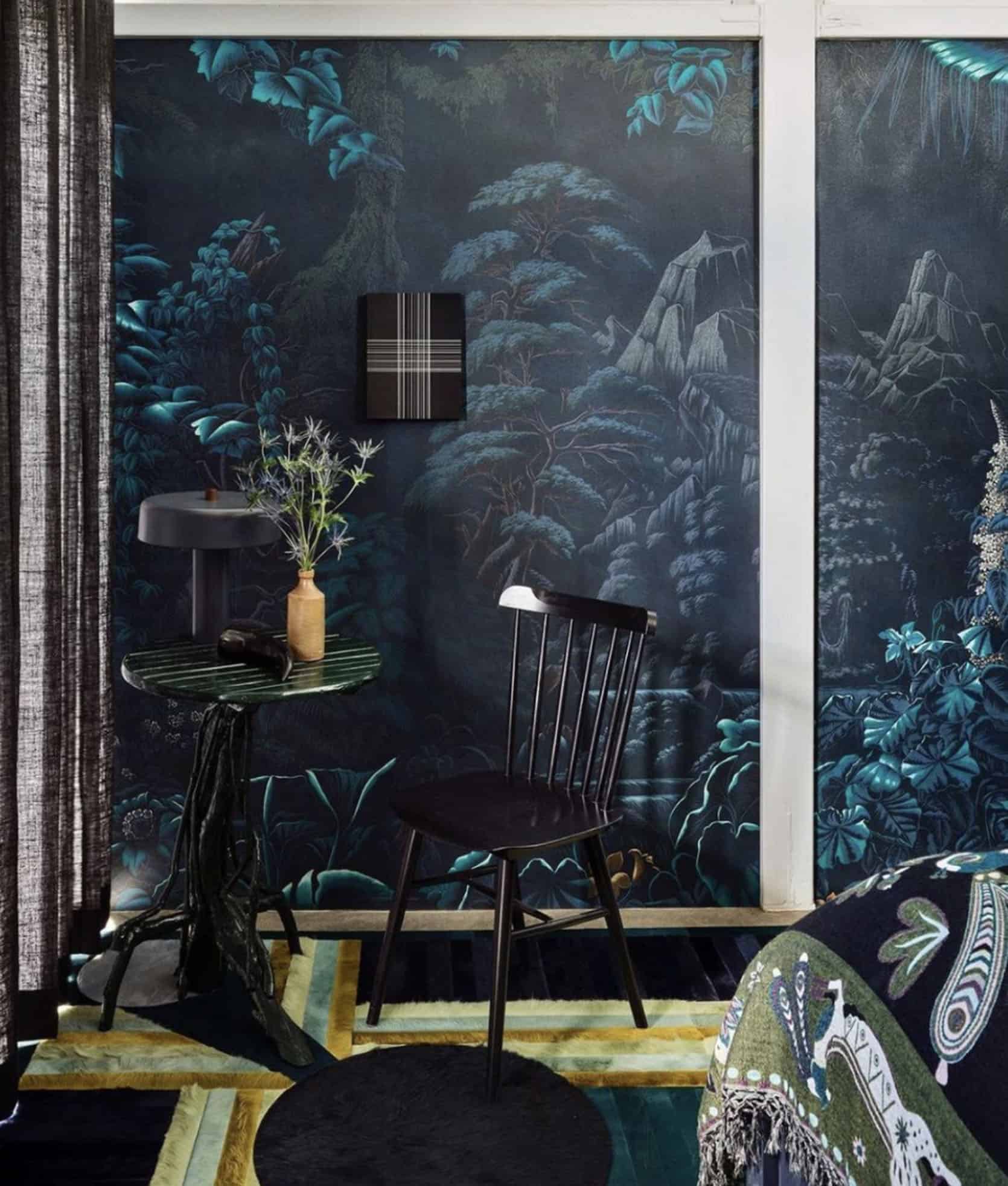
This home is FULL of 2021 trends (it was also in our kitchen trend post for those diamond floors). But let’s focus on the tapestry at hand. While the colors are dark and muted, it still adds warmth and more visual interest to the room. Plus it nicely contrasts all of the modern elements.

Wait, in all of these examples the tapestries are there to contrast the modern elements and I love that. Plus the moodiness of a tapestry kinda feels sexy when but in a modern space. Who knew tapestries would be the item to create a sexy vibe!

Again, super modern space (what up enormous brass cherries?) and an extra-large vintage tapestry to balance. Yes, please!

I do have to say that this framed tapestry is probably my favorite. It’s also a room designed by Ashe Leandro, who in my book can do no wrong. Since the room isn’t overly modern but unlike the others is a bit softer, I love that the tapestry has a modern edge with it being framed in a lucite case. So beautiful.
After A Brief Break, Serge Mouille Lamps Are Back Baby
Now, this was a controversial trend. And by controversial, I mean that Emily wasn’t entirely convinced when I said that Mouille Lamps were “back”. She didn’t think they really ever left which isn’t wrong. But my case for this being a 2021 trend was that I felt they had taken a back seat for the past few years and now were back in full force. Look, a classic is a classic but I’ll never forget when I was first designing my old living room and initially wanting to install one, I overheard Ginny saying that they were everywhere and getting to be a bit overdone (or something like that). Also, this was not in response to me wanting one. Ginny would never do that unless I asked her opinion! Naturally, I was like, “well, I don’t want to do something on a design blog that’s overdone!” So instead I used a Noguchi pendant lol (another VERY popular light fixture that Mel used in her MOTO). This topic is very much related to Mal’s post she wrote last week. Anyway, this stunning lamp took a bit of a breather but now if popping back up in a ton of designer’s portfolios. Wanna see?

First, we have the ever talented Lea Johnson and her new basement oasis. She just installed this beauty and man does it make such a stunning impact.

Then we have Crystal Sinclair with this cozy but chic living room (this home’s kitchen was also in this year’s trend post). As you can see instead of using wall art to create interest, she used beautiful, modern light fixtures… like this Mouille Chandelier:)


Now, when most people think of a Mouille lamp, the classic black version comes to mind first. But if you want a white version, fear not and look at these beautiful examples.


And just because I love them so much here are two more photos that both made my heart skip a beat.
Natural Wood Framing: DIY Some Instant Character
This trend was one that might also be a little controversial since interior wood framing is usually original to a home but it’s also a very DIYable way to add some great interior character to your home. Plus, I’ve been seeing it a ton lately.

With this incredibly cozy and textured home, I’m not sure if Ido and his partner, Kristina installed that framing or if it was there initially. From the article, this home was almost uninhabitable when they got it so who knows. But this one thing I do know is that it’s beautiful and cool.

This is actually from The Proper Hotel in Austin, Texas that was designed by Kelly Wearstler. Clearly, they wanted to have a vintage meets modern look and by adding in the wood strips they achieved that in a really creative way.
This framing definitely looks original but look how cool that mural looks in the nooks! Just a great way to add more depth to a mural/space.

But look, not all of us can go screwing wood strips onto our walls. So this painted version (paired with beautiful vintage pieces:)) is such a great way to get the look without the potential wall damage.
The Dramatic Bedroom Curtain Wall
So Sarah Sherman Samuel did this behind-the-bed-curtain-wall look last year in her main bedroom and since then I’ve been seeing it more and more. 2021 trend? I think yes. Let’s dive in.

This was Sarah’s bedroom update last December and while I love her first version, this one is more up my alley. The curtains give the room a ton of movement, what could be called a secondary headboard, and lots of privacy. But what I love the most is that large black circle. It’s SO GOOD!

Here we have another neutral curtain wall with a bold piece of art hanging in front of it. They took it once step further and mimicked the curtain folds intro the headboard and the bed frame. Pretty interesting!


But curtain walls don’t always have to be cream or gray but instead can be a great way to add a bold color moment in the bedroom. I love the orange but boy does that pink curtain and yellow mirror combo just have my eyes dancing.
Statment Desks Are The New Black
This is probably a no brainer, right? Those of us lucky enough to work from home have been thinking pretty non-stop about our “offices” and the desk is our first stop. I know that I am in the process of finding a sick desk because well, it’s in my living room so I want it to look really cool! And from what the internet is telling me…I’m not alone.

Kellie Brown is the queen of post-modern interiors. If you don’t follow her you should be. This stunning stone design makes me so happy and is a total showstopper. I love that it doesn’t scream desk but easily functions as one. That’s something I am heavily thinking about. Also fun fact, one of Emily’s best friends Scott styled this shoot!

So this one may look more like an actual desk but OMG is it cool! Plus look at that storage (something I often forget to consider:)).

And here we have a gorgeous wood beauty that would knock anyone off of their feet! That curve, those legs…it’s just special.
Wall Dividers That Have More Than One Function
This to me is another covid inspired trend because we all need a little more privacy. Plus there are truly so many great room dividers available these days that can really make a space pop. Let me show you how.
Tell me that green divider doesn’t make this room sing! Its color and shape are unexpected and it just adds the perfect amount of something “weird” in the space. Now, I’m not sure if it’s simple decor or if it’s used for its privacy purpose but regardless it’s perfect right where it is.


Oof! The first time I saw this apartment my jaw hit the floor. Yes, it’s custom (or I assume from looking at it) but it’s undeniably cool and totally functional. Five stars for small space creativity! Also, I love the color palette:)

I told you this house was full of trends! Here is likely another example of a room divider being used for decoration as opposed to privacy. But regardless it looks awesome and again brings warmth to this space.
Single Color Rugs… I Know WILD
This is the most surprising trend to me and while I’m not opposed, I’m not sure if I’m 100% on board. Why? Well, what I love about rugs is the ease with which they can bring pattern into a space. So if you remove the pattern, then you have to work harder to create visual interest elsewhere. Again not bad but I have one eyebrow raised.

First off I am not in the least bit surprised that YSG is on this trend because well, they are trendsetters! But here they not only have what looks like a patterned wall-to-wall carpet, but the texture of the chairs, table, and light fixture offset the lack of pattern in the rug. Plus the mauve tone on tone looks awesome.

Another really modern space. Why I think this solid green rug works is because there is so much movement and texture on the walls (roman clay? limewash? Not sure). So I think the moral of the story is that if you want a solid rug you need to have bold texture elsewhere.

First off, go look at this house, it’s incredible. Second, look at that solid yellow rug (that isn’t following our rules but still looks super cool:)). This works because again, lots of texture in the space, and this rug gives the room the bold pop of color it needed to feel vibrant. I’m very into this trend here.

Now, this solid rug has more texture than the others and beautifully contrasts the lighter tones of the rest of the space. Plus it’s has been deemed by the design firm “the healthiest condo in Canada.” So maybe there’s something to solid rugs and our health:)
Reeded Accent Walls
This trend is hot off the press because I just started to notice it after our incredibly talented contributor Malcolm created this DIY headboard (progress photo below). Then I saw it on another blogger’s site and she was inspired by Studio McGee. Now if you are curious what’s the difference between reeded and fluted wood go to this visual. So while dowels took over 2020 and have a similar look, we say that the reeded (the more delicate version) wood feature is here for 2021.

Here’s a close up of Malcolm’s AWESOME DIY headboard (still in progress) but will be revealed soon! It feels chic, current, but with a little traditional vibe to it. We can’t wait to see it all done!
Next, we have designer and blogger Fariha and her incredible reeded bedroom feature wall. Also, it’s a DIY! It looks so good and we hope to see more of it this year.


Fariha said she was inspired by Shea McGee’s bedroom hallway which is also so beautiful. We can see why she was inspired and why we think it has juice for 2021.
OOOOk that’s that. I have a few more trends that I’m keeping my eye on and will report further into the year:) But for now, let’s take about these. What do you think? Do you agree? Are you surprised? Any that you love or hate? Let’s talk.
Love you, mean it.
Opening Image Credits: Design by YSG Studio | Photo by Prue Ruscoe | via Rue Magazine


Reed walls will be a way to play with texture!
I like the brown backsplash – it looks like leather! I don’t love it with the white uppers and hood but I see it’s potential
My mum still has that exact backsplash from 1981 in her laundry….
??
(When I see reeded walls, cupboards, etc. I imagine all the dust and fuzz and pet hair that’d drive me nuts sticking to it.
Okay, I may or may not vacuum a section of textured wall from time to time! Hahaha ?
Mandi @ Vibtage Revivals did suuuuuch a cool reeded/fluted wall DIY:
Yummy décoroation and a great blog as usual. I know an online site with great home products, worth a look….
Who are these people who have desks without laptops, computer screens, old coffee mugs, half-filled notebooks but most of all without cables??? I know they serve more as inspiration but there is a point where the space is just too unrelatable / unattainable, I need to see at least one oversized screen, a few cables and some coffee stains to imagine whether this a workable office space I can aspire to :p
I actually found all of thise desks to be, well, fugly-as!
I have a single color (teal) rug in my bedroom. I am officially on trend for 2021. Who knew? 😉
The only one of these trends I don’t like is the curtain wall.
Not thrilled with any of these, except the Serge Mouille lamps, which I don’t think ever stopped being popular. Curious to see the year end recap of the trends and whether the EHD team’s predictions were correct.
Jared, I’m seeing the same “trends” everywhere…so they ARE trends. *sigh* Insiration is not trendy for me.
The only trend that I don’t dislike is the Serge Mouille lamps, which I don’t think were ever out of style.
It will be interesting to see the EHD team’s year end recap to see which trends they got right.
Oops- double post. My bad
Malcolm! Just stop! Ugh the man can do no wrong
Haha you’re too kind!
Oooo, give me a dramatic curtain wall (and, like, everything else in that SSS home)! Seriously. Freshly inspired.
Also, burled wood pieces with super clean lines. Only, let’s not talk about it until I’ve hoarded all of the pieces that I “need.”
I love the curtain wall too. I did this years back as a way to get around my landlord not allowing us to paint. I hung a big colored curtain wall behind the headboard to bring some color into our bedroom. It’s a great renter-friendly trick!
Blogpost idea: at the end of the year compare these trend predictions with actual trends in the year to see how close you came / how far off you were – any surprises you missed. What do you think? Do y’all already have such a post? I didn’t see any in the 2020 wrap-up posts…
I just picked out a yummy brown Sherwin-Williams paint for the guest bedroom. I can’t wait to put it up!
Those reed walls are giving me hope for our Weldtex (combed plywood) walls in our 1950s basement!
fantastic round-up. I’m thinking about reeding the backsplash in my laundry nook after seeing this. thanks for all the inspo.
Jen … careful! They collect dusty fibre, threads, etc. Might not be the place for it?!?
I would be surprised if a vertical area would collect much of anything. I have an old midcentury dining table and the sides of it (the small vertical area under the table top and between the legs) is reeded. I have never ever had to clean there.
I have to say I love the predictions. I’m having a design dilemma of my own if you ever need post ideas. I fell off the modern farmhouse wagon after fighting it and now I have a lot of it and I hate it. I know I should bring new items in with accessories but I wouldn’t mind seeing some images and ideas of how to do that.
Some edgy ceramic pieces/lamps/bowls could modernize it and give it a boost. Maybe some funky artwork to cut through the modern farmhouse vibe?
Thanks, Rusty. I read your mind. I picked out some pottery last week and it’s starting to arrive. It definitely helps. Working on the artwork. My husband thinks I’m crazy. He literally told me I have a problem.
Agreed! My problem is I went all-in on mid-century modern and now I feel like I have to either a) scrap everything or b) live with it waaah. Would love a post on how to pivot styles if you get tired of yours without changing everything!
Such a great idea for a post!
Agreed – after living mostly in my house this past year I’m a bit bored with my decor, but, like Caitlin, I’m planning a move so don’t want to buy new stuff.
Would love some easy refresh ideas on rearranging or refreshing that don’t involve big financial commitment.
I have been dying for a post like this
Mer, I think mid-century plays really well with the current trends. Maybe just buy one or two small curved pieces of furniture if you can. That’s what I’m trying to do. I also really crave color these days.
Mer, as a EHD reader you may already have seen this, but in Styled, Emily suggests that Traditional decor is a good counterbalance to MCM.
When I was @8 years old, my favourite colours were green and brown. My sisters teased me (I didn’t get the memo to know the “trend” was pink and purple). I stood my ground saying that “The Earth is brown and trees are green and they go together and I’m a nature girl!”) ? Both these colours suit me as clothing (I have eyes that are green if I wear green and blue if I wear blue, plus a few freckles, so brown looks cute!). I STILL like both these colours, whether they’re on trend or not. However, the colour that’s often referred to as caramel, but is actually “baby poo brown”, nope! True caramel, as in the leather colour, yes. I lived in a rental with a kitcgen painted this colour … need I say more?!? Many of the “trends” here don’t do it for me. The powder blue and the natural wood, yeah, baby!!! All the way! (But Emily’s painting her wood ?!!) Each time I see trend posts (here and elsewhere), realize that I’m a lot more comfortable with me and my style than I knew. Other people ask me about things I’ve designed or decorated and… Read more »
Hhhmmm … I just wondered if Emily’s painting ger farmhouse wood coz she’s overdosed on woodiness at the mountain house??!!??
Ah-ha!!! ?
Trend posts are my favorites, I love to see the new ideas even if I would never do them. Love the reeded walls and the wood trim adds. Do not love the tapestries, you will never convince me that it looks good unless you live in a Belgian castle. And I can only handle brown furniture as a single piece, once it becomes a ‘set’ I’m out hahaha. I will be using pleated drape walls on a 60s condo in Palm Springs, and have been debating whether to go with a powder blue – Dix Blue from Farrow & Ball, for the doors. Thanks for putting this together, Jess, love it.
Why a Belgian castle? Sorry, you triggered me cause I am Belgian haha!
The Belgians and French are known for beautiful tapestry work?.
Hello, Fariha’s incredible reeded bedroom feature wall looks amazing. This could be something I put into my home in the future. I have looked but would love a clearer description of the details used to create it.
I love these: ashe leandro, lea johnson, crystal sinclair, sarah sherman samuel, elements design, ysg studio, evolved living. The others, for me, range from ok to eye-hurting. Trend or no trend, good design matters to me and I lean toward minimal, clean, simple. I can like some browns, but generally do not like a lot of brown (although I do have a beautiful brown leather sofa that my husband insisted on). That brown tile is pretty, but unless you have dump-truck loads of cash for swapping it out after a couple of years, I don’t think brown tile is a good choice for most situations. I like the idea of a tapestry or fabric wall hanging in earthquake country, especially over a bed! Thanks for sharing your insights from all your research, Jess!
While not a “decor trend” per say, shopping vintage and local is also increasing. This will have the effect of people’s homes feeling distinct and rooted to their unique location in the world, reflecting not only their own personalities but the story and history of their place.
Ooh, yes!
And it’s THE most sustainable way to shop!
Win – win – win ?
Thank you for these posts. These are always my favorite every year. I would love to see them used and their application throughout the year as well.
Malcolm slayed that wall! Also that green desk is everything! Reeded walls for the win!!!!
Thanks!!
I love this! I have missed the trend posts with pretty interior design pictures, and hope there will be more in 2021 than in 2020! I totally understand not being in the mood for trend posts in 2020, btw.
I may not ever do any of these, but I LOVE to look and discover new interior designers to follow, too.
Yes yes yes to tapestries!!
Agree! Husband and I have a tapestry we purchased in Hautefort France (where the movie “Ever After” with Drew Barrymore was filmed. Little did I think it would ever be on trend. We just like what we like and the that it fact that it is a memento from a favorite trip.
not feeling any of it…but, I felt the same way about skinny jeans back in 2010 and look at me now.
I like the natural wood trim–the Ido Yoshimoto room is a dreamscape–and I *love* the reeded accent walls. I hope Malcolm’s reveal post will include instructions! The curtained bedrooms, on the other hand… just kinda make me think of mid-range corporate hotel rooms. Like the kind of thing you might find at a Sheraton near an airport. I can recognize them as *good design* and aesthetically pleasing, but the association is just too strong for me.
A full DIY article for my reeded wall is coming at ya soon!
Thank you for this! I also missed the trends posts last year. Most of these have potential – I especially like the room dividers, pastel blue and tapestries. Brown has definitely been coming back, which is a bit scary except in moderation/rich shades (in my opinion) 🙂 The wood accents are great too.
1. blue pastel – i love pastels, so i’m totally into this. looks amazing with caning. the yellow kids room picture is one of my fave kids rooms i’ve seen lately. also, how are we not mentioning that pink hood in the last blue pastel picture?! love! 2. brown – um. no. the only thing i was okay with was the brown couch in the right side first picture. everything else. no. brown tiles? nooooooooooooooooooooooooooooooooooooooooooooooooo. 3. tapestries – dusty, so that would be a pass for me because of allergies. all of the tapestries shown here aren’t my style, so no. but a happy pastel one would be a yes (but not in my house – dust). 4. Mouille Lamps – i didn’t know they ever stopped being trendy. i love the way these look in photographs. but i wonder how they would look in real life at night as a light source. i don’t think i would like that. i feel like it would just be weird shadows everywhere. can anyone confirm? 5. natural wood framing – nice. didn’t know it’s a trend. no real feelings about this. 6. curtain wall – nope. due to dust again. but i… Read more »
Lovely,
So odd! You articulated nearly every response I had to these pictures—including, sadly, the allergies .
That green divider also reminds me of the fingers (as in, a row of lady fingers) I saw a lot of in 2020, which I like a lot.
My spouse came to our marriage with a really well made brown leather couch. I never would have bought it…but I’ve come to love it, for its proportions and that it seems to play nicely with all the colors I do love.
Parsley
Parsley,
Great minds think alike! Yes, when i saw the green divider, i thought of lady fingers as well, and i love that look!
I came into my marriage with a really well made brown leather couch as well. It was a GREAT couch for kids and stuff and served us well for a while. I originally loved it when i bought it in the early 00’s, but then grew to dislike it because it’s just not my style. i bought it when that big brown leather couch look was big with pottery barn in the late 90s/early 00s. i’m glad you love your leather couch though!
Loveley
Tapestry can actually easily and quickly be vacuumed with brush attachment, though.
I had the sudden urge to paint my living room a light, pastel blue last week. I have no idea where it came from, and I thought I was going insane… I’m currently feeling very validated! Maybe I’ll go for it!
yes I love this! I feel like the blues that this post is hinting towards tend to be pale blues that don’t have a lot of green in them. What do you think?
Remember to go lighter than the swatch you are drawn to! I often have used pale blues and mints- they look so great as a light tint, but can easily get too dark in a whole room.
You: “The 10 Decor Trends of 2021 That We Think Are Going To Be Flooding Your Feeds”.
Me: “Time to unsubscribe.”
Thanks for this! Yes, it is a difficult time for most, but a little art and design is a nice break. Doesn’t mean we have to go out and buy all these things – as a matter of fact there are no links involved so no pressure. Trend posts – for me anyway – give me a different way of looking at colors and furnishings that I might not naturally appreciate. When you really look at these trends, you can learn more about how to style or even freshen up the colors and items you already own without totally buying into a trend that will be gone next year. So yes, I think trend posts are valuable.
I appreciate this site and following along all the trends and whatnot, but please please please can you hire an editor? Emily’s style and brand is too sophisticated to have to decipher each sentence like you’re reading a tween’s text messages.
I usually don’t mind the writing style, but I think it was yesterday’s Facebook lead-in that started with “Me and the girls.” I taught my primary students not to begin a sentence with Me. I’m sure Emily knows better. shudder
Would love a post on where to get tapestries like these–so beautiful!
Julie, mine have all come from estate sales or auctions. I had them put away when we moved to this house-looks like some can come back out!
They used to be plentiful on eBay.
Besides the reeded wall, I have been seeing more wood walls, or “wood paneling.” In the 1960’s most of it was awful stuff. I know, I grew up with a houseful of it. Today’s wood paneling started with ship lap and has moved on to birch plywood wall in contemporary homes.
I have root beer colored glass tiles in my shower…it’s a gorgeous band that goes around the three walls and compliments our granite. We love the way it dazzles up the shower.
Single color rugs are gorgeous and I’m on board!!
Any recos for a paint color similar to the mauve brown tone in the YSG-designed photo?
My parents were (amateur) design enthusiasts, and had stashes of AD and Elle Decor lying around from when they were building their house in the early 80s. I grew up looking at these magazines again and again, and I still remember the photos… which wouldn’t look at all out of place in this post! Black chinese screen dividers, chocolate brown velvet sofas, mustard yellow curtains, marble coffee tables, even desks with no screens (because nobody had a computer at home back then, ha ha). We even had cane chairs and teal furniture! Mom would be proud:)
If overstuffed chocolate brown furniture is on-trend, the Midwest’s time has come! ?
But seriously, it’d be interesting to read a post on how to do something like chocolate brown furniture in a way that’s chic, not…Midwestern basement. Said with love, from a Midwesterner.
Yes please! “How to style your husband’s Big Brown Sofa” would be MUCH appreciated.
I feel validated that I just painted my son’s room blue and I just spent 2 hours looking for rugs and sorting by the color brown. I even paused a few times on solid rugs. I’m usually later to the party (not late but just not first) so can someone give me a virtual hi five???
?
Thanks for great share! When you really look at these trends, you can learn more about how to style or even freshen up the colors and items you already own without totally buying into a trend that will be gone next year. Keep up to date decor trends will be the best way to improve the value of our house.
Your photos are Large! They need to be somewhat smaller so you can read and look at the same time!
There’s so much texture and tonal differences in a single rug, even if it looks like it’s one color. I like that abrash effect- where differences in vegetable dyes and dye lots create slight variations in color in a rug. Also -and I know this may appear nit-picky- please proofread! Your content is great, but the typos can be very distracting (statment desk vs. statement desk)
The curtains behind the bed also bring to mind a Kelly Wearstler design–this feature is in the guest rooms at the Avalon Palm Springs 🙂
Superb! Hi, I have been reading your content. You’re doing great work. Actually, I’m content writer from The Propertunity (Real Estate Marketing Agency). We helped many of our clients with your home decor ideas. Keep sharing such a value-adding content. Thank You Soo Much!!!
Have a Nice Day!
Abdullah-