
Design Trends
5 NEW Kitchen “Trends” We’re Seeing and Loving (and Some We’re Doing Right Now)
The other day, Emily emailed me (Arlyn, EHD Editorial Director for anyone who’s not up to speed) with some ideas for upcoming blog posts, one concept being talking about some new kitchen trends she’s been noticing (and wanting) during all the research she and the design team have been doing this last year while designing the Portland project and mountain fixer.
We chatted about a handful of design details she’s really loving right now and Jess and I went to work digging through her Pinterest boards to find examples to show you guys and talk through.
Now, I find talking “trends” in the kitchen to be a funny thing. Unlike a living room where you can swap out a shibori-print pillow with a cactus silk pick in the name of “nowness,” you can’t exactly just rip out a countertop or backsplash on a whim to keep up with the times. Well, you can, but who’s doing that?? Running to Target is FAR easier than calling a general contractor. I’m not saying “trends” aren’t a thing in kitchens, because they ABSOLUTELY are, and omg do design editors/design enthusiasts love talking about them, but these trends move much slower than other decor trends. Traditionally, kitchen designs turn the page and evolve HEAVILY every 10-12 years, while the more micro elements of the kitchen (hardware, cabinet color, backsplashes) change a little faster. Makes sense given the most costly part of a kitchen are cabinetry and countertops, which stick around a bit longer.
I’d feel better calling these kitchen design inspirations than “trends” because a trend is fleeting, while a solid design choice can hold its own for decades (heck…even generations), and all of the things Emily called out are actually really classic, subtle/practical choices that can be made should you be in the middle of a kitchen renovation. All of these inspirations are subtle and unfussy. There’s nothing ornate here, or “cool” like bold encaustic tile floors and backsplashes. They’re decisions that you could confidently make for a new kitchen without stressing about whether you’d get tired of it in a year, hence going with something more basic.
So, keep reading if you’re into seeing what we think are some fresher (read: NOT just “trendy”) takes on kitchen design. Or keep reading if you rolled your eyes at the “kitchen trends” title and want to hate comment on it all…either way, keep reading because you’re already here and you might as well. Besides, Emily will chime in which “trends” she decided to actually incorporate and which ones she just couldn’t pull the trigger on.
Thicker Countertops
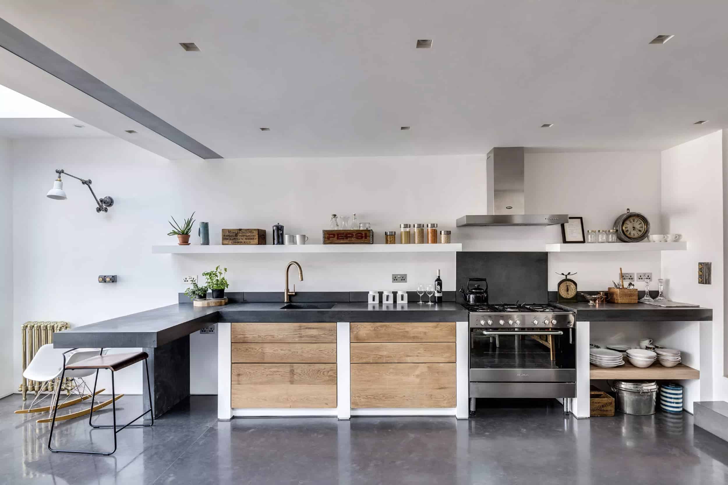
Where a regular countertop might be about two inches, these new thicker countertops we’re seeing and really liking are thiiiick…think 3-4 inches. The look is particularly fresh and inspiring when the countertop is a cast material like concrete (and frankly, more feasible because a 4-inch marble slab would be so insanely heavy, not to mention would be insanely expensive). This dark (we’re guessing stained) concrete in a kitchen by Paper House Project is yummy, sleek and modern (where the wood front cabinets bring in some warmth).

Here’s a cast concrete countertop—by Fraher Architects—that has more of a rustic edge, though the thinner unfinished plywood cabinetry keeps it from getting too industrial. The thickness of the edge really helps you to feel the texture of the material, which is always a good thing (well, mostly). A quick note on anyone interested in concrete. It can either be precast by the manufacturer and then installed on-site just like stone surfaces, or it can be cast in place. I think depending on how custom the top needs to be for your design, you can pick a route. What I don’t know is if there’s a preferred way or cost difference (and if you do, please comment to let us know!).

Oh goodness, this is just sexy. Bravo Roxane Beis. The cement render finish here looks so lush yet primitive…like a busty cavewoman. The idea of no distinguished countertop, like over by the range, is interesting…the clean line is refreshing and your eye just instantly traces the cement-rendered cabinet frame (as it should). It’s sultry, kind of exotic but also so insanely simple.

The countertop thickness is pretty traditional (if not just a little thicker than normal) on the majority of this kitchen by Kimberly Ayres, but they go for broke (probably literally) on the island here. It’s hard to see in this image, but the island has a waterfall edge on both sides, so the chunky, blockiness of the application is a big statement. I think this would be most visually effective in a space that’s overall pretty simple.

This kitchen by Jamie Bush is so pristine and clean-lined. It leans into its warm modernity, which is definitely amplified by the thick, dark gray countertop material. It’s especially nice juxtaposed with the thinner drawer front handle rail. Anything thinner, and it would have been thin-line overkill.
**Emily here: I am doing this at the mountain house. The reason that we are opting for the thick counter is that we aren’t really doing a backsplash but I wanted the marble to be more visually present. So by adding that thickness, you see it vertically in addition to it being a horizontal surface. The thing you have to think about is that if you are using readymade cabinetry, it may effect your top drawers or cabinet doors. You see, the thickness of the stone isn’t actually 3 or 4 inches, it’s typically 2cm and faced out to look like that which means it will recede OVER your cabinets or add height to them. So you have to design your cabinets so that the drawers and cabinet doors are lower than that lip. The other option is to have higher counters and build it up. I think at the mountain house we are doing 2-inch simple miter countertops, but this is making me want to go to 3 inches.
Mixed Material Counters or Islands

Some trends are purely aesthetic, others are super practical…we’re filing this one under “practical.” For anyone who cooks, you know it’s impossible to chop on a stone counter (it’s totally not safe—slippery—and it ravages your knives). Of course, most people aren’t out here smashing garlic and chopping onions right on their quartz, but it’s still worth mentioning in case you use those thin plastic cutting boards. Plus, having a spot that you dedicate solely to prep—chopping, rolling, kneading—is a luxury, so if you have the space and your second home is happily at a countertop, this design detail might be of interest to you. (Design by Peter Ivens)

Usually, we see mixed countertop material in this configuration: stone on the countertop surround and butcher block on the island, but here from English kitchen company Plain English Design (and in the images to follow, from Mike Tuck Studio and Studio McGee), the mix happens directly on the island.


Ohh this one (designed by Australian firm Hearth) has just a piece of marble, so they better be regularly whipping up weekend croissants or other pastry on that cold stone surface.
** Emily here: I really tried to bring this idea into the mountain kitchen but ultimately decided against it because I didn’t have the perfect spot or maybe because I didn’t trust myself to do it exactly right and again, taking a risk on your countertops is kinda scary, especially when it’s not necessary. We just didn’t have the right space for it, but when done well (like above and below) I think its super special.

This one—by Studio Wonder—is obviously less wood-and-stone combo, but we couldn’t NOT include it because it’s so stinking cool.
Counter Cabinetry

Of all the design trends on this roundup, this is probably my favorite. It’s like a buffet with a built-in hutch…it feels familiar and homey, like something from your grandma’s house (minus the country chicken wallpaper…you know what I’m talking about). Except this is like hutch 2.0…it’s not a regular grandma, it’s a cool grandma. Emily and the design team incorporated this look into the kitchen of the Portland project and OMG it looks so good (reveal to come, we promise).
Sure, open shelving is still well-loved, but if you’re looking for a more integrated aesthetic that’s still door-free, this look right here (above, from deVOL) might be just what you’re looking for.

A little shorter than what Emily used in Portland, but the glass-front and latch hardware here is so similar to what was installed in that kitchen (*heavily influenced by deVOL). I like that the beadboard backsplash is carried through the back of this cabinet (it would look SO cool if it were something even bolder, like tile, or hell, throw caution to the wind and do a fun wallpaper or contrasting paint color).
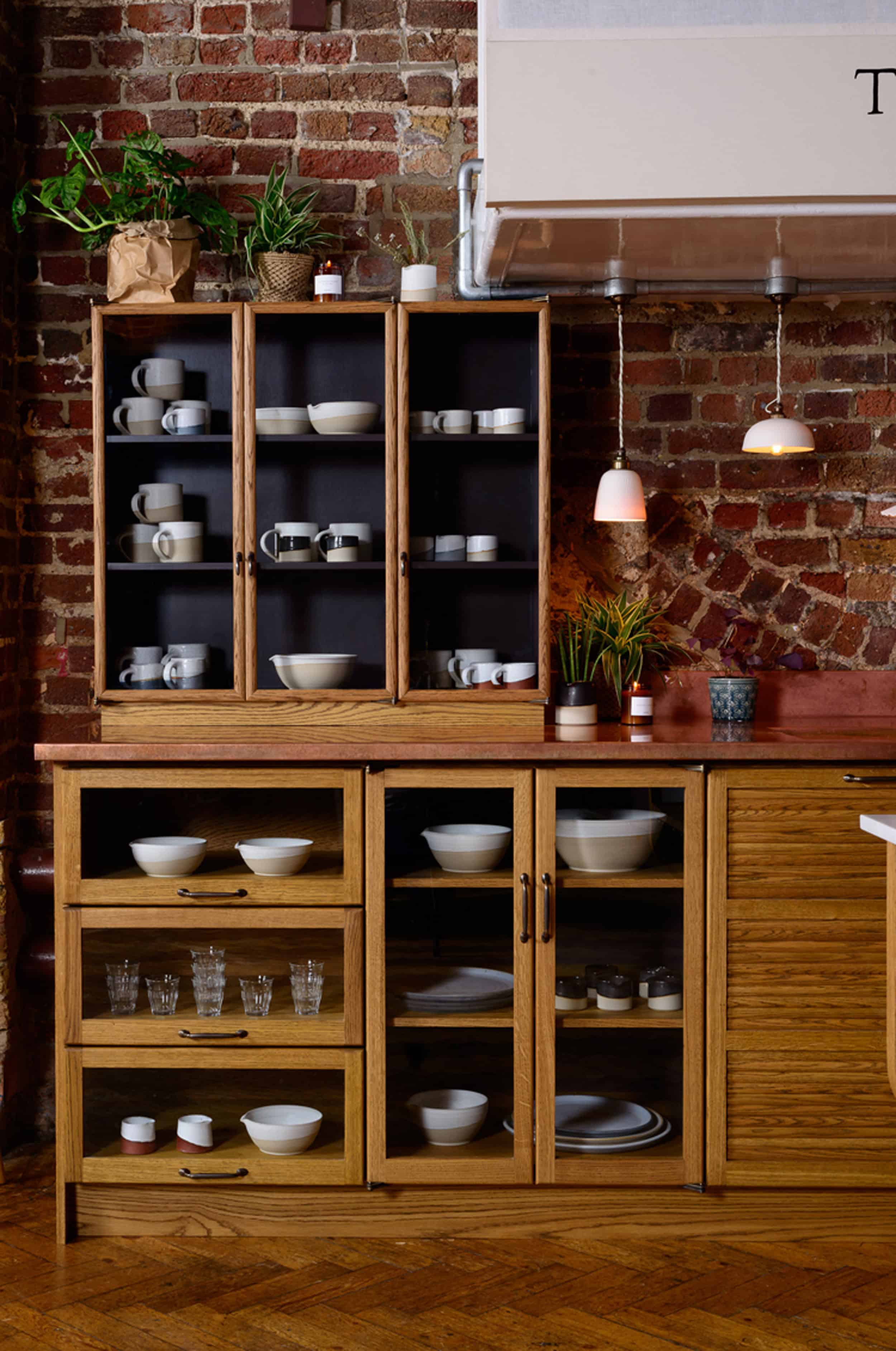
Another gorgeous inspiration from deVOL, this one actually looks like a hutch. The little platform it’s on is probably there because the hinges of the doors wouldn’t open otherwise, but it has a very modular vintage Euro look.

The practical part of the cabinet-on-counter look is that it works as hidden appliance storage. You can stash toasters, coffee makers, whatever, without having to either leave it out on your counter (visual clutter) or lugging it from a high up shelf or lower cabinet somewhere. It’s right there on the counter already. Some of these also have outlets inside, so you can plug the toaster in right where it is, use it, then unplug and close the door. (

Oh, I bet that’s hidden small appliance storage right there in that bottom part of the cabinet shown above (design by Katie Martinez), while the top has…who knows what else (plates, pantry stuff, etc.).

A countertop-to-ceiling look like this one by Boswell Construction is uber-dramatic and we dig it.
** Emily here: Yes, we did this in Portland. The pros of these countertop cabinets are that they look really charming and classic, and allow easy, casual access to items. They also break up that horizontal line of uppers and adds more interest in the same material (which keeps things cohesive). They do take up some counter space so if you don’t have a ton of kitchen prep area, be careful. I’m OBSESSED with how it turned out in Portland and can’t wait to show you.
The Updated Beadboard

Remember this post about the kitchen cabinet evolution saga from the mountain fixer where Emily REALLY badly wanted beadboard-esque rustic wood (like deVOL does, below) and then it turned into a flat cabinet front with deep ridges but then everyone was like you’re ruining your life and the future of your family with those ridges, then Emily went with a Shaker front instead for practicality (except stay tuned because there’s an update there coming soon)…well, that look is what we’re talking about when we say “updated” beadboard. Basically beadboard but without the actual bead or groove (that’s the thin little strip between the boards that gives it its name). So really, just slatted wood. Without the bead, it loses it’s traditional vibe and goes instantly Scandi/modern. It’s a look, like this shot above from Whiting Architects, that’s clean and simple but with more texture. If you get a twitch every time you see an episode of House Hunters Renovation where the kitchen designer introduces a Shaker front cabinet with the same “we’re innovative rebels” vibe that Tim Cook presents a new iPhone, you might just be into this updated beadboard.


These cabinets definitely have a bit of a ‘70s wood paneling aesthetic, but we don’t hate it. (Design by Carole Whiting.)

Here’s another take by GIA Bathrooms & Kitchens on updated beadboard, where the “board” part of the beadboard is much narrower. While I actually like these cabinet fronts quite a bit (and yes, the knobs are pretty cool but all together it’s a liiiiittle too contemporary for my tastes), I could see how a wider board is a bit more timeless.

Ohh but in this putty green (in a kitchen by Carole Whiting)…I could probably look at this and love it forever.
These next few inspirations (by Megan Myers, Foomann and Madeleine Blanchfield) are even tighter (and check that extra thick concrete island…). I think it works if the inset isn’t super deep, so it’s not as dark and obvious. When it’s shallow and subtle, it is A. much easier to clean and B. far less busy.


**Emily here: YES. We’re incorporating this into the mountain fixer kitchen and in a few other places. We are doing it in wood grain, which feels more like planks than “updated beadboard” I suppose. I love the first few photos with the more Scandi-inspired vibe and if you are looking to get the ones at the beginning then definitely hit up Sarah Sherman Samuels’ collection with Semihandmade.
Thin Vertical Tile Backsplash

There’s been a ton of tile talk around EHD headquarters (it’s SUPER interesting around these parts), but mostly because, between the Portland and mountain houses, there have been SO.MANY. bathrooms to design, hence so much tile to talk about/research inspiration for. And something that is a HARD HITTING trend is thin vertical tile backsplashes and installations, as seen.
Above, in a kitchen by Veneer Designs, it’s offset, like traditional brick-patterned subway tile is, but vertical. And because the tile is thinner (these look about 6” tall by about 1.5” wide), it feels so much fresher than a standard subway.


While the offset installation feels more traditional, a stacked vertical definitely comes off more modern, but nice and clean. The black vertical stack of the previous kitchen from Wit & Delight is a nice contrast to all the white marble. Opting for a color like a soft or moody blue—like in this kitchen via Heath Ceramics by Vaughn Johnson Architect—makes the rather simple look more interesting (and oh boy, how fun would contrasting grout be here?).
**Emily here: This was a big yes in our book. And while we’re using thin vertical tiles for the mountain house, it’s technically not in the kitchen. I am indeed doing a 1″x8″ vertical tile in a bathroom. My tiler is going to kill me, and by kill me I mean he’s going to charge me a ton to install. In case you are wondering why a small tile would cost more, here’s the cheat sheet: more tile = more cuts and more cuts = more time and more time = more money. But a bathroom or backsplash wants what it wants.
And there you have it. The five kitchen design inspirations that we love and almost all of them we are doing. Most are either already done or in the works but as always, we can’t wait to hear what you love/hate. And……go! 🙂


I’m loving the hutch look (especially when it goes from the ceiling all the way down) and the mixed countertops! They look like the solid, long-lasting type of design details that will age really well. The rest of it still feels very much like trends to me, but fun to mentally install in my own house while I’m reading….I can’t lie, that bead board has a special place in my design-loving heart.
Would love to see a post on kitchen flooring trends!
I second this suggestion!
Noted!
Ooh, fun! Here are my thoughts. 1. thick counters – For the most part this look is too heavy for me especially in anything darker than light gray/beige. You did find some sweet examples but I’ve seen thick counters in real life and made a note to self to stick with 3cm or thinner countertops. The inspo photos seem to have very little if any overhand over the drawers, and I just want to speak from a practical point of view and experience! that if you use your kitchen at all, a proper overhang (while it may cause a shadow) will save you so much cursing when your coffee/gravy/water/chicken soup gets bumped and runs dripping down onto the floor instead of creating a stream down every cabinet front and sometimes into them. 2. inset butcher blocks in counters – I had three feet of butcher block directly to the left of the stove in my 8×10 kitchen last house, which my husband’s grandma had put in. I used it daily since I cook every night and it was AWESOME. There was room along the back edge to leave a lamp and a tray with frequently used prep items, so it… Read more »
LOL on the “lush yet primitive… like a busty cavewoman”
Love all these looks, can’t wait to see how they’ve been implemented. The only ones I take issue with are the hutch on countertop look – when datum lines are super minimal, it works. Some of the pics have the wood trim hacked off in odd ways, or the lines don’t continue seamlessly from cabinet to cabinet. You can get away with a lot of creative material and color choices when the installation is perfect. When it looks like the carpenter didn’t plan ahead (or didn’t have the skills to make it perfect) not so much.
I absolutely love the vertical tile look! I’m so glad we haven’t done our kitchen backsplash yet. But it’s a townhouse we’ll probably leave in 3-4 years, do you think it’s timeless enough for resale?
I never knew this about myself, but vertical tiles make me absolutely mad! Not for the design but I so desperately want to stack them “back” into their horizontal positions! It looks nice when I glance at photos but then if I look to closely…
Planked anything-for the love of god, if this is a kitchen that uses some heavy cooking/baking/food stuff – think of the cleaning of every.single.ridge. I’ve dealt with that before and the deep cleaning was a nightmare. Unless you hire help to do that, then go on right ahead.
I love your design, and your creativity. We build kitchens and bathrooms from ground up and we can use your inspiration!
The “updated beadboard” is going to go the way of shiplap and be reviled in 10 years. Those cabinets are the future “dated” kitchens we’ll all be ripping out. And mismatched countertops are going to be our “what were they thinking?” moments right alongside them. But the hutch look is classic and lovely, and maybe I could get behind thick countertops: )
I agree. I despise shiplap which to me is reminiscent of 70s wood plank painted white and updated beadboard is the same thing. I think that a lot of these things are just influencers needing to keep introduce new looks – that is why they seem to come back. I think they are hideous and thought so from the first time I saw them. So glad Emily didn’t do it in her mountain house. I was sitting looking at those pictures going “ARRGG”. I do like mismatched counters and might do it when we are doing our countertops in a few years. Thick countertops and hutch cabinets – I can see those working in some kitchens and less so than others. Honestly, sometimes interior decor blogs just exhaust me. I need to take a break from time to time otherwise I feel a few brain cells atrophying away. The endless “buy buy buy” and “update update update” … oooof. I just saw a perfectly beautiful bathroom on instagram but apparently that was the “before”. I mean, come on. Tearing things out for the heck of it -sometimes I need a break from all of it. That said I do understand… Read more »
Huge no on the bead board cabinets. And the hitched do make me unhappy. They feel plopped in the middle to me and always feel like a mistake. Especially when they do not go to the ceiling; to the ceiling is slightly better.
YES but in 10 years we won’t be back to dark stained maple and Santa Cecilia granite. At least I hope not! LOL
agree, the only thing I don’t love is the updated beadboard. I ripped out all the beadboard in our house
Just a note that most countertops that are “thick” look thick because of an overhang/lip, not because the actual slab is 4in thick. Any material, concrete included (keep in mind its poured, and all that initial water=heavy) would be SUPER heavy in a 4 in thickness and I’m sure that would require special support.
exactly. I just ordered a quartzite and it would’ve been cost prohibitive to make them that thick. Plus, I was maxing out the size of the slab anyway (about 72″) and there wouldn’t have been enough to make it that thick. That’s why I had to go with quartzite and not marble. Needed BIG pieces.
Could you share the color of the dark cabinets.. thank you
Great post and I love Arlyn’s writing! These inspirations felt more about empowering us to do what we love in terms of materials and space (a hutch on the counter, yay!) than about making us feel like we must have a certain material or look. Love that idea.
Thanks so much!
I agree! The best designs come from choosing what YOU love, and building from that. Unique mixes of material, textures and style will help keep hard “trends” at bay.
I very into the format of this blog post: fleshing out the particulars of a trend (ahem, inspiration), then Emily jumping in to quickly give her two cents. More of this please!
So fun and educational to see these broken out and explained visually. I really love Sarah Sherman Samuel Semi Handmade beadboard fronts and now I see why – the proportions seem really fresh & current! I pinned quite a few of these photos, thanks for the research EH team!
Loving these – esp. the hutch look. Thanks, great post!
We did a thick concrete counter in the kitchen. The contractor didn’t think about putting the upper cabinets a few inches higher, though, so there is less space between uppers and lowers than is standard. It’s fine, but a little annoying when things don’t fit, like the soda stream machine. I am 100% going to do thick counters again buyback next time will “Measure twice”…
I’m excited to see more inspiration as I have been trying to find a way to keep my think butcher block -now on my island- and incorporate it into a combined surface design with quartz or cement. Love the casual look of it. BTW, my quartz installers said they do think edging all the time with a mitered edge so the counter is actually not super heavy or custom – the edge is sort of a faux thickness. They showed me examples to swoon over!
“If you get a twitch every time you see an episode of House Hunters Renovation where the kitchen designer introduces a Shaker front cabinet with the same “we’re innovative rebels” vibe that Tim Cook presents a new iPhone, you might just be into this updated beadboard.” Oh, lord, every stinking kitchen on that show is the SAME one! Dang. Then, the homeowners dislocate their shoulders patting themselves on the back over how “unique” and “personal” their design is. Barf. I really like the hutch idea. Wish I had a big enough kitchen to use it. But I had a large run of custom bookshelves built earlier this year, and I incorporated a type of hutch (everything was open shelving except for the top half of the center unit which has glass fronted doors to house my Heintz Art Metal pieces — nice integrated lighting, too). Glad Emily made her comment about the wide slab countertops, because that’s what my contractor did with my en suite vanity. I wanted statuario marble (he tried to show me tiles, but, nope, I insisted on slab — kind of a obsession I’d had for years), and he had about an inch thick slab mitered… Read more »
I have a counter cabinet & it reaches the ceiling. It’s painted white, like the rest of my cabinets. Sadly the paint on the sides from the counter going up a couple of inches is chipping. I’m sure it’s from water. I’m always wiping down the counter.
If I had the choice, I wouldn’t do it again.
While I like the look of the hutch, for me it’d better be nearly as deep on the top as the bottom. Having a door swing over a portion of otherwise usable counter space so you have to move EVERYTHING to open a drawer or cabinet would drive. me. nuts. And yeah…I’m with Paula on cleaning grooves in cabinet doors. I like clean and simple in the kitchen so it’s low maintenance.
I have a section of cabinet that is behind a door and so the lower drawers are only ~20″ instead of 24″ deep. I found that I just horde jars of nuts and beans and chili under the upper cabinet and since the counter top is already shallower there isn’t much usable space in front of all of my jars. I planning on bringing down the sides of the upper to create a “hutch” look and there will only be about 8″ of counter top in front of the doors so I won’t actually keep anything there in the way. What I’m saying is that there are areas in most kitchens where you’re not keeping (or probably shouldn’t be) stuff on the counter to interfere with the hutch. I think that’s the whole point of the hutch is to keep the stuff on the counter inside the doors instead of in front of them. If not, it’s probably not a good solution for you.
I put in some hutch style cabinets (counter to ceiling) in our kitchen a few years ago. I love them. They really add amazing/practical storage to our small-ish kitchen. Plus, they look so pretty!
Also loving the vertical stacked tile and the updated beadboard. Would love to incorporate one of them into my bathroom renovation, but not sure if I think they have staying power….
These are great! I literally just googled “kitchen trends” as I’m beginning to plan our next renovation. I would LOVE a post on sourcing cabinets. I’m hoping to do flat fronts in a solid wood but just keep finding veneers…
Who’s, not whose. But otherwise a very interesting post.
I really like the hutch look, but i do wonder if that makes it hard to replace the countertops without ripping out the cabinets? I think proper planning could resolve that issue – essentially your upper cabinet shouldn’t rest on the countertop, but rather the countertop should be cut around the sides of the upper cabinet – but knowing that people often replace their countertops for a quick refresh when trends change but they can’t afford new cabinets, I think this is an important consideration. I also like the thicker countertops, but I’ve heard similar things about having to have cabinets designed specifically for the thicker countertop – both to accomodate the lip, and also sometimes to make sure the cabinets are sturdy enough to support the extra weight that even just the deeper hangdown in front would entail. Honestly the one trend above that I strongly dislike is the updated beadboard one. Not from a practicality standpoint, though I understand how that could be harder to clean, but I just really don’t like the look. They feel weirdly commercial and mid-century at the same time. Though, I may just be a long way behind on this trend – here… Read more »
LOVE the hutch uppers (and have been attracted to this for a long time, so not sure it’s truly a new trend) and HATE the updated “headboard” which, to me, is both ugly and impractical.
Counter Cabinetry is by far my favorite of these “trends.” I like the vintage look it gives and how vertical storage can sometimes be confined to just one stack of cabinetry that looks intentional and stylish, without necessarily needing upper cabinets everywhere. The mixed countertop is practical as well as a natural way to break up really long counters/islands. I can see myself wanting to incorporate both of those features into my dream kitchen. As for the rest, I like them sometimes, mostly in really contemporary style kitchens. But I would have to see them in person, sparkling with style, before I might consider them in my own home. It wasn’t specifically one of the trends but I dislike concrete countertops.
I like a lot of the posts here, but I REALLY liked this one. Super pretty pictures that are inspirational and show that beautiful kitchens aren’t always shaker style/subway tile
Hi Arlyn! Thanks for ridding us of the “trend” word, design inspiration describes these or any other “new” ideas perfectly. I am loving those clean-lined countertops Em is using in the mountain house. If I had the bucks, I’d have my counters and cabinets ripped out tomorrow and replace them with these beauties.
My wish, my love…that Mike Tuck kitchen and every single detail in it! A dream. Thanks for sharing.
It’s great to see creatives trying new things. I like it when all our kitchens look different. I dont worry about “dated”, just happy to see what you made and it’s a plus to hear how it evolves with new ideas, materials, and lifestyle.
Where can you source the thin tiles?
i pinned just about all of them…. 😉
Oh! I am so glad you used one Natalie Myers’ pictures as your inspiration. It was this kitchen that made me want to work with her and our result was STUNNING! You can see pics of my whole house on her instagram. We are #beverlywoodremodel and my PANDA marble is gonna set some trends. I know it!
😉
This is your retail store front so people in your niche will get you.
Test your own reactions to a person need first get. A good
content-based website is said to be 95% typography.
Emily, I’m a long time reader, and I really love and appreciate the content your team puts out, but something you are doing in these posts is really bothering me. If you’re going to put up a huge inspiration post like this filled with beautiful images from other designers, then you should give them credit BY NAME under each photo. Simply saying “image source” is not enough. And every photo should have an alt tag with the designer’s name in it as well, so if it gets pinned, people know it’s not your work it’s theirs even if it leads back to this post. You owe it to these other designers to give them some good SEO juice to their sites if you’re going to use their imagery to create your content.
Hi Jillian, thank you for your comment and you’re totally right. We will be sure to credit a designer or architect source as long as it’s available/when we can in our posts.
Awesome!
I absolutely love the vertical tile look!
Hi, Good Time
Thanks for nice sharing.
pls visit my sire
Thank you, you are generous with your knowledge.
I think it would be great to have a “reader’s rooms” feature periodically…new construction or renovations done by readers to show how “we” have used the EHD content to inspire us. I think it would help others realize they can make it happen on the average person’s budget.