Design
How To Frame Posters Better…So They Look Cool (With A Personal Design SOS To Prove It)
This is an oddly important/big post for me (and potentially quite vulnerable for the person it’s basically about). You may be asking yourself, “Jess, why is teaching us how to frame posters so that they look cool ‘big’ for you?” Fair question. This post is about how my kind and sweet boyfriend sent me pictures of his apartment so that I could more or less publicly critique his art installation. In the now 10 years I’ve worked here, I’ve never talked about a boyfriend. But he’s very special, and this was clearly the natural next step. It’s the classic: become official, then say I love you, then be talked about on a design blog. Normal relationship stuff! To be fair, he offered as I was worrying about being stumped on something I wanted to write about. It went something like, “Well, what about helping me make my walls look better?” I stopped, smiled, and then double-checked he was sure. He confirmed, and started sending my photos.
If any of you know my style, festival posters and vinyl albums are not what I tend to put on my walls🙂 But it is what a lot of people do. It’s a visual reminder of good times and interests, which I can, of course, understand. I sent one of his photos to Arlyn, and her response was, “If Charles lived alone, this is exactly what his place would look like.” While I don’t want to gender types of art or framing styles, in my experience, this does tend to be a classic male aesthetic. For my economically-minded boyfriend (along with so many guys this age), they head to Amazon, grab very affordable standard “full bleed” frames for things like posters and albums, and call it a day. There isn’t anything inherently wrong with that. But when you are an adult (say heading into your 40s), there are simple ways to elevate a beloved festival poster to look how you really want and, dare I say, yes, look cooler.
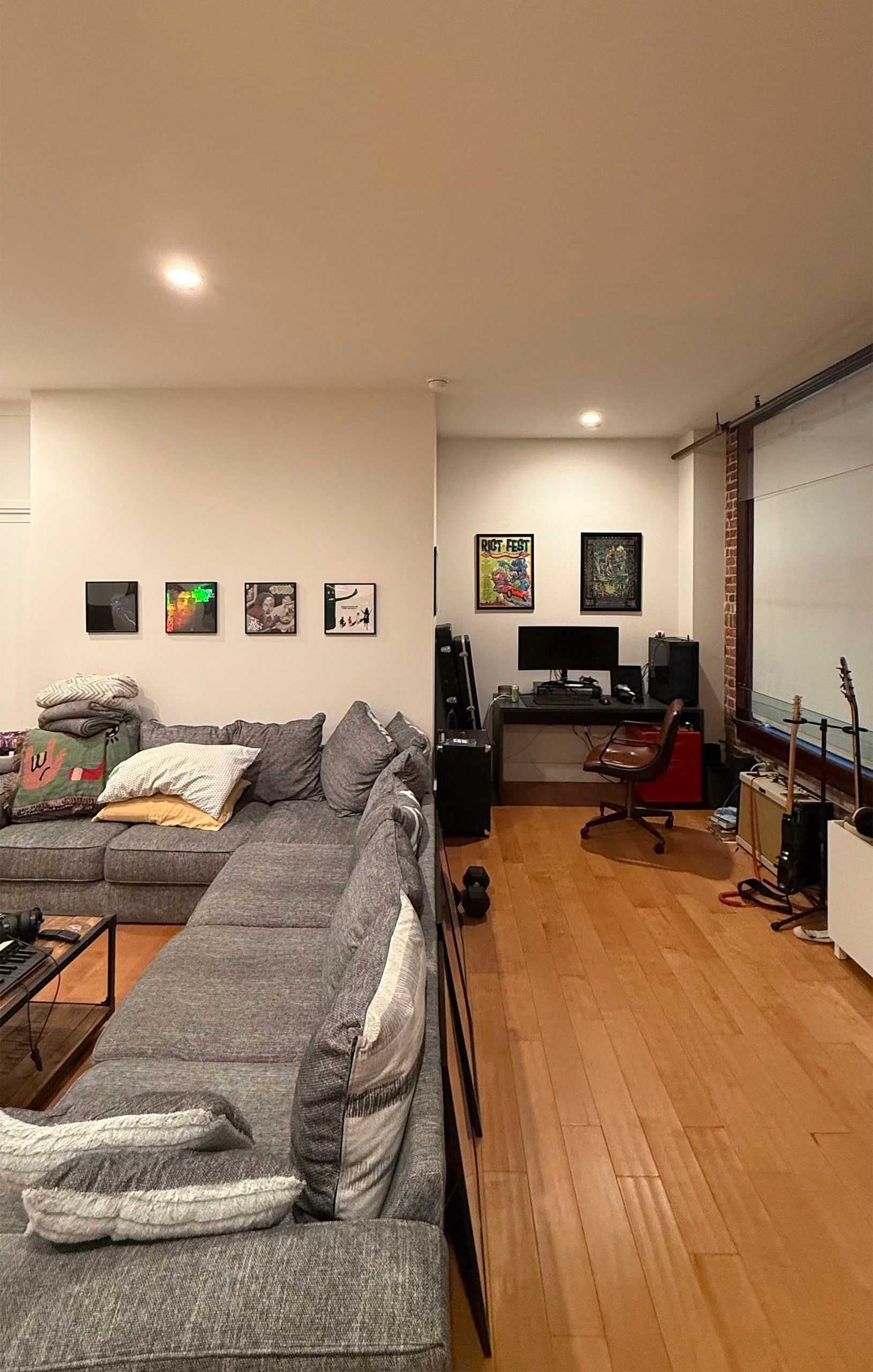
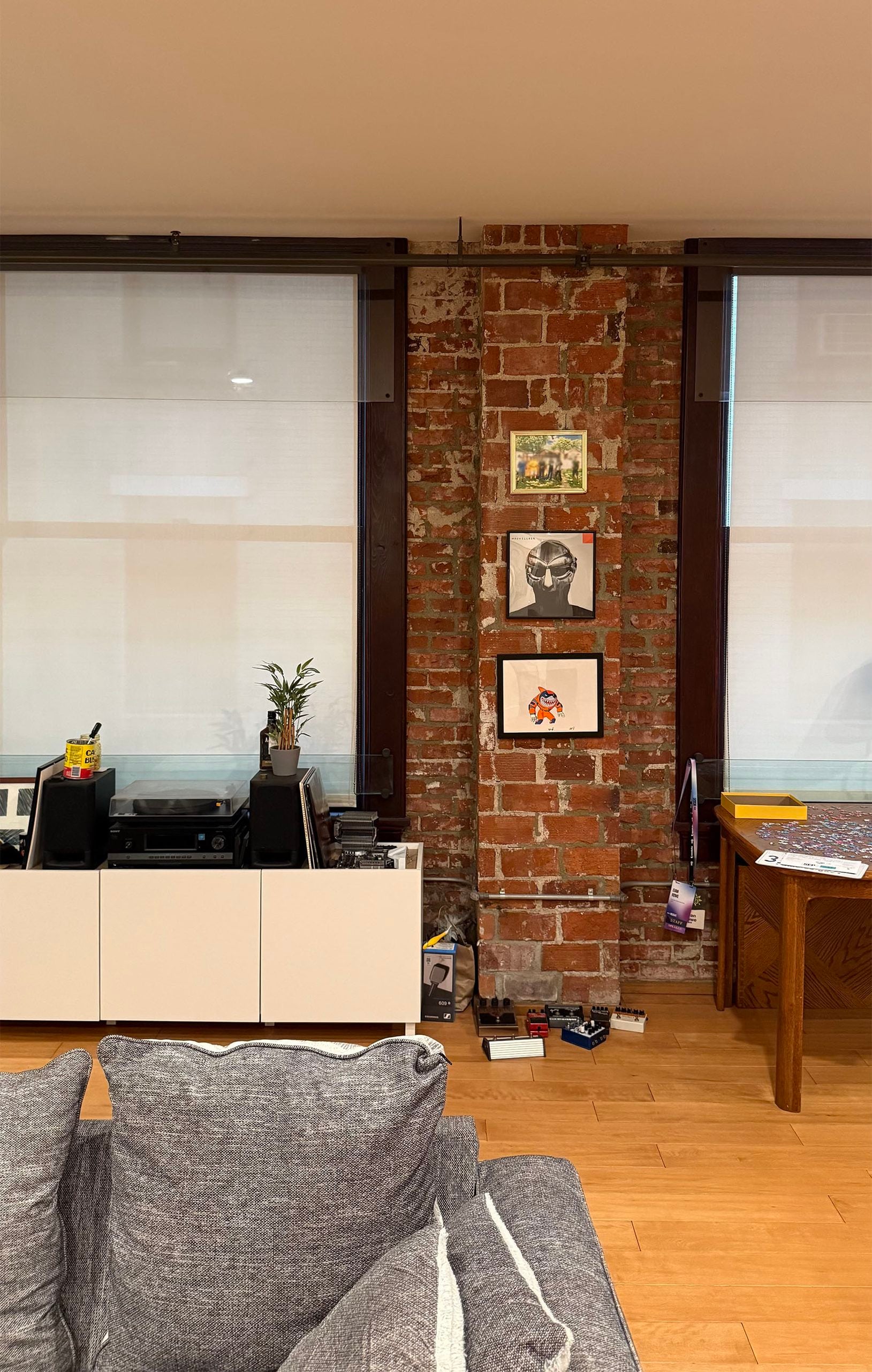
Let me also say he has a very cool apartment (with central AC!). You never know what you might walk into when entering a man’s home for the first time, but a downtown loft with huge windows and an awesome brick wall feels very much out of a movie:) It wasn’t the reason for the next date, but it didn’t hurt his chances. But guys, stop. This post is about ART. I couldn’t help but notice said art on that first visit too. To me, it was “classic single guy in his late 30s”. Did I think it could be kicked up a notch? Sure. But I’d never suggest someone change something in their home. I do not go into people’s homes judging or imagining how they should be different. But in this case, this was a person I was newly dating and, if things went well, would maybe, down the road, potentially build a life with someday. I was going to be checking out the decor, people! Ok, enough dating storytime. Let’s talk design.
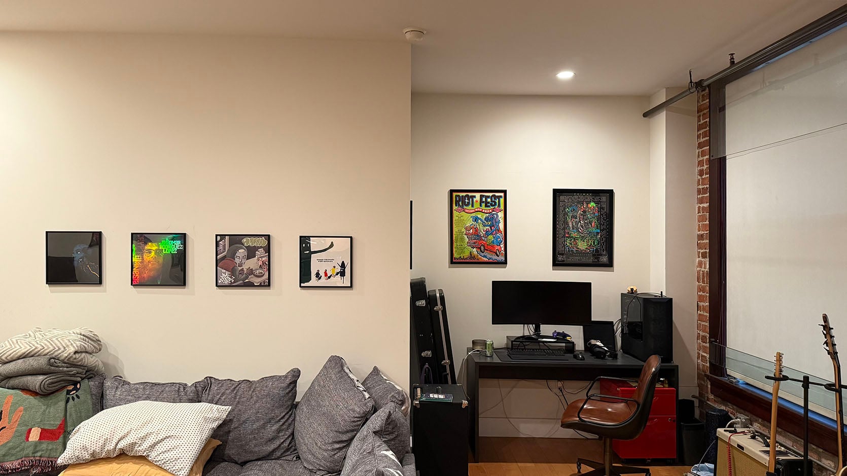
This is how the art currently looks. His original plan was to add another row of four albums on the larger wall to have a bigger grid configuration. Turns out the first row was a real pain to put up, so he decided to deal with it later…that was months ago. A story as old as time. The two framed posters above this desk, to me, are a little too far apart. I believe he centered them with the whole wall. Logically, I see how that made sense. But visually it’s not quite right. If the frames were larger, this could have been fine. But in their current size, the scale is off with the width of the wall, and it also looks a bit off with the desk.
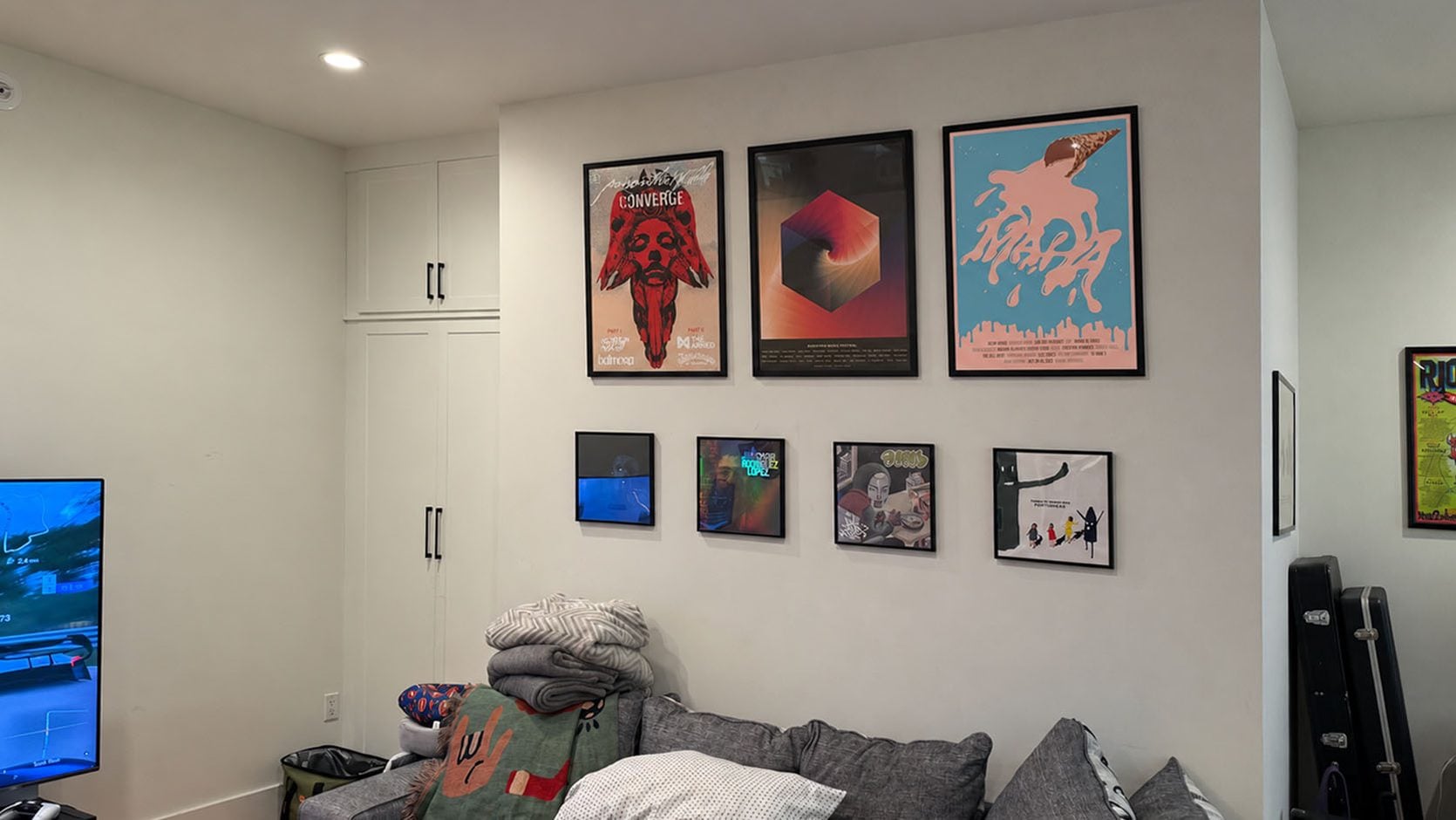
So, as he was sending me photos, he decided to do one more pass with the help of AI…just to see. He has these three large posters framed, leaning against the back of his sectional, so he popped them in, and this was the result. Of course, he immediately didn’t like it (too high and not in line with the albums). It was then my turn…
How To Frame Posters Better: Use A Picture Mat
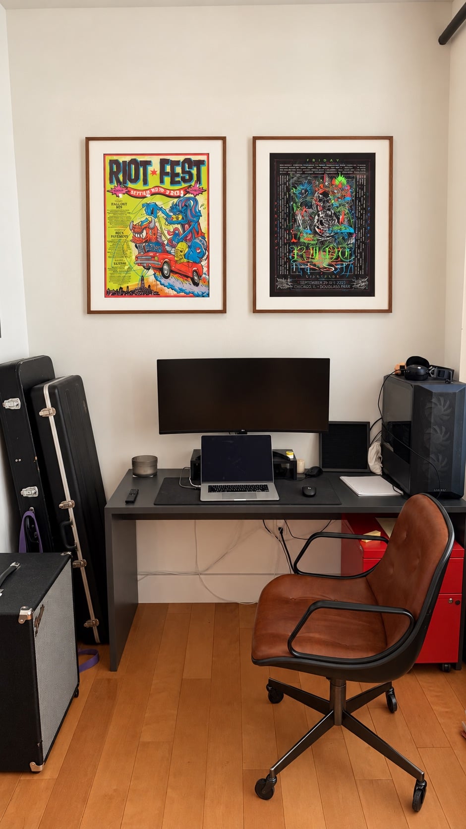
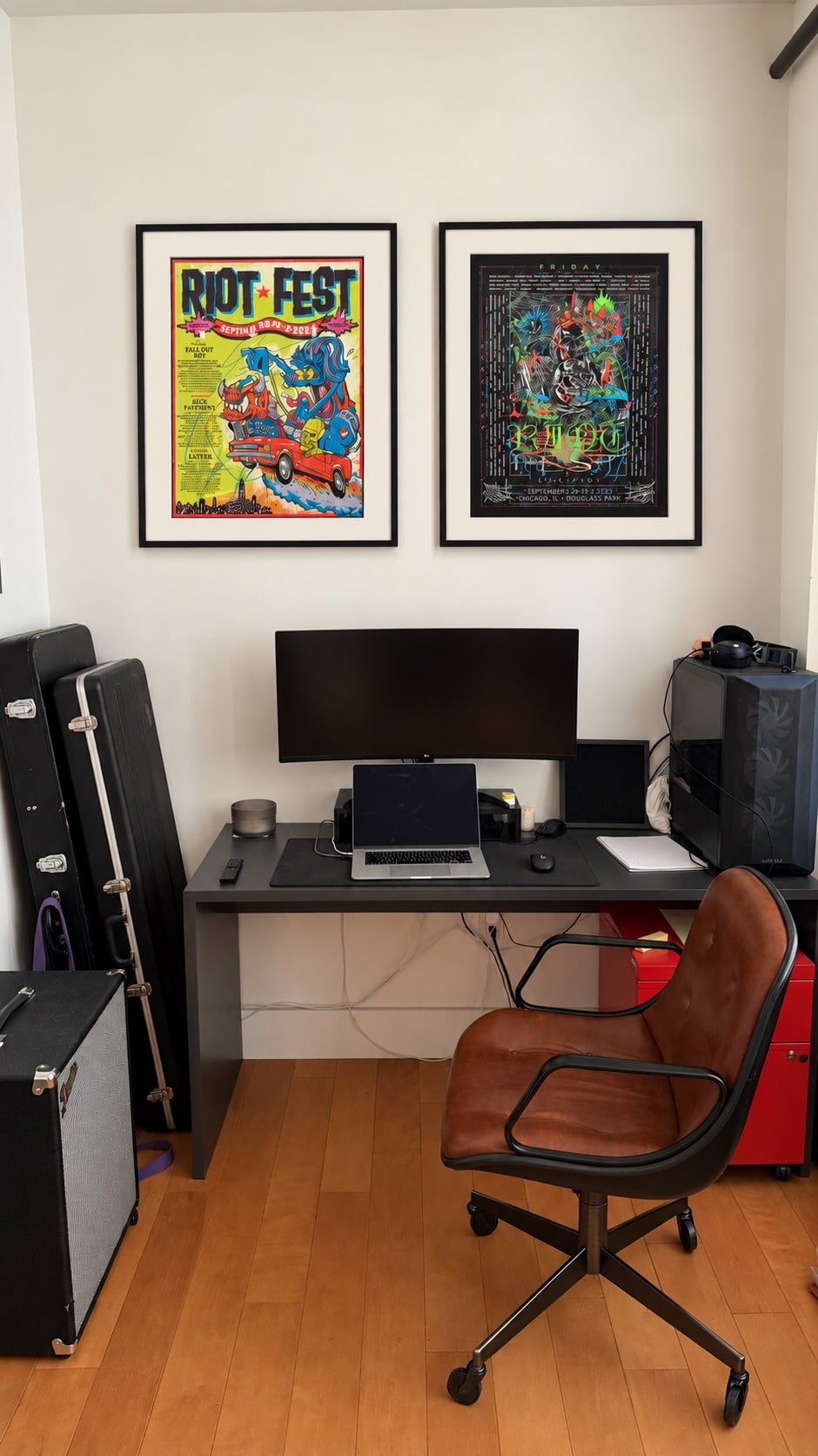
See how much better it looks with a picture mat and in a larger frame?? It looks intentional and elevated (but still fun). Since all of his frames were black, I wanted to show him an option with a darker walnut. Another way to add a layer of style is to mix frame colors and even materials. It’s all about the overall visual balance, which I’ll get into more later.
I also prefer a thinner frame in general because it feels more modern and tends to look more expensive. Speaking of which, the unfortunate reality of doing this kind of poster framing is that it will likely require a bigger financial investment. A standard full-bleed poster frame is 24″ x36″ and runs in the $35 range on Amazon, but upgrading to a ready-made frame with a mat border (like 28″ x 40″) is anywhere from $45 to $100. It doesn’t have to be a lot more money, but it’s not less. Of course, it’s even more if you want a custom frame, but if it’s in the budget, they do look incredible. We’ve used Framebridge, and I’ve used Frame-It-Easy for online orders. Frame-It-Easy doesn’t have many thin frame options, so just note that. If you are in Portland, Em’s handyman, Dave, is an expert framer and has helped her with some pieces. If you are in LA, I’ve used Quick Frames in the Los Feliz/Atwater area. They guarantee they have the best prices, and they are so easy to work with.
But if you simply prefer a full bleed, here’s an example I like:
The frames are in a pretty wood that’s thin and complements the credenza’s tone. The scale of the art with the width of the credenza also looks great. Oh, and the edges of the posters’ borders have some negative space. It almost gives the illusion of a mat frame.
Here are some great larger (mat-friendly) frames I found:
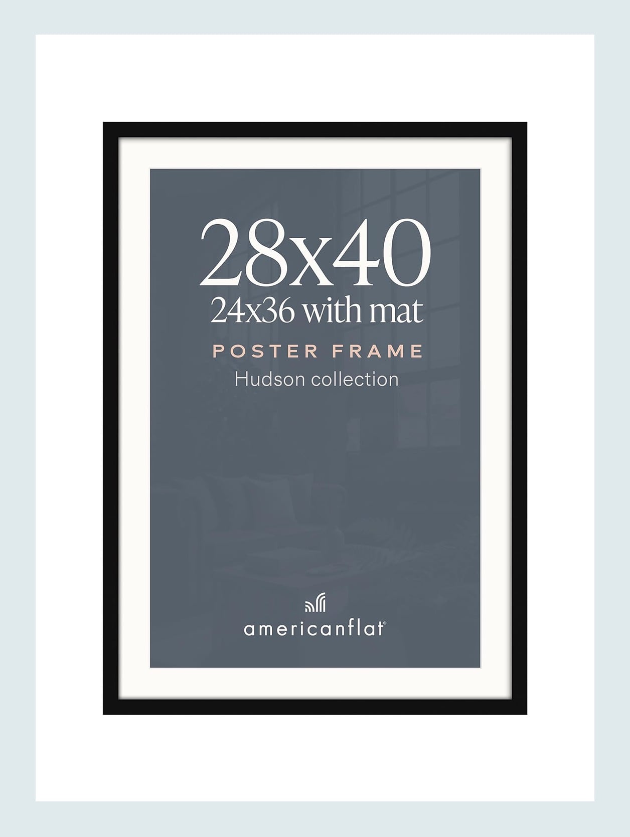
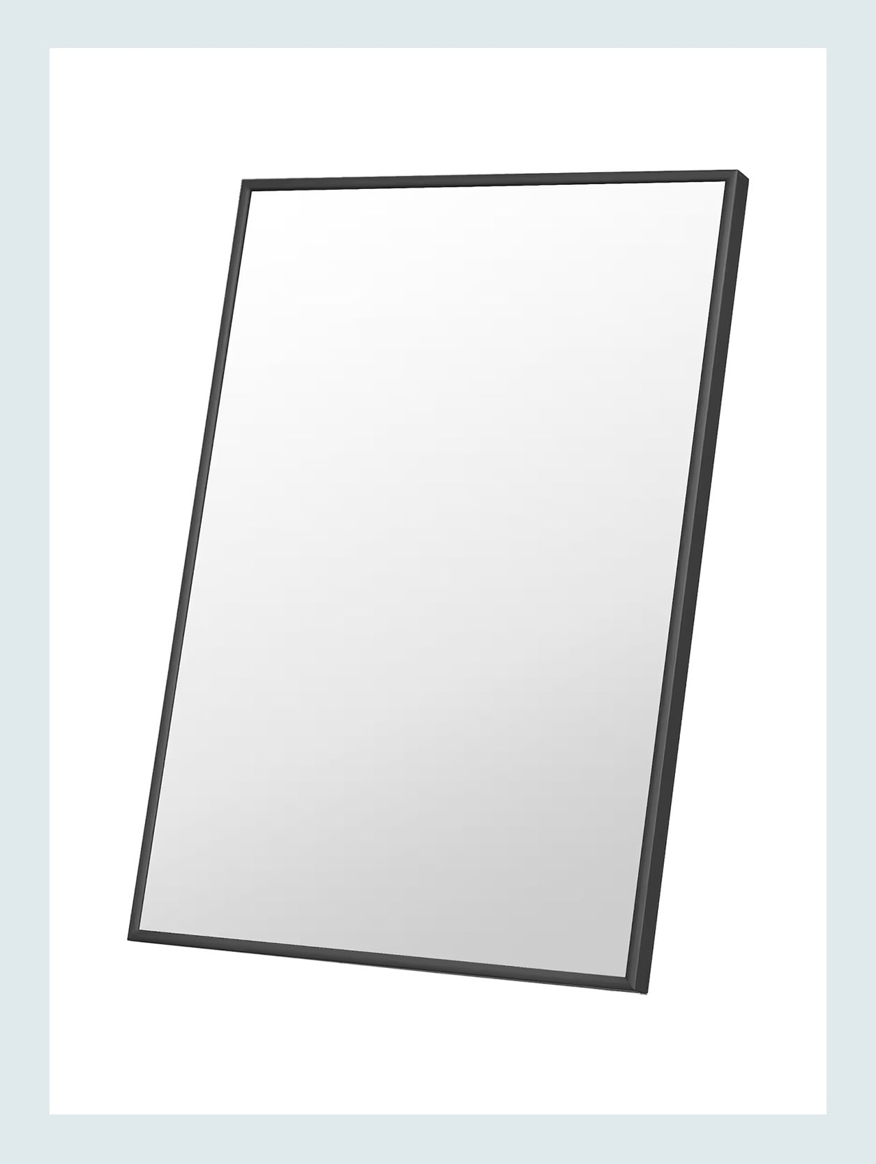
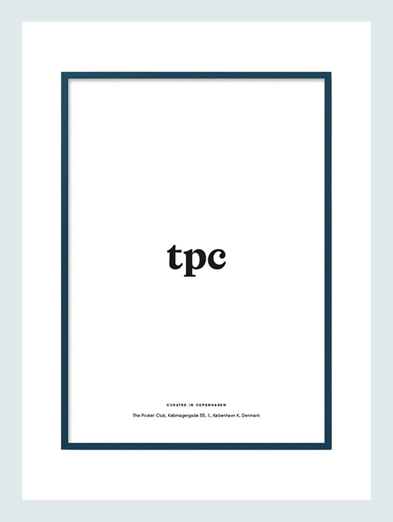
Engineered Wood Matted Poster Frame to 24×36 – $49 | Thin Aluminum Poster Frames – $77 | Petrol Wood Frame – $129
These are all ready-made and in three different price points. They also each have other color options. The first two only come in neutrals, but The Poster Club one comes in a bunch of really fun but cool colors. Don’t be afraid of a pop of color.
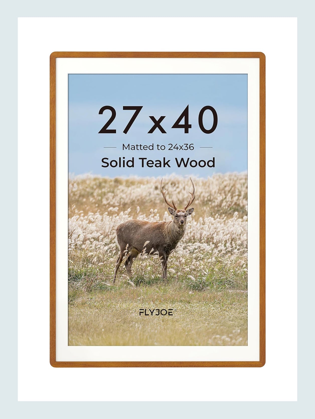
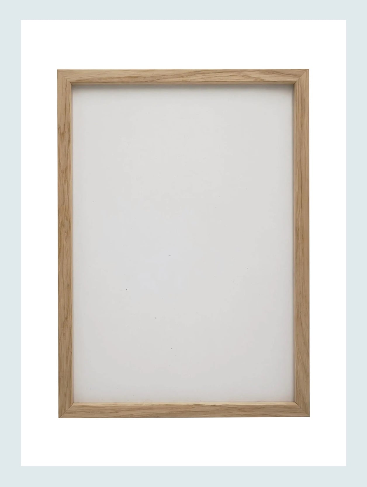
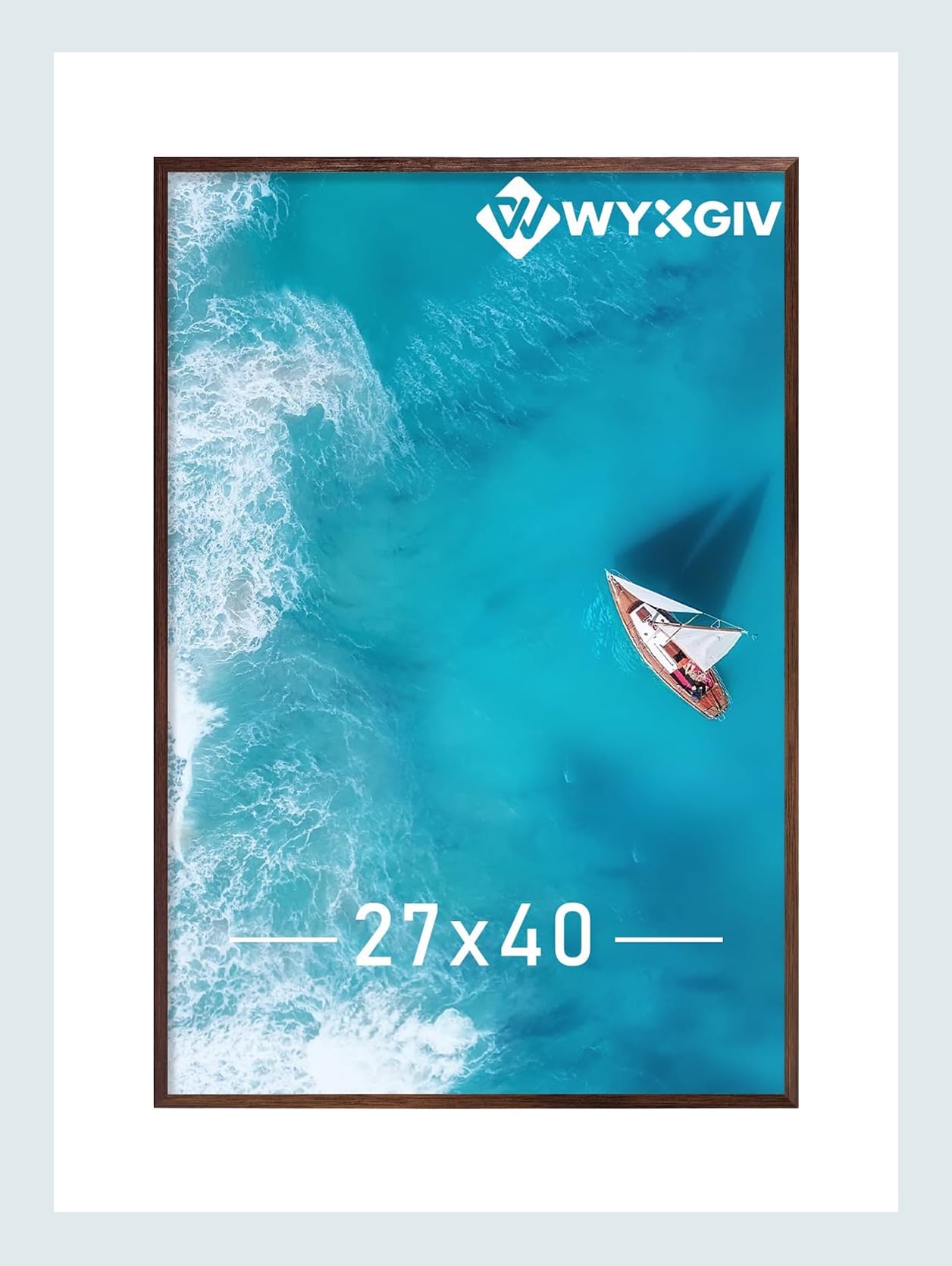
Solid Teak Wood 27 x 40 Frame – $98 | Oak Wood Photo Frame Matted to 24×36 – $81 | Brown 27×40 Picture Frame – $45
These also all come in other colors! All pretty wood, and how great are the edges of the teak wood frame? That’s a subtle detail that, especially in a gallery wall, gives it some edge.
How To Frame Posters Better: Mix In Other Art (With Good Framing)
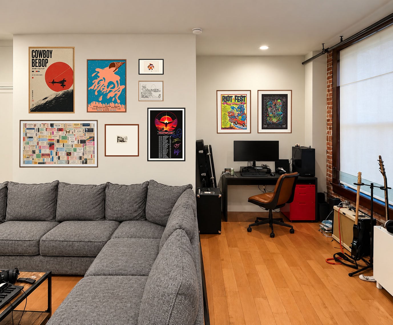
Ok, he liked the dark walnut for the design area pieces, which then helped choose the frames for the bigger wall. And as you can see, I moved the albums, but they’ll be back shortly. The grid of four on the large wall was in the same sightline as the diptych on the desk wall. It was too linear and one note. It didn’t really create any real interest, and your eyes didn’t have anywhere to bounce around to. But by making the diptych’s scale bigger and the larger wall a gallery (that fills the whole wall), your eye is happier with this better balance.
Let’s also note that not all of the posters have a mat border on the large wall. When you are creating a gallery wall specifically or hanging a lot of art in the same room, it’s important to have different styles and sizes of framing, unless you are creating a grid. But for a gallery wall, have some be full bleed (with a quality frame), some with a mat border, some float mounted, maybe one large mat with a little piece of art, etc. Here’s a whole post on how to create an EHD-approved gallery wall and another on how to hang art on different walls in the same room🙂 Now, you also want to mix the frames’ colors themselves. See how I used dark walnut, light oak, and black? It creates a subtle visual depth with how they are mixed in a balanced way. There’s almost equal space and use between them all.
Ok one more thing, and this is not a rule but, I think, a good guideline for poster and album art is to STAY AWAY FROM LARGE POSTER AND ALBUM WALL GRIDS. It may seem like the most logical configuration, but in many, if not all, of the examples I shifted through, they fell visually flat to me. They can take up a lot of wall space, which sounds good, but lack that movement and that interest we want from our wall art.
Here’s one of the better examples I found. While I would have personally opted for thinner frames, I appreciate the variety in sizes and frame styles, as well as the gallery being floor-to-ceiling.
Back to my boyfriend’s gallery wall:) This, of course, isn’t the final art he wants or I think is perfect, but putting it together was more to show to him (and maybe the men or other poster lovers in your lives) that they can still have art that speaks to them and makes them happy, but how it’s framed and arranged does make a pretty big difference.
How To Frame Albums Better: Maybe Don’t?
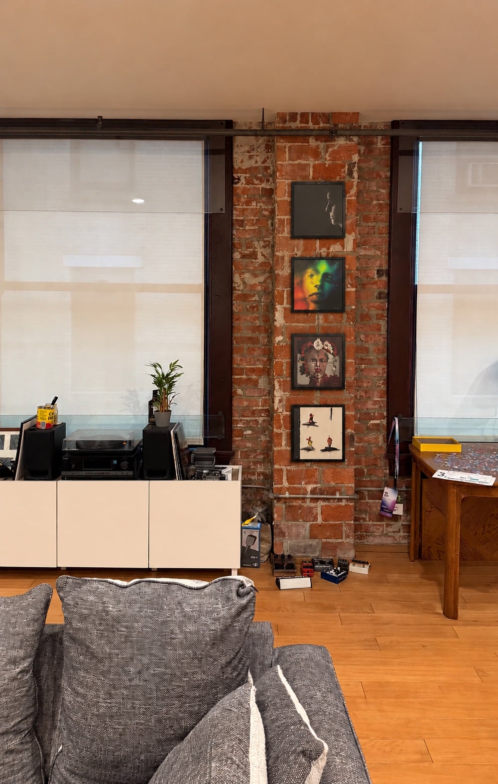
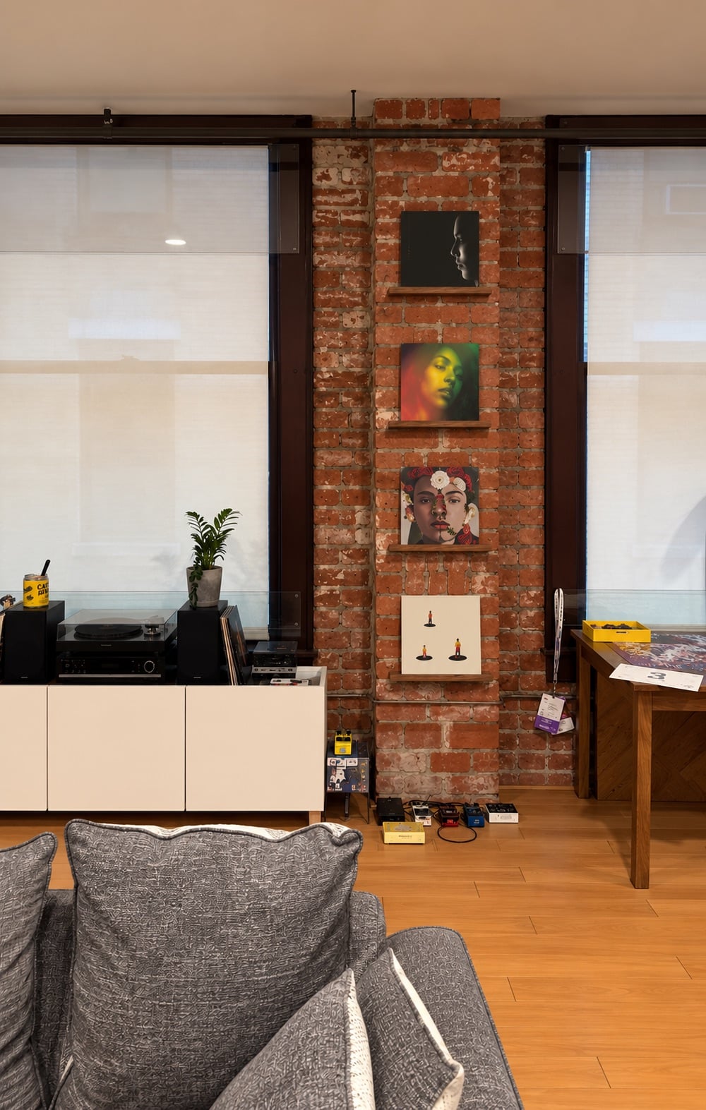
See, I told you his albums were safe. The frames he put them in are totally fine. But what I think could make them look even cooler would be to put up single-album floating shelves. The brick column is a perfect place. I love how the walnut is a little softer to the eye, and functionally, he could easily swap out which ones he felt like displaying on any given day. What’s more fun than showing off your latest vinyl purchase and having easy access to play it?? There is also a 3-D element to these shelves that adds more visual variety to the room. Now, these shelves are $24 a piece, whereas frames like the ones he has can easily be $10 or under. A new option can cost more, but if you love it, I think it’s worth the larger investment.
There are, of course, so many different shelf options. Here are some others I found that I really liked:
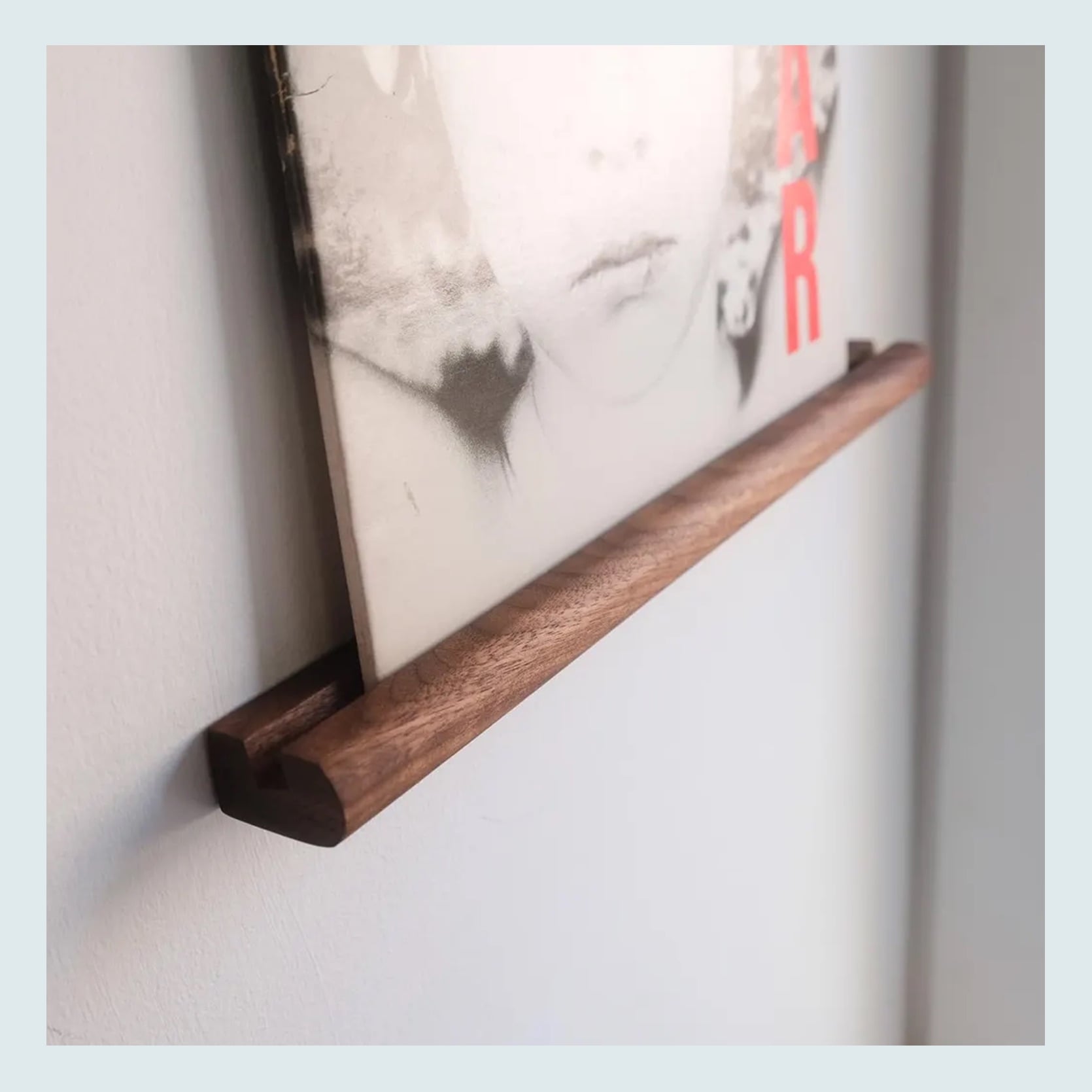
Vinyl Record Ledge – $34
This is the one I used in the render. It comes in three different lengths and two different wood tones. I love how simple it is.
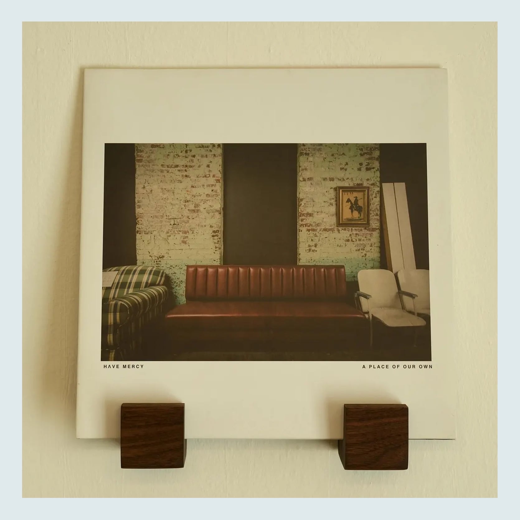
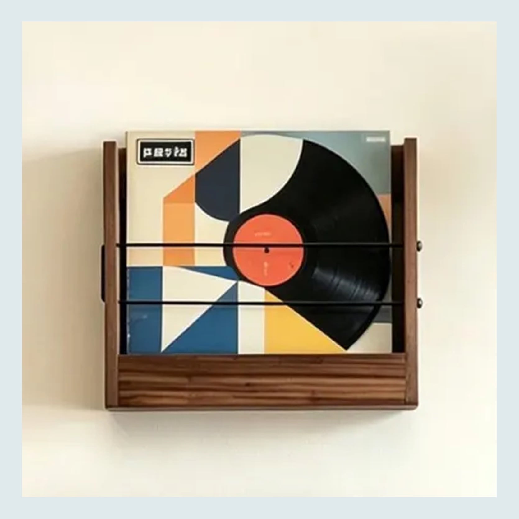
Handmade Walnut Floating Vinyl Record Shelf – $48 | Mid Century Modern Album Holder – $238
These were two others I thought were great too. The wood hooks (?) are very cool, but I wouldn’t display too many of them on one wall. I think this design is best at a handful max. The second album holder is so pretty but definitely not inexpensive. It comes in a lot of sizes, so if it’s in your budget, I think it’s a great choice.
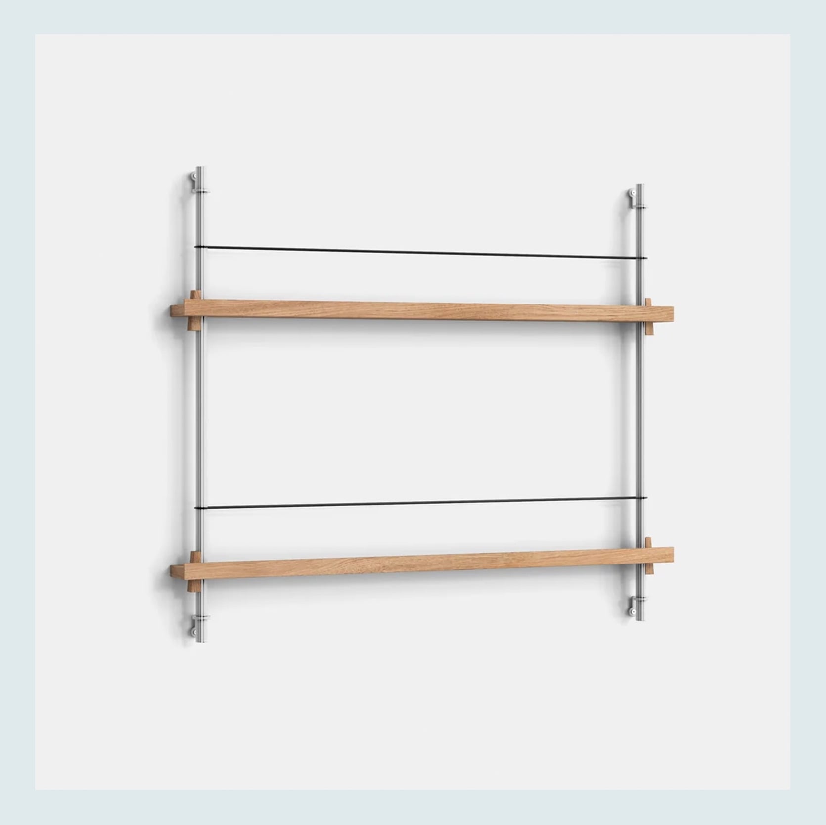
Magazine Shelving – $383
I saw this on Instagram and loved the idea! Technically, it’s a magazine holder, but in the example above, it can easily be used as an album display shelf. It comes in other colors and larger configurations too. Very cool, very chic, very Scandinavian. I actually was gifted my long wall mirror from my last apartment from this company, and it’s still so wonderful and beautiful. So I trust their quality.
One More Wall Art Display Option: Art Ledge
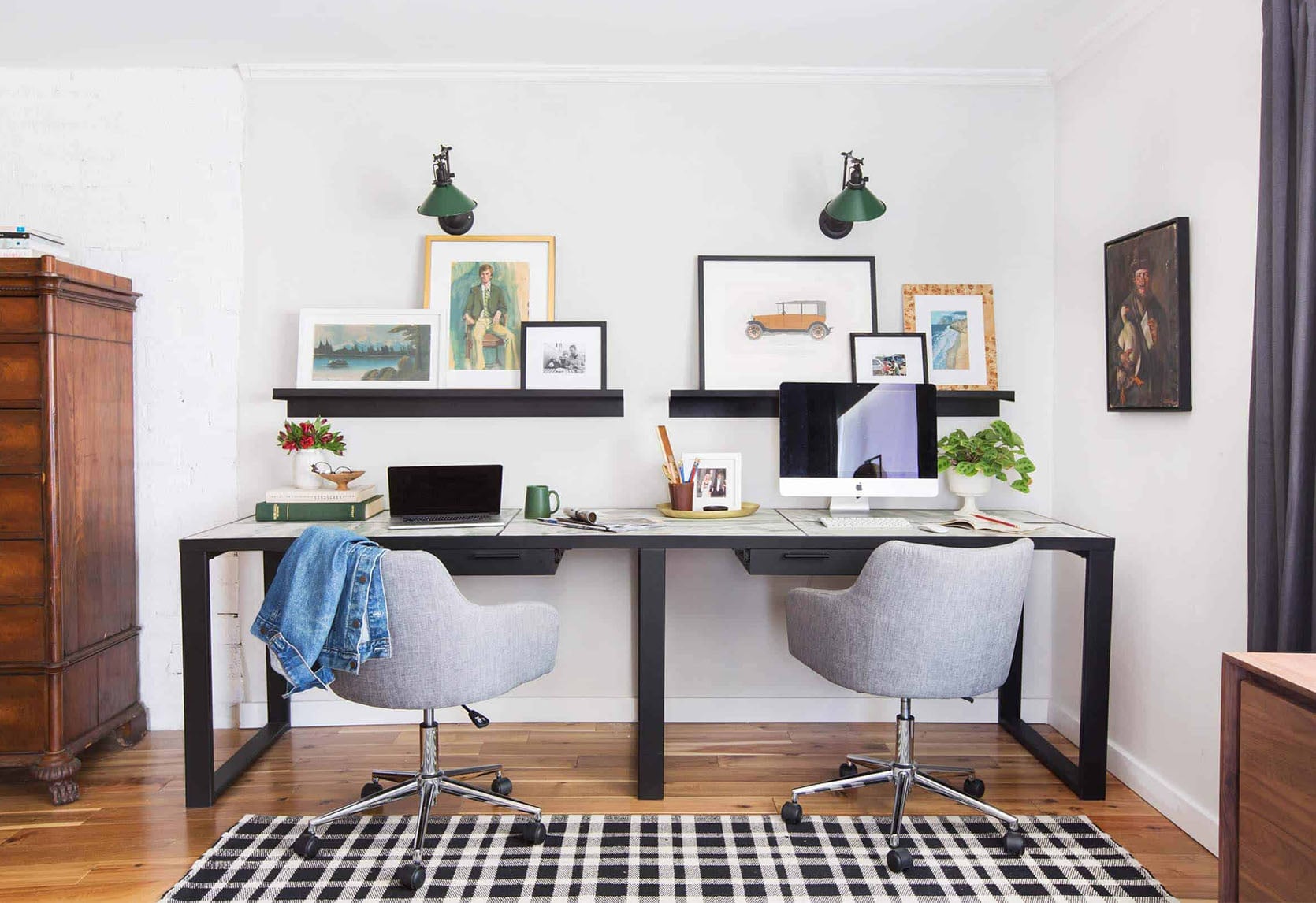
Another idea I really love, especially for rentals, is a long art ledge. I think the longer, the better/makes sense is best. In most cases, things look better when a little bigger. Again, scale is SO important. Think rugs, coffee tables, a piece of cake:) Like the single vinyl floating shelves on the brick wall, it gives so much flexibility. You can change up your art or the styling as often as you want.
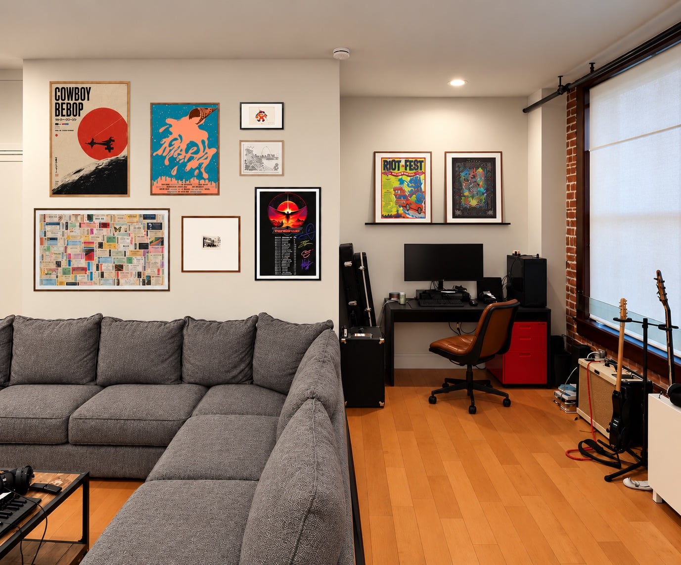
I chose to show an art ledge over his desk with the two pieces. If this were a real shoot/life and not a render, I would have layered in more, but I like the visual variety it has in relation to the gallery wall. There would need to be a lot more playing around if the ledge were put on the larger wall, given the bigger and taller canvas (the sofa sitting low adds “more” height). Regardless, always remember it’s a great-looking display option.
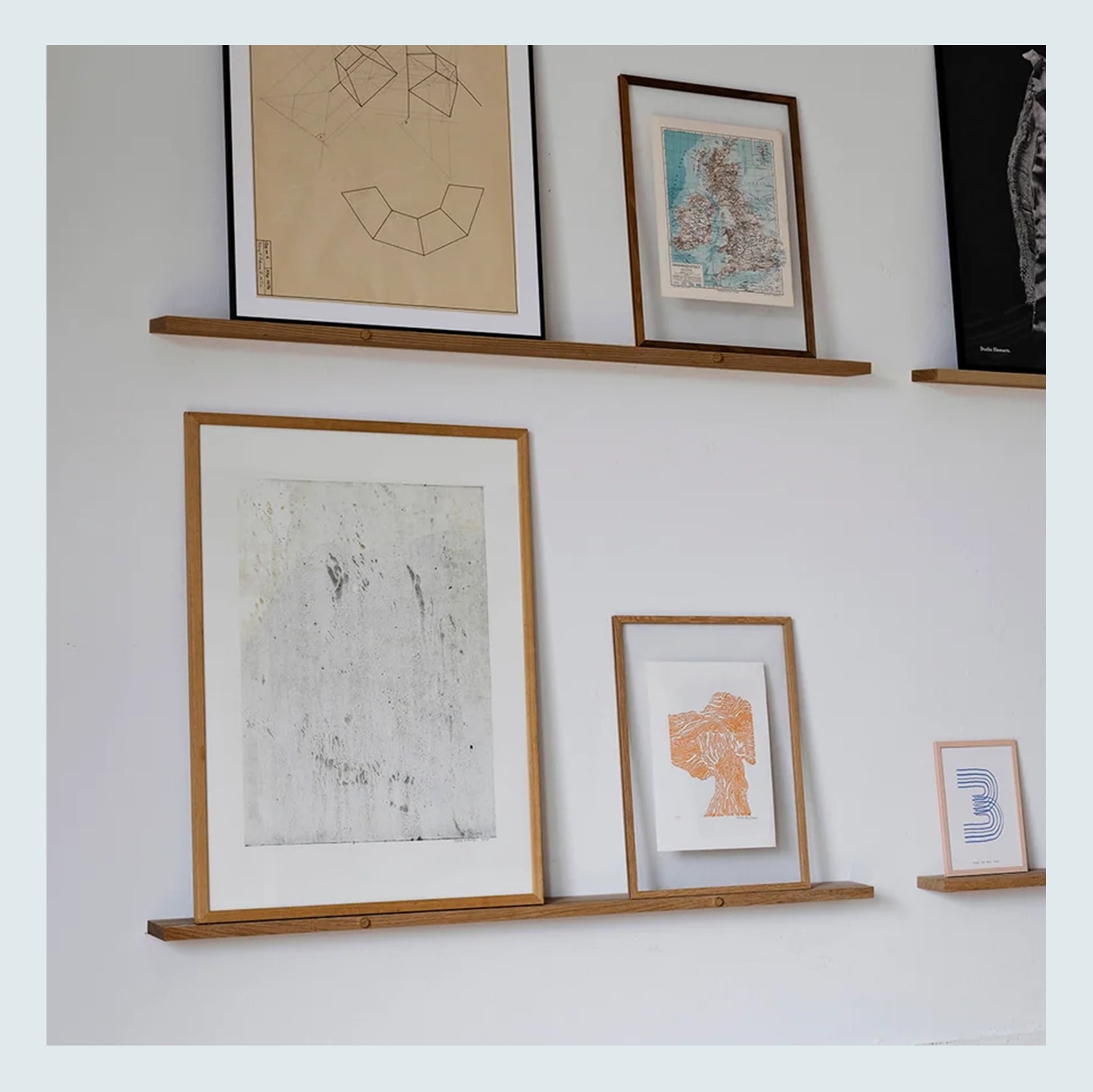
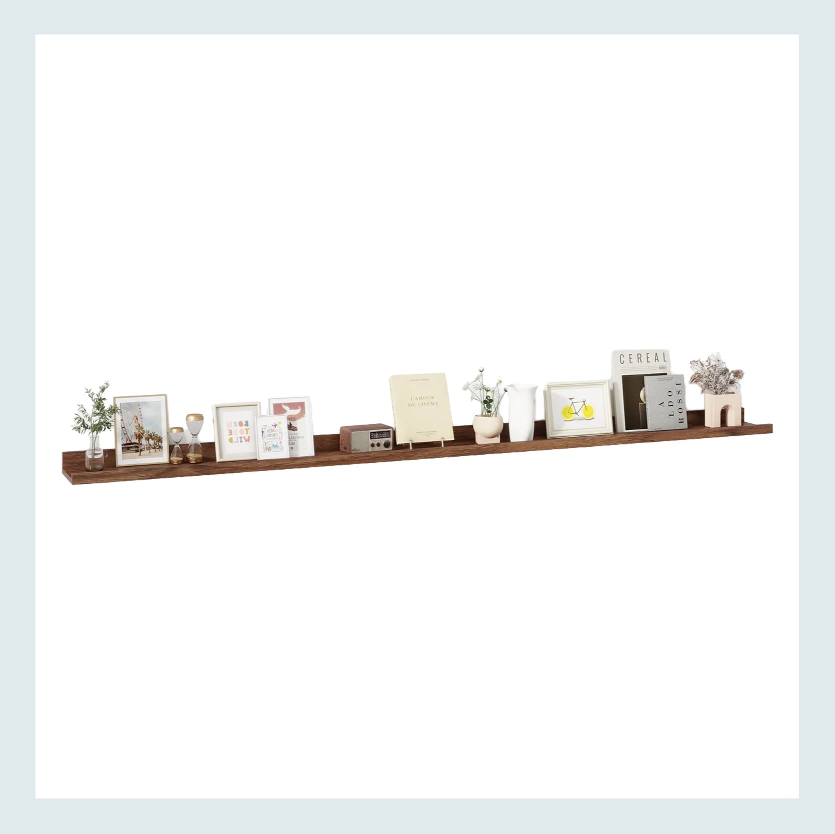
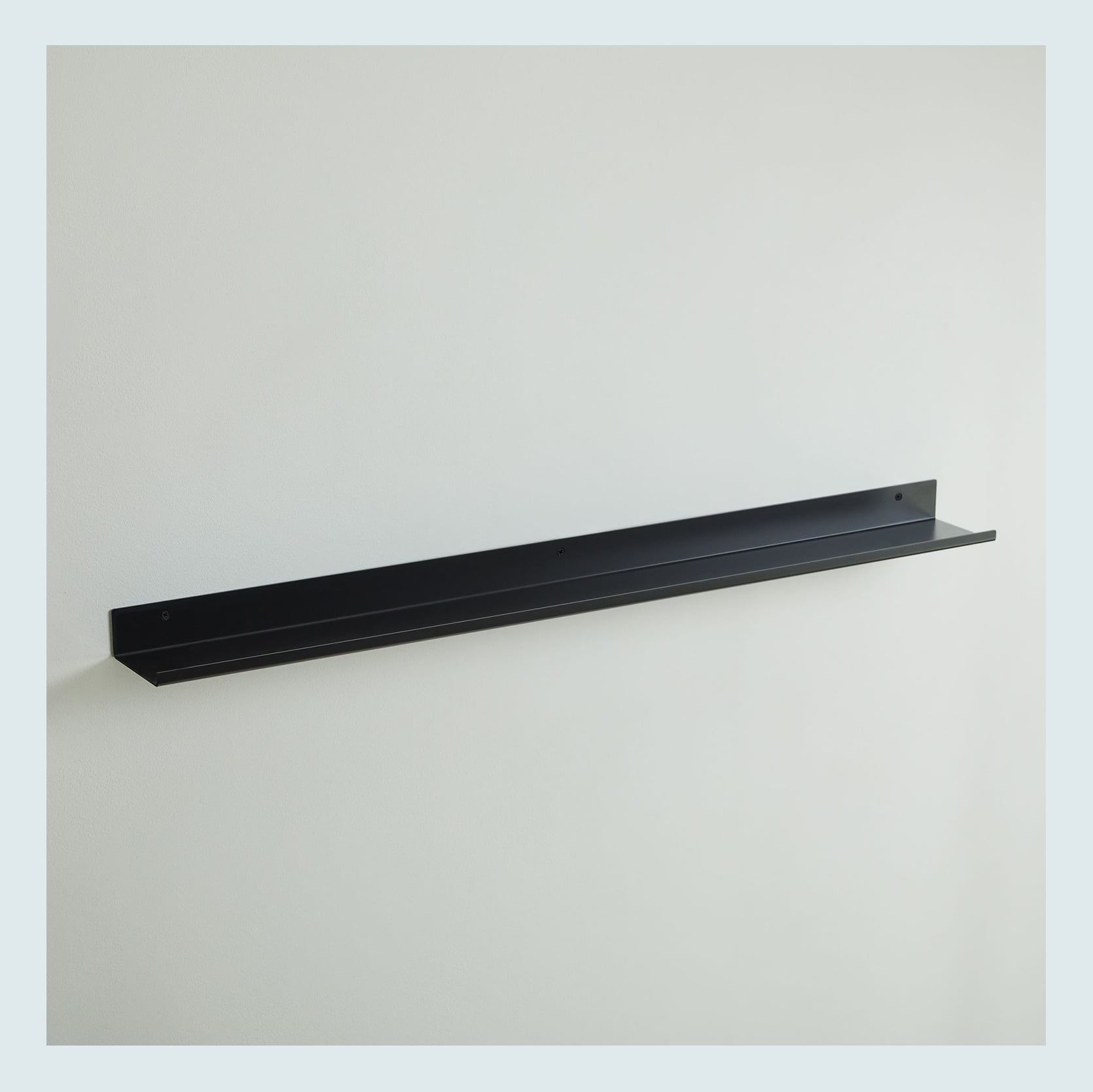
45″ Gallery Shelf – $162 | 72″ Wall-Mounted Floating Shelves (Set of 3) – $86 | Floating Lines Metal Ledge – from $49
Three great product options with multiple lengths for each, in three different price points. I do love the wooden circle dowel detail in the first one, which, naturally, is the most expensive. Cool cool cool. I am also a huge fan of the thin black metal one too. I think that profile is so chic but really understated in the best way.
Here’s a wooden art ledge very similar to the dark wood one above that shows a great display of multiple layered albums. Why I feel this one really works is that while they are floating, they are visually anchored by the TV and the wall/window. They aren’t just in the center of a big empty white wall all by themselves. I now think that was the issue I kept seeing with the posters and albums that were in grids. They were too large, with too much empty space around them (like in my boyfriend’s place…). This example is cozy but still has some breathing room so that corner setup isn’t cramped.
Vintage Posters

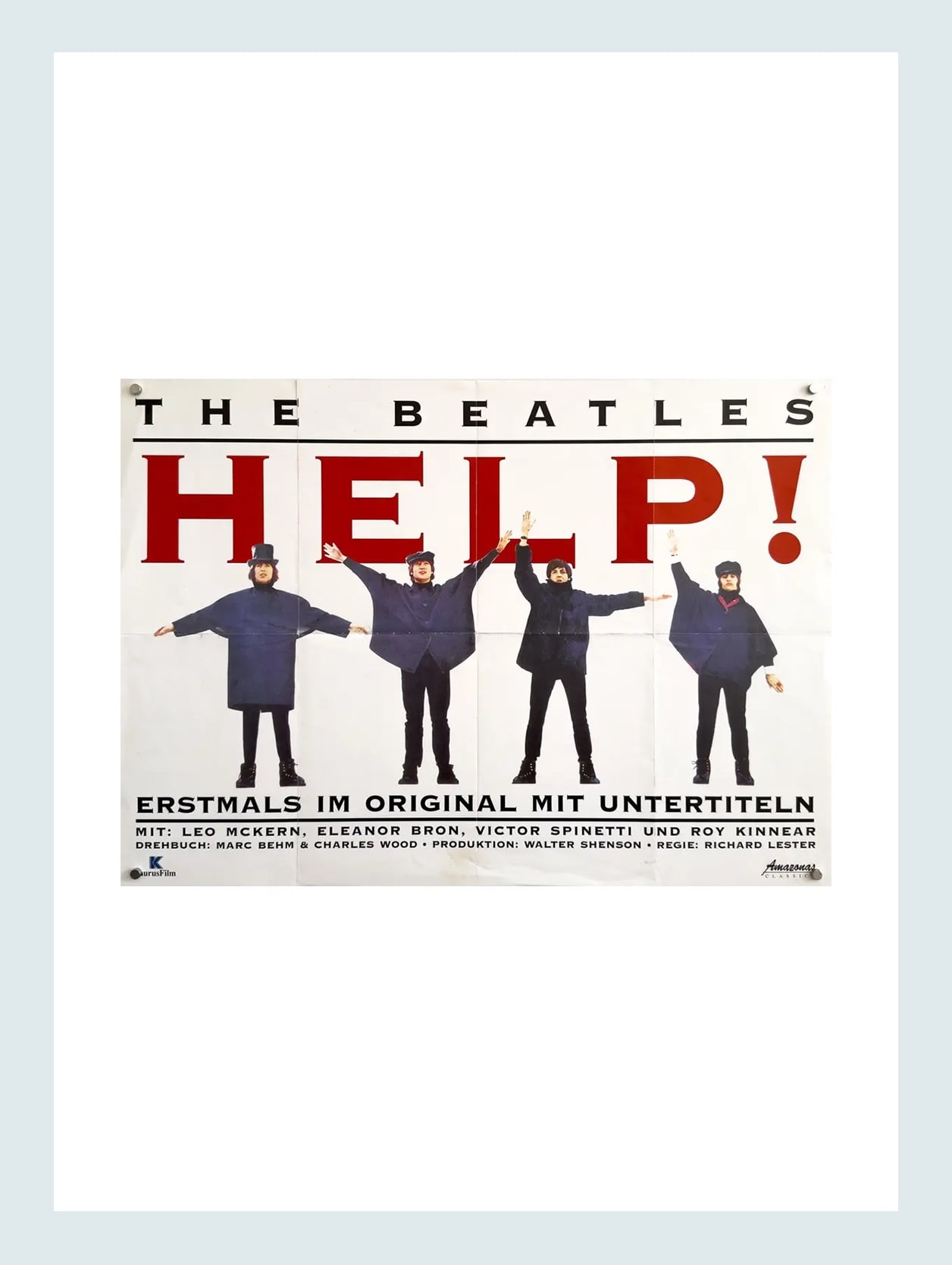
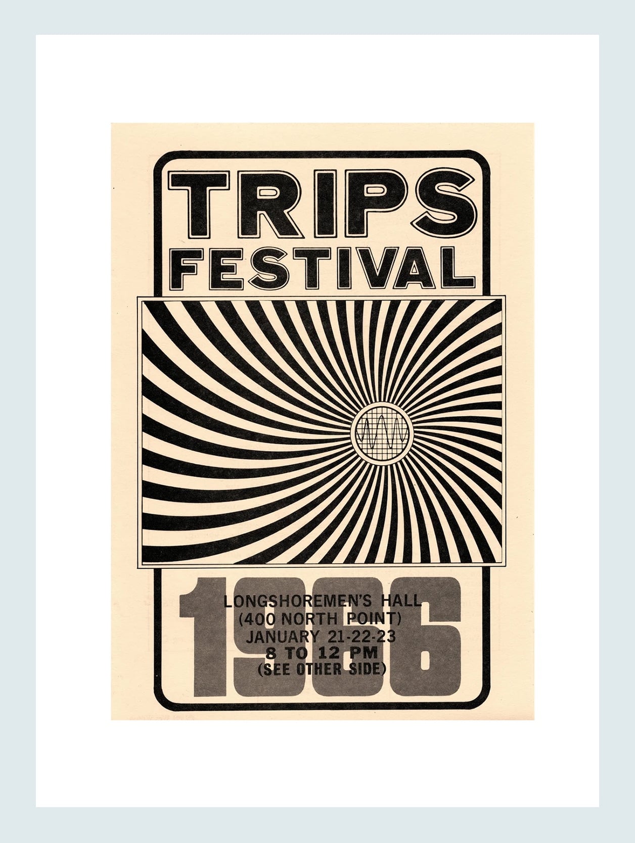
Vans Warped Tour 1998 Poster – $19 | The Beatles Help! Original Music Poster, 1965 – $128 | Trips Festival 1966 Handbill (6.5″x9.5″) – $100
Aside from flea markets, thrift stores, garage sales, and good old-fashioned hand-me-downs, the internet is your best bet to find cool posters. I doubt I have to convince any of you readers, that a vintage poster is almost always the way to go. The patina is priceless and visually adds so much soul to a room. We suggest Etsy, eBay, and Chairish as go-to places to check out. If y’all know of any great vendors, let us all know in the comments! But if your person is like my boyfriend and has a lot of their own beloved poster art, maybe just one vintage option could get added to the mix if it looks right:)
TV And Movie Posters
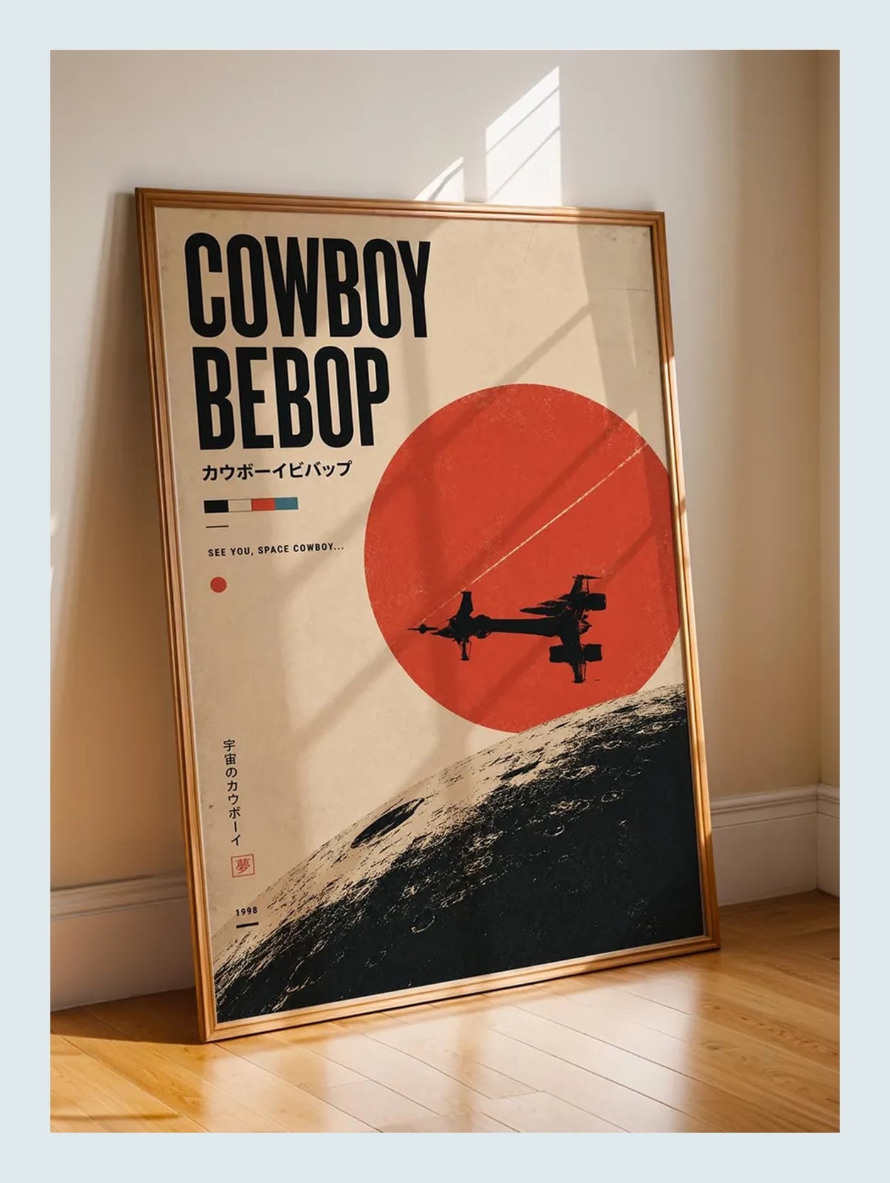
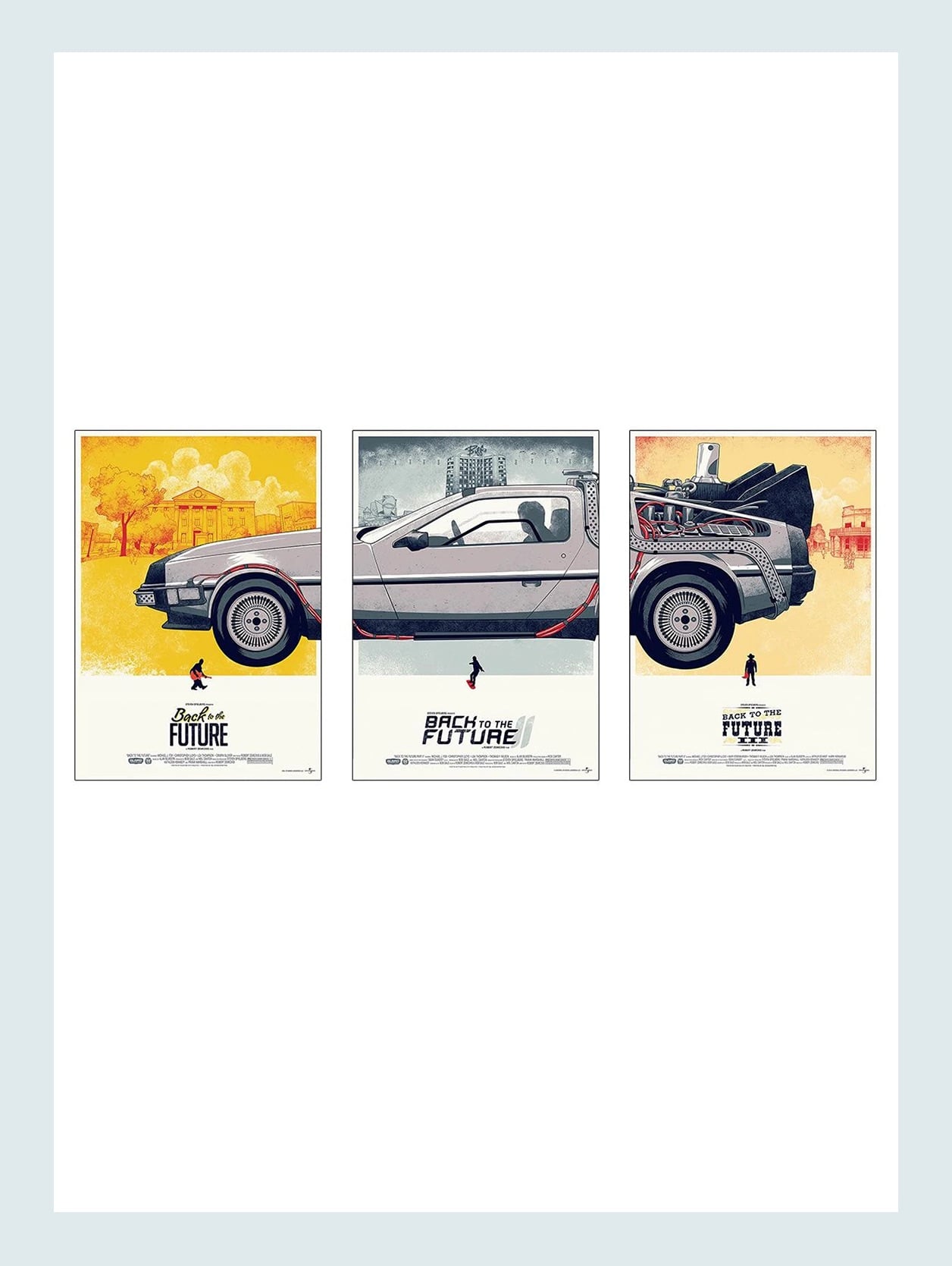
Cowboy Bebop Anime Poster – From $28 | Back to the Future Trilogy Movie Poster DeLorean – 3 Parts – $64
This one is less about finding something vintage and more about something that they love that’s presented in a cool way. One of his favorite shows is an anime called Cowboy Bebop. I haven’t watched it yet, but the original illustrations are maybe not what he would want to put on his walls. But when I asked if he liked this version on the left, he was into it. Again, I don’t know if this is something that he will end up getting, but it’s a good-looking, cool option of something he really loves. The Back to the Future triptych that’s on the right is actually one that Arlyn bought for her husband for either his birthday or their anniversary. They both LOVE those movies, and this was something that she knew he’d love and she didn’t mind hanging in their home. Oh, and she framed them in IKEA frames.
It usually doesn’t take a lot to make something look a little (or much) better. I hope that’s how you feel after reading this. Everyone should get to have art that they love in their home, and good framing is pretty transformative. Now, I only had my boyfriend read the first three paragraphs of this post (which he approved and said he really liked, phew), so chances are good you might hear about him again:) Until then, I’m just excited to help him make his place feel and look even better than it already does. Maybe a rug is next??? We’ll see!
Love you, mean it.
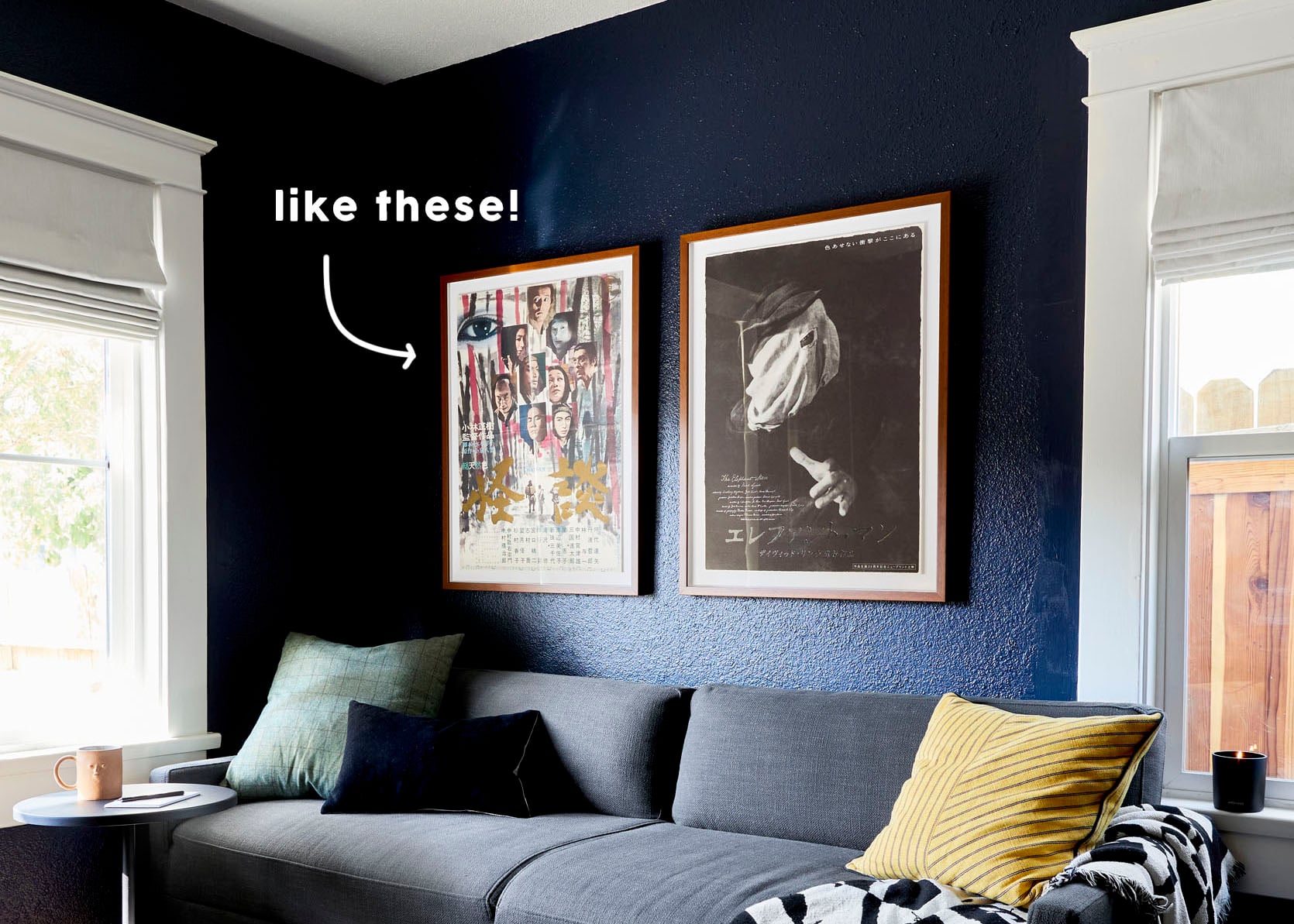
Opening Image Credits: Design by Sara Ligorria-Tramp and Macauley Johnson | Photo by Sara Ligorria-Tramp | From: Sara & Mac’s Office/Guest Room Reveal – LOTS Of Function + Even More Color and Style


Jess, thank you for sharing a private glimpse of your life with us! This was a great post – I’m navigating some of this with one of my teens right now and love the balance of price points that can all achieve similar visual results.
Love these ideas! I think all he needs are a few plants and a rug now.