Design
6 Design Trends That Will Make Your Home Cozy For Fall (And Beyond)
While I have slightly mixed feelings about letting summer go, there’s really nothing like fall. I mean, we say it every year, right? So, to fully shed my sandals’ tan and dreaming of swimming in the ocean (of which I only did once this summer…FAIL), I thought we could look at the design trends that are here, happening, and helping us get in the cozy mood. If nothing else, I guarantee your serotonin levels will rise from looking at all of these beautiful rooms. Let’s start with a bolder one:)
Outlining
This one has been sneaky, but over this past year has been slowly growing. These first two examples are the “higher-end versions”. Both of these “outlines” are done with, I believe, wood and look incredibly chic. Obviously, high contrast is the name of the game. The example on the left is more of a classic contrast moulding detail, but it gives the effect that the trend is trying to accomplish…drama. I think that dark but warm wood moulding against warm white walls is going in my dream home. The example on the left is a much more intentional outlining of the room and is SUCH a statement without a lot of color or materials. Something to consider is remodeling:)
But you don’t need expensive wood to give a room this look. Both of these examples used paint! The example on the left created its own outline with extra detailing, which is so creative. Then the example on the right simply followed the ceiling and gave it a little something extra, both subtle and a statement. Actually, if you follow our girl Mallory, she did a version of this on her bedroom closet cabinets, and it looks so great!
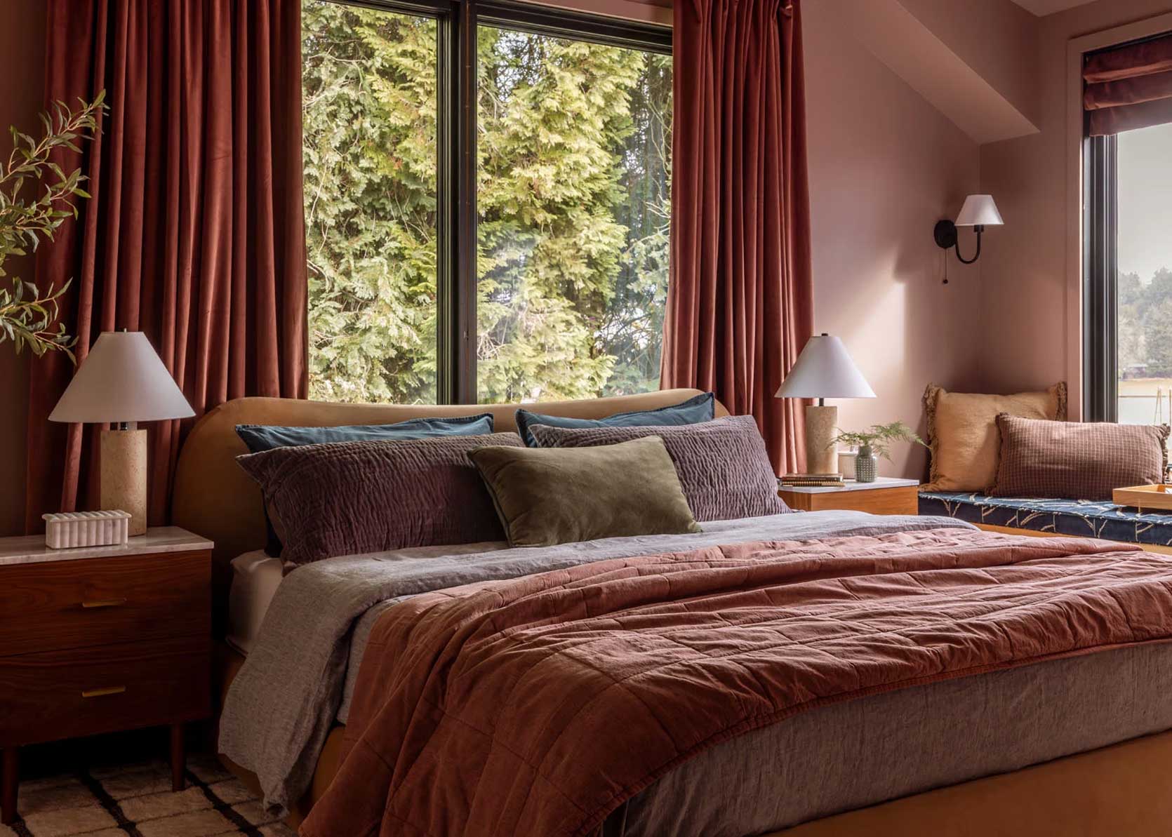
Slightly Sheer Taupe Curtains
Taupe, natural, flax, etc, are all colors included in this “trend”. These warm neutral curtains are really everywhere! Not a new idea in the slightest, but especially in the high-end homes, people are swapping white and cream for taupe. Seeing all of these homes even got me, and I made the same decision in my bedroom (the shoot is happening in 2.5 weeks!!!!!). See how happy Bobby Flay is in his taupe-draped living/dining room? We should all be that happy sitting in our homes:)
If you want to go blackout, that’s totally great and your call. However, this “trend” is about the semi-sheer. You want that warm sunlight to pass through those curtains to create a happy, warm glow. I can’t tell you from personal experience, it’s magical. This iconic Eames House is the perfect example to show that (obviously) this is not in any way new but is completely timeless and inviting.
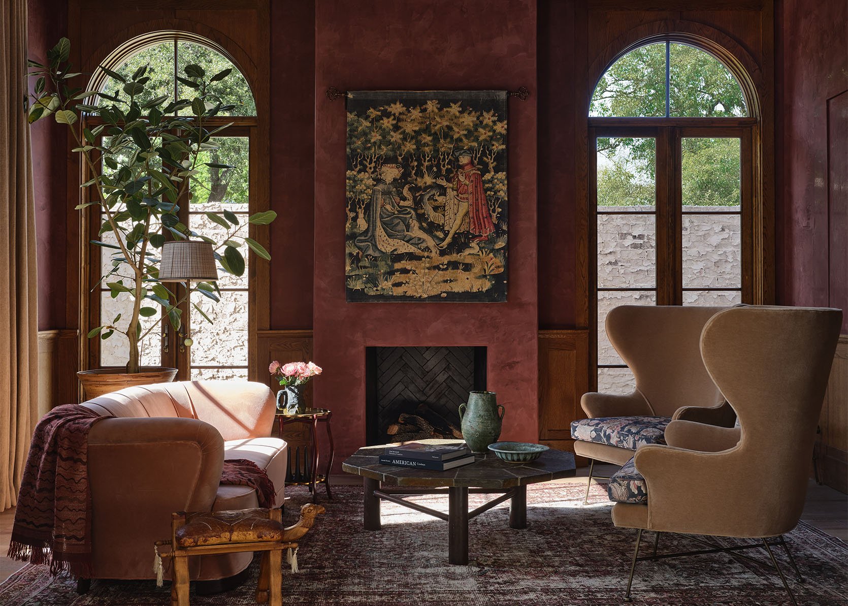
Burgundy
Burgundy has been making its way onto our feeds and into our homes for a minute, and we see no sign of it slowing down anytime soon. I adore it when people and designers go bold and cover a whole room with it. It’s moody, sexy, and so inviting. How stunning are those spaces?! Personally, I love a burgundy that leans a little brown, but there are lots of different options to try out.
Maybe painting an entire room is a little too much for you, personally. What about a piece of furniture like these beautiful sofas? And if you scroll through the photos, you’ll see the coolest cylinder bar cabinet in a similar burgundy tone. To me, burgundy = cool sophistication.
Of course, you can go even smaller with it. These two spaces have furniture-based burgundy accents, but pillows, vases, throws, candlesticks, etc., are all great ways to add this color into your home, whether it’s for the fall/winter season or indefinitely. This color isn’t going anywhere.
THE Color Palette – Burgundy, Olive, Blue, And Ochre
Now, Caitlin gets all the credit for this one! She’s got such an incredible eye for color palettes, and as soon as she mentioned it, I realized that it was all over my saved photos in different variations. Take the bedroom on the left, the tones are more subtle, so it’s softer on the eye, but still so fun and eclectic. Shapeless Studio is always ahead of the curve. Speaking of trendsetters, Flack Studio is another UNREAL design studio that is always bringing creativity to the forefront. This furniture factory turned home is a feast for the eyes and very much abides by this overall color palette. But like the bedroom, it isn’t visually too overstimulating because the colors are all pretty mid-toned and not overly saturated. Just incredible.
Clearly, people are really feeling this color palette in a bedroom. What I love is that you can really make it your own based on the color you want to highlight, versus what colors are more secondary. I’d say green is a main color for both spaces, but the room on the left leans more into the burgundy/purple, while the room on the right leans more into the blue.
Reath Design is another studio I would trust wholeheartedly with mixing colors because every room they design is, well, perfect. This is a more liberal take on the trendy color palette, but all of these spaces are done so beautifully that there’s no way they’ll feel dated anytime soon.
European Tapestries (It’s A Takeover!!)
Those pastoral tapestries are bigger than they’ve been in a while! I can’t scroll on anything without seeing a handful of rooms with one in them. Just so we’re clear, I am a huge fan. If you’re lucky enough to find a big one (at a reasonable price, which is subjective, I guess), then it’s the most beautiful statement piece. I love how these two bedrooms use them to almost give the illusion of a huge headboard. Also, stylistically, they are versatile. The room on the left is very clean, slightly moody, and purposefully gives a high-end luxury hotel look. While the room on the right is still beautiful, it has a lighter, “happier” color palette and looks more relaxed feel. Both tapestries really make the rooms sing.
I wanted to include this because I love the paneled tapestry look:)
But bedrooms aren’t the only ideal room for this type of tapestry. Give me a large tapestry in a living room any day. It’s just wild how much movement, texture, and soul they add to a space. Of course, you don’t have to just have them on your walls. Pillows and furniture pieces also come adorned in the same kind of fabric, which is a really fun twist.
Whimsical Beds
My last observation is that a lot of beds I’m seeing are becoming more whimsical, and why not?! I love it. This room is a suite at a stunning hotel, but that canopy style has been popping up more on my feed. Remember the first shared kids’ room Em designed for her kids in their Los Feliz home?
This is not in a hotel but in a magical home. The kids who get to sleep in here are very lucky. I also love that the canopies are placed in the traditional way, and instead, coming from the side.
There’s also the option of creating a DIY framed draped headboard like design influencer, Marco Zamora did in his bedroom. It’s all very romantic!
But it’s not all about big pieces of draped fabric; I’ve also been noticing more whimsical detailing in wooden headboards, too. Both of these are great interpretations of that. So if you’ve needed a sign to go whimsical with your bed, I say go for it:)
That’s all I have for you today. Any thoughts? Are there other trends you’ve noticed? Let’s chat.
Love you, mean it.
Opening Image Credits: Designed by Shane & Pierce | Photo by Michael P.H. Clifford | From: Why You Should Choose Bigger Art (As Proven By A Beautiful Italian-Inspired New Build)
“See how happy Bobby Flay is in her taupe-draped living/dining room?”
Giggled at this Fun Friday typo. Whimsical beds FTW, too!
Know the feeling when you have a tapestry from a local vintage shop folded on the chair in your bedroom, waiting for you to get back to the plan of a long pillow for your bed, and then Jess’ post highlights tapestries in her Friday post?
So much great eye candy, and thanks for bolstering my idea!
“Bolstering” – excellent play on words haha! And yes, I’m feeling inspired too.
Check out the tapestries available at Romantic English.
I used taupe semi-sheer drapes in our bedroom a couple years ago and love them! They added just the right amount of coziness to the room.
Just wanted to let you know that the webpage has been crashing on me consistently. Whenever the ad near the bottom switches, I can no longer scroll in either direction and have to reload the page. Today it took me 6 times to get through the post! I’m using Firefox on Windows.
Not sure if this will help but I close down the video and bottom ad as soon as I open each page because I had similar problems. Has helped. Plus too much going on in the page with it all open. Overwhelming although not as bad as some sites which I simply don’t visit because too much happening on a teeny tiny screen. (iPhone 15 plus).
I’ve had the same issue on this site for a while. I visit this site infrequently now because it’s so frustrating to scroll on my iPhone.
I’ve had to start opening posts I really want to read on my computer; it’s too hard on my iPhone!
Let us not forget who did this pallette first!
I need to up my bedroom game.
I’m going to NEED a roundup of Burgundy, Olive, Blue, And Ochre accessories. 😀
This is all perfectly whimsey for Fall! Love the inspo. Keep it coming. The bed canopies in particular are something I keep wanting to play with. But the color combinations highlighted here? Perfect for the weekend…
Every so often I feel like the emperor is wearing no clothes when reading an article where everyone is waxing lyrical about trends or rooms that I think are truly forgettable or even downright ghastly and this is one of those times. I’m sorry to say there’s nothing in any of these images that I really like. Feels like they are all trying too hard.
I painted my bedroom in burgundy( w. a hint on brown in it) and I LOVE it. I also had the ceiling painted a soft pint.
What color did you use?