
Budget Ideas
How I DIY’d Canning Jars Into An Art Installation (And Would I Do It Again?)
I’m indulging in some nostalgia lately – looking back at 10+ years ago projects with fun emotions (“oh wow”, “I did what?” and even “oh that’s fun”). Maybe in 10 years I’ll look back at the Craft Barn or the squiggle bulletin board with the same surprise and nostalgia. This project I TOTALLY forgot about and when I slacked my team after stumbling upon it on the internet my team was like “what exactly are we looking at?” Exactly. Let me show you.

My client (fun fact, it’s producer Rachna Fruchbom who produced Shrinking, Parks and Rec, Fresh Off The Boat, and And Just Like That) already had these vintage pieces (she is rad, by the way – Orlando and I LOVED working with her and her fam). The piece in question was a huge store display shelving unit which seems great in theory, but what can someone actually put in it in their real home that makes sense? And in a playroom, no less?? Books/cute toys in the bottom cubbies, sure. But the rest of the cubbies were too small and chopped up to be functional. It’s not like you separate your lego colors, or have so many nice looking kids collectables. It’s a cool piece, but actually created a big creative problem that Orlando and I needed to solve (mostly to shoot the room, which was so cute). Rachna gave us free reign as long as we didn’t blow the budget, so we got creative.
Canning Jars FTW???
You may know that my love/nostalgia for canning jars is greater than most. Odd Even. Growing up mormon we canned everything we could, including our annual tuna canning session from the Oregon coast (which was as stinky as it sounds, producing year-round delicious fresh tuna that all my college roommates would fight over). All my vases at our wedding were vintage/antique canning jars I collected throughout our engagement (many I still have). I would say this odd love has depleted, but it hasn’t. I drink daily out of huge canning jars as if it’s a normal glass.
Why Mason Jars?
If I remember correctly, finding anything that made sense to fill the cubbies was impossible. Jars of art supplies would cost so much more (and be unnecessary), wrapping boxes in colorful paper was maybe another idea but could also look soooo janky. Colorful kids blocks also could have worked for a shoot, but would also be more expensive than you’d think and look messy when messed up (and hard to maintain). If you can come up with an idea that makes sense please let me know. We didn’t want it to be bitsy, messy, random, or cost too much. So I guess that landed us on painting mason jars…
We Measured And Math’ed…

Assuming that I had the idea (zero recollection but that is my hand writing), Orlando and I mathed it all out by measuring every row of cubbies and figuring out which sizes of jars would fit in each and how many we would need. We then bought them all (likely from a store, this is pre-Amazon Prime), and chose the paint colors.

This is the only photo still on the internet of us painting them (this is before smart phones for photos or video – how did we even create daily content 12 years ago???). I’m not sure if we chose one blue and then diluted it increasingly with white to get the ombre effect OR if we chose a few shades and just played around with mixing them together as we moved up the wall of cubbies. Either way, it created this ombre look which I have to admit is still really fun.
What I Think About It Now

Is it gimmicky? Sure. And if they ever were to move or get rid of that piece they would have a lot of painted jars to deal with. However, it’s still a compelling wall of color that is simple for your eye to understand (i.e. not busy) and created a conversation. It’s also very 2012 in a really fun way. The pops of gold/silver of the lids as a nice shine and texture.

I don’t know if I would do it again, but still without an alternative solution I stand by why I did this. It ended up being around 60-75 jars (feel free to count) which cost about $230 (per my OG post about it) and then another $200 or so in other supplies. That’s not nothing and hilariously certainly doesn’t account for our time (which neither did I back then – a rookie mistake of my first few years of having design clients and why I ultimately ended up pivoting away from it). If you added up Orlando and I’s time to do this (likely 10 hours x 2 people) it would add about $3,500 in design labor. Which would take the entire project to $5k which is simply FAR too much for a fun DIY mason jar ombre art wall in a 3-year-old’s playroom. But doing DIYs for content is a different business, so I’m sure even at the time we felt it was worth donating our time to execute this DIY (but typical designers would never do this because it would simply cost their clients too much).

Wait, That’s. Not. All. What about those painted frames???
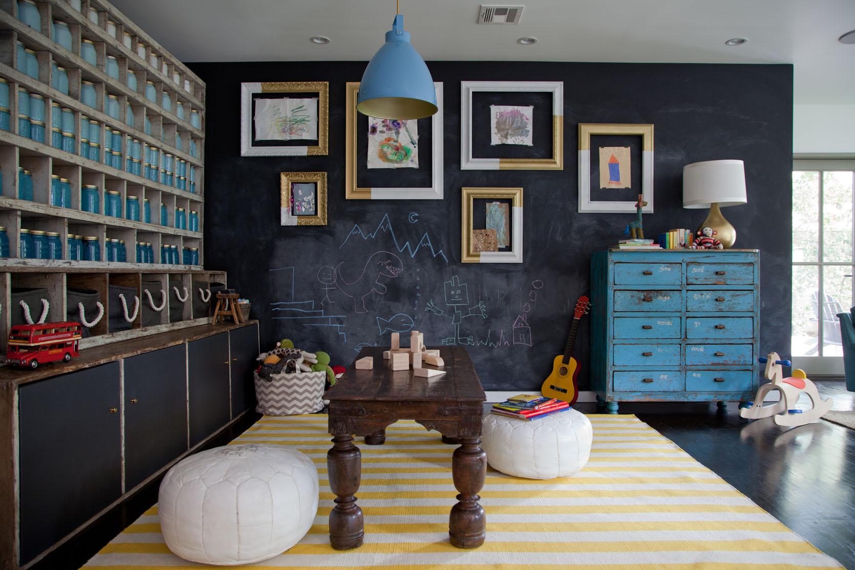
We didn’t shut off our creativity there, folks. We found a bunch of empty vintage frames at the flea market and thrift stores and painted them each 1/2 white, 1/2 gold. SO 2012!!! They housed kid art which I still think is a cute and clever idea, and could totally be updated in 2025.


And that’s the tale of the canning jar art installation wall from 2012. Shout out to Orlando for helping me do it (he was my design assistant at the time). We had so much fun, pre-kids, and I’m only sad that we don’t have a fun reel or video to show you.
So what would you do with these cubbies? I’m genuinely curious what other solutions would make sense! Comment away!!
*Photos by Bethany Nauert


Em, I genuinely LOVE IT! Have to add though, this is definitely a pre-kid project. :))))
What if you hung a giant piece of art in front of most the cubbies and then only filled the remaining visible ones left with books, art supplies, blocks etc? More for display than daily use. And then you could have left the chalkboard wall more open for drawing.
That’s a great idea! And kids use so much art supplies – maybe some cubbies could be craft paint containers and colored pencil box containers (crayons, pencils, paint brushes) – all in a thought-out color scheme: ombre in a different form?
Was this a playroom actually used by a 3 year old? I appreciate it as an art project, but all the actual 3 year olds I’ve met would have been climbing the shelves trying to get into those mysterious blue (glass!) jars.
Maybe you weren’t allowed to, but I would have just painted the insides of the cubbies in your ombré blues and left them empty. All the 3 year olds I’ve known have been passionate collectors of small treasures, like interesting rocks and bits of flotsam found in parking lots.
*Orlando’s and my
I do love me some good mason jars but I would have either taken out some of the verticals to reduce the “cubbiness” of it or I would have put put doors up and made it closed storage.
Another question: how long did the homeowner keep it like that?
I understand why you did it for the photoshoot, but it’s giving off paint shop vibes rather than playroom. And given how unique all the vintage furniture items are, the sameness of the jars is…jarring. I would have preferred it with more colour variations though, feels a bit flat with just blues. Even just one yellow jar to speak to the rug! And all those black baskets are just dying in the cubbies too.
I think over time it would have been filled with books, individual toys (like one teddy bear in each cubby), kid creations (all those painted pottery items that you can’t throw away too quickly!), kid collectibles from walks (stones, rocks, twigs), toys that are lovely to look at but never get played with (am looking at all those gorgeous wooden toys that get discarded for plastic tat) – and some just left empty to enjoy the space.
I’m so confused by this. I guess one woman’s art installation is another woman’s confusion. 🤣
I think you could have painted the back wall of each cubbie hole, same ombré theme. Then no jars and would have been faster!
I went back and read the original post. I saw that the client would eventually like to use the storage unit for wine. So this needed to be a temporary solution while the room was used for play.
I feel the glass jars are kind of useless and wasteful. I would have gotten cut-out wooden letters and numbers, and put those in each cubby. You could paint them, or leave them natural wood.
It says you used a quart each of Benjamin Moore colors 743-749 in this post with more pics:
Sorry, tried to add a link to the original post but I don’t think it worked. To find the post, maybe look for the title?
HGTV Magazine Spread: A lovely House Makeover in Studio City
This is way more aesthetic than myself in 2012 who would totally have filled this with funko pops. This makes me nostalgic for the popularity of milk paint and chalkboard paint!
How old is that furniture? I love antiques, but I typically avoid painted pieces because of lead paint.
Did you leave the jars for the family?
This is interesting as a styling approach but as a mom of three kids, I look at those cubbies and think STORAGE. Lol. Those would need to hold some serious kid junk in our house.
Children’s Books! Lots of them on eBay and thrift. Put ads on Facebook marketplace (or back then, Craigslist) asking for donated children’s books.
I can’t imagine you’d much over $400, which is similar to what you spent on the jars!
NOW…thrift prices are necessary 😉 $.50-$1 per book!
But if you look closely, you can see the cubbies are only maybe two inches deeper than the jars, so maybe 5-6″ total. You might be able to fit adult paperbooks in that depth, but probably not kids’ books, which tend to be much wider.
Where is that blue dresser thing from? The drawers are labeled in an Indian script from the western state of Gujarat and most have names of herbs/spices so likely seems like from the kind of grocery stores my mother used to go to in Bombay of the 1970s!
Oh my gawd. I did the painted frames because of this post. Teehee
Wow, it’s the wall of anxiety for me. At every age, my girl has been a climber, so that piece would not have made it into my house to begin with, but add a bunch of glass jars? YIKES. I can see little stuffies, figurines, art projects or other kid treasures in those cubbies looking really charming, but I would constantly worry the whole thing would fall over. This is a very creative way to get some color on the wall though!
Love the hombre! Always fun. As a similar art installation, I’d paint paper maché balls or simple roundish shapes. Not breakable, adds that good curve to the grid, and they could easily be recycled.
Omg I completely forgot about this!! It’s weird but it still makes me smile. 🙂
This, for me, really summarizes the tension that seems to exist between styling for magazines/shoots (Creative! Attractive! Different point of view! Eye-catching!) and designing for everyday life (Safe, sturdy storage).
No way would Emily, even pre-kids, have put painted, breakable jars in cubbies like this for actual real-life use. It IS really eye-catching, though!
One of the things I love most about this blog is seeing how design ideas do in real life, with real kids/pets/friends in the mix. The truth is that if this piece was in a playroom in my house, it would hold a hodge-podge of books/crafts/LEGO builds/art supplies/CrunchLabs boxes/games. And I would probably be coming here for ideas on how to make it look cute!
Tissue paper honeycomb balls.