
Design 101
Would You Try This Unexpected Color Combo In Your Home? (+ How These 28 Rooms Got It Right)
BUCKLE UP, Y’ALL. It’s (almost) Christmas in July. Today, I’m sharing one of my favorite no-fail color combinations – yeah, seriously – and making an impassioned case for the mixing and matching of (you may have guessed it by now) RED AND GREEN. That’s right, gang – you can (or maybe even should?) be employing this fresh, warm, cozy color combination in your home. I’ve compiled a few of my all-time favorite examples of Christmas colors done right (as in “livable,” “will be enjoyable for a long time,” and “will not make you feel like you’re living inside a Santa set up at the mall”) and I’m SO excited to share. From farmhouse to full glam, from English countryside to 90s revival, from quick DIYs that’ll add a little personality to your home to full-blown red and green kitchens (two of them, actually!) – there’s something for everyone here. I’m going to ease you in with my favorite trick – just adding a pop of red or green to an existing space – but by the end, we’ll be going ALL OUT. ARE YOU READY? (Can you tell I’m ready? Can you also tell I drank a lot of caffeine before writing this introduction? Like, HEY, HAPPY TUESDAY! Let’s look at some inspiration, friends!)
Add A Little Pop


We’re easing our way into it with some nice, desaturated tones. There’s something inherently comforting and home-y about this palette, right? Brick reds, olives, and sea-foam greens – it’s a nice mix of sturdy and soothing. I love a red stripe or plaid paired with a tiny hit of green – if you’re looking to add some color without adding a ton of fuss, this is a really livable option.
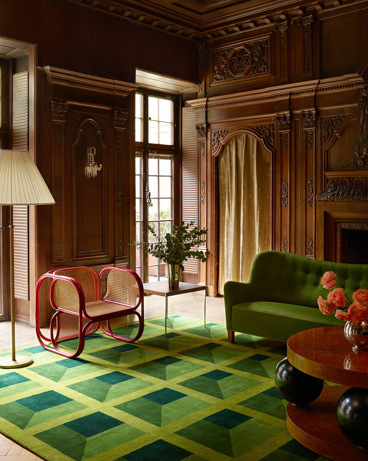
Turning the saturation up a little (or, uh, a lot) here with this next space! OBSESSED with the super punchy Bočan chair against a sea of green furnishings (here’s the rug), warm woods, and ornate detailing. Red is such a powerful accent color (remember when Em added that balloon chair to her old living room?) – adding a single piece in a contrasting color is an awesome way to make a high-impact design statement without splurging on a ton of stuff. (And if you wanna learn more about these chairs…well, baby, I GOT YA.)


Two sets of stripes, two VERY different looks. I love the room on the left – who knew that olive, kelly green, and coral could all live so happily together? There are a lot of traditional elements (the stripe, the piping, the tufted headboard, and embroidered shams), but the unexpected color palette leaves it all feeling fresh and youthful. On the right, those terra-cotta cushions speak to the rich wood credenza. The rattan definitely warms up the space, too – no one’s thinking “winter” or “Christmas” when they see a giant peacock chair.

CAN I VISIT? The hand-painted mural is to die for, but first: this is the kind of magazine-worthy styling that I love, y’all. Like, yeah, just chilling in my ::checks notes:: extremely red kitchen with my ::checks notes:: pile of apples and ::checks notes:: tray filled with rose petals. You know. LIKE WE ALL DO. Photos like this are the reason I still subscribe to magazines – it’s SO FUN to see things that are so inspiring and escapist. Second: let this live as proof that candy apple red and kelly green can, in fact, live in harmony.


No-fail design hack: add a bright red pendant. It’s the simplest finishing touch – and it’s pretty easy to install if you have some DIY chops! – but it makes ALL the difference, don’t you think? It really brings the quiet, muted palette on the left to life while bringing a really nice balance to the bold, more saturated palette on the right.

My first thought when I saw this home: “the person who lives here is fun and vibrant and welcoming!” One thought noticeably absent from my brain: “red and green are usually billed as the be-all and end-all of Christmas colors!” That’s due in large part to the other primary colors featured here, which brings me to my next favorite tip for making this palette work in your home…
Sprinkle In Some Blue Or Yellow

The mix-and-match here is SO good – I looooove these ornate, lacquered Chinoiserie chairs paired with such graphic, colorful, modern art. (The walls are great, too. Obsessed with this paint job – the variation in finishes just gives it a little something extra, right? It feels extra special and thoughtful and considered.)


Who knew that such bold, bright colors could feel so grown up? In the room on the left, we have no lack of pattern – the pillows! The blankets! The rug! The wallpaper! The curtains! The art! – but it all feels balanced by the sweet, playful mix of red, green, yellow, and blue. The room on the left is the opposite – not a pattern in sight! – but again, the hard lines are softened by the fun and vibrant soft surfaces.

Weekly reminder: PRETTY LOOKS GOOD NEXT TO PRETTY. The blue art, the yellow frame; the yellow lamp with green accents; the chalkboard-colored walls and vibrant upholstery (those tigers are lined in green, too!)…it’s all such a masterclass in building an eclectic, cohesive space. If you wanna take it to the next level, though, there are a few options…
Go Permanent With Built-In Fixtures And Finishes


WOAH. Tone-wise, these are VERY different. Commitment-wise, though, these are VERY much the same – these two homeowners will be working in these red and green wonderlands for a WHILE. I’m obsessed with the cabinets on the left – the profile, color, and finish are all ::chef’s kiss:: – and I also love that hit of yellow. The kitchen on the right is a “modern-day interpretation of when the 90s referenced the 70s” but I love thinking of it as a 2022 take on a 90s sitcom kitchen. You know, like…it’s livable and relatable, but the color palette is turned up to the MAX. (And those cabinet pulls? So good.)

DREAMY OFFICE SETUP. (I mean, that coffee table under the desk and the plant light fixture? ARE YOU JOKING? Like, yes, I would love to work from here, thank you!!!) This artichoke shade on the built-in bookshelves makes for a great, neutral background – committing to color on permanent fixtures really allows the other decor pieces (like say, the red curtains) in the room shine, don’t you think?


GO BIG OR GO HOME. That red seating on the left makes such a statement – it wouldn’t have been my first instinct (probably why I’m a partnerships person and occasional blog post writer and not, you know, a professional interior designer in a magazine) but MAN, I don’t think anything else would have had as much of an impact. It’s luxe, isn’t it? And the entire apartment on the right is worth a tour – the ENTIRE HOME is decked in shades of red and green and it’s UNBELIEVABLE.

Last but not least – everything kinda goes with those sweet and timeless red clay tiles, right? I’m especially taken by how thoughtful the placement is – that diamond motif combined with the timeless stripe leaves the tile on the floor and the tile in the shower feeling SUPER cohesive, despite the difference in finish and color. That actually brings us to our next tip (my personal favorite – you ready to see some INCREDIBLE spaces?)…
Layer In Lots of Pattern


I mean, like, would I really write a post without including a bunch of photos of wallpapered spaces? I THINK NOT. I’ve long been taken by the bathroom on the left – I once pitched a post exclusively about that mirror after seeing it in so many rooms! – but the room on the right is a new favorite of mine. Do you see how the paint color in both (the trim on the left; the mantle on the right) is SUPER similar, but how the surrounding elements totally change the feel of the color? It’s incredible how much personality we can bring into our homes while working under the same constraints, you know? I’M GETTIN’ EMOTIONAL, GUYS.

I love someone who just GOES FOR IT. There’s something so unapologetic and personal and special about this room, don’t you think? The striped rug on top of the carpet; the painted rattan console (right next to an end table and a bookshelf – who else woulda thought to put another surface in there? It’s brilliant!); the frames of the gallery wall…it all just sings. Weirdly, I don’t think any other color console would have felt nearly as cohesive – it’s just really special and intentional.


SPOILER: I LOVE THIS HOUSE. The whole place is done in variations of this restrained palette and it’s IMPRESSIVE. The printed headboard against those green walls and the green door into the patterned bathroom…swoooooon. Highly recommend checking out the full tour as it’s SUCH great inspiration for those looking to keep each room feeling connected but still different.

LET’S ALL GO ON A TRIP. (Because this is a hotel, in case the crisp bedding and beautiful symmetry didn’t tip you off.) That striped headboard? Those terra cotta-colored lamps (are those shades leather?!)? The sweet red fringe on the pillows? That WALLPAPER? ADD IT ALL TO CART. (Most interesting, though: did you clock all the light sources here? We’ve got picks for DAYS.) This is the perfect mix of playful AND restful, which is such a hard balance to strike.
Opt For Full Glam


When in doubt, GO ALL OUT. (If that’s not an idiom yet, it ABSOLUTELY should be.) I wanted to show you two super classic examples of red and green first – that’s the entrance of the Beverly Hills Hotel on the left and a suite at the Greenbrier on the right (if you’re not familiar with the latter, it’s worth learning about – such SICK design history!). Before it was a ~Christmas~ commodity, red and green were SUPER CHIC. Lemme show you how to translate this super glam look for your everyday life…

WELL. For someone’s everyday life, at least. First: look at the modern shape of that mantle juxtaposed with that classic commode. INCREDIBLE. Second: while every piece here is incredible in its own rite, it’s the mix of upholstered pieces that take this room into the freakin’ stratosphere. A room with black chairs would have been beautiful, but a room with these deep salmon-colored chairs is SHOWSTOPPING. The tension is what brings it to the next level, you know?


But hey – maybe you WANT more classic, full-glam maximalism…and in that case, THIS IS FOR YOU. Can you believe the impact that these full-scale pieces (the chandelier; the art) make in such a tiny space? And the sconce above the bar – it’s all so thoughtful. I DIE. I don’t think I have the willpower to stick to such a tight palette (believe me, I’m trying – it’s hard!) but the impact is unmatched. Like, how can we continue to shove this color pairing in the “Christmas” barrel when beautiful spaces like this exist?
This is where I leave you for now – WHAT SAY YOU??? Yay/nay on the red and green? (It’s okay if it’s not for you – I know that color isn’t everyone’s jam.) Anyone inspired to add a pop of color? Anyone realize that they’re already rockin’ this color palette in their own home? (I’ve realized that there’s lots of deep reds and olives in my childhood home – probably why I’m so drawn to it, I think.) LET’S CHAT, OK? xx
Opening Image Credits: Design by Salvesen Graham | Photo by Simon Brown | via Architectural Digest


This office with a glass table for work and red curtains is like for me. I think my husband will murder me if I rearrange his furniture again. 🙂
I love that office table!
Another amazing post, Caitlin! Now don’t get me wrong – everyone on the EHD staff who writes posts, including the EHD alum and EHD adjacent people – have something unique to contribute and interesting to say. That’s why I’n here every day for a dose of design delight. But if I were asked to name the one single contributor who pushes me out of my comfort zones, who inspires me to imagine new possibilities, who provides history and context to improve my design education, and who just plain blows my mind…well, Caitlin, that would definitely be you. Thank you for what you do, and please know that you do it very, very well.
Ditto!
GAH! Love the post, Caitlin!!! I am surprised especially by how much I enjoyed all those wallpapered spaces, I think the – in most of these cases – small scale patterns with lots of white, really help here to let the spaces breathe, while still making them feel really eclectic and old-house-cozy. I also love to use these kinds of posts to check out the house tours of rooms I especially liked and thought I’d link some of my favourites below in case others want to have a go: my most favourite I think is the Tour of Hannah Carpenter’s home – just that room with the buttery yellow trim, blue patterned wallpaper and green scalloped headboard made my heart sing and the rest of the house is just as good if not, impossibly, better: This is the housetour for the room with the green trimmed fireplace and oak pattern wallpaper. Since the Tour is for House&Gardens it features a lot of garden. The garden however is definitely also worth staring at and the glimpses of house you get are wonderfully eclectic. (Also the home owner Claire Worthington is a pattern and wallpaper designer – swooon) The Lisa Burdus home… Read more »
Jumping back in to say that I in fact loved the Tour of Hannah Carpenter’s home so much that I went back and stared at it at least THREE MORE TIMES and will probably keep coming back. I also went to check out Meta Coleman whom she designed the house with and am delighted to report that all the projects on her website and instagram are a masterclass in ecclectic timeless and cozy design with beautiful colours /
ALSO also somehow Hannah Carpenter’s home really reminds me of Karin and Carl Larsson’s house for some reason – I think it is the colours and the feeling of homemade ecclectisism and thought I’d share that too just in case people are unfamiliar and would like to look at more pretty things and design history. Karin Larsson was in many ways the first interior designer, her family house that she designed – furniture, textiles and all – and that Carls Larsson immortalised in his beautiful paintings of family domesticity made them the desing influencers of their time – you can read more about them here and check out more detailed shots of their house here ?
Thanks for the Karin and Carl Larsson information! My mom had some postcards of Carl’s paintings hanging up in our home (I still hang a lot of museum gift shop postcards on my own walls!) and I loved them, but never knew anything about him and Karin or their home. Between the post and these links, what a gift to dive into!
It’s definitely a cold climate vibe though. It wouldn’t work in Australia.
100% yes! I’ve followed Hannah for years and that’s how I first saw Meta’s work. SO glad to finally see her stuff featured on the blog! It would be my dream to have her design my house, haha.
What fun! It’s remarkable how different every space is. Thanks for sharing. It’s hard for me to pick a favorite but maybe your welcoming people home with the green chest on red floor with the blue lampshade.
Thats the one I like the most too.
Certainly, muted tones of red and green, I like. A lot. In fact, my living room incorporates these.
However, the more burn-your-eyeballs-out and fluoro tones are a hell-no! from me.
It’s too much and actutriggers uneasiness in my body – a visceral reaction.
Anyone else??
Yes, I’m on team muted. I once painted my tiny NYC kitchenette, emphasis on the ette, red and white. It was too damn cheerful. Later, I reupholstered a classic camel back sofa in a cream and deep red stripe. My guests looked like bugs stuck on a candy cane. My yellow dining room (years after the kitchenette) looked like it needed wheels to take us to school, and after that the formerly yellow dining room was painted red which made everyone want Chinese take-out. I love color, but have learned thru trial and error that, for me, toned down is best.
Bahaha ??”My guests looked like bugs stuck on a candy cane.”
I painted a rental kitcgen “pumpkin” while I was a uni student! The landlady paid for the paint! Wot on Earth were we thinking?!? It looked like someone spewked all over the walls!!!??
I thought a lot of these spaces were chaotic and over-decorated.
I love these color story posts. excellent compilation of examples. I personally find the amount of bold color works especially well for creative, commercial or party spaces because of the energy they bring. Most of these are a def VIBE. My office is where I feature goldenrod, red and sky blue on classic 1960s paneled walls (my husband doesn’t want me to paint these but if I did I’ve considered Farrow and Ball Green Smoke) . This post is making me consider this green for the primary bedroom that is adjacent. I was a completely zen mood for sleeping but some kind of color story with the office would be nice. This is food for thought. Back to this story tho, I think its loads of fun and always nice to see an alternative to the eternal charm of neutrals. None of these space are forgettable. Now off to fill a tray with rose petals.
Oh wow, I could live in that Beatriz Silveira room forever. That mix of velvets is heartstoppingly gorg.
Cross referencing your chair post (did you know you were on this Christmas-not-Christmas train then?), was surprised to see how many of those rooms also incorporated the red/green vibes in more modern spaces. Not that I don’t love a good trad wallpaper maximalism moment, but the etcetera chair, Camaleonda chair on a vibrant green rug, and the groovy chair with those lamps + that snake … it’s so good even when the room isn’t packed to the brim. And proof this color combo works no matter your style!
Love love these posts … keep ’em coming!
my favorite color combo going on 25 years, since I found an errant sheet at goodwill in college with a beautiful pattern, is sage green with muted coral. Love this post!
I’m curious too if anyone will share bits about their cultural heritage here- I live in a neighborhood that’s about 25% Chinese immigrant, and red and green abound! It’s such a great contrast to the gray houses with black house numbers that make up the homes of us gentrifiers (mine’s actually not that classy- terrible beige terribly done popcorn stucco, but the aesthetic pervades).
NOW I NEED A PLANT LIGHT FIXTURE!!!!!!!!!!!!!!!!!
We all do!
KJ, are you a librarian? You have all the answers, all the time! It’s brilliant!
Oooh, ooh, you know who does this color combinations SUPREMELY well? Amy Beth Cupp
I can take that combo when the colors are desaturated and toned down, but not when they are this bold, primary and bright. It’s one of those settings I’d love to visit, but not live in. If someone loves those colors then definitively they should go for it.
Totally not a color combination I gravitate towards but I had some gasp moments looking through those pics. Thanks for another great, passionate, article on design. Super fun to read and definitely changed my mind about the power of that combo.
That striped tufted headboard is insane. The amount of work it must have taken to get all those stripes to line up and look perfect… I dont even want to think about it.
My living room walls are balsam green, my rug is red wool from Ikea. I love it.
seriously? sorry, but if it was a choice between any of these or an all white (which i can’t stand)….i’d have to choose the all white. these all make my eyes hurt. i love color in a room, but there is a certain point to where you have to say enough and this is way over kill. JMO though as aways
Hey Renee. Ditto, ditto, ditto. Exactly what I said. If I had to choose, it’d be all white for me too. And I detest those wash out white out rooms. This made me say out loud, Oh no. No, no,no.
.
Such a fun trip with color. Thank you for the inspiration. I truly believe color keeps you young!
Okay, I wouldn’t normally go for this color combo, but these look awesome. and not like Christmas or the home in Home Alone at all! That design by marie-anne oudejans room!!!!!!!!!!!!!!!!!! So good! The Meta Coleman bedroom, swoon! she always knocks it outta the park and i wouldn’t have ever thought of putting that all together. the lamp in the bridie hall room! so cool. that rp miller office: the placement of the coffee table with the desk is legit genius. love. that carolina vincenti hallway is AMAZING. i soooo wish our hallway was wide enough to do one side with bookshelves. i always love that look and feel. the side by sides of salvesen graham and claire worthington rooms: SO. FREAKING. GOOD. that wallpaper in the first one, i’ve seen before and i kinda LOVE it. that second one….too much good stuff. i love that mirror with everything else. the lulu little room. at first, i would think that was too much red, but it’s actually perfect with the Indian themed art. it all works well and red it a nice color if you’re going for that Indian look, which i love. the furniture in the beatriz silveira picture is… Read more »
Sorry, the deep reds and greens (like in the last two pictures) still scream “Christmas” to me.
Lovely! All the designs are really beautiful.
I’m into the complementary look with blue/orange. I usually do desaturated and split complementary, basically all blues & blue/greens are welcome and balanced with corals (red/pink side of orange), rust or brown, and a range of raspberry/cranberry tones. I like the soft blue focus most of the year- it plays well during the holidays (a splash of red, green, or crisp white upgrade the intensity), cozy up with blankets and pillows in the fall or spring, and can easily be simplified to a summer vibe with vases of greenery.
Oh, I love this post! I have red and green in my place, and wish I had more. I’ll be looking at these images for a long time to come, I am absolutely drawn to them. The are fresh and renewing.
I wish that there were more retail fabrics and decor in these colors. Don’t tell Emily, but but I do all little tired of the predominance of blue.