
Design Trends
A Neutral Mid Century Living Room Vignette
Just as you thought we were done tearing up our studio and reimagining it in a different way for some blog content, we have done it again. You may remember just a few months ago when we finally turned a little corner of our studio into a much needed (and now very used) design library with temporary wallpaper. We loved the product so much and thought it was such an easy and temporary way to instantly infuse a new look into your space that when Tempaper reached out about working together and sent through their new lookbook of delicious temporary wallpaper patterns, we decided to play decorator again.
Temporary wallpaper has really come a long way folks since the gross applique patterns that you used to find tucked into the corner of your local hardware store. Tempaper has hundreds of different patterns, color ways, and even custom sized murals to fit your wall and space. We had so much fun flipping through some of their new patterns and deciding on which one to use in this post.
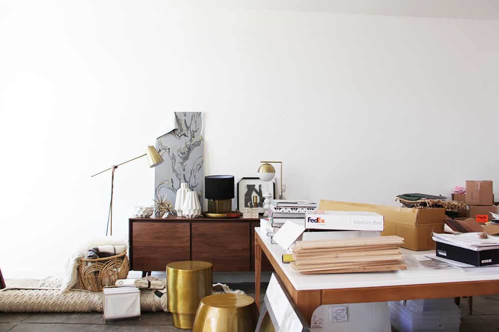
Before we started, that side of the studio was really a catchall for whatever was coming in or being used in an upcoming shoot as you can see in this pic. We are currently in the process of a big office redesign as we outgrew the configuration that we were in before, so it gave us a good excuse to move things around and setup a fun little living room area for the shoot.

We make things happen very quickly around here as you can see from the GIF. But, in all reality the process was so easy and very quick. Brady got to work and moved everything out of the space and then started with the hanging of the wallpaper. The process is easy. You peel, stick, and the cut off the excess. Brady found it easiest to apply the paper at the top then let it hang with the backing on it and just peel it off as you are sticking it. I was going to hire a taskrabbit to do it, for fear that it would take too long but he really did do it in just a couple hours and assures me that even I could do it! If you mess up, it was easy to remove and rehang, and although this pattern did have a repeat, it was very easy to line up and move around until you got it just right.

Step 1: Start by peeling the wallpaper from its adhesive backing. We went with their Marble Pattern in the Storm colorway. This pattern is GOOD you guys. We really loved the organic free form shapes of it and the metallic really picks up the light in such a good way. It also comes in a few different color ways if grey isn’t your vibe.

Step 2: Once you line up your pattern (depending on your wallpaper) you will start at the top and smooth it out and press it against the wall just as you would a sticker. You will notice that our walls have a bit of texture to them but the wallpaper still stuck to it and it looked great overall, so the product can work on your walls even if they are slightly textured.

Step 3: Continue to peel off the backing about 12 inches at a time and press it down as you go until you get to the bottom of the wall. This is probably the trickiest part of the whole process as when you smooth it down you will want to make sure to pull it tight so that you don’t get any wrinkles or little air bubbles. Once you stick the top of the paper down it will fall smoothly down the rest of the wall so it is just a matter of pulling off the backing and slowly smoothing it down.

Step 4: Once you get to the bottom of the wall, use a straight edge or a ruler and an exacto knife to cut the excess off. We found we got the cleanest lines when we would place the ruler against the wall and move the ruler and exacto knife together all the way along the edge rather than pulling the exacto blade by itself and then resetting once you got to the end of the ruler. The paper is pretty thin so you won’t have to press too hard to cut through it.

Step 5: Once you have a clean cut you can easily pull off the excess from the bottom of your wall or baseboards.
Time to play. We started with this very beautiful wood credenza (that is going to live permanently in Brian’s office); it served as the perfect mid-century piece to play against the curved and organic lines of the marbled wallpaper and to warm up the grey palette that that wallpaper had set for us. We kept the rest of the vignette pretty neutral so that it didn’t compete too much with the busy pattern on the wall with hits of black, cream, white, and brass throughout to bring out the metallic gold that we loved so much in the wallpaper.

The big brass coffee table is so lovely what with its dark gold finish, good size, and simple shape. It is a lower coffee table so make sure it works for the height of your sofa or chair if you are interested in it, but it worked perfect for our setup. Those faceted white ceramics although they look expensive are NOT and they do come in a few different sizes. We ended up buying one of each to hoard for shoots since they are so good and graphic without being colorful.

When it comes to what to do above your credenza you have a few options: 1.) TV (which isn’t aesthetically our #1 choice but we also understand the need to watch garbage reality TV in the comfort of your living room). 2.) Art – but this paper was already busy so adding art could have been too busy unless it was super quiet and understated, or 3.) Mirror. We went with this simple round one because well, it was the perfect size for above our credenza because it again worked in the gold tones from the beautiful wallpaper.

Every credenza needs some height and light, so to echo the circular mirrors shape and also bring in a hint of black to bring out the black of the wallpaper, we brought in this simple black based lamp. The black also helps to keep the top of the credenza from feeling too wood heavy. We then gave it a few friends like this geometric wood box in a lighter tone to work with the wood of the credenza and this vintage embroidered windmill textile which is coming to The Flea real soon! Speaking of The Flea we have some BIG news next week about it so stay tuned.

On the other side of the credenza we wanted to bring in some greenery and balance out the height from the other pieces on the credenza so we clipped a few branches and threw them in this geometric vessel. When it comes to accessorizing the top of your credenza (or any surface for that matter) you can go as mild or as wild as you want depending on how collected you want it to look. But to keep things from looking too thrifty or cluttered you will either want to keep things corralled (like we did by using the book as a surface to display on), or keep to a consistent color palette.

On the other side of the vignette we brought in some more wood accents with the mid-century style chair and again a small hit of brass with the floor lamp. Throw down a basket with a few blankets in it, flip on the light and prop that lumbar pillow behind you and you’ve got yourself an inviting little place to sit and enjoy your beautiful wallpaper and morning cup of coffee if we do say so ourselves.

And, because you know we love a good GIF way too much to not show you how it all came together, we created this one for your viewing pleasure.

Wallpaper | Table Lamp | Windmill Art (The Flea) | Wooden Box | Black and White Book | House Art | Black Bowl | White Ceramic Vase | Wood Credenza | Gold Mirror | Gold Coffee Table | Wooden Tray (vintage) | Geometric Bowl Planter | Blue Mug | Chair | Woven Blanket (no longer available) | Basket | Blue Pillow (The Flea) | Plaid Throw | Brass Floor Lamp | Braided Rug
We pulled together a few of our favorites, all of which we have seen and felt in person and give a big thumbs up to. The metallics in their paper do have some sheen so they really do pick up a a lot of good light and the textured burlap paper (like #2) brings in just the right color of blue and added texture if you are wanting to change things up without committing to paint or real burlap wallpaper. I would use #6 in a kids room and #1 in that perfect powder room that you can’t commit to.

1. Chinoiserie Garden | 2. Burlap Navy | 3. Marble Storm | 4. Medallion Berry | 5. Tropical Fete | 6. Woodgrain Indigo
*** Photography by Tessa Neustadt, Styling and Design by Brady Tolbert. Written by Emily and Brady. Go Team!
Need more inspiration for your walls? How to create a focal wall, Best online art resources, My 10 go to paint colors, Favorite pastel paint colors (for grown ups).


Could not believe that chair was from Target!
The wallpaper looks easy to apply, do you know how easy it is to remove after a few months or a year? I spent weeks peeling horrible wallpaper from our new home and I’m reluctant to have to go through that process again if I change my mind about a room design.
Hey Margo! We used their paper in another project and removed some of it 6 months later and it came off with no problem at all or any leftover residue. It’s very easy! xx Brady
For the last few days your posts are missing from my in-box. Are you having technical troubles?
We will take a look into it and see if there are any issues! Thanks so much for letting us know. xx
Beautiful! I wish they had this years ago when I was renting. I was wondering if you are planning on using wallpaper in your new home? Most of your pins are relatively pattern free. Whatever you do I’m sure it will be beautiful! I can’t wait to see your kids rooms! Their rooms in your current home are my favorite!
I just LOVE that tempaper! I did my bathroom in temporary wallpaper from Spoonflower and it really was easy to install. My only question is how easy it is to remove…
Also love the midcentury feel of the room. I actually posted today a way to buy some of the classic mid -century pieces (knoll dining tables, eames chair, egg chair, those beautiful wood cabinets) through online auction and how to make them work with other mixed generation pieces… for a look I’ve dubbed ‘Antique Chic!’ check it out if you’re interested. I think you would love some of the vintage/antique pieces I found!
link below:
Love your blog as usual- thanks for always have such inspirational content!
-Stefanie
Obsessing over ever detail of this setup and SO FREAKING EXCITED that so much of this is from Target! I’ve been contemplating putting up wallpaper in our master bedroom for a while but can’t seem to get my husband on board. Any tips with that? 🙂
Do it! It’s such a quick and easy way to change things up and they have so many great patterns to pick from!
I just bought the Burlap Navy on Saturday! I feel so validated that it is EH approved. It will go on a wall behind a floor-to-ceiling vintage teak cado-style shelving unit. The texture makes it more dynamic than just painting the wall a solid color; light reflects on it in an interesting way, giving it a little bit of movement throughout the day.
The burlap catalog photo looks mostly solid but it’s two colors that form a textural pattern (in addition to it actually being textured). That might sound busy for fellow minimalists but on a wall it will look like a solid with depth. As with all wallpaper, I highly recommend getting a sample so you can test it in your room before buying rolls. I love tempaper and I own, so I could use whatever. I like that I can change it quickly, painlessly and affordably.
So glad to hear! Definitely send us through pics after you finish. xx
O M G WHY IS THAT WALLPAPER SO GOOD IT MAKES ME WANT TO FORGO ALL MY WHITE WALLS.
Sorry for the all caps but sometimes it’s necessary.
Also – Brady – you GD saint for putting it up it takes a certain type of patience there…!
Yay! I was a little dubious about the Target removable wallpaper, but these patterns look way more personal and sophisticated. I spent a good deal of money using a wallpaper guy in my old house and would love to avoid spending that much money again (although he was the most skilled wallpaper artisan I have ever come across and was REALLY happy with the result!).
Thanks!
Out of curiosity, how many rolls did you need to cover that stretch of wall? I watched the gif and wasn’t sure if that was all from one double-roll or if you had more. I’m trying to conceptualize what 20.5″ x 11 yards’ worth of coverage looks like!
We ended up using just under 4 rolls but our ceilings are also very tall as you can see in the GIF so you will want to double check your ceiling height and do the math to make sure you have enough! xx
The “house art” is actually by Hagar Vardamon aka Happy Red Fish The original of that piece is still available in her Big Cartel shop. Thought you would like to know!
Thanks! Good Eye xx
I’ve been eyeing that credenza for some time and I ALMOST pulled the trigger on it, but then I found another from Organic Modernism and now I’m all sorts of confused. How do you guys like that one?!
We love it in person! It is a really solid piece and the wood is such a pretty tone.
Hi Emily!
Looks great! But I’d like to know where the table with all the stuff on it came from? The one pushed to the right in the second and third picture. It is beautiful!
Thanks a bunch!
Those are some of our new office desks/tables they are from allmodern, and are awesome in person!
Love the wallpaper or should I say wall covering!
I love this!! So beautiful. Quick question…is the braided rug the Ivory or Gray color? Totally want to get it for my bedroom. Thanks!!
It is the Ivory color way! xx
Wow, Em! You and your team have done it again…the room is gorgeous! I didn’t even know I liked MCM until I started reading your blog. Your rooms are always so well styled yet extremely livable. I can’t wait to see what you do in your new house.
Really cool!
nice patterns and designs guys thanks for sharing …
Really nice post dude interesting.
merry Christmas bro really nice collecting …
I’m happy that you posted about this: I’ve been curious about temporary wallpaper for a long time, but I was always worried that it would look like vinyl. This is really stunning! Love the look!
It looks so great! What is the flooring?
Lovely paper and it is so great to have more beautiful temporary options. I can’t pinpoint exactly what, but something about this space yells office waiting room to me (albeit an extremely stylish waiting room). Were you imagining Brian’s office space when you styled it?
That wallpaper is stunning!
This post is good…. Waiting for your next post….