
Living Rooms
Mountain Fixer: Family Room Fireplace UPDATE Notes from Readers
Well, earlier this week we revealed the family room fireplace design and plan and you guys had some notes, suggestions, comments and criticisms. And since we live in a democracy, I have no ego and I actually LOVE feedback, we decided to explore a lot of them. Some of them we absolutely agreed with and others we didn’t. On Wednesday, I read a ton of the comments then called Julie in to discuss. She immediately said, “already on it” and she had changed a ton of the renderings because your suggestions were either really compelling, worth trying out or totally right.
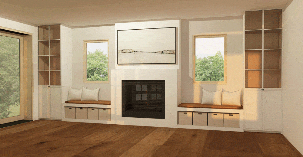
Below (and above) was the final design plan, prior to your comments.

The below rendering shows all your notes and concerns that we felt we needed to address.

- “The TV is too high.” We don’t agree. It’s only 4 1/2 feet off the ground, and I think you are responding to the height of TVs typically above fireplaces, but this one isn’t high, I promise. There is no hearth so it sits much lower than you might expect. No one will be awkwardly staring up and putting strain on our necks…pinky swear.
- “The mantel is too deep to see the TV.” We agree!! You are absolutely RIGHT.
- “The windows feel small.” We don’t agree. They are 2-feet by 4-feet and allow for storage. Also, outside of one of them is a staircase to the upper deck that we were trying to avoid seeing. As much as I love windows, we have floor-to-ceiling scenic doors on the left, so we are good in the way of light.
- “The black bookcases feel too heavy.” We are split on this one. I know that they’ll tie in with the kitchen island and the firebox, but I do suppose that they would be visually lighter if they were white and blended in more with the walls and fireplace surround.
- “The logs are unnecessary, can be dirty and full of bugs.” HA. We agree, but we LOVE the look. I actually had forgotten to put in the renderings that Julie did with baskets for storage. We will likely have the option of either and maybe for shoots, we’d do logs because they are just so pretty, but for life and other shoots, we’d do bins for storage. Brian loves the logs and we do need them in the living room fireplace.
We LOVED your feedback and notes, so thank you so much. You guys had way more and other suggestions, so we rendered them all out to show you. (there were even more versions than the below options).

A few of you wanted no bookshelves to keep it feeling open, but as you can see here (above), it’s just so long (more than 6-feet on each side) and you lose so much function. We also added storage at the bottom, so it’s wood and bins for toys but frankly, we don’t like how it looks when it’s divided up like this. We also bumped out the back wall above the TV, which we agree would make it easier to see. THANK YOU.

You can see in this design we continued the entire fireplace up to the ceiling but it reads more modern than what the house is turning out to be. We also tried white shelves with white backs like some of you suggested, but it felt like…why not do something more interesting? A good rule is that IF you are customizing, you should make sure you are actually doing something that looks custom and special, and not something that looks readymade.

To rectify, we added black reclaimed wood to the back of the shelves like others suggested in lieu of black on the fronts, but it felt so stark. Again, the divided log/storage even on a smaller scale looks too cluttered and silly.

Many of you suggested doing the shelving the same height as the fireplace, but it’s just such a waste of space and the middle feels so unbalanced.
So those were all the nixed ideas. Let’s head back into the ones we tested out and kept.

As a reminder, here is the original design (above).

Next, we bumped out the fireplace wall above the mantel so that it comes into the room 8 inches. Thank you all for suggesting that. The TV honestly isn’t too high for this room and trust me, I HATE a high TV.

Another option we tried as a jumping off point to the previous design was dividing the bench opening to function both as storage and logs. Honestly, we don’t really like this. There are so many boxes and nooks now that it feels pretty cluttered.
Next up, we further explored the white idea but with some more detailing to feel more special.

Here, we wanted the cabinets to be white with a lighter wood in the back and sides and vertical lines on the faces which we decided was too busy because of the shadow lines. Hot tip: Shadow lines on a dark piece of furniture doesn’t show up nearly as much as white.

So we chugged along and kept going with another option. Here is the same idea but with a cleaner version of the cabinets, like we ultimately did in the kitchen (that post is coming soon)—just a classic shaker.
FINALLY, we are down to two NEW options for you guys to choose from.

FINAL OPTION #1: The original design WITH the mantel bump out so the TV is a bit closer. We like the black, we do. And we can be flexible with what goes in the bench nooks—wood or storage.
FINAL OPTION #2: White cabinet fronts with wood on the back and sides of the interior (with the wood or storage option under the benches).
OOHHHHH, I forgot to mention. The reason we aren’t doing wood front drawers is because we really like the idea of the plaster continuing from the fireplace, working with the fireplace in the living room. It just felt more special and appropriate for a mountain house.
So again, with both options, you can have wood OR storage underneath the benches, not both but either.
As you can see, at this point it really comes down to black cabinet fronts and shelves or white cabinet fronts and shelves. Remember that the black cabinetry ties in with the black island in the kitchen which opens to this room. However, the white would help it feel more open and fresh.
I honestly love BOTH, but might be leaning more to picking the white. Brian hasn’t seen this yet, but I think he would go for either. So what say you???
[SBEH_POLLS poll_id=”164066″][SBEH_GIVEAWAY_ENTRY id=”164066″]


Is there a reason for the cube shelves/splitting each shelf in two, instead of just one shelf running straight across at each level? (not explaining very well, but hopefully you get what I mean!)
Are you referring to the tall cabinets? It looks like those have glass doors on them to me.
Agree. I think adjustable shelves would be more functional. Also, Emily said she wanted custom work to feel unique, but the box shelving really looks like those IKEA cube shelving units. Maybe that’s just me, since I have IKEA at home….
Aside from that, my vote is for final option 2. White shelving all the way!
Yes! I agree that’s they cube shelving looks very IKEA and not custom.
Yes! This is my exact issue with them too. I LOVE everything about this design except the extra board splitting the side cabinets in half. There are a lot of long clean lines in this design, except these shelves that are broken up into many small squares. It makes the black ones look especially heavy and busy. It’s probably too late at this point, but I’d love to see a rendering without the split shelves.
Ditto on all this! My eye wants the shelves to be rectangular instead of cubes.
Agreed! 🙂
I feel the same way! Division looks like ikea 🙂
First! Thank you for doing this – it is incredible! I love these kind of posts. I recall when my neighbors used to give their two cents about what to do to my house, it was equal parts hilarious and frustrating.
And agreed. A wide single shelf on the tall side shelves would calm the eye more than all the squares currently in the side cabinets. (ditto ikea comment below) I love the black (special!) Wondering why it appears they are not flush with the window seats? It is smooth from the mantle wall to the bench seat, but not to the tall shelves – adds another “visual stop”. Does that makes sense?
LOVE LOVE LOVE you Emily!!! So fantastic- I look forward to your posts every day!
Off topic but are you Irish? The reason I ask is I am and Sadhbh is my daughter’s name!
Best,
Áine
Hi Áine! Yes, I’m Irish and I love hearing about other Sadhbhs – when I was little I only knew/heard of one other person with the name! Seeing your surname – did you know Sharon Horgan, the writer/actor, has a daughter called Sadhbh too?!
I still am wondering why you don’t have deep drawers instead of doors in your BLACK side storage. Way more functional I think. Thanks for considering all the ideas. Mountain Home probably more modern in the aesthetics than what I would have done but it’s going to be beautiful!
Remember that the reason for black cabinets on either side was so that the back of the fireplace wasn’t this big black hole in a sea of white. I vote a very strong vote for the black cabinets. It’s balanced. It’s special. COME ON PEOPLE! I usually like both options on the “I design, you decide” (and they are usually both special) but this choice is just deciding between interesting and generic.
I completely agree!
This is exactly what I was going to say. The black cabinetry balances the fireplace. With the white everything fades into the background and my eyes just go to the black box in the middle.
agree! and added emphasis on the special.
I hear what you’re saying about the dark cabinets balancing out the black box, but I feel like that can be accomplished with darker throw pillows (currently white in the renderings) and some darker decor in the cabinets (dark-spined books, art with black frames, a black vase, etc.). I think with darker accessories in the white cabinets the space will ultimately feel more balanced than with the tall black cabinets. But I’m sure either would be lovely!
Agree!!
I agree with Holly, white cabinets with darker accessories would feel more balanced.
Yes! The black looks so cozy to me.
I agree 100%. The black cabinets are more dramatic and more interesting. The white cabinets look typical while the black ones look fresh and balanced.
Agree!! The black cabinets are so perfect for this house. Maybe if this house is in say Orange County, sure go with white (maybe), but this is your Mountain house and the white is just so bleh. Side note for the TV, can you do a back mount with short arm (we have this) so the TV is either up against the wall or pulled out slightly when needed. I feel the extra bump out might look a little bulky?
TOTALLY AGREE! White feels really coastal to me
Yes, white cabinets are everywhere. The black just looks so much more special and balanced.
100% agree. I love the black cabinets. White is what everyone else is doing and this is supposed to be custom and special.
I agree completely. The white looks so much more generic. This is probably the first time I have actively disliked one of the choices in a “you decide” post!
Yeppers. Didn’t see this before I replied, but heck yeah.
I’m SO with you. I can’t believe white cabinets is in the lead.The black makes so much more sense visually. It feels intentional and designed in black. The room goes Millennial-SoCal-vibes-generic.
EEK. ok i’m going to do another push for the black OR a color. I do kinda agree with you about the white feeling more suburban!!
Agreed! I couldn’t figure out why I liked the black cabinet option more, but you’re right.
I really love both options but I was so excited to see you bringing in more black accents into this house since you usually do white! Either way will be beautiful but I voted for black.
Yes to the black. It’s bold and beautiful and ties in the kitchen cabinetry. Perhaps you should also included a refresher photo of the kitchen plans so that people can see how the two tie in together? White cabinetry would just be such a missed opportunity!!
Team white and team split wood, bugs be damned!
I think the white is a bit suburban, but the black is a bit too stark. Just to throw a spanner in the works, and since this is a family/play room, how about painting the cabinets a colour – NOT GREY, or any shade of grey. But an actual country colour like Robin’s Egg Blue, or Kelly Green or something like that.
This is what I thought too. Maybe the same colour that the bunk beds are? Black is too dominating with all the white.
I had the same thought! What about the bunk room green…
Yes!!! Please paint the cabinets a fun color. Otherwise I think white would be pretty. It’s okay to have pretty and pleasing even if that’s not super exciting.
Yes! Green would be lovely and mountainy 🙂
OOOOOOHHHHHH I was JUST thinking this!!! stay tuned … xx
I’m team fun color! Gray, green, anything! Also would love to see a rendering of shelves going across instead of cubes on the bookshelves.
I LOVE the black cabinets, I’m sad that they’re currently losing the vote.
They do make the room feel a little less open, but that’s what I love. It makes the space feel cozier around that fireplace vs a big white wall- but then again, I always love more visual depth on walls vs minimal because that’s what feels homier to me personally.
I’m also just so torn on the logs/storage debate.
Functionally the storage makes more sense because the logs aren’t actually needed in this room, but ughh the logs just look sooooo much cooler and mountain-esque. (It’s a word now)
So excited to see how this turns out regardless of what wins!
Is the fireplace just decorative? I live in Texas and have used our fireplace exactly one time in 20 years, so I’m not an expert on these things 🙂
love the new renderings.
Would it be wrong to slightly step back the upper portion of the cabinets to mimic the setback of the fireplace/tv? I love me some symmetry!! In either case though, I love the black and the white! so pretty!
This would be lovely.
This is a great idea! I’m not really partial to the stepped back mantel but it would look much better with stepped back shelves too.
I like this idea! I think it would make the built-ins feel more custom too
Instead of benches under each window, how about bookshelves that go up to the window and run the length from the fireplace to the wall?
Just a couple of quick thoughts – the design is meticulous but for me it is too formal and static for the landscape where it’s located. Nature is messy and organic, contradictory and awesome. Since the focal point, ie the fireplace is in the centre of the wall it would require some creative design to make it more informal and relaxed. For me, nature should be the focal point. At our summer lake house 3 of the 4 Walls ( not north wall) have large windows framing the magnificent landscape. Who needs tv?
Marlene, You articulated exactly what I was trying to say in my comment:
‘nature is messy and organic, contradictory and awesome” I love how you say that and I know exactly what you mean. I love the sound of a screen door and the breeze from open windows, furniture that looks like it has been there from the 60’s but super functional and cool.
I think it would be extremely difficult to create a ‘feel’ of a lake house/ mountain house that I have experience- that quirkiness that evolves over time is hard to just ‘design’. I almost wonder if you should just wood panel the whole thing. I really don’t know what is missing but I agree it feels too formal and perfect.
I agree totally. While the black is very beautiful, to me it gives the room a very stark modern vibe and I thought at one time the direction was to go more rustic. Could the cabinets be pure wood and not painted?
At any rate, keep the wood interiors no matter which color the cabinets are painted as they warm things up a bit.
Yay so glad the full fireplace will be bumped out! The original plan looked like one of those Amish electric fireplace kits.
I love both, the white cabinets feel like a safer option (and since I’m boring I love safe options), but the both look like they would work (this is no help at all)
What about the idea of softer edges around the fireplace since you are using plaster? That feels more unique and scandinavian to me and less minimal/modern/new. And if you did that what about making the cabinets really look like 2 pieces of furniture built-in as opposed to the more Room and Board style look? I recently saw on Amber Interiors a photo of a kitchen with what looks like a piece of furniture built into the wall beside the fridge as opposed to perfect cabinetry and it kind of takes your breath away when you see it. I could see 2 pieces like that in this room creating something truly special and unique. They could be really simple pieces. I also like the idea of many tones of wood layering together in a cozy moutain den- and could add that little bit of ‘off’ that creates energy and tension in a space. There is still something that feels too ‘new build’ to me, as opposed to the energy you experience in something unexpected- something that feels almost a little off but in a good way. The black for sure does that more than the white but this fireplace compared to… Read more »
I AGREE SO HARD WITH THIS. The soft edges is GENIUS and will give it that rustic feel.
YES. I agree so much with this whole comment. The fireplace would feel so much more organic and special if you just slightly rounded the corners of the fireplace. It would definitely make it all feel more Scandinavian cabin and less new -build. I voted black cabinets because it feels less suburban than the (also beautiful!) white. I think this whole post was genius because it showed everyone just how good your first design was. Also I love the birch. Who cares about bugs when it looks that good?
yasssss soft edges like the cozy scandi cabin inspiration pictures from when she was trying to decide on the main fireplace! it would tie in with the german schmear so much better and be cozier. genius!
Yes, great ideas! Given these two options I like black better, because white looks boring suburban or coastal to me and black, though I’m obsessed with it, doesn’t look quite right for the mountain aesthetic. I was wishing for a rendering that had the cabinets in wood, but they’re so large that I wondered if they would compete with the floors unless you matched them perfectly. I love the idea of the cabinets not trying to match, but being their own special thing. Something that looks vintagey, like it has a story and has lived there for hundreds of years. That would only work if you pulled the fireplace in a less modern direction. Normally I am anti-curved lines but having seen some of the plaster fireplace ideas from the stone one, I think this has serious potential! Now I have an itch to go look at Pinterest for vision! Hah!
Completely agree, thank you!
I AGREE. Such a good idea re softer edges and yes, we are hoping that the cabinets feel like a piece of furniture and not built-ins necessarily.
I love both but prefer white. The black option felt too modern for the mountain house.
I feel like the cabinets are a tad too narrow. Hard to tell in the renderings, but is there equal space between the fireplace/window and window/cabinet?
I love all the options and how you address the reader concerns! This space is going to be amazing no matter what you choose!
Paige
What if you closed up the bench storage and had that accessible from the top? To store kids toys without the cluttered look of the bins?!
JennBlogsHere.com
PLEASE do the log storage by the fireplace where you will use it! You will never carry wood from this room to another- you will wish it was right by the fireplace where you need it. For this room i like the idea of rounded corners on the fireplace to soften itup. Maybe you could plaster the front of the benches as well and have a top that lifts or is hodden under cushions for drop in storage. That would make this wall less “busy” as some have commented.
Absolutely love the white. I know this is being used for content so it should be editorial but since you’re also living in I think the white is much easier on the eyes. It’s beautiful, calming and less busy. Can’t wait to see!!
Still worrying about the height of the TV. It might be 4 1/2 feet from the bottom edge of the TV,but the center of the TV would be 5 1/2 feet from the ground. Given that most people will be sitting on furniture or the floor when watching the TV, I still worry about neck strain. But every room has it compromises and perhaps this is your best option here. Overall, it’s looking great!
Bob Vila says (and come on – who could you trust more than Bob?) that the tv should be 42 inches on-center—that is, so that the center point of the TV sits that far above the floor. Forty-two inches factors in the 18 inches above the floor at which a traditional sofa seat is raised, plus another 24 inches above that to reach the eye level of the average adult in a seated pose.
If the bottom of your gorgeous Frame tv is at 4 1/2 feet – that means the bottom of the tv is 54 inches off the floor. The center must be another foot at least.
Obviously you have make choices and not everything is ideal, but I think we should just all be transparent that the tv is likely going to be higher than conventional wisdom and that’s ok.
Please not the white option. It’s FINE but so boring and looks like it would fit right into a suburban tract house. Not that there’s anything inherently wrong with that, but this is supposed to be an elevated design – bolder and more editorial. More special. Black all the way.
Agree!!! The black is so beautiful. White washed everything has had its moment and now it simply looks uninteresting. Pease do something more forward thinking instead of the outgoing trend a lot of your readers are apparently still loving! WHITE cabinets really would be a missed opportunity!!
I typically like more open, light and airy looking designs but surprisngly I’m leaning toward the dark cabinets here because they seem to add some coziness to the space and keep it from feeling too stark.
BLACK! BLACK! BLACK! BLACK! BLACK! BLACK! BLACK! BLACK! BLACK! BLACK! BLACK! BLACK!
YASSSSSS! Completely agree.
Please, please, PLEASE bbbblllllaaaaaaaaack!!! I almost want to cry at the thought of those cabinets not being black… I know our eye gets used to a design trend and can therefore find it challenging when it encounters a contrasting idea but this is a Mountain Fixer Upper people! And as much as I love the images of all white interiors that are saturating our Pinterest and Instagram feeds, this is a Mountain Fixer Upper people! One needs to spend only a moment exploring The Woodhouse Lodge from Megan Pflug to understand the power of black -enthralling, cozy, inviting, comforting and yes, possibly challenging to our complacent eye. I simply cannot fathom these cabinets not taking the leap from generic, seen-it-a-million-times-before white to this-space-is-begging-for-the-intrigue-of BLACK. At the very least, the Mountain Fixer Upper’s kitchen island needs a friend, right?
ps. I am finding The Mountain Fixer Upper “I Design You Decide” process to be sooo educational but also, unexpectedly affecting..?
THISSSS!!! ^
Seriously, I NEED black cabinets to happen! I loved the original plan, and I won’t be able to cope if all you people picking apart the design kill my DREAM! And the TV height is fine! It’s a rec area. The kids will be playing wii tennis in there someday (or whatever the kids do these days) and will need to see over all the activities happening!
HAHAHA. Oh good!!! just looked up that house and LOVED it. and so glad you are liking the ‘I design, you decide!’
Try not centering the fireplace. It’s more interesting, and you could put the TV to the side of it instead of above, with windows closer to the corners of the room. Also, 4. 5′ off the ground is indeed high, especially since the center of the TV will be even higher. Stooping for heavy logs gets old. Perhaps raise up the log storage and keep it next to the fireplace instead. Basically, consider asymmetry. Do people actually sit in window seats? They look really uncomfortable. They seem like wasted space if they aren’t truly going to be used and are just to achieve a particular look.
Second this all the way. As Marlene above was talking about the “messy, organic” qualities of both nature and mountain homes. (and I voted for white before… I changed my mind).
Agreed on TV height and asymmetry! I even made a quick little mockup of one potential asymmetrical idea that keeps most of the elements they are using above.
Kimmy, I just looked at your mockup, and it looks so good! I’m not sure if the fireplace is able to be moved at this point, but if it is I think this is such a great idea. And as Emily mentioned above, the room already has huge slider doors, so I don’t think losing one of the smaller windows would affect the light too much. Great plan!
Oh, nice, Kimmy! I really like the black one. The asymmetry is definitely a strong contender to my eye.
I’m fairly certain she showed us that fireplace is already roughed in. I doubt the placement can change. Not to mention, an asymmetrical fireplace make furniture placement so difficult.
I just love the black so much! Why do I feel so emotionally invested in whether it wins? Like I want to call all my friends and demand they vote for the black to splash the pot here. It’s just so balanced with the black fireplace interior. And it will look stunning with the kitchen!
Also, we have stacked wood in our house and no bugs. Just make sure it’s nice and dry before you bring it in.
Is there any merit to adding a wood slab mantle to the top of the fireplace to match the back of the bookcases? Architecturally it feels like the fireplace jut out should terminate into something and/or have a “cap”. Just a thought.
Hi Emily and team! Architect and long time reader here, enjoying watching your process at the mountain house. 🙂 While I agree with many of the previous commenters that the wall looks busy, I think it’s driven mostly by a muddled hierarchy that could be improved with a few small tweaks. A few things I would experiment with: – making the benches ‘of’ the cabinetry rather than the fireplace, e.g. painted wood finish, align the leading edge of the seat with the cabinet, continuing the toe kick underneath, etc. – alternately, you could continue the plaster benches to the perpendicular walls and set the cabinets on them…the cabinets could be shallower @ 10-12″ deep; In this case I might try making the cabinets and the adjacent wall surface around the windows wood paneling (!) in the same species/finish as your window trim – adjust the plaster surround on the fireplace so it’s not ‘equal-equal’ all the way around; making it narrower on the top and sides will help the fireplace feel more weighted; also lowering the mantle elevation would allow the TV to move down – trim out or soffit above the tall open cabinets to lower the top of… Read more »
YES! I’m an architect and long time reader as well:) These excellent suggestions are spot on and would make a real difference imo.
I’d stay away from all the “squares” as well – square fireplace surround, square fireplace box and square bookcase grid. Square is uncool – rectangles are where it’s at.
These suggestions are so compelling! I very much think the TV size and the plaster surround of the fireplace could be experimented with, and the other ideas are worth considering.
I agree! These are great ideas. Proportions are the key in here to make the room feel interesting and balanced. I also suggest making the fireplace more special, it needs some character like the stone fireplace has in the living room. Maybe a wood mantle, interesting shape or stone? I know you are going for plastered look, but it’s the focalpoint of the room and needs to be more special.
Nicole now THAT’S some talk about details. Great suggestions that I would love to see fleshed out by the EHD team 🙂
Not an architect, but totally onboard with Nicole’s comment above. I said something very similar to her first suggestion on the last post, but she articulates it much better than I did ?.
I’d love to see renderings of the cabinets as closed storage , as well as of the back wall of cabinets & wall around the windows in the same material (wood paneling, wall paper, etc)
Piggybacking on Nicole and PiperLou’s suggestions, and some of the comments that the cabinet configuration looks too “new build”, I think that the cabinets and the adjacent wall space around the windows could be more integrated. Paneling the wall to match the cabinet interiors is a great idea – especially if the interiors of the cabinets and the back wall are somehow clad in a more rustic wood (instead of a fine grained wood). They could even be clad in painted wood – like the green in the bunk room. And somehow tie in the window trim so it reads as one cozy wall.
I also love Nicole’s ideas and want to mention that I am not a fan of the symmetry. It’s almost there!!
This was a tough one because both designs are beautiful but I have to agree with you on custom cabinetry. It should look custom and white cabinets are so overdone.
DEFINITELY the dark cabinets! Much more cozy and cabin-y, especially in that more cave-like room (I say that because the ceiling is much lower than in other rooms in the house). It’s more unique and edgy, while also being cabin appropriate, and I think it pushes the boundaries more than the white version–and I know pushing your boundaries is something you want to do with this project. ALSO, the white version just looks like it would be found in a new build in the suburbs–zero personality to it.
Why not put wood on one side and baskets on the other? (Instead of making each side 50/50?)
What’s the plan for window treatments on those windows? If the plan is to leave them without window treatments in order to feature a view, they’ll be two big black rectangles at night and make the black cabinet option even darker. Could be dark and cozy. Could be grim.
I have tall black cabinets on either side of my fireplace! I LOVE them. Especially at night! I installed LED tape lights (behind the “lip” along the sides of the shelves) and at night they glow like lanterns. Beautiful and they light up the objects inside. The lights are on dimmers. I voted for BLACK and am seriously sad that it looks light white is winning.
Ikea Branas woven storage bins used to come in a large rectangular size – not shown online but available in the store. Two per side would be much less busy looking than the 4 per side that you are showing. Or…..One large bin per side with log storage and it’s still a cleaner look that nets you storage AND your beloved logs.
What about the pinball machine? This room is going to be super fun and filled with laughter and gleeful shouting, not zen and calm. The white is beautiful, but not the energy it feels like you’re going for in this particular space. I still love the black! It’s so much more interesting, it balances the fireplace, and it was your original plan after, no doubt, lots of time thinking about alternatives.
I don’t think the issue is black vs. white. I can’t get my head around a pinball machine with this symmetrical/formal design. I feel it is a missed opportunity to create a really fun room.
Yes, THIS! The symmetry is definitely reading very formal to me too, so it’s hard to envision it as a cozy family room right now. I’m sure it will look more “warm” in person all styled out in comparison to the computer renderings, but with all of this talk about figuring out the balance between the firebox, shelves, windows, wood/bins below, I can’t imagine it will very easy to add a bulky pinball machine as well. Perhaps you should get two! One for each side of the room 😉
The white cabinets with the wood interior literally made me gasp in delight. Genius.
Looks great! I generally opt for black accents, but I voted for white this time — just feels more peaceful. You could always really lean into the black in accessories on the shelves!!
Would you consider doing more organic lines between the fireplace box mantel and the built out TV backing? It feels quite modern the way it is, and I wonder if a slight slope would help it feel more rustic/traditional.
Just wanted to potential fix for a high tv in case you didn’t know about this product- we bought this amazing tv mount on amazon that you can easily pull the tv down & in front of the fire place- I can do it with one hand. It makes for less neck strain, then pops back up when not in use.
The birch logs skeeved me out too- all I saw was bugs hiding in there when you first posted it and I LOVE baskets for hiding my toddlers toys.
The birch logs are beautiful. Don’t compromise on that design element. Just visit Etsy and choose one of the vendors that advertises kiln dried logs. This process kills the bugs. Loved the original, but love the white version too!
Yes so much better. Fireplaces always should extend to the ceiling. I think the dark cabinets frame the room better and make the whole space more cozy and like a mountain house Not to mention i think people dont fully picture the entire space who are not designers as these cabinets relating to the island will be really great to tie the two together. But both options now would be fine. The only thing ill say is the millwork is a bit fictional you will have some sort of trim header at the top. Maybe a flat 1″ wood piece because you ceiling will never be completely level with the floor they will have to build it about 1″ shy to get it through the door and erect it into place. so if you dont do trim up there you will have about a 1″ gap. then the same goes on the sides typically most walls in existing homes wont be completely square and plumb. So you have a little trim piece there as well. I might delete the boxed upper and make it rectangular shaped rather than boxes since you now have storage boxes underneath i think with those… Read more »
Normally I’m all for white and bright and airy, but between these two options the black cabinets are definitely my favorite.
I think someone asked this last round, but is there a reason the bench and the cabinets are not the same depth?
Can you make custom doors for under the bench that have log circles on them? I know it’s fake, but it would give you the look you want without compromising for bugs and lack of storage. It would be sort of like what Katie at Bower Power or Kristen at Hunted Interior did on their fireplace inserts
The white cabinets feel more integrated and spacious. The black cabinets on their own are beautiful and probably more interesting but it looks a little checkered or striped with black cabinet/white bench/black firebox/white bench/black cabinet. The black cabinets matching the island maybe takes away from the specialness of the island since they are visible in the same space. I also think the white cabinets keep the focus on the fireplace. In every single other room in this house I’ve preferred the darker color scheme but in here the white cabinets seem to work better.
^^This.
Just a note on the logs – we have this design at our farmhouse (with the bench seats on top) and have never had issues with bugs, dirt, etc. We love the look and of course the convenience as in the winter we tend to start a fire as soon as we get up there each weekend.
The key differences are, black is bold, full of personality; it absorbs light and commands attention. White is safe; it blends in, creating a uniform background. White is lazy, it will work no matter what. I voted white since I went with the background effect. But I prefer family rooms with more personality. Can I change my vote?
I have a fireplace that looks a lot like your newest rendering. I wish I could send you a photo, but I don’t have anything posted online! (email address to send to?)
Anyways, in short, I LOVE IT! But I have a complaint that I think you’d want to know about: the shallow mantle ledge is really hard to style! you can’t layer things or put any big bowls or vases. Maybe you will keep that ledge completely clear to prevent the TV from be blocked, but it’s really annoying to shop for a vase that’s less than 4″ diameter, and things look kind of lined up in a row on the ledge (even very minimally styled). Also if you go with this design, I will certainly look to you for styling advice.
What rendering software does Julie use on her sketchup renderings? I’m an interior design student and these kind of questions rattle around in my curious brain when I see posts like these.
I voted for the white, but mostly because I really dislike the black. I think the cabinet itself is a rather boring design, so highlighting it felt more like a ’70s throwback (I’m waiting for the shag rug). At least with the white, my thinking was the focus would be on the warm wood and maybe ANYTHING ELSE besides those cabinets. I was thinking of how awesome the railings are at the Portland fixer, and how it’s such an opportunity to use beautiful sculptural items rather than a purely functional, kinda boring piece. Aren’t there cool rustic options, even if not built in? Also, the “wasted space” comments seemed off to me… what about opportunities for art and/or sculpture in those spots??
This from someone who voted for the black island counter 😛
Ugh, please don’t let this vote sway you to the boring side. I don’t think people are looking at the big picture, black makes more sense with the kitchen.
The black looks more special. It’s bold, but it definitely still works. You seem to be incorporating the black elements in many rooms. It all ties together and gives it the cabin edge. BLACK!