
Roundups
The New Jake Arnold x Crate & Barrel Collection Is Giving Us Heart Palpitations
If you’ve made it this far you probably saw the opener photo, got butterflies, then had to click through to see more. Honestly, same. We were so excited when we heard Jake Arnold + Crate & Barrel were collaborating and now that the collection has launched, we wanted to do a deep dive into the beautiful pieces that they created together. I was actually lucky enough to see the collection yesterday in person and ya’ll, it’s even more stunning IRL. So today I am thrilled to highlight some of our favorite pieces and share why we love them so much. Enough talk, let’s let this collection speak for itself:

Those chubby chairs are the perfect balance between modern and traditional. I am a huge fan of this layout and all of the pieces in the space. Perhaps the star of the show is this guy over in the corner:


This bar cabinet is one of my favorite pieces – dare I say – I’ve ever seen?? I love that it combines form and function seamlessly and THOSE LINES. Just, wow. So so good, Jake Arnold + team!!
Living Room

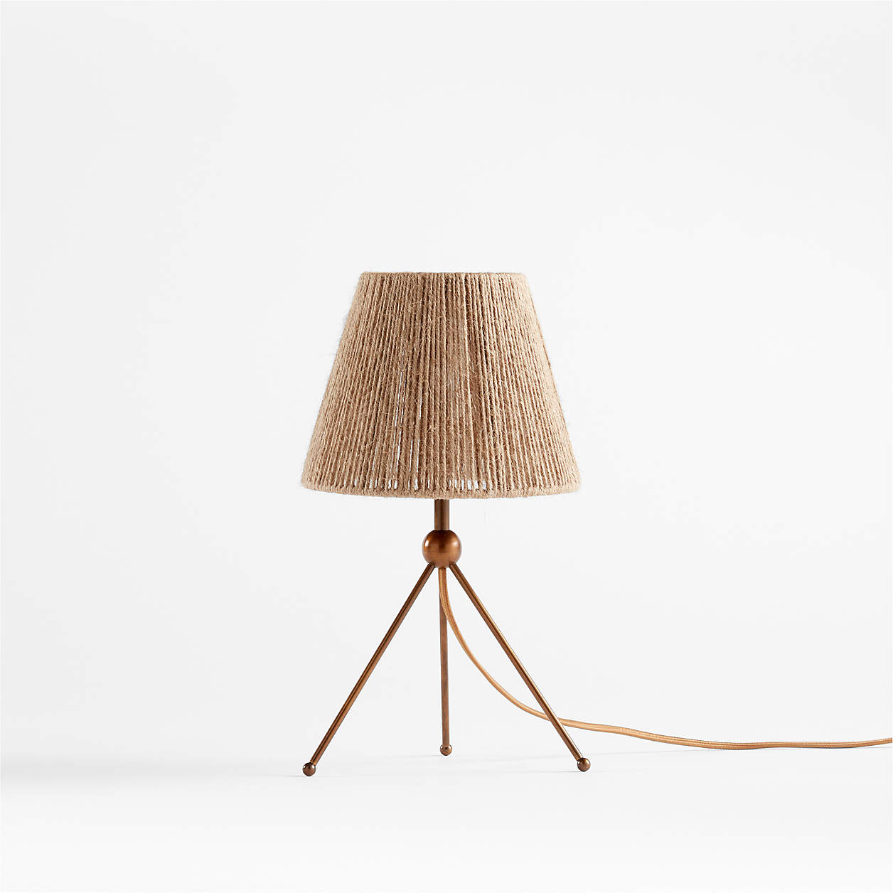
This is some serious eye candy am I right or am I right?? The curve of the chairs, the warm cognac sofa, and THAT CREDENZA. Hold up, let’s have a closer look at that…


Just wanted to confirm that this piece it’s awesome and it sure is. How amazing is that woven texture?! And those feet?? The whole thing is *chef’s kiss*. Also, click through to see the genius cord management solution in the back. That MAKES it for me and you can tell that there’s so much thought that went behind all of these pieces to make them beautiful and also functional so they can last you a lifetime. Now a moment for some of the other awesome products featured in this room:


Alright, let’s take this to the bedroom, shall we? Let’s start by saying that there’s nothing sexier than a statement bed and this one DELIVERS. The color is perfect, the lines are gorgeously crafted and all in all, it couldn’t be better. See for yourself:
Bedroom

Hi, can we get a closer look? Yes, yes we can:


But here’s the real kicker: IT HAS STORAGE. Yup, you heard that right. The base of the bed pulls out which is literally a dream. Just when I thought it couldn’t get any better…I TOLD YOU THIS COLLECTION DELIVERS. Now we’ve been neglecting a seriously awesome part of the collab and I cannot continue on until we bring it up, ladies and gents, the lighting portion:
Lighting


This truly knocked my socks off. I love all of the textures and the continuity is so clear through that brass ball detail. They just really nailed it. Alright now, let’s chat a bit about decor because, between the candle holders and the textiles, we’re about to have ourselves a feast. BUCKLE UP.
Decor and Textiles

Ah, this room is styled so beautifully. Did ya notice that awesome candle holder on the coffee table?? Let me show you a more in-depth photo below because it CANNOT be missed. Here are some of our favorite decor pieces & textiles:


So good right?! Let’s end it off with a HUGE congrats to Jake Arnold, Crate & Barrel, and the amazing team work it takes to build something as incredible as this. Way to go everyone, it’s a MASSIVE success!! xx

If you want to check out even more of the collection, you can head here (definitely do because there are even more amazing pieces we didn’t have room for in this post, it’s worth it I swear!). Which products are your fav?? Let’s chat below! Thanks for being here. xx
**Images courtesy of Crate & Barrel


Thank you so much for bringing this blog to our attention. My heart really skipped a beat seeing this wonderful home collection.
I agree this collection is gorgeous, and I think there is room for a more nuanced discussion about these collaborations. Like other collaborators before him, many (most?) of JA’s items are direct copies of antiques/vintage items. Making good design accessible is fun, AND is it really design if it’s a direct copy? When it comes to these collaborations, I feel like two conflicting things are true.
These are complete rip-offs of amazing vintage designs.
If they gave credit to the original designers, that would be one thing, but they don’t. See Studio Marrant’s insta stories for side by side comparison with original designs.
Agree the lack of credit with these collabs is a big problem for me
Thanks for bringing this to my attention. It’s disappointing and I wish c&b and other collaborators were more honest about this. There’s a way to honor the vintage originals while also updating designs and making them more accessible.
Can you link to this? I can’t find anything more than a passing mention to Jean Royère.
I don’t see these as identical copies, but inspired by something that happened before, like everything else. If this was about the artists being copied and angry with this, I’d agree that they deserve the credit and some compensation for reproducing. But the more I read about it the more it seems that some designers are angry when the vintage (uber expensive) pieces they use in the projects became more accessible to average people. So is it about protecting the original artists and makers or is it more about their designs being something that’s no longer exclusive to the rich clients? I think it’s the latter. Designers want to be unique in what they source and don’t want to be copied by everyone especially by the poor. And that argument I’m completely against.
I actually like this collection a lot more than the originals that supposedly inspired the collection. If the original artists want to get in on the trend they can to produce more or make lines at an accessible price point. I know that they can’t But isn’t that the point? If their design is so good, why shouldn’t we recreate more of it if they can’t anymore?
Just viewed the side-by-sides. This is a tale as old as time, the precious and rare being watered down for the masses. Not a problem because the process democratizes beauty. But it does seem very odd that these designers are taking credit for furniture design when what they’re really doing in these examples is curating and copying.
I agree, but there’s no copyright or patent infringement when things are not exactly the same. Nothing is truly original, it’s often inspired by something else, by an idea, feeling or other artists. Someone came up with a chair or a sofa, and others were compelled to make other chairs and sofas. Once someone started a trend to have more square furniture (MCM), then came the seventies and someone decided to build more curved furniture and others followed. Why shouldn’t they follow if the consumers are looking for that? I think it’s okay, especially if the materials or production makes it more accessible for more people to buy. Why should the millionaires be the only ones who hoard good design? Why shouldn’t others have it?
Like I said, I think it’s great to make good design accessible. But many of these items are direct copies, and I don’t understand the lack of credit.
The collection is great, but lets talk about that house. Stunning!
Oh, didn’t notice this morning, but that house where the Crate & Barrel catalog was shot is Villa Vendome, a Jake Arnold project too.
I cannot BELIEVE how beautiful this entire collection is. Some of these pieces feel like they were designed just for me – which is nuts because obviously they weren’t. Some of my favourite ever design elements are on repeat here – spherical legs/construction elements, green velvet, cognac velvet, bent wood, dainty candlestick holder, THAT LIGHTING! I live all the way in Oman, but I’m going to have to find a way to get my hands on some of these…
Okay, I mean this in the nicest way possible – what’s up with the bizarrely dim lighting and lack of styling? Like zero wall art etc. etc. No knocks on the collection itself. Is this a trend I’m not aware of?
The house they used is for sale so it’s possible there were restrictions? If I were the seller, I wouldn’t want any changes that would need repairing straight away. And I’m guessing from a marketing perspective, C&B wanted the viewer’s eye to solely focus on the collection
When a brand drops a collection they do this so the emphasis is on the product and assuming they didn’t want to distract the viewer with other non Crate items.
If companies like CB put interesting art and one of a kind objects in the photo, then customers are disappointed if they can’t buy them. It’s a challenge for art directors who work for retailers – books and plants work, but any painting, map, vase, sculpture, blanket — better be for sale!
Check out the Instagram of Colin King, the stylist on this photoshoot. His lighting was featured on a post a few days ago: Restraint & balance are hallmarks of his styling & he is so amazing at what he does. His compositions might look austere, but they are so beautifully balanced & artfully arranged & often compared to still life paintings–always with the fewest # of items necessary to create the balanced, artful, thoughtful image. While it might be hard to live in such a setting, this styling really works here & complements & highlights this C&B collection so well.
I was wondering, in all seriousness, what you do when you’ve already designed and decorated your home and a collection like this drops? How do you not go nuts every time there’s new/amazing stuff like this?
Close the browser window, remember how pretty my existing stuff is, resist the impulse for “more! more! more!” that blogs/ads/trips to Target create in me. Maybe return to buy a candleholder if I’m still drawn to the collection 1-2 months later. (I probably won’t be.)
Works for more than just furniture!
While I don’t find the ‘new’ pieces actually new designs per se, I really like it all.
Most pieces have an art deco edge to them (maybe impacting it not looking so much like ‘new’ design, but reproduction vibes with a twist or two).
I especially like the “chubby chairs” in that green. They’d be perfect in the living room of my almost 100 yr old house.
Nice, cozy vibes.
Gotta say, those lights jutting put of the ceiling are jarring and dated – at first I thought they were sptinklers!
Those are all the rage, supposedly more attractive than the now-detested recessed lights.
Never liked can lights either. They seem so lazy to me. No thpught necessary.
But those mini-spotlights are sooo 90s! Ugh.
Love the serene, grounded feel. And that accent chair is delightful!
The way I wish that couch with the box pleats came in ANYTHING besides white linen. Speaking of couches…anyone have any good resources for ones that come in patterns?? Besides The Inside?
Gorgeous. Would be interesting to hear how involved they are in sourcing and manufacturing ethically as designers of the land.
I recently read that pvc materials can be from Uighur labor camps. So sad and horrific that this is happening today.
?Good point.
Anyone know where the ceiling lights are sourced from? The black flush mounts?
THX
Wyoming, possibly the Cylinder Downlight from Apparatus:
No, I linked the wrong one. I think it was their Cylinder Sconce not the Cylinder Downlight (sorry, on my phone and didn’t look closely enough):
$1700?!! I’ll sit in the dark.
This company makes dupes for a lot less:
While it is lovely, has anyone noticed that almost everything is brown and tan? Monochromatic, almost. I am missing the variety that color brings… Without the greenery, it would seem like too much of the same. Actually, it reminds me of my husband’s dinner plate! (He only eats things that are brown and tan, literally, and I have to sneak a green bean or two in there, haha)
Agree. I’m not ready for the return of the ubiquitous earth tones.
This collection is really lovely. I especially love the Muirfield chair, the three light floor lamp, and the bed. Hidden storage is always a plus. However, I’m personally getting a little tired of the all shades of brown aesthetic as much as I’m still tired of the all shades of grey one. Something about these images, and so many others lately, feel dull and monotonous. I see the appeal of neutral spaces, but I hope color makes a larger comeback soon.
What a collection! Colin King’s styling in these photos is A+!
I get that California King Beds aren’t a super usual size but I sure wish more collabs had that option – that bed you showed was ?but only comes is Q/K. Great collection!
I appreciate the look, but it is nothing I would personally buy.
The collection is lovely, but very neutral. I just came back from Vegas Furniture Market and KBIS Kitchen and Bath Industry Show and one of my biggest takeaways was that they were showing lots of color for 2023.