
Bedrooms
My Brother’s Beautiful Guest Bedroom – A Warm and Modern Retreat
I wouldn’t exactly say Ken asked for a pink and dare I say purple guest bedroom but here we are (and we all really love it). But the thing is, bedrooms are my favorite, and guest rooms (and kids’ rooms) are my most favorites – you can lean into an idea, a theme, or a style without as many functional constraints (like living rooms or even “storage” stuff with everyday used grownup bedrooms). It’s a luxury for sure, and one that we had so much fun designing – AND IT WAS SO EASY!! We pitched this to AllModern, and almost everything in the room is from them. They hand-vet their designs for quality and pretty much everything was delivered fast + free. See? Easy. So let’s take a tour 🙂

Bed | Blue Pillowcases | Shams + Quilt | Green Lumbar Pillow | Duvet Cover
We started by choosing the perfect bed – we needed a bed that would be low, i.e. a platform that didn’t have a high headboard blocking the window. I loved that the Liza Upholstered Bed from AllModern not only checked that box, but the shape of the headboard complements the more rigid squared-off window and is a softer transition in front of that big square. The fabric is a really warm light caramel that works as a neutral (that I think could go with so many color palettes). It also comes in a few neutral boucle fabrics as well. And BTW the bed was super easy to put together, FYI – just clips into place.

Blackout Curtains | Curtain Rod (similar) | Rug
The rest of the room came together in textures and tones with a few bolder patterns. The blackout curtains are so excellent – They are 100″ wide and 108″ long which fit this room almost perfectly (there is a bit of a puddle behind the bed) and the width of them made it so easy to cover the huge window. Shout out to our Rowena rug, which we chose because it gave a nice graphic, but simple pattern and a bit of lightness and balance to the room.


Nightstand | Lamp | Bud Vase | Sconce
The nightstands are simple, but we chose them for the mixed material (marble and walnut) and we liked the depth of the wood tone (versus just choosing white oak). I felt that this room could handle deeper, warmer tones since it got the least amount of natural light and was tucked away in the house. The nightstands are super heavy and solid, FYI – if you are into high-quality furniture (and need two people to move them) just know we are so impressed with these. The lamps are also really heavy (cement) and brought a pretty texture to the room, as well as a graphic shape of the lamp.
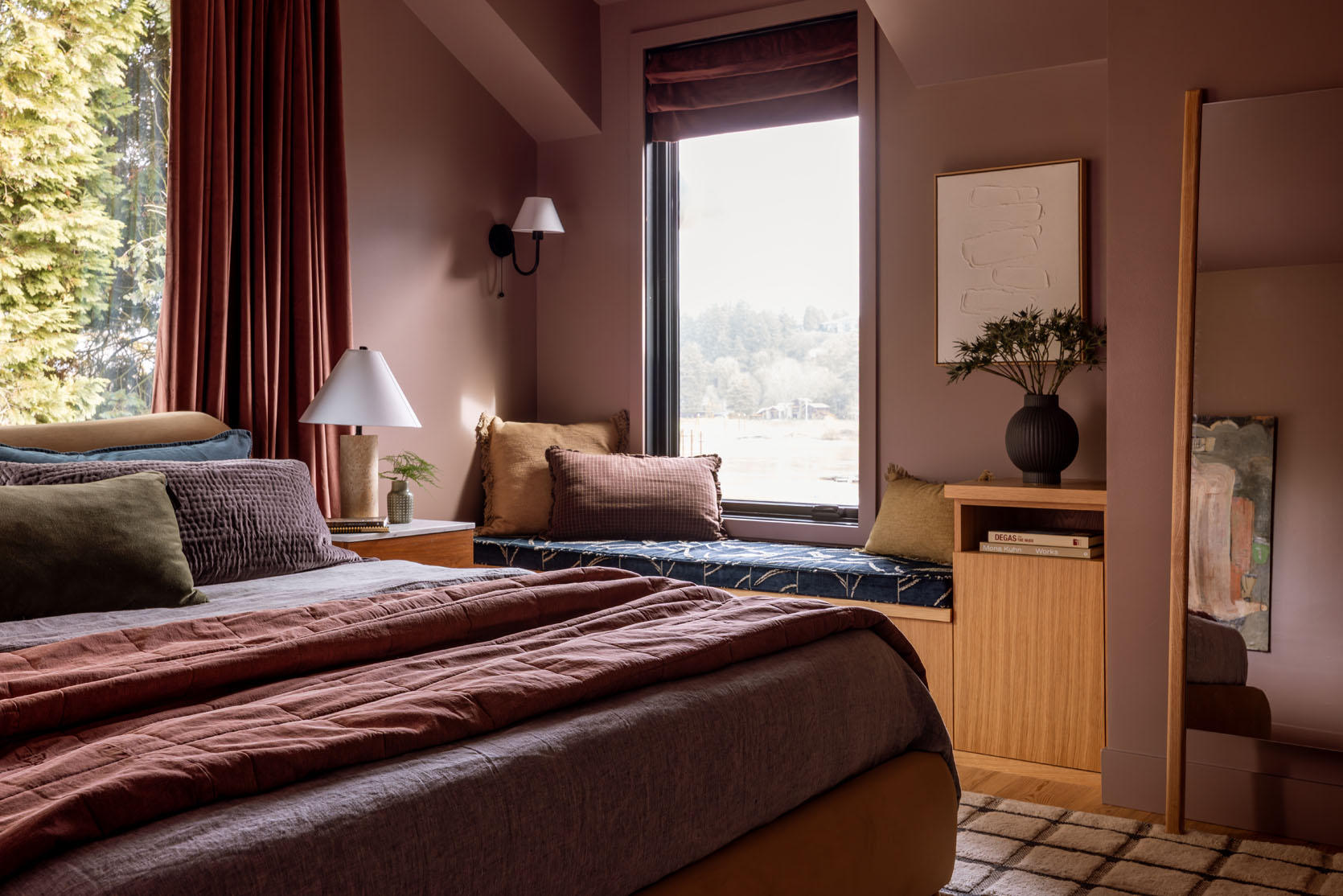
Paint Color | Art | Black Vase | Mirror
It’s likely time to talk about the paint color which I didn’t realize I’ve used before!! It’s called Cocoa Berry by Sherwin-Williams and I just LOVE it because I randomly chose it twice (our powder bath too). It’s a really warm dark mauve that can definitely lean towards “purple”, although we try not to use that word because people have FEELINGS about purple, but this color is just gorgeous.

The incredible painting is by MaryAnn Puls – they bought it from the OG Portland project years ago. It works so well in the family room downstairs, but once we brought it up here I knew we had to hang it.

Blue Pillowcases | Shams | Green Lumbar Pillow | Beige Fringed Pillow | Brown Lumbar Pillow
All the bedding and pillows are from AllModern (I also love that brown-toned pillow from the Chris Loves Julia collection on Wayfair).


Faux Tree (similar) | Black Planter (similar)
The room really came together so quickly – we chose the paint color last, which is not how everyone’s process works, but in my mind it’s the easiest way to do it. Choose the furniture or conversation pieces first (like the bed, rug, and art) because there are more color limitations on those things, and then make the paint color work with those (not the other way around).


The architect, Anne Usher, designed all of the bedrooms to have bench niches in them so we added this beautiful Pollack fabric for the bench cushion – the deep blue felt like a really pretty complement to all the warmer pinks (and we used the green colorway in the dining room so its a call back to that).

Denim Blouse (size down) | Jeans
I truly LOVE how this bedroom turned out so much – the colors, tones, textures and the overall vibe really hit a 10/10 of cozy. And yet it’s so livable, comfortable, and inviting. It’s an absolute retreat of a room, and perhaps we’ll be crashing here after many a summer BBQ gone rogue 🙂
A huge thanks to AllModern for partnering on this room and making it all so easy with excellent modern furniture and decor that mixes so well together. AllModern keeps things simple with hand-vetted modern collections. Their designs are made for real life (which I can attest to!) and are made to stand the test of time.
*Architect: Anne Usher
**General Contractor: JP Macy of Sierra Custom Construction
***Interior Designers: Emily Henderson (me!) and Max Humphrey
****Styling: Emily Henderson (me!)
*****Photos by Kaitlin Green


OMG Emily! Thank you for this beauty of a bedroom! I was so unsure about what color scheme to use in my bedroom, and this is it! I’s so inviting and warm and cozy. Checks all the boxes!
Does anyone else wish Emily was your sister? Beautiful!
This is absolutely stunning!!! Such a rich, moody, cosy space. Perfection – I’m so envious you get to sleep here!
Very nice! While the bruised palette isn’t to my personal taste, I can appreciate it and see how this is in keeping with the modern, block colour vibe of the rest of the house.
PS I love purple although I use it in a very different way. I normally use it with greens and golds, a spot of orange and lots of white and rattan so interesting (and nice!!) to see a different interpretation!!
I would have appreciated a pulled back shot of the room. It’s hard to picture it all together. It feels warm and cozy
GORGEOUS!!!! LOVE love love so much I am now frantically wondering which room in my house I can turn pink. Bravo.
Love it! You’re so good with fabrics and textures. This is beautiful.
This is so pretty! I can’t stand it. Gonna have a chat with my room. Lol
Wow! What a beautiful room! I love the uniqueness of the color palette.
Love it! What a stunning, sophisticated, cozy cocoon of a room!
The color layering is very special. The touches of blue are unexpected and work very well
It looks great! I love the color palette. PS Iʻm showing this to my husband who thought I definitely hung the art in our guest bedroom too low!
Looks great. I am curious why the bed was placed on the window wall instead of the wall that faces the windowseat/river?
Good question! I find it bizarre in general to place a bed in front of a window (because who does t want to look out??) but assumed it was an American thing as I see it often in American pictures. I thought it must be due to logistical but looking at the floor plan it’s not the case.
I think there’s a large TV (not pictured in the reveal) on the wall opposite the bed. It’s really the only place to put the TV.
Is there a link for the Roman shade ? ?
I coincidentally did this same color scheme in my tiny basement guest bedroom a few years ago — I had a request for pink walls but it was dark and gloomy with low ceilings and black windows, and I’m not a pink person, so it needed to be a moody pink. I just dialed it in with white bedding though, and I think I need to go with pops of mustard and blue after seeing this!
This is gorgeous! It feels so plush and cozy. Would be so nice to stay in.
Wow!! I love it!!?
This guest room feels so inviting! Love the perfect mix of warmth and modern style.
This room is a moody, sexy vibe. I love it.
Oooh I love the color of this! It got me thinking … any chance you would consider doing a post on favorite paint colors for rooms organized by which direction they face? I made the mistake of not taking that into account (even though we did paint samples!) as a first-time home buyer. My white north-facing living room looks flat while my blue south-facing bathroom is far too bold.
I looooooove this! Definitely bookmarking that beautiful pink paint color!