
The Portland House
Portland Project: Inspirations for Front Door Colors
Today, we are back to the Portland Fixer – the project I’m doing with my brother that we are selling in July – more on that here. To say we are behind on blogging about this house is obviously an understatement – those posts are in the process of being prepared (WE’RE WORKING AS FAST AS WE CAN, TYPING/DESIGN FURIOUSLY) and we are adding to our team daily to get this content out. We’re all basically panting in the office to get it all done. But today’s easy task is for you to weigh in on the color of the front door.
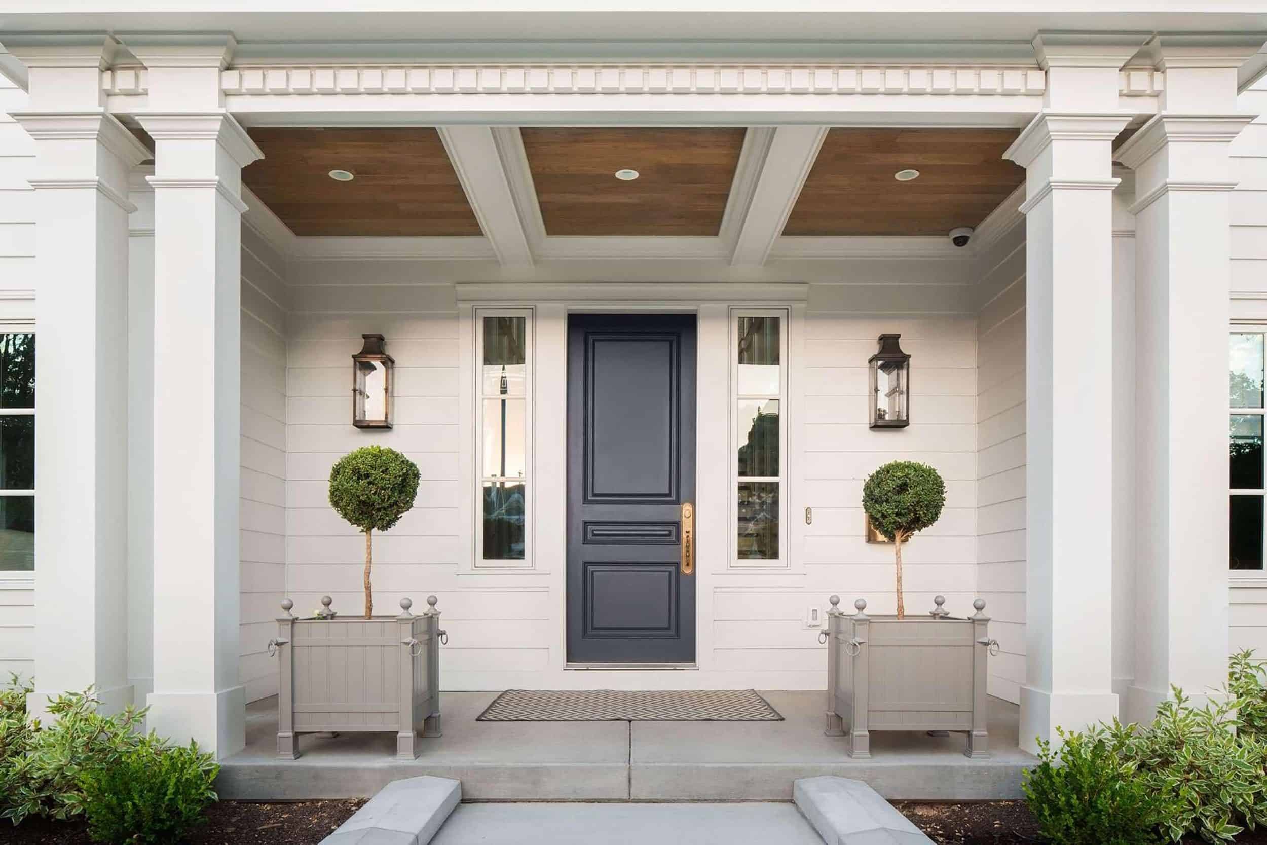
The house is Oyster White SW 7637 by Sherwin–Williams which is a lovely warm white. The rest of the elements are below so you can get a sense for what’s happening up front:

We’ve got white, gray, black, gold and green in the plants. The doors are paint or stain ready (the mudroom door is from Rejuvenation, the other two to match are through Medallion). They have windows in them for light and pair pretty beautifully with our brass lantern sconces. The floor tile is Clé herringbone and it’s RIDICULOUS. So much texture and yet so classic. More on that later.
While all of that looks very lovely together, it seems to me that we need some color. We have a ton of plants (thanks to Kate at Monrovia, I love you deeply) but is green, white, black, gray and gold enough? Maybe.
At home in Los Angeles, I have a bright red door and it brings me daily happiness. Plus as you can see, the front door is under a large overhang so anything too neutral seems like a missed opportunity to do something fun and colorful. Anything too dark will just fade away into the shadow. Where’s the fun in that?
Here are some inspiration images that we are loving. First up – not shockingly, the blue family. I love some light, some medium and some dark…although leaning towards the powdery tones.


It’s hard for me to resist a brighter blue like the above because it just gives me that shock of color that I love. However, I am not the one buying this house. We need to choose the color that has the widest appeal. Does everyone universally love this color? I DON’T KNOW.
We do know that most people love gray…


But in a city that already has a lot of gray, we’ve been warned not to bring gray too heavily into the color scheme. Gray can feel sad and under that overhang, I don’t think it’s the best idea.
We considered a sage-y green, like the below:

But all the plants are already green, so it would be nice to bring in another layer of color…
We always have the option of staining the wood door and keeping it natural.

The color palette could certainly use some warmth, and nothing does that quite like wood does.


Of course, a red door brings an instant jolt of happiness to the curb appeal (I can attest from my own house). But does everyone like red as much as I do on the front door of a house?


Remember, this is not my house. I have no idea who is going to buy this house. The color of the front door needs to hit the emotions of so many people.

What is your gut? Ours right now is a dark powder blue, otherwise known as a medium toned blue – not royal but not teal. Just a rich powder, but if you all said red I CAN GO RED.
What do you think? We superimposed some hues we’re hemming and hawing over onto a real photo of the front exterior taken yesterday to get a sense for what some of the inspiration colors in the images throughout the post would look like on the front facade. The idea is that the same color would go on the double entry doors as on the mudroom Dutch door. What do you guys think? Is blue universal enough (and pops enough on the house) that we go that route, or keep things neutral with black (to match the window frames) or a stained wood (hard to say no to that warmth). Okay…GO!


Mid toned wood please! They look like really beautiful doors; it would be a shame to paint over them.
Agreed! The wood is beautiful, save it!
I agree! Mid tone wood would be lovely.
Ditto!!!
Triple ditto.
Sage green . It’s Oregon!
Ditto! Love a pretty, non-ornate, wood door for this house. There’s so much other stuff going on here that I love the idea of staying in a neutral palette and bringing some warmth with the wood.
Same! Wood looks nice with the exterior color and is universally liked. The new owners could always paint it a different color later.
I’m on team wood toned. Looks more expensive and classic.
Complete ditto!!! That was my first instinct!
Me too!
Jumping on this train!
Agreed! They are classic.
SameWood
Agreed!
Yes! Wood!
Agree!
Agree!! I think wood would add a beautiful, natural feel.
Definitely just stain it! The new owners can always paint over it if the choose but once it’s painted it is so hard and expensive to go back to beautiful wood!
Most definitely stained wood. Beautiful doors!!
Ha. you guys. I LOVE this idea. I think the front needs warmth and maybe the wood would do it (wood always does). xx
Wood stain!!!!
Another vote for wood!
Yep. wood!
Absolutely natural wood!
A huge upgrade, the paint is ordinary in my opinion, natural wood is THE way to go.
Totally agree! Beautiful, natural wood feels expensive IMO
Wood please! It can always be painted by someone later if they feel the need to get that pop of color but it’s so much harder to strip it back to wood!
Yup!!
Wood please! No red
I like 1, 2, or 4. Red is not my personal fave for a front door generally, but I do like it on this house because of the overhang and needing more of a pop. I actually love the darker blue, but I’m a blue fanatic so maybe that’s just me. Is the house already painted or is that the color photo shopped on? It almost looks like it has a khaki tone to it. Curious because I am considering new paint colors for my house.
#2 or #5 as you need a bit of contrast
My sentiments exactly. I love wood, but the overhang calls for a bit more contrast in my humble opinion. Heavily leaning to #5, a classic black pops against the white.
Yes–the overhang will shade the door too much for a color to look right. GO BLACK.
I’m with black!
Why not give egg yolk yellow a try? It works really well with the grey/white/black combo, pops out in the green of the garden, and is always, always cheerful even on rainy drizzly days!
We have a red front door on a summer cottage of grey shingles and after seeing a yellow door in our foggy, seaside town, I’m thinking of copying it this summer. Whenever we drive by it it just looks so happy.
Dabito had a great example on his first New Orleans house…
I second the suggestion of a yellow. Of the options above, I like the blues best. But would love to see a yellow option added in.
Yes!
We have a yellow front door and it makes me so happy!
I ‘m with you. This house needs a brighter pop of color than what is listed above. A bright yellow would be fun, surprising and bring the eye in.
a chartreuse-y leaning yellow!!! just what the eye needs up here in Portland to combat all of our gray days -a jolt of color that suggests new spring growth : )
(not sure how it would play with the oyster white -which as someone mentioned is reading khaki on my screen..? if a yellow doesn’t play nicely with the house color, my favorite of the provided options is definitely Red.)
I agree with the chartreuse! I live here in Portland as well and painted my house a lovely dark teal green with a chartreuse door and it makes me smile every time I walk in my house. I painted it Benjamin Moore Shades of Spring #537. It looks great next to my off-white trim.
The yellow and red doors above make the house looked dated and circa 1974. Even the pastel blue looks kinda sad. Add the happy yellow-green and put planters next to it and it will look Modern Traditional and say “Welcome!”
yessssss yellow!!!! it’s my dream to have a yellow front door!
I was going to say the darker blue (I have a blue door myself) bc I liked it best from the renderings. but then I read this and I am SO TEAM YELLOW! (I normally hate yellow!) I think it’d be a show stopper!
Yes to this!
Posting twice to say YES to yellow!!
And I was just coming here to suggest yellow…
Yes to a beautiful soft yellow! Would be perfect in Oregon.
Another for yellow! If not (since it wasn’t presented as an option), then stained wood all the way. The new owners can always repaint but its hard to bring back wood! Especially one so warm and beautiful!
I change my answer. Team happy yellow!
Me too team yellow
Yes, yellow would be great!
Agreed. Egg yolk yellow is the PERFECT color amidst the gray and green of Portland. It will shine like a welcome beacon and look like the quintessential happy face for the home.
Yellow yellow yellow!
“Agreed. Egg yolk yellow is the PERFECT color amidst the gray and green of Portland. It will shine like a welcome beacon and look like the quintessential happy face for the home.”
At the mention of Egg Yolk Yellow I totally read that as “Welcome BACON” — Hahaha
Shine like a happy yolky beacon, I say!
I’m on the yellow train too. It may just be this particular photo, but I’m not loving the off-white of the house. I really wish it was a different color. To me, it looks really dated/old. Maybe a different photo would render differently.
I was team #2 (blue) until I read this yellow option. Now I think I’m team Yellow. I think a mustard yellow would look amazing.
I also don’t think red is the way to go. I think it’s a color you really like or really don’t like. The others are more neutral in a way that shouldn’t scare away any potential buyers.
I just painted my front door yellow yesterday. Yellow!!
Yes to yellow!
I read somewhere years ago that realtors said that yellow doors were the most popular color among homebuyers so I’ve always paid attention to door colors. They’re right! It’s so cheerful and happy. I painted my friend’s door a yolk yellow and it was fabulous, team yellow all the way!
Team yellow!
TEAM YELLOW!! (yes, in caps)
yes! yellow would be my vote too!
Agreed! None of these colors pop AT ALL.
Yes to yellow, buyers will want something design-forward if they are looking at a house by America’s design sweetheart. Also, whatever color you choose bring it inside so it ties in.
I’m on the yellow bandwagon. Followed by darker blue.
Yellow!!
I was going to say green — it has contrast with the house but is harmonious with the landscape. But I LOVE the yellow idea. That’s my new vote.
I’ve lived here for 25 years and I’m familiar with this neighborhood. Yellow!!!
A lovely gold yellow…or stained as a second choice. I love a cobalt blue door, but that overhang is quite deep, so may not pop as much.
I LOVE YELLOW. this is hilarious. I was going to suggest yellow but I thought that it wasn’t universally loved and since we have to sell this house I wanted to not reject a certain buyer. but man, maybe we should consider yellow … 🙂
I went to comment because I just wanted to say DO YELLOW! And here you are already Emily, so here is yet another yellow vote for you!
Team yellow! Buttery french or sunshine yellow would be gorgeous.
I think you need to draw the eye in under that overhang so my vote is for color! I just painted our front door Newburyport Blue and LOVE air!
that was our old door! I love that color VERY much 🙂
I like #6.
I’m usually a fan of neutral but for a front door I love a pop of color so I say red or blue.
Please not red. “I see a red door and I want to paint it black”. Well maybe not black, the stained wood options look great. They add warmth and contrast beautifully with the white siding
Ha. Ok. good to know. I love red but apparently its not totally universal 🙂
2/6
#2 or #4 to give the dark overhang a pop of color
I like the stained wood best – #6, followed next by the powdery blue of #1
I agree!
Me too!
I think #2 is the perfect balance of pop without looking out of place. Live your blog!
thank you !
Green or the stained wood.
The lighter and medium blues of your inspiration pics are scene stealers, but your house is so different than those. Red looks the best in the mock ups. It stays true to being that color. No mistaking the red door for a different color. I love a red with some brightness to it like poppy or dark tangerine. The Parker hotel doors always seem the right red against white.
I’ve read / seen on TV somewhere that black or dark blue front doors sell houses. And I’ve noticed since then, whenever developers are refurbishing old Victorian houses near me they go on the market with black doors. But these are invariable set against red brick or cream stucco. Not very adventurous but perhaps worth baring in mind…
Then again – maybe it’s a UK thing – as 10 Downing Street has a very glossy black front door and people make an association with that?…
image here:![comment image]()
I love this idea. if it weren’t an overhang I would definitely consider this. at the same time i love color. and by color I mean blue 🙂
Red, or a mid-toned wood stain. Either would be lovely. I’m thinking the dark blue would compete with the black framed windows, no?
My vote is for a light-medium wood stain.
Paint vote would be for… a medium or slate blue or a more interesting/stronger green than the sage. Like a black green (Jasper by Sherwin Williams). Definitely no to red, gray and light blue paint.
I also LOVE the idea of a dark green, its got that black look with a hint of color.
Love the light or dark blue for this house!
wood or black. I also like the idea of black-green someone said. With 2 doors it is a bit more tricky!
I’m also on the mid-tone wood bandwagon. Especially in portland, it would be nice to keep a natural element in with the white, black and gold.
I love the light earthy tones or the natural wood!! So beautiful, and not over done by everyone else!
Love the medium-dark powder blue, though I generally do not like blue with black (the hardware). It’s like when my husband tries to wear a blue blazor with black pants- it never looks right to me. I have seen blue and black done well together- in fashion, design etc- but I’d much rather see brass against blue. I also love a darker green front door on a white house but I don’t think it is as universally appealing, except that when something looks really great it can appeal to even those who would not have chosen the color themselves.
/Users/Farberhomemac/Desktop/colorful-front-doors-that-ll-make-you-want-to-bust-out-the-paint-best-door-plants-ideas-on-pinterest-ebccdbacb-green.jpg
I was leaning towards stain until I saw the mock-ups, then I went RED all the way. With the heavy overhang, all the softer colors just look meh. The red really sings.
I love the medium blue for this house. Since the door is recessed so much below a huge portion of the house, it really benefits from the saturation and warmth in that color. The red is nice, but I think it pops too much for me. The green is lovely but a tinge too light for being so hidden , and I totally agree that a differentiation from the plants would be nice. I love the natural look of the doors, but I’m not sure it pops enough. Maybe in real-life it would though! Love the idea board at the top – that herringbone tile and the lights…sooooo pretty!
#2 is my favorite!
#2, but I think I’d go a bit more vibrant than the one you have in the picture so it really pops.
I like either leaving them unpainted (it’s beautiful wood), or maybe a brighter green than the sage. NOT red or black.
I like #5 since it’s so classic but if you want some color I’d go with #1. Again a classic color but adds a little color to the scene. Good Luck! I love following the progress!
The light blue or a pretty yellow.
I’m feeling the natural wood!
Do CORAL instead! We did coral when I repainted our front door and it’s the happiest color to come home to! This is what it looks like:
I agree. Coral would be perfect.
That’s a bit different than what I was picturing when you said “coral.”
I live in a condo townhouse, so it goes without saying we have no choice in exterior colors. Our front doors are painted an ugly toned down orange that I have HATED since the day we moved in. Your color is closer to red and so much prettier than our door color.
thank you 😉 yes, in the picture, it looks more red. in real life, it’s a little lighter and peachier, but not peach. if that make sense. ug. sorry you can’t pick your door color! but at least you can do whatever you want on the inside, right?
Yes, a soft light coral would convey color in the shadow of the overhang!!
Write-in vote for green – not the sage color you showed, but something bright and cheerful – like an Irish green.
I’m super into the white/black/green and white/navy/green combos.
I’ll second the yellow – yolk, mustard or whatever. Close to yellow is a natural or light wood. Red is a bit of a cliche and the blue, though beautiful doesn’t hold up in the darkness of the overhang of the porch. Green/gray is quiet and lovely but a little too safe. Isn’t Portland often rainy and overcast? In that case – yellow, for sure.
After seeing the mock-ups, red or stained wood (#6) seem like the only choices that really fit with the house. The red doors pop and bring drama, while the stained doors blend in perfectly with the rest of finishes and give the front a serene look. I love blue, but I’m not feeling it with this house.
I echo this entire comment 1000%!! Took all the words right out of my mouth.
One thing to consider if you are selling is regional preferences. I recently had a color consultant visit my home in OH, and she said that locally the most popular exterior colors remain taupe with black shutters and red door. What do people in Portland prefer? Personally I love a powdery blue but it can read very feminine and may not appeal to more masculine taste. I think the wood stain is gorgeous, when it is not too deep. I think I prefer wood stain the most.
With board and batten, I usually love a painted door but I was really drawn to the stained wood. Maybe bc it’s in the Pacific Northwest? If you go with paint, my vote is for a medium blue. I love the red, but because there are two locations, it feels too loud to me … LOVE what you have done with the house!
Keep it wood! It just looks right
RED
#6, #2, or #5 – in that order. 🙂 Usually I love red doors, but it doesn’t seem to suit this house for some reason. The pale blue (#1) and sage green (#3) seem like they’d be better for a sunnier entry way, or a location that isn’t the PNW.
Love me a wood door! Can’t imagine painting over that wood beauty!
I love the stained wood #6! That is what I would do!
Ooh, red for the double entry doors. Or something equally bright. But does the mudroom door need to match? Maybe it could be black, or wood?
I vote light powder blue (not medium-toned). Though that might get lost or read as gray under the overhang. My second choice would definitely be stained/natural. No on red! I think red can be jarring to some people…I wouldn’t totally mind it myself, but it’s polarizing enough that I don’t think you should do it.
The porch definitely needs warmth added and I love a stained front door, but there does seem to be a missed opportunity if you don’t paint it. Perhaps a dark green door (adds depth but stays somewhat cohesive with the existing color palette) but with additional wicker or wood accents (added with furniture or planters). .
RED!!
My own front door is a slightly greeny dark blue, “Restless Sea” (Behr) but it’s just a builder-grade steel front door. I do think it would have mass appeal, but I would also love to have a warm stained wood door. Warm stained wood is my vote for the Portland house.
As a buyer I’d vote for wood.
If I wanted to paint it, I always could. But once it’s painted seems daunting to change back to wood.
Adding planters next to the door with bright pops of red or yellow flowers would add some punch without hemming the buyer in to a specific color choice.
Yes, dark green for depth while maintaining a minimal color palette, but with wicker or wood accents (furniture?) for added warmth.
Light wood or red and make sure there’s a light shining on that door to bring it forward.
Red really pops but red in general feels a bit dated. I have a teal/minty blue-green door and every time I pull in the driveway it makes me smile. I do love the simple black door though, #5. It’s chic and timeless. If I were painting it for myself, I would pick #3, green. If I were painting it to sell I would pick #5.