
Bedrooms
Charlie’s Room Progress and Sneak Peek + Shop The Look
Designing rooms in your house is like raising children – the process isn’t going to be perfect regardless of the room/kid, but some of them are more of a struggle at different times in their lives/process than others. In this case, Charlie’s ROOM is my problem child. And I don’t even know why!!! It’s not odd-shaped, it doesn’t have awkward window placement or anything. Functionally it has no problems, but stylistically I was just STUMPED. Let’s recap:

When we moved in it looked like this, above. Totally fine, with a wall of pretty old windows. But we had some construction to do (see overall upstairs construction post here) so we added this little bathroom, which reduced the size of the room but really worked and most people who didn’t see it before thought it was how the house was built (yay!).

We chose the paint color for the whole house in one day, without really knowing ANYTHING about the design of most of the rooms. Charlie had a huge request for a green room. Great. I’m pretty into green these days and I was picturing a pretty olive.

Brian and I (and Ginny/Mel) did a facebook live paint deciding video and if you saw it you might remember the debate:
– The room has angled ceilings with no real stopping point or moulding so we thought at the time that we would have to paint the ceiling.
– Brian wanted a brighter green, Farrow and Ball’s Calke Green
– Brian suggested doing two walls – the window wall and the wall opposite. I literally was unable to even put that in consideration and yes, we did get into a tiny on-camera awkward tiff about it. As much as I really try to respect his opinions (truly), every now and again, I wanna be like YO, DUDE, WHO WON DESIGNSTAR? ME OR YOU??? Which is hilarious because I wasn’t even particularly good at design back then.
Another note – if it didn’t have plaster walls and sloped ceiling and near the jack and jill which is wallpapered I probably would have chosen a dope paper. But Birdie’s room, our bathroom and their bathroom were all papered so I didn’t want it to be a fun wacky house where every single room had some crazy big wall statement – and yet I would probably go back in time and would have just chosen a paper that would have worked (something super super subtle with a tonal pattern, maybe?).
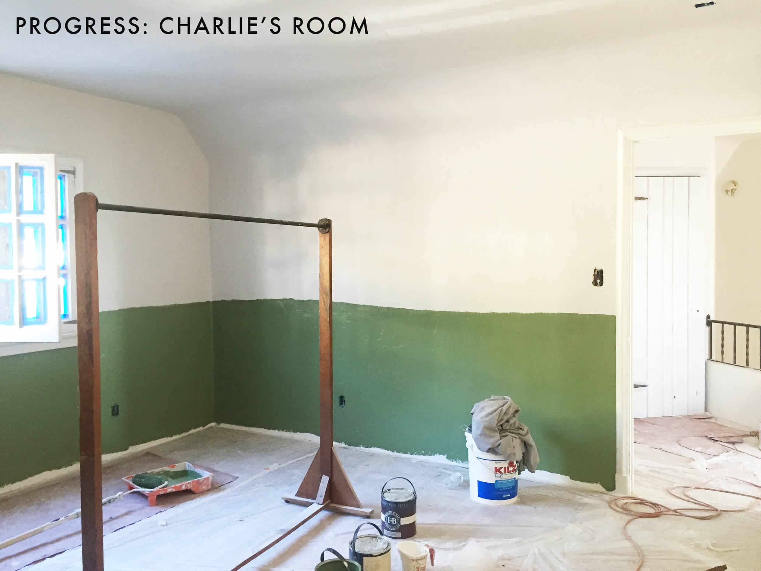
So we compromised – the brighter green, but on the bottom half of the room and we’d add a chair rail so the top of the room would be Ammonite and ceiling can remain white. I didn’t feel great about it but it was being painted the next day so I was like o’well, let’s see how this looks….
Instantly I was like, hmmm… but I didn’t know why I wasn’t psyched about it. It just felt kinda dated and not very happy.

His last room was one of my favorite in the old house. I loved stepping into that room every day and I knew that this room wasn’t going to have that emotional stomach flip already.
But we were moving fast to get into the house, and remember paint is not a big deal to replace. It’s not permanent, folks. Plus this stuff is good content…
So we kept it as is and moved along – knowing that I would probably change it at some point.

Here it is – Calke Green on the bottom and Ammonite paint on top. Nothing should be bad about this but it just wasn’t good. It felt like school colors and somehow dated. I did 1 million mood boards to make it work but even on a computer with unlimited furniture, lighting, rug and accessory choices I couldn’t make it work!

Look how depressed Bear is in there – and NO! Dalmatian! Don’t jump!! I could have definitely made this work, but I didn’t want to make it work. Part of me wanted to take the chair rail off completely but the problem is that the guys did SUCH a good job installing it and connecting it to the windows and doors. They said that they feared taking it off would damage the original window and door frames. GREAT. We were able to find moulding that matched those frames and that’s what they used, but it was thick and rounded so it took a lot of cutting, filling, patching, etc to have them look seamless.
Then I thought let’s just add beadboard on the bottom half and paint it white to match all the window and door frames. But I had to find beadboard that is VERY VERY thin so that it could simply be installed on above the base board and under the chair rail. I didn’t want to have to ruin the baseboard by taking it off to put it on top. Luckily we found some. 
Next we needed to choose a different color. I thought I could handle a non blue/gray color on a wall but turns out I can’t. Again, there was something that felt dated and 80’s about it – this combination of country, beadboard, forest green … with that heywood wakefield dresser …
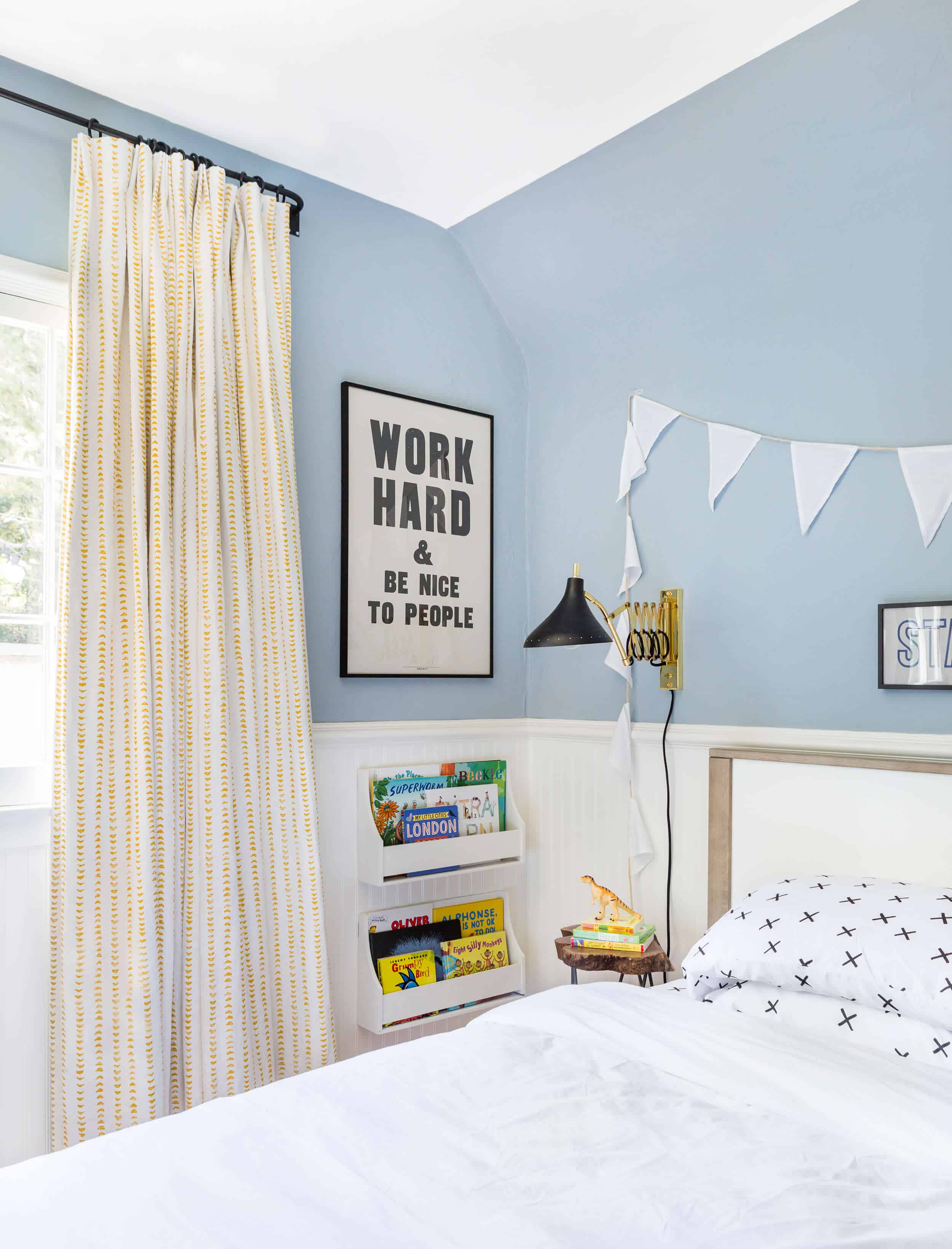
So we made some changes and added chair rail on the bottom and repainted the top Sharkskin by Portola. The installation took much longer than I thought – 3 full days of two guys. Two days to properly cut, install and patch/paint the beadboard, then a day to paint the top.

Our contractor charged us $2500 for this room + the painting the laundry room + the family room (going from navy to a neutral). I’m sure you could get it for less, but his guys did an amazing job and they were here for days so it seemed good. I believe the beadboard was super inexpensive – like $250 from Imperial Moulding in the valley.
It was instantly better. But it didn’t totally solve my problems. It still felt strangely 80’s – the powder blue, while such a beautiful color is also kinda an 80’s color!!
And those GD temporary blackout curtains were bumming me out every day.

I love the rug (from Target), and was convinced it could pull the room together.
Once the curtains were installed (by Calico) it changed the whole room.

Then we received a new much more modern glider (gifted from West Elm) and it helped even more.
It was coming along and while I wasn’t 100% happy and certainly toyed with putting up wallpaper we ultimately decided that choosing and installing a last minute wallpaper would probably end up with regrets and that if I tried hard enough, I could make this work.
For all the moms out there – we kept Charlie in his crib til 3 years, 3 months because he didn’t know there was another option and we were psyched he had a cage to keep him contained at night. Then one day he watched a movie where a kid climbed out of his crib and he was like WAIT – I CAN DO THAT??? He tried it that night and succeeded (with SUCH pride). Two days later he landed wrong and hurt his knee. It didn’t seem serious but he wasn’t walking on it so we went to urgent care just in case (typically I wouldn’t have but a friend of mine’s daughter wasn’t complaining much about her ankle and then two weeks later they realized that it was broken the whole time and they felt TERRIBLE).
Meanwhile we converted his crib into a toddler bed (while feeling SO guilty that we hadn’t a couple days before). But he was so big that it just seemed time to move him to a big boy bed anyway – especially with the shoot coming up. We asked you about twin versus full on the Facebook live and all of you said FULL. It took some convincing of Brian Henderson but I’m SO glad we have a full and so his he. All of us read in bed together and it’s just wonderful. He only fell out once and we have no bumpers or anything and maybe that’s because it’s a full?
Stay tuned for the final reveal in August, but let’s just say that I am pretty happy with the room. I’m like a ‘8’ out of ’10’ on the satisfaction scale. I’m not sure what I would need to change to be a 10 (I have a couple ideas) but I’m sure I’ll figure it out. On contrast I’m a ’10’ on Birdies room, the kitchen/dining, the patio, living room, all bathrooms, etc. I am at a ‘4 ‘in the family room though … now THAT’s my REAL problem child.
Meanwhile – here is what we used in the room, and stay tuned for the full reveal. xx

White Bunting | ‘Work Hard & Be Nice To People’ Print | ‘Start With Yes’ Print | Two Tier Wall Bookshelf | Accordion Wall Sconce | Live Edge Side Table | Bed | ‘X’ Pillow and Sheet Set | White Duvet Cover | Blue Throw Blanket | Blue Quilted Pillow | Blue Striped Pillow | Plush Zebra | Plush Fox | Blue Shade Table Lamp | Antique File Cabinet Side Table | Rug | Paint by Numbers Art (vintage) framed by Framebridge | Dresser | White Table Lamp | Glider Chair | Dinosaur Toys | Navy Basket | Bean Bag Chair | Bookcase | Wood Box | Navy Globe | Beadboard | Wall Color | Curtain Fabric


This is such a fun post!!!! Exactly why I keep coming back day after day.
I like the evolution of the room and seeing all the tweaks. Where is the room’s ceiling light from?
Thanks! It is from Circa Lighting:
Aww. I’m really glad you didn’t go with the wallpaper you instastoried awhile back because it seemed so rushed! I was worried it would be another regret! I’m So glad you were able to work with the color because I think it is really cute! From the sneak peaks Charlie’s room looks so fun!
In the full reveal, or here if you want, please tell us about the dresser switch. Tonal reasons? I love them both! And another question, has Charlie complained about the green request going south, or forgotten about it?
I wondered the same thing about the green request. If that was my niece, she would nevah, evah forget but boys can be more easy going.
HA. Charlie picked the blue (which I insta-storied but I forgot to take photos of!!) He helped me paint the swatches on paper and we held them up so he felt super part of the process. Wait, now that i remember he wanted a darker blue but brian thought it was too dark so we snuck in this one instead. Re the dresser – YES it was a tonal problem. I love that dresser but against the powder blue it looked dated. on an all white ship lap wall it would be amazing. Its a vintage heywood wakefield and i love it (I think my best friend has dibs on it). We needed a deeper, darker tone and that one from rejuvenation helped it feel more modern. They gifted it for the magazine shoot because obviously I wouldn’t buy a $2200 dresser for a 3 year old. But we have told him that he’ll have that dresser til he’s 60. It’s so very very pretty and incredibly well made. Anyway, no he’s not sad about the green 🙂
I love including family members in decisions, but could we maybe agree that for wall colors Brian has only a very limited amount of say from now on? I agree with him on a lot of stuff, like the light fixture in the kitchen, but Calke Green was really wrong, and I feel like whatever blue Charlie picked may have been right. It is Charlie’s room after all, and I’m sure whatever choices you gave Charlie were already carefully curated.
I don’t have kids but maybe it’s because Charlie is in some kind of transition phase that you have been having trouble with his room. He’s not a baby and (according to some) not a toddler. He can do more things on his own now and I take it he has started school. I think this room design looks like a good step in him growing up. Maybe that’s just hard to deal with! (I am also not a psychologist).
Good insight! (I happen to be a psychologist) 🙂
Emily, this is one of the best posts EVER for me. You’re the only one who not only posts what is not working 100%, but also what is working 50% (the green color) or 70% (the curtains). For the life of me, if you asked me whether the before curtains are the wrong color I couldn’t have guessed, until I saw the new ones and realized “oh yeah!!” You are so good at explaining the process, and at showing us what is, not wrong, but not entirely right for your vision. Thank you so much for making us a little smarter design-wise with every post!
Totally agree. Love learning the process.
I think Charlie’s room was problematic because his animal wallpaper room was sooooo good, I couldn’t top that design, ever! Love the triangle detail on the curtains and the overall combination of soft colors. The other curtains looked purple against the green and then blue walls. I love all the design choices you go through and am continually emboldened to explore my design range in my own home because of you!!! Thank you to you and your team. ❤️
I know. His last room was so amazing that it was hard to top it. I also don’t want to be the person that puts a large mural/paper in every kids room (although its so so easy/fun).
I love those curtains that you ended up with! I totally relate to this since I never really liked my son’s nursery in the beginning. I was rushed too and I think that’s why. I was literally having contractions as my husband was finishing installing the wood floors in the nursery. So there was no time to design before and not really that much after either. Finally 3 years later I like it!
I have a question about the Niels glider. Do you like it? Is it comfortable? Do you think the fabric would clean well? I love the way it looks compared to other gliders out there. Now that baby number 2 is coming I finally convinced my husband that we should buy a glider. I used a wood rocking chair with my first every single day and we are still using it. Since we already have everything else for the nursery I think he is ok with splurging for a glider since he knows I will use it a lot. I have had my eye on that West Elm glider but it is so hard to find reviews so I would love to hear your opinion on it!
I haven’t tried the WE pictured, but to me it doesn’t look cozy enough for newborn snuggling. On the plus side, it is nice and tall. But the arms look a little low and the seat too thin. This is coming from a momma who regrets her glider choice (baby is 17 mo old now). Land of Nod has some really lovely ones I wished I had splurged on.
GL with your new little!
If you’re willing to splurge, I highly recommend the Land of Nod Milo glider and ottoman. We sat in a number of them before buying (including the Niels) and it was above and beyond the most comfortable AND it looks great!
That one does look like an amazing glider! Unfortunately, I do not think I could sell my husband on spending that much. While the Niels is out of my price range, it is close enough that I could have probably gotten my husband to go for it with enough pestering. And really, anything will be better than the wood one I have now that we got for free. I figured I spent 3 years in an uncomfortable wood chair, even falling asleep in it, that anything will be better than that!
I can’t speak to this WE glider. I have the Graham glider from WE and I looooove it. It is so comfortable and looks brand new. My son turns 20 months tomorrow. It was great for nursing and we love cuddling and reading it. I got a Moroccan poof knock off from Land of Nod as an ottoman and I’ve fallen asleep in there when he’s been sick and needs some holding. I also don’t feel like it screams baby glider. Congrats on your new LO.
The milo glider from land of nod is what we used to have, but we wanted something more modern for the shoot. Truth – milo is more comfortable for sure. The WE is comfortable for a chair, but compared to the milo its not as comfortable, no. Part of me thinks that if we had never sat in the milo chair that we wouldn’t think that the WE one is less comfortable because its not like its uncomfortable, but when comparing the two my prognosis is this – milo is more comfortable (and still cute/simple), WE is more stylish and modern (but less comfy). The WE one actually ended up in Elliot’s room and it looks so beautiful in there. I had originally planned on reupholstering Charlie’s chair and putting it in there, then I realized that since we had the big bed in Charlie’s room we don’t need the chair, too to read in. So it went into Elliot’s room. It’s really great. Its just not as kushy and large scale as the milo.
May I suggest painting the wainscoting and the chair rail charcoal or black. Right now it still skews New England 80’s for me. Good luck with getting it up to “10 out off 10”!
We definitely thought about it but the mouldiings run into all the door and window framing and look connected – like there is no braking point so It seems like those would have to go dark as well (we toyed with a super inky-navy). And brian didn’t want dark either. So hard!
Hmmm… Black window sashes only for a more masculine look? Black doors/white trim?
Those curtains really do make the room – so bright and cheerful! I’m still telling myself that the bottom paint by number dog painting is the one I made when I was ten. 😉 Also, my daughter is over 3 and a half and still in her crib! Please tell me what movie Charlie watched so I don’t let her see it! We just moved her baby brother into her room, so I stand by my decision to not add to our sleep woes, but I have a feeling we’re going to have to do the conversion very soon.
I am shocked how much that room changed just by installing different curtains! Even in the sneak peaks I had seen of this room I knew that the green wasn’t working. So glad this room is coming together!
i did the same thing with our son! i kept him in the crib as long as humanly possible until he was literally diving out of it. we just took the side off the crib but now bedtime is so rough because he just gets up when he doesn’t want to go to sleep which of course is every night. maybe we need a full bed so at least i can be lying down too!
Charlie gets up, but less and less as time goes by. I think that he LOVES his big boy bed so much and he’s really proud of it. If he’s not super tired he’ll sneak down once, but if he’s super tired he doesn’t.
It’s coming along! Those yellow dotted curtains made such a huge difference! And re: big boy bed, my (tiny for her age) daughter managed to climb out of her crib completely on her own at 2 years, 1 month. Figured it out entirely on her own, too, just ninja’d her ankle up over the top and swung down to land perfectly on her feet.
I thought the green was pretty. I also thought the breadboard and blue is pretty. So I guess I’m like you. It’s just about personal taste. Looking forward to the final post.
I actually like the green ? I know you said it’s school colors, but that’s exactly what I love about it. If I could, I’d have a chalkboard, globes, old desks and even an anatomy skeleton in every room of the house lol
And black countered science tables!!
“i thought I could handle a non blue/gray color on a wall but turns out I can’t.” Ha! You and me both. 🙂 Blue is just so good! We did the same with the crib. Same exact reasons…why not? It’s a perfect cage. :). And then grandma let her sleep in a big bed and it was all over because she was enlightened. And then we were like, well, she was kind of an adult in a crib…so we moved our next two kids out of their cribs sooner…but the contained three year old was fun while it lasted!
Thank you for sharing the process! I do have one question, where is the overhead light from?
Thanks, it is from Circa Lighting:
I liked the green. It didn’t feel dated so much as classic to me. In a more modern house, I probably wouldn’t have liked it as much, but I think it worked here. Then again, it’s not my house. (Although I’m sad that Charlie didn’t get his requested color.)
I like the new room as well; heck, I even like it with the blackout curtains. Maybe I’m just not super discerning?
I’m curious as to whether the kids will get more say in their rooms as they get older. On one hand, that seems natural. On the other hand, when mom is a designer who needs blog content, the needs of the household may outweigh the desires of the children.
I was going to type almost this exact same comment. I liked the green and the blue, was sad Charlie didn’t get his requested color, although at 3 he probably didn’t care that much, but wondered about when he and Elliot get older.
Ha. I should have put this in the post – he chose the blue. We painted all the samples together and taped them up on the wall and he chose. He was super excited. Don’t worry!! But i’ll edit the post so people don’t think i’m doing any weird design cruel tricks on my kids 🙂
Re: The “desires of the children” … I get that, but he’s… 3? I know I had crazy requests when I was his age for the design of my room, the names of my future siblings, what I wanted for dinner, etc. I feel like as parent, you get to choose when to acquiesce (castle in the backyard!) and when to make a decision the kid will never remember, nor will scar them (paint color, lol).
My Mom was going to use the name I picked out if my brother had been a girl. I was 6 though, not 3:)
Odds are Charlie doesn’t even remember requesting green at this point, but the post did make me wonder as they get older how Emily (and other design bloggers) will balance kid’s wants vs the needs for blog content.
HA. he chose the blue and don’t worry – I’m focused more on my kids happiness than blog content. While I may tweak this room to be 100% happy with it, then I won’t and elliot’s isn’t changing (besides getting a twin bed at some point).
Yeah, that’s why I specifically asked about when they get older. I know Charlie isn’t going to be scarred for life not having green and that even if he hadn’t had a hand picking out the blue, he likely wouldn’t have cared that much. It’s just that that got me thinking about when the kids are older and how teenagers often have… let’s just say “interesting” taste. When they are older, you want to give them more freedom, but at the same time, when your job involves showing off your house, you may not want to give on certain things. It will be a balancing act.
This room is looking great! Your updates are great steps in the right direction. I cannot wait to see the finished room.
So cute! I guess this ship has sailed but it might have been nice to take the beadboard up to picture rail height (before the ceiling break) and install pegs along it shaker style for storage. Then it could either be painted it or left a natural wood with a strong paint color above. I love those curtains!
I totally agree with you. Up higher would have felt more modern. Or if I had chosen larger width bead board … ugh!
I agree a taller beadboard would be more modern, I know you can’t change it now but could you cheat it? Maybe a white painted silhouette of an animal parade marching across the top of the beadboard? Or a white picture rail/shelf for his trains now, lego creations later and eventually his sports trophies? Something white atop the beadboard would give the illusion that it was taller.
I just love it!!
Regarding moving it from 8 to 10, maybe more fun and playful art would do the trick to make it a more “happy” room? In the pics it looks GREAT, although kind of serious. Like, I would LOVE it to be MY room, but for a 3 years old, maybe a little more fun and colors would help. Maybe even trying colorful bedding? (that should be an easy and inexpensive try out)
I agree with this. I LOVE what you’ve done but maybe it just needs one touch that says it’s all Charlie. Perhaps offer three colorful (inexpensive) duvets to him and have him pick out his favorite. That way he is more represented and you can always replace it when he gets older and no longer likes trains, dinosaurs, cars, space, etc…
He loves the room a lot and the art isn’t the problem, i think its the beadboard situation. But not changing that, folks. 🙂 We talked about if the typography is too grown up but its balanced by the animal heads on the other wall (that you haven’t seen yet). Stay tuned 🙂
It’s looking great, and I’m SO happy you ended up with a bed situation you all are happy with. That sounds small, but it’s HUGE. The curtains make such a difference!
My two year old has been sleeping in full mattress on the floor since she wafs about 15 months old. She never slept great in a crib and we always had to lie with her for her to fall asleep and then transfer her to the crib so a mattress on the floor was so much easier for us. It’s also a Montessori concept and difficult to make look good stylistically but I’ve seen it done!
I’m just about to transition our 2 year old into a Montessori floor bed. Have you ever googled ‘Montessori house bed’? So many beautiful ideas!
Ha. Scrolling through the pictures before you mentioned them, all I could look at were the blackout curtains! I kept thinking, “Those could not be her real choice?” Phew. It’s looking great, I think. Although, I have a real hankering for an olive room these days…
What light fixture is in this room and it is bright? We have been trying to find a similar drum fixture for a small front office/library/den but everything only uses one bulb or two and we don’t think it will be bright enough
It is from Circa Lighting, we have it in a few rooms in our house and it has been great. We took out the extension rod that it comes with to shorten it, and we love it. Here is the link:
I want that bed for my own room so bad! I wish they had it in a King. Pass the word on to your Target friends, please 🙂
I love the style you ended up with here! A few of the Target products you linked to are unavailable including that amazing rug. I hope it will be back in stock soon!
We are hoping the same as well, it has been great for the room. When we linked everything up it was available, and their stock changes pretty frequently so keep an eye on it as it will most likely be in stock again soon.
xx
I think the room looks great! I wonder if maybe the 8/10 is because our kids are so special to us and when the room is maybe reading more catalogue (still beautiful) and not special/different enough it’s hard to get to a 10. I also really associate my kids personalities with the colours that were in there nurserys (which were done before they were born, so for no good reason). I wonder if maybe you being a visually creative person you do this too? Pinks and soft/sagey greens for Birdie and more saturated primary colours for Charlie. Maybe the less pure colours in Charlie’s room just don’t feel enough like him to you? These are all just guesses obviously. I do think the room looks great as is!
I had a question about the curtains. I noticed that the old ones were blackout, but these ones do not seem to be. Do you plan to use some other blackout solution (e.g. shades) underneath?
Funny story. When they first came Calico had made a mistake and didn’t do blackout lining. We were shot the sneak peeks that next day. They came the next week and took them down, relined them with blackout and reinstalled them the next day so we are all good now 🙂 because ya, i don’t mess around with anything other than blackout for our kids.
I’m guessing the answer will be “vintage” and therefore unable to source, but I’d love to know about the floor lamp next to the glider.
Can you share a source for that awesome wood/tree trunk side table you have in the nook by the window? So so good!
It’s Target! I think its in the get the look, no?
The headboard in the last photo fits just PERFECT under that chair rail. Was it difficult to get just the right height? And I agree that the yellow curtains made a world of difference. As always, i love seeing your progress and can’t wait to see the final reveal!!
Hi Emily! We’re in the process of converting my daughter’s room too (she’s about the same age as Charlie) (Full sized bed all the way, btw!!) I’m curious to see how you store stuff! Books, toys, etc. Her room is on the tiny side, but I’m curious to see your final product!
OOh, a lot is in the closet. then we have a trunk, a shelf that you haven’t seen yet and honestly we REALLY try to limit the amount of toys and books they have mostly because it all just starts to feel like plastic garbage. He loves his cars, dinosaurs, a handfull of stuffed animals he would DIE without and we have loads of books in the closet but recently read (in the book Simplicity parenting) that giving them less choices in general is a good thing. Not that you should also not have a lot of toys but these kids have a castle, they can go out there and use their imagination … 🙂 But i’m sure as they get older and are into more things everything will change. Oh legos, he loves his legos and bristle blocks.
LOL re: marital differences and the shade of green – I spend a lot of time in Sussex UK because my husband is a Brit. I love the colors of the train stations there – they are a wonderful green – somewhere between F&B Theresa’s Green and Green Ground – with both cream and white accents. I just love them, especially with the reds and pinks of geraniums and roses.
Recently I told my husband that I thought we should use that combination in our house somewhere. He looked completely horrified and told me that this was the hospital corridor and/ or school lunchroom colors of his youth, so absolutely not.
Colors are so funny.
I just love the animal paintings in Charlie’s room – I assume they are paint by numbers. They are so fun and modern and appropriate for a kids room.
Great post, Emily! I was not a fan of the green, or the whole chair rail concept, but you’re bringing it along. We just moved our newly 4 year old to a Full bed based on your readers’ recommendations. Now I inadvertently fall asleep with him every night!
It’s so snuggly!!!!
Looks very nice!! Would have liked to see where the green color scheme could have gone though. Such a different color!!
I think his room looks wonderful now! I do have a question about the closet – isn’t the entrance to the closet right where you have the chair in the corner? How does he get to his clothes and stuff?
Fave sneak peek to date! I’ve got a little dude who has zero thoughts about what color his walls should be and even less of a thought about what it will do to his mother’s nerves if he keeps attempting to scale his crib. I care deeply about both.
Wow! The curtains really did make all of the difference. Beautiful!
Would love to know where I can find an awesome mushroom floor lamp like the one next to your glider!
The hit of yellow from the curtains and rug make this room for me — so lovely with the cool blue of the walls. And, thank you for posting the source for the “Work Hard” print; it made me tear up. My father, who passed away two years ago, had a motto, repeated each morning as he dropped me and my brother off at school: Work hard and do right. I always loved how attainable the goal was: I can work hard! I can do something right today! Work hard and be nice to people works too.
Emily, I’m. Wondering where that amazing, curved front chest of drawers for Charlie’s room went?? I saw it near the entry hall in some earlynpicsmof your house, but I’m. Wondering why you chose to not vhave it in Charlie’s room?
I love posts like these, it’s so interesting seeing your thought processes! I think at 3 my DD didn’t have much interest in paint colours, but at 8 I let her paint her bedroom purple (and she literally painted it, while I did the cutting in) and it looks amazing! I think if kids have an interest in their surroundings they deserve enough respect to be listened to. (And btw she climbed out of her cot at 18 months!! The sides came down that very same day)
I’m wondering about the whole ‘pink for girls, blue for boys’ thing? Any thoughts? I know it’s a very common theme. (I have to say I find the Gaines have a big gender divide for their family – the boys play sport and chop trees, the girls cheerlead and bake and arrange flowers … I find it quite interesting … #randomthoughts)
I love all your work! One quick question… when you frame the paint by number artwork, do you use glass in the frame?
Thanks!
My understanding is that a painting (usually done on canvas, board, or panel) doesn’t need glass unless the painting was done on paper or thin cardstock. Posters, photos, pastels, & paintings on paper generally need glass protection, however. If you do use glass on something besides a poster, you should use either a mat or spacers so that the glass doesn’t rest on top of the artwork.
I hope someone chimes in here with any necessary additions or corrections to my response!
Everything looks amazing! And thank you for sharing all your struggles in between!
I hate to be the person to ask about the one detail you didn’t link to . . . but where did you get the curtain rods? Are they the same ones you used throughout the house?
Thank you!
As soon as I saw the new curtains you could probably hear me across the Continental Divide yelling “me too!” I just had slipcovers made for our family room armchairs in the bluebell colorway of that fabric (indigo ground, white boomerangs) — my eldest son LOVES it. I really wanted John Robshaw’s Aleppo but knowing how hard my family is on our furniture (including our four cats) I just couldn’t brook spending that much $$$ on slipcovers. But I really wanted to. I kinda still do, but I know I’ll regret it. Grr. In said son’s room over seven years ago (!) I made my own mattress ticking design with what felt like a literal ton of different width painter’s tape. He was at his first sleepaway camp (he was nearly six years-old and just for a week — I was so proud of him) so I worked throughout the nights and got it done. I loved it then and I love it now. His favorite color is blue, and blue is probably my least favorite color (although I subscribe to the Joseph’s Technicolor Dreamcoat school of more is better), so this way I was able to give him his… Read more »
Emily- love this. My daughter is going to be 4 in August and is till in the crib!! However, we’re moving in Sept and you inspired me to get her a full bed. Have you seen any pretty feminine full size bed options for little girls? Thanks!
I also debated full vs twin for our three year old and I am so glad we went for a full. I spend so much snuggle time with him in his bed, dad too for when we all pile in and read books. Even the cat joins in. Such good stuff!
Hi Emily! Thanks for another great post. I have admired curtains in a few of your rooms- could you explain who makes them for you and how to decide on the proper construction (French pleats, grommets, plain curtain rings). I would love to order some fabric but don’t know where to go from there!
Seriously love the Brittany spaniels!!!! We have two Brittany pups and they told me they love it too!! 🙂