
Brady Picks a Gray Paint
Hey guys, it’s Brady! I’m back and this time it’s all about grey. The perfect grey for my living room that is.
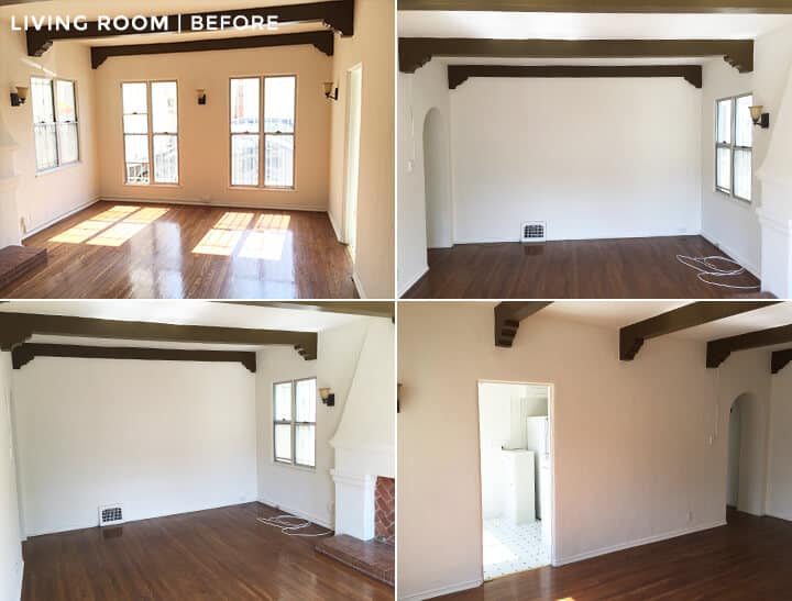
When I first moved into my space I knew that I wanted to do something dark, moody, masculine, and slightly modern. I also knew that I had loads of natural light, as you can see from the pic below. It is a 1920’s Spanish style with high ceilings, floor to ceiling windows, and lots of original charm and character. So, I thought that it would be the perfect opportunity to go dark. I wanted to find a paint color that was a true grey, one that didn’t have too many undertones of color bleeding in. You know, more ‘silver fox’, less ‘just for men’ – if you don’t get that reference then let’s just move on to the room.

Greys, I quickly found out, can be very tricky. Some look blue, some look purple, some look green or brown, and some look any combination of the aforementioned. Grey is one of those colors that seems to absorb from every other color around it, so depending on what else you have going on in the room it can go so many different ways. Which for some rooms is an asset, but I didn’t want my room looking a muddy brown or a periwinkle purple so I was on the hunt for just the right grey. Picking out a grey is about as easy as picking out a white, meaning not easy at all. They all look grey when in the paint deck or by themselves, but when you start seeing them in the context of your room or next to other seemingly grey objects, you quickly realize how many shades of grey there are.
Step one in finding my perfect grey was heading to a paint store (or 5) to pick out some paint chips. In reality I wouldn’t have gone to 5 different stores but as I wanted to make this as informative and helpful as possible for someone else trying to pick the perfect grey, I figured it would be best to include the best greys from a handful of different paint retailers – Therefor giving every brand a fair chance at my heart (or my living room walls).
Once you have picked out a handful of your favorite paint chips, have your paint store mix up sample pots of each of those colors. They run anywhere from $2-5 dollars per pot depending on the brand, and that $2-5 dollars is money WELL spent. (Side note: give them a call ahead of time and ask them to premix them for you. You would think it is fast to mix 15 pots of paint, but I assure you it ain’t so quick – I sat there trying to chat to the paint store clerk about the mall, boys, clothes and even threw in some politics because I was SO bored during the next hour and half. . . he wasn’t having it).
Some people open up all those pots and paint directly on the walls, but I choose to just use some large sheets of paper to paint on. That way I would not have 50 shades of grey to try and paint over on my walls (see what I did there). Also, this way I could move the papers around during the day to see the way the light picks up the color on different walls as well as try it next to certain pieces of furniture and surfaces in the room.
An hour or so later and I had all of my favorite paint samples on paper and on the wall.


Top Row Paints (L to R): Kendall Charcoal | Charcoal Slate | Dolphin | Secret | Amherst Gray | Whale Grey
Bottom Row Paints (L to R): Elegant Charcoal | Seal Grey | Dior Grey | Overcoat | Cinder | Nobel Grey
Don’t mind the old Ikea couch that is being used temporarily while my new sofa is on it’s way. I taped the size of the new sofa on the wall to help me plan around it. But, please DO notice a sneak peak of that stunning credenza that arrived from CG Sparks (one of my favorite stores that I always used to find myself in when I lived in Utah).
I sat and stared at these colors for the next couple of days (and nights) to see which one I really liked. Paint color, especially dark paints, look COMPLETELY different at night than they do during the day. In simpler terms, it’s like when you meet a guy out at a bar one night and you think you have found Mr. Right. His hair looks nice, his teeth are white, and his jaw is perfectly structured. Then you go out with him during the day, and it’s like “WTF was I thinking”. He looks shockingly different in the daylight – so is true with paint colors. So I will repeat myself. Check out your paint colors during both morning, mid-day, and evening light. It WILL change quite a bit, and you don’t want to end up with the heinous grey that has thinning hair, yellow teeth, and no jaw line.
I narrowed my favorites down after a few days of mulling it over, and I have rounded them up for you below. I always love to see how paint colors look in other people’s rooms. It gives you an idea of how it could possibly look, but also how different the paint color can read in different rooms, which again is a lesson in why you can’t pick out your paint color by just selecting a paint chip at the store and grabbing a gallon and slapping it on the walls one evening.

Elegant Charcoal by Glidden: This one is tricky, as on my wall it looked very much a true grey without too much of any other colors bleeding in, however in these two photos both the rooms have slight hits of a chocolaty brown in it if the light hits it in the right way.

Kendall Charcoal by Benjamin Moore: Definitely has been a long time favorite of mine. I like that it has some depth to, and can go a variety of shades depending on what you place next to it as well as the amount of natural light it has. In the picture you can see that without a lot of natural light it is a deep charcoal color, whereas on the right it leans a bit more greenish brown.

Charcoal Slate by Benjamin Moore: Very similar to Elegant Charcoal in color, however, it is a slightly darker and more rich color. It also had slight hits of blue and darker grays when in my living room. (bathroom photo by: Edmund Barr via Our Humble Abode)

Amherst Grey by Benjamin Moore: Similar in color to Kendall Charcoal, however, it exudes a lot more green undertones in the light.
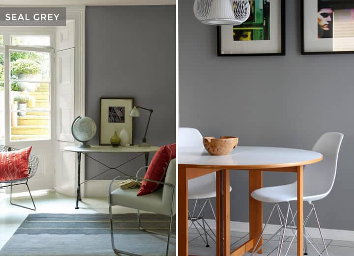
Seal Grey by Glidden: This is definitely the lightest of my favorites. This one is probably also the most true grey of all the above. It doesn’t really have any undertones of different colors so it was a good possibility for my living room.
At this point I am pretty sure which one I am going to go with, but as it goes with Mr. Right you gotta introduce him to your friends to know if he will really get along with everyone (in my case that means my sofa fabric, drapery fabric, and a few accent colors I am throwing in). Come back soon to see the next installment in Is Brady Still Single?, I mean, Makeover Takeover. Until then, I’m headed back to the paint store to give that paint clerk a second chance.
xx
Brady
Don’t miss a single Makeover Takeover post: Brady Picks A Sofa | Sara Updates Her Childhood Bedroom | Ginny’s LA Living Room
Oh Brady,
You’re so cute, but – can you ask someone to copy-edit how you use apostrophes? (Or, as you might say, apostrophe’s?)
I was just going to suggest the same. Love the grays, but the misused apostrophes (including in the title!) Hurt my grammar-loving heart….
I know, but if you read this blog, you have to let it go. Grammar and spelling mistakes are in almost every post.
Yeah… it’s a problem.
No hate, though! Quite the opposite. Yours is the only blog I read.
YES. This one is so glaring that I felt I could not stop myself from commenting… and you beat me to it! 🙂 I love the content, but the grammar and spelling errors are really distracting.
Yes! I was going to say the same thing. Actually even more than having a copy-editor it would be really beneficial for Brady or anyone else with this problem to learn when to use and not use apostrophes. The rules are fairly simple and once learned it’s very easy to get into the habit of using them correctly without even thinking about it.
I didn’t notice the apostrophes. I was too distracted by that paint brush that looks like it’s been through the garbage disposal. lol.
Omg THANK YOU for saying this; I’ve been wanting to say it because it bothered me so (I know Emily studied writing/literature or something like that in college?), but didn’t want to be THAT guy.
APOSTROPHES, guys. …Not used to pluralize items, or in LAST NAMES. Like, “welcome to the Henderson’s” KILLS ME. Unless there is one dude at your house named The Henderson and it is his house.
WHOA guys. . . It’s not a book, it’s just a fun daily blog post.
I just like how everyone wants to let the rest of the readers know that they noticed it too, like one comment is enough, the rest of the world doesn’t need to pipe in with “I know it’s already been pointed out 5 times, but for the record I saw it too!”
Hey guys, we’ve had 4 different copy editors over the years. They either a.) Don’t catch enough, or b.) Don’t want to be on call 24 hours a day. Right now we don’t have anybody, so I’m sorry!!! Many people think they want the job, but nobody really wants to work at 5am for 20 – 40 minutes (which is often what the need/ask is). We normally finish the majority of the post the day before, but then there are always edits, and those edits often don’t get edited by the copy editor because they are done at 5 or 6am right before it goes live. Typically each of us read through the posts, but sometimes we don’t (like today) and mistakes, like the apostrophe, slip by. Then we edit and it’s fine (although many of you get the post via email and it can’t be changed which is a bummer). But I’m sorry! I know that I have pet peeves too, and I don’t want it to be something that distracts people that much… if anybody knows anybody that wants a 5 hour a week job at 5am please let us know …
Exactly, it’s the perfect gray not the perfect grammar. Lighten up people.
here here!
Hear, hear Not here, here. As in “hear this, people of Rome”, not “Come here, people of Rome”
I hope the above “here, here!” is a typo. Enough distraction for one blog post, eh?
Since we’re nitpicking, the example you gave actually is possessive, and therefore would require an apostrophe. However, that apostrophe belongs on the outside of the s, to identify that it is the plural Hendersons and not a single Henderson, as in “Welcome to the Hendersons’ [House].”
That was supposed to be a reply to J.
Dear Nitpicker, I don’t disagree with you, but in the colloquial sense, a sign on the front door of a house may say “The Hendersons”. NEVER “The Henderson’s”, and “The Hendersons’ ” only if you want everyone to know that you are, in fact, the OWNER of said house. lol.
Thank you, Emily, for everything you do and bringing us bananas-crazy-amazing content EVERY DAMN DAY, which cannot be easy.
That being said, I don’t think these comments weren’t made to be “negative” or “nitpicky” (both mentioned), just something we’ve noticed that made us a little distracted from the sheer gorgeousness of some posts. That’s all. No “negativity” here. Everyone is still OBSESSED with Emily and every step she takes, myself included. xoxo.
I’ll be your copy editor, Emily and team! I love your site and your work.
You could find a friendly Londoner for your copy editing job. At 5.00am in LA it is 1.00pm in London – much more sociable. I’m in Australia so the time zone works against me, otherwise I would have volunteered.
Skip the copy editor, and each read the short book “eats, shoots and leaves”. It should solve the problem 🙂 xx
HI Brady,
I loved this post. Grey is my absolute favorite when done right. It’s the magical background that makes everything look great. I can’t wait to see the finished room. Also, I love your writing style. Fresh and smart.
Great post, Brady! The paint store clerks at my local Ben Moore LOVE to chit-chat! HA! Sometimes it’s difficult to get out of there….
But, back to your actual colors– I tend to avoid very dark colors because I live in the extreme Northeast surrounded by forests so light is fleeting here esp in the winter. I would go with Seal Grey… It’ll be fun to see what you do next. Thanks for sharing!
I am so in love with grey paint! It’s so pretty and looks so great with white molding and silver accessories. I love the look of the darker ones, but in my home, I’d probably go with a lighter grey.
~Krisztina /
I love them all. I really really love gray. I probably have too many shades in my house. Not that you need another option, but I have Chelsea Gray in my bedroom and on the interior or my front and back doors and I LOVE the color!
Oh noooo, I love it how it is. White! But I guess I’d choose seal grey so it won’t be soo dark in there. But as a whole, from the grey choices, Kendall. Maybe it would work. I don’t know.
Love the blog, and this is a fun article, but some copy editing would go a looooong way. There are some pretty egregious plural/possessive errors in here that really break up the flow of the piece. Again, not trying to be mean, just some constructive criticism 🙂 Good luck with the hunt for the perfect grey.
Love all the options – I’ll probably be using your gray suggestions in the near future!
I also love your writing style! Can’t wait to read more from you and the rest of the gang!
Great article and beautiful living room! However, apostrophes are used incorrectly throughout:/ (Gray’s in the title should be Grays, and it is spelt differently in the text [grey] than in the title, etc.) The Communications major in me had to point it out. Thank you for the great piece though!
And by Gray’s in the title I meant “Pick’s”, apologies.
spelt? isn’t that a grain?
How exciting!
I love this kind of post, it’s so helpful! I think I’d go with one of the darkes shades, but it’s tricky…
Will you show us the end result?
xxxx
Thank you for this post! I painted my living room gray a few years ago and totally wish I could have read this post before doing that. I was totally unaware of how complicated it is to pick a gray and ended up repainting after the 1st gray I chose turned out way to blue. I still am not thrilled with the gray we ended up with, and reading this post before hand would have helped me think through the various options better. So thank you and please post this back in time so I can read it 4 years ago. 🙂
My husband and I had the same problem with finding the right gray for the nursery- so many were too blue! Our doors and trim are all a creamy and warm white, so I felt it was important that the color we ended up with be a warmer grey as well. Was curious if Brady would support that logic, or not. I wanted to add, that after the third trip to the paint store it dawned on me that we were picking from the same vertical row (or ones right next to each other) and I think that is why they kept being so cool/blue. I took some chips from the other side and finally got the warmer or more neutral color I was looking for!
When you paint a sample on a piece of paper with white borders, it’s hard to get a sense of what the color actually looks like next to wood furniture or other non-stark white materials in the room.. I generally paint it all the way to the edge and then hold the paper up next to the other surfaces so there is a more realistic, non-contrasting picture of the real result! And yes, the grammar and usage on this entire blog is pretty lacking… but I just love you guys 🙂
I find it weird, he only “lightly” brushed them onto the white papers. Because nobody is gonna paint their actual walls by brushing it lighting like what he did.
*lightly.
I’m eager to see how your living room turns out cause dark-moody-masculine is a look that I’m very drawn to lately!
When I was choosing a dark moody gray for my house I had the same concern about it having some undesired undertone that will affect the way it looked under different types of light. What I did then was creating a true gray in my computer (I think I even used WINDOWS PAINT!) and used the color matching tool of the paint retailers to find which of their grays was the one I’d previously chosen. After that it was a matter of deciding how dark I wanted it to be. Now I can say that I’m very pleased with the result of this method I made up.
clever Fredrico!
Loved your post, Brady, and I did get your reference to “Silver Fox vs. Just For Men.” Grey paint is my obsession! I have used various shades in several houses (mine and friends) and understand the tiny nuances of that wonderful color. My opinion leans toward the Seal Grey for the purity of grey color it gives off. But I’d love to suggest you have a look at Plymouth Rock by BM. I’ve used it several times in spaces and men love it. Its a great neutral grey during daylight but gets super cozy at night. Good luck and I can’t wait to see your finished room!!
I used Kendall Charcoal in my powder room… love, love it…I’m in FL so it tends toward brown/green with our light
I love gray! We recently repainted our entire home. We put up the sample wall of grays just like this & mulled it over for a week. We finally picked one & had the painters go at it. I hated it! The tone we chose did not work in a large scale…it turned almost periwinkle in the afternoon/evening. We tried again & went with Stonington Gray by BM. It turned out fantastic! Sometimes it takes more than one try to get it right I guess 🙂
We use Stonington Grey, too, and adore it! It’s a perfect grey in all lights!
Majority are going for the seal gray because they like lighter grays. Seal gray is harsh and very cold at least on the inspirations you’re showing. If you like it then explore lighter grays (that may actually be a good idea; See other EH projects when she repainted a dark room with a lighter color). As someone who likes dark because they do give character to the room and they take the room to a completely different level, I would consider Charcoal slate, Kendal charcoal, Amherst gray, and Nobel gray. The final decision would depend on the undertone I like or don’t like. I wouldn’t accept green, muddy, or harsh white/gray undertones.
Brady,
Don’t mind everyone with their corrections on your use of apostrophes. This is the only blog that I follow that puts out quality informative content almost every day, no fluff. With that type of production schedule, mistakes happen and things are done quickly for the benefit of the reader. One person commenting, fine I can deal with that. Everyone jumping on the bandwagon…really, is it necessary?
Also, I love the Kendal Charcoal selection, it is beautiful. I am excited to see how the room comes together.
-Kelsey
Yep, what Kelsey said.
I sooo agree! The EH team puts out the best interior design content. I’m so thankful for all the amazing posts! For every negative comment, just remember that there are probably 200 people who loved the post but didn’t feel the need to comment (that’s usually me).
Brady, thanks for a great post! I’m so excited to see this darker color palette develop. I love me a white room but it seems like everyone is defaulting to that nowadays.
Exactly Hannah, Ugh I can’t stand the superiority complex some people have when reading “free” content. If you want something perfect, go buy a home design magazine.
I also agree with the dark palette comment, it will be a great departure from the sea of white lately.
Can’t you just switch apartments with Ginny? Seems easier, haha.
I see all of your inspiration photos are of rooms with a lot of paneling and molding. I’m looking forward to seeing how the gray looks in the more pared-down Spanish Colonial style room.
Finally someone who understands my pain when it comes to picking out the right shade of any color. I will have 18 swatches up on the wall of very different shades of the same color and everyone else who walks through the door says why so many swatches of the same color? I’m like, are you color blind dude?
Brady, I cannot wait to see how this turns out. It will be a fun departure from the other makeover takeover rooms! Excited to see what grey you go with, as I have long been a fan of the color but been too scared to do it in my own house.
Loving this post and your tips! Didn’t even notice the couple apostrophes in the wrong places.
We used the BM Dior Gray in our front room/dining room. The walls have a lot of white paneling though, which helps mitigate the dark color. I love it, but I will say that when we put a picture light up the gray turns a little dark purple in that direct light.
For lighter grays – everything kept turning baby blue in our living room. Several people recommended BM Stonington Gray but even that went blue against the table lamps that are cozied up to the largest wall. We went with BM Covington Gray instead and, at least on our walls with our lighting, it stays a beautiful dove gray without going blue or green.
Brady! I love your writing! I knew that if anyone could spin a hilarious tale out of picking the perfect grey, it would be you! And while I’m on the topic of your writing, I miss your “behind the scenes” column! Bring it back, please?
Agreed! The Brady BTS posts were great! Even if they were in need of a little copy-editing. 😛
I’ll copy edit posts for ghetto cheap. I can’t handle how many people commented on the grammar in this post – it’s not such a big deal. This blog is beautiful, and if you want amazing content you have to recognize people are human.
Still love you Brady, and def appreciate the overview of grays. That Kendall Charcoal slays me.
Just hear me out. While seal grey is nice and clearly the winner, I really like Amherst. It looks soft, elegant, and yes I like the green undertones. Seal is a bit too unfinished cement looking for me. Plus I just painted a room a lighter grey and it often looks lilac-ish. Take this with a grain of salt. Just fun to give and opinion and see the results. You will rock it!
Dear Emily Henderson, if the only problem you face while posting literally days after having a sweet (second) baby is a misused apostrophe – then I’d say you’re well on your way to be an even bigger success than you already are! 🙂 I am astonished by these rude comments and am inclined to remind everyone that the golden rule isn’t about grammar. Keep up the fabulous work and don’t let the naysayers bring your team down.
Go with your long term beau: Ken Doll Charcoal. You already have admired him from afar and now it’s time to get him behind your couch.
This is the best name ever, if I go with that grey you know I will be stealing that pun for the post 😉 I think I am a big fan of Ken Doll as well, but we will see which color goes up on the walls. xx – B
You guys need to chill out about the grammar. I’m a creative too and can’t spell for sh*t. We can’t all be good at everything. Great post, can’t wait to see what you go with.
Uh… really? These punctuation comments are hilarious! Love my greys/grays ? (not the ones on my head!) I’m thinking Charcoal Slate. Keep up the errors..makes you more relatable ?
Brady, when did you live in Utah?? Did you ever shop at the Green Ant? That’s a favorite of mine, too.
I was actually born and raised in SLC! I miss it and those snowy winters, but I can’t complain about the beach and sunny weather here. I LOVE the Green Ant and so does Emily, she actually purchased her safari chairs that are in her living room from there.
You’re kidding me?! I can’t believe she scored those chairs at Green Ant! I had read in an older post that she got them in Utah when she was out here for a conference (Alt Summit I think?), but I thought she must have picked them up in Park City. Now I’ll have to stalk their inventory even more than I already do.
We got a little bit of snow in the Wasatch this week. It’s very perdy.
Good gravy Brady! You hit that nail on the head, and how did you know I have been researching grays for months?!?? The struggle is real to find a true neutral…our last house ended up going light blue…oye! A good gray, like a good man, is hard to find, huh? Excited to see what you pick!
Jen – can I get an amen?! Hopefully some of my research will help you out with your place. Let me know how it turns out. xx – Brady
Thanks for doing the dirty work on the gray research for the rest of us, Brady!!
I agree with both sides of the grammar issue: I find grammar errors annoying, but I can overlook it because of the great content. That said, I would like to suggest that you find a Midwestern or East Coast copy editor, because he or she would be on call at 7 or 8 am–a more reasonable hour to rise than 5.
And if you are serious about finding someone good, as opposed to picking someone at random, create a post with a lot of errors and email it to all interested people as a test. But send it at 5 am and require it be returned in one hour. Then compare the results!
Great idea, Emma. I’m on the East Coast and am happy to take a copy editing test at any time of the day or night if the prize is a gig on the EH team.
PS Emily: Please don’t take the absence of exclamation points as a lack of excitement or interest. It’s just that we copy editors don’t believe in using them willy-nilly (I believe this one is justified)!
I, too, hard a hard time with choosing the correct grey. I finally decided on Techno Grey by SW. Love how the guest room turned out. Can’t wait to see what you decide.
I’m willing to be a copy editor! And, live on the East Coast…and awaken very early.
Hi Emily and Brady: These grays are great! Gray just seems magical to me. Depending on the time of day, grays change so much that it feels as though five colors have been rolled into one. Amherst Gray is a favorite for my furniture business. If you’re interested, take a look at this dresser. It was shot in the middle of the day.
Greys are so hard – so many samples I bought home had hints of pinks in them when painted on the wall. In the end the paint shop added black into the one that was the closest to get rid of the pinks. Good Luck!
I like the Seal Grey best. It’s a bit light, but in a flat finish it would look buttery and sophisticated, IMHO. True neutrals are the best for gallery walls and can be accessorized with any color—so as moods and seasons change, the walls can work well in any situation.
I like the darker grays (US spelling), but they put off too much color. I think I’d want to try those in a glossier finish—then I’d feel as if I were living in an oil painting!
BTW, I’m a professional copyeditor and huge fan. When testing against other professional proofreaders, I scored in the top 1% in one third of the time. I charge standard EFA rates, but since I’m fast, it’s pretty cost effective to choose me. I live in Minneapolis, so that would be 7am my time—totally doable! I’d love to work with the EH team! Querylara(at)icloud(dot)com
@LaraEdits
Emily, I will copy-edit your posts at any time of the day or night. Seriously. Email me!
Love it, Brady! Can’t wait to see the after!
I was kind of leaning toward Cinder before I saw your final choices, but maybe that’s too purple-ish? I would probably personally gravitate to something a bit lighter like the Seal Gray, but of the darker options the Elegant Charcoal is my fave.
Brady,
I appreciate your great attention to detail for design, and especially how you tracked down all the grays to show their fleeting characters during night and day. On another note, I am a college English Professor (with a PhD from UC Berkeley) and truly, I didn’t notice any of the grammar because I was so mesmerized by your message and intention to provide a first hand narrative about your design process. I also appreciate the casual, fun and explorative tone of this blog. Please don’t be paranoid when you write the next blog. I think that the grammar cops have just been traumatized by too much sentence diagramming. Keep up the great work! 🙂
the meticulous, not to say obsessive, time spent on discerning the holy grail of the right grey paint, as opposed to the nearly random placement of apostrophes, is disconcerting. sorry.
Great post Brady! Just wondering where the links are to the example rooms? I really love the bathroom with the arrows on the wall and would like to know more about some stuff in the room.
First of all, we have missed you!
Second, this post is amazing, grammar included!
can’t wait to see what you picked
Do you know all I saw was a great post about grey paint!
I painted my living room grey last year and although I love it, I’m still not sure I got the colour right (and that was after I painted it one grey, only to re-paint over with another)!
Personally, I love the Charcoal grey or the seal grey. Can’t wait to see the finished room.
I might just get a Seal Grey shade for my home office. I am surprised by the color, something that doesn’t have an underlying tone to it. You’re right, Brady, I need to rethink about the grey I wanna use in my home office a.k.a future nursery when and if I get pregnant. 😉
Oh, and Brady, I didn’t particularly sees any grammar error, I’m more about the tone and vibe of the writer than grammar when I read a blog post. 😉 And, somehow this copy-editing thing has helped generated a lot of comments for this post, no?? Hah!
Thanks so much for including an image of our bathroom in your gray round up. I k ow you have no way of knowing this, but the wall color isn’t charcoal slate, it is Wrought Iron from Benjamin Moore. If you want to see more of our bathroom, hop over to ourhumbleabodeblog.com
Just have to say how pleased I am that Emily found a replacement for the (irreplaceable) magnanimous Orlando. I adore the creative voice of a quick-witted man with impeccable taste and a penchant for over-sharing their personal life. Brady is just the right fit and has filled the void that Orlando left in his wake. I can’t wait to read more of his posts!
PS Emily, this is not at all to say that I don’t adore your content… I have remained a faithful daily reader and your voice, of course, is the one that keeps me coming back 🙂 Plus, as a Lady Boss myself I know just how much talent/experience/effort it takes to select the RIGHT team… That’s a FEAT in and of itself!
Cheers to the incredibly talented and well-rounded EH Design Team!
You and Ginny should have swapped apartments since she didn’t want grey and you do 🙂
The bones of your new place (and hers) are so wonderful!
I would totally love the copy editing job of 5 hours per week at 5am each day. My number is 985.778.3176. Email – [email protected]
I am a stickler for proper grammar and punctuation. Hire me to help and we will stop the comments that are so incredibly distracting and frustrating.
Melissa Arnold
Oh, I will totally accept trade of services as payment!
Really enjoyed this post about the challenge of finding exactly the right shade of grey. However, I think it is also really important to consider the colour of your flooring. I painted my walls a very light shade of grey once only to discover it looked hideous with my “inherited” laminated yellowie pine / beech coloured flooring. I think it’s also apparent in the photos of Ginny’s place before she painted it white. In the photo of Seal Grey a white floor has been used.
Re the grammar, goes to show that I was so gripped by the content that the apstrophe use completely passed me by although I did spot an e missing from therefore. It’s strange how my dyslexic brain works.
I used Benjamin Moore’s Galveston Gray in my living room (after trying Cinder, which read way too blue). Love it!