
Uncategorized
You Asked For It: 5 Color Palettes To Freshen Up A Tired Honey Oak Kitchen (UPDATED!)
Hello again, EHD universe. It’s Arlyn, and I’m back with MORE HONEY OAK KITCHEN content. The reader help post (check it out here if you want to see their real kitchens!) exploded with popularity, and many readers asked in the comments for actual mood boards and color palette ideas to help them refresh their dated kitchens without demo or painting cabinetry. So, because I can’t help myself from fake shopping and putting together simple design ideas, I got to work building five ways I think anyone can help breathe some life back into their 1980s or ’90s-bedecked homes.
For each color palette idea I cooked up, I have some *loose* inspiration because, listen, it’s not easy finding good photos of older kitchens that have much to pull from them. Every photo I include here has warm oak-ish cabinetry that you have to make the mental leap with a bit, but the key is working with the warm, heavily-grained yellow/red/orange tone of this wood type.
Another thing you’ll notice is that most of the kitchens below have white countertops, which, in my personal opinion, is a massive help to lighten the load of honey oak. Not a single kitchen submitted to us (including some of the ones we didn’t show you) had white stone counters. Most had either some yellow-tinged Formica or a dark brown, gray, or black granite. The same goes for flooring. Beautiful flooring goes a long way to making basically anything look good, so anyone looking to take real action in their homes will need to consider what they’re working with or cover/replace if it’s in their budget and something they want to do.
As for the individual pieces I’ve included on each board, it’s less about the exact product and more about the idea behind the product. Not everyone will need barstools, but those play the role of what color dining furniture would work if it’s included in your space; it doesn’t matter if your window coverings take the shape of cafe curtains or Roman shades but the fabric and hue shown is a good jumping-off point; and any tile, paint, hardware or rugs could happily live in the tonal range shown on each board.
Alright, so now that I got my disclaimers out of the way, let’s dive in and explore some concepts I sketched out that honestly, make me kind of wish I had a honey oak kitchen to transform (though I may be biased…).
Honey Oak Color Palette To Try: Cool Neutrals Like White, Marble & Black
The Inspiration:
The above inspiration is all about keeping the heaviness of the oak below your sightline and ensuring that anything above that is white and airy. The example from deVOL leans a bit warmer, but a peek of a black and white mosaic floor tells me they are also using black to ground the material choices.
Don’t be afraid to bring in some color via accessories like vases, cookware, cookbooks, dishes, and glassware, etc., as long as you keep the base choices monochromatic.
The Moodboard:
Cool neutrals paired with crisp whites and sharp blacks are the path of least resistance for *any* honey oak kitchen, no matter the undertone of your cabinet. Marble or white tile, flowy linen curtains, white shelving, black furniture, and accents…it’ll all make most people happy and make the room feel like an entirely new space.
Make sure that the backsplash pairs well with the white color you choose. If you go a bit warmer, a creamier marble or tile would work best; true white would be great with slightly bluer undertones of marble.
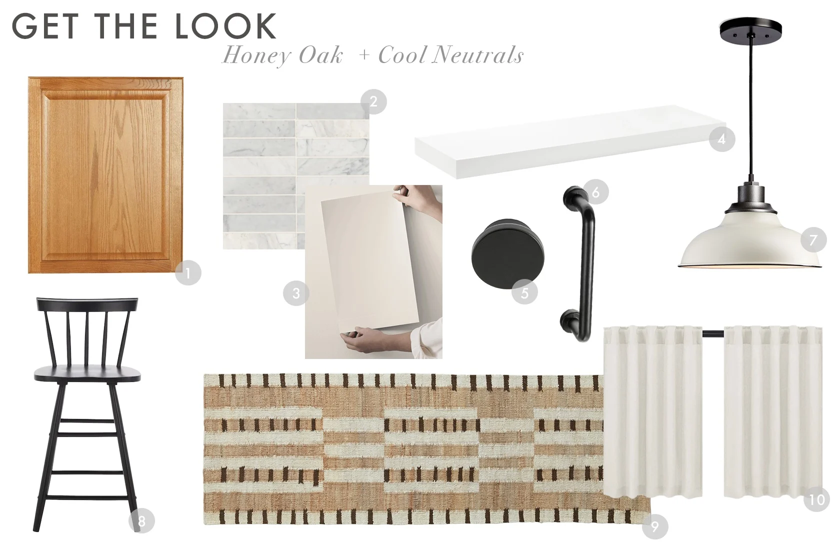
1. Base Cabinet Decorative End Panel in Medium Oak | 2. Monet 2″ x 8″ Honed Marble Decorative Tile in White Carrara | 3. Alabaster Paint Sample | 4. Big Boy Floating Shelf | 5. Oversized Ethan 1 5/8″ Diameter Round Knob Multipack (Set of 10) | 6. 3″ Center Bar/Handle Pull Multipack (Set of 6) | 7. Carson 12″ Cord Pendant in Matte Cream | 8. Black Counter Height Wood Bar Stool | 9. Tempo Flatweave Runner | 10. Linen Blended Tailored Semi-Sheer Short Cafe Curtain (Set of 2)
Honey Oak Color Palette To Try: Warm Neutrals & Natural Materials
The Inspiration:
A very solid design choice, no matter what room you’re in, is to lean into what you have. In this case? Play up the warmth of the oak, instead of trying to counteract it. Take that kitchen from The Design Files directly above. They could have easily used a bright white tile, but instead opted for a (non-yellow) cream. And in the kitchen from deVOL in this group of examples, the walls are a welcoming, glowy, buttery hue. Again, the key here is to avoid using anything on the walls that could go too yellow.
In fact, if your honey oak is more yellow than it is orange or red, this may not be the route for you (your kitchen will better jive with the blue or green moodboards below…keep reading).
The Moodboard:
This look plays up warmth. I picked a shade from Benjamin Moore, Soft Chamois, which they describe as “A soothing white with a warm, delicately shaded cast,” and I think it would be quite lovely with oak. Not everyone likes bright white spaces, and a shade like this would be beautiful in a kitchen that gets great natural light.
A tile to match the wall paint would be nice, but I opted for a creamy mosaic with sand-hued diamonds to borrow color inspiration from the wood. Antique or unlacquered brass hardware would blend in with the cabinetry while still giving them a bit of an elevated touch. And for the pieces to round out, a rug with some pink and brown would shake things up just enough that the design is interesting without adding too much contrast, and natural materials like wicker, leather, and neutral oak might just make the honey oak feel intentional.
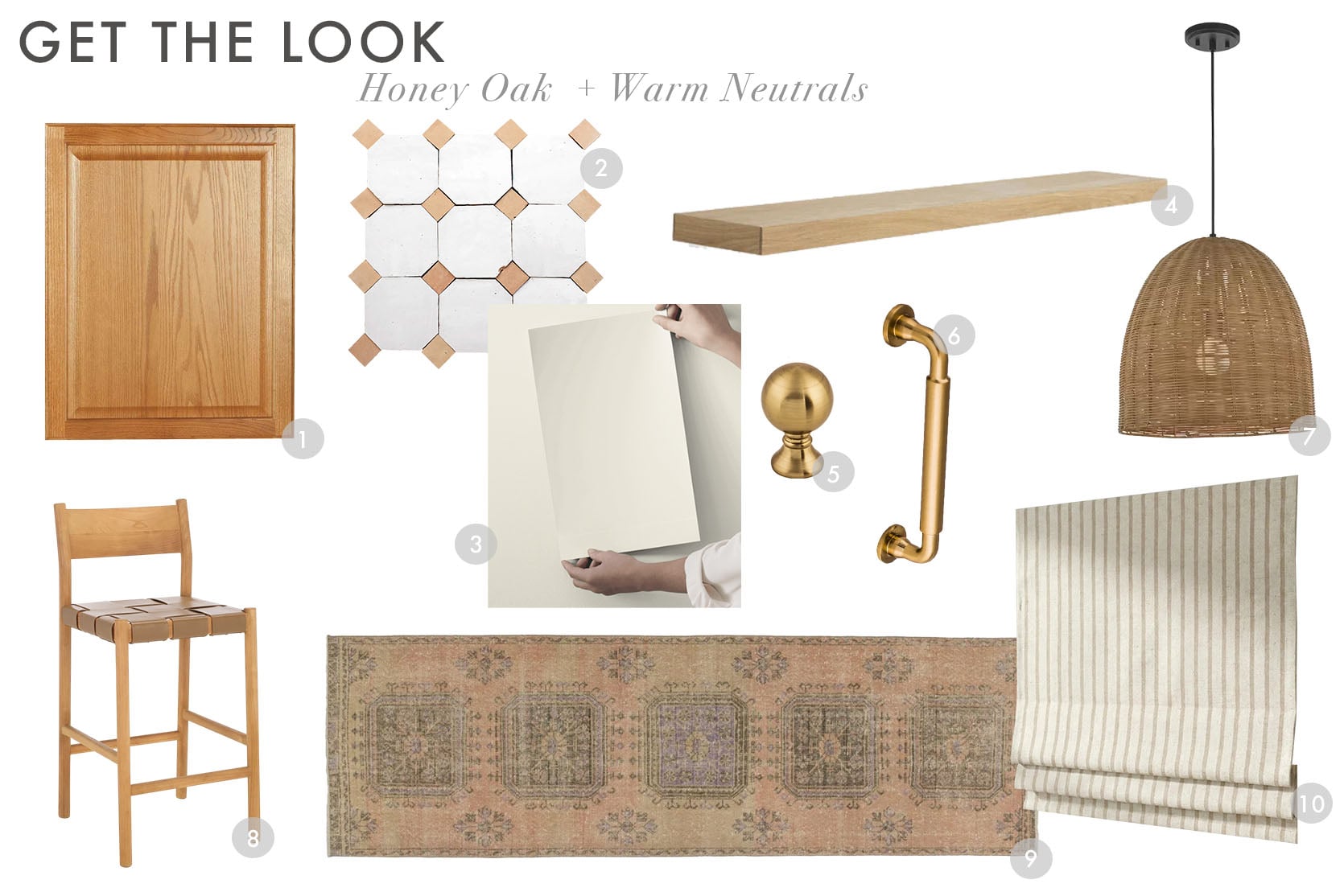
1. Base Cabinet Decorative End Panel in Medium Oak | 2. Moroccan Sea Salt Octagon + Natural Bouchon Zellige Tile | 3. Soft Chamois Paint Sample | 4. Oak Wall Shelf | 5. 1 Inch Round Cabinet Knob in Honey Bronze | 6. 5-1/16 Inch Handle Cabinet Pull in Honey Bronze | 7. Island Pendant with Natural Rattan Shade | 8. Woven Leather Counter Stool | 9. Savelle Vintage Turkish Runner Rug | 10. Beige Ticking Stripe Linen Roman Shade
Honey Oak Color Palette To Try: Green, Rust & Gold
The Inspiration:
As much as I love the neutral path, the green route is my favorite. That’s no surprise to me, being that I tend to prefer analogous colors over complementary, as it’s more interesting to my eye. But the great part about this is that green works with either yellow-toned honey oak or red/orange-toned honey oak. I picked a cool (toned, not “hip”) sage and a darker green with blue undertones in my moodboard, but you can play around with those to best suit your exact finish.
If your cabinets are warmer, go with a cooler green and vice versa, though the bathroom above from Montér Minde Kjøkkensenter pairs a warmer green with a fairly yellow wood tone, and it works so well so…maybe any green will work here, no matter what you’re working with. 🙂
The Moodboard:
Green and gold is a gorgeous combination, so gold would be my pick for any finish in hardware, lighting, and fixtures. And because I think keeping the contrast at a minimum is a good idea in a kitchen with honey oak cabinets, try to find a window covering and any seating or table in a material that closely matches the tone of the door fronts. A little pop of rust, pink, or red in a rug rounds things out to my eye.
One note for the paint color below. I don’t necessarily think I’d like that on the walls (a warm white like Benjamin Moore Pale Oak or, you guessed it, White Dove), since I’ve seen photos of people who went with a dark color on the walls to “modernize” their honey oak (too much contrast to me), but if someone has, say, an island or freestanding furniture piece in a wood tone, painting it in a similar green would be quite nice.
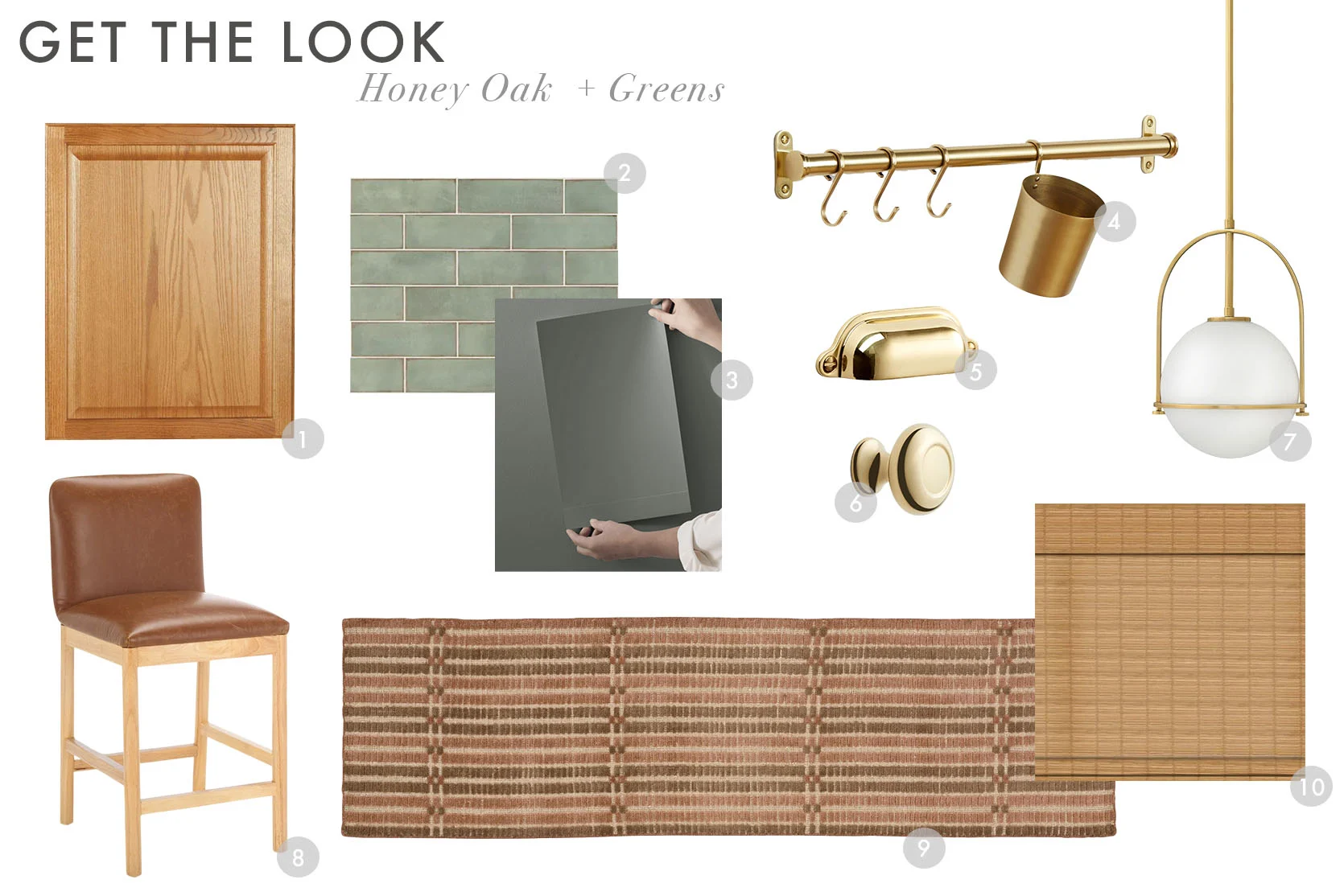
1. Base Cabinet Decorative End Panel in Medium Oak | 2. Santa Fe Green Polished Ceramic Wall Tile Sample | 3. Pewter Green Paint Sample | 4. Brookside Rail System | 5. Vernon Bin Pull | 6. Howell Cabinet Knob | 7. Somerset Pendant Light | 8. Madsen Vegan Leather Counter Stool | 9. Leah Hand-Loomed Rug | 10. Natural Cordless Woven Wood Shades
Honey Oak Color Palette To Try: Blues & Warm Neutrals
The Inspiration:

Look familiar? Ugh, what a dream space Emily created here in her Portland farmhouse kitchen. While of course her kitchen is a far cry from honey oak anything, I thought it would be a great example to show how well light, dusty blues would marry with a honey oak that’s a bit redder. Orange and blue are complementary on the color wheel, so they just work because color science says so. Cool balances warm. Simple.
The Moodboard:
Such a breath of fresh air, huh? This hand-glazed tile, in a classic square, is a great chambray blue and just so good-looking. I would love to see it in a kitchen where the uppers were removed (or at least some of them) so it could go either all the way up the wall or to the bottom of a top floating shelf. What a showstopper that would be while still feeling quiet and calm. This blue paint leans a bit green, which works so that nothing feels overly same-same, and again, maybe not for the walls, though if you like that vibe, go for it.
I opted for polished chrome hardware and a white metal shelf to keep things in the “cool” arena, rather than going warm with brass or more wood. As for the stool, a cognac leather is a nice monochrome moment with the cabinetry, but then a darker walnut lifts up that lagging honey oak. A rug with slate and reddish accents is the perfect addition underfoot to make everything come together nicely.
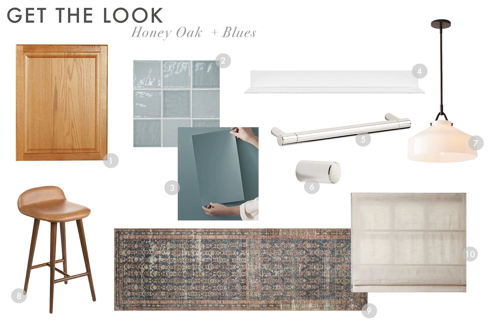
1. Base Cabinet Decorative End Panel in Medium Oak | 2. Marin Ceramic Wall Tile in Misty Blue | 3. Mediterranean Paint Sample | 4. Tromso FM 3 Steel Floating Shelf | 5. Modern Flat-End Polished Chrome Cabinet Drawer Bar Pull | 6. Modern Flat-End Cylinder Polished Chrome Cabinet Knob | 7. Henry Pendant | 8. Sede Toscana Counter Stool | 9. Amber Lewis x Loloi Rug | 10. Jawara Linen Cotton Roman Shade Cordless
Honey Oak Color Palette To Try: Subtle Earth Tones
The Inspiration:
I may have started with the easiest sell (cool neutrals), but I’m ending it with perhaps the hardest sell. This one won’t be for everything, but I love it as I’m firmly in my earth tones era right now. This inspiration is the most alive and “now” of the bunch, but perhaps the hardest to pull off. All the colorblocking of burgundies, rusts, terra cottas, and (surprise!) blushes above—like in that dreamy kitchen from Zia Tile’s feed designed by Francesca McConchie and bathroom by Meet West—are so good. R & M Bespoke’s kitchen is a wild card, for sure, but I couldn’t help but share the drama and bravery of a rich, dusty pink hue on the walls and ceiling.
The Moodboard:
The key to making earthier tones work is employing white as an accent, rather than the other way around. Creamy white tile, reflective polished nickel, milk glass lighting, white shelving…it all is the perfect canvas for going with a peachy or pinky wall color. Throw in an earth-toned rug, and well…when can I move in?
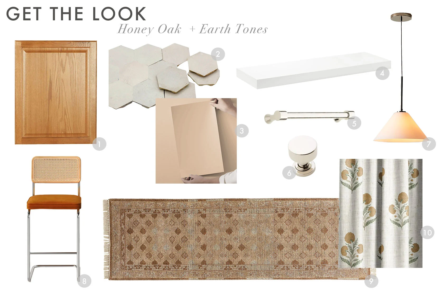
- Base Cabinet Decorative End Panel in Medium Oak | 2. Terra Cotta Honeycomb Singular Wall & Floor Tile (Set of 48) | 3. Terra Bella Paint Sample | 4. Big Boy Floating Shelf | 5. Strasbourg Solid Brass Cabinet Pull | 6. Colmar Brass Cabinet Knob | 7. Sculptural Cone Pendant | 8. Walsh Bar & Counter Stool (Set of 2) | 9. Lance Hand-Knotted Light Brown Wool and Nylon Performance Runner | 10. Poppy Block Print Floral Custom Curtains
How’d I do? Was this helpful to round out the honey oak kitchen story from before? Which one of these speaks the loudest to you? I honestly really love them all for many reasons and think each has its merits depending on the tone of your cabinet (for the record, I wrote out the word “tone” 15 times in this article, so sorry for the overload…it’s just important when discussing wood). And since paint can be so hard to figure out without seeing it in the space with those honey oak cabinets (or any other wood), we definitely recommend Samplize!
See you in the comments.
Your friend in design, Arlyn


The red chequered floor with the oak and the pink tablecloth is gorgeous! I’m actually less keen on the blue/green than I expected; the toning colours are speaking to me. If anyone does revamp their old kitchens with these palettes I’d love to see an update post showing what readers managed to do with all the advice!
This is so helpful! Thank you, thank you!
Thank you so much, this was so helpful! I’m really digging the greens, or the warm earth tones. Although it’s making me realize my problem might be the counters even more than the cabinets – eek.
This was such a lovely post! I know that honey oak is such a huge percentage of American builder grade 2000s-ish kitchens, thus a fair percentage of your readership, but I wonder if you could do a similar group of posts for dark wood kitchen?! I may, cough, be asking for selfish reasons.
While just one small example, I was really inspired by Caroline Winkler’s “lazy girl” kitchen makeover video. Her cabinets are more cherry, but they’re dark and the tips are good! YouTube link!
Love! These posts feel affirming, empowering, creative and compassionate. Great work. I have a dated farmhouse kitchen that I’m trying to boost. The Uncommon kitchen book (mentioned here) was also so helpful.
going to copy the green board in my kitchen! love this 🙂
Wow! You re so talented and this post is so helpful! More content like this, please!!
Love this! Please, please, pretty please give us the same help with dark espresso kitchens. Bonus if you could throw in a dark brown, vivid granite countertop! This was the trend that followed the honey oak and is still installed by builders now.
Thank you for your work! Your content really stands out!
I loved my dark brown dresser close to deep plum (dark mauve) and light mauve walls. All the walls were toned down. If you search for plum walls you can find other accent colors that also work with it. I loved sky blue as an accent with dark mauve and brown furniture. If you don’t like pinks, search for toned down versions of mauve.
What an amazing follow-up–these color palettes seem modern, fresh, and doable. Thanks so much!
Thank you so much! I would love to see more content like this that helps me learn about color and updating my home in affordable ways. I bought my home last year and want to update it but can’t afford major renovations right now. I’ve been reading EHD for 8+ years and it’s pretty to see aspirational content but I would love more of these posts!
More posts like this please. All of these options are beautiful! Well done
Love the earth tones, but they are so verging on light pink that I’m surprised pink doesn’t figure. I think light (not too juvenile, like F&B pink) pink looks amazing with this color wood.
This is amazing, Arlyn. And so timely. We’re three weeks out from getting a new (white!) countertop installed on top of our old honey oak cabinets and we’re trying to make it all work. The pallet we’re aiming for is the first one: whites and blacks–it really modernizes the space. Thank you for all of the work you put into this!
Please share photos when you’re done! It sounds amazing, and would be a perfect follow up. Maybe EHD will reach out to you.
Love this! You did a color scheme with your rental kitchen – could you do more with that darker cherry wood? Would love to see some more options! These are my fave posts as a renter that will quite possibly always be a renter. Thanks!
Oh my gosh, what beautiful example and mood boards! Please consider doing the same for cherry kitchens!
I love that you did this, Arlyn! How helpful!!!!! Man- this should be a regular recurring topic on this blog!
Okay, Arlyn, this is a masterclass!! Kudos. ?
Stellar job.
I’m actually surprised with the warm terracotta and how well it goes with it and tones the orange-y tones.
I’ve been updating our builder-grade kitchen with honey oak cabinets using a black, white & natural elements palette and I’m amazed at how well it is working. We also have the dark granite counters lamented above.
It’s still a work in progress, but painting the walls white, adding minimalist black cabinet hardware, installing a black pendant light over the sink, and accessorizing the kitchen has made a world of difference. One of the easiest things I did that had a big impact was adding a vintage brass ship lamp to the counter. It brings warmth and visual interest to the kitchen.
I love this topic because even though these honey oak kitchens are dated, I think they’re not dated in a bad way. I personally think they’re classic. They feel homey and warm and quaint. I do understand the desire to modernize them though. Love all the suggestions here. Doing neutrals, namely white with that honey oak is my favorite and if you are adding color, I think the green + blue is PERFECT because they’re the perfect balance to the warm wood. Paint and tile and art and modern fixtures + lighting. No need to rip out perfectly good cabinetry. So, I’m our last house, which was a 1950s ranch, the previous owner had updated the cabinets in the early 2000s with cherry cabinets + black granite+ that faux old world floor tile. And painted the walls goldenrod yellow. Completely dated and not in that classic way. Before we moved out, I painted the walls white (BM Swiss Coffee), changed the cabinet hardware to modern black ones to tie in with the countertops, updated the light from a boob light, and added artwork in green/blue/pink/black tones. It was PERFECT for minimizing that cherry wood + black granite look, and saved… Read more »
Wow Lovely, really your stagging was really well done!
?Thanks Deborah!
Lovely….so nice to see your comment. I’ve missed you.?
We revamped our kitchen a few years ago (on a very low budget). I think I stuck with the warm whites and neutrals palette. Changing out the blue countertops and painting the brown walls was a game changer! We installed the vinyl plank flooring right over the laminate.
Wow! What a transformation!
Thanks for the before and after. Nice update.
Beautiful changes that dramatically illustrate possibilities. Kudos!
SO GOOD!!!!!
What a fantastic post! Relatable, educational and beautiful!! Would love to see more of this kind of content on the blog. It is a wonderful counter-balance (and bridge) to all of the aspirational posts on high-end high-cost renovations and redesigns. So glad you are back on the already formidable EHD team Arlyn!
Couldn’t have said this any better! This is a wonderful post, so relatable, and very very useful. So well written and illustrated. Thank you Arlyn!
100% agree!
These are so great!!! Easy to see how a couple changes can make a big impact!
This is an amazing and helpful post! Can we do this same thing with cherry cabinets?
Both Honey Oak posts are so inspirational! Greatly appreciate all of the time and thought you put into finding alternatives to completely gutting perfectly solid kitchen cabinets. Huge thanks – I can’t wait to make some changes in my small kitchen!!
Thank you for this article! I may be way off, but I sorta feel like honey oak cabinets with plain slice wood (not always white washed rift cut) might be on their way back??? That groovy, 70’s, Cali look seems to finding its way in instagram and magazines. What’ya think?
Great post! I’m surprised there aren’t more comments. I love all of these ideas.
Hello, my name is K, and I too have a honey oak kitchen. I think the saving grace is that the counters, backsplash, and appliances are all white. Our kitchen is open to the dining room, so we decided to lean into the light wood and white color story with accents of brown, tan and grey. We found a Danish teak dining table and a pine sideboard table, which work well enough with the cabinet color. Overall, its come together better than expected!
These are some really pretty and inspiring options you’ve compiled. Love that you included some unexpected (to me, anyway) color mood boards that make it very interesting. I think I personally gravitate toward the cool neutrals, but the earth tones are visually exciting! Thanks for more good fodder to noodle around.
Yes to all the color combos. Love them all.
i love this post! Can you do one on what to do with wood trim? So many inspo pics on Pinterest/IG have white trim around windows, baseboards, white doors (though I love that Emily used oak for her windows). Our entire house is full of honey oak wood trim, windows, and doors but it’s in really good shape. I don’t want to paint it white (tons of work, still in really good shape, if painted white it chips and shows dirt/dust), but would love some inspiration for deemphasizing all the wood!
Thanks!
Wow, Arlyn, as an interior designer let me just say—these are beautiful! Thanks for the work you put into these!
I see so much waste in my industry, and absolutely love that homeowners are looking for ways to preserve perfectly good features that are a bit dated, making them beautiful again with some thoughtful design choices. Let’s all get off the hamster wheel of trends and get creative! More of this, please!
Loved this! Finally! Something for those of us who rent and can’t change anything! And——- have 1980’s oak cabinets. They’re in such great shape
Because the owners chose quality in original
build. A girl can dream! These help!
This is wonderful, especially the pink and warm tones! I would love to see a similar article on how to work with white cabinets and/or dark granite countertops.
Oh how I needed this post from 2017 to 2019 (from the time we bought our house to when we actually *tried* to “update” our kitchen on a very very small budget (all in – less than $5k). I searched for articles like this one and didn’t find anything very helpful or in a style that spoke to me. All of the ideas you have listed are beautiful (that green is my favorite)! We ended up removing wallpaper, painting, adding black hardware, and swapping out the tile (“swapping” makes it sound easy, but we installed it ourselves after hiring a demo crew and it was not what I would call easy). I knew the white washed kitchens were on their way out and wood would come back in so I didn’t want to paint nor did we have the money to replace the cabinetry. We opted to go high impact with the tile because our kitchen is pretty small and I love pattern. At the time I think EHD was posting a lot of cement tile and I loved the look. Keeping it in a quiet color palette seemed to work best, so here are the results:
Wow, impressive. Another great story on updates without total reno. Love your floor!
Oh, well done! I initially dove in thinking that reading this post would be an academic exercise for me because my kitchen is not honey-oak. Then I remembered, uh, we just took over an old family home in a town across the country so we can spend time with an elderly relative there. We can’t pour money into that house but minor changes to boost eventual resale? You bet! I’ve bookmarked your post, Arlyn, and will refer to it frequently. Your first color palette helps confirm and better orient my sense of using black, white, and grey. (Also planning hits/pops of deep but bright blue thruout the house.) Thanks1
The #9 link for the rug does not work. Can you fix it?
all fixed! here you go: https://rstyle.me/+KT6NfhZ2xibd7mUabrLJtg
Nice work. Wood is never out of style and I appreciate highlighting how compatible and versatile it can be in our homes.
Thank you, Arlyn, for all these examples and explanations.
I am 100% here for upcycling the existing kitchen if the layout still functions and the cabinets are in good condition. Earth tones are winning me over. It’s interesting to consider the cooler side of earth tones – ochres and umbers, could feel very upscale.
I am planning to update my mom’s honey oak kitchen/peach formica countertops c. 1988. It was all custom built and still perfectly functional. I’m planning to remove some of the upper cabinets/replace with open shelving, tone the wood cabinets with a slightly darker wood stain to knock down the orange cast. White quartz countertops, cool beige tile backsplash, brushed brass hardware and faucet, paint the island base green and replace the table/chairs/rugs. I can do all of it for around $5k, and mom will be thrilled.