Design
5 Interesting (& Fun) Ideas Happening In Design Right Now + Why We’re Not Calling Them “Trends”
For obvious reasons, we write a lot about interior design and home decorating trends. But sometimes, we come across moments and concepts we think are worth exploring that aren’t necessarily en masse the way a “trend” is. For instance (and a bit of a spoiler alert): Swans in home decor are popping up a lot, but by no means do I think that large majestic birds are “happening.” They’re just a stylistic choice someone chooses because they love it. The same goes for the color pink right now. Blush, dusty mauve, and fleshy peach were never out of style—imho, no color is ever obsolete if used in a fresh way—but more and more, I’m seeing designers go all-in on rose.
So, today, I’m diving into five non-trends that I just plain and simply think are fun happenings in the design world worth bringing to your attention. No pomp; no circumstance; no large declarations. Just “Hey, watcha think about this?” conversations.
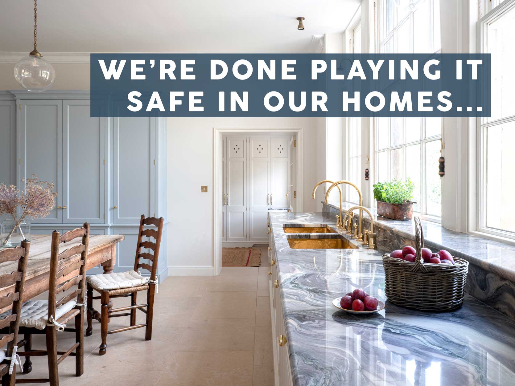
#1: Blue Marble Countertops
Blue marble tends to come off a bit dated when it has the wrong edge finish and in a kitchen that feels overly fussy. It was a thing in custom kitchens in the early 1900s, then again in the ’70s and ’80s, and is definitely making a strong comeback recently, though still quite niche.
Kate Hudson famously picked a vibrant blue, heavily veined marble for the kitchen she renovated in her current home, which also happens to have been her childhood residence. People either love it or hate it, with some critics saying it looks like a cheap pool liner. While it’s not really something I would pick for myself, maybe ever (it’s just not my preference for veining style), I’m all for *her* loving it.
Here is the kitchen (above) that she did in collaboration with Cafe Appliances, which ran in Architectural Digest. Bright white and true blue is a bit high-contrast for my liking, but it’s a classic combination, so while it seems pretty bold, it is tried-and-true to say the least.
This deeper, more gray-blue countertop—the same kitchen from the opening image, a design by Guild Anderson—is more in line with my personal taste. Same result, in that it feels both vintage and forward at the same time, but more palatable and low-key.
A marble with tons of movement mixed with a strong wood grain is hard to pull off, but there is something very cozy and rustic about this kitchen, by Eleanor Roper Interiors.
Moving into the bathroom, a deeper blue marble is easier to work with because you only need a little bit due to the smaller space. I especially love it in a color-drench aesthetic, such as the powder bath above by Decus Interiors.
Coe Mudford Interior Design turned a simple fireplace wall into the star of the room with this soft blue marble slab design. In a traditional white-and-grey marble, for instance, it would have been beautiful but expected, and this choice adds just enough color to be interesting without being pushy.
This bathroom shared by Starel Stones notes that it uses blue wave marble, resulting in a room that looks like you’re floating in the clouds (or sea). I’m transfixed, honestly.
A blue lapis marble is absolutely stunning in this petite modern bathroom by Hunt and Design. Note that they took it above the arch of the mirror to great result.
#2: Saltillo Floor Tiles
In general, welcoming, character-filled interiors and architecture are increasingly desirable, as compared to stark or pristine contemporary homes. And with that, we’re seeing warmer colors and materials more and more. One in particular I’ve been eyeing is Saltillo tiles. Now, you may see what I’ve posted below and think “oh, terra cotta!” but well…not exactly. All Saltillo tiles are terra cotta, but not all terra cotta is Saltillo.
Saltillo needs to be made in Coahuila, Mexico (the capital city is Saltillo) using old-world, hand-made techniques. It’s very durable, naturally slip-resistant, and affordable at around $5 to $6 per square foot, installed. The only downside is that, since it’s a natural, unglazed material, it needs to be resealed every few years, depending on foot traffic.
I love that the designer (Terramar Interiors) here retained the original Saltillo floors in the bedroom that adjoins this bathroom suite, and made them feel purposeful and fresh by bringing in a similarly toned floor in a star and cross brick pattern.
The Saltillo tiles we typically see are square in varying sizes with thick grout lines between them, but this brick-shaped Saltillo from Tiles of Ezra reads way more modern, paired with crisp white walls, a sleek gray pedestal(ish) sink, and ribbed aqua glass.
While this is technically red cotto from Zia Tile, I wanted to show it because we don’t typically see an organic, hand-made floor like this with a modern kitchen like the above by Laun Studio. It’s a good reminder that just because you’re renovating doesn’t mean you always have to tear out everything. Sometimes old lends some gravitas to new.
Saltillo works especially well in hacienda- or mission-style homes. I love it with creamy plaster walls and architectural features like this fireplace in a home by Intimate Living Interiors.
These floors are fantastic choices for hard-working rooms like the kitchen and bathroom due to their durability, which comes from the fact that Saltillo tiles are typically quite thick (about 3/4-inch) and fired at very high temperatures.
Oooh, a picket design! The listing for this home notes that this style is rare, which is unfortunate because it’s so lovely.
#3: Pink Top-To-Bottom
Unexpected red. Burgundy. Brown. Now…pink! Of course, all of those colors are different, but they do live in the same world of warm, rich red undertones. Soft, blushy pinks are popping up everywhere I look, particularly in bathrooms, though it’s a gorgeous, nearly neutral hue for any living space, really.
I stopped dead in my tracks when I saw this bathroom Heidi Caillier recently shared, mostly due to that gorgeous built-in cabinet, but also because the color palette just glows.
When I said above that a satiny pink like this bathroom by Uns Hobbs Interior is basically a neutral, what I meant is that it works so well with almost any color. Green? Yes! Brown? Of course. Purple or white or blue or red? God, yes! Going to bookmark Farrow & Ball Templeton Pink for a future room…
I mean, who doesn’t want a glossy pink kitchen in Paris? Pairing a sweet, fleshy pink like this with other tan surfaces keeps the color from leaning too saccharin. (Be sure to click through to see the pink stone fireplace surround, too!!)
Look, I love a color-drenched room like the next person, but at times, it can feel like the walls are caving in on you if things are too dark. But in a dusty pink, it still feels happy, intentional, and dramatic.
#4: Chintz
Ah chintz. I’ve long had a hate-hate relationship with this fuddy-duddy floral. HOWEVER, it’s actually a fascinating fabric that has grown on me. To be specific, chintz fabric is a plain weave cotton that has a glaze or sheen and typically features colorful, repeating floral patterns. It was originally created and produced in India, and after being imported into Europe, it was banned by England and France because it was too popular and threatened their domestic fabric.
The fabric and pattern is niche and not for everyone, but I’ve grown to appreciate it on a skirted sofa, fringed ottoman, or ruffled pillow in a room I’d love to stay in for the weekend (though not necessarily live in).
I mean, Heidi Caillier makes anything and everything look good, and she almost has me convinced I need a chintz-covered roll-arm sofa. For me, it works because it’s expertly blended with other less frilly patterns and furniture silhouettes.
There has been a collective obsession with English interiors for the last five or more years, and a chintzy rose-printed sofa feels perfectly at the center of this design style. Note the pairing with the kilim rug and the geometric ottoman fabric.
Chintz doesn’t have to be heavy-handed. It can also be soft and more subtle, like the Colefax & Fowler Fuchsia fabric used on the armchairs above in the home of Emma Sherlock.
Another skirted armchair, this time by A Glass of Bovino, who loves chintz so much, you can find it in one form or another across her whole beautiful and elegant home.
Not brave enough to go with a floral-patterned sofa? Stick to a solid but then have some fun on your ottoman, perchance with a chintz and fringe? Uns Hobbs Interiors creates another interesting, layered room with that exact technique.
#5: Swans
Okay, hear me out…swans…I saw a lot of articles last summer about TikTok’s “swancore,” and I rolled my eyes. Any word that is affixed to “core” will have that effect on me, but what I thought was a quick passing fad maybe has some staying power?
I’ve written about my love for a little whimsy in our homes, and this fits squarely into that narrative, but remember: A little goes a long way. Try a single vintage brass swan planter. Or a ceramic swan pitcher. Feeling frisky? Put a small swan figurine on a bookshelf. Let’s look at some examples.
Architectural Digest wrote about swans and their return on the home scene just a week or so ago, and I bookmarked it even before locking in what motifs I wanted to write about for this article. It’s a little wild, fun, and frankly, kind of weird (but in a good way…most times).
Now this is just lovely. I’m nearly convinced I now need to find a vintage brass swan in some form or another…particularly a planter-slash-vase.
It’s hard to see this far away, but that brass planter on top of the pink book is indeed a swan. It looks practically demure next to the collection of hands, creepy faces, and vintage oil portraits of bearded men.
A swan oil painting or print is a gentle bridge into swan decor. I don’t have the exact link to the one above, but this one is super close.
Matilda Goad is my quirky, eclectic decor idol. She has so much fun with her home that it would make a serial sad-beiger question their commitment to solely creamy whites. I can’t take my eyes off the swan on the top middle shelf…can you?
Maison Balzac has some of my dream too-beautiful-to-use table linens, and this is the first I’m seeing this swan napkin. I’ve gotta say…it’s so regal and lovely and just unusual enough without scaring anyone off.
I have loved Nina Campbell’s Swan Lake wallpaper since maybe…2011? That’s nearly 15 years, people, and it never gets old to me. So I guess the girl who rolled her eyes at “swancore” is a bit of a hypocrite, hm? (She says to herself…)
—
Well, that was fun. Honestly, I much prefer talking about interesting things on our radar that we just want to bounce around in our minds or chew on a little bit, rather than a deep dive into a specific trend that we have to decide how we feel about it. Most of these I shared today might never find a home in my home, but it’s a good exercise to mentally try them on to see how far you can push yourself (or not).
Until next time…
Opening Image Credits: Design by Guild Anderson | Imagine by Emma Lewis
Omg. I grew up with all of this in the late 80s. Don’t mind touches of it now, but only if done very sparingly.
I absolutely fell in love with the kitchen design by Eleanor Roper Interiors 😍 The combination of blue, red, and brown tones is simply beautiful. The glossy pink kitchen is another favorite of mine—it feels calm yet interesting and fun. I’m not sure what to think of the tan countertop. I imagine any other color would be too contrasting or look too kitschy.
I loved reading about these non-trends because I find them very inspiring. They seem to have more personality to me, perhaps because we don’t see them everywhere (at the moment). Or because they are more individual, so the differences between likes and dislikes are greater than with usual “trends.”
Love the posts like this that expose me to designs I might not otherwise come across! While most of the above is not my cup of tea, it’s so fun to look through and find new Instagram accounts to follow. I know the blog has had posts like this in the past, but it would be great to have a post on niche or up and coming designers/stylists doing something a bit different than the big names (as much as I love Heidi Caillier!).
Adore pink, Saltillo (and its oddly scorned sibling terracotta) and chintz (and went crazy buying same in India earlier this year).
I look at trends in a different way. I love it when something I already love takes off or when a trend I love comes along because there is just so much choice!! When I think a trend I love is cooling down I panic buy to make sure I’m stocked up before it dies because I never mind having anything off trend if I love it (long may millennial pink prosper for this gen x-er). If I’m not interested, it doesn’t impact me (I’m looking at you fixer upper farmhouse style, granny chic and cottage-core). I know a lot of people are fearful of buying something on-trend and there is a fixation on so-called timeless style (which doesn’t exist because EVERYTHING dates) so in my opinion don’t avoid trends anymore than you should led by trends. Get into it if you love it and there’s nothing wrong with looking like you belong to the era you’re living in, even a post-modern pastiche of everything like ours.
Once again, I LOVE what you have shared with us. So meaty and so full of things to ponder. Thank you!!
I have a feeling the blue stone in Kate Hudson’s kitchen looks amazing in person and just reads too contrasty in the pictures. When you look at the one where you can see it on the angle it looks gorgeous to me.
I love that darker wood kitchen mostly because those cabinets are so good!
I don’t know enough about the blue marble, but I believe these are all classic elements that may be having a moment but have never really gone out of style. Spaces incorporating them may appear dated but it’s not the fault of these classics.
Another great piece, Arlyn!
Okay too funny because I added a swan print to my bedroom this year. We saw trumpeter swans on Swan Lake in Yellowstone so I added it for the memory. I also bought a tiny swan figurine to put a floral frog in and it is so cute! Who knew it was a thing?!
Pretty sure that first brass “swan” planter (from thorn floral studio) is actually a duck or goose 🙂 (Head shape is wrong for a swan.) Just in case you’re looking for one lol
I love this type of article! Thanks Arlyn!
I got a chintz couch for free from FB Marketplace! It was in pristine condition. Not sure I’ll ever top that find! Down filled, solid construction, and even came with the leftover fabric if I ever need to replace a cushion!
I could tell this was an Arlyn post from the title. I like all the writers on here for different reasons; with Arlyn, I always know I’m going to get an educational and informative take. I live in the UK and 100% blame Matilda Goad for my swan fixation (I have planters, I have fabrics, I have sculptures) so was pleased to see her influence mentioned here. And, yeah, I don’t think I really got chintz until I moved to the UK…
Why, doesn’t everyone need a swan? 🤣 This guy has been part of our family for over 20 years. He gets a bow at Christmas and a party hat for birthdays. The old Cajun man who sold him to us said he’s carved out of a hunk of cypress root. Is he elegant? Is he tacky? Wrong questions! The only thing that matters is if the swan has a good backstory.
love him!!!!
Arlyn, I also much prefer interesting things and curiosities to trends. Trends seem to beg the question: do I participate with what everyone else is doing. Interesting things seem to spark more imagination and personal agency. Of course they overlap, but I appreciated you mentioning that!
Great read!
I love Saltillo tile, and my whole house has it. It’s a very traditional floor choice where I live (southern Arizona), and very practical here too as it stays cool and is the color of the dust we track in. I’m glad to see it having a “moment” on a larger scale!