Design
Is Your Open-Concept Floor Plan Not Working For You Anymore? Here Are 4 Ways On How to Fix It
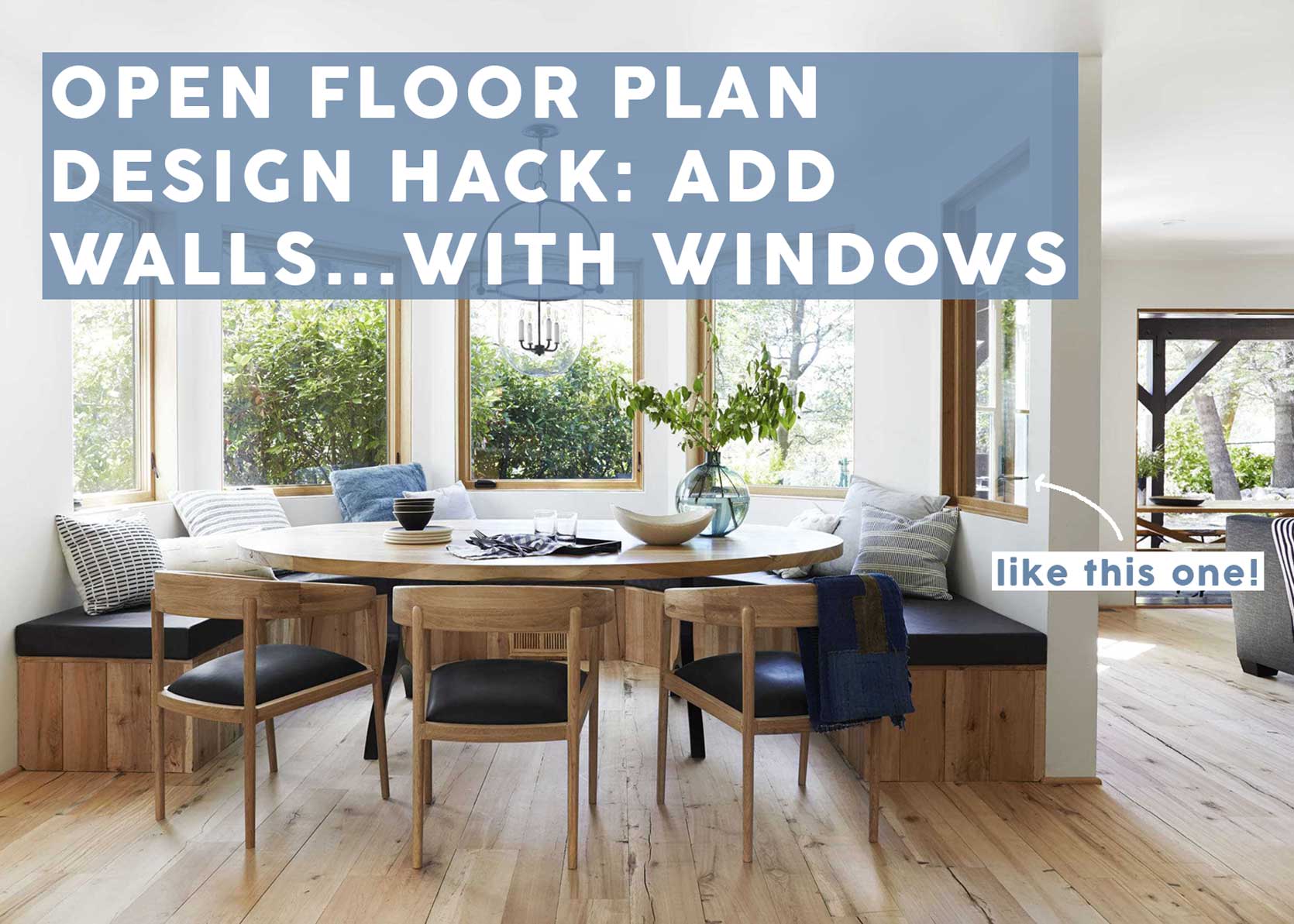
Don’t want an open floor plan, but not exactly sold on closing off all your rooms from each other? Well, welcome to your happy medium: Putting back up a wall (with interior windows) or an architectural room divider. I think it was only a matter of time before those vast, open-concept homes with no distinct spaces grew a little tired, especially because it can be challenging to figure out a furniture plan for them if you aren’t a professional.
And while I can agree that there is an appeal to having no barriers to the flow in your house (especially with kids who want to run around wild), there is no denying that many rooms actually function better—or are 100% more charming at the very least—when they are broken back up. The key is to ensure light can still pass between rooms and visibility remains between spaces. That way, you get visual—and actual—separation that allows you to carve out areas with a distinct function in mind, but not feel closed off. Bonus points? Your home may get the Nancy Meyers-esque upgrade you’ve always wanted.
If you’re struggling to envision what I mean when I say to add a room divider—because I’m not talking about a folding screen—keep reading, because I’m breaking down four ways to do it and sharing tons of inspiration to give you a creative jumpstart.
Interior Windows & Window Walls
We first touched on our love of interior windows three years ago in this post. This is by far my favorite way to partially close off an open-concept home, because light can still pass through, but you gift yourself distinct rooms. It can be done as a full wall with doors, partial side dividers to create a pass-through, or literally with an erected window wall in the middle of a space (see Jean Stoffer’s designs below).
Jean Stoffer is a pro at adding in this type of architectural room divider. There’s no denying the homes she works on for clients or herself are on the grand scale of things, where adding in walls might not chop up square footage nearly as much as it would in something, say, 1,400 square feet. But I still think it’s safe to say it’s easy to admire and pocket away inspiration from her and her team’s work.
I’m especially intrigued by the idea of the window wall in the middle of the room to allow for a little seating area. That, and the entry vestibule below, which was common in homes in the 1800s and 1900s to control interior air temperature in cold climates. While I’m guessing this one might have already existed, it still makes my brain wonder how putting up walls around an entryway could create a very cozy little foyer.
I have had that kitchen and bedroom by Bryan Graybill saved in my folders for the better part of two years, and I constantly reference it to applaud its beautiful use of interior windows to set spaces apart but also keep them in company with each other. The café curtains are a charming touch.
I remember when Shelby of Pretty in the Pines was plotting out this windowed room divider in her long living room. If you click through above, you can see what it looked like when she moved in. Now, she has a well-sized but comfortable living room, and was able to carve out a charming breakfast nook and separate her kitchen space.
Not all built-in room dividers need to be large and in charge. Sometimes, just a sliver of a partition is enough to make a difference.
We’re all so quick to think a room needs to be surrounded by solid drywall, but windowed walls (and French doors to boot) keep the room semi-private yet still visibly part of the living spaces or thoroughfares. Setting it off in a refreshing mint gets an A+ from me.
Even a narrow sliver of a larger space can be turned into a compact but effective office or studio room. Think about it…how many of us have open lofted spaces on our second floors, or a great room we can’t quite figure out? All you need is—I’m estimating here—five by 10 feet of unused floorspace to create a bonus area you can turn into something useful.
If you’ve gotten this far thinking the idea was nice but too formal or traditional, don’t worry, there are other ways. Take the above and the below two images for inspiration that are more metal-forward, each giving more contemporary vibes. The white, seen above in an image shared by The Organized Home, is unsurprisingly light and unobtrusive…
…while a black finish on the grates makes more of a statement.
There must be something about floor-to-ceiling shelves of books behind a grated glass enclosure like this, but wow, this sure is the way to do a studio bedroom, huh?
I love the work of Colombe Studio, and this rounded, windowed room transition is such a stunner.
Floor-To-Ceiling Room Dividers & Furnishings
Next up, something not as grand, that requires less construction: free-standing or installed dividers and larger furnishings. This approach tends to come off more contemporary, and was a common strategy in the mid-century. If you love any excuse to display your treasures and books, this one might be for you.
A rounded edge is a nice touch with a shelving unit like this, as it encourages flow a bit better and limits anyone accidentally ramming their ribs into a sharp corner.
Reeded glass and caning keep things semi-private on the other end, but still open and airy. I love this approach for a more decorative and interesting take on room division.
This shelving unit appears to be attached (or tensioned) to both the floor and ceiling beam, which is safer, of course, than something tall and narrow that is freestanding.
Working with a designer or expert woodworker (unless you’re incredibly skilled yourself) could render a useful and pretty entryway cabinet-slash-bench-slash-room divider like this one above by Four Block South.
Just a darling vintage room divider (and another one if you flip through above), in the time capsule-esque home of Dana and Colin of Un.Flipping.
And here, a reminder that not everything has to be installed. A more sturdy, heavy-bottomed cabinet like the one above by Kerf Design (which has hooks on one side and plant shelves on the other) might just be the right solution for you to set apart a living space that’s directly right off the front door.
Bookcases & Passthroughs
Can you believe that Zenia Olivares of Style It Pretty Home built the room divider above herself?!? You can see the before and some of her process in this Reel she posted on her Instagram. Just wow!
My heart has no other option but to swoon when I see a transom window anywhere in a home, especially when it’s inset into a gorgeous slate blue millwork opening like the above by Timber Trails Home. There is just no beating character like this in a home, especially not just some long stretch of openness.
I love seeing small nooks tucked away behind other rooms, and this one, in a shot shared by Block Shop Textiles to promote their new line of fabrics with Sunbrella last spring, gets top marks due to that bentwood arch and shelving room divider. ::applause::
The work that Alice Gaskell has done on her clean-lined, cold, and contemporary new build home is jaw-dropping, and I just love this bookcase room divider she designed. Click here, and swipe to the second photo to see what it looked like before. Prepare to be amazed and inspired.
—
So…how we feeling? If you have a super open floor plan and love it, great! My intention isn’t to bring forth a smear campaign against them. They have their merits, for sure, and when you’re in one, you may breathe a sigh of relief. And while open-concept homes may check a lot of people’s boxes these days for how we live, what they aren’t, at least for me, are memorable. What is memorable? Beautiful architecture, even if it’s not original, because we don’t all get to live in soulful turn-of-the-20th-century homes; more like turn-of-the-21st-century. If you’re looking to bring some character and a better use of space to your house, then I hope this post gets your gears churning.
Until next time, friends…
Opening Image Credit: Design by Emily Henderson | Photo by Sara Ligorria-Tramp | From: Mountain House “Reveal”: The Dining Room Built-in Dilemma (+ The 3 Mistakes We Made)


Great article. I definitely prefer see-through houses to open plan which (apart from being good for parties) I find inefficient and feel most people compensate for with expensive workarounds (butler pantries to hide the kitchen mess so the main kitchen stays pristine, tv rooms to control the noise and create cosiness etc).
I get the yearning for light and space though, so there are some really useful – and lovely – ideas here.
Excellent as always Arlyn!!!!
Love this post! The biggest issue for me with completely open floor plans is the noise. I remember people jacking up the TV volume to hear it over the dishwasher and the blender going at my in-law’s house because they had wood walls, vaulted ceilings and open concept. No place for the sound to go but bouncing around the room irritating everyone. Was also just in a brand new Pho restaurant that we were so excited to visit. We had to shout to hear each other at our table because again, entire restaurant was open concept no dividers of any kind and the sound just bounced all over the place making it unbearable for me. I know the issue of sound is probably the last thing people think about when considering open concept, but its the first thing to hit my senses and make me want to flee the space. Open concept looks pretty but lives terribly. Love all of the examples you found to solve for it.
As someone who lives in a loft, so a VERY open space, I have to mention that textiles get special consideration [otherwise, maybe acoustical panels?]. In our case, our big space is loosely divided into kitchen, living area, dining area and home office/reading nook and, except for the kitchen, each one has as large a rug as could possibly make sense.
The large windows have floor-length curtains. There is a large sofa and 5 armchairs, all upholstered. Those may seem like strictly aesthetic choices, but they all help to dampen noise.
For the kitchen, I chose the quietest/most powerful vent I could find. It’s installed in a custom wooden hood, and the dishwasher is paneled, again minimizing sound as much as possible.
I LOVE the ideas presented here [although they tend to be pricey!]. If you do choose to live in an open space, you have to be very intentional in making it work, but it can definitely be done.
I really love semi-enclosed rooms like these. They are the best of both worlds in many cases! Sadly, window wall dividers are a lot harder to do than plain drywall and finding the person who can do it is tougher and more expensive as well. I do have a handy hubby and we are planning a cased opening for our 12×12 entry space (has no defining edge at the moment other than the cube shape of the room) but he is balking hard at doing a transom light along the top edge. I showed him those process pictures from Pretty in the Pines and he said the lumber being used was specially planed 2x4s without the slightly rounded corners that you find in typical lumber yards. Transoms Direct exists to be ordered from, thankfully, which means I need to start saving my dollars!
You can easily order transoms and sidelites from any Home Depot. The key is finding the most knowledgeable employee in the window department.
Something I LOVED about my parents’ house was that they had glass pocket doors that separated the family room from the TV area. We used it constantly growing up.
Loved this post! Arlyn I appreciate how well thought out and researched your posts always are!
I love all these beautiful examples ! 😍
Are you there examples from ”ordinary“ U.S. houses?
I am not a huge fan of open concept, especially when you can see everything the minute you walk in your front door. I don’t want to enter my home and see dishes in my kitchen sink. These are beautiful examples of creating separation. Thank you for the inspiration.
Fantastic article. SO many brilliant ideas and links. I’m inspired!
Loved each of these, and the Timber Trails home example most of all. It also seems possibly more “budget friendly” to execute, but I’m sure there’s a lot I don’t know. Wonderful inspiration here, Arlyn!
It’s funny to me. Some open concept houses make me feel anxious. Somehow seeing almost the whole space all the time does that for me. Like there’s no where to go and retreat. I feel like a hamster who could run the walls. I think this must be the opposite of how most feel.
Any ideas for a tall vaulted ceiling great room? I’ve thought of super tall wood slats but they would need to be very long!
For those looking for inspiration on making their homes more functional and charming, these ideas are incredibly helpful. By the way, if you’re also planning your educational journey abroad, connecting with the best abroad consultancy in Chennai can make your transition smooth and successful. Just like thoughtfully dividing spaces at home, the right consultancy helps carve out a clear path for your studies overseas.
Thank you Arlyn! This article confirms an idea I had about enclosing the windowless dining space (not calling it a room) right off my entryway. It’s “far” from the kitchen and would rather be a little office nook. I already repurposed the breakfast nook as an office, but with all the windows in that space it wants to be where we eat. Transoms at least and windows at best in the new office nook would allow natural light.
I’ve renovated five houses and I’ve ADDED four walls (and about to add a fifth) and framed out a space between two rooms with bookcases on each side and a header. Never removed a wall.
I loved this article and I would really love to see examples or understand how to block off a typical great room. A lot of the examples were for traditional homes, which likely would be better suited for closing off. It’s hard for me to imagine how to close off a great room, and I’d love that advice
I really need help with this — has anyone closed off a second floor catwalk with a wall of windows??? i dont like that i can hear my guests on the second floor snoring from my living room. and i don’t think it’s that safe with my wild kids….
Maria Killam did something similar with drywall.
mariakillam.com/panelled-moulding-entry/